What is Noguchi Akari?
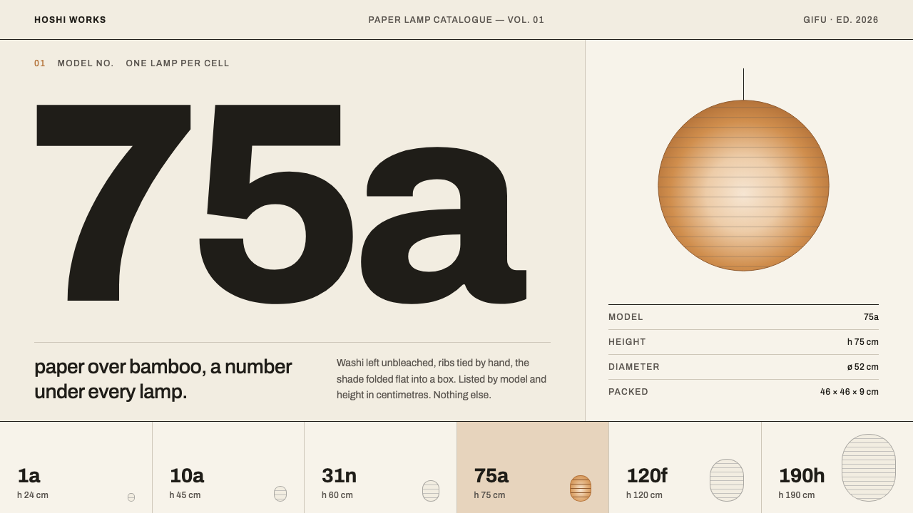
Noguchi Akari reduces a catalogue to its essentials: a paper-toned ground, one amber glow behind a single layer of washi, and a number with a height beneath it.
Noguchi Akari in brief
Noguchi Akari is a design style built from a single object and a single catalogue. Akari is the paper lamp that the sculptor Isamu Noguchi began making with the Ozeki workshop in Gifu in 1951: unbleached mulberry washi stretched over bamboo ribs, collapsible into a flat box, and sold by number rather than by name. The style takes its page from that paper and its voice from the catalogue that later presented the lamps.
Its palette is warm and quiet: the unbleached tone of the paper as ground, neutral greys drawn from printed photographs of the lamps, an amber glow held behind a single layer of paper, and a deep violet-indigo ink borrowed from Josef Müller-Brockmann's 1975 catalogue poster. Everything sits on a strict Swiss grid. One object occupies each cell, with a number and a height beneath it, and nothing else.
The effect is calm and orderly, a kind of printed hush. The page never explains itself, because the object is meant to speak, and the grid ensures that every lamp is given the same respect. It suits product catalogues, specification sheets and brand pages that need order, restraint and a sense that quality is being quietly assumed rather than announced.

Where does Noguchi Akari come from?
The story begins in Gifu in 1951. Isamu Noguchi, passing through the region, saw the paper lanterns hung on the cormorant-fishing boats of the Nagara river and recognised in them a way of making light that was at once ancient, local and entirely modern. He began a collaboration with Ozeki & Co., a lantern maker founded in 1891, and the first Akari lamps came out of that partnership. The workshop's craft knowledge of washi, bamboo and folding ribs met a sculptor's sense of form.
Akari are made from unbleached mulberry washi glued over a framework of bamboo ribs; because the ribs fold, a lamp collapses into a thin, flat box. The range grew to more than a hundred models, from about 24 centimetres to 290 centimetres in height, and the models were identified only by number, never by name. That decision is the key to the style: the numbering declines to turn a lamp into a character or a brand. The number is a quiet, neutral handle, like an entry in a drawing register or a specification list.
The second source is Swiss. In 1975 Josef Müller-Brockmann produced a catalogue and poster for the lamps, applying the grid-based, grotesque typography of the Swiss school to an object made of paper and bamboo. The meeting looks improbable and works perfectly: the lamp's irregular, handmade glow is held by the most rational layout system in graphic design, so that each cancels the other's excess. The poster's deep violet-indigo ink gives the style its single graphic accent, and the catalogue gives it its structure. Production meanwhile continued without interruption through 1990 and after, with the lamps distributed internationally from New York.
Three lineages are visible in this style. The first is mid-century sculpture as usable object, the idea that a sculptor's work can be a thing you live with. The second is Japanese craft industry modernised, in which a traditional workshop enters a contemporary market without losing its method. The third is Swiss grid typography, which supplies the rule-bound page. The Noguchi Museum, which looks after the designer's legacy, is where the continuity of these ideas is kept. Together they explain the style's temperament: modest in manner, exact in arrangement and quietly warm.
What defines the Noguchi Akari look?
Washi Ground
The ground is the natural, unbleached tone of mulberry paper, a warm off-white with a faint fibrous softness. It is the page and the material at once. Because the paper has not been whitened, every other colour sits on it like ink on a sheet, and the whole layout feels handmade without a single texture effect.
Print Greys
The primary colour is a neutral grey taken from printed photographs of the lamps, the tone a lampshade takes on in black-and-white reproduction. It carries headings, rules and captions with a calm authority. Grey is chosen because it refuses to compete with the object it describes.
Amber Behind One Layer of Paper
Amber is reserved for light itself, the glow held behind a single layer of paper. It appears rarely and only where a source of light would be, such as a small lamp shape or a key highlight. If amber is also used for buttons, links and badges, the one warm moment on the page loses its meaning.
Violet-Indigo Ink
A deep violet-indigo, borrowed from the ink of the 1975 catalogue poster, serves as the printed accent. It works best for numbers, short headlines and fine rules, where it reads like a second ink on the sheet. It gives the greys and the amber a dark, concentrated counterpart without introducing black or a bright brand colour.
Lowercase Archivo
Type is set in Archivo, a grotesque in the Swiss tradition, and in lowercase wherever possible. Lowercase removes the shouting from labels and headings and lets numbers stand out as the most formal element on the page. Sizes are few and alignments flush, so the text behaves like a catalogue rather than an advertisement.
The Hairline Swiss Grid
Layout is a strict modular grid drawn with hairline rules, with one object per cell. Cells are equal, gutters are consistent and nothing spills across a border without a reason. The grid is the page's real structure: it turns a collection of different lamps into a series that can be compared at a glance.
A Number and a Height
Beneath each object sits a number and a height, and nothing else: no name, no adjective, no price badge, no call to action. This caption discipline is borrowed directly from how the lamps are sold. The restraint makes the information feel authoritative and leaves the object, and the reader's imagination, to do the rest.

Who shaped Noguchi Akari?
The sculptor who began the Akari series in Gifu in 1951, making lamps that are objects of everyday use and works of sculpture at once. His insistence on light as a material, held by paper and bamboo, is the heart of the style, and the choice to number the lamps rather than name them gives the catalogue its distinctive voice.
The Gifu lantern workshop, founded in 1891, with which Noguchi collaborated from 1951. Its knowledge of washi, bamboo and ribbed construction made the lamps possible. It stands for the craft-industry half of the style: a long tradition of making that can be carried into a modern product without being diluted.
The Swiss graphic designer whose 1975 catalogue and poster for the lamps supply the style's grid, its restrained typography and its violet-indigo ink. His work brings a rational, systematic order to a handmade object, and the style inherits both the discipline of the grid and the particular ink of that poster.
The museum that keeps and interprets the designer's legacy, a custodian of the lamps' history and a continuing reference point for how they should be presented. It represents the long afterlife of the series: production continuous through 1990 and after, and an audience that still approaches the lamps through careful, quiet presentation.
How do you use Noguchi Akari today?
Noguchi Akari is an excellent choice for subjects where objects deserve to be seen one at a time: catalogues, collections, specification sheets and brands built on quality and calm. It is a style of arrangement more than of decoration, so it rewards content that has already been well chosen.
On slides, a cover can show a single object or glow on a paper-toned field with a lowercase title and a number in violet-indigo, set against a visible grid. Content slides divide into equal cells, one idea or one item per cell, with a number and a short caption below. Data slides work as ruled tables and small multiples in greys, with amber reserved for the one item that deserves to glow.
In web interfaces the style suits product catalogues, portfolios, design shops, gallery and archive pages, and specification-driven pages such as pricing tables. Use an even card grid with hairline dividers, show the object large and the caption small, and keep navigation in lowercase text. Interactions should be quiet, with a gentle amber warmth appearing on hover or selection, as if a lamp were being switched on.
For editorial and marketing work, the style supports lookbooks, exhibition posters, brand books and long-form pieces about craft. Keep copy short and factual, let photography be soft and evenly lit, and align everything to the grid. The most persuasive thing the page can do is to be orderly enough that the object seems worth looking at.
The most common mistake is reaching for Japanese clichés. This style is a conversation between a Japanese craft and a Swiss page, not a generic Zen look, so brush strokes, red suns, bamboo clip-art and ornamental motifs are out of place. A second mistake is spreading amber across buttons and headings, which dilutes the single glow. A third is adding names, adjectives and prices to every cell, which breaks the number-and-height discipline. Fill the grid sparingly; empty cells are part of the rhythm.

Noguchi Akari — FAQ
Why does the style identify objects by number instead of by name?
Because the lamps themselves were sold that way: Akari models carry numbers, not names. The convention keeps attention on the object, avoids turning products into characters and gives a catalogue its calm, systematic voice. In a layout, a number plus a height is often all the identification a thing needs.
Is this a generic Japanese style?
Not in the usual sense. It joins a Japanese craft, paper and bamboo lamps made in Gifu, to the Swiss tradition of grid-based graphic design. The result is more modernist than traditional, and it avoids the visual shorthand usually used for Japan. Think of it as a catalogue style that happens to be about a Japanese object.
How does it differ from Swiss International Style?
It shares the grid, the grotesque type and the restraint, but adds the warmth of paper and a single amber glow. Pure Swiss Style tends toward high contrast and often stark black and white. Noguchi Akari softens that with an unbleached ground, neutral greys and one deep ink colour, so the grid feels hushed rather than severe.
Where should the amber go?
Only where light would be: behind a layer of paper. In practice that means a single focal element per page, such as a lamp-shaped highlight, a selected item or a hover state that suggests switching on. If amber is also used for standard buttons and links, the page loses its one warm moment.
Can the style work for products that are not lamps?
Yes. Furniture, ceramics, stationery, books, tools and any collection of well-made objects can use it, as can portfolios and archives. It is less suitable for loud or highly interactive products where information has to move quickly and the hush would slow things down.
Related design styles
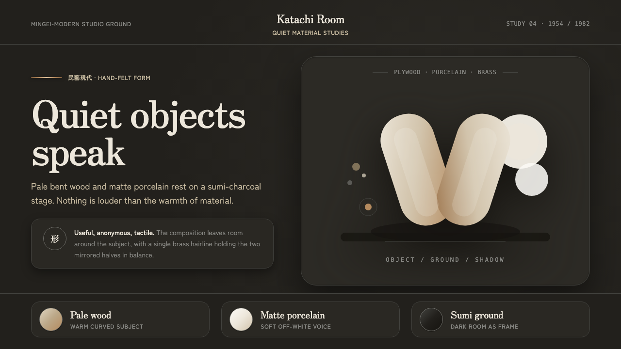 Sori Yanagi ButterflyQuiet objects speak. Pale plywood and matte porcelain glow on a sumi-charcoal…
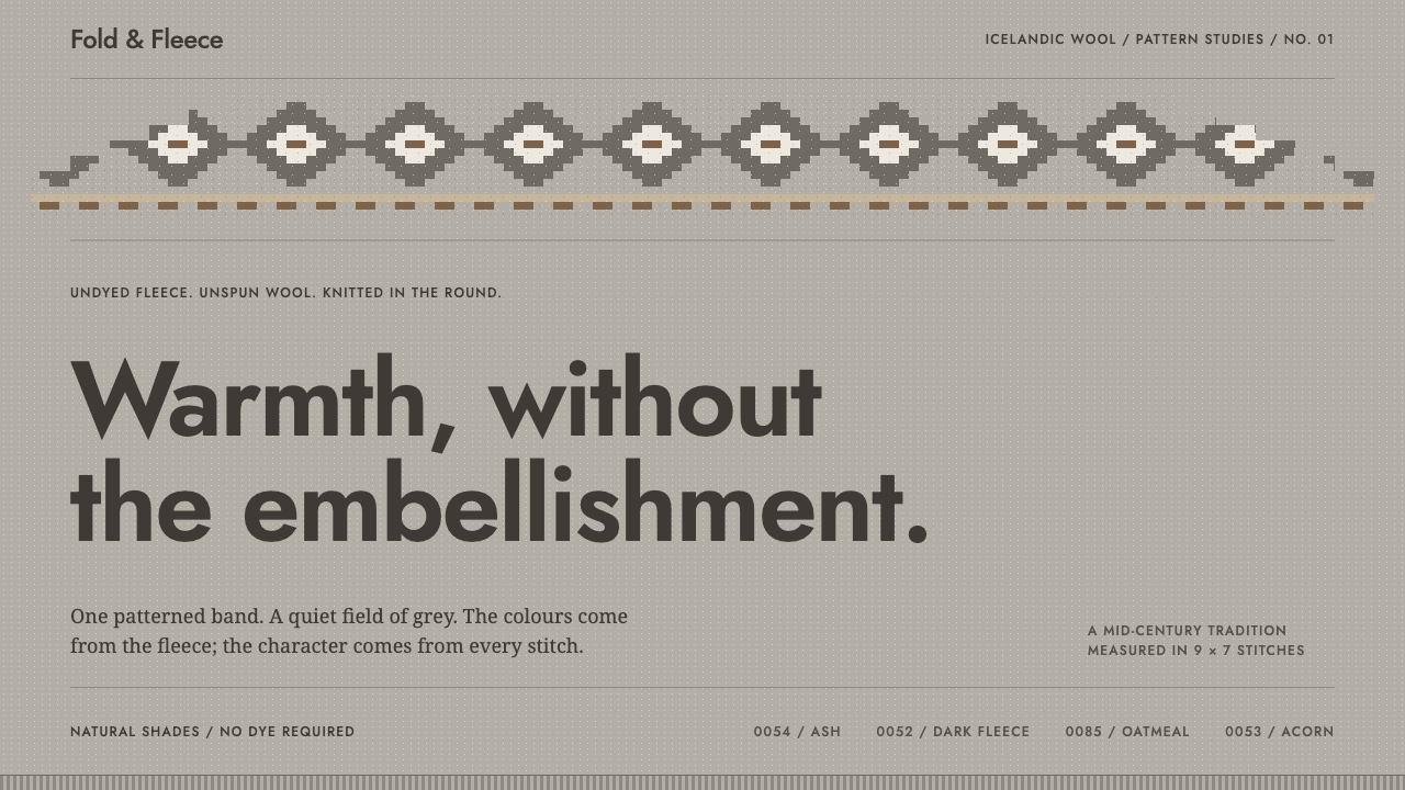 Icelandic LopapeysaWarmth without excess. One stepped stitch band crowns a flecked fleece-grey f…
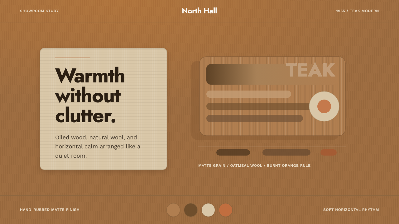 Scandinavian Teak ModernWarmth without clutter. Teak grain, oatmeal wool, and one burnt-orange rule h…
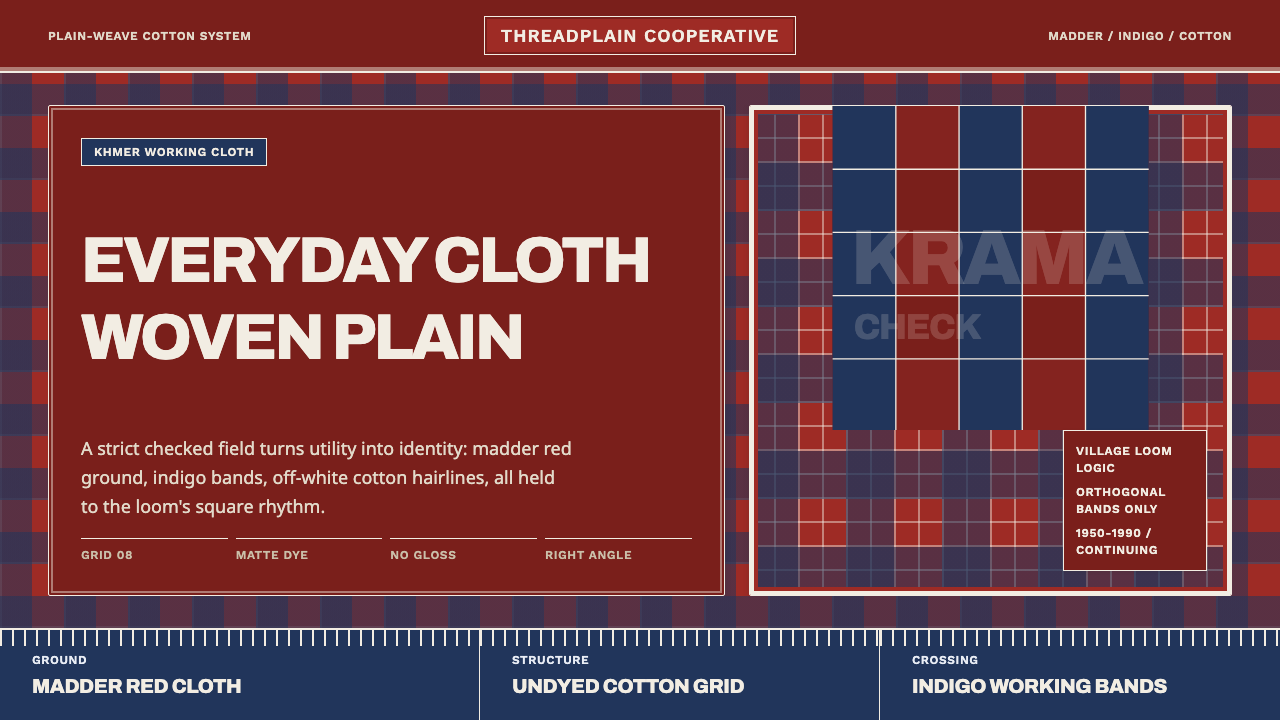 Cambodian Krama CheckPlain cloth has authority. Madder red, indigo bands, and cotton grid lines do…
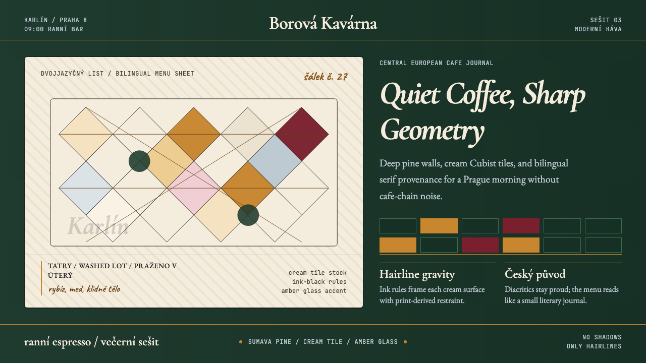 Czech Prague Modernist Cafe (2020)Quietly assured. Pine green, cream hairlines, amber Cubist tiles, and literar…
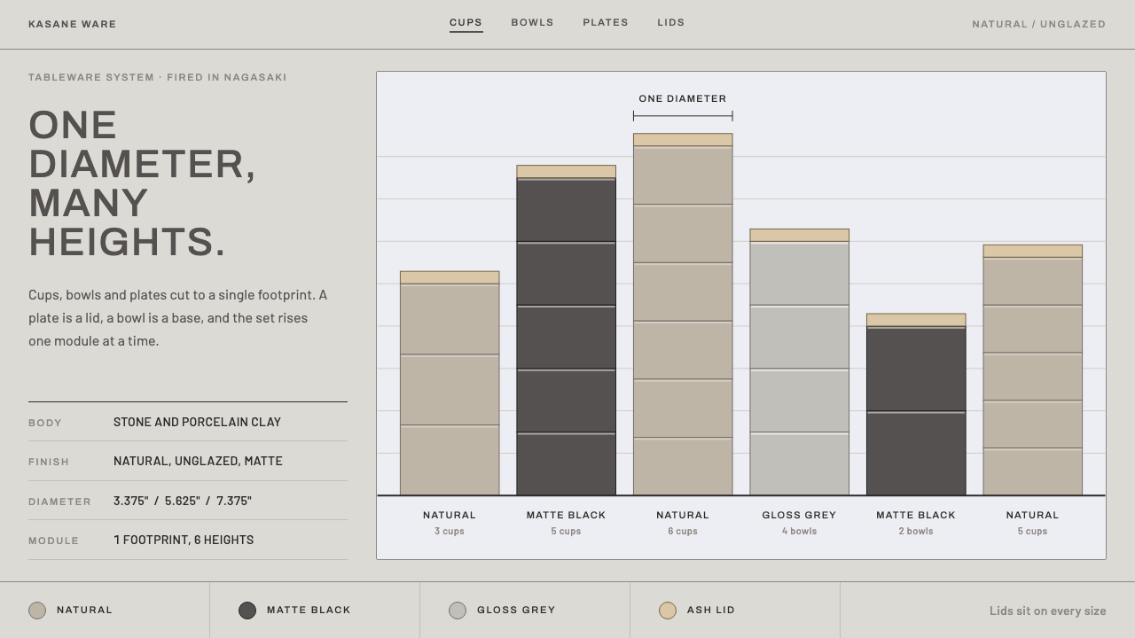 HASAMI PORCELAINOne diameter, many heights. Greige ground, matte-black stacks, wide-tracked A…