What is HASAMI PORCELAIN?
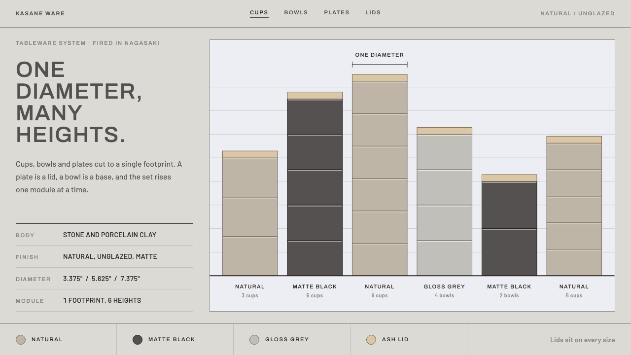
Hasami Porcelain turns one rule — every piece shares a single diameter — into a design language of bare clay, matte black stacks and blocks that vary only in height.
HASAMI PORCELAIN in brief
Hasami Porcelain is a modular tableware system designed in Venice Beach, California, in 2010 by Taku Shinomoto and manufactured in Hasami, a town in Nagasaki, Japan, that has been firing pottery for roughly four centuries. As a visual style it is defined by its governing constraint: every piece in the line is built on one shared diameter, so a plate doubles as a lid, a bowl becomes the foundation of a tower, and cups, bowls and plates nest into columns that take up no more table space than a single piece.
The style is best understood as a grammar of stacking. Where most design systems let width, spacing and proportion vary freely, this one fixes the footprint and allows only height to change. Translated to a page, that means blocks of identical width piled in a vertical rhythm, differing in thickness and in the weight of tone they carry. The result feels engineered but never cold: the logic is that of a well-organised kitchen cabinet rather than a laboratory.
Its palette is drawn from the material itself. The ground is the dry, matte, unglazed body of the porcelain, a greige that sits between warm ash grey and pale beige. Matte black provides weight and anchors the stacks, and a pale ash-wood tone adds the occasional note of warmth. Labels are set in wide-tracked capitals of a plain, sturdy grotesque, speaking in the quiet voice of a product tag rather than an advertisement. There is no gloss, no glaze-like highlight and no ornament. The whole look is about what clay looks like before the finish is applied.

Where does HASAMI PORCELAIN come from?
Hasami ware comes from the town of Hasami in Nagasaki, on the Japanese island of Kyushu, where kilns have been firing pottery since the early 1600s. The town's long specialty is everyday porcelain: sturdy, affordable, made in volume for ordinary households rather than for display or ceremony. That places it in the orbit of mingei, the Japanese folk-craft idea that plain objects made by skilled hands for daily use carry their own dignity. Hasami was always a production pottery, though, organised around repeatable shapes and efficient firing rather than the signature of a single master, and that industrial temperament is what the later design system builds on.
The line itself dates from 2010. Taku Shinomoto designed it in Venice Beach, California, and had it made by the Hasami kilns, a collaboration that joined an American, retail-minded sensibility to a four-century-old Japanese manufacturing tradition. His name is tied to Tortoise General Store, and the logic of a shop hangs over the design: things that must be shelved, boxed, shipped and restocked are best served by parts that always fit together. Tableware in which every piece suits every other piece is easy to display, easy to store and easy to extend one piece at a time.
The stacking idea has a deep precedent in Japanese food culture: the tiered jūbako box, in which festive food is packed in layers that lift off one by one. Hasami Porcelain carries that principle from lacquer to porcelain, with one important change. Rather than a fixed set of identical boxes, the line is a small vocabulary of plates, bowls and cups that share a diameter and can be recombined in any order: a plate over a bowl, a cup on a plate, a tower of mixed pieces. The visual identity that grew up around the line absorbed the same lesson and builds whole compositions from interchangeable units of equal width.
The best-known expression of the line is the unglazed Natural finish, in which the clay body is left bare, dry to the touch, matte and coloured somewhere between grey and cream, alongside a matte black version. The identity that has accompanied the line, from roughly 2012 to 2024, applies the same restraint to the page: a great deal of plain ground, black as the principal weight, a faint ash-wood warmth and widely spaced capital lettering. Product photography of stacked pieces does the illustrative work. Because the objects themselves are the brand, the identity is essentially a translation of material into layout, and the three currents it draws on, mingei-descended production pottery, modular systems design and American–Japanese design exchange, each leave a trace: honesty of material, interchangeable parts, and a cross-Pacific eye for what is worth keeping plain.
What defines the HASAMI PORCELAIN look?
Shared Footprint
The defining rule is that everything shares one width and only height varies. In layout terms, cards, sections, rows and panels are cut to a single column measure, and hierarchy comes from how tall each block is and how heavy its tone feels. This gives pages an almost architectural calm: the eye is never asked to reconcile competing widths, so it travels vertically, from block to block, the way a hand moves down a tower of bowls.
Unglazed Greige Ground
The background is the colour of unglazed porcelain: a dry, matte greige between warm grey and pale beige. It is deliberately not white. White would read as glaze and gloss, while greige reads as raw material, slightly dusty and tactile. Because it is neutral and gentle against itself, it lets black and wood tones carry all the emphasis without the page ever feeling stark.
Matte Black Weight
Matte black is the only heavy tone. It appears as the solid body of featured blocks, as the footing of a composition and as the colour of the most important text. It never shines: there are no highlights, no gradients across its surface and no glossy edge. Used in a few large masses rather than many small accents, it plays the role the black stacks play on a table, grounding everything that sits above it.
Ash-Wood Warmth
A pale ash-wood tone supplies the single touch of warmth, a human and tactile counterpoint to an otherwise mineral palette. It is used sparingly, as a tab, a divider or a quiet background for a note, and it never competes with black. Think of it as the colour of something you could pick up and hold, set against the clay and the stone-like darkness around it.
Wide-Tracked Capitals
Labels, headings and navigation are set in capital letters of a plain, sturdy grotesque with generous letterspacing. The tracking is the style's signature: it lets short words such as category names or product sizes feel measured and even, like type stamped on the base of a piece. Body text stays quiet and small, and nothing is italic or decorative. The voice is that of a product label, informative and calm, not a slogan.
Stacked Rhythm
Vertical order is the main compositional device. Sections pile on one another with tight, consistent seams, and lists read like columns of nesting pieces: each item the same width, each separated by a thin joint rather than a large gap. Variation comes from thickness, a slim row here and a deeper block there, and from alternating the tone of adjacent layers between ground and black.
Matte Surfaces, Quiet Depth
Surfaces are flat and dry, and depth comes from stacking, not from effects. Where separation between layers is needed, it is made by a change of tone or a thin line, not by a cast shadow or a glow. Rounded forms appear sparingly, usually as a circle that echoes the shared diameter, but the page's architecture stays orthogonal. The overall impression is of objects in daylight: matte, quiet and seen from one clear angle.

Who shaped HASAMI PORCELAIN?
The designer of the line. In 2010, working in Venice Beach, he drew up a tableware system in which every piece shares a single diameter and arranged for it to be made in Hasami, Nagasaki. His central idea, constraint as a design generator, is the reason the style translates so easily into layout: fix the footprint, vary the height and let the system do the rest. He stands at the centre of the American–Japanese design exchange that the style represents.
The Venice Beach retail context connected with the line's origin and with Shinomoto's work. It stands for the shop-minded thinking built into the system: objects that are displayed on shelves, stored in cupboards and bought one at a time are best served by parts that always fit. As a reference point it explains why the identity reads as curated and calm rather than as an advertisement.
The potters and kilns of Hasami, who have fired pottery for around four centuries and who manufacture the line. Their tradition of everyday production porcelain is the other half of the story: the design draws its confidence from a town that knows how to make durable, stackable ware repeatedly and well. Whenever the style speaks of honest material, it is quoting this workshop culture.
How do you use HASAMI PORCELAIN today?
Hasami Porcelain is a good style to reach for when the content is made of many equal things and the goal is calm: a catalogue, a set of options, a collection, a toolkit. Its single rule is easy to apply and easy to check. If blocks do not share a width, the style is broken. That makes it forgiving to work with and consistent across a whole project, even when several people contribute pages.
On presentation slides, a cover can be built as a tower: a column of equal-width bands in ground, black and ash tones, with the title in wide-tracked capitals on one band. Content slides work best as three or four equal-width stacked rows, each carrying a short label and a single sentence. Data slides suit comparison charts in which every bar or segment shares a width; keep the chart to greys and black, and reserve the wood tone for the one series that matters.
In web interfaces, the style excels at product catalogues, configurators, settings panels and any dashboard of repeated modules. Cards share a column width and stack vertically; sidebars and tabs are set in capitals; the active item is shown by turning solid black. Pricing pages can present each tier as a layer in a stack that grows taller as features accumulate, which makes the hierarchy readable at a glance. Keep forms plain, with bordered fields on the greige ground and a black button as the single call to action.
For editorial and marketing work, the style supports slow, considered storytelling. Long articles benefit from a narrow single column on the ground tone with section labels in capitals; product pages can alternate full-width black and ground bands. Photography should be quiet and daylit, with objects on neutral surfaces, ideally in stacked or repeated arrangements that echo the layout. Copy should be brief and factual: sizes, materials, uses.
The most common mistake is to treat the greige as a generic beige and fill the page with warm decoration, such as rounded cards, soft shadows and pastel accents, until the stacking logic disappears. A second is to vary widths freely, which breaks the one-diameter rule that makes the style recognisable. A third is to render black with gloss or gradient; it should be matte and flat. Finally, resist the temptation to tighten the letterspacing on the capitals, because the generous tracking is half of the voice.

HASAMI PORCELAIN — FAQ
Is Hasami Porcelain the same as Japanese minimalism or wabi-sabi?
It is related but not the same. Japanese minimalism and wabi-sabi lean on emptiness, irregularity and the beauty of imperfection. This style is more systematic: its beauty comes from a strict rule, one shared diameter, applied without exception, and from the satisfaction of parts that fit. It also carries an American retail sensibility and a production-pottery pragmatism that a purely contemplative style lacks. Think of it as calm through order rather than calm through emptiness.
Why is the ground greige and not white?
Because the page is meant to be the unglazed clay body, not the glaze. White reads as polished and clinical, and it makes black look harsh by comparison. Greige is dry and tactile, close to raw material, and it lets matte black feel like a natural partner rather than a contrast. It also keeps the whole composition softer for long reading while still giving text enough clarity.
Can the style work with a dark background?
The style's reference is a light, unglazed ground, so the natural version is light. A dark variant is possible by treating the matte black as the ground and the greige as the text and stack colour, but it loses the idea of raw clay and tends to feel heavier. The better approach is to keep the light ground and use black stacks as the dark moments, so that depth comes from alternation rather than from inversion.
Is it suitable for data-heavy interfaces?
It is a strong fit for interfaces made of repeated modules, such as dashboards of equal-width panels, comparison tables of tiers and catalogues of items, because the equal-width rule makes scanning easy. It is less suited to dense, free-form analytical screens that need many different column widths. In those cases, apply the stacking logic to the outer frame and keep inner content neutral, rather than forcing every chart to the same shape.
What does 'one diameter, many heights' mean on an actual page?
It means every content block, whether a card, a section, a banner or a list row, takes the same width inside its container, and the only thing that varies from block to block is height and tone. Imagine a column of boxes stacked on a shelf: they all sit flush, and the only way to tell them apart is how tall they are and whether they are clay-coloured or black. If you find yourself reaching for a narrower or wider block, the system is telling you to change its height instead.
Related design styles
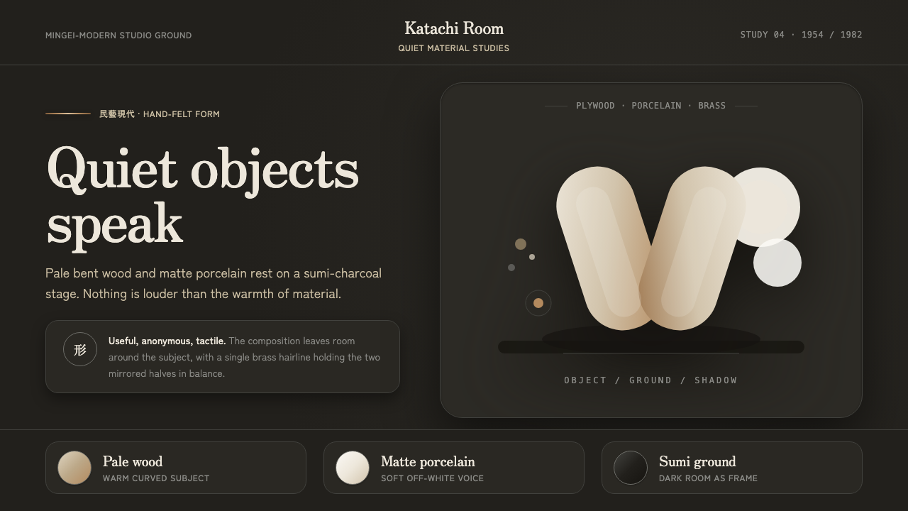 Sori Yanagi ButterflyQuiet objects speak. Pale plywood and matte porcelain glow on a sumi-charcoal…
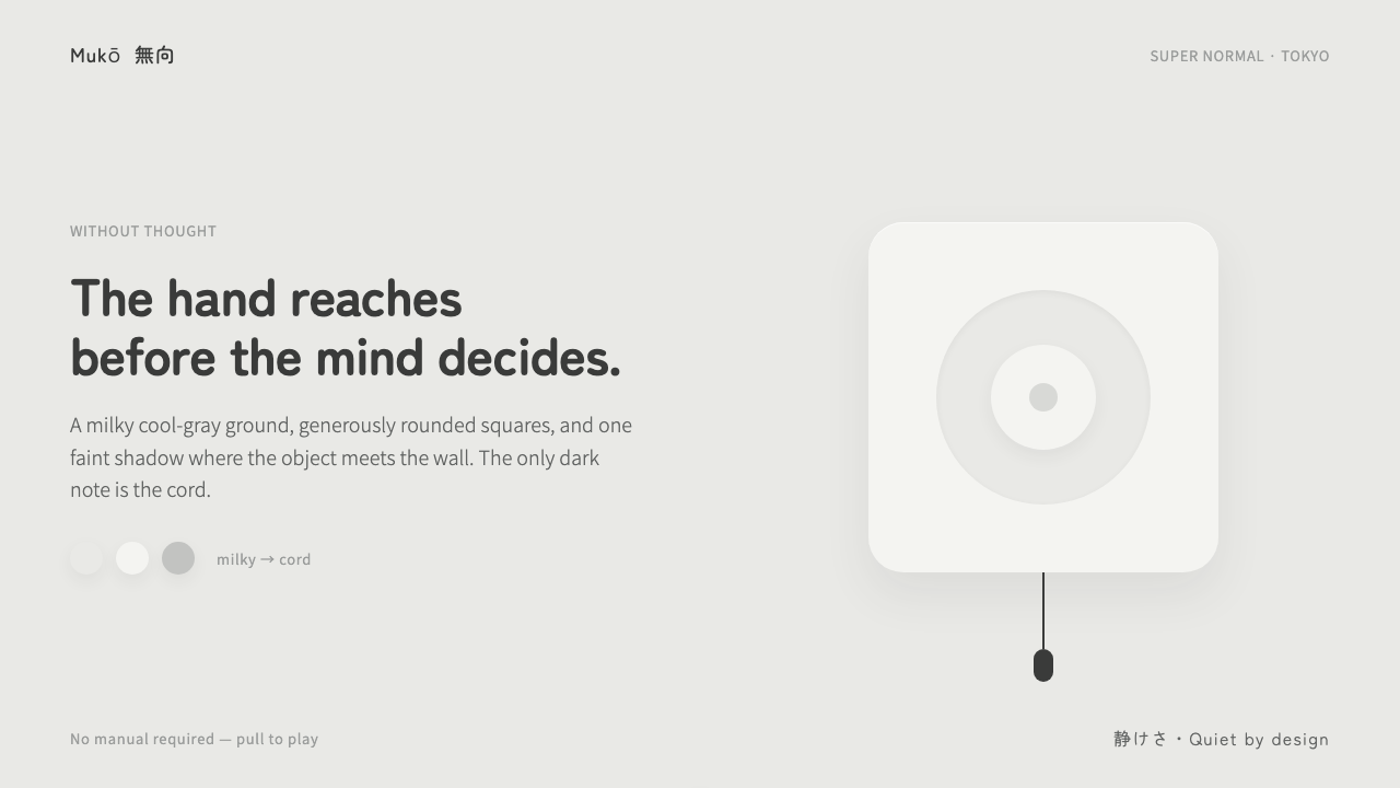 Fukasawa Without ThoughtHand reaches before mind decides. Milky cool-gray plastic, rounded squares, o…
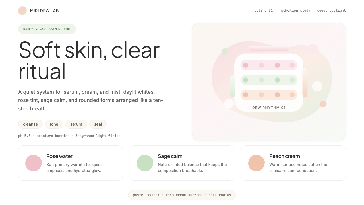 K-Beauty CleanCalm arrives dewy. Rose, sage, and peach pastels float through airy rounded f…
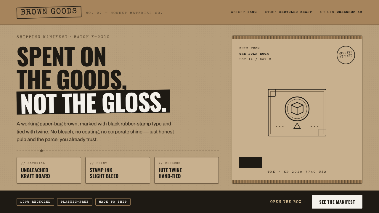 Kraft Paper PackagingThe goods, not the gloss. Mid kraft-brown fields, black rubber-stamp type, co…
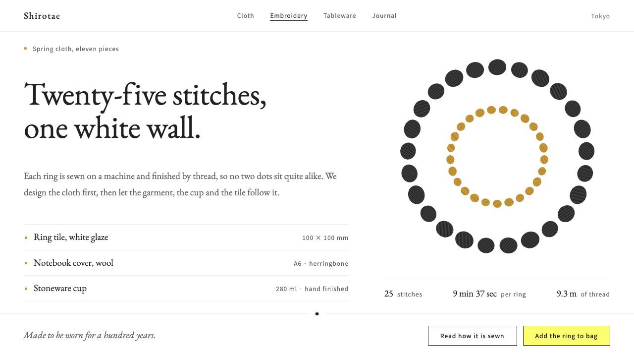 minä perhonenThread is the figure, white the ground. A 25-dot stitched ring, grey Garamond…
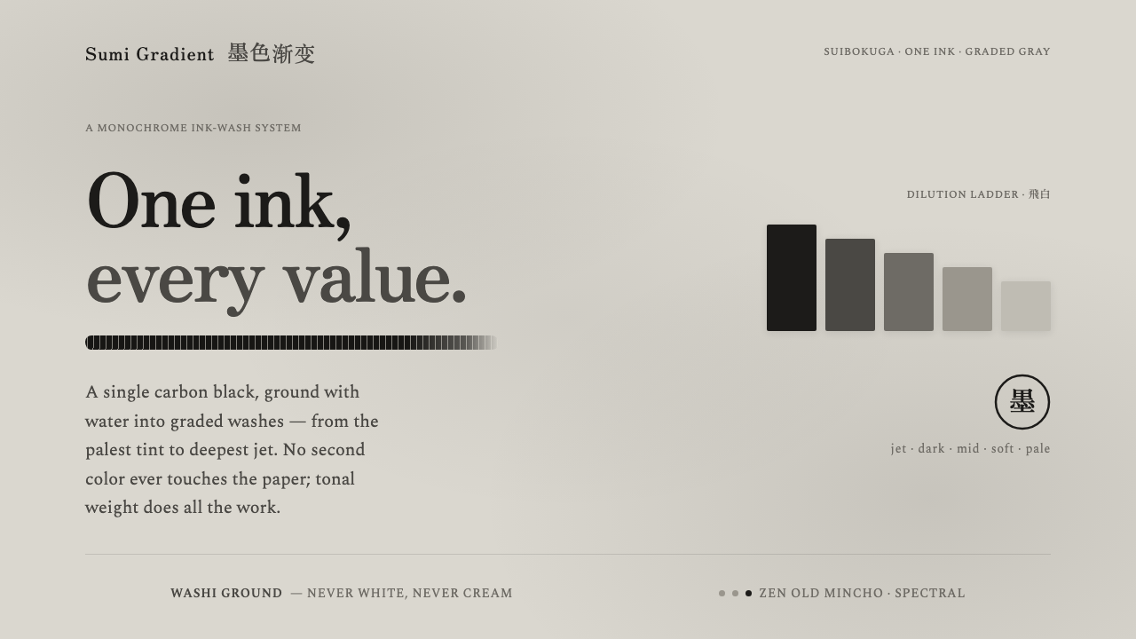 Sumi Grayscale GradientOne ink, every value. A single carbon black diluted into graded grays, marked…