What is minä perhonen?
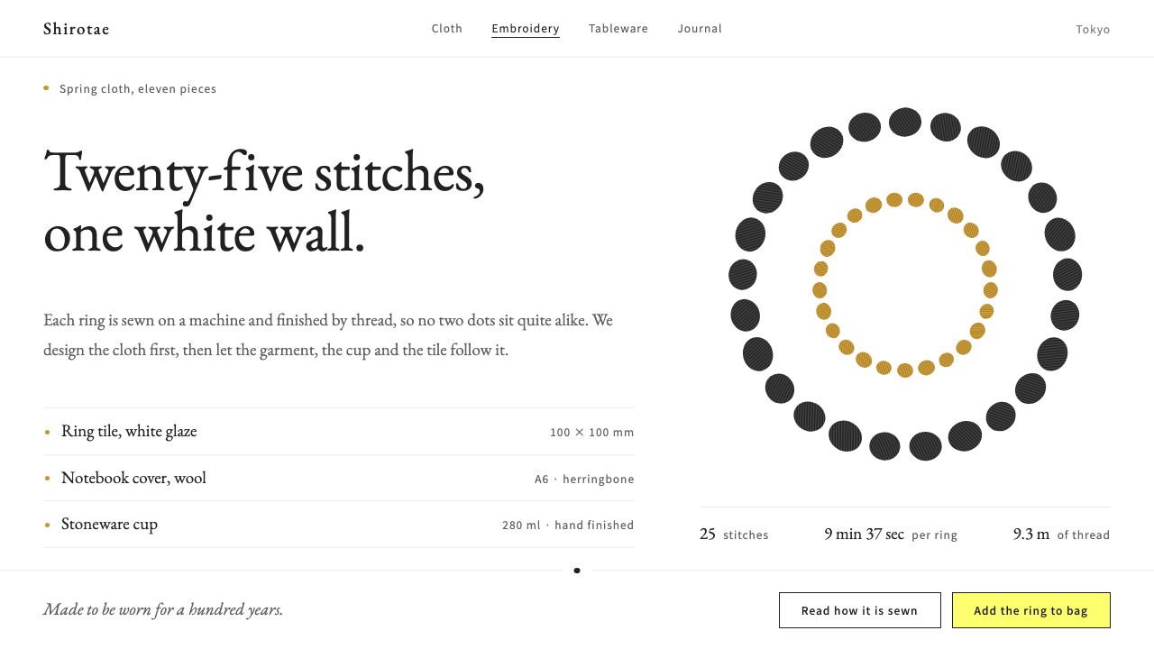
minä perhonen lets thread be the figure and white be the ground: a ring of twenty-five embroidered dots, dark grey type, hairline rules and a single lemon-yellow button.
minä perhonen in brief
minä perhonen is the visual language of a Tokyo textile and clothing house founded by Akira Minagawa. It is built from the house's own surfaces: white walls, white paper, dark grey type, very fine dividing lines and a great deal of air. Colour is not spread across the layout; it is handed over to the embroidery, so that thread is the figure and white is the ground. The one flat block of colour left on the page is a single lemon-yellow button, and its job is to say 'submit'.
The emblem of the house is a motif called tambourine, a ring of 25 embroidered dots. It began on cloth and has since appeared on tiles, cups, notebook covers and sofas, which tells you something about the system. A good motif is not a decoration applied to one thing; it is a unit that can travel across surfaces without losing its logic. The design system borrows that portability, and the patience that comes with it.
The tone is unhurried. This is a style for content that wants to slow the reader down, to talk about making and about use over years, and to let objects speak for themselves. It is closer to a quiet gallery wall than to a campaign poster, and everything in it, from the empty space to the thin rules, is arranged so that a pause feels natural rather than empty.

Where does minä perhonen come from?
Akira Minagawa founded the house in Tokyo in 1995 under the name minä. Its identity has always started from the textile: the best-known motif begins on cloth and only later moves onto other things. That order, surface first and product second, is still visible in how the visual identity behaves. Colour and form are decided at the level of the thread, and everything built around them is kept neutral enough to let them speak.
The name tells its own story. The house was called simply minä at first, and in 2003 it took the longer name minä perhonen. In Finnish the phrase means 'I am a butterfly', a small but telling sign of the Nordic and Japanese exchange that the source lists among the currents running through the house. A Tokyo label with a Finnish name is not a contradiction in this system. It is a clue that the calm, spare sensibility is meant to travel between places.
Tambourine arrives in the autumn and winter season of 2000 to 2001. A single ring of twenty-five dots takes nine minutes and thirty-seven seconds to embroider and uses 9.3 metres of thread. Those two figures are the whole philosophy in miniature: the motif is defined by the time and material it consumes, not by how it looks as a thumbnail. Since then it has left cloth for tiles, cups, notebook covers and sofas, and each move has kept the ring intact.
Behind the surfaces sits a stance that the source lists first among the house's movements: slow design, summed up in the idea of clothes made to last a hundred years. Beside it sit Japanese craft textiles and the Nordic and Japanese exchange. The current visual language, dated roughly from 2015 to 2024, applies those values to pages: white as wall, grey as ink, the hairline as a stitch line, lemon yellow as the one bright button. It is meant for content about craftsmanship, durability and long use, where the right emotion is patience.
What defines the minä perhonen look?
White as wall
Pages are white in the way a gallery wall or a sheet of good paper is white. The ground is not a blank to be filled; it is the quiet surface on which a small number of things are allowed to appear. Because nothing competes with it, the white is also what gives the embroidered colour its force, and it is the reason a single accent can be seen from across the room.
Thread is the figure
Colour belongs to the embroidery. In practice this means imagery of stitched motifs and textiles carries almost all the hue on a page, while interface elements stay neutral. The figure and ground relationship is deliberate and nearly literal: thread sits on cloth, cloth is white, and the layout never asks colour to do a job that thread is already doing.
Dark grey type
Text is set in dark grey rather than pure black, in a classic old-style serif with a humanist, bookish rhythm. The softened contrast keeps long reading calm, and the serif suggests a printed catalogue or a label sewn into a garment. Type is never shouted: sizes change gently, and hierarchy comes from placement and spacing more than from weight.
Hairline rules and air
Structure is made from very fine dividing lines and generous empty space instead of boxes, fills or shadows. A hairline behaves like a stitch line: it connects and separates without drawing attention to itself. Margins are wide and gaps between blocks are large, so the page breathes, and the rhythm of reading is set by white space rather than by decoration.
One lemon button
The only solid block of colour on a typical page is a lemon-yellow button, and it is reserved for the action that submits something. Because it is alone it is unmistakable. The rule is strict by design: a second yellow element anywhere on the page would turn a signal into a decoration, so everything else stays quiet to protect the one thing that matters.
The ring of dots
The tambourine ring, with its twenty-five dots, is the one round, repeatable unit in the vocabulary. It can be tiny or large, repeated as a field or isolated as a mark, and it carries the colour that the layout refuses to carry itself. Its dotted rhythm gives the page its only sense of ornament, and because it is a stitched form, it brings texture without simulated surfaces.

Who shaped minä perhonen?
Founder and designer of the house, who established it in Tokyo in 1995. The name change from minä to minä perhonen in 2003 and the tambourine motif both belong to his body of work. His stance, that clothes and objects should be made to be used for decades, is the philosophical centre of the design system, and it explains why the layouts favour patience over persuasion.
The best-known motif of the house, a ring of twenty-five embroidered dots first seen in the autumn and winter season of 2000 to 2001. A ring takes nine minutes and thirty-seven seconds to stitch and uses 9.3 metres of thread. It is included here as a protagonist rather than a person: in this design system the motif is the character, and everything else is the room it stands in.
The Tokyo textile and clothing house itself, called minä from its founding in 1995 and renamed in 2003. Its surfaces, white walls, white paper, dark grey type, hairline rules, are the source of the design system's rules. The house is the real author of the system: its way of presenting cloth and objects was simply translated onto pages.
How do you use minä perhonen today?
The minä perhonen style rewards restraint, and it works best when the content has something genuine to show: a made thing, a process, a material. The system gives that content room. It asks the designer to remove rather than add, and to trust white, grey and one point of yellow to carry a page that would otherwise be crowded.
For presentation slides, covers work as quiet title cards: white field, the title in dark grey serif placed with generous margins, a ring of dots or a detail of stitching as the only image, and no accent colour at all. Content slides should be sparse, one idea per slide, separated by a hairline rule rather than a shaded band. Data slides suit small, plain tables and thin-lined charts in grey, with colour used only for the single value you want the audience to remember. Hold the yellow back for a closing slide that asks for a decision.
For web interfaces, the style fits product pages, collection pages, journal layouts and any interface where the object is the star. Keep the canvas white, keep text dark grey, and let hairline rules separate sections. Forms are where the system is clearest: fields are light and unframed beyond a fine line, and the submit button is the lemon-yellow element on the page. Dashboards in this style should be small and calm, with few simultaneous elements. Pricing pages should present one plan at a time rather than a loud comparison grid.
For editorial and marketing work, think of a printed catalogue or an exhibition wall text. Long-form articles use a comfortable measure, large margins and photographs of stitching, cloth and tools. Marketing pages tell the story of how something is made and how long it will last, and they let a ring of embroidered dots appear as a quiet signature. The style suits craft, textiles, homewares, stationery, ceramics, publishing and any brand that wants to be remembered for care rather than urgency.
A common mistake is to read the white as emptiness and fill it, adding gradient banners, cards with shadows or several coloured buttons. That undoes the system, because the yellow only works while it is alone. Another mistake is to push contrast to pure black and heavy weight in the name of legibility, which removes the soft, bookish tone; the dark grey and gentle hierarchy are part of the voice. Finally, avoid fast, attention-seeking motion and urgent copy: the style promises patience and breaks that promise the moment it hurries.

minä perhonen — FAQ
What does the name minä perhonen mean?
It is Finnish for 'I am a butterfly'. The house began in Tokyo in 1995 under the shorter name minä and took the full name in 2003. The choice of a Finnish phrase for a Japanese label reflects the Nordic and Japanese exchange that runs through its work, and it is a good reminder that the style is meant to feel calm and portable across cultures rather than tied to one national look.
Why is there only one coloured element on the page?
Because the colour belongs to the embroidery. In the house's world, thread supplies the hue and cloth supplies the white, so the interface is asked to stay neutral. The single lemon button is the one place where colour does a job of its own, which is to mark the action that submits. A second coloured control would turn that signal into decoration, and the whole system depends on the signal staying unambiguous.
Is this simply minimalism?
Not quite. Minimalism usually removes in order to be austere, while this system removes in order to let something rich appear. The embroidered ring of twenty-five dots, the textiles and the objects carry plenty of colour and detail; the page is quiet so that they are not drowned. It is closer to the way a gallery lights one object than to a stripped-down interface for its own sake.
Can this style be used on a dark background?
It is designed as a light system: white walls, white paper and dark grey ink. A dark version would reverse the central metaphor, because the thread would no longer sit on white cloth. If a dark mode is unavoidable, keep the same restraint: a deep neutral ground, soft light-grey type, hairline rules in a low-contrast tone and one single warm accent for the action that matters. Avoid saturated fills and glows, which would contradict the quiet voice.
What kinds of products and content suit this style best?
It suits content about craft, material and long use: textiles, homewares, ceramics, stationery, publishing, exhibitions and brands that talk about durability. It is a poor fit for urgent, high-density or promotion-heavy contexts such as flash sales, trading screens or busy news homepages. The practical test is whether the reader should slow down; if the answer is yes, this is a strong choice, and if the goal is to hurry them along, it is not.
Related design styles
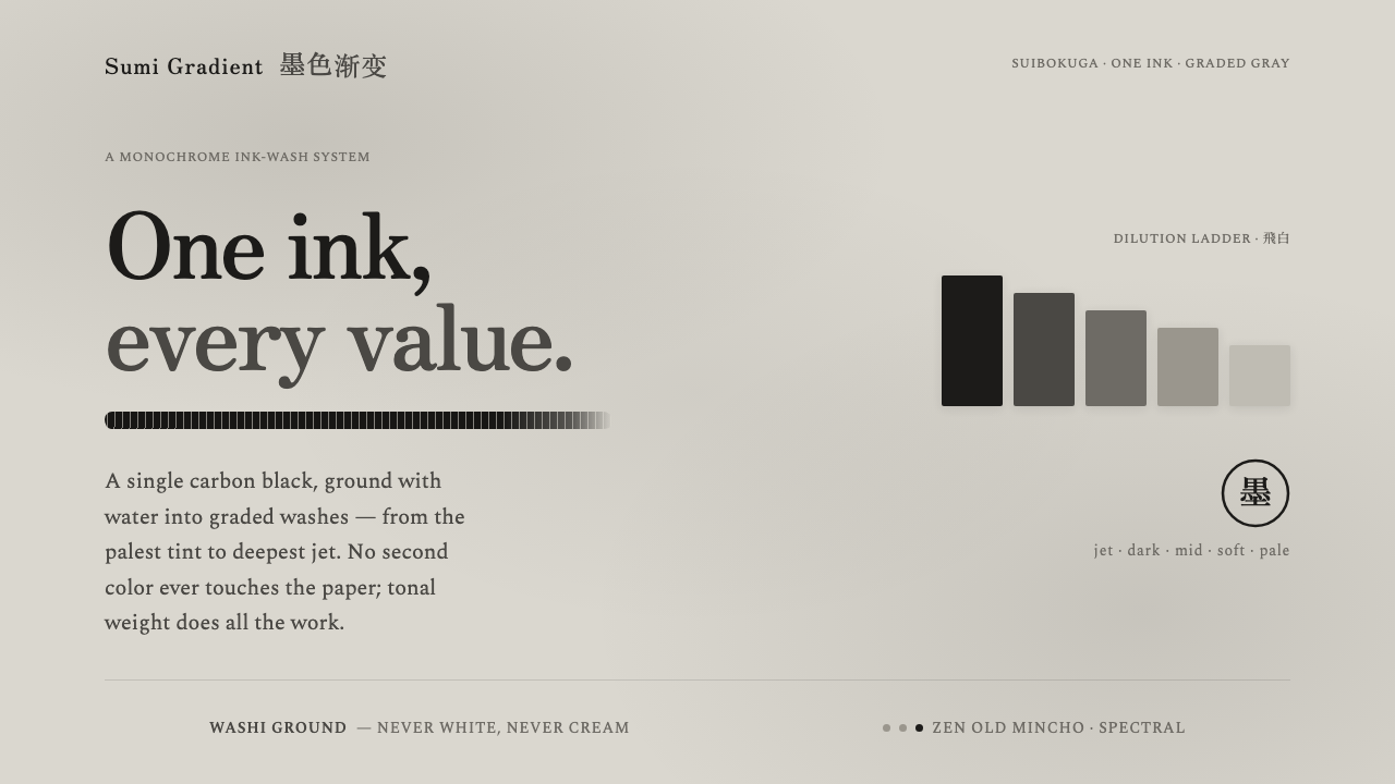 Sumi Grayscale GradientOne ink, every value. A single carbon black diluted into graded grays, marked…
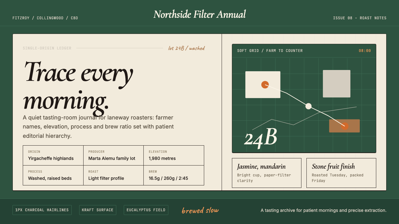 Melbourne Third-Wave Coffee ModernQuiet provenance. Eucalyptus green, cream cards and italic serif tables pace…
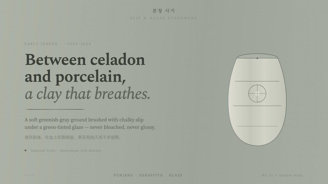 Buncheong Gray Slip WareBetween celadon and porcelain. Greenish-gray clay, chalky slip brushwork, dar…
 HASAMI PORCELAINOne diameter, many heights. Greige ground, matte-black stacks, wide-tracked A…
 Indigo ShiboriCloth before image. Bound cotton plunged into sukumo vats — raw-white resist…
 Joseon Moon JarQuiet imperfection glows. Milk-white porcelain floats on charcoal with a visi…