What is Balinese Coconut Shell?
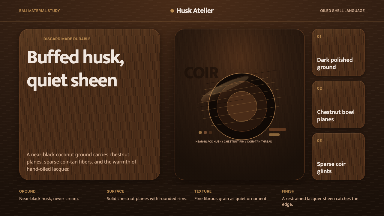
Balinese coconut-shell craft takes a husk most people throw away and turns it into a quietly glowing surface — near-black, hand-oiled, and warm in a way no synthetic material quite manages.
Balinese Coconut Shell in brief
Balinese coconut-shell craft is a material tradition, not a single decorative motif: artisans take discarded coconut husks — a byproduct of the island's enormous coconut harvest — and transform them into bowls, buttons, jewelry, and lacquerware. The raw shell is cut, sanded, and then finished either with hand-rubbed oil or a clear lacquer, a process that draws out a natural surface ranging from near-black to a warm chestnut brown, threaded through with the fine, fibrous grain of the coir just beneath the shell's outer layer.
Unlike materials that are painted or dyed to achieve their color, coconut shell earns its palette through the finishing process itself. Sanding reveals depth and grain that varies piece to piece; oiling or lacquering brings out a soft, low sheen rather than a hard gloss, and darkens the surface further as the oil is absorbed and reapplied over repeated use. The result is a material that looks handled and cared for rather than manufactured — a quality craftspeople lean into rather than disguise.
As a design language, this style is built entirely around that dark, polished ground. There is no cream or white base anywhere in it — the husk itself, not a backdrop behind it, is the visual foundation everything else sits on. A single warm, fibrous coir-tan accent is used sparingly against that dark ground, paired with clean, contemporary, unfussy type that reads as modern and eco-conscious rather than rustic or folkloric.
Where does Balinese Coconut Shell come from?
Coconut palms have been central to daily life across the Indonesian archipelago for centuries, and Bali is no exception — the tree is sometimes described locally as providing for nearly every household need, from food and drink to thatching and rope. Coconut shell itself was historically treated as a byproduct or even waste material left over once the meat and water were used, commonly repurposed into simple household items like ladles, cups, and buttons by rural households rather than treated as a prized craft material in its own right.
That changed as Bali's craft and design economy grew through the later twentieth century, driven in large part by the island's tourism industry and its increasingly prominent place in the international interiors and homeware trade. As demand grew for handmade, natural-material goods — bowls, furniture accents, jewelry, lighting — coconut shell was rediscovered by artisans and workshops as a genuinely attractive material in its own right rather than merely a byproduct: durable, naturally water-resistant once sealed, visually distinctive when polished, and appealingly sustainable since it repurposes an agricultural waste stream rather than consuming new raw material.
The lacquerware tradition specifically draws on Bali's broader, older history of wood and shell lacquer work, applying the same finishing techniques — layered clear lacquer or hand-rubbed natural oil, built up and polished over multiple passes — to coconut shell surfaces to bring out their grain and deepen their color. This craft is generally understood to have flourished as a distinct, actively marketed artisanal category roughly from the 1990s into the 2000s, as eco-conscious and natural-material design sensibilities gained international traction and Balinese workshops positioned coconut shell goods accordingly.
Today the craft sits within a broader Balinese eco-material movement that also encompasses bamboo, rattan, and other repurposed natural materials, all sharing a similar ethic: take what the island already produces in abundance, work it by hand rather than by machine, and let the material's own natural character — rather than applied color or pattern — carry the visual identity of the finished object.
What defines the Balinese Coconut Shell look?
Color
The palette runs from near-black through warm chestnut brown, entirely derived from the natural shell rather than any applied pigment. There is no cream, white, or bright accent competing for attention — the darkness of the husk is the dominant note throughout, with a single fibrous coir-tan used only sparingly as a secondary color.
Surface and Sheen
Finished surfaces carry a soft, low sheen rather than a hard, glassy gloss — the result of hand-rubbed oil or a thin clear lacquer worked into the shell rather than a thick applied coating. Light catches the surface gently rather than reflecting sharply, giving every surface a warm, handled quality rather than a manufactured, plastic one.
Fibrous Coir Grain
Fine, thread-like grain lines run through the shell's surface, a natural trace of the coir fiber layer just beneath the outer husk. This grain is irregular and specific to each piece rather than a repeating pattern, and it is treated as a feature to be revealed by sanding and polishing rather than smoothed away.
Rounded, Bowl-Like Silhouettes
Forms tend toward the rounded, concave silhouettes inherited from the shell's own natural curvature — a bowl shape is not imposed on the material so much as coaxed out of a form the coconut already had. This carries into the broader visual language as a preference for soft, organic curves over hard geometric edges.
Restrained Accent
Against the dominant dark husk ground, only one warm coir-tan accent is used, and only in small doses — a detail, a line, a single highlighted element. The restraint mirrors the material discipline of the craft itself: nothing is added that the material and its finishing process did not already suggest.
Clean, Contemporary Type
Typography paired with this material language stays clean, unfussy, and modern rather than rustic or hand-lettered — a deliberate contrast that positions the craft as contemporary and design-forward rather than folkloric. The type does not try to imitate the organic quality of the shell; it provides quiet, legible structure against it.
Material Honesty
Every visual cue in this style traces back to something the material actually does — the color comes from sanding and oiling, the grain comes from the coir fiber, the sheen comes from hand-finishing. Nothing is simulated or applied purely for decorative effect, which keeps the style feeling grounded in an actual physical process rather than a purely graphic invention.
Who shaped Balinese Coconut Shell?
The craft is carried primarily by small workshops and individual artisans across Bali rather than any single named designer or studio, working within a broader Indonesian and Balinese tradition of transforming agricultural byproducts into finished goods. Their techniques — cutting, sanding, oiling or lacquering the shell — are typically learned through workshop apprenticeship rather than formal design education.
Lacquerware specialists apply Bali's older wood and shell finishing traditions specifically to coconut shell, building up layers of clear lacquer or oil through repeated hand polishing to deepen color and bring out grain. Their finishing techniques are what distinguish a piece of raw, unworked shell from the warm, glowing surface associated with this design language.
Coconut-shell craft is part of a wider Balinese movement, active from roughly the 1990s onward, that repurposes abundant natural and agricultural byproducts — coconut shell, bamboo, rattan — into finished design goods for both local and international markets. This movement's shared ethic of visible, unpainted natural material is what gives coconut-shell work its distinctive, unmistakably honest surface.
How do you use Balinese Coconut Shell today?
This style translates a physical, tactile material into flat digital surfaces, and it succeeds when the dark husk tone is treated as the genuine foundation of the composition rather than one dark option among many — the entire visual identity depends on that near-black-to-chestnut ground carrying real depth rather than reading as flat black.
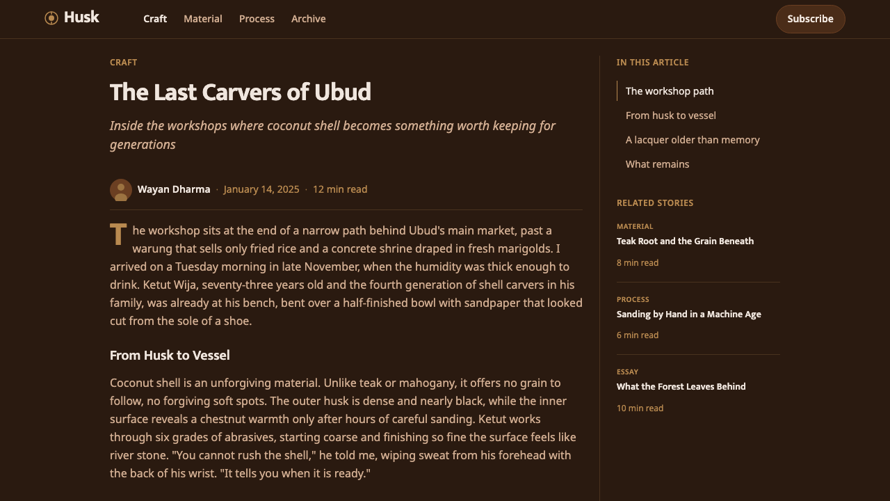
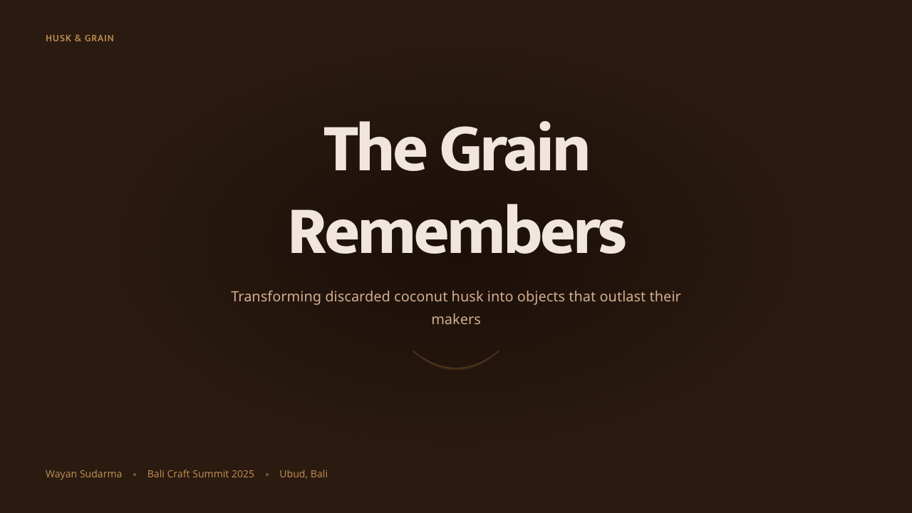
For presentation slides, the style suits a cover page built around a deep, warm dark ground with subtle grain-like texture and a single coir-tan accent marking the title or a key figure — restrained rather than busy. Content slides should keep that same warm darkness as the base, with body text in a clean, high-contrast light tone and section markers using rounded, organic shapes rather than hard geometric dividers. Data visualizations read well as simple, softly rounded forms — a bar or a dot rather than a sharp rectangle — echoing the material's own preference for curved, bowl-like silhouettes.
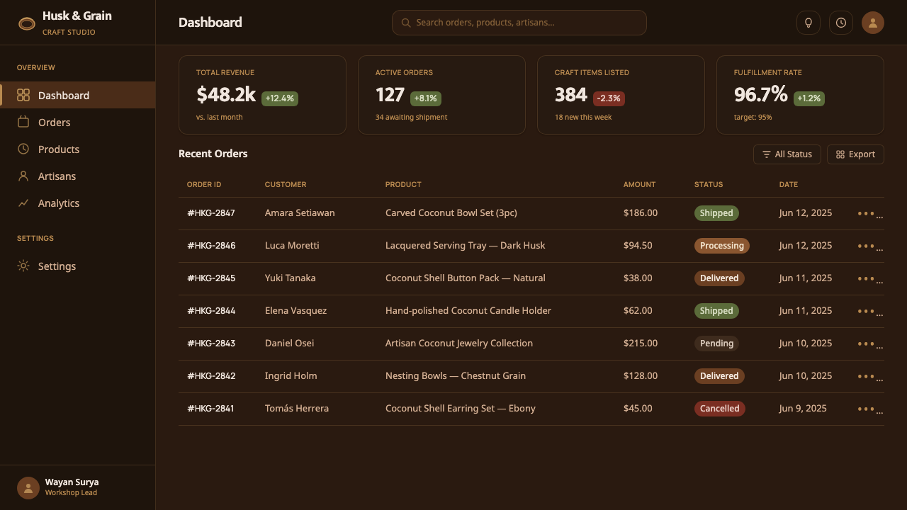
For web interfaces, the style suits dashboards and pricing pages that want to feel warm, sustainable, and premium rather than clinical — a dark-mode-native aesthetic where the darkness itself is the design statement rather than an alternate theme. Cards and containers benefit from soft, low-contrast shadows and gently rounded corners rather than sharp edges, echoing the shell's own polished, handled surface; the coir-tan accent works well reserved for a single interactive state such as a primary action or an active tab.
In editorial and marketing contexts, the style is a strong fit for sustainability-minded, wellness, or craft-forward brands — home goods, natural beauty, eco-conscious hospitality. A marketing page can lean into full-bleed dark sections with warm, softly lit product photography and minimal, clean type overlaid directly on the dark ground, letting the material's own richness do most of the visual work rather than competing decoration.
The most common mistake is lightening the base tone toward a generic warm beige or brown in the name of readability, which erases the specific near-black-to-chestnut depth that makes the style recognizable — this is not a beige palette softened for comfort, it is a dark, polished husk. A second common error is adding decorative texture or pattern that the material itself would not produce; every visual detail should trace back to something sanding, oiling, or the shell's own grain would actually do.
Balinese Coconut Shell — FAQ
Why is the ground always dark rather than a lighter wood tone?
The darkness comes directly from the material itself. Coconut shell, once sanded and finished with oil or lacquer, naturally deepens toward near-black or chestnut brown rather than the honey or pale tones associated with many woods — the finishing process draws that depth out rather than adding it artificially. A lighter version would no longer be describing coconut shell specifically; it would be describing a different material altogether.
How is this different from generic dark 'earthy' or 'natural wood' design styles?
The key difference is specificity of process. This style traces every visual cue back to a particular material and a particular finishing method — coconut husk revealed through sanding and hand-oiling, with its own fibrous coir grain — rather than a general mood board of dark, natural-feeling tones. A generic earthy palette could come from wood, stone, leather, or clay; this one is anchored to a single, identifiable material with its own specific texture and origin.
Does the sheen mean this style should always look glossy?
No — the sheen described here is soft and low, closer to the gentle glow of hand-rubbed oil than the hard reflectivity of glossy lacquer or polished metal. A version of this style that reads as high-shine or mirror-like has overshot the actual material reference; the warmth of the look depends on that restrained, low-key sheen rather than dramatic reflection.
What kinds of products or brands does this style suit, and where does it struggle?
It suits brands built around sustainability, craft, wellness, and premium natural materials — home goods, eco-conscious beauty, hospitality, and slow-living lifestyle products. It struggles in high-energy, fast-paced, or overtly technical contexts — gaming, high-frequency trading tools, youth-facing entertainment apps — where the quiet, handled warmth of the material reference reads as too slow or too subdued for the product's actual pace and personality.
Related design styles
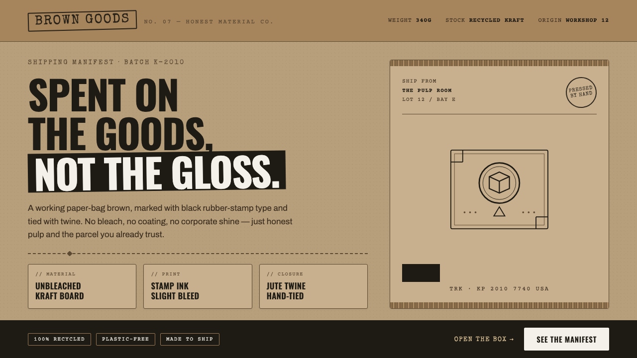 Kraft Paper PackagingThe goods, not the gloss. Mid kraft-brown fields, black rubber-stamp type, co…
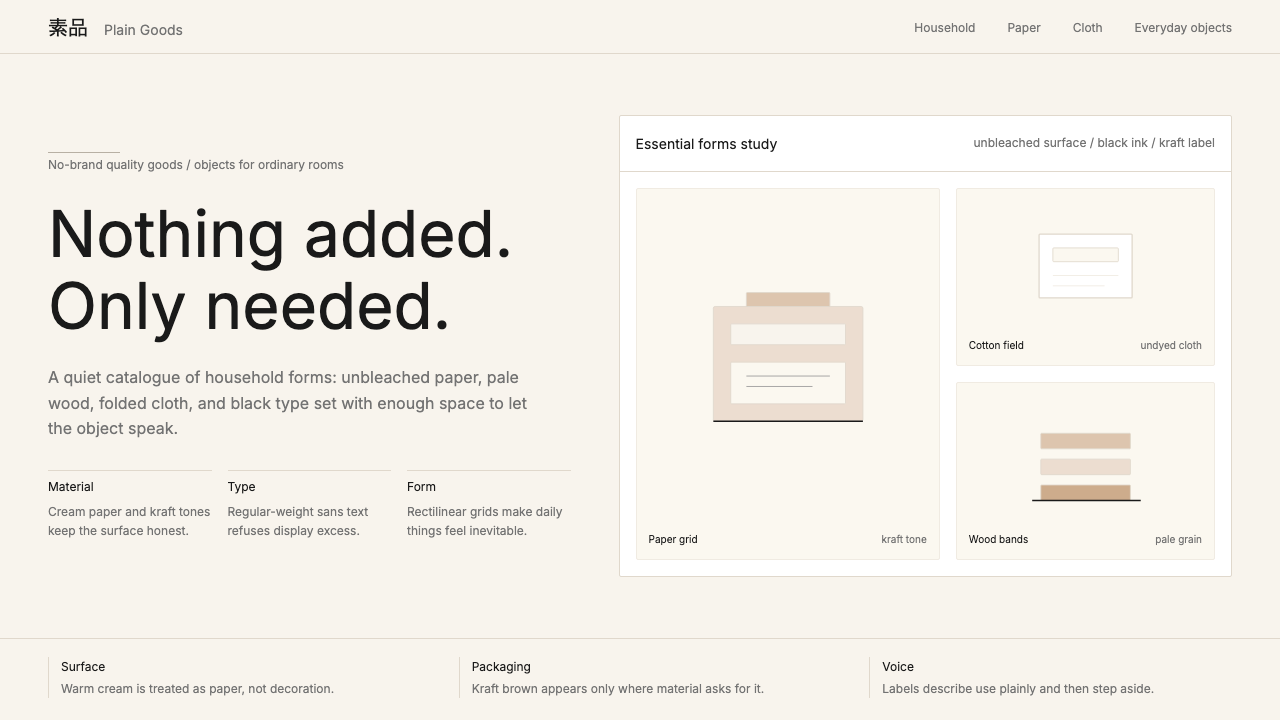 MUJIAnti-brand restraint. Cream paper, kraft brown, and regular Inter leave only…
 Whole Foods MarketFarmer’s-market polish. Moss green on butcher-paper cream, white cards, growe…
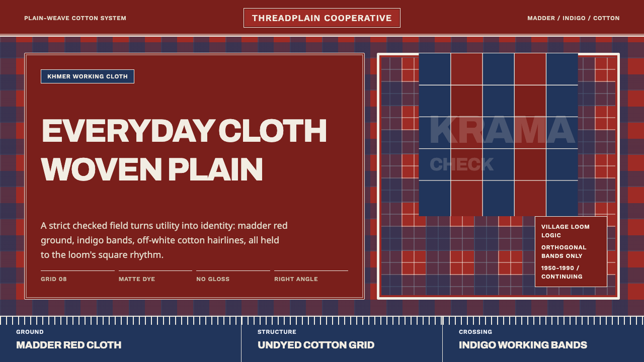 Cambodian Krama CheckPlain cloth has authority. Madder red, indigo bands, and cotton grid lines do…
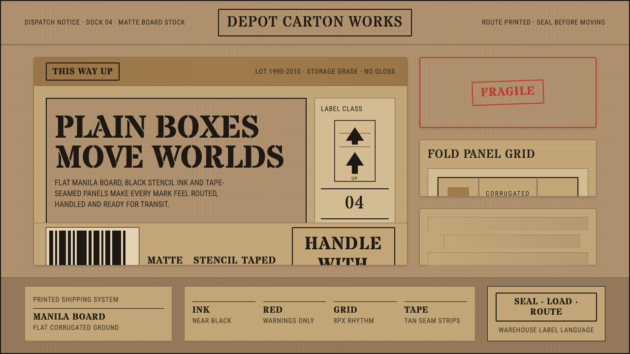 Cardboard Box CraftPlain utility has texture. Manila board, black stencil type, tape seams, red…
 Melbourne Third-Wave Coffee ModernQuiet provenance. Eucalyptus green, cream cards and italic serif tables pace…