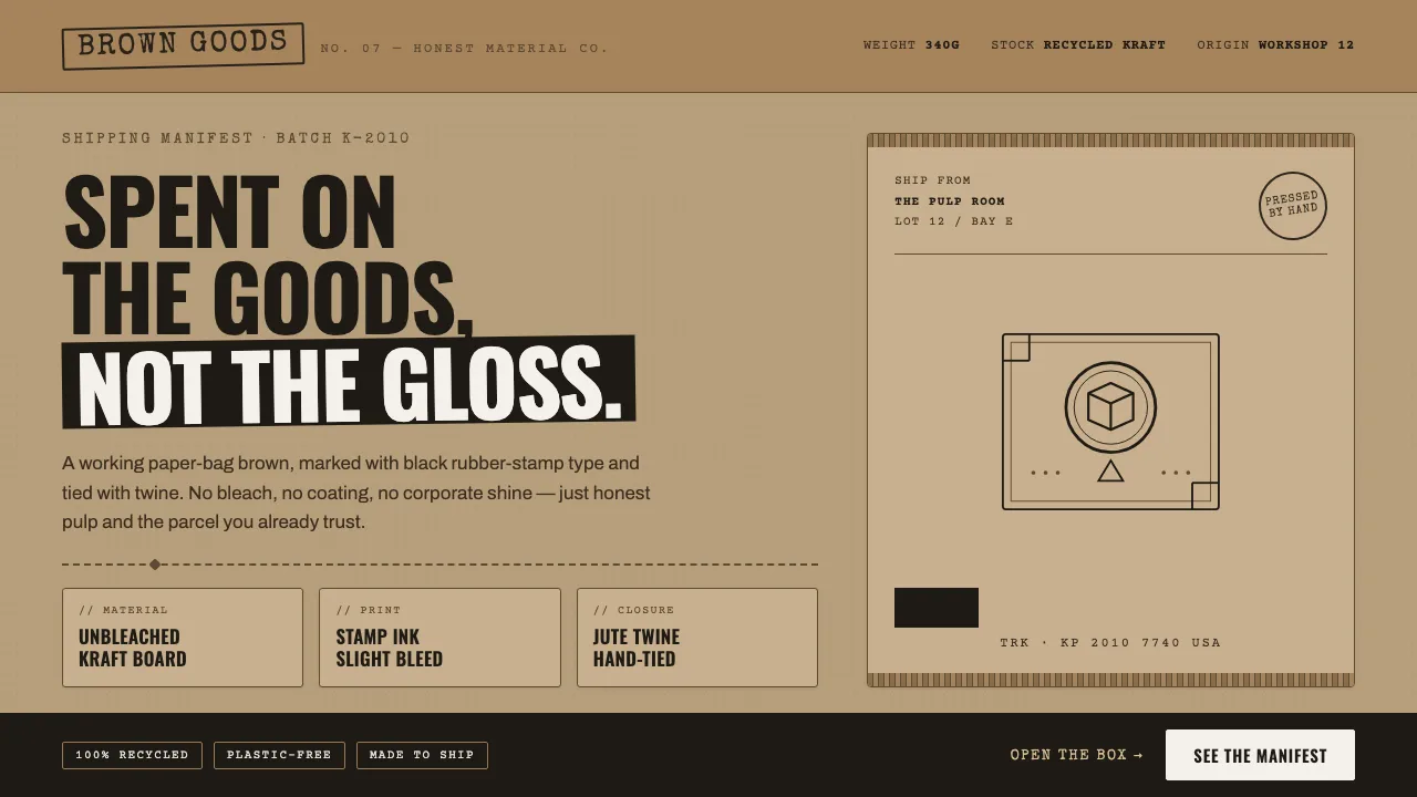
About Kraft Paper Packaging
Kraft Paper Packaging is the deliberately plain, honest aesthetic of unbleached cardboard — the recycled-pulp parcel of the DTC and artisan-maker era. Flat mid-brown fields, black rubber-stamp type, corrugated flutes, and twine ties signal craft, sustainability, and material truth over polish.
The look refuses cream and bleached white in favor of a real working paper-bag brown, marked with monospaced typewriter and stencil-stamp lettering. Ink bleeds slightly, fibers show, and every component reads like a shipping label.
- Origin
- Global / Internet (DTC e-commerce and artisan-brand packaging)
- Era
- 2010–now (DTC and maker-brand packaging era)
- Key figures
- Independent makers · Craft roasters · Etsy-era small brands · Sustainable-packaging studios
- Movements
- Sustainable 'honest material' packaging · Recycled-pulp and corrugated-board branding · DTC / maker-scene minimalism
Kraft Paper Packaging design spec
Colors
Typography
The other 11 sections — buttons, cards, spacing, motion, techniques and more — open once you unlock. Download the DESIGN.md or send it to your AI in one click. Unlock once, yours forever.
Sign up nowStyles similar to Kraft Paper Packaging
Also inspired by crafts & folk art, with a close feel.
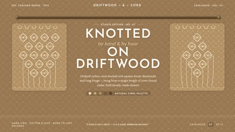 Macramé Fiber ArtSlow craft, hand to fiber. Undyed ecru cotton on raw-jute walnut, square knots, driftwood dowel.
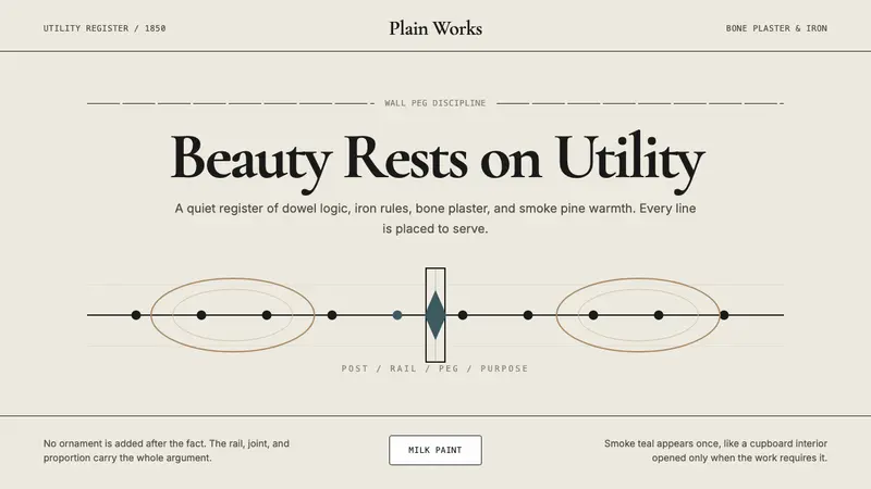 Shaker Furniture 1850Utility becomes beauty. Bone plaster, iron black, smoke pine, and one smoke-teal line.
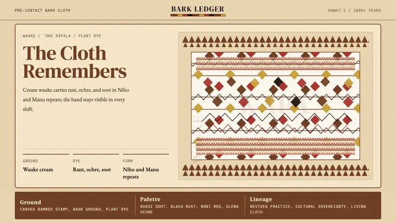 Hawaiian Kapa (Bark Cloth)Ceremonial geometry. Cream wauke, rust, ochre, and soot stamped in repeat.
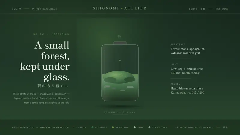 Moss TerrariumWabi-sabi, kept under glass. Layered moss greens on shadow ground, mincho serifs, one soft lamp.