What is Platinum-Palladium Print?
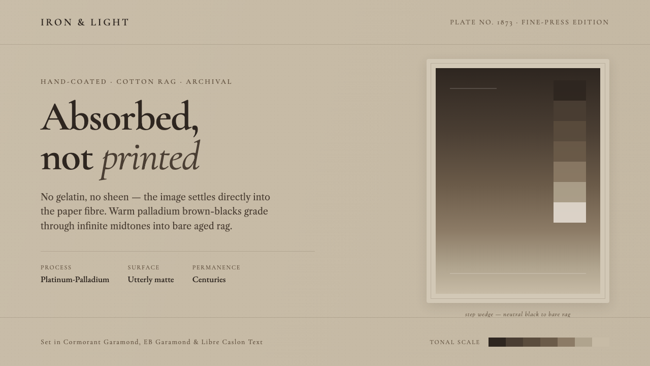
Platinum-palladium prints do not sit on paper like ink; they seem to sink into it, turning photographic detail into a quiet field of warm, matte presence.
Platinum-Palladium Print in brief
The platinum-palladium print, also called a platinotype, is a fine-art photographic process in which the image is absorbed directly into cotton-rag paper. The result has none of the glossy gelatin surface associated with many photographic prints. Instead, image and paper appear inseparable: the photograph feels held within the sheet rather than deposited upon it. Its surface is diffuse, tactile in implication, and resolutely matte.
Its tonal character is its defining visual quality. A platinum-palladium print can move from neutral black through warm black into reddish brown, while preserving unusually delicate transitions through the middle values. Palladium is especially associated with warm yellow-brown deep tones. Rather than producing sharp, shiny drama, the process gives photographs a softened authority: dark areas feel deep without becoming opaque, and highlights retain the presence of paper.
As a design language, Platinum-Palladium Print translates this archival materiality into digital work. It favors the atmosphere of aged cotton rag, brown-gray palladium tonality, refined bookish serifs, and gradations that appear absorbed rather than electronically polished. The objective is not to imitate a damaged historical print. It is to preserve the process's relationship between image, paper, restraint, and attentive looking.
Where does Platinum-Palladium Print come from?
The process was patented by William Willis in 1873, placing it in the formative period of photographic printing. Its significance lies not only in its age but in the material proposition it made: a photograph could be valued as a permanent-looking object whose image belonged to the paper itself. That proposition gave the platinum-palladium print a lasting place in fine-art photographic printing.
Its later cultural setting belongs to North America and the broader traditions of pictorialism, alternative-process photography, and fine-press printing. These traditions treat the print as more than a transparent delivery system for an image. Paper choice, tonal behavior, surface character, and the act of printing become part of the work's meaning. The photographic subject may be important, but the physical interpretation of that subject is equally important.
The process remains relevant through an ongoing fine-press revival. In that context, platinum-palladium printing represents a durable counterpoint to the speed and gloss often associated with mass reproduction. Its appeal is not nostalgia alone. It offers a visual ethic in which subtle tonal judgment, material restraint, and close viewing are treated as central artistic values.
What defines the Platinum-Palladium Print look?
Absorbed Surface
The central cue is absorption. Images should appear to emerge from a warm rag-like ground, with no suggestion of a slick coating or a separate image layer. Keep surfaces diffuse and dry in feeling. The most convincing compositions let the background remain visibly present inside the lightest passages, as though paper and image are collaborating rather than competing.
Warm Tonal Range
The palette is governed by neutral black, warm black, brown-gray, and the reddish-brown direction associated with palladium. Contrast is built through density and tonal separation, not through aggressive chromatic accents. Dark passages should feel mineral and settled; lighter passages should carry the warmth of aged paper. Color is atmosphere, not decoration.
Infinite Middle Values
The style depends on delicate middle values. Avoid reducing an image or interface to stark light-versus-dark opposition. Let transitions unfold gradually, especially around portraiture, architecture, landscape, and editorial imagery. The desired effect is not haziness. It is controlled tonal continuity, where small changes reward sustained attention without becoming theatrical.
Bookish Typography
Refined book serifs are the natural typographic companion. They establish a tone of scholarship, permanence, and measured reading that aligns with fine-press practice. Headlines should be composed rather than shouted, while body text should feel editorial and breathable. Typography carries much of the hierarchy, so ornaments, novelty lettering, and loud display treatments weaken the system.
Aged-Rag Ground
The ground should suggest archival cotton rag rather than a sterile white screen. Its warmth provides the visual field against which black and brown-black values become expressive. This is not a license for fake stains, scratches, or distressed effects. The paper reference should be sensed through warmth, softness, and restraint, not through theatrical simulation of age.
Matte Restraint
Everything should read as matte: imagery, dividers, panels, and typographic fields. Avoid glassy highlights, metallic shine, slick gradients, and visual effects that imply a polished coating. Depth, when needed, should come from paper-like tonal layering and generous empty space. The mood is quiet because nothing asks to be touched merely for spectacle.
Who shaped Platinum-Palladium Print?
Willis patented the platinotype process in 1873. His name anchors the historical origin of the process and its central material claim: photographic images can be absorbed into paper rather than presented on a glossy gelatin surface.
Evans is identified among the key figures of the platinum-palladium print tradition. His inclusion locates the process within a fine-art photographic lineage in which tonal interpretation and the character of the finished print matter as much as photographic subject matter.
Stieglitz is named as a key figure connected to the tradition's pictorialist context. That context helps explain why platinum-palladium printing is valued as an expressive photographic object, not simply as a technically faithful reproduction.
Crane is included among the key figures in the continuing fine-press and alternative-process lineage. His presence underscores that the platinum-palladium print is not only a nineteenth-century artifact, but a process sustained through contemporary fine-print practice.
How do you use Platinum-Palladium Print today?
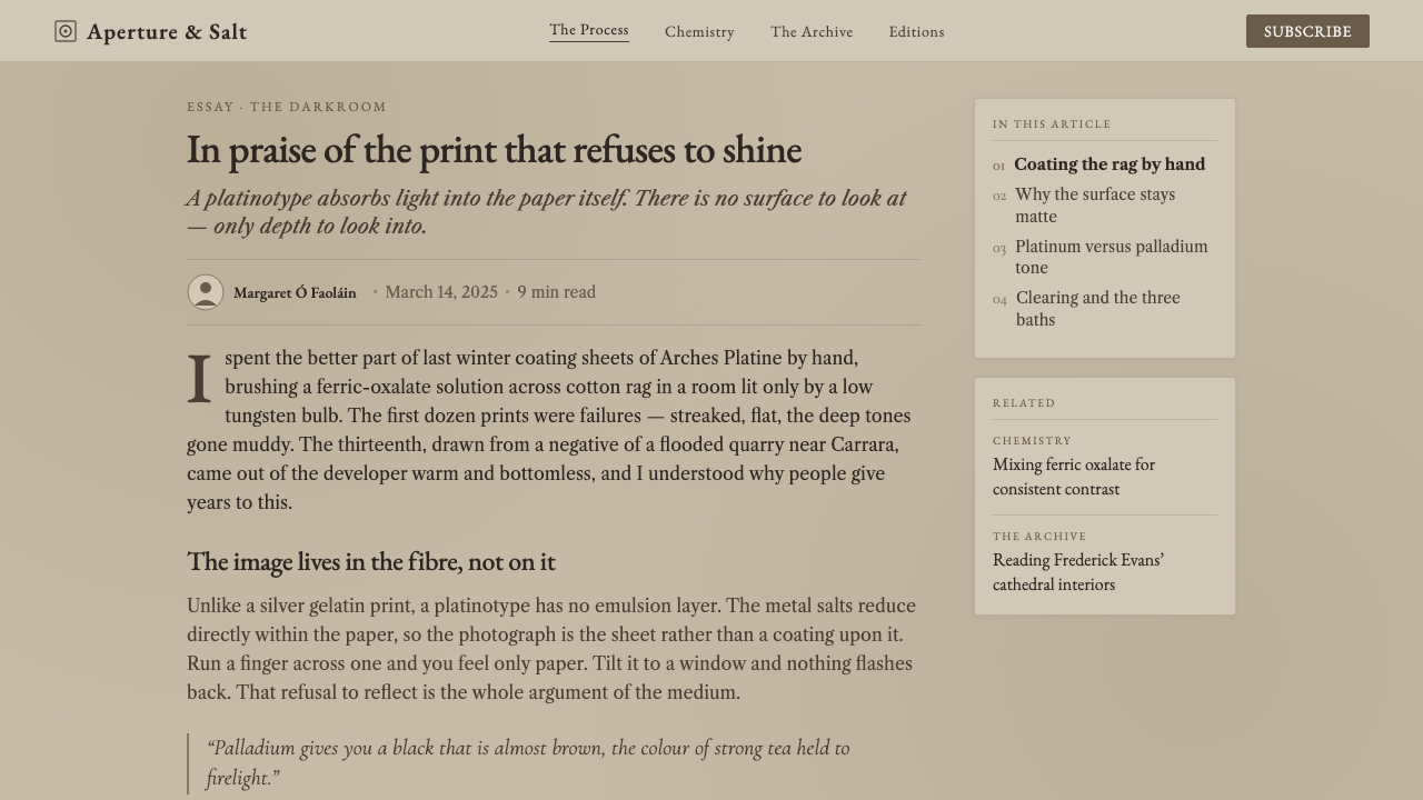
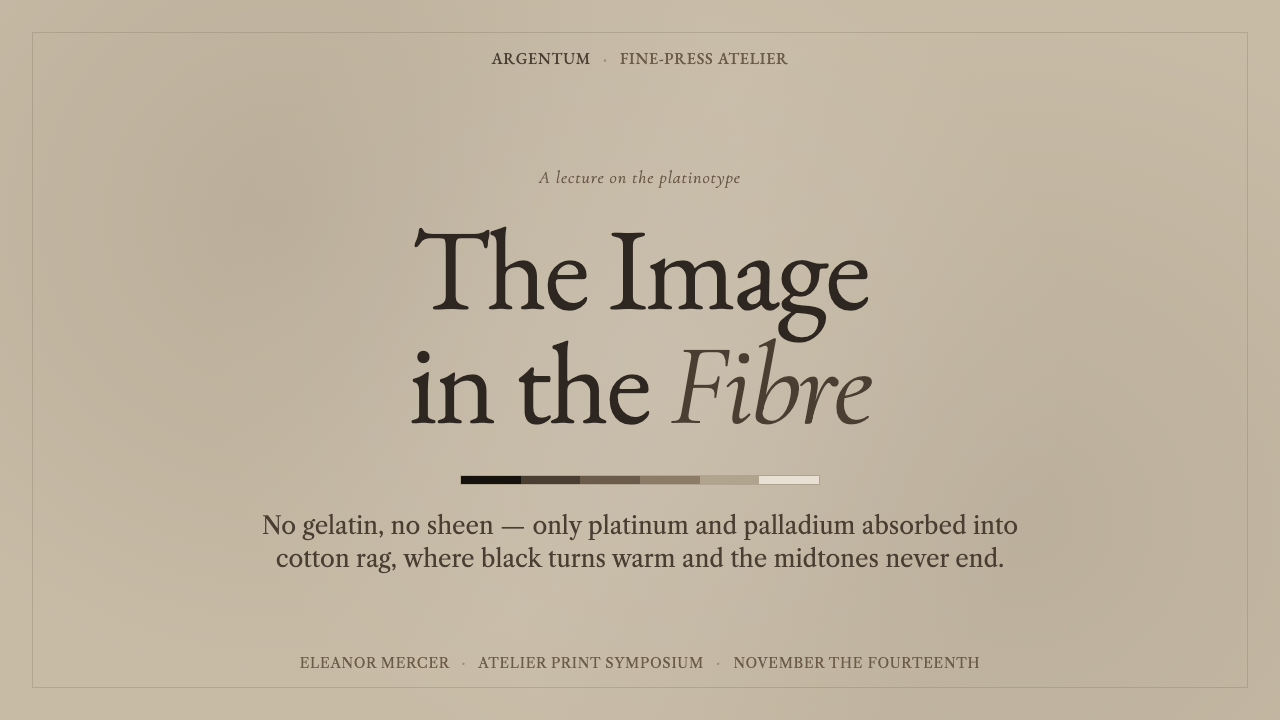
For presentation slides, use the style to create a contemplative cover rather than a promotional poster. A strong image may occupy a generous field, while a restrained serif title and compact metadata sit quietly nearby. Content slides should use warm paper-like space as an active element, with editorial captions, brief quotations, and images given room to breathe. For data slides, favor tonal distinctions and direct labels over bright categorical color; charts should feel like printed evidence, not a control panel.
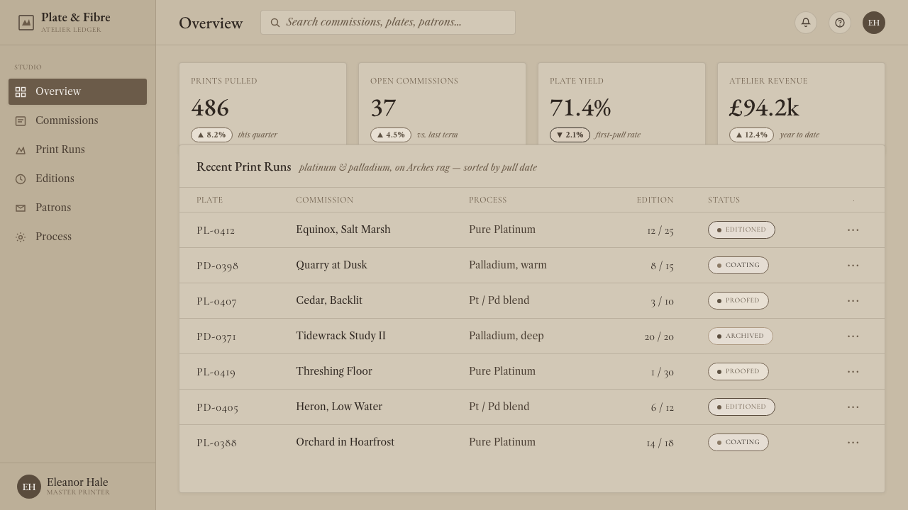
For web interfaces, Platinum-Palladium Print is best suited to archives, portfolios, publishing platforms, cultural institutions, and premium editorial products. Dashboards can use it when their task is reflective review rather than rapid operational monitoring: activity histories, collections, research records, and image libraries benefit from its calm hierarchy. Pricing pages can borrow its dignity through disciplined serif-led structure, but conversion-critical actions must remain unmistakable rather than disappearing into the atmosphere.
For editorial and marketing work, let imagery carry the emotional weight. Pair full-bleed or generously framed photographs with measured headlines, carefully spaced summaries, and captions that feel considered rather than auxiliary. Marketing pages work especially well when presenting craft, provenance, authorship, or lasting value. The style can make a product feel archival and serious, but it should not turn every message into a museum label; a clear narrative and visible next action still matter.
The common mistake is mistaking the style for a generic sepia filter. Simply warming a photograph and placing it on beige does not create a platinum-palladium sensibility. The system depends on absorbed-looking tonality, delicate middle values, matte restraint, paper-aware space, and typography with editorial discipline. It also fails when artificial wear, glossy interface effects, or excessive brown styling overwhelm the image. Warmth must support contemplation, not become costume.
Platinum-Palladium Print — FAQ
Is Platinum-Palladium Print simply a sepia photographic style?
No. Warm brown is only one possible tonal direction within the process. The more important qualities are the image's absorbed relationship to cotton-rag paper, its diffuse matte surface, and its unusually delicate middle values. A sepia treatment can change color while leaving an image glossy, contrast-heavy, and visually detached from its background. That produces a different effect entirely.
Why does the style avoid glossy effects?
Gloss contradicts the material logic of the reference process. Platinum-palladium images are valued for their matte, diffuse character and for the impression that image and paper form one surface. Strong shine, glass-like reflections, and slick visual treatments introduce a separate coated layer between viewer and image. They make the work feel manufactured for display rather than absorbed into a physical support.
Can this style work for data and interface design?
Yes, provided the product benefits from calm reading and interpretive depth. It works especially well for collection browsers, research records, editorial dashboards, and portfolio systems. The key is to preserve legibility: use clear labels, strong textual hierarchy, and tonal separation that remains understandable at a glance. It is less suitable for interfaces that depend on dense alerts, rapid scanning, or highly colorful real-time status signals.
How should photography be selected for this visual language?
Choose images with tonal depth, meaningful texture, and a subject that can withstand slow looking. Architecture, landscapes, portraits, objects, and documentary details can all work when their light and form provide subtle transitions. Avoid imagery whose main appeal is neon color, hard commercial retouching, or instant visual shock. The photograph should invite examination of its values, not compete with the surrounding page for attention.
Related design styles
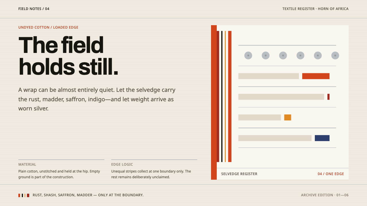 Afar Nomad TextileWeight lives at the edge. Rust and madder selvedges cut across a quiet cotton…
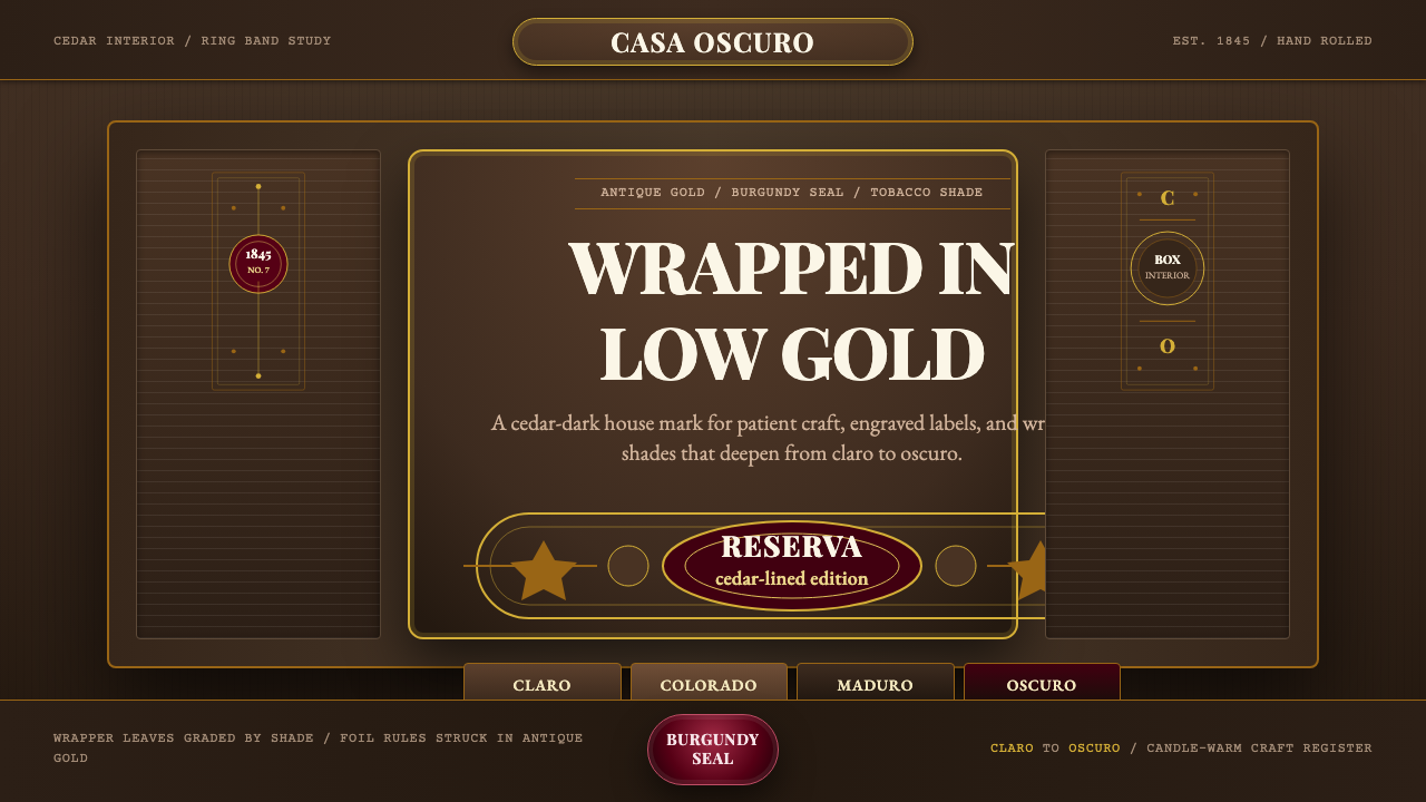 Cuban Habano CigarLuxury sleeps in shadow. Tobacco brown, antique gold rules, and burgundy seal…
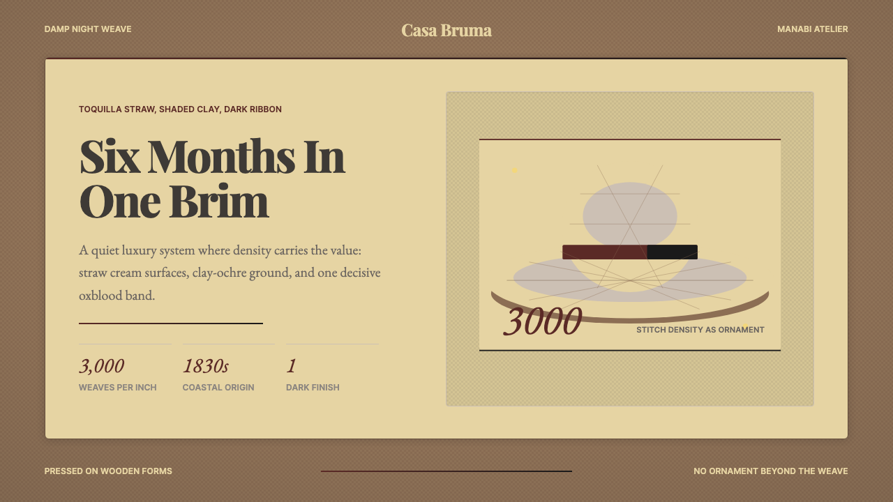 Ecuadorian Montecristi Panama HatLuxury disappears into density. Straw cream, clay ochre, and one oxblood ribb…
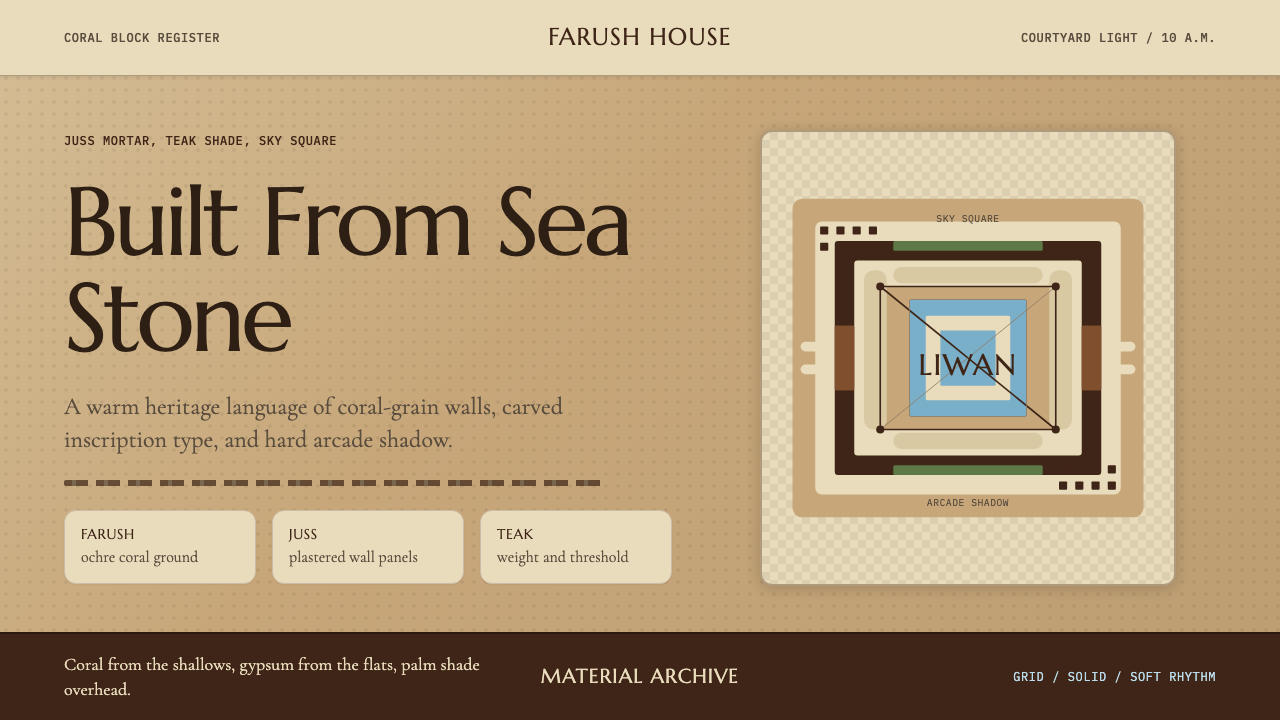 Emirati Bait Al Naboodah Coral HouseFeels built, not styled. Coral ochre, teak brown, and a sky-square courtyard…
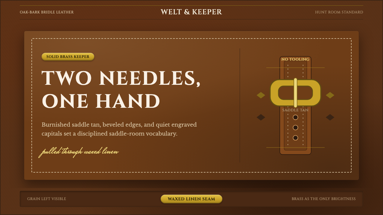 English Saddlery TanQuiet hand-made luxury. Saddle tan leather, brass accents, and waxed-linen st…
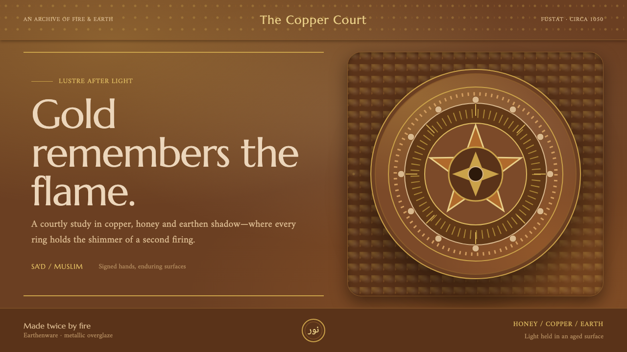 Fatimid LustrewareOpulence fired into earth. Copper-gold lustre glows through dense medallions…