What is Japanese Soroban?
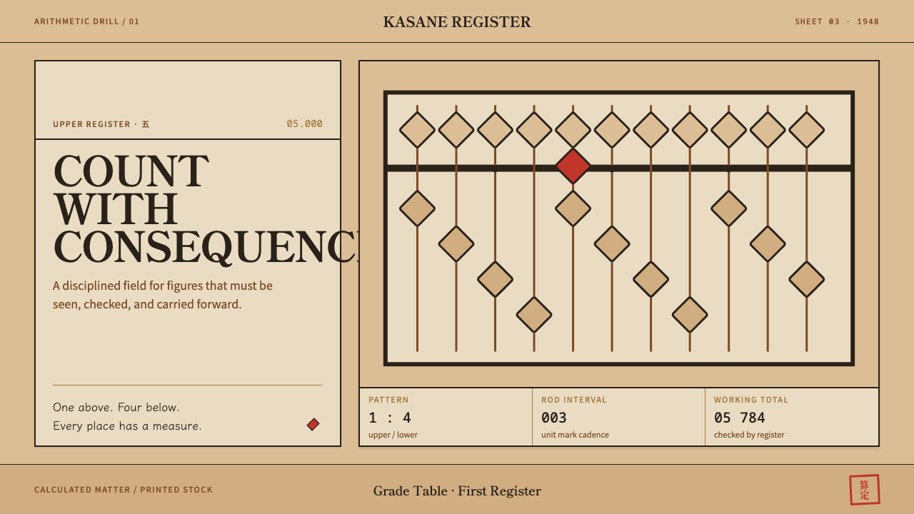
The soroban reduces arithmetic to a few honest materials and one reckoning bar; this style carries that logic onto the page and produces something ruled, dense and numeric, stamped once in vermilion.
Japanese Soroban in brief
The Japanese Soroban style is a design system drawn from two objects that sit side by side in an abacus classroom: the bead abacus itself, and the printed grade table used in abacus examinations. From the instrument it takes structure, a single horizontal bar that cuts the layout into an upper and a lower register. From the paper it takes texture: small, dense, ruled type on cheap off-white stock, finished with one vermilion seal.
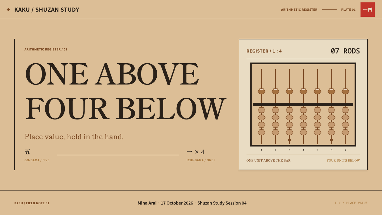
The instrument supplies the proportions. In its modern form the soroban settled on one bead above the reckoning bar, worth five, and four beads below it, each worth one. The beads are birch or boxwood, turned into a double-cone shape so that in side view each one reads as a diamond. The frame is ebony, near-black and polished to a mirror finish, and the rods are smoked bamboo, with a small dot marking every third rod so the eye can find its place in a long number, much as a comma does in print.
On a screen or a sheet of paper the result is the opposite of what most people expect from the phrase 'Japanese design'. This is not a tea room. It is examination equipment: ruled, numeric and administrative, with narrow table columns, a great many figures and tightly spaced lines. The ground takes the warm tone of boxwood beads, the structure takes the logic of the bar, and the only colour event on the whole page is a single red seal.
Where does Japanese Soroban come from?
The abacus traditions of East Asia share a common ancestry, and Japan received the instrument from China, where the suanpan carried more beads on each rod than a practised hand actually needs. Over generations Japanese makers and teachers pared the design down. The version that defines this style, one bead above the bar and four below, became the modern standard in the first half of the twentieth century. The source period for this system is therefore roughly 1900 to 1950, when both the streamlined instrument and the culture of graded examinations around it took the form we recognise today.
Two regions are named in the craft itself. In Ono, in Hyōgo Prefecture, workshops make the Banshū soroban; in Okuizumo, in Shimane Prefecture, they make the Unshū soroban. The old provincial names carried in those labels, Banshū for the Harima area and Unshū for Izumo, still stamp each instrument with a place of origin. The materials the design borrows, boxwood or birch for the beads, ebony for the frame and smoked bamboo for the rods, are the materials these workshops work in. Their craft is a craft of precision: a bead has to slide cleanly, stop crisply and stay where it is put, and the surface has to be polished enough to show a reflection.
The second source is not an object but a bureaucracy. Shuzan, arithmetic done on the abacus, is taught as drill, and that drill is organised into a ranking system called kentei, in which a candidate sits an examination and is awarded a grade. The Japan Chamber of Commerce and Industry is the institution most closely tied to this graded certification, and its printed grade table is the document this design imitates: a small, packed table that states, grade by grade, what a candidate must be able to do. The paper is cheap, the type is small, and the red seal is there because an official table needs one. Nothing in it is meant to persuade; it is meant to be correct.
A third thread is anzan, mental calculation. Students who practise long enough on the abacus stop needing the physical beads: they picture the instrument and flick imaginary beads with their fingertips. It is an apt idea for an interface style. The abacus is a tool whose highest achievement is to disappear into the user's head, and a page built in its image is likewise a tool to be read quickly and trusted, not a picture to be admired. That is also why the style belongs to the exam hall rather than to the tea room: it carries the seriousness of drill, the discipline of ranking and the plainness of an administrative record.
What defines the Japanese Soroban look?
Boxwood Ground
The page takes the warm, slightly yellowed tone of boxwood beads and aged paper, a pale wood-coloured off-white rather than clean white. It feels calm and a little worn, like stock that many hands have passed over. A bright, cold white would break the effect, and so would a heavy grey; the ground should look like something that has been used for years in a room full of people practising sums.
Ebony Rules
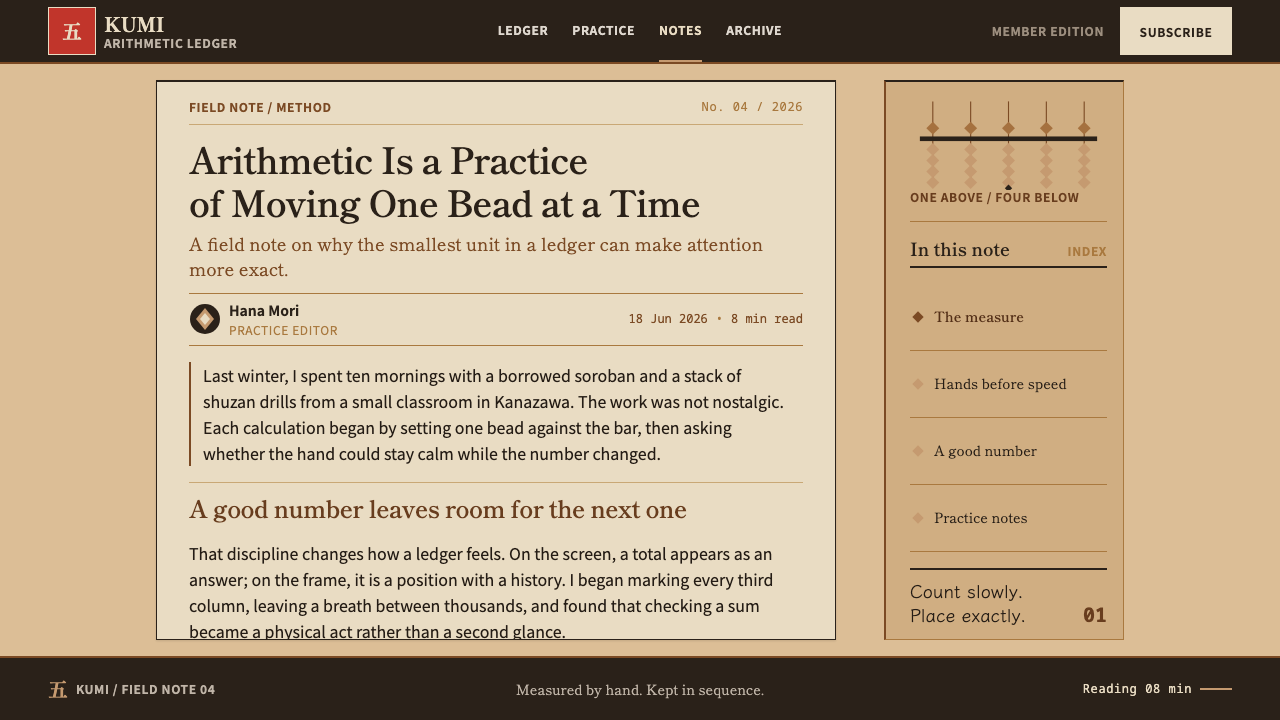
Structure is carried by lines. Heavy near-black bars and fine hairline rules divide the page into registers and cells, the way the ebony frame and the reckoning bar divide the instrument. The contrast between one dominant bar and many delicate rules around it is the main compositional device; boxes with soft edges, shadows and tinted backgrounds are replaced by plain ruled cells.
The Reckoning Bar
A single horizontal division splits the layout into a short upper zone and a taller lower zone, echoing one bead above and four beads below. Headings, totals and summary figures sit above the bar, while the working table sits below it. The unequal proportion is the ornament: it gives the page a recognisable skeleton without a single decorative element.
Mincho Figures
Numerals and labels are set in a mincho, the Japanese serif style with fine horizontal strokes, firm verticals and small triangular terminals. Set small and tight, it gives the printed-ledger look of an examination sheet. Headings are never grand: size differences stay modest, and hierarchy comes from position on the grid and from the weight of the rules, not from large display type.
Dense Ruled Tables
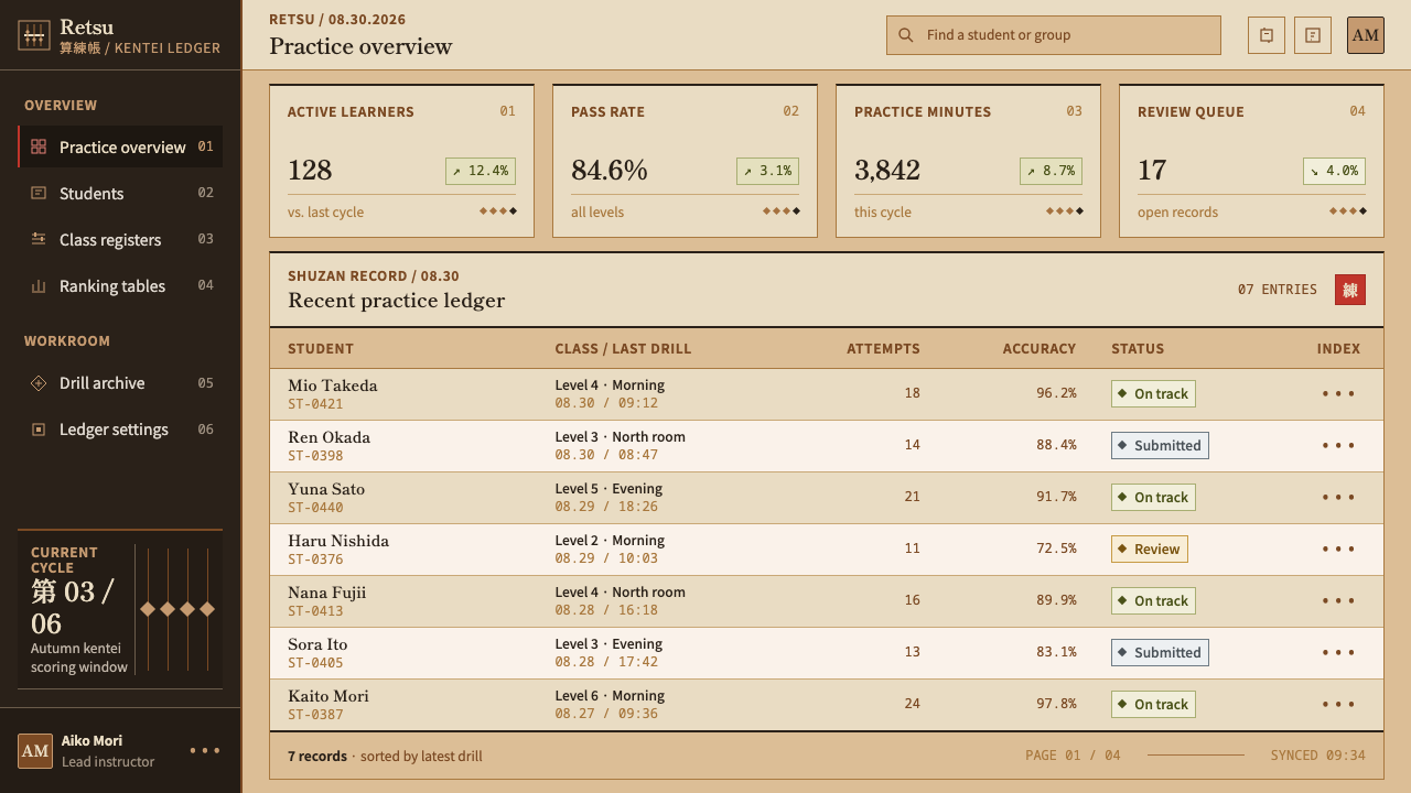
Columns are narrow, figures are many and line spacing is tight. Density is a feature, because it recalls the grade table, which had to be complete before it could be pretty. Information is arranged in grids with rules between rows rather than in cards with generous padding, and numerals line up in tidy columns so that comparison across rows is effortless.
Diamond and Dot
The only ornament is structural. The diamond silhouette of a double-cone bead and the dot that marks every third rod are the whole decorative vocabulary. Diamonds can serve as bullets, markers and separators; a small dot can mark a regular rhythm, such as every third row or column. They are guides to reading, never decoration for its own sake, and they should stay small.
One Vermilion Seal
Colour is almost absent. A single vermilion seal, a small stamp placed in the lower right corner, is the one chromatic event on the page, and it marks approval, a result or an identity. Because it stands alone it reads as an official mark. Repeat it across headings and buttons and it turns into decoration; keep it single and it keeps its authority.
Who shaped Japanese Soroban?
The Chamber is the institution most closely tied to the graded abacus certification that this style depicts. Its printed grade tables, dense, small-type and stamped, are the direct model for the design's paper and typography. A candidate moves up one grade at a time, and the table's job is to state each level's requirements plainly. That attitude, an authority speaking in numbers rather than in persuasion, is what the style inherits.
The workshops of Ono, in Hyōgo Prefecture, are one of the two named centres of Japanese abacus making. Their products define what a good instrument feels like: a clean slide, a firm stop and a polished surface. The design echoes that craft by valuing precise alignment over expressive flourish, and by treating every rule and column as something that has to line up exactly.
The second named centre is Okuizumo, in Shimane Prefecture. In this design the workshops stand for the material side of the instrument: ebony, boxwood and smoked bamboo, few in number and chosen with care. They show that austerity is not cheapness. The same lesson applies on the page: a handful of tones, one typeface family and a few rules can feel rich when each is finished properly.
How do you use Japanese Soroban today?
Soroban works wherever the content is numbers, tables, grades, schedules or procedures, and where trust matters more than warmth. Its great strength is credibility: a page in this style looks like an official record of careful arithmetic. Applying it well means keeping the three structural ideas, the bar, the rule and the single seal, and refusing everything that does not belong to them.
For presentation slides, build the cover on a field of boxwood tone, with one heavy bar crossing the slide in its upper part, a title set small and left-aligned in a mincho-style serif, and a single vermilion seal in the lower right corner. Content slides should be treated as ruled tables: a header register above the bar and the detailed rows below it. Data slides favour the table over the chart; when a chart is necessary, draw its bars in near-black and give the one value that matters the vermilion colour.
For web interfaces, the style suits dashboards, pricing tables, scoreboards, admin panels, reports and any screen that is mostly a grid of figures. Stack rows with hairline rules, keep numerals aligned in tidy columns, and reserve the vermilion for the single most critical status. Leave out cards, soft shadows and rounded containers. Navigation can be a plain ruled row of text labels, and form fields can be simple ruled boxes in the manner of an answer sheet.
For editorial and marketing work, the style fits exam-preparation brands, schools, accounting and finance tools, stationery, documentary publications and annual-report-like pages. Long-form text sits in a narrow, dense column with ruled section headings. Marketing pages can use the stamp as a recurring motif for approval, achievement or grade, always as a single mark and never as a pattern.
The most common mistake is to treat the style as generic Japanese minimalism, with large areas of empty space, soft grey type and an invitation to quiet reflection. This style is the opposite: dense, ruled and numerical. A second mistake is spreading vermilion across buttons, headings and icons; once the seal appears more than once it stops being a seal. A third is bringing in rounded shapes, gradients or glossy highlights, which fight with the flat, printed-paper character of the exam sheet.
Japanese Soroban — FAQ
Is the Soroban style the same as wabi-sabi or Japanese minimalism?
No. Wabi-sabi and Japanese minimalism are usually associated with generous empty space, soft materials and a contemplative mood. The Soroban style is built from a counting instrument and an examination table, so it is dense, ruled, numeric and administrative. It shares the restraint and the respect for good materials, but it expresses them through tight tables and hard lines rather than through emptiness and softness.
Why is the style based on an examination table as well as the abacus itself?
The abacus gives structure, but it is a three-dimensional object, and a page needs a printed surface. The grade table used in the abacus examination supplies exactly that: a small, dense, ruled sheet in mincho type on cheap off-white paper, with a vermilion seal. Combining the two lets the design take proportions from the instrument and texture from the document, which is why the result reads as an official record rather than as a picture of an abacus.
Why does the style allow only one red accent?
Because in the source material the vermilion appears once, as a seal. A seal works through singularity: it says that someone has approved this page. If red shows up in several places it becomes a general highlight colour and loses that meaning. Keeping a single seal also keeps the rest of the page quiet, so the eye finds the one coloured mark immediately.
Can the style handle photography and illustration?
It can, but sparingly. The style is about tables, rules and figures, so imagery should be treated as a plain, flat element: a close photograph of beads or wood, cropped tightly and sitting inside a ruled cell, or a simple line drawing of the diamond-shaped bead. Large atmospheric photographs and decorative illustration pull the page toward lifestyle branding and weaken the examination-hall character.
Where does the Soroban style struggle?
It struggles wherever warmth, playfulness or emotional storytelling is the goal: children's products, hospitality, wellness, luxury and narrative brand pages. Its density can also become tiring in long reading experiences if the columns are not given enough rhythm. It is strongest for factual, procedural and numerical content, where being correct and orderly is what the audience wants to see.
Related design styles
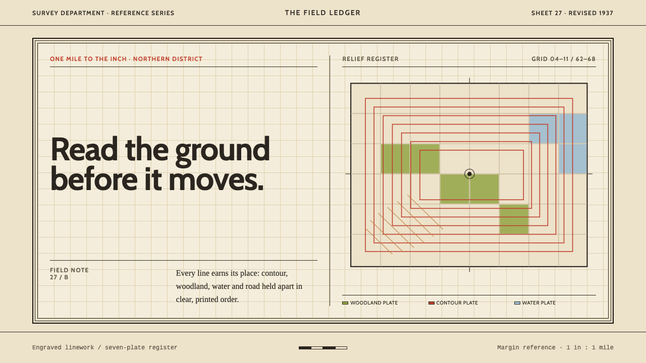 Ordnance Survey One-InchPrecision has a paper trail. Buff margins, red contours and engraved black ru…
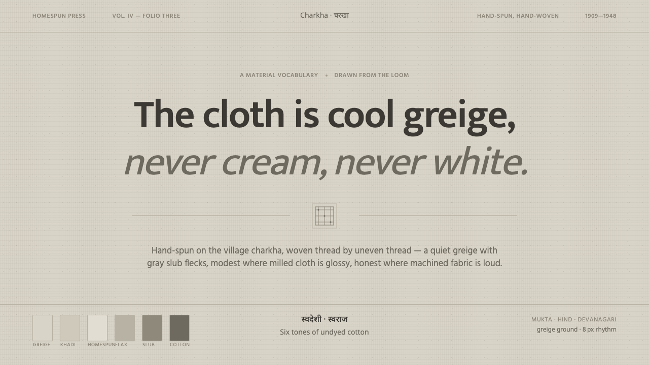 Undyed Khadi WhiteModest, never cream. Greige homespun cotton with gray slub flecks and plain h…
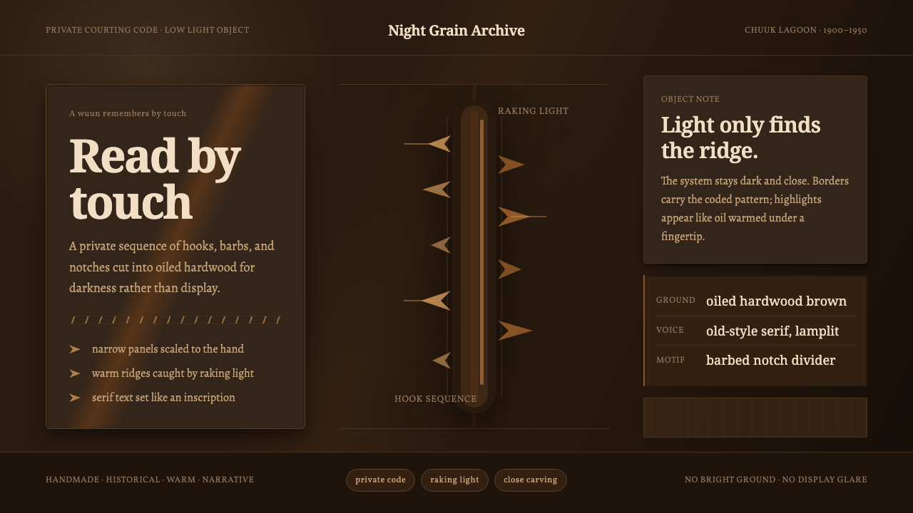 Chuukese Love Stick CarvingIntimacy carved for darkness. Oiled brown grain and hook-notches read by raki…
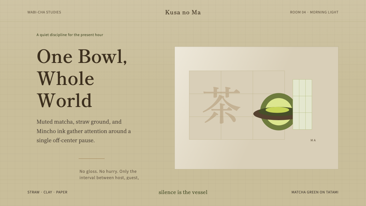 Japanese Tea CeremonyStillness has weight. Tatami straw, matcha green, and Mincho type leave room…
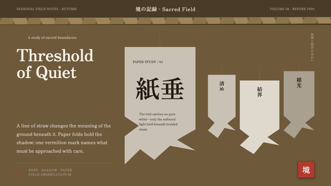 Shinto Shide Paper StreamerQuiet becomes sacred. Shadowed washi hangs from a straw-gold line, marked onc…
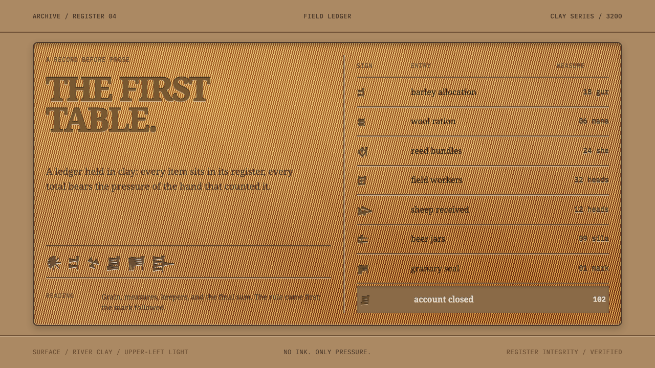 Sumerian Cuneiform TabletData began as pressure. A clay ledger uses scored grids and shadowed Noto Ser…