What is Undyed Khadi White?
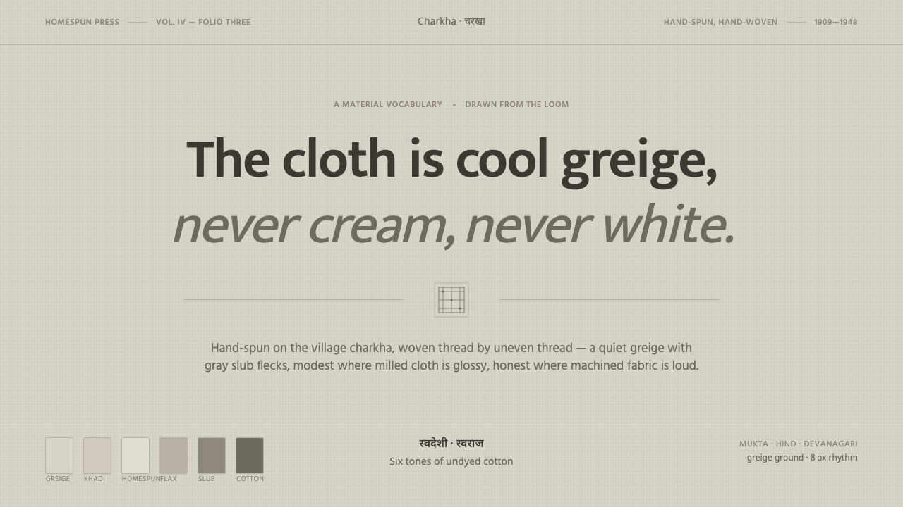
Undyed Khadi White turns handmade cloth into a visual ethic: cool greige, gray slubs, plain type, and the quiet dignity of making do with what is real.
Undyed Khadi White in brief
Undyed Khadi White is a design language distilled from raw khadi, the hand-spun and hand-woven cotton associated with Gandhi, swadeshi self-reliance, and village making in India between 1900 and 1950. Its base is not a polished ivory or a warm cream, but a cool natural greige suspended between dove grey and oatmeal. Gray cotton slubs remain visible across the surface, giving the material an irregular, human presence.
The visual mood is modest, tactile, and quietly purposeful. A restrained greige ground carries muted flax and slub neutrals, while plain humanist sans type keeps communication direct and unpretentious. The system does not imitate luxury, machinery, or perfect industrial regularity. Its appeal comes from the evidence of making: a surface that is useful, honest, and slightly different from itself wherever the weave changes.
In an interface, the cloth becomes an atmosphere rather than a literal textile illustration. Texture should suggest handwork without becoming visual noise; typography should feel familiar without becoming bland; and space should allow the neutral field to remain perceptible. Undyed Khadi White works when every choice supports the same idea: quiet materials can carry conviction.
Where does Undyed Khadi White come from?
Khadi is hand-spun, hand-woven cotton in its most direct form: fiber becomes thread through the charkha spinning wheel, and thread becomes cloth through village weaving. Undyed khadi retains the visual evidence of that process. Its natural greige is cool rather than creamy, its weave is rough rather than polished, and gray cotton slubs interrupt the surface with small signs of irregularity. The material is not unfinished in a careless sense; its unfinished appearance is part of its identity.
Between 1900 and 1950, Gandhi made khadi an emblem of swadeshi self-reliance. The charkha was not merely a production tool in this context. It represented the possibility of making locally, depending on practical human labor, and refusing the idea that value must arrive in a perfected industrial form. The cloth therefore carries both a material character and a political one: simplicity is connected to agency, and handwork is connected to collective independence.
The source of the style is not a single artist or a decorative vocabulary. It belongs equally to Mahatma Gandhi, village hand-spinners, and charkha weavers. Their work establishes the qualities that the visual system preserves: directness, modesty, visible labor, natural irregularity, and a refusal to disguise the material beneath a more luxurious surface. The style should consequently feel grounded rather than nostalgic, and purposeful rather than quaint.
Curio translates these qualities into an interface through a quiet greige ground, muted flax and slub neutrals, plain humanist sans type, and an honest irregular texture. The result is a digital surface that remembers cloth without pretending to be cloth. Its origin remains legible in the balance between order and variation: the layout is deliberate, while the atmosphere allows small deviations that keep the work connected to human making.
What defines the Undyed Khadi White look?
Cool Greige Ground
The dominant field sits between dove grey and oatmeal, with a cool natural cast that keeps it distinct from cream or decorative ivory. It should feel quiet enough to recede behind content, yet present enough to register as a material surface. The ground establishes the style before any component or illustration appears.
Slub Texture
Gray cotton slubs appear as irregular flecks within the greige field, recalling the uneven weave of homespun cloth. Texture should remain quiet and distributed rather than becoming a pattern with a visible repeat. Its purpose is to make the surface feel made, not to compete with reading or navigation.
Muted Material Palette
Color stays close to the natural family of greige, flax, and slub neutrals. Variation comes from material proximity and tonal distinction rather than spectacle. The palette communicates restraint and continuity, allowing hierarchy to emerge from placement, contrast, and typography instead of bright chromatic interruption.
Plain Humanist Sans
Typography is plain, open, and human rather than technical or ornamental. A humanist sans gives labels and longer passages a familiar rhythm, balancing the roughness of the cloth with clear communication. Type should support the system's modesty: readable, steady, and confident without theatrical display.
Order with Irregularity
The layout should be composed and dependable, while the surface prevents it from feeling machine-sealed. Alignment, grouping, and hierarchy provide usability; subtle variation in texture supplies the human counterpoint. This tension is central to the style: the interface is organized, but never sterilized.
Material Honesty
Every visual decision should acknowledge what it is doing. Texture is allowed to remain texture, type remains type, and neutral color remains neutral rather than pretending to be precious stone, polished paper, or luxury fabric. The system gains character by refusing false refinement and letting modest materials speak clearly.

Who shaped Undyed Khadi White?
Gandhi made khadi an emblem of swadeshi self-reliance and connected the cloth to the possibility of local, human-scale making. His association with the charkha gives the material its strongest ethical charge. In the design system, that legacy appears as modesty with purpose: the surface does not seek status, but it does make a clear statement about independence and agency.
Village hand-spinners represent the human labor that turns raw cotton into thread. Their presence in the source material keeps khadi from becoming a purely symbolic surface. The irregularity of Undyed Khadi White should therefore feel inhabited by people, preserving the sense that variation can be evidence of work rather than a defect to erase.
Charkha weavers complete the movement from spun thread to hand-woven cloth, making the weave itself part of the message. Their work informs the system's emphasis on visible structure, tactile restraint, and material honesty. The interface should feel assembled with care, not stamped into uniformity.
How do you use Undyed Khadi White today?
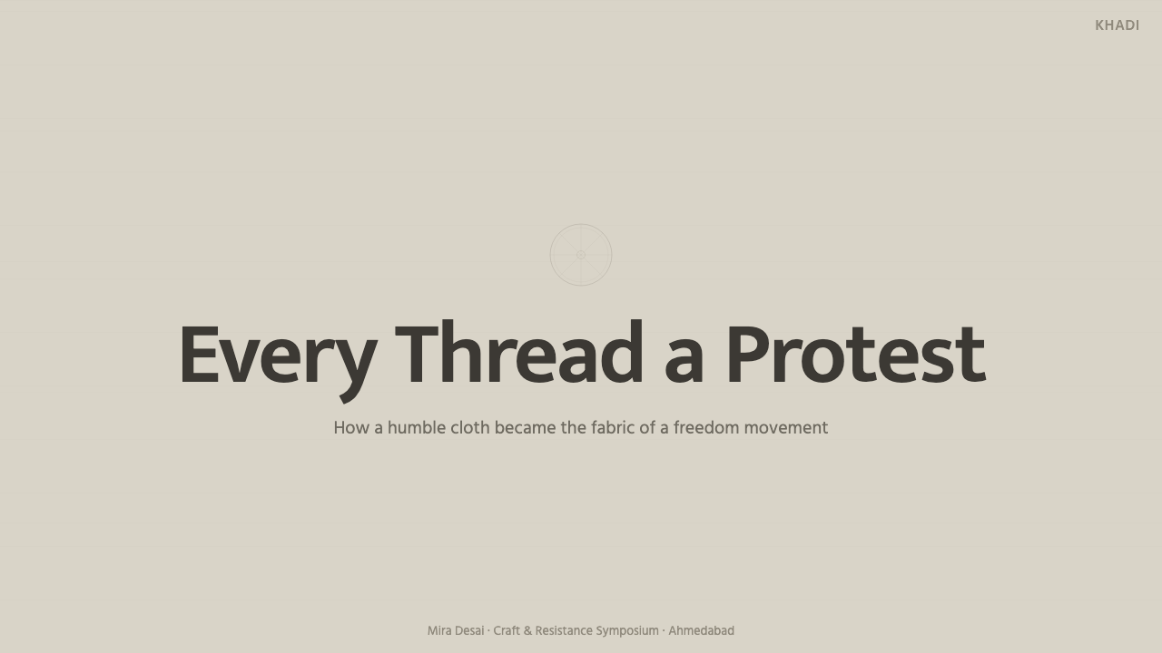
For presentation slides, Undyed Khadi White suits covers that establish calm before information begins: a quiet greige field, a plain humanist sans title, and a restrained suggestion of slub texture. Content slides should preserve that composure through clear grouping and generous breathing room. Data slides benefit from tonal organization and dependable alignment, allowing the information to feel grounded and useful rather than theatrical or technologically glossy.
For web interfaces, the system works especially well for dashboards, service portals, and pricing pages that want to communicate trust without corporate polish. Use the greige ground as the continuous environment, keep text direct and human, and let panels separate through quiet tonal shifts or carefully controlled texture. Pricing tiers should be distinguished by clear hierarchy and language before decorative treatment; the material character is strongest when the interface remains easy to scan.
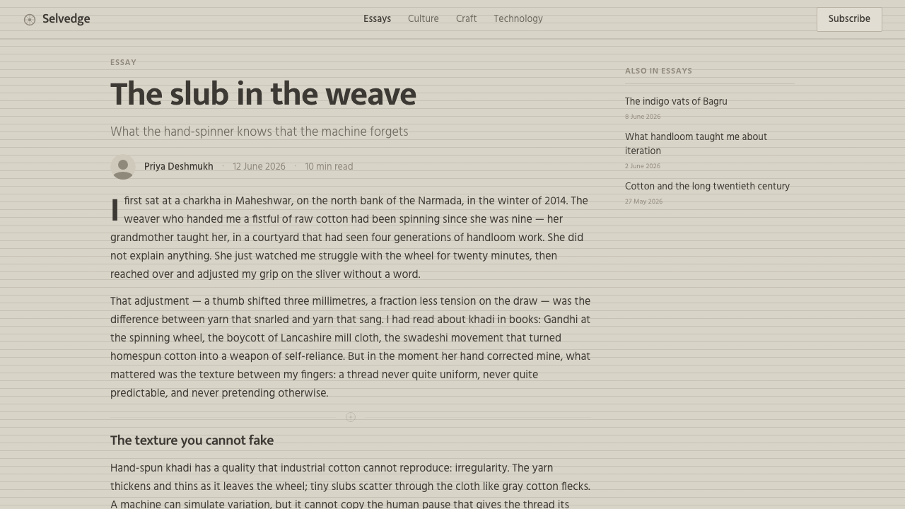
For editorial and marketing work, the style supports long-form content that values process, responsibility, and practical usefulness. Articles can use the neutral field as a reading environment, with slub texture appearing at the margins or in restrained section moments. Marketing pages should favor grounded language and tactile descriptions over claims of luxury. Product storytelling becomes more credible when the visual surface admits modesty instead of trying to make every object look immaculate.
The system also suits identity work for organizations that want to appear capable, independent, and close to real making. A wordmark or title set in a plain humanist sans can carry the identity without additional ornament, while the greige and flax family provides continuity across print-like pages and digital surfaces. The key is to let the material reference remain quiet enough that it supports the message rather than replacing it.
The common mistake is treating the style as generic rustic decoration. Adding heavy paper effects, exaggerated fibers, warm cream, distressed lettering, or excessive irregularity turns a disciplined material language into a costume. Undyed Khadi White is not about making a surface look old or handcrafted at any cost. It is about translating cool greige cloth, visible slubs, plain type, and self-reliant modesty into a coherent system.
Undyed Khadi White — FAQ
Is Undyed Khadi White simply an off-white style?
No. Its defining quality is the cool natural greige that sits between dove grey and oatmeal, not a creamy or polished off-white. The gray cotton slubs matter as much as the base color because they connect the surface to hand-spun, hand-woven khadi. Remove that material irregularity and the design becomes a generic neutral interface rather than this specific visual system.
How much texture should the interface show?
Enough to suggest an uneven homespun weave, but not enough to interfere with reading, navigation, or hierarchy. The texture should feel distributed and incidental, like gray slubs within cloth, rather than a loud repeating pattern. Its role is to preserve the sense of human making while allowing the interface to remain calm and functional.
Is this the same as a generic rustic or handmade aesthetic?
No. The style has a specific source: undyed khadi, Gandhi's association with the charkha, swadeshi self-reliance, and the work of village hand-spinners and charkha weavers in India. A generic rustic treatment may borrow rough texture or warm neutrals without carrying that logic. Undyed Khadi White should remain cool, modest, and materially honest rather than merely nostalgic.
What kind of typography belongs with the style?
A plain humanist sans is the natural fit. It gives the interface a familiar, readable rhythm and balances the tactile irregularity of the cloth without competing with it. The type should be steady and direct rather than ornamental, technological, or luxurious. Its restraint is important because the material ground already supplies the character.
Related design styles
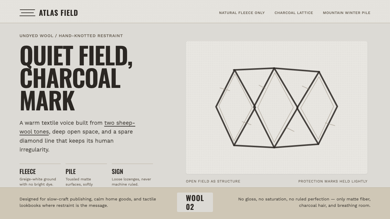 Beni Ourain Berber CarpetRestraint feels tactile. Greige wool field, Oswald type, and a loose charcoal…
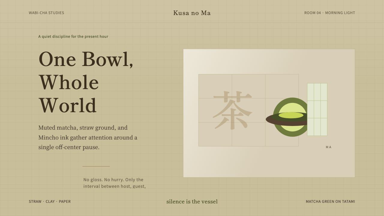 Japanese Tea CeremonyStillness has weight. Tatami straw, matcha green, and Mincho type leave room…
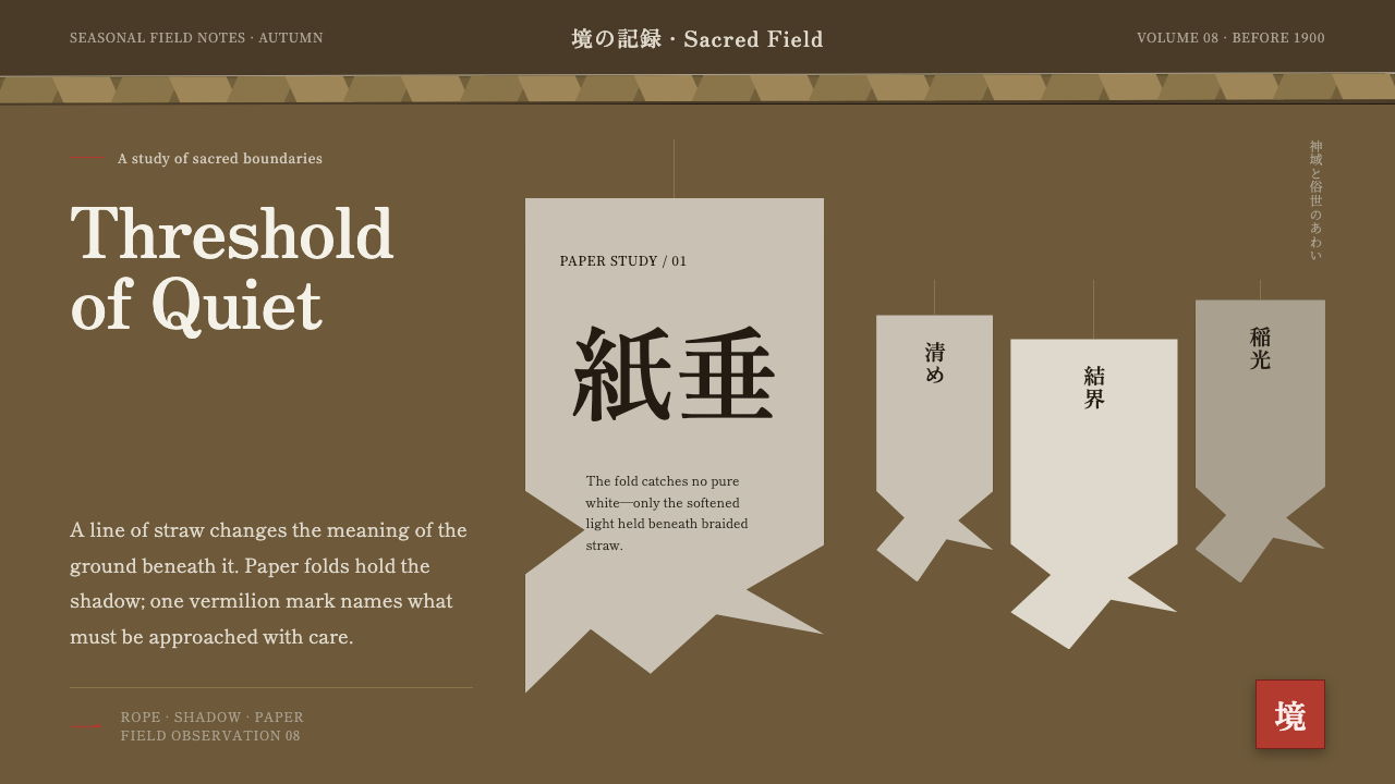 Shinto Shide Paper StreamerQuiet becomes sacred. Shadowed washi hangs from a straw-gold line, marked onc…
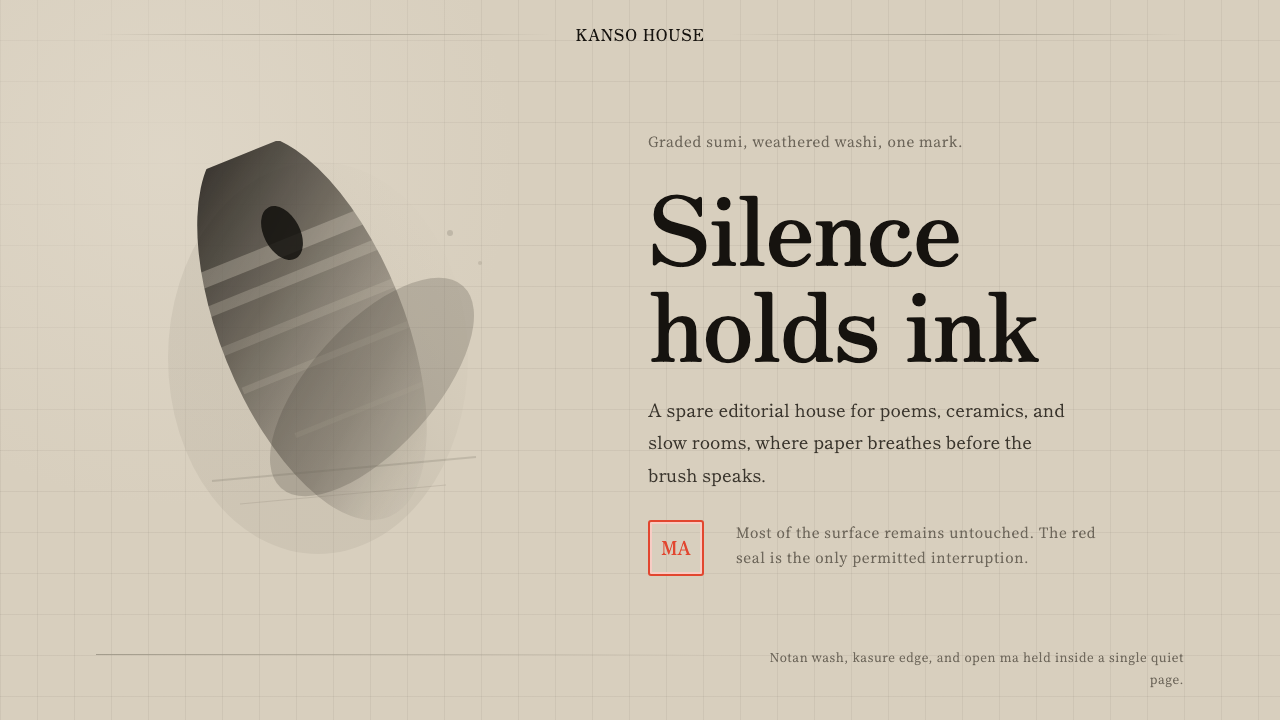 Sumi-e Ink WashRestraint carries weight. Washed black ink floats on oatmeal washi, anchored…
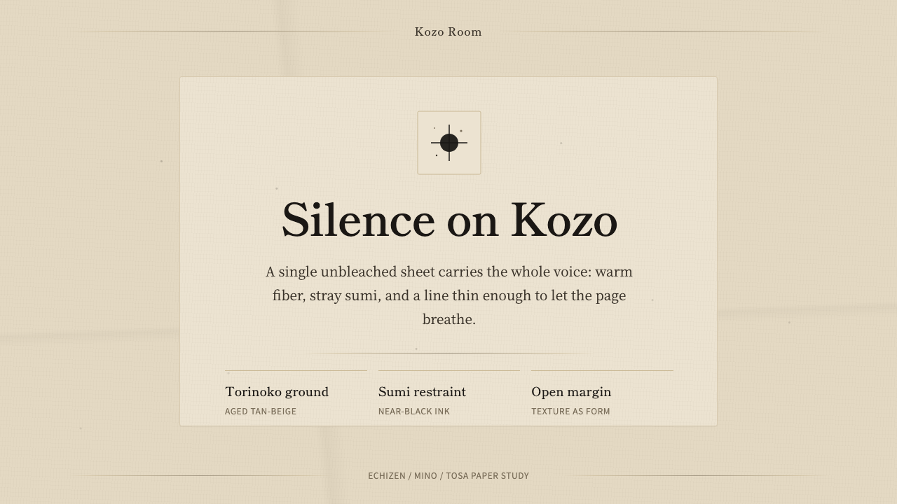 Washi Paper MinimalQuiet is material. Warm kozo grain, sumi specks, and hairline rules hold the…
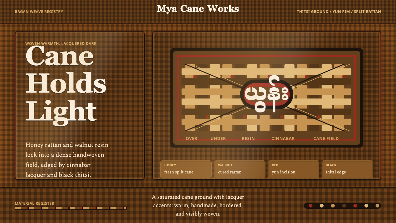 Burmese Cane RattanWoven warmth holds the page. Walnut cane lattice glows with cinnabar rim line…