What is Solentiname Primitivism?
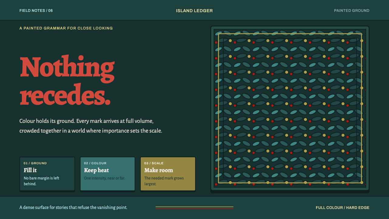
Solentiname painting turns a jungle into a wall of separately painted leaves, where nothing recedes and the back of the picture burns as hot as the front.
Solentiname Primitivism in brief
Solentiname primitivism is the painting tradition of a small archipelago on Lake Nicaragua. Beginning in 1966, local farmers and fishermen painted the world they already knew: the lake, the forest, the birds, the thatched houses and the stories of the gospel. The pictures are small oils, and they are filled edge to edge. Foliage is not a backdrop but the main subject, built from thousands of separately painted leaves, each one a distinct mark with its own outline.
The defining rule is that nothing recedes. Colour is never modulated across a plane: a leaf at the back of the picture burns as hot as a bird at the front, and size follows importance rather than distance. Birds, flowers, houses and sacred figures are laid flat on top of the foliage like specimens pinned to a board. There is no atmosphere, no haze and no fading toward a horizon, and where a horizon exists at all it sits high or disappears.
As a design language it is dark, saturated and dense. The ground is a deep jungle field close to black, the shapes are hard-outlined and flat-filled, there are no gradients anywhere, and no margin is left unpainted. Emptiness, in this grammar, is not breathing room; it is something unfinished. The tradition sits in the family of naïve and primitivist painting, but it is better understood as communal: a way of seeing that a whole community shared.
Where does Solentiname Primitivism come from?
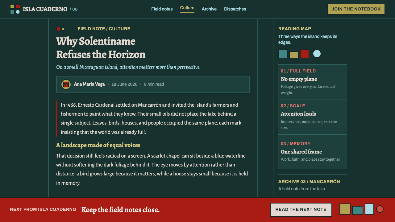
The story begins in 1966, when the poet-priest Ernesto Cardenal moved to Mancarrón, the largest island of the Solentiname archipelago in Lake Nicaragua. The islands belong to the Río San Juan region, a remote country of water, forest and small farms, and the people Cardenal settled among were farmers and fishermen. Around him they began to paint. They did not paint the saints and landscapes of an imported academic tradition; they painted the lake, the foliage and the houses they already knew by heart.
The library places the tradition inside two overlapping currents. One is the liberation theology base-community movement, in which ordinary believers gather in small groups to read scripture against the facts of their own lives. That context explains why gospel figures appear in these pictures not as distant icons but as flat, brightly coloured people standing among Nicaraguan leaves, birds and thatched roofs. Sacred story and local geography are painted in the same grammar, at the same intensity, on the same surface.
The other current is folk craft. Nicaraguan folk craft and the wider family of naïve or primitivist painting supply the technique: the picture is built the way a handmade object is built, from a repeated unit made one at a time. Thousands of separately painted leaves accumulate into a field, and each carries its own small decision about shape, outline and colour. It is the unit-by-unit logic of handwork, not any theory of perspective, that produces the density defining the style. 'Primitivist' is a label applied from outside; the discipline on display is the opposite of casual.
The library dates the wider tradition from 1950 to 1990, with the community painting beginning in 1966 and the community itself recorded as destroyed in 1977. That interruption matters when the style is borrowed. These pictures belong to a particular place and a particular group of people at a particular moment, and the most honest way to use their visual grammar is to say where it came from: the Solentiname archipelago and the painters of its islands, with Cardenal, Róger Pérez de la Rocha and Elvis Chavarría among the names attached to the school.
What defines the Solentiname Primitivism look?
Dark Saturated Ground
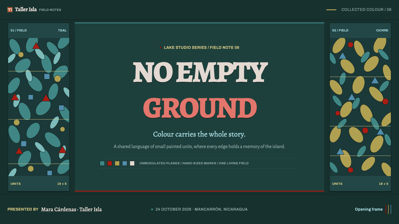
The field is a deep jungle green so dark it is close to black, and every colour laid on top of it is fully saturated and unmodulated. Reds, yellows, blues and oranges are never lightened or greyed to suggest distance; each plane keeps its full strength. Against the dark ground this makes every shape glow like something lit from within, which is why the style belongs to dark layouts and does not transfer well to pale ones.
The Leaf as Module
The basic unit is the single leaf: a small closed shape, painted individually and repeated thousands of times with slight variation in angle, size and colour. Foliage is therefore a field of discrete marks rather than a continuous mass. The repetition has the rhythm of handwork, regular enough to read as pattern and irregular enough to prove that a person made every unit.
Hard Outline
Every shape is closed by a dark outline pressed against its flat fill. The line separates adjacent saturated colours so they cannot blur into one another, and it makes each leaf, bird and petal read as a cut-out placed on the surface. There is no soft edge anywhere; an edge is either a clean line or the meeting of two flat colours.
Flat Space, No Recession
There is no atmospheric perspective and no diminishing scale. The back of the picture is as hot as the front, objects stack upward instead of receding, and the horizon, where it appears, sits high or vanishes entirely. Depth is replaced by layering: gospel figures, birds and houses lie flat on top of the foliage, each fully visible, none hidden behind haze.
Scale by Importance
Size follows meaning rather than distance. A bird that matters is large, a house that matters less is smaller, and a sacred figure keeps its weight whether it stands near or far. This is a hierarchy built entirely from scale and placement, with no help from shadow, blur or depth, and it translates directly into layouts where the most important element is simply the largest.
No Empty Margin
Nothing is left unpainted. The picture runs to every edge, and the spaces between major elements are filled with more leaves rather than left open. In this grammar blank space does not give the eye a rest; it signals that the work is unfinished. The density is not chaos, though: because every unit is flat, outlined and fully saturated, a crowded picture still reads clearly.
Who shaped Solentiname Primitivism?
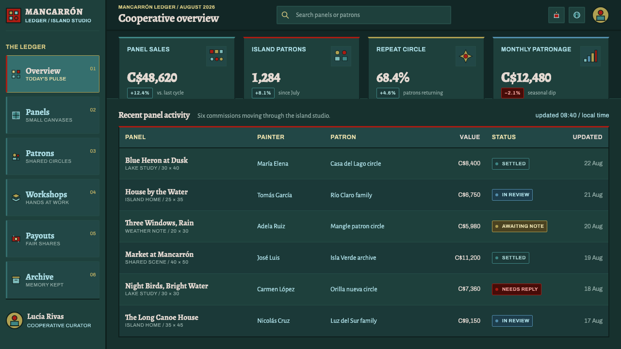
Cardenal was a poet and a priest, and in 1966 he moved to Mancarrón, the largest island of the Solentiname archipelago. The farmers and fishermen around him began to paint the lake they already knew. He is best understood as the person who made the conditions for the school rather than the author of its style: the grammar of dense foliage, flat colour and hard outline belongs to the painters. His presence explains the gospel subjects and the base-community setting that run through the work.
Pérez de la Rocha is one of the names the library attaches to the Solentiname school. His place in the record points to the central fact of the tradition: the pictures were painted by people of the islands themselves, working in a shared visual language rather than as isolated individuals. The style is best read as a community's grammar with many hands in it, and Pérez de la Rocha is one of those hands.
Chavarría is listed alongside Pérez de la Rocha as a key figure of the school. Having several named painters rather than one master is itself informative: the leaf field, the flat colour and the outlined shapes recur across different hands, which is how a shared grammar differs from a personal style. When you borrow this look you are borrowing a convention held in common, and naming Chavarría and his fellow painters is the honest way to credit it.
How do you use Solentiname Primitivism today?
Solentiname primitivism is a loud, dense, dark style, and it rewards designs that actually need those qualities: cultural projects, community and nonprofit work, music, food, nature and travel, and anything that wants to feel hand-made and alive rather than polished. It asks for commitment. Half-applied, it turns into a green wallpaper behind otherwise ordinary layouts.
For slides, the cover is the natural showpiece. Fill the whole frame with the dense leaf field, then set the title on a flat, hard-outlined plate so that it reads cleanly against the busy ground. Content slides keep the dark ground and use one or two large, saturated, outlined shapes as the focal element, scaled by importance. Data slides can treat bars, segments and markers as flat outlined shapes in saturated colour, with no gradients, glows or drop shadows, and with labels set on solid plates instead of floating over the pattern.
For web interfaces, the style suits landing pages, onboarding, galleries and campaign sites better than long-session tools, but it can carry dashboards and pricing pages if density is treated as structure. Use the dark ground for the page, flat outlined cards for panels, saturated colour for status and tier differentiation, and keep all running text on solid plates. Let the largest card be the most important one, since scale carries the hierarchy here, and avoid soft shadows entirely.
For editorial and marketing work, think in full-bleed bands of foliage with flat figures laid across them: a feature opener, an album or festival poster, a cooperative's product label, a community report. Headlines in a heavy, simple face on a plate work well, and illustrations should be flat, outlined and unmodulated. Because the style comes from a specific community, credit its origin in the piece whenever the context allows.
The most common mistake is to add depth. A gradient glow, a soft drop shadow or a blurred background turns the picture from a flat field into a lit scene and kills the principle that nothing recedes. The second is to shrink the pattern into a low-contrast texture behind text, which keeps the green and loses the burn. The third is to use the look as generic 'tropical' decoration, detached from the place it came from.
Solentiname Primitivism — FAQ
Is Solentiname primitivism the same as naïve art?
It belongs to the naïve or primitivist family but is narrower. Naïve painting is a broad label for self-taught work outside academic convention; Solentiname is a specific community tradition with a recognisable grammar: dense foliage built from individual leaves, saturated unmodulated colour, hard outlines and no recession. A layout that merely looks childlike is not Solentiname. The discipline of the grammar is the point.
Is 'primitivist' a fair name for this work?
It is a category label from the art world, applied from outside the islands, and it can mislead. The pictures are carefully made: thousands of separately painted leaves, a consistent logic of outline and colour, scale organised by meaning. The library keeps the term because it is how the tradition is catalogued, but the right way to read the work is as a fully realised visual system with its own rules, not as an absence of skill.
Can it work on a light background?
Poorly. The dark saturated ground is part of the grammar, because it lets flat colours burn without needing gradient or glow. On a pale ground the same saturated hues lose that intensity and the foliage field reads as a pattern rather than a wall. If a light version is unavoidable, keep the outlines dark and the colours fully saturated, but expect to give up some of the effect.
How do I keep a dense layout readable?
Put all reading text on flat solid plates, keep the outlines consistent, and let scale do the hierarchy. The density belongs to the ground and the illustration layer; the information layer should be calm. Because every element is flat and outlined, the eye can still separate a crowded composition into discrete units, as it does in the paintings.
Related design styles
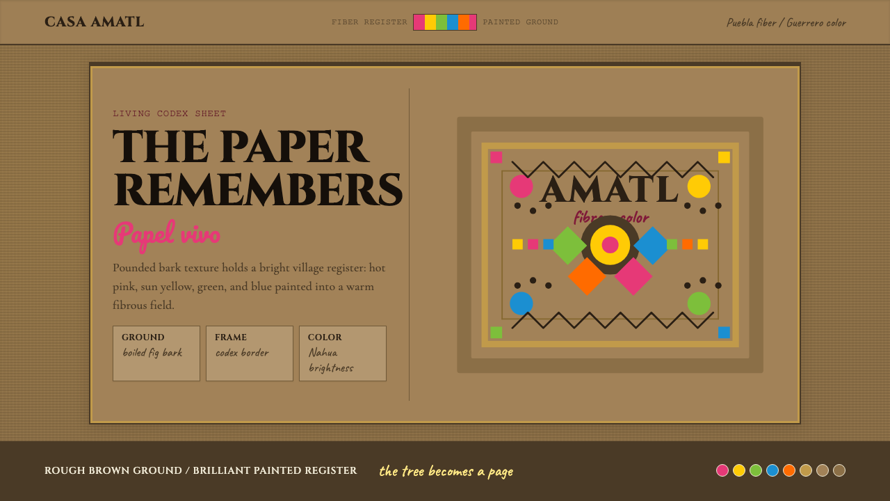 Mexican Amate Bark PaperLiving craft, not nostalgia. Bark-brown fiber carries hot pink and sun-yellow…
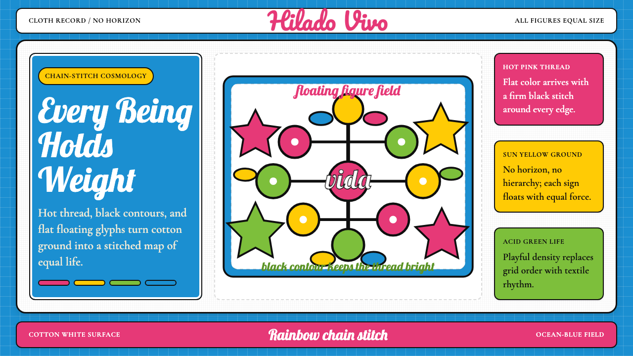 Mexican Otomi TenangoAll life floats equally. Ocean blue, hot pink, sun yellow, acid green, black…
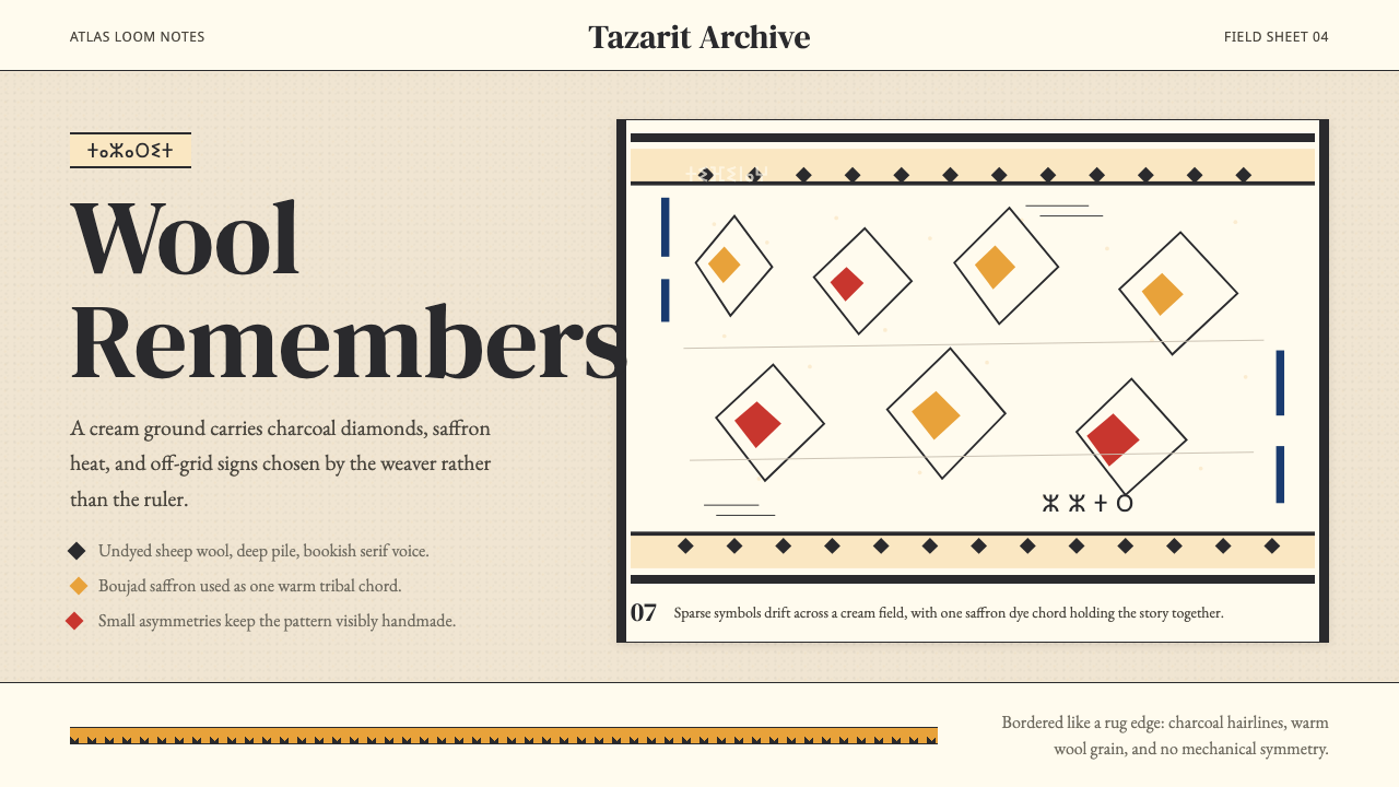 Moroccan Amazigh Berber RugAutobiography in wool. Cream ground, charcoal diamonds, saffron bands drift o…
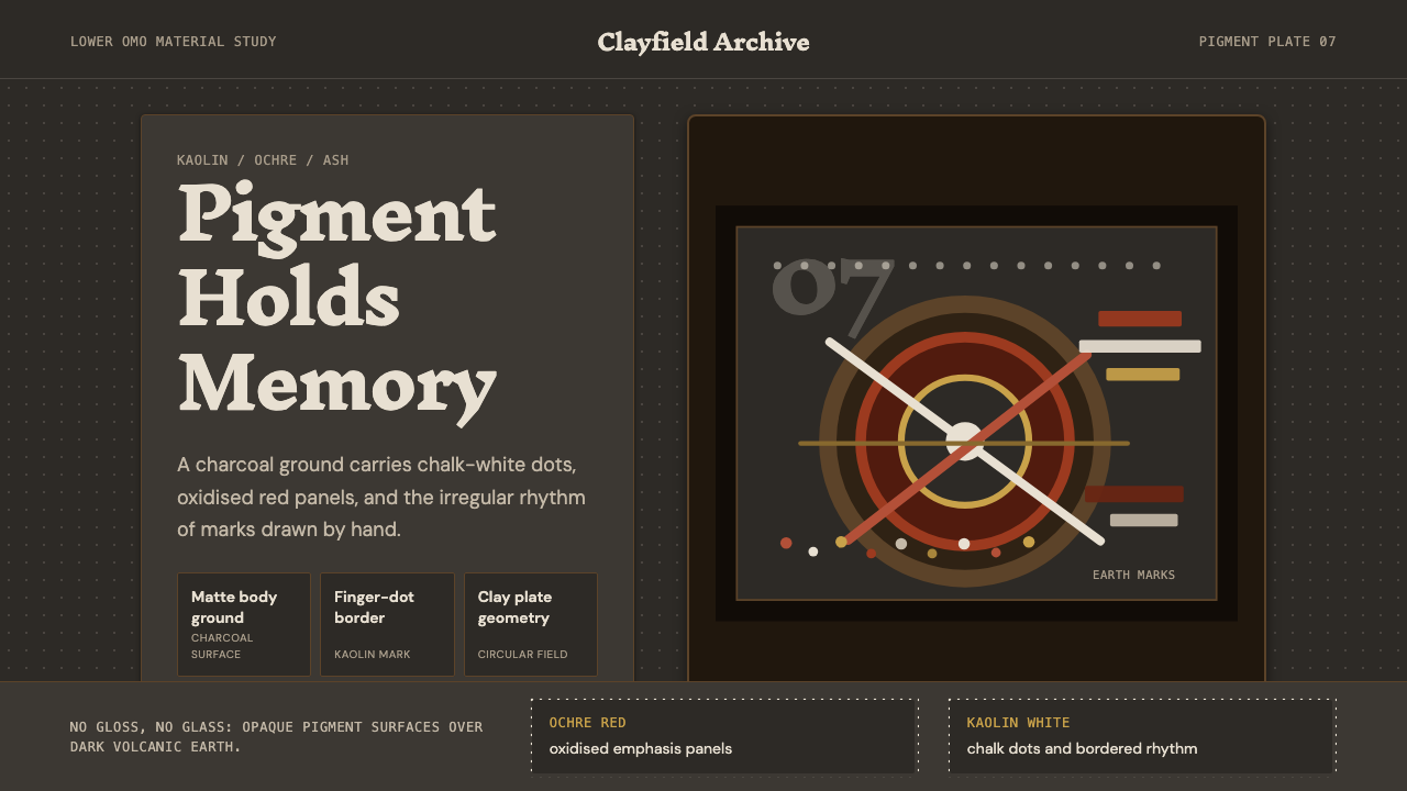 Mursi Omo Valley Lip Plate PaintRaw dignity, matte and proud. Kaolin dots and ochre rings sit on charcoal gro…
 Poison Dart Frog PlateBright means don't touch. Saturated orange and gold frog morphs fluoresce on…
 Aboriginal Dot PaintingAncient story-map energy. Red ochre, bone dots, concentric circles, and U-mar…