Design style guide设计风格指南
What is Mursi Omo Valley Lip Plate Paint?什么是 Mursi Omo Valley Lip Plate Paint?
On the banks of Ethiopia's Omo River, kaolin clay, ash, and ochre become a daily ritual of identity — raw earth pigments drawn onto dark skin with fingers and palms, proud and never decorative for decoration's sake.在埃塞俄比亚奥莫河畔,高岭土、草木灰与赭石是每日的身份仪式——用手指和掌心将泥土颜料涂绘于深色肌肤,粗粝而有尊严,从不为装饰而装饰。
Mursi Omo Valley Lip Plate Paint in briefMursi Omo Valley Lip Plate Paint 速览
The Mursi Omo Valley Lip Plate Paint design system takes its name and spirit from the body painting traditions of the Mursi people of southwestern Ethiopia. Their daily face and body paintings — finger-drawn dots, palm prints, concentric rings of white kaolin clay, and bold ochre stripes — are not fixed patterns but living compositions that shift with mood, ceremony, and the availability of pigment. The result is an aesthetic of raw dignity: purposeful, matte, and grounded in the earth itself.穆尔西奥莫唇盘彩绘设计系统从埃塞俄比亚西南部穆尔西人的人体彩绘传统中汲取名称与精神。他们每日在面部与身体上绘制的图案——手指点阵、掌印、高岭土白色同心圆环、大胆的赭石条纹——并非固定图样,而是随心情、仪式和颜料可用性变化的活态构图。呈现出来的,是一种粗粝的尊严之美:有目的、哑光、根植于大地本身。
What makes this tradition remarkable as a visual language is its materiality. The palette is defined entirely by what the earth provides: chalky white from kaolin clay, warm deep red from iron-rich ochre, cool near-black from ash and charcoal. These pigments sit on the surface of dark skin, never sinking in, always present as a texture you can almost feel. Marks are made quickly with fingers, palms, and sticks — gestural rather than precise — yet the resulting compositions carry enormous graphic authority.使这一传统作为视觉语言显得非凡的,是其材料性。色板完全由大地所能给予的东西定义:高岭土的粉笔白、富含铁质的赭石暖深红、灰烬与木炭的近黑色。这些颜料浮于深色肌肤表面,从不渗入,始终以一种几乎可以触摸的质感存在。标记用手指、手掌和木棒迅速施加——是手势性的而非精确的——然而由此产生的构图承载着巨大的图形力量。
As a design system, Mursi Omo translates that earth-pigment-on-skin materiality into digital surfaces. The charcoal ground is deep and matte, never glossy. Marks appear as hand-applied rather than machine-drawn. The tension between the chalky near-white of kaolin and the warm oxidised red of ochre drives all compositional energy, against a shadow-dark field that gives every mark weight and presence.作为设计系统,穆尔西奥莫将泥土颜料涂抹于肌肤的质感转化为数字界面。炭灰底色深沉而哑光,从不光亮。标记以手工施加而非机器绘制的方式呈现。高岭土粉白与赭石氧化红之间的张力驱动着一切构图能量,在阴影般深暗的底面上,每一处标记都获得分量与存在感。
See the Mursi Omo Valley Lip Plate Paint design system →查看 Mursi Omo Valley Lip Plate Paint 完整设计系统 →
Where does Mursi Omo Valley Lip Plate Paint come from?Mursi Omo Valley Lip Plate Paint 从何而来?
The Mursi are a Nilotic people inhabiting the remote lower Omo Valley in southwestern Ethiopia, a region where multiple ethnic groups — including the Surma, Suri, Karo, and Hamar — have maintained body adornment traditions largely untouched by outside influence. The Omo River valley's geographic isolation, lying between highland and lowland ecosystems, allowed these practices to develop over centuries with considerable depth and continuity. While the exact antiquity of Mursi body painting is difficult to establish, the practice is understood to be centuries old and remains actively practised today.穆尔西人是尼罗特民族,居住在埃塞俄比亚西南部偏远的奥莫河谷下游。这一地区聚居着多个族群——包括苏尔玛、苏里、卡罗和哈玛尔——他们的人体装饰传统在很大程度上未受外界影响而延续至今。奥莫河谷地处高地与低地生态系统之间,地理隔绝使这些习俗得以在数百年间以相当深度和连续性发展演变。穆尔西人体彩绘的确切历史难以确定,但这一习俗被认为有数百年历史,至今仍在活跃实践中。
The Mursi are best known in the wider world for the clay lip plates worn by adult women. These ceramic or wooden discs, inserted into a cut in the lower lip beginning in adolescence and gradually increased in size, are understood as a marker of social status, beauty, and individual identity. But the lip plate is inseparable from the broader body painting tradition: face, neck, and torso paintings accompany the plate as part of a unified visual identity that the wearer assembles and modifies daily. The paintings are not permanent tattoos but fresh compositions — washed off and reapplied — making them closer in spirit to performance than to fixed inscription.穆尔西人在更广泛的世界中最为人所知的,是成年女性佩戴的陶土唇盘。这些陶制或木制圆盘在少女期开始嵌入下嘴唇的切口,并逐渐增大尺寸,被理解为社会地位、美丽与个人身份的标志。但唇盘与更广泛的人体彩绘传统不可分割:面部、颈部和躯干的彩绘与唇盘共同构成一套统一的视觉身份,由佩戴者每天组装和修改。这些彩绘不是永久性纹身,而是新鲜的构图——洗去后重新涂绘——在精神上更接近表演而非固定铭刻。
The pigments used are entirely local and mineral. White kaolin clay is sourced from riverbanks and applied in thick, chalky strokes that retain a slight relief. Ochre — ground from iron-oxide-rich stone — provides warm deep reds and oranges. Ash and charcoal yield the near-black tones. These materials are mixed with water or animal fat and applied directly with fingers, palms, thin sticks, and broad blades of grass. The marks are gestural and confident: dots laid with a single finger press, rings drawn with a sweeping palm, stripes made with the flat of the hand. There is no sketch beneath, no hesitation.所用颜料完全来自本地矿物。白色高岭土从河岸采集,以浓厚的粉笔质笔触涂抹,保留轻微的浮雕感。赭石——从富含铁氧化物的石头中研磨——提供温暖的深红与橙色。灰烬和木炭产生近黑色调。这些材料与水或动物脂肪混合,直接用手指、手掌、细木棒和宽草叶施加。标记是手势性的、充满自信的:单指按压点出的圆点、掌心扫出的圆环、手掌平拍出的条纹。其下没有草稿,没有犹豫。
Western awareness of the Mursi body painting tradition grew significantly through the photographic work of Hans Silvester, whose widely published images from the 1990s and 2000s brought the tradition to international attention — along with significant debate about representation and the ethics of photographing isolated communities. The anthropological record was also shaped by David Turton, who spent decades studying the Mursi and documented the social meanings embedded in their body practices, and by photographers Carol Beckwith and Angela Fisher, whose long-term documentation of East African ceremonial cultures provided important comparative context for the Omo Valley traditions.西方对穆尔西人体彩绘传统的认识,随着汉斯·西尔维斯特的摄影作品在1990年代至2000年代被广泛发表而显著增长——同时也引发了关于表现方式与拍摄孤立族群伦理的重要讨论。人类学记录也由戴维·特顿所塑造,他花费数十年研究穆尔西人,记录了其人体习俗中嵌入的社会意涵;卡罗尔·贝克威斯与安吉拉·费舍尔对东非仪式文化的长期记录,则为奥莫河谷传统提供了重要的比较背景。
What defines the Mursi Omo Valley Lip Plate Paint look?Mursi Omo Valley Lip Plate Paint 的视觉特征是什么?
Ground Color底色
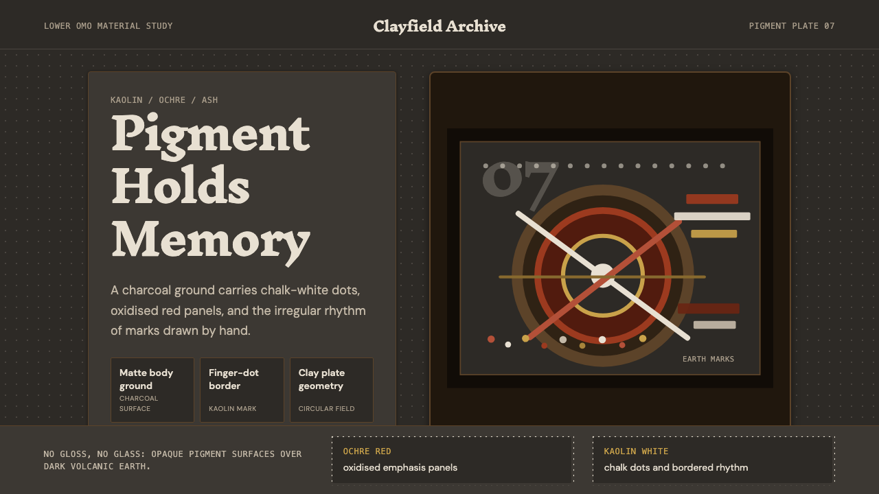
The foundational tone is deep charcoal — not pure black, but the rich near-black of ash on dark earth. It is matte and absorptive, giving the impression of a surface that drinks in light rather than reflecting it. This dark ground is essential: it is what makes the chalky kaolin marks luminous and gives the ochre stripes their warmth. Without the deep shadow field, the marks lose their presence.基础色调是深炭灰——不是纯黑,而是深色大地上灰烬的那种厚重近黑。它是哑光的、吸收性的,给人以表面饮入光线而非反射光线的印象。这一深色底面是本质所在:正是它使高岭土标记发光,使赭石条纹获得温暖。没有深暗的阴影底场,标记便失去存在感。
Chalky White Marks粉白标记
Kaolin clay marks are the primary graphic element: dots, concentric circles, palm outlines, and broad stripes rendered in a chalky, slightly textured white that never achieves the cleanness of a printed white. The marks carry visible grain and slight irregularity at their edges — the trace of the finger or palm that applied them. In digital translation, this quality is achieved through slightly softened edges and subtle surface texture, never through crisp geometric precision.高岭土标记是主要图形元素:圆点、同心圆环、手掌轮廓、宽条纹,以粉笔质的、略带肌理的白色呈现,永远无法达到印刷白的洁净。标记带有可见的颗粒感,边缘略有不规则——是施加它们的手指或手掌留下的痕迹。在数字转化中,这种质感通过略微柔化的边缘和微妙的表面纹理来实现,而非通过精确的几何清晰度。
Ochre and Earth Red赭石与土红
Warm iron-red occupies the accent position in the palette — present but not dominant. It reads as oxidised, aged, and mineral rather than bright or saturated. When ochre appears alongside kaolin white on the charcoal ground, it creates a visual warmth that suggests fire, ceremony, and the heat of the Omo Valley landscape. The earth reds are never vivid primaries; they carry the weight of something dug from the ground.温暖的铁红占据色板中的强调位置——存在但不主导。它读来像是氧化的、陈旧的、矿物性的,而非明亮或饱和的。当赭石与高岭土白共同出现在炭灰底面上时,创造出一种暗示火焰、仪式和奥莫河谷地景热度的视觉温暖。这些土红色从不是鲜艳的原色;它们承载着从地下挖出之物的分量。
Gestural Mark-Making手势性标记
The vocabulary of marks is bodily and direct: dots pressed with a single fingertip, rings swept with the pad of a thumb, parallel stripes laid with the flat of four fingers, broad areas filled with a palm print. There is no attempt to achieve mechanical regularity — the slight wobble of a hand-drawn circle, the fading pressure at the end of a stroke, the occasional double-mark where a finger lifted and reset, are all part of the system's authenticity. Perfection in the conventional sense is not the goal.标记的词汇是身体性的、直接的:单个指尖按压的圆点、拇指垫划出的圆环、四根手指并排铺出的平行条纹、手掌填满的宽阔区域。没有任何试图达到机械规整的努力——手绘圆形的轻微抖动、笔触末端的压力减弱、手指抬起再放下留下的偶尔重复标记,都是这套系统真实性的组成部分。传统意义上的完美不是目标。
Texture Over Flatness肌理而非平滑
Where most contemporary digital design systems prize the smooth and the flat, Mursi Omo celebrates surface. The matte chalky pigment, the visible grain of the clay, the slight variance in opacity across a single mark — these qualities signal that something was made by hand from natural material. Digital implementations of this aesthetic introduce controlled noise, irregular edges, and subtle material variation to maintain the sense of an applied rather than generated surface.当大多数当代数字设计系统以光滑与平整为追求时,穆尔西奥莫颂扬表面肌理。哑光粉笔状颜料、可见的粘土颗粒感、单一标记中透明度的轻微变化——这些特质表明某种东西是由天然材料手工制作的。这种美学的数字实现引入了可控的噪点、不规则边缘和微妙的材料变化,以维持一种被施加而非被生成的表面感。
Circular and Radial Geometry圆形与放射几何
The dominant geometric form is the circle and its relatives: concentric rings, arc segments, dot clusters arranged in radial patterns, oval lip-plate echoes. Rectilinear grids exist but are subordinate; the organizing principle is centripetal rather than Cartesian. Compositions tend to radiate outward from a central point — the face, the mouth, the eye — and the surrounding marks respond to that center of gravity.主导几何形态是圆形及其变体:同心圆环、弧线段、放射状排列的点簇、椭圆形唇盘的回响。直线网格存在但处于次要地位;组织原则是向心性的而非笛卡尔式的。构图倾向于从中心点——面部、嘴部、眼部——向外辐射,周围的标记对那个引力中心作出回应。
Purposeful Sparsity有目的的稀疏
Mursi body paintings are not dense all-over patterns. Large areas of unmarked skin — the dark ground itself — remain visible between marks, and this negative space is as active as the marks. The paintings breathe. This sparsity is purposeful: in a composition where the ground is rich and dark, leaving it exposed is itself a decision of presence. Over-marking destroys the balance; restraint gives each mark its maximum weight.穆尔西人体彩绘不是密集的全覆盖图案。标记之间大片未绘制的皮肤——底色本身——保持可见,这些负空间与标记同样活跃。彩绘在呼吸。这种稀疏是有目的的:在底色厚重而深暗的构图中,让它裸露本身就是一种存在感的决定。过度标记破坏平衡;克制赋予每一处标记最大的分量。

See the Mursi Omo Valley Lip Plate Paint design system →查看 Mursi Omo Valley Lip Plate Paint 完整设计系统 →
Who shaped Mursi Omo Valley Lip Plate Paint?谁塑造了 Mursi Omo Valley Lip Plate Paint?
A French photographer whose extended documentation of Omo Valley body painting from the 1990s onward brought the Mursi and neighboring peoples to wide international attention. His book-length compilations introduced these painted bodies to design, fashion, and art audiences worldwide — though his work also generated sustained debate about the ethics of staging and aestheticizing practices from a community with which he had no deep prior relationship. Regardless of the controversy, Silvester's images remain the most widely circulated visual record of Omo Valley body adornment.法国摄影师,从1990年代起对奥莫河谷人体彩绘的长期记录使穆尔西人及其邻近民族获得了广泛的国际关注。他的摄影集将这些彩绘身体介绍给全球的设计、时尚和艺术受众——尽管他的工作也引发了关于摆拍和将一个他并无深厚预先关系的社群的习俗审美化的持续争议。无论争议如何,西尔维斯特的图像仍然是奥莫河谷人体装饰最广泛流传的视觉记录。
A British social anthropologist who spent decades conducting fieldwork among the Mursi, beginning in the late 1960s. Turton's scholarship provided the foundational ethnographic account of Mursi society, including the social meanings of the lip plate and body painting within their broader systems of identity and status. His work is the primary academic source for understanding these practices as something other than spectacle — as embedded in specific social logics that outsiders frequently misread.英国社会人类学家,从1960年代末起在穆尔西人中进行数十年的田野工作。特顿的学术研究提供了穆尔西社会的基础民族志叙述,包括唇盘与人体彩绘在其更广泛的身份与地位体系中的社会意涵。他的工作是理解这些习俗而非仅将其视为景观的主要学术来源——这些习俗嵌入于外部人士频繁误读的特定社会逻辑之中。
An American photographer who, alongside Angela Fisher, spent decades documenting ceremonial life across sub-Saharan Africa. Beckwith and Fisher's collaborative work created one of the most comprehensive visual archives of African ceremonial adornment, providing comparative context for the Omo Valley traditions and helping establish the broader East African body painting aesthetic in the visual culture record. Their approach emphasized long-term relationship-building with communities rather than brief photographic visits.美国摄影师,与安吉拉·费舍尔共同花费数十年记录撒哈拉以南非洲各地的仪式生活。贝克威斯与费舍尔的合作成果创建了非洲仪式装饰最全面的视觉档案之一,为奥莫河谷传统提供了比较背景,并帮助在视觉文化记录中确立了更广泛的东非人体彩绘美学。她们的方法强调与社群建立长期关系,而非短暂的摄影拜访。
A British-Australian photographer and scholar whose long-term fieldwork across East and southern Africa — conducted in close collaboration with Carol Beckwith — documented ceremonial body practices including those of the Omo Valley peoples. Fisher's written accounts accompanying the photographic work provided cultural context that helped international audiences understand body adornment as a sophisticated social and aesthetic system, not merely an exotic visual spectacle.英澳摄影师与学者,与卡罗尔·贝克威斯密切合作,在东非和南部非洲进行长期田野工作,记录了包括奥莫河谷民族在内的仪式性人体习俗。费舍尔随摄影作品撰写的文字叙述提供了文化背景,帮助国际受众将人体装饰理解为一套复杂的社会与审美体系,而非仅仅是异域视觉奇观。
How do you use Mursi Omo Valley Lip Plate Paint today?今天怎么用 Mursi Omo Valley Lip Plate Paint?
The Mursi Omo Lip Plate Paint system occupies a specific niche: it is best applied where rawness, material weight, and cultural depth are communicative assets rather than liabilities. It works strongly for projects that want to signal authenticity, non-corporate identity, or a connection to craft and earth — creative portfolios, cultural organizations, artisanal brands, music and arts platforms, and documentary or editorial design contexts. It is the wrong choice for projects that require clinical precision, cheerful lightness, or the polished finish of mainstream consumer technology.穆尔西奥莫唇盘彩绘系统占据一个特定的细分领域:它最适合应用于粗粝感、材料重量和文化深度是传播资产而非负债的项目。它对于希望传达真实性、非企业身份或与手工艺和大地相连的项目具有强大效果——创意作品集、文化机构、手工艺品牌、音乐与艺术平台,以及纪录或编辑设计场景。对于需要临床精确度、轻快感或主流消费科技抛光完成度的项目,它是错误的选择。
For presentation slides, the system works at its most powerful on covers and section-break pages. A cover built on the deep charcoal ground with a single large circular mark — perhaps a ring of kaolin dots around a sparse central space — gives an immediate visual authority that no amount of slick gradients can match. Content slides should practice restraint: white text on the dark ground, mark-inspired dividers used sparingly, and the earth-red accent reserved for key callouts or data highlights only. Overloading a content slide with the decorative vocabulary of the system defeats the effect. Data visualizations in this palette take on a ceremonial quality — bar lengths and ring segments in warm earth tones against the dark field read as weighted and deliberate.在演示文稿中,这套系统在封面与分节页上最具力量。一张建立在深炭灰底面上、带有单一大圆形标记的封面——也许是围绕稀疏中央空间的一圈高岭土圆点——给予一种任何数量的光滑渐变都无法匹敌的直接视觉权威。内容页应当实践克制:在深色底面上使用白色文字,稀疏使用受标记启发的分割线,将土红强调色仅保留给关键引用或数据亮点。用这套系统的装饰词汇堆满内容页会破坏效果。这种色板中的数据可视化呈现出一种仪式感——温暖土色调中的条形长度和圆环段在深色底场上读来厚重而深思熟虑。
For web interfaces and dashboards, the system demands commitment. A charcoal-ground dark UI using Mursi Omo principles should keep its layout sparse and breathable — wide margins, generous vertical rhythm, restrained typographic hierarchy. Navigation and label text should be the chalky near-white; active states or selected items shift to the warm ochre accent. Avoid implementing this system in a light-background variant: the entire palette logic depends on the depth of the dark ground, and a light inversion loses everything essential about the system. This is one of the more demanding styles to implement correctly in a UI context, because digital design conventions tend toward lightness and density; going the other way requires explicit discipline.对于网页界面和仪表板,这套系统需要承诺。使用穆尔西奥莫原则的炭灰底深色界面应保持版面稀疏而有呼吸感——宽边距、慷慨的垂直节律、克制的排版层级。导航和标签文字应为粉笔般的近白;活动状态或选中项切换为温暖的赭石强调色。避免在浅色背景变体中实现这套系统:整个色板逻辑依赖于深色底面的深度,而浅色反转会失去这套系统所有的本质。这是在界面场景中正确实现最具挑战性的风格之一,因为数字设计惯例倾向于轻盈与密度;反其道而行需要明确的自律。
For editorial and marketing work, the system is well-suited to contexts where cultural weight and visual distinction are the primary goals. A magazine spread, cultural institution identity, or arts organization campaign can use the charcoal ground, kaolin white, and ochre palette to establish an immediate sense of depth and seriousness that lighter, brighter styles cannot achieve. The gestural mark vocabulary — dots, rings, palm echoes — works well as graphic texture in backgrounds, chapter breaks, and section openers, provided it is not reproduced at mechanical regularity. A grid of perfectly uniform dots loses the hand; slightly varied sizes and pressures restore it.对于编辑和营销工作,这套系统非常适合文化重量和视觉区别是主要目标的场景。杂志跨页、文化机构品牌或艺术机构活动可以使用炭灰底面、高岭土白和赭石色板,建立更轻盈、更明亮的风格无法实现的即时深度感与严肃性。手势性标记词汇——圆点、圆环、手掌回响——作为背景、章节分隔和段落开头的图形纹理效果良好,只要不以机械规整的方式复制。一格完全均匀的圆点失去了手的感觉;略微变化的大小和压力将其恢复。
The most common mistake when applying this system is importing contemporary digital polish into what is fundamentally an anti-polish aesthetic. Smooth anti-aliased edges, glowing shadows, high-saturation color, or crisp geometric precision all contradict the system's logic. A second common mistake is attempting to lighten the palette — using a pale grey background instead of deep charcoal, or substituting a bright red for the muted ochre. These substitutions produce a result that has neither the warmth of Mursi Omo nor the clarity of a more conventional system. Trust the darkness of the ground and the chalkiness of the marks; the tension between them is the design.应用这套系统时最常见的错误,是将当代数字抛光引入一种从根本上反抛光的美学。光滑的抗锯齿边缘、发光的阴影、高饱和度色彩或精确的几何清晰度,都与这套系统的逻辑相抵触。第二个常见错误是试图淡化色板——用浅灰背景代替深炭灰,或用明亮红色替代低调赭石。这些替换产生的结果既没有穆尔西奥莫的温度,也没有更传统系统的清晰度。相信底色的黑暗和标记的粉笔质感;它们之间的张力就是设计。
See the Mursi Omo Valley Lip Plate Paint design system →查看 Mursi Omo Valley Lip Plate Paint 完整设计系统 →
Mursi Omo Valley Lip Plate Paint — FAQMursi Omo Valley Lip Plate Paint · 常见问题
Is it appropriate to use a tradition from an indigenous community as a design aesthetic?将原住民社群的传统用作设计美学,这样做合适吗?
This is a question worth sitting with seriously rather than answering quickly. The Mursi Omo system as a design language draws from a visual vocabulary — earth pigments, gestural marks, dark grounds, sparse composition — rather than directly reproducing sacred or ceremonially restricted imagery. The aesthetic qualities of kaolin dots and ochre rings on charcoal are available as a design reference in the same sense that wabi-sabi or Bauhaus are design references: as a set of visual and compositional principles that have been studied, documented, and made available for creative interpretation. What would be inappropriate is misrepresenting the source, claiming cultural ownership, or reproducing specific ceremonial imagery outside its context. Using the system thoughtfully, with credit to its origins, is a different act than appropriation.这个问题值得认真对待,而非快速作答。穆尔西奥莫作为设计语言,借鉴的是一种视觉词汇——泥土颜料、手势性标记、深色底面、稀疏构图——而非直接复制神圣或仪式限定的图像。高岭土圆点和赭石圆环在炭灰上的美学特质,作为设计参考的方式,与侘寂或包豪斯作为设计参考的方式相同:作为一套已被研究、记录和开放给创意诠释的视觉与构图原则。不当的做法是误传其来源、声称文化所有权,或在其语境之外复制特定的仪式图像。以深思熟虑的方式使用这套系统,并注明其来源,与文化挪用是不同的行为。
Can this system work in a light-background variant?这套系统能在浅色背景变体中使用吗?
Not without losing what makes it work. The entire visual logic of Mursi Omo depends on the depth and absorptive quality of the dark ground. On a light background, the kaolin white marks become invisible (white on white), and the ochre loses its luminous warmth — it simply reads as a muted tan. The system is fundamentally a dark-ground system. If a light-ground application is required, the honest answer is that a different design system will serve better. Trying to force Mursi Omo onto a light background produces something that neither reads correctly as this system nor works well as an independent light design.不行,否则会失去使其有效的核心。穆尔西奥莫的整体视觉逻辑依赖于深色底面的深度与吸收性。在浅色背景上,高岭土白色标记变得不可见(白底白字),赭石也失去其发光的温暖——只是读来像低调的棕褐色。这套系统从根本上是一套深色底面系统。如果需要浅色底面的应用,诚实的答案是换一套不同的设计系统会更合适。试图将穆尔西奥莫强加于浅色背景,产生的结果既无法正确读作这套系统,也无法作为独立的浅色设计良好运作。
How do you apply the gestural mark quality in a digital medium without it looking gimmicky?如何在数字媒介中呈现手势性标记质感而不显得哗众取宠?
Restraint is the answer. The gestural quality comes from specific mark types — dots, rings, stripes — used sparingly and in positions of structural significance, not scattered as decoration. A single large ring used as a framing device around a title, or a row of dots as a section separator, reads as designed. A page covered in randomly placed dots at different scales reads as a texture wallpaper. The rule is: every mark should be in the position it is in because of the composition, not because the style suggests marks. Digital implementations should also avoid over-perfecting the marks — a circle with perfectly identical edge quality at every point no longer reads as gestural. Introducing controlled variation in edge softness and opacity at small scale preserves the hand without making the result look naively rough.克制是答案。手势性质感来自特定的标记类型——圆点、圆环、条纹——稀疏使用,置于具有结构意义的位置,而非散落为装饰。单一的大圆环作为标题周围的框架装置,或一排圆点作为段落分隔符,读来是经过设计的。一张布满随机放置的不同大小圆点的页面读来像纹理壁纸。规则是:每一处标记应当因其在构图中的位置而存在,而非因为风格建议使用标记。数字实现也应避免过度完善标记——每个点边缘质量完全相同的圆形不再读作手势性的。在小尺度引入边缘柔化和透明度的可控变化,在不让结果显得天真粗糙的情况下保留手工感。
What kinds of typefaces pair well with this system?哪类字体与这套系统搭配良好?
Typefaces that carry their own material weight work best — faces with visible stroke contrast, slightly rough or humanist qualities, or a monospaced evenness that recalls the regularity of repeated marks. Ultra-geometric sans-serif families with clinical precision tend to fight the system's handmade quality. Slab serif faces with sturdy bracketed serifs can work, particularly in display sizes, because their structural weight echoes the weight of the kaolin marks. Avoid delicate high-contrast editorial serifs, which read as too refined, and avoid thin ultralight weights, which disappear against the dark ground. The typographic texture should feel as substantial as the marks it sits alongside.承载自身材料重量的字体效果最好——具有可见笔触对比、略带粗糙或人文主义特质的字体,或令人想起重复标记规律性的等宽均匀感。具有临床精确度的超几何无衬线字体系列往往与这套系统的手工质感相抵触。带有粗壮托括衬线的粗衬线字体可以使用,尤其是在展示尺寸中,因为其结构重量呼应了高岭土标记的分量。避免精致的高对比度编辑衬线字体——它们读来过于精细——也避免细超轻字重,它们在深色底面上会消失。排版质感应该感觉与它并置的标记同样厚实。
Does this system work for commercial brands, or is it too niche?这套系统适用于商业品牌吗,还是过于小众?
It is a strong fit for a specific type of commercial brand and a poor fit for most others. Brands where it works: independent record labels, cultural festivals, documentary film production companies, artisanal food or craft producers positioning against mass-market competitors, and creative agencies or studios that want to communicate depth over polish. The system signals seriousness, cultural awareness, and a preference for authenticity over convenience — all of which are brand values for a particular audience. Where it fails commercially: consumer technology, mass retail, children's products, health and wellness, financial services, and any brand where the primary communication need is clarity, friendliness, or approachability. The system's darkness and rawness are not universally readable as trustworthy; for audiences unfamiliar with the reference, they can read as simply heavy.它非常适合特定类型的商业品牌,但对大多数其他品牌并不合适。适合的品牌:独立唱片公司、文化节、纪录片制作公司、对抗大众市场竞争者的手工食品或工艺品生产商,以及希望传达深度而非抛光感的创意机构或工作室。这套系统传达严肃性、文化意识和对真实性而非便利性的偏好——所有这些都是特定受众的品牌价值观。商业上不适合的场景:消费科技、大众零售、儿童产品、健康与保健、金融服务,以及任何主要传播需求是清晰度、友好感或亲近感的品牌。这套系统的黑暗与粗粝并非对所有人都读作可信任;对于不熟悉这一参考的受众,它们可能仅仅读作沉重。
Related design styles相关设计风格
 Moroccan Amazigh Berber RugAutobiography in wool. Cream ground, charcoal diamonds, saffron bands drift o…羊毛里的自传:奶油底、炭黑菱形与藏红花色边带轻微偏移。
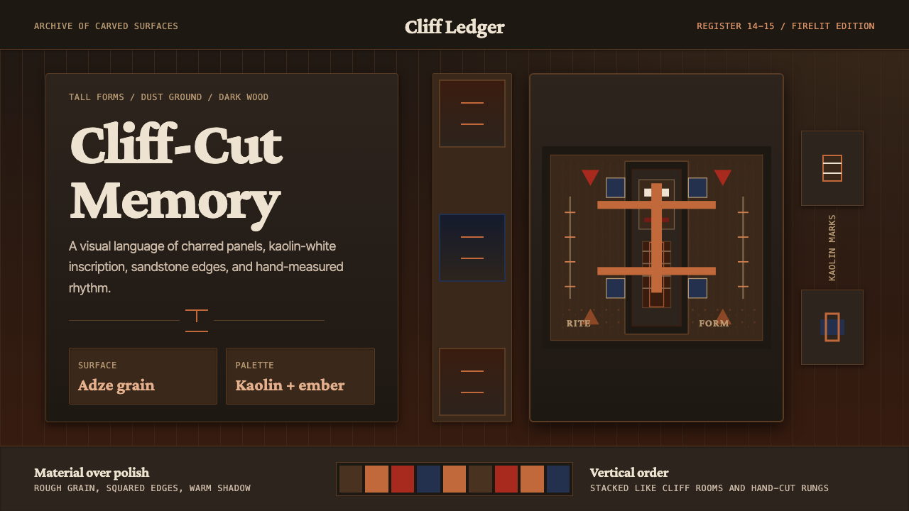 Dogon Bandiagara Cliff MaskHand-hewn gravity. Charred wood, kaolin type, and sandstone geometry stack li…手凿般沉稳:炭木底、高岭土字与砂岩几何层层堆叠。
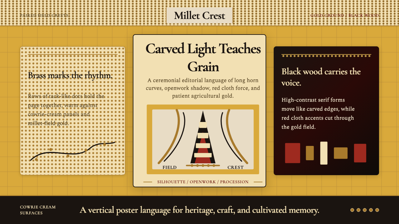 Bambara Chi Wara AntelopeCarved memory in gold. Black serif silhouettes and brass-dot borders carry th…金色中的雕刻记忆。黑色衬线剪影与黄铜点边框承载田野仪式。
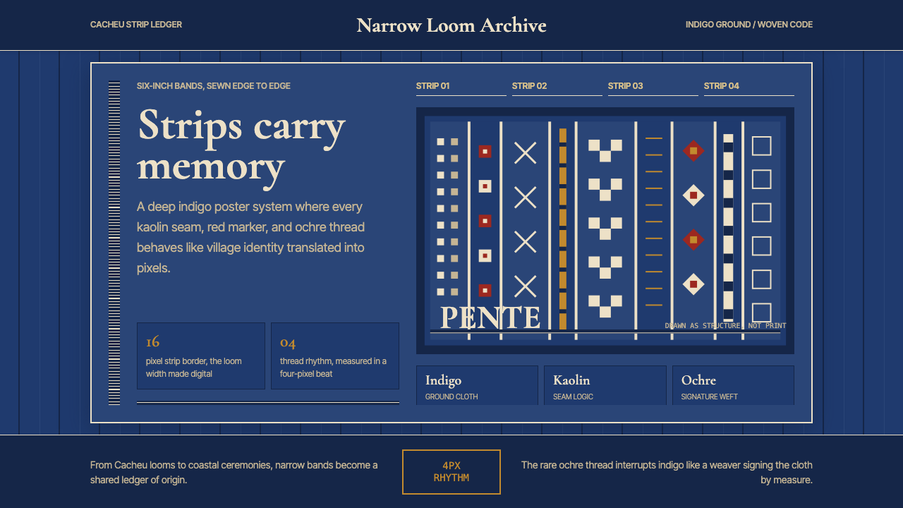 Bissau-Guinean Pano de PenteIndigo remembers. Narrow bands and kaolin seams turn weave grammar into pixel…靛蓝会记忆。窄幅竖带与瓷白缝线,把织纹语法变成像素。
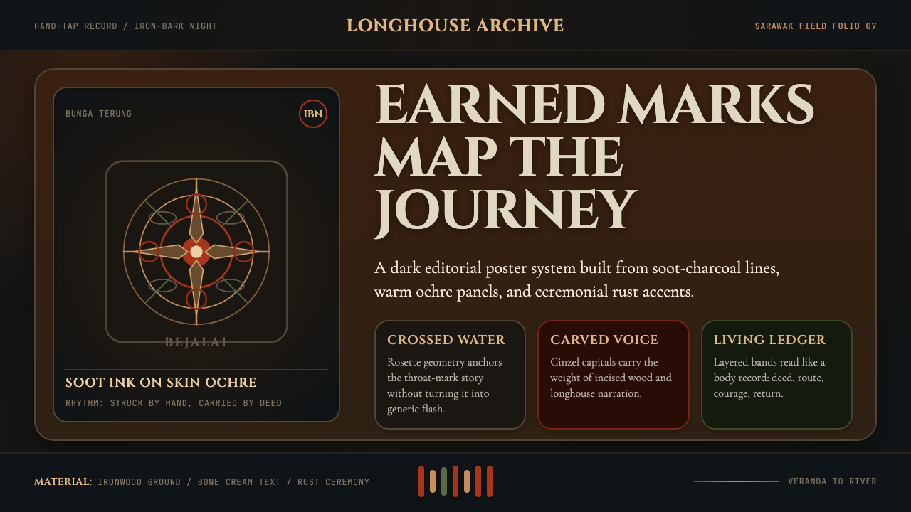 Dayak Borneo Tattoo (Iban)A living journey ledger. Soot lines, ochre panels, and rust rosettes feel han…身体成旅程账本。炭线、赭面与锈红莲座如手敲入肤。
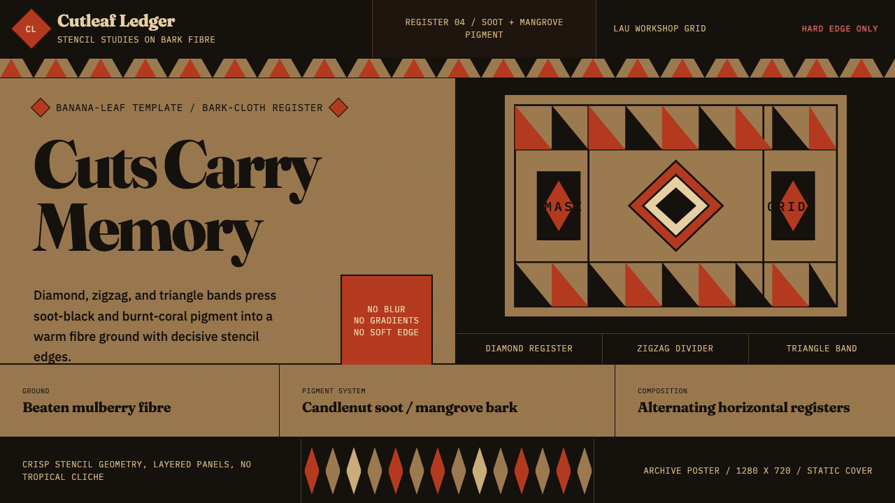 Fijian Masi (Bark Stencil)Stencil memory stays sharp. Soot black and burnt coral strike bark-fibre band…模板记忆锋利:烟黑与焦珊瑚红压入树皮纤维横带。