What is Poison Dart Frog Plate?

Poison Dart Frog Plate turns the rainforest’s brightest warning into a scientific visual system: luminous frogs, disciplined labels, and a black field that makes every signal impossible to ignore.
Poison Dart Frog Plate in brief
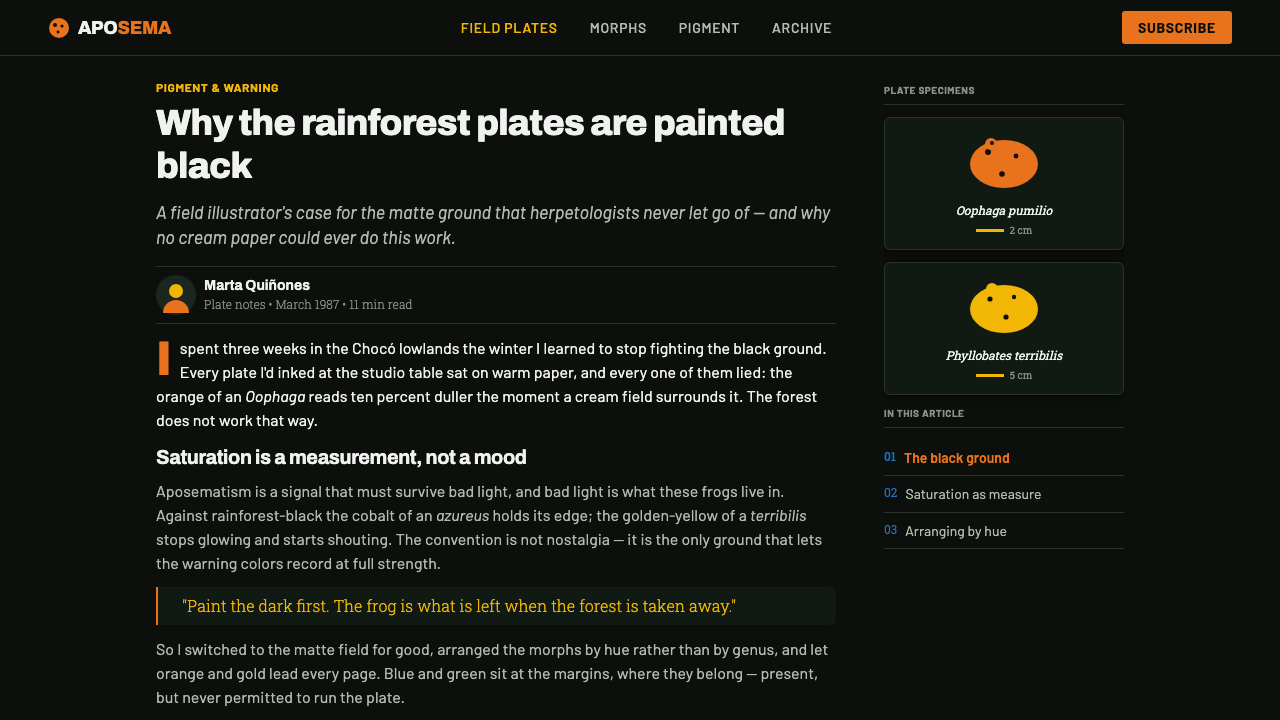
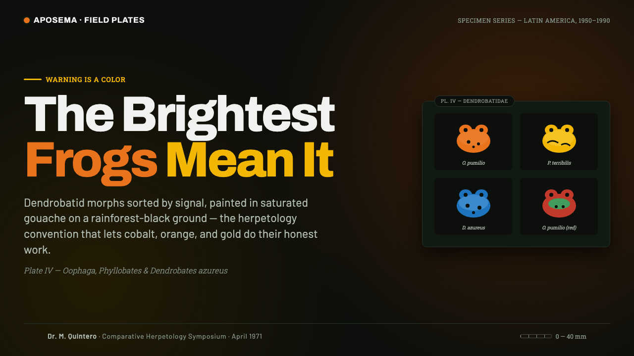
Poison Dart Frog Plate distills the visual language of mid-to-late twentieth-century dendrobatid identification plates. It takes vividly colored frog morphs as its central subject and arranges them against a deep rainforest-black ground, where orange, golden-yellow, and cobalt bodies read with the directness of warning beacons. The style is rooted in observation, but it is not visually timid: every specimen is presented as both evidence and spectacle.
The governing idea is aposematic coloration, the biological logic by which conspicuous color warns potential predators away. In this design language, brightness has meaning. Saturated orange and gold carry the strongest visual charge, while cobalt and leaf-green act as supporting signals that expand the plate without weakening its hierarchy. The dark ground is functional rather than atmospheric ornament; it intensifies the contrast between specimen and field.
Rendered as saturated gouache, the system combines scientific order with tactile drama. Glossy-looking skin, decisive black banding, clean silhouettes, specimen labels, and scale references give the composition documentary discipline. At the same time, the color treatment makes each frog feel electric, almost self-illuminating. It is a style for information that should feel vivid, rare, and slightly dangerous.
Where does Poison Dart Frog Plate come from?
The style belongs to a mid-to-late twentieth-century herpetological plate convention associated with Central and South American rainforest species. Its source is not a decorative art movement in the usual sense, but the practical visual problem of identifying highly variable dendrobatid frog morphs. A plate had to make differences in body color, banding, and overall appearance immediately legible while preserving the authority of a scientific reference.
Aposematic-coloration warning-signal plates supplied the conceptual foundation. Dendrobatid frogs were especially suited to this approach because their warning coloration already creates sharp visual contrast in nature. Illustrators responded by giving color central evidentiary status: a warm orange body, a gold morph, a cobalt specimen, or a leaf-green supporting form could communicate identity before a viewer read the label.
Saturated gouache became an especially effective medium for the convention. It could establish dense, matte black grounds while keeping a frog’s color opaque, crisp, and intensely visible. The medium also supported small descriptive distinctions: glossy-looking skin could sit beside hard black markings, while contours remained clear enough for close comparison. The result was neither a loose wildlife painting nor a sterile diagram, but a specimen image with theatrical force.
Field-guide gouache painters, herpetological plate artists, and dendrobatid morph illustrators carried this approach through the period from 1950 to 1990. Their shared contribution was a visual grammar rather than a single authored school: arrange specimens for comparison, use labels to stabilize interpretation, keep the background subordinate, and let warning colors deliver the strongest message. Poison Dart Frog Plate reuses that grammar as a contemporary style system.
What defines the Poison Dart Frog Plate look?
Rainforest Black Ground
The ground is a deep, matte black that behaves like a scientific display field rather than a decorative backdrop. It absorbs visual noise and makes every saturated body color appear more concentrated. Large empty black areas are essential; crowding the frame weakens the specimen logic and turns the composition into generic neon decoration.
Aposematic Palette
Orange and golden-yellow lead because they carry the clearest warning charge. Cobalt and leaf-green support the system by introducing taxonomic variation and cool contrast. Color should identify, separate, and prioritize specimens; it should never be scattered evenly across every component simply to make the page feel colorful.
Saturated Gouache Surface
The image surface should feel opaque, pigment-rich, and hand-rendered. Gouache-like color creates a dense visual body that is more tactile than digital glow. Highlights are controlled and localized, suggesting moist amphibian skin without turning the frog into a polished plastic object or a photorealistic rendering.
Black Banding and Contour
Black markings are structural information. They articulate limbs, separate color zones, and preserve recognizability when the body palette is intense. Their edges should be crisp and deliberate, with enough variation to read as natural specimen patterning. Soft, smoky, or decorative linework undermines the plate’s taxonomic authority.
Specimen Labels
Labels provide calm against the visual intensity of the frogs. They should be precise, consistently placed, and visibly subordinate to the specimen while remaining easy to scan. Their restraint is important: a plate becomes credible because type, reference marks, and image agree on an orderly method of looking.
Comparative Arrangement
Specimens are arranged so color, silhouette, and banding can be compared at a glance. The composition favors discrete, well-spaced bodies over a continuous rainforest scene. This is the difference between an identification plate and wildlife illustration: the viewer is invited to distinguish forms, not to imagine a habitat narrative.

Who shaped Poison Dart Frog Plate?
Dendrobatid morph illustrators established the visual priority of visible difference. Their work treated color pattern, body silhouette, and black banding as comparative evidence, allowing a plate to communicate variation with unusual immediacy. In Poison Dart Frog Plate, their legacy appears in the insistence that each vivid frog remain distinct, labeled, and visually accountable.
Herpetological plate artists joined illustration to scientific reference practice. They used arrangement, labels, and controlled backgrounds to make observation repeatable for readers. Their influence gives the style its rigor: beauty is allowed, even amplified, but it must support identification rather than replace it.
Field-guide gouache painters demonstrated how opaque, saturated pigment could carry both surface richness and descriptive clarity. Their approach made dark fields, bright bodies, subtle gloss, and clean markings coexist without losing legibility. The style inherits their balance between hand-rendered warmth and disciplined visual documentation.
How do you use Poison Dart Frog Plate today?
For presentation covers, Poison Dart Frog Plate works best when a single large frog or a compact group of clearly different morphs commands the black field. Let the title behave like a specimen heading rather than a dramatic slogan, and reserve the brightest orange or gold for the biological subject. Content slides should retain generous darkness around short explanations, labels, and visual comparisons instead of treating black as a surface to fill.
For content and data slides, use the plate’s comparative logic. Place categories as distinct specimens or colored signals, then use restrained labels and reference marks to explain what differs. Charts can borrow the style’s hierarchy by allowing orange and gold to identify the key finding while cobalt and leaf-green support secondary categories. Avoid turning every series into a different fluorescent accent; the visual message should remain as legible as a field-guide comparison.
In web interfaces, the style is especially effective for dashboards, collections, research tools, and pricing pages that need a memorable dark identity. Cards can behave like individual specimen fields, with a vivid image or status marker against quiet black space. Navigation and controls should remain orderly and low-drama so the warning palette retains meaning. A dashboard benefits when bright color signals priority, state, or category rather than merely decorating every control.
For editorial and marketing work, use the contrast between documentary labels and intense imagery to make a feature feel collectible or museum-like. Editorial spreads can pair a large frog plate with concise captions, taxonomy-like metadata, and generous dark margins. Marketing pages can sequence color-led specimen panels through a black field, but each panel should reveal a real distinction, product benefit, or narrative beat rather than repeating the same visual flourish.
The most common mistake is confusing the style with any dark background plus saturated colors. Without comparative arrangement, scientific labeling, controlled black space, and a clear orange-or-gold-led hierarchy, the result becomes generic nightlife neon. Another frequent error is over-rendering the frogs with excessive realism or gloss. The point is not to simulate rainforest photography; it is to make color, form, and observation feel unusually immediate.
Poison Dart Frog Plate — FAQ
Is Poison Dart Frog Plate simply a neon style on black?
No. Neon is usually an effect-first language built around glow and atmosphere. Poison Dart Frog Plate is an identification-first language built around warning coloration, specimen comparison, and labeling. Its brightness has a biological and informational role. If the vivid color no longer helps a viewer distinguish subjects or hierarchy, the design has left the plate convention behind.
Why is the background so dark?
The dark field follows the herpetological plate convention described by the source material. It maximizes the apparent saturation of aposematic colors and isolates each specimen from visual distraction. A lighter field can be used only if the project deliberately gives up the defining rainforest-black contrast; it will produce a different, quieter visual language.
Can this style work without frog imagery?
Yes, provided the project preserves the underlying logic: vivid signals against a quiet black field, discrete items arranged for comparison, and labels that make the system feel observed rather than merely decorated. It can suit any collection, classification, or status-driven interface. However, the more it abandons specimen structure, the less specifically it will evoke Poison Dart Frog Plate.
How should typography behave in this style?
Typography should act like field-guide information: concise, consistent, and visibly organized around the specimens. It should clarify names, categories, descriptions, and reference cues without competing with the frog morphs. Decorative display type can be used sparingly for a heading, but the system becomes stronger when labels remain calm and factual.
What makes a result feel inauthentic?
An inauthentic result usually uses bright color as surface excitement while abandoning the observational discipline of the plate. Excessive glow, cluttered layouts, vague labels, too many equally bright accents, and scenic rainforest decoration all weaken the system. Keep the black field purposeful, make each specimen distinct, and let the strongest colors communicate a real difference.
Related design styles
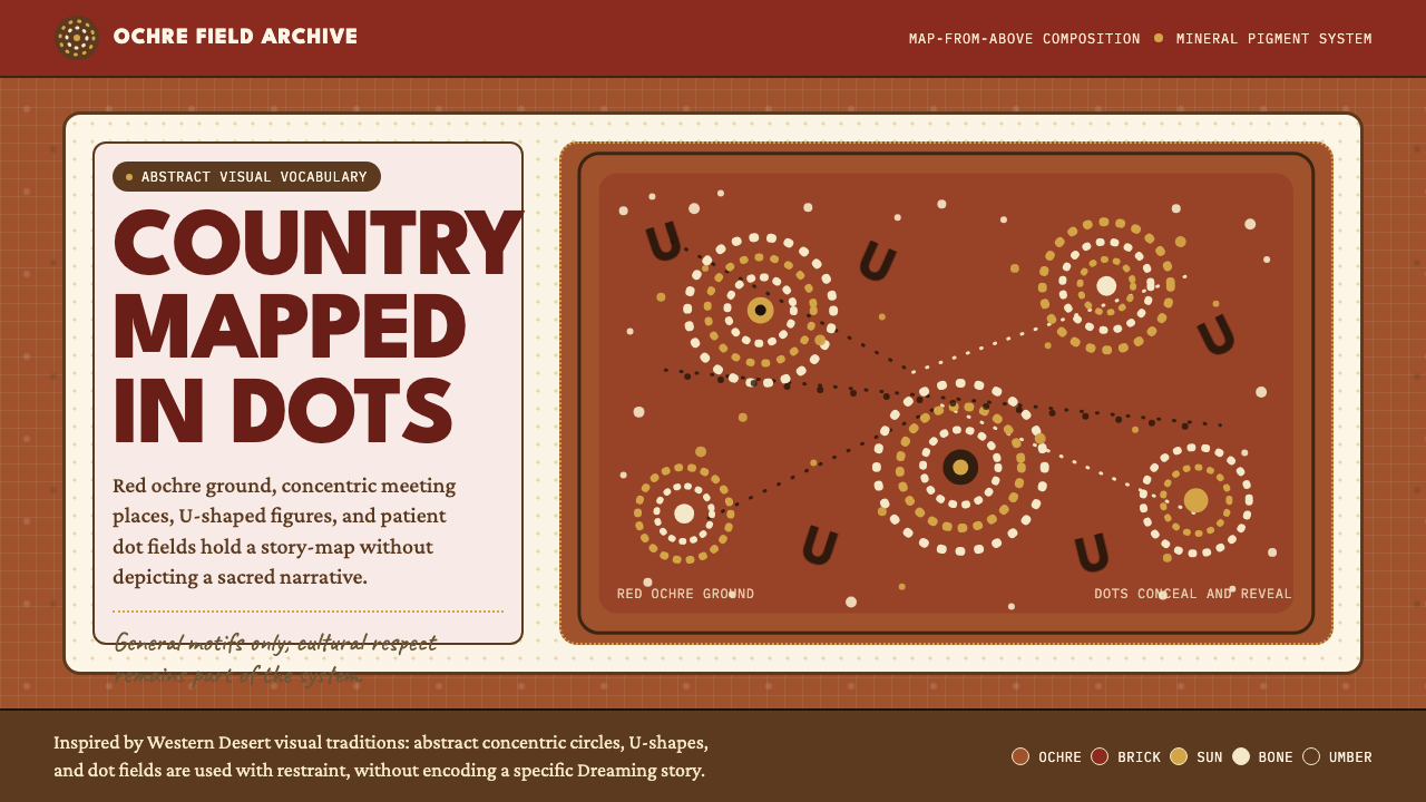 Aboriginal Dot PaintingAncient story-map energy. Red ochre, bone dots, concentric circles, and U-mar…
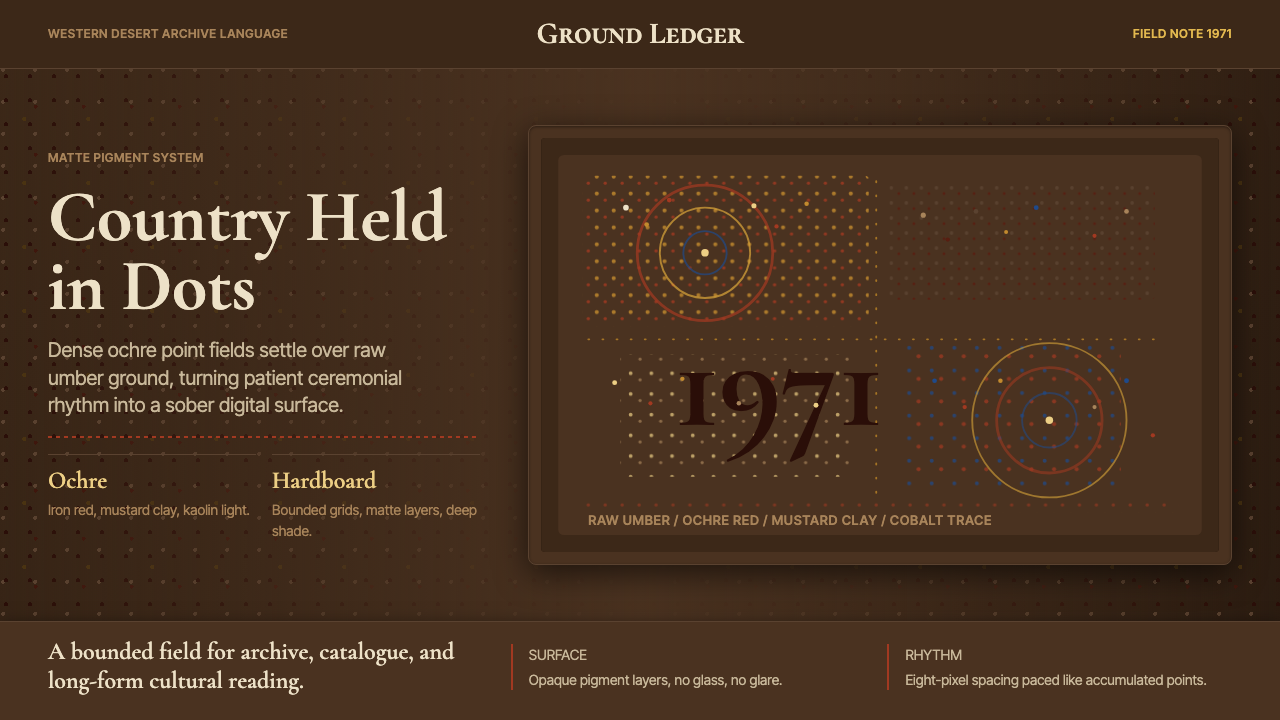 Aboriginal Dot Painting (Papunya 1971)Ochre memory, held steady. Raw umber ground, Cormorant type, disciplined dot-…
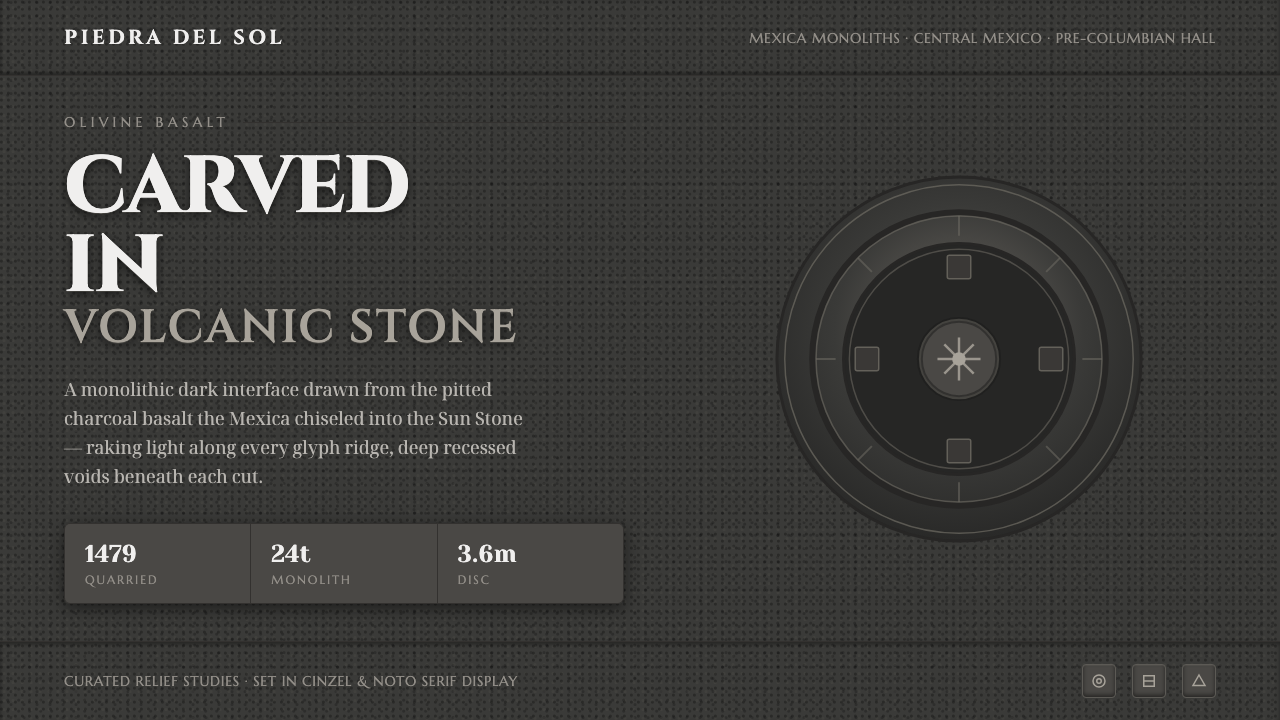 Mexican Volcanic StoneCarved, not floated. Pitted charcoal basalt, raking-light glyph relief, monum…
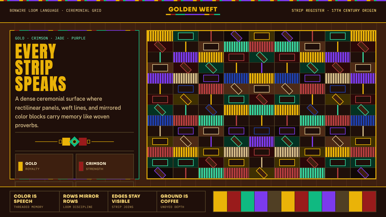 West African Kente ClothWoven authority. Gold, crimson, jade, and purple strips lock into a dense cof…
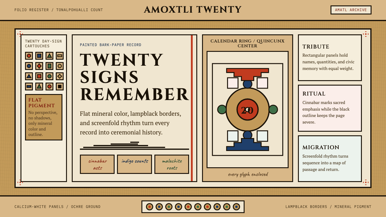 Aztec CodexSacred records stay severe. Ochre amatl ground, Cinzel capitals, black cartou…
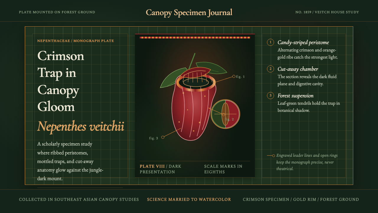 Carnivorous Pitcher PlantBotanical danger glows. Crimson traps and gold rims float on jungle-dark gree…