What is Solar Sail Regatta?
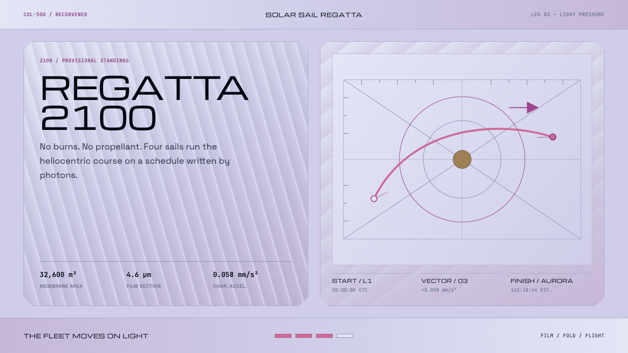
Solar Sail Regatta imagines a race run on sunlight alone: lilac film, team colours borrowed from an interference chart, wide-set class plates, and magenta curves where thrust is only ever the push of light.
Solar Sail Regatta in brief
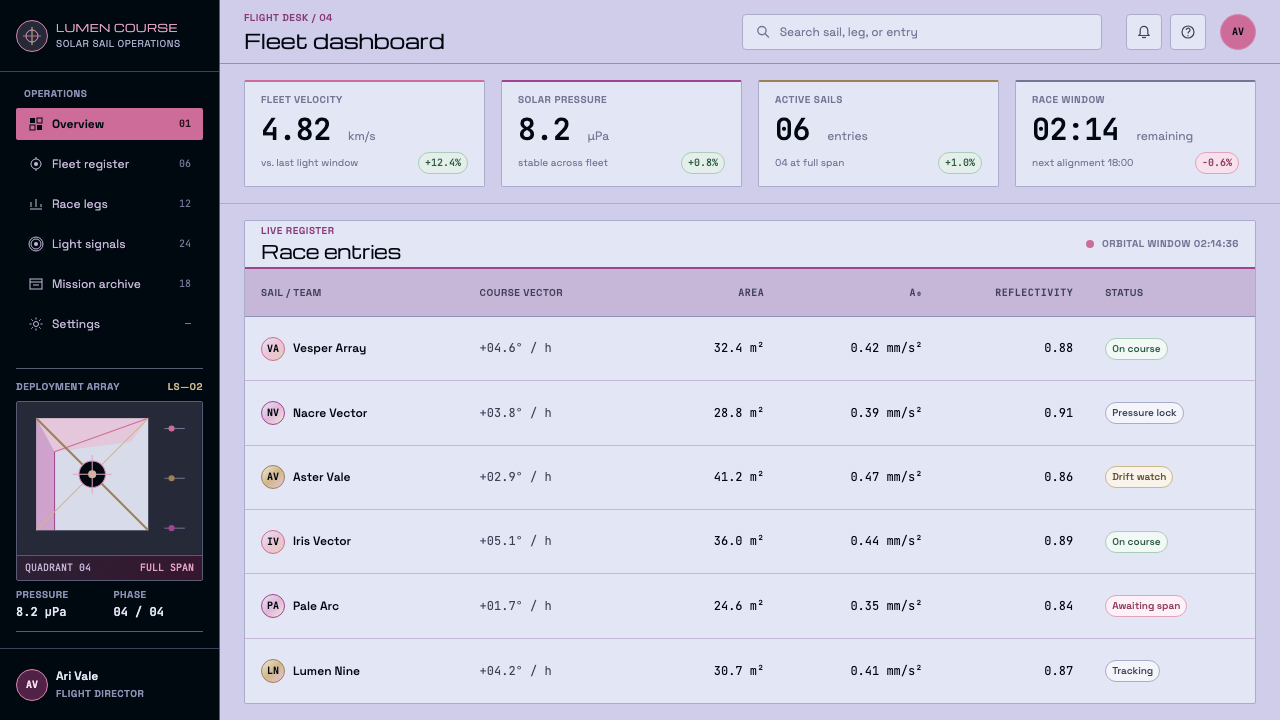
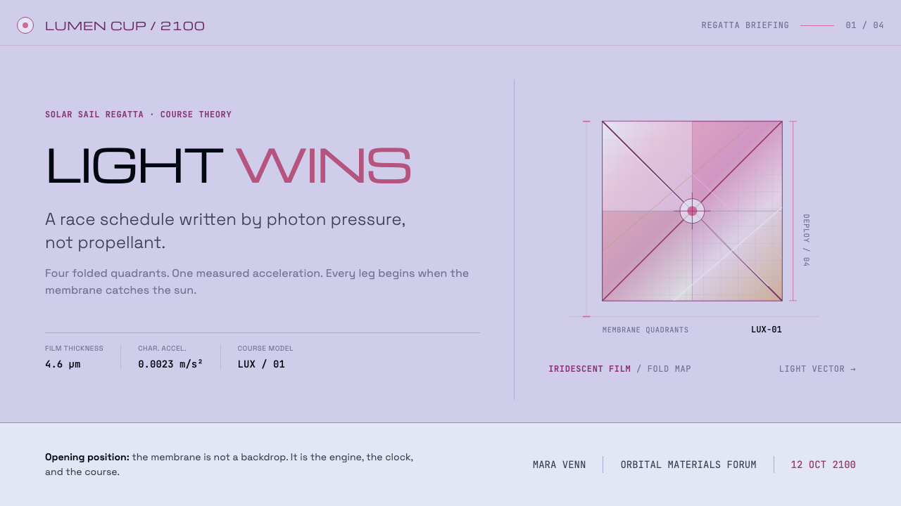
Solar Sail Regatta is a light-ground design system that stages a spaceflight race inside an interface. The premise is a regatta of solar-sail craft, projected to the year 2100, in which every vessel is pushed by the pressure of sunlight and nothing is ever burned. Its look follows directly from the physical object: a thin aluminised film that photographs silver with a lilac cast, creased along its folds, and shading into pink and magenta wherever the membrane bends.
A solar sail is not a mirror. The source describes it as four microns of aluminised film, and the point is made with care: the colours in this system are observations, not science-fiction atmosphere. The ground is taken from the onboard photographs that LightSail 2 took of its own sail, and the team colours come from Michel-Lévy's interference chart, the reference geologists use to read colour as a measure of thickness and path length. Where the film bends, the optical path changes, and the colour moves with it.
On top of that physical base the system lays the furniture of a race. Class plates for sail classes and standings are set in wide, extended display lettering. A monospaced voice carries sail area, reflectivity and characteristic acceleration. Each leg of the course is plotted as a light-pressure curve rather than a route. The effect is that of a technical programme for a sporting event, with the dry precision of a flight-dynamics report and the formality of a regatta.
Where does Solar Sail Regatta come from?
The regatta has a real precedent. The Columbus 500 Space Sail Cup was approved in 1988 for a start in 1992, the five-hundredth anniversary year of Columbus's voyage. Entries came from eight countries, and the flagship sails were named after the three ships, Niña, Pinta and Santa María. None of them ever flew. The design system keeps the race going on the page: it takes a competition that existed only on paper and gives it a visual world, with the clear understanding that the race is a premise and the precedent is the record of an unflown event.
Behind the imagined race stand real flights. IKAROS, the sail demonstrated in 2010 and associated with Sagamihara in Japan, showed that a sail could be deployed and used in interplanetary space. LightSail 2, flown in 2019 and associated with Pasadena, photographed its own sail from orbit, and those pictures are the images from which this system takes its ground colour. Between the unflown Columbus cup and these working sails, solar sailing moved from a competition on paper to an operating technology, and the regatta is projected forward from there to the year 2100.
Two further strands feed the look. The first is thin-film optics. The pink and magenta banding on a creased sail is an interference effect: when light reflects from a very thin layer, colour depends on thickness and path length, and the same principle is read off in Michel-Lévy's chart. The second is postwar aerospace lettering, the wide, squared-off capitals associated with Aldo Novarese, which in the middle of the twentieth century became shorthand for instruments, technology and space. This system uses the first tradition for its substance, film and light, and the second for its labels, plates and standings.
Taken together, the setting is international rather than national: Pasadena and Sagamihara as the places where sails have been built and flown, and eight competing countries in the original cup. That gives the style a neutral, institutional register, the voice of a sporting federation, a mission programme or an exhibition catalogue, rather than the voice of any single agency or company.
What defines the Solar Sail Regatta look?
Sail-film ground
The page is the film itself: a pale, silvery surface with a lilac cast, soft and slightly cool, as if photographed through the light that bounces off a creased membrane. It is a light ground, not a dark one, and the lightness matters. It lets thin lines and fine tints read clearly, and it keeps the whole system feeling like a document about optics rather than a dramatic picture of space.
Interference-chart team colours
Team livery is taken from Michel-Lévy's interference chart, which means the colours are related to one another by physics rather than picked from a rainbow. They form a family of tints drawn from one scale, each distinct enough to identify a team yet soft enough to sit together on the same page, and related to the pinks and magentas of the sail itself. The effect is varied but never garish.
Magenta light-pressure curves
Each leg of the race is drawn as a curve of light pressure, not as a route on a map. The line is thin and magenta, rising and falling as the sail faces the sun or turns away. This turns charts into the central image of the style: a smooth line is both the course and the data, and a reader learns to see progress as a gradual bend rather than a jump.
Wide-set class plates
Sail classes and standings are named on plates set in wide, extended capitals, in the spirit of postwar aerospace lettering. The letters are squared-off and generously spaced, as if stamped on an instrument panel. Used for labels, headings and rank positions, they give the page its sense of official hardware without needing any ornament at all.
Monospaced data voice
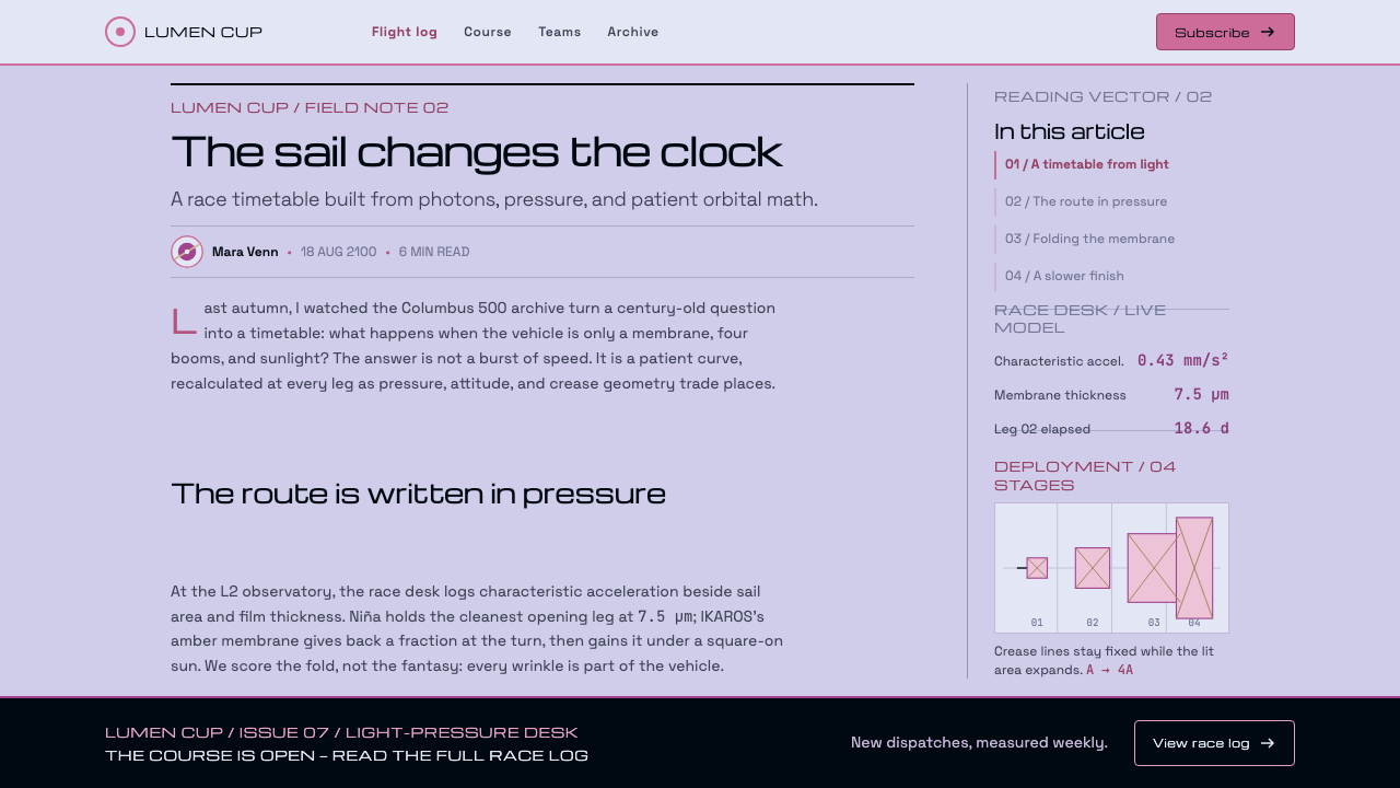
Sail area, reflectivity and characteristic acceleration are set in a monospaced face, so numbers line up in columns and read like instrument output. The contrast between the extended display lettering and the plain, even monospace is deliberate: one is the name of the thing, the other is its measurement. Keeping the two voices apart is part of what makes the style legible.
Fold lines and creases
A sail is folded for launch and unfolds with its creases still visible, and the system keeps this as structure. Thin dividing lines and subtle changes of tint mark the boundaries between regions of a page the way fold lines mark panels of film. Bands of pink and magenta appear where the surface turns, and only there, so colour always signals a change in the underlying material.
No burns
The sentence 'no burns' is a design rule as much as a premise. There is no flame, no glowing thruster, no harsh flash. Change comes slowly and smoothly: curves bend, tints drift, positions shift in small steps, like acceleration measured over days. The style rewards patience and precision over drama, and any effect that suggests combustion is out of place.
Who shaped Solar Sail Regatta?
Friedman is associated with the Pasadena side of the story and with long advocacy of solar sailing. He co-founded the Pasadena-based Planetary Society, whose LightSail 2 flew in 2019 and supplied the photographs behind this system's ground colour. His name anchors the idea that a sail race could be a public enterprise and not only a laboratory demonstration.
Mori is associated with Sagamihara and with IKAROS, the sail demonstrated in 2010. IKAROS is the other real anchor for the regatta: a sail that actually unfolded in interplanetary space and was used for flight. His name represents the Japanese half of the system's international setting, alongside the American one in Pasadena.
Novarese is the type designer whose name the source ties to postwar aerospace lettering, the wide, squared-off capitals that came to stand for instruments, technology and space. In this system his tradition supplies the look of the class plates and standings. He is a good example of how a typographic style can carry a whole era's ideas about the future.
Michel-Lévy is the French geologist whose interference chart is used to read the colours of thin crystal sections under polarised light. The source takes the team livery from his chart. Through him, the colours in this system are not arbitrary choices but a borrowed scientific scale, and the same chart explains why a bending sail shifts from silver through pink to magenta.
How do you use Solar Sail Regatta today?
Solar Sail Regatta suits work that wants precision without darkness: science, aerospace, research and engineering subjects presented in a light, calm, instrument-like way. Its strengths are leaderboards, curves and measured numbers, and it works well wherever a collection of competitors, versions or experiments must be compared fairly.
On slides, make the cover a clean sail-film field with one wide-set title plate and a single magenta curve crossing the page. Content slides can follow the regatta format: a class plate for each section, monospaced figures for the measurements, and thin fold lines between regions. Data slides are the style's natural home, because the light-pressure curve is already a chart; line charts with a few team-coloured series, and tables that read like standings, need very little additional decoration.
In web interfaces, the style suits dashboards, benchmark leaderboards, experiment trackers and research tools. Rank positions can sit on wide plates, metrics in monospace, and the main trend as a magenta line over a pale ground. Pricing pages can name plans like sail classes and compare them in a plain table; the clarity comes from the numbers lining up. Colours from the team family should identify categories consistently, and motion should be gentle, with curves drawing and tints easing rather than snapping.
In editorial and marketing work, the style fits explainers about space, optics and propulsion, mission programmes, event pages for competitions and exhibitions, and anything about long timelines and slow progress. The regatta premise is an easy narrative frame: classes, legs, standings. It works best with a factual tone that treats the unflown cup, IKAROS and LightSail 2 as real history, with the fictional 2100 race clearly presented as a premise.
The most common mistake is to flip the style to a black, starry, neon science-fiction look. That throws away the thing that makes it distinctive: the light, lilac, film-like ground and its quiet interference colours. A second mistake is to add flames, glows or motion trails, which contradict the rule that nothing burns. A third is to turn the pink-to-magenta banding into a loud rainbow gradient; the colour should appear only where the film bends, and in small, controlled amounts.
Solar Sail Regatta — FAQ
Is a solar sail really a mirror?
No. The source describes it as a few microns of aluminised film, thin enough to crease along its fold lines and to show colour wherever it bends. It photographs silver with a lilac cast rather than as a bright mirror. That fact is the foundation of the system's palette: the ground comes from LightSail 2's own photographs, and the pinks and magentas come from interference where the membrane curves.
Did the Columbus 500 Space Sail Cup ever take place?
No. It was approved in 1988 for a start in 1992 and was entered by eight countries, with the flagship sails named Niña, Pinta and Santa María. None of the sails flew. The regatta in this design system continues that unflown race into an imagined future, set around the year 2100, and it should be described as a premise rather than as a historical event.
Why is the ground light rather than space-black?
Because the colours come from the sail, not from the sky. The ground is taken from photographs of the sail film itself, which is pale and silvery with a lilac tint. A light ground also fits the style's role as a precise technical document, where thin lines, small tints and monospaced numbers need to be read easily. A black version would be a different, more cinematic style.
What does 'no burns' mean for animation and effects?
It means nothing in the interface should look like combustion. Avoid flames, glows, bursts and trails. Motion should be slow and continuous: curves drawing themselves, tints easing from one value to another, positions shifting gradually. The idea comes from the physics of light pressure, where thrust is tiny but steady, and the animation should feel the same way.
Can I use the style for a purely fictional space product?
Yes, but keep the grounding. The system works because its colours, labels and curves have physical reasons behind them. A fictional product can use the regatta structure of classes, legs and standings, but if it drops the lilac film ground, the interference tints and the monospaced measurements, it will stop looking like this style and start looking like generic space decoration.
Related design styles
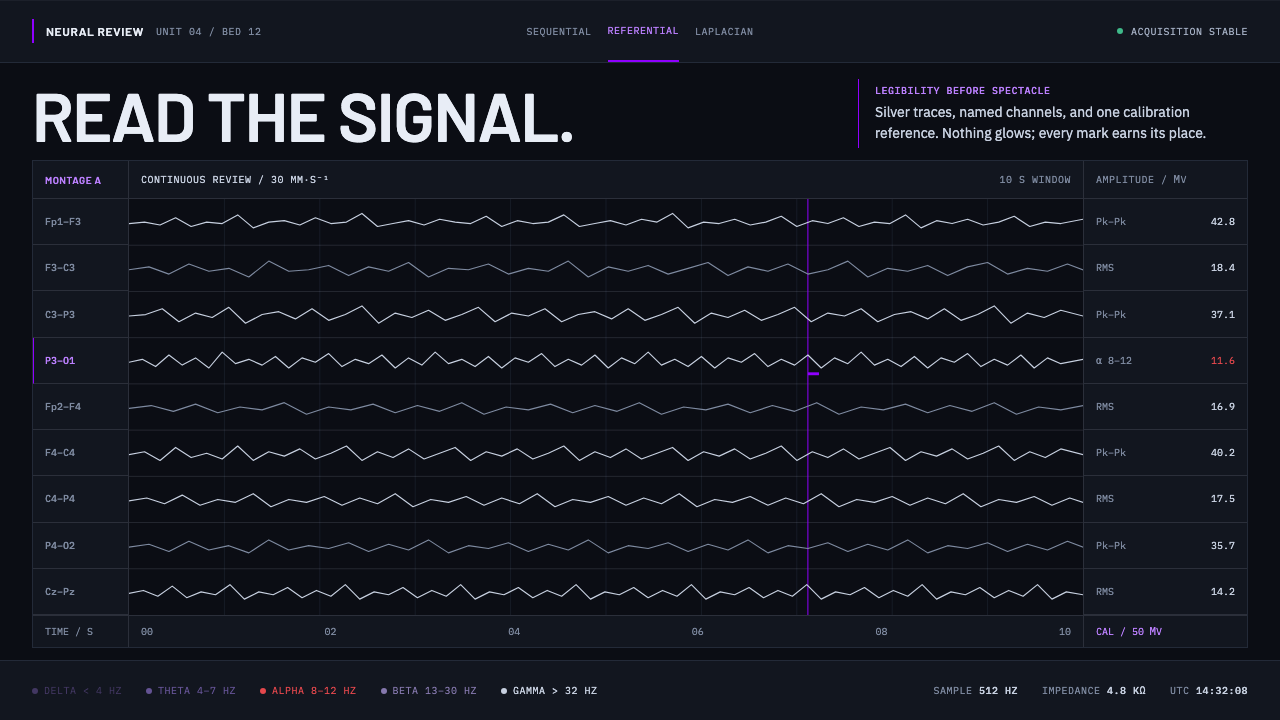 Neural Interface ClinicalClinical restraint makes signals legible. Silver traces cross near-black; vio…
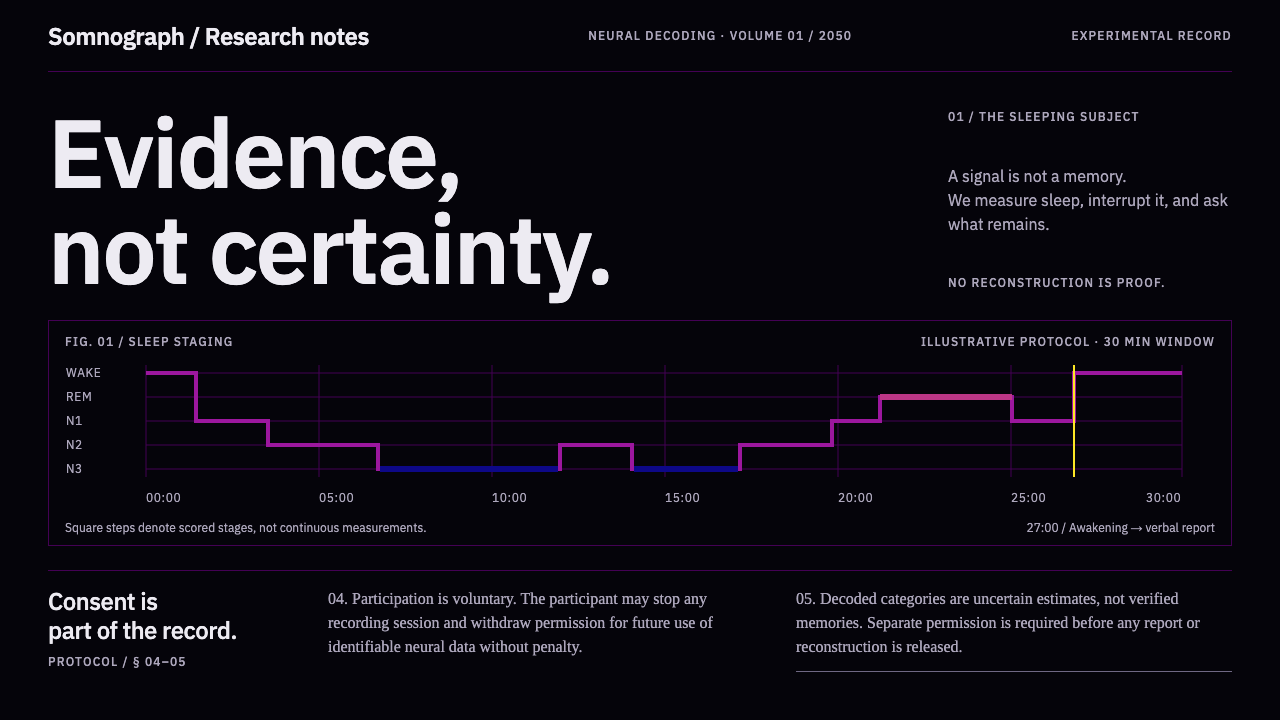 Dream Recording LabEvidence, not certainty. Plasma sleep-stage traces on black; consent stays fu…
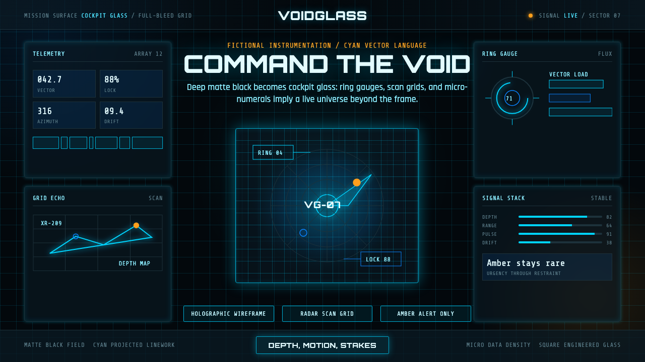 FUI Sci-Fi HUDBlack until it glows. Cyan wireframes, ring gauges, and radar grids sell live…
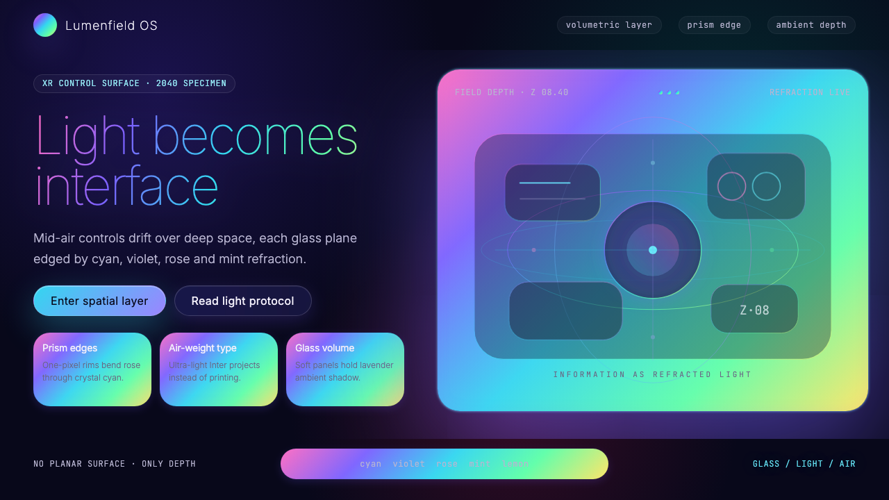 Holographic UI 2040Information made of light. Deep-space black, ultra-light Inter and prismatic…
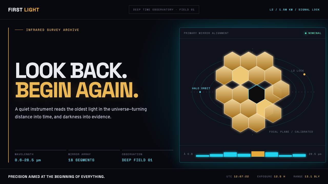 James Webb Telescope (2022)Precision meets deep time. Mirror gold hexagons and cyan telemetry glow acros…
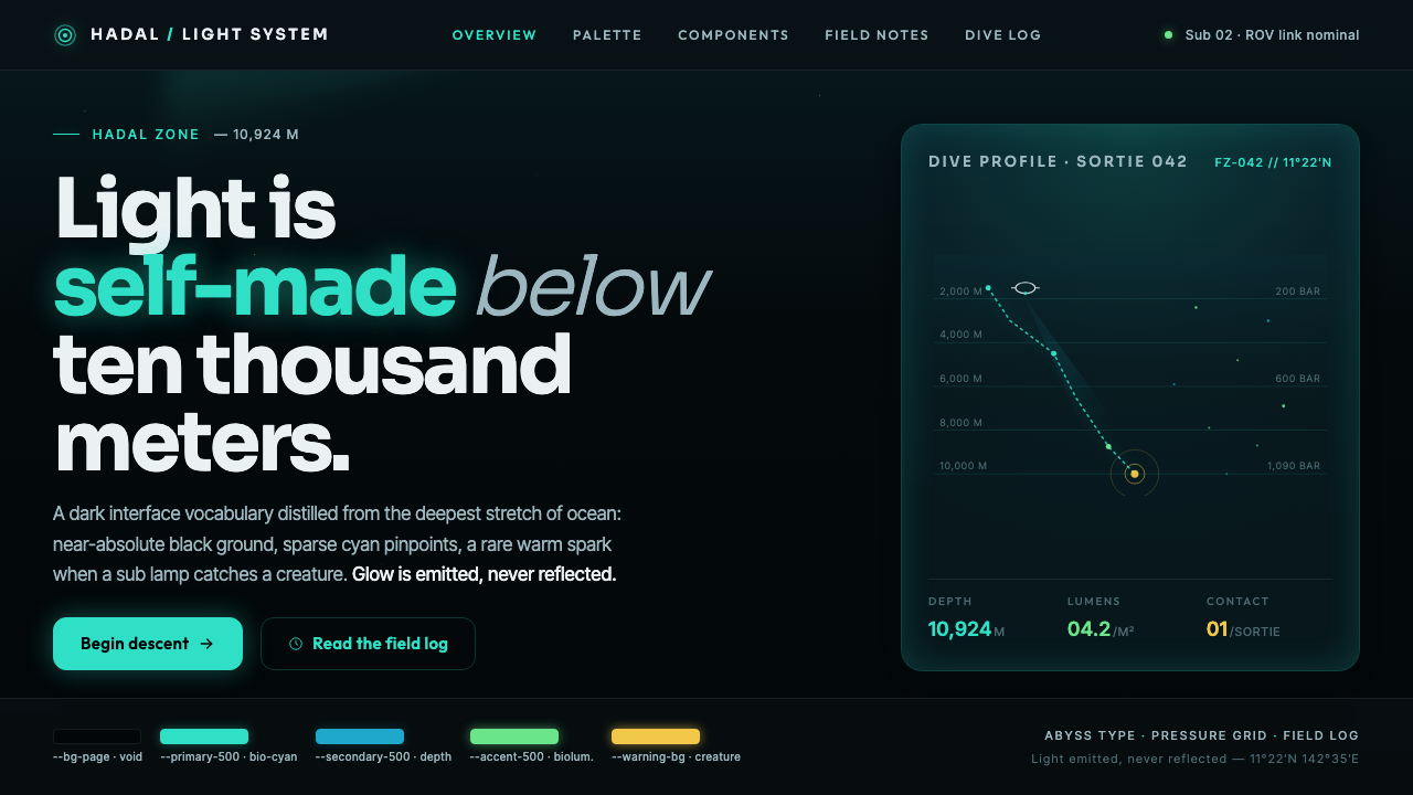 Mariana TrenchLight is self-made below ten thousand meters. Hadal-black ground, cyan pinpoi…