What is Skype?
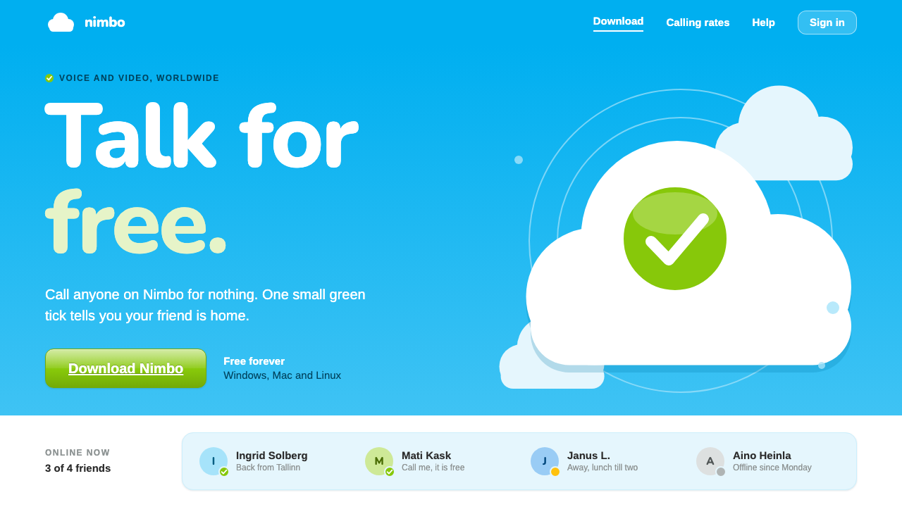
Skype made free calls over the internet feel ordinary, and its look did half the persuading: a cyan sky, clouds built from circles, and a green tick that only ever meant a friend was there.
Skype in brief
The Skype style is the visual identity of the mid-2000s consumer internet-telephony boom, as it appeared on skype.com and in the Windows contact-list client between roughly 2005 and 2008. Its signature is a bright cyan band across the top of an otherwise white page, with soft clouds drifting inside it and a hand-lettered, rounded 'S' set into the largest cloud like a logo stamped on the sky.
Everything about it is built to lower anxiety. Telephony over a computer was, in the early years, a strange idea for ordinary people: was it safe, was it really free, would it work on a bad connection? The design answers with friendliness. Corners are rounded, buttons are plump and glossy, panels are a pale, calm blue, and the type is a clean humanist sans that never raises its voice. The cloud motif signals that the service lives somewhere out there, light and weightless, rather than inside a box on your desk.
Color is used with unusual discipline. Cyan carries the brand and the hero areas. Pale blue holds information. White gives breathing room. Green is reserved almost entirely for status and action: online, connected, free, go. Because green never decorates, it never has to be decoded; when a viewer sees it, it means something is available right now. That single-purpose use of one hue is the system's most transferable idea.

Where does Skype come from?
Skype was launched in August 2003, the work of Niklas Zennström and Janus Friis together with a team of engineers in Tallinn, among them Ahti Heinla and Jaan Tallinn. The founders came from Nordic backgrounds, with the company's roots spread across Stockholm, Copenhagen and Tallinn, and the Estonian engineering team supplied the peer-to-peer technology that made the product possible. Instead of routing every call through expensive central switches, the software let users' own computers carry the conversation, which is why calls between two Skype users could be free.
That technical idea shaped the brand. A product whose pitch was 'talk to anyone, anywhere, for nothing' needed a face that felt like a favour, not a utility. Early software in this category looked like engineering tools, gray and dense. Skype went the other way and borrowed the language of the friendly consumer web: rounded shapes, bright sky colors, and a logo that looked like a cloud rather than a circuit. The result sat comfortably alongside the wider Web 2.0 mood of the period, when sites wanted to feel approachable, a little glossy, and personal.
The most visible stage of the look is the skype.com redesigns of 2005 and 2008. The earlier page leaned on a big cyan hero with a prominent download button; the later one refined the same ingredients with cleaner spacing and a more polished sheen. In parallel, the Windows client developed its own interface identity: a contact list where each row held a name, a short mood message and a small status icon, with a green tick for online. The client was where most people actually lived with Skype, and its small, glanceable status vocabulary became as recognizable as the website's sky.
Seen as a design movement, Skype belongs at the meeting point of three currents: peer-to-peer internet telephony as a technology, Web 2.0 consumer software as a visual mood, and friendly rounded tech branding as a tone of voice. It is a nostalgic reference now, and that nostalgia is precisely its use. It recalls an era when connecting with someone far away still felt like a small miracle worth celebrating, and when interfaces were allowed to be warm about it.
What defines the Skype look?
Cyan sky band
A wide, bright cyan band runs across the top of the page and acts as the hero. It is saturated enough to own the brand but light enough to feel like daytime, and it contrasts cleanly with the white page beneath. Large headlines and the main download button sit inside it, so the first screen reads as one confident gesture.
Clouds from overlapping circles
Clouds are constructed from simple overlapping circles rather than drawn freehand, giving them a tidy, toy-like geometry. They are pale and slightly translucent, drifting in the hero as decoration that never competes with the text. The logo itself follows the same logic, with a rounded hand-lettered S nested in a cloud shape.
Pale blue information panels
Supporting content lives in calm, pale blue panels with soft rounded corners. They separate explanation from action without resorting to heavy borders, and they keep the page feeling airy. Text inside stays dark and legible, and the blue is chosen to sit in the same family as the cyan hero rather than fight it.
Green means go
Green appears only when it carries meaning: a friend is online, a call is connected, a service is free. It is never used as decoration or as a second brand color. This strict single-purpose rule makes status instantly readable and gives the small green tick its famous authority in the contact list.
Glossy rounded buttons
Buttons are plump, rounded and carry the period's soft top highlight, as if made of glazed plastic. The finish signals tappability and warmth in an era before flat design. Dial-pad keys follow the same treatment, so the whole interface feels like one family of friendly, pressable objects.
Contact-list rhythm
In the client, each contact is one row: a small status icon, a name, and a short mood message in lighter text. Rows are evenly spaced and quietly striped by whitespace, so a long list scans fast. The pattern turns presence into a glanceable column, which is the heart of the whole product.
Friendly humanist type
Typography is a clean, open sans-serif with generous letterforms, set in sentence case and medium sizes. Headlines are bold but not shouting, and body copy is relaxed. The voice matches the visuals: conversational, reassuring, never technical for its own sake.

Who shaped Skype?
Co-founder of Skype, who with Janus Friis turned peer-to-peer technology into a free calling service for ordinary people.
Co-founder alongside Zennström, part of the Nordic duo whose company roots stretched across Stockholm and Copenhagen.
A Tallinn engineer on the founding team whose work helped deliver the peer-to-peer technology behind the calls.
Another member of the Tallinn engineering team that built the software at the heart of the early service.
How do you use Skype today?
For slides, the Skype style works best on a cover or section opener, where a full-width cyan band can carry the title while a few pale circles suggest clouds. Keep the lower page white and let a single rounded button or badge hold the call to action. Content slides should stay light: white ground, pale blue panels for callouts, dark text, and plenty of breathing room. It suits decks about communication, community, remote work or anything meant to feel welcoming rather than corporate.
For data slides, use the pale blue family for charts and reserve green strictly for the one thing that means good, live or available. A status table with small green ticks for active items and neutral gray for the rest reads at once. Avoid adding a third or fourth accent color; the system's authority comes from how few colors it uses and how consistently each one keeps its job.
In web and app interfaces, the style is a natural fit for messaging, calling, contact lists, presence indicators, onboarding screens and download pages. A cyan hero with a prominent primary button, followed by white sections and pale blue info panels, gives a landing page a clear hierarchy. Dashboards can borrow the contact-list rhythm for team availability, with rows of name, short status line and a green indicator. Pricing and plan pages benefit from rounded cards and the single green for free tiers.
For editorial and marketing work, lean into the nostalgia with intent. Posters, newsletters and social graphics that reference the mid-2000s internet can use the cloud-and-sky motif, the glossy button and a friendly voice to evoke early online togetherness. Pair short, warm copy with generous space, and let the cloud shapes frame a photograph or a short message rather than fill the page.
The most common mistake is to spend green freely. If green decorates headings, backgrounds or secondary buttons, the tick loses its meaning and the interface becomes noisy. The second mistake is to over-polish: adding heavy shadows, many gradients and busy textures turns the gentle gloss into clutter. Keep the highlight light, the clouds simple and the white space generous, and the warmth will come through on its own.

Skype — FAQ
What is the Skype design style?
It is the look of skype.com and the Windows client from around 2005 to 2008: a bright cyan hero band on a white page, clouds made of overlapping circles, pale blue info panels, glossy rounded buttons, and a green tick used only to mean online or connected.
Why is green used so rarely in this style?
Green is reserved for meaning. It marks that a friend is online, a call is live or something is free. Because it never decorates, the viewer learns to read it as a signal, and it stays instantly legible even in a long contact list.
Where does the look come from?
It grew from the launch of Skype in August 2003 and the Web 2.0 consumer-software mood of the mid-2000s. Its founders, Niklas Zennström and Janus Friis, worked with a Tallinn engineering team, and the brand adopted friendly rounded tech styling to make peer-to-peer calling feel safe and ordinary.
What kinds of products suit the Skype style?
Messaging and calling tools, community and contact-list interfaces, onboarding and download pages, and nostalgic marketing that wants to recall the early social internet. It suits anything that should feel welcoming, clean and a little warm rather than formal.
How do I avoid making it look dated in a bad way?
Keep the gloss subtle, the clouds simple and the white space generous. Use cyan for hero areas, pale blue for panels and green strictly for status. Modern spacing and clean type next to the nostalgic motifs make it read as a deliberate homage rather than an old page left behind.
Related design styles
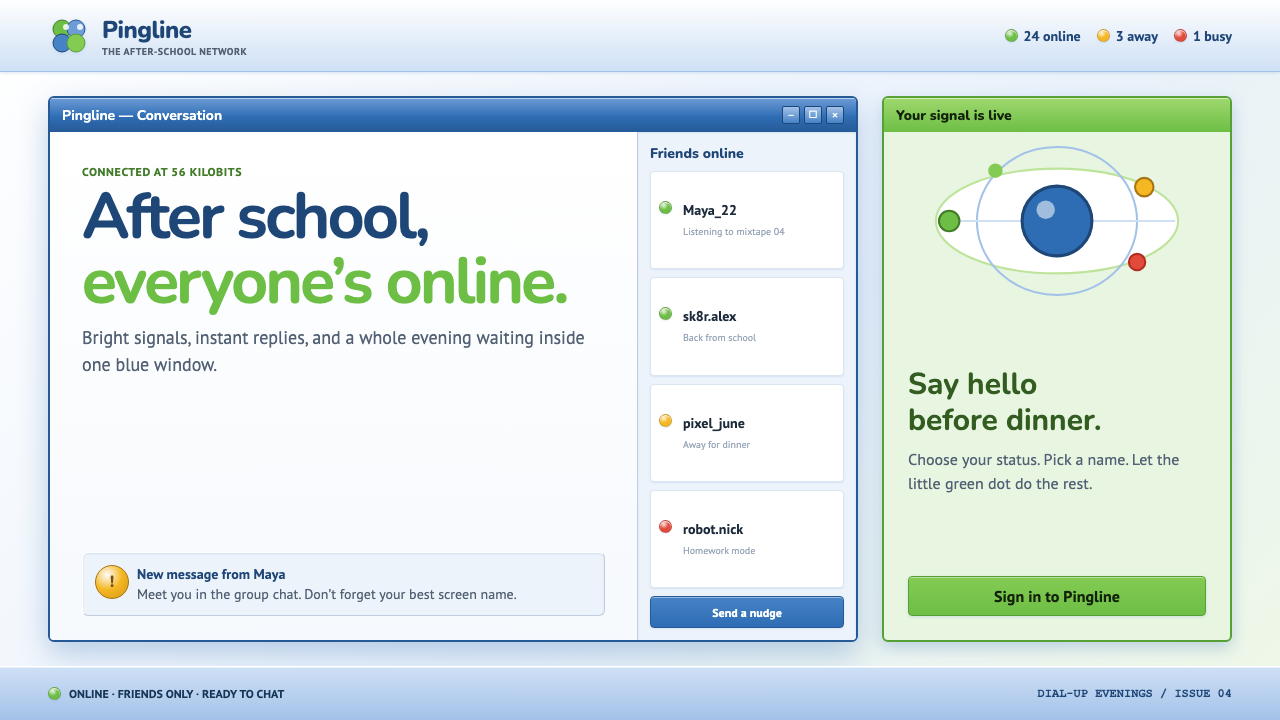 MSN Messenger (2001)Dial-up optimism, online. Luna-blue chrome and bright status dots keep every…
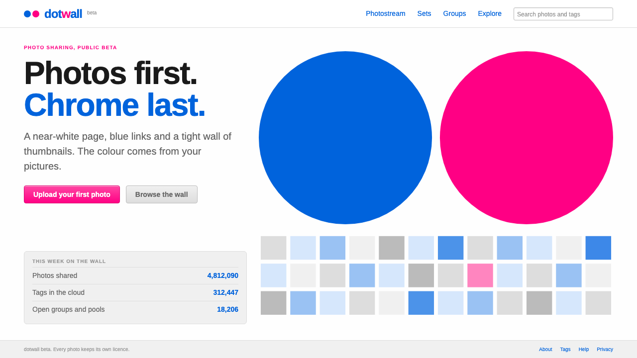 FlickrPhotos first, chrome last. Near-white page, blue Arial links and a blue dot b…
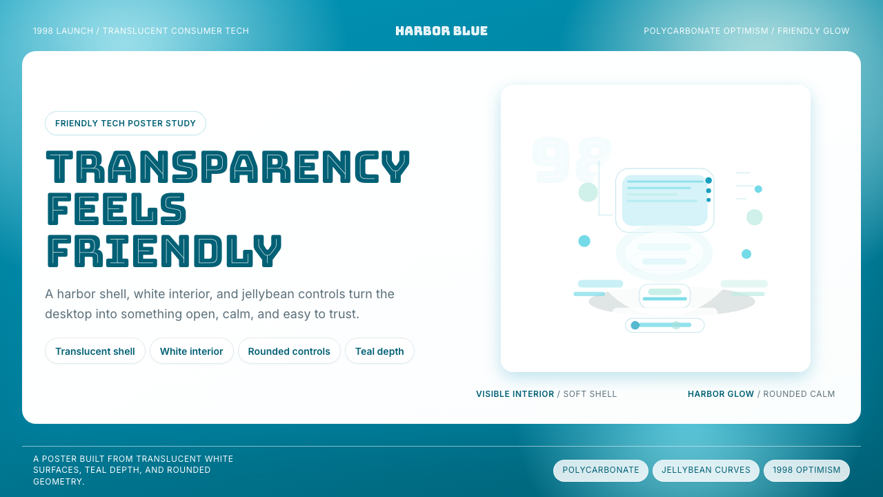 iMac G3 Bondi Blue (1998)Transparency feels friendly. Bondi blue, white glass, and pill curves set the…
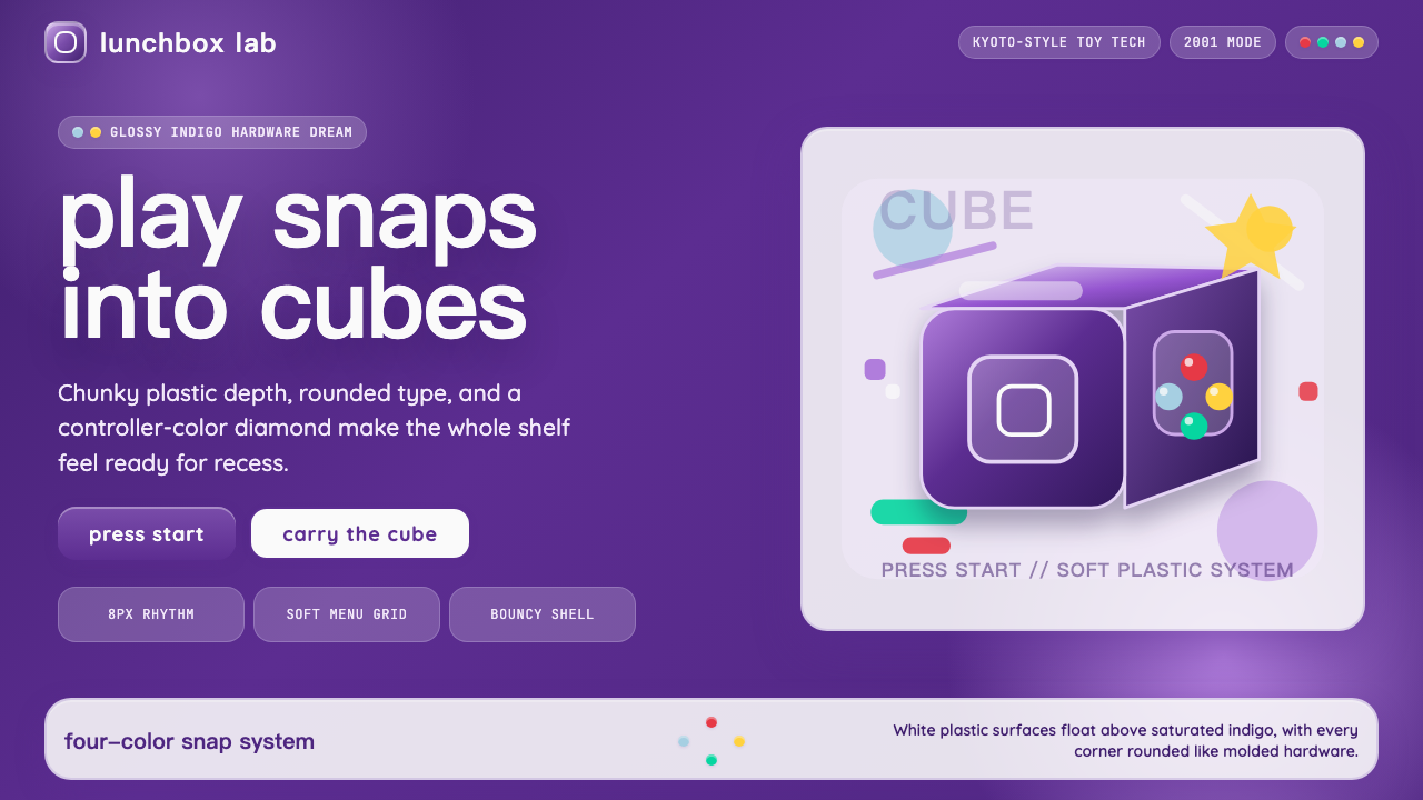 Nintendo GameCube (2001)Toy-tech refuses restraint. Indigo plastic, glossy cubes, and four-color butt…
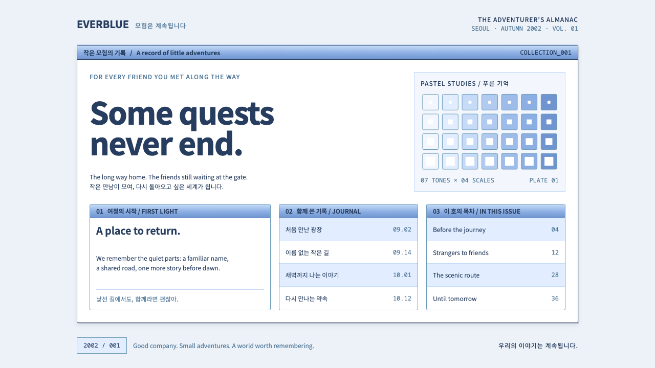 Ragnarok OnlineSmall adventures, lasting warmth. Periwinkle chrome, navy hairlines and dense…
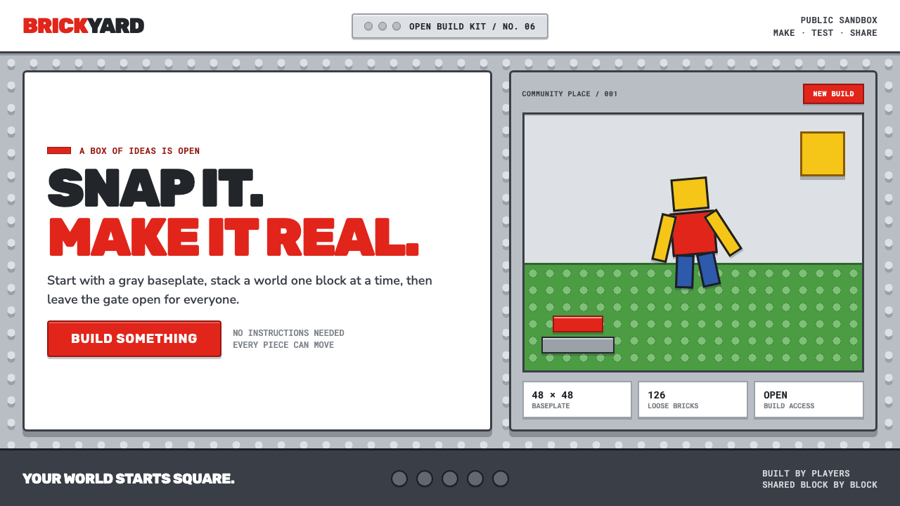 Roblox (2006)Play begins with a click. Fire-engine red cuts through a hard-edged gray stud…