About Skype
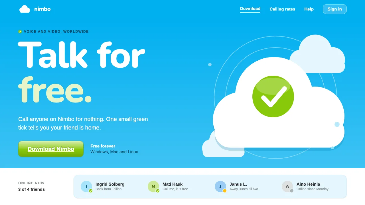
Skype made free calls over the internet feel ordinary. Its look did a lot of that work: a soft hand-lettered "S" inside a cyan cloud, a bright cyan band across the top of a white page, and a contact list where a small green tick meant a friend was online.
This system rebuilds the 2005–2008 skype.com and the Windows client from that period. It uses cyan heroes, pale-blue info panels, clouds made from overlapping circles, glossy rounded buttons and a green that only appears when it means "go".
- Origin
- Nordic and Baltic (Stockholm, Copenhagen, Tallinn)
- Era
- Launched August 2003; skype.com redesigns of 2005 and 2008 and the mid-2000s Windows contact-list client
- Key figures
- Niklas Zennström · Janus Friis · Ahti Heinla · Jaan Tallinn
- Movements
- Peer-to-peer internet telephony · Web 2.0 consumer software · Friendly rounded tech branding
Skype design spec
Colors
Background
Surface
Primary
Secondary
Accent
Text
Typography
ArimoHeadings
ui-monospaceMono
Unlock for 1 credit
The other 11 sections — buttons, cards, spacing, motion, techniques and more — open once you unlock. Download the DESIGN.md or send it to your AI in one click. Unlock once, yours forever.
Sign up nowHave an account? Sign in
Styles similar to Skype
Also inspired by brands & products, with a close feel.
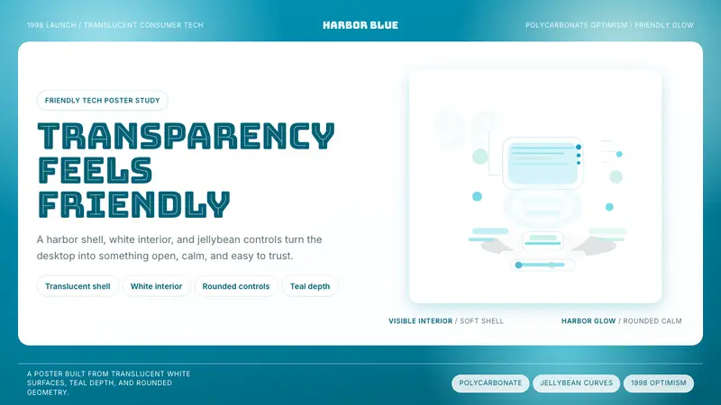 iMac G3 Bondi Blue (1998)Transparency feels friendly. Bondi blue, white glass, and pill curves set the tone.
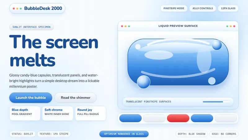 Y2K Aqua 2000Optimism looks lickable. Candy-blue pills, pinstripes, and glass panels gleam in Y2K depth.
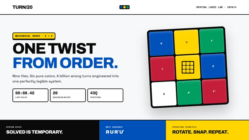 Rubik's Cube (1974)One twist from order. Six pure colors snap into a black-guttered 3×3 grid.
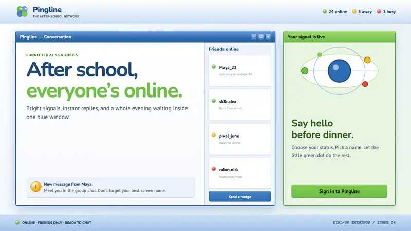 MSN Messenger (2001)Dial-up optimism, online. Luna-blue chrome and bright status dots keep every chat buzzing.