What is Flickr?
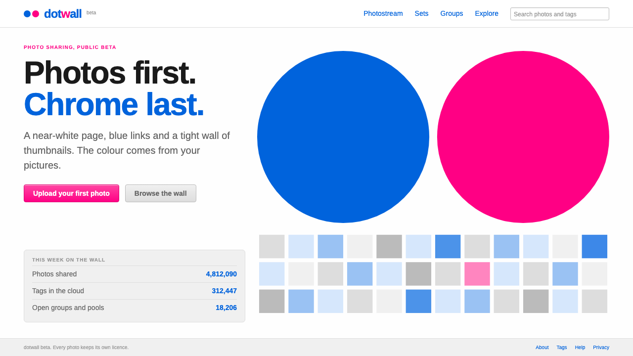
Flickr let the photographs be the loudest thing on the page: a near-white canvas, plain blue links, and a brand reduced to one blue dot beside one pink dot.
Flickr in brief
Flickr's early look is a study in how little a product needs to say about itself. The page is nearly white. Links are blue and set in an Arial-style sans serif. Photographs appear as small thumbnails in tidy grids, and the interface surrounding them is built from pale grey panels, thin rules and short text labels. The brand is two circles, one blue and one pink, paired with a lowercase wordmark that includes a pink r.
This was the visual world of Web 2.0 social software in its early years, and Flickr was one of its defining examples. The site carried a small beta tag for much of its first stretch, and the interface looked appropriately provisional: friendly, practical and unpolished in a way that invited participation. The design did not try to make the site feel like a magazine or a gallery. It treated it as a shared shoebox of pictures, tagged and organized by the people who uploaded them.
The system reconstructed from that era keeps its discipline. Pink is rationed to the logo moment and the single action that matters most. Blue carries every link and everyday button. Grey panels hold the metadata, captions and controls so that the photographs, which provide all the real color on any page, stay the loudest element. It is a style built around deference to user content.

Where does Flickr come from?
Flickr launched in February 2004. It grew out of Ludicorp, a small company based in Vancouver, British Columbia, and was shaped by two of its founders, Stewart Butterfield and Caterina Fake. Yahoo acquired it a year later, and the product continued to develop within that larger company, with its base then moving to Sunnyvale, California. The look discussed here comes from the gamma and beta years between 2004 and 2007, and is anchored on the 2006 stylesheet that gave the site its settled appearance.
Several ideas were running through the site at once. One was social software: photographs were not just stored but shared, commented on and collected into groups, so the interface had to make other people's contributions easy to find. Another was folksonomy, the practice of letting users label content with free-form tags instead of relying on a fixed taxonomy. The tag cloud, in which popular words appear in a larger type size, became one of the most recognizable interface patterns of the period and fit Flickr's visual restraint exactly, since it needed no icons or illustrations.
A third idea was openness. Flickr was a prominent early home for Creative Commons photo sharing, and its pages made licensing visible without ceremony. This sat naturally with the plain visual style: if the point of a site is the free circulation of photographs, the interface should not compete with them for attention.
The brand marks reflect the same modesty. A blue dot and a pink dot, side by side, is among the smallest logos any major web service has carried. It is friendly rather than corporate, and it gave designers a simple rule for using color: let the dots set the two brand accents, and let everything else step back. That rule is what the later system distills.
What defines the Flickr look?
Color
The page ground is near white, with pale grey panels for secondary content. Blue is the working color: every link, every everyday button, every interactive hint. Pink is the rare exception, held back for the logo and the one call to action that matters most. Photographs bring the saturated color, so the interface deliberately supplies almost none of its own.
Typography
Text is set in an Arial-style sans serif, with blue underlined links and modest sizes. The one expressive typographic element is the tag cloud, in which more popular tags appear larger. The logo wordmark is lowercase and rounded, with a pink r, and does not dominate any page. There are no decorative faces and no heavy display type.
Thumbnail grids
Photographs are organized into tidy grids of small thumbnails, often square-cropped, with a short caption or count beneath. The grid is the main layout device. It gives every photograph a similar footprint and lets visitors scan hundreds of pictures quickly, so the page works as a contact sheet rather than a magazine spread.
Panels and metadata
Secondary information such as titles, dates, tags, comments and view counts sits in pale grey panels or thin ruled sections. These panels are designed to be quiet. They organize information without creating a strong visual box, so that the photograph above them remains the center of attention.
Tag clouds
Tags are shown as a cloud of links in varying sizes. This is both a navigation tool and a visual signature of the Web 2.0 era. It communicates that content has been organized by the community, not by an editor, and it does so using nothing more than text size and blue links.
Tone
Friendly, plain and provisional. Copy is short, buttons say what they do, and the occasional beta label admits that the product is still growing. The tone invites contribution rather than admiration, which is why the whole system feels more like a shared workspace than a publication.

Who shaped Flickr?
Butterfield was one of the people behind Ludicorp and Flickr. His involvement ties the site's look to its origins in a small Vancouver company, where a product that began as part of a game-oriented project turned into a photo-sharing service that shaped how people thought about social software.
Fake was a co-founder of Flickr and, with Butterfield, a central figure in establishing its community-first character. The site's emphasis on tags, groups and sharing reflects the philosophy of social software that she and her colleagues championed, and which is visible in every plain, welcoming interface decision.
The Vancouver company that built Flickr before Yahoo acquired it. Its small scale explains much of the look: a modest team shipped a modest, practical interface, and the restraint became the identity rather than a limitation.
How do you use Flickr today?
On slides, the style works best for photo-led presentations. Use a white or near-white background, let a single image fill most of the slide, and add a short caption in a small blue or grey sans serif. A cover can be as simple as a lowercase wordmark and a pair of blue and pink dots. For content slides, use grey panels for notes and keep the images in tidy grids, much as a contact sheet would.
In web interfaces, it suits photo galleries, portfolios, community platforms, personal archives and any product where user-generated content is the main attraction. Use blue links and everyday buttons, reserve pink for the key action, such as upload or publish, and keep panels pale so that thumbnails stand out. For dashboards, a grey-paneled layout with a blue accent and a text-size-based visualization, such as a tag cloud, keeps the feel without adding visual weight.
In editorial and marketing work, the style gives a warm, early-web feel that works well for community-focused announcements, nostalgic campaigns and anything that wants to say that users are the stars. A newsletter or landing page can borrow the grid of thumbnails, the blue-and-pink dot motif and the small, modest labels to signal friendliness without gloss.
The most common mistake is using the pink everywhere. The whole logic of the style depends on pink being rare, so turning every button or heading pink removes its signal value and makes the page look like a different brand. A second mistake is letting the interface compete with the photographs: drop shadows, gradients, bold banners and large decorative icons all work against the idea of deference. A third is making it too clean: a little provisional charm, such as a small beta label, is part of the tone.
As a practical rule, check each screen against a simple question: is the content the loudest thing here? If a photograph or a user's own work is not the most colorful element, the chrome is doing too much. The system is at its best when there is almost nothing to notice except the pictures.

Flickr — FAQ
What is the early Flickr design style?
It is the restrained Web 2.0 look of Flickr's early years: a near-white page, blue Arial-style links, grids of small thumbnails, pale grey panels, a tag cloud and a brand made of a blue dot beside a pink dot. Its central idea is that the photographs, not the interface, should supply the color.
When and where was Flickr created?
Flickr launched in February 2004 from Ludicorp in Vancouver, British Columbia, built by a team that included Stewart Butterfield and Caterina Fake. Yahoo acquired it a year later. The look described here comes from the 2004 to 2007 beta years and is anchored on a 2006 stylesheet.
What is a tag cloud and why is it linked to Flickr?
A tag cloud is a set of text links in which more popular tags appear larger. Flickr's use of free-form user tags, sometimes called folksonomy, made the pattern famous. It fits the style perfectly because it communicates community organization using only text size and blue links.
How should pink and blue be used?
Blue is the working color for links and everyday buttons. Pink is rationed to the logo and the single most important call to action. Keeping pink rare is what gives it meaning, and leaving the rest of the page nearly colorless lets photographs be the brightest elements.
What kinds of products suit this style?
Photo galleries, portfolios, community platforms, personal archives, and any product where user content is the main attraction. It also suits projects that want a friendly, early-web character. It is less suited to luxury or highly branded contexts that need strong chrome of their own.
Related design styles
 MSN Messenger (2001)Dial-up optimism, online. Luna-blue chrome and bright status dots keep every…
 Ragnarok OnlineSmall adventures, lasting warmth. Periwinkle chrome, navy hairlines and dense…
 Roblox (2006)Play begins with a click. Fire-engine red cuts through a hard-edged gray stud…
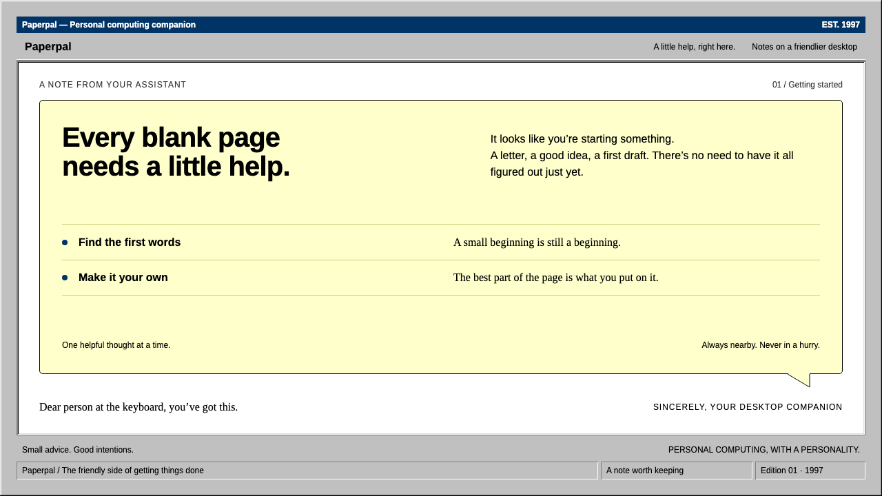 ClippyHelp with a human touch. Pale-yellow balloons, navy trim and hard grey bevels.
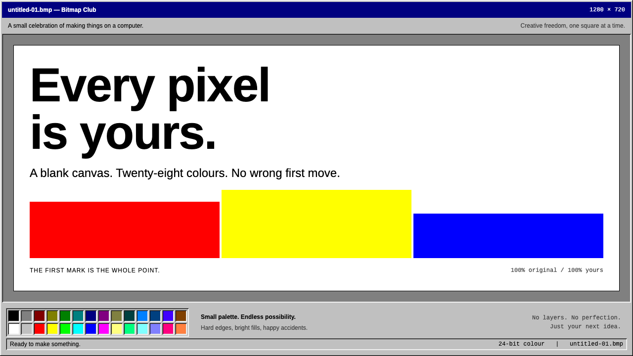 MS PaintFirst-computer freedom. Navy captions, grey bevels and 28 fixed colours frame…
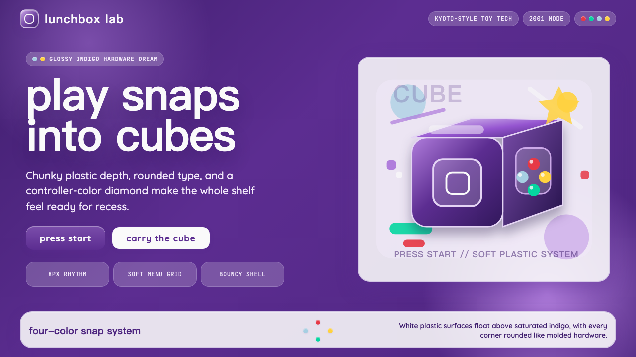 Nintendo GameCube (2001)Toy-tech refuses restraint. Indigo plastic, glossy cubes, and four-color butt…