What is Skeuomorphic iOS?
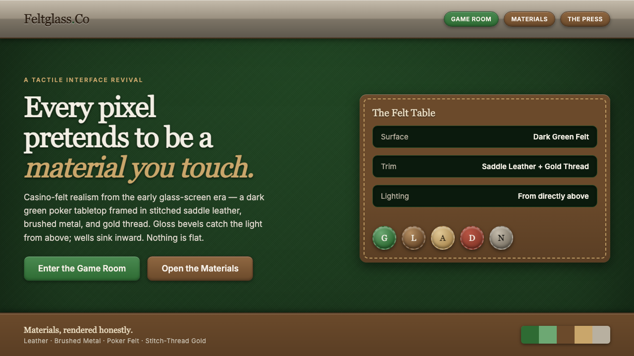
Skeuomorphic iOS made the screen behave like a tabletop of touchable materials: dark green felt, stitched leather, lacquered wood, brushed metal, and glossy bevels.
Skeuomorphic iOS in brief
Skeuomorphic iOS is the early-iPhone design language associated with the period from roughly 2007 through iOS 6 and the broader pre-iOS-7 era. Its central belief is that a digital interface becomes easier to understand when it borrows the appearance of familiar physical objects: a notebook can look leather-bound, a surface can resemble felt, and a button can appear glossy, raised, and ready to press.
The style is defined by literal material imitation rather than abstract flatness. Dark green poker felt establishes the ground, leather frames and panels provide enclosure, gold stitching describes seams, and brushed metal or lacquered wood supplies trim. Highlights, bevels, and shadows are not incidental decoration; they explain how each object appears to sit in space and how the user is expected to touch it.
Its most recognizable expression is iOS 6 Game Center, presented as a dark green casino-felt tabletop surrounded by lacquered wood and metal. The result is theatrical but coherent: the interface does not pretend to be a neutral canvas. It presents itself as a constructed object with weight, surface, edge, and tactile character.
Where does Skeuomorphic iOS come from?
The word skeuomorphism describes a design approach in which a digital object retains visual clues from a physical predecessor. In this lineage, the screen is organized through real-world metaphor: leather suggests a bound cover, felt suggests a playing surface, metal suggests a frame, and a beveled button suggests something with a raised edge. The design lineage reaches across the 1990–2010 period, while the iPhone gave the approach a highly visible global form.
Apple developed this language in Cupertino for a global internet product that had to make unfamiliar touch interaction feel legible. In the early iPhone period, material cues helped turn abstract software into recognizable things. A surface could feel enclosed, an object could appear pressable, and a control could communicate its boundary through gloss, inset highlights, and shadow rather than through a flat outline alone.
The visual system reached an iconic point in iOS 6 Game Center. Its dark green poker-felt tabletop, lacquered wood, and metal framing made the application resemble a physical casino table. The source material identifies Steve Jobs as having personally steered this direction toward realistic casino felt, making Game Center a particularly clear example of how a literal material reference could become the defining identity of an interface.
Scott Forstall is identified with Steve Jobs among the key figures of this early-iPhone and pre-iOS-7 design era. Together with the broader Apple design context, these figures represent a period in which interface identity was built through recognizable surfaces and real-world metaphors. By 2013, the historical category had become a record of a distinct design period: an iOS language in which the screen was expected to look like something that could exist in the physical world.
What defines the Skeuomorphic iOS look?
Felt Ground
A deep green poker-felt ground gives the system its strongest environmental cue. It is dark, tactile, and unmistakably associated with a tabletop rather than an empty digital canvas. The ground creates atmosphere while also unifying the objects placed upon it.
Leather Enclosure
Leather-bound panels make information feel contained and crafted. Their value lies in the suggestion of covers, bindings, and durable objects that can be held. Stitching and seams reinforce the sense that a panel has been assembled rather than simply drawn.
Gloss and Bevel
Glossy bevels make controls appear raised, polished, and pressable. The highlight catches an imagined light source, while the bevel describes an edge turning toward or away from the viewer. Together they give digital controls a physical front face.
Material Trim
Lacquered wood and brushed metal appear as framing materials, giving surfaces a constructed perimeter. Wood adds warmth and furniture-like presence; metal adds engineered restraint. Their contrast helps separate the tabletop, container, and control layers.
Inner Highlight
Highlights placed inside an edge suggest a lip, inset, or polished surface catching light. This is a spatial cue rather than a mere embellishment. It tells the eye where a surface turns and makes the object feel built from layers.
Drop Shadow
Drop shadows separate objects from the felt and from one another. They establish depth, weight, and a visual order in which panels sit above surfaces and controls sit above panels. The shadow is part of the material illusion, not an independent graphic effect.
Literal Metaphor
The defining rule is that every visible surface should imply something touchable. Skeuomorphic iOS does not merely borrow a color or texture; it builds a small physical world whose materials explain the role of each element. That coherence is what distinguishes a system from decorative nostalgia.

Who shaped Skeuomorphic iOS?
Steve Jobs is the clearest named advocate in the source material. He personally steered Game Center toward realistic casino felt, turning the dark green tabletop from a generic texture into a defining statement of the interface. His role represents the conviction that digital products could gain character and legibility by committing to a recognizable physical metaphor.
Scott Forstall is identified as a key figure associated with the early-iPhone and pre-iOS-7 design era. Within this account, his importance belongs to the wider continuity of skeuomorphic iOS: an interface language organized around familiar surfaces, literal materials, and controls that appear to occupy physical space.
Game Center is the canonical interface artifact of this style rather than a person. Its dark green poker-felt tabletop, lacquered wood, and metal framing condense the system into a single scene. It demonstrates how a product can use one coherent material world to make an application immediately identifiable.
How do you use Skeuomorphic iOS today?
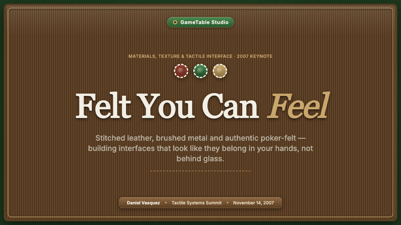
For presentation slides, use Skeuomorphic iOS most deliberately on the cover, where a dark green felt ground can establish the world immediately. A leather-bound title panel, stitched seam, or polished metal frame can carry the heading, while glossy controls or small raised markers suggest interactivity. Content slides should preserve the same material hierarchy: information belongs inside crafted panels, section changes can be expressed through changes in surface, and data slides can treat charts as physical tokens or cards arranged on the tabletop. The result should feel like an object laid out for inspection, not a flat document.
For web interfaces, the style suits dashboards and pricing pages that want to feel collectible, premium, or game-like. A felt background can hold leather or metal containers, while bevels and inner highlights make buttons visibly pressable. On a dashboard, material differences can separate navigation, data panels, and active controls; on a pricing page, each tier can behave like a crafted placard rather than a floating white card. The system remains readable when the material cues support hierarchy instead of competing with labels and values.
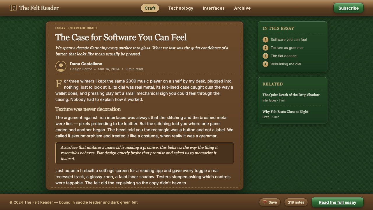
For editorial and marketing work, Skeuomorphic iOS is strongest when the page is treated as a scene. Articles can place pull quotes, metadata, or section headings inside leather-bound surfaces, using stitching and trim to mark structure. Marketing pages can turn a product feature into a tabletop arrangement: the main object sits on felt, supporting information appears on cards, and calls to action use a polished raised treatment. The style is especially effective when the campaign wants nostalgia, tactility, luxury, or the sense of opening a physical kit.
The common mistake is to apply random textures without building a coherent material world. A leather panel beside an unrelated glossy button, a metal frame with no structural role, or heavy shadows on every element creates visual noise rather than skeuomorphism. The palette can also become overly dark and theatrical if the deep green ground, wood, metal, and gold stitching all compete equally. Choose a dominant surface, assign supporting materials clear roles, and let every bevel, seam, highlight, and shadow explain what the user is looking at.
Skeuomorphic iOS — FAQ
Is Skeuomorphic iOS simply a collection of textures?
No. Texture is only one part of the illusion. The system depends on a complete material relationship: felt establishes the environment, leather contains information, metal and wood frame objects, and bevels, highlights, and shadows explain depth and touch. Without those roles, the result is decoration rather than a coherent physical metaphor.
Why is dark green felt so important to the style?
It is the strongest environmental reference in the source material and the signature surface of iOS 6 Game Center. The felt makes the interface read as a tabletop, while the casino association adds theatrical energy and immediate recognition. It is not merely a dark background; it is the surface that gives the surrounding materials somewhere to exist.
Can the style use flat interface elements?
A small amount of visual flatness may be necessary for legibility, but the defining system rule is that surfaces should imply something touchable. The canonical language uses leather, felt, wood, metal, gloss, bevel, and shadow to make objects appear physical. If every surface becomes visually neutral, the result moves away from Skeuomorphic iOS and toward a different design language.
Is Skeuomorphic iOS the same as any realistic interface?
No. Its identity comes from a specific early-iPhone material vocabulary and from the pre-iOS-7 design era. Realism alone is too broad: this style is recognizable through its dark green felt, leather binding, stitched seams, glossy bevels, brushed metal, lacquered wood, and layered shadows. The materials must work together as one constructed world.
When is this style a good fit for a product?
It fits products that want tactility, nostalgia, luxury, theatrical atmosphere, or a strong game-like identity. It is particularly effective when the interface benefits from objects that look collectible and controls that look pressable. It is less appropriate when the product needs a completely neutral, weightless, or purely abstract visual language, because Skeuomorphic iOS makes a deliberate promise that the screen resembles a physical place.
Related design styles
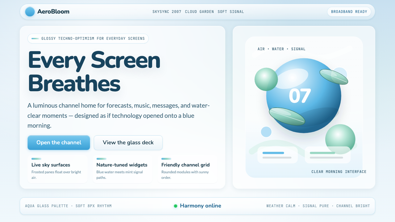 Frutiger Aero 2007Glossy techno-optimism. Translucent glass, photoreal skies, blue-greens — tec…
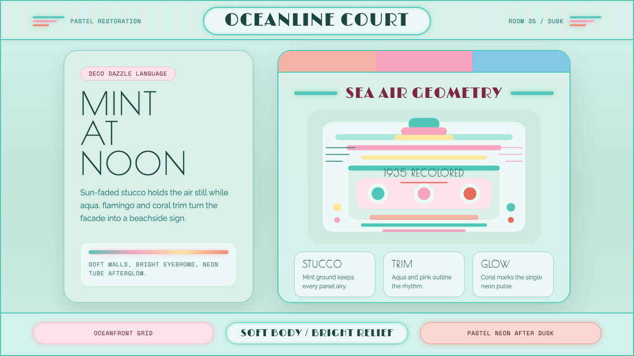 Miami Art Deco PastelSunlit Deco, not noir. Mint stucco, aqua bands and flamingo trim make it brea…
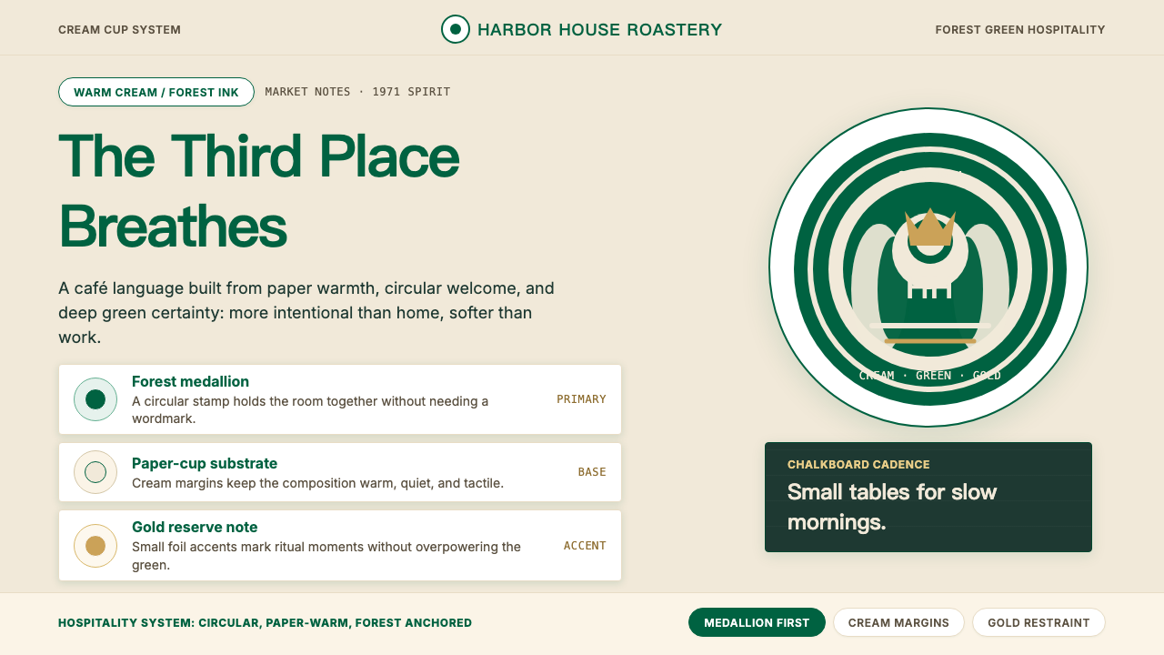 Starbucks (Siren)Hospitality becomes an emblem. Forest green medallion on cream paper, with re…
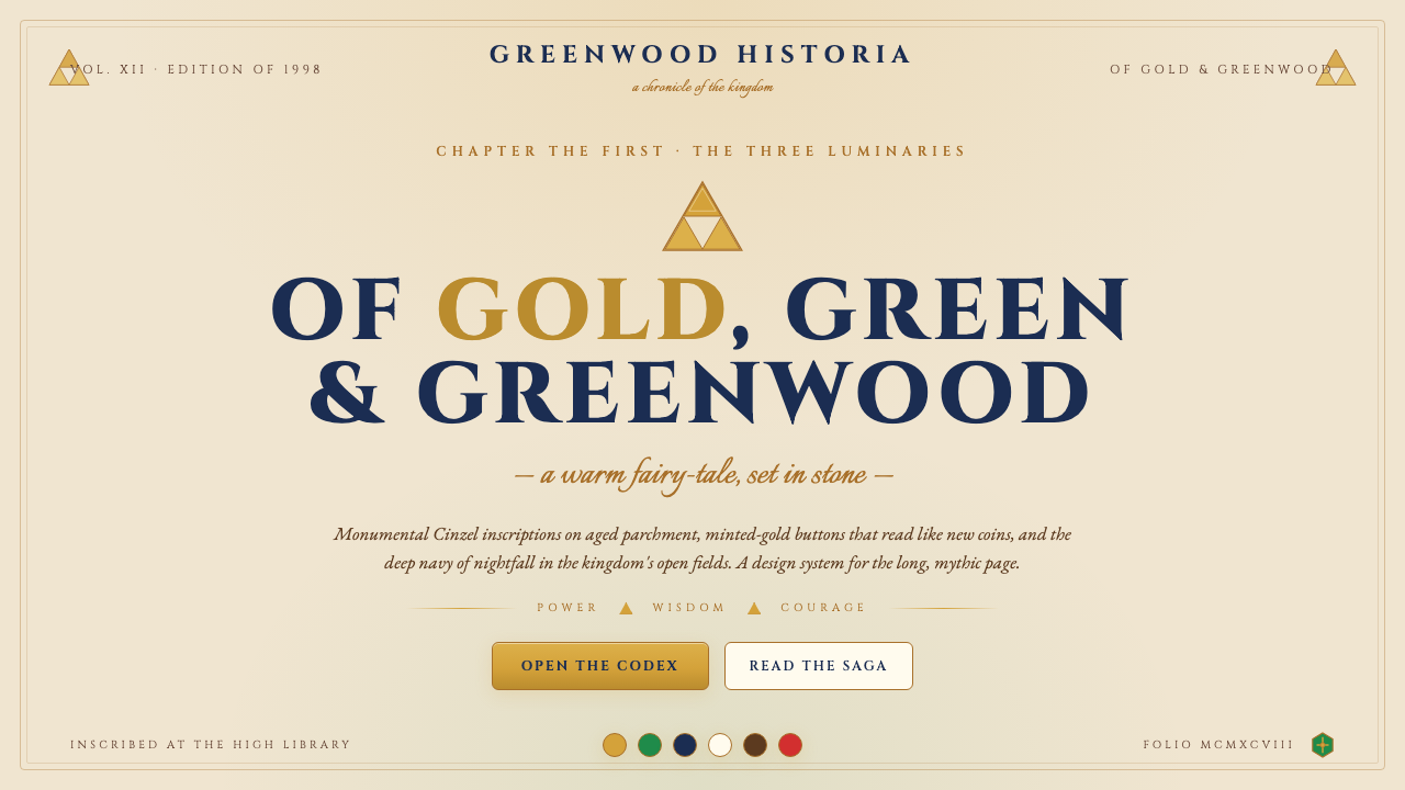 Zelda Ocarina of TimeWarm-fantasy mythology as a UI. Cinzel inscriptions on cream parchment, minte…
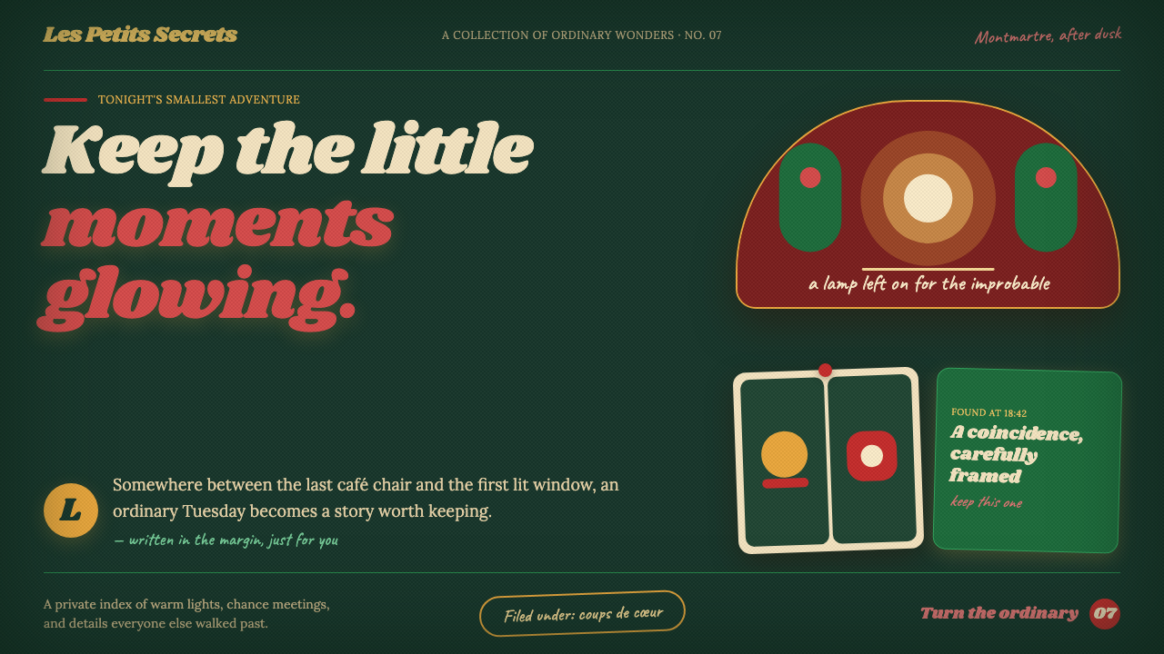 Amélie (Montmartre 2001)Ordinary moments glow like secrets. Storybook green, carmine accents, and cre…
 Budapest Millennium LineChestnut glaze turns transit into a room. Fired slab type and flat yellow run…