What is Victorian Chromo Trade Card?
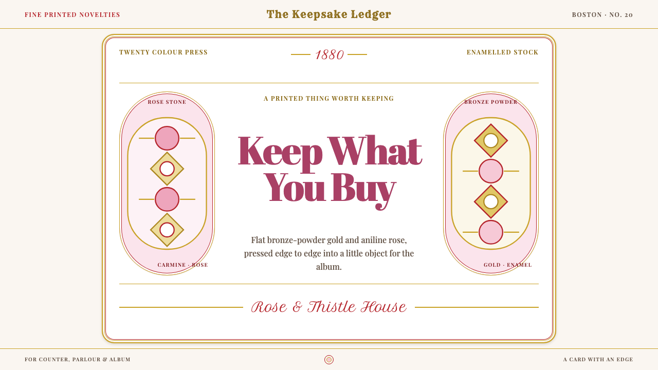
The 1880s trade card was advertising you were meant to keep: a glazed, embossed, die-cut keepsake printed in gold and red, filled to its very edge.
Victorian Chromo Trade Card in brief
A Victorian chromo trade card is a small piece of advertising printed in many colours by chromolithography, and meant to be kept rather than thrown away. In the American 1880s it was printed on glazed, enamelled stock, embossed, and die-cut into scalloped silhouettes. It sold soap, thread and patent medicine with flower sprays, ribbons and flushed, rosy-cheeked children. The card was a gift from a merchant or manufacturer, and its beauty was the point.
As a design style it is defined by abundance. Nothing is empty: the printing filled the card all the way to its cut edge. The palette is gold and red, with flat bronze-powder metallic ink laid over carmine, madder lake and early aniline rose. Compositions are centred and symmetrical, and the lettering is a lively mixture of whatever display faces a printer had to hand. Where modern design prizes whitespace, this style treats an unprinted area as a wasted opportunity.
Visually the result is rich, warm and slightly overwhelming in the way a confectionery box is. The gold is an opaque solid, not a gradient that pretends to reflect light. The reds are saturated and chemical. Edges are scalloped, framed and outlined. It is a style that promises pleasure and tells you so loudly, which is why it remains such a recognisable shorthand for the Victorian marketplace.
Where does Victorian Chromo Trade Card come from?
The trade card belongs to the American consumer economy of the 1880s, centred on Boston, New York and Philadelphia. Factories were producing branded goods in quantity, shopkeepers needed a way to be remembered, and advertising was only beginning to become a profession. A card that was handsome enough to be kept in the home was a form of publicity that cost the recipient nothing and kept the merchant's name on the parlour table. The advertising and the souvenir were the same object.
The technology that made it possible was chromolithography. Each colour is printed from its own separate surface, one pass over another and carefully lined up, so that a rich picture is built from layers. The printers who pushed the process furthest are associated with Boston, and Prang of Boston is named as running it to twenty colours, an extraordinary number that gave pictures the depth and gloss of a painting. The 1880s represent the commercial peak of the process in the United States, before cheaper photographic methods took over.
The materials mattered as much as the colours. The glazed, enamelled card gave inks a smooth, bright surface. Embossing pressed a raised relief into the paper, and die-cutting trimmed it into scalloped silhouettes, so a card was not just printed but shaped. The metallic effect came from bronze powder laid in ink, producing a flat, opaque gold. Beneath it the reds used carmine, madder lake and the new aniline rose, a synthetic pink so intense that it made earlier pigments look subdued.
The card also belongs to a collecting culture. Die-cut embossed scraps and trade cards were traded, pasted into albums and treasured, which pushed printers to compete on charm. The look that resulted, with its filled surfaces, symmetrical layouts and display faces from the compositor's cabinet, such as fat-face Didone, Tuscan wood type and copperplate script, is a record of printing habits rather than an aesthetic theory. Printers did not regard whitespace as a design choice; the paper had been bought, so it was printed. The design system revives that outlook on purpose.
What defines the Victorian Chromo Trade Card look?
Palette: gold and red
The palette is gold and red. The gold is bronze-powder metallic ink laid flat, opaque and without any gradient, so it reads as a solid colour rather than a reflection. Beneath it come carmine, madder lake and early aniline rose, in saturated layers that sometimes sit directly against each other. Cream and enamel-white appear mainly as the card stock showing through. Colour is plentiful, warm and never subtle.
Filled to the cut edge
Nothing is empty. Ornament, pattern or picture occupies every part of the card right up to the die-cut edge, and when there is spare room, more ornament fills it. This horror of emptiness is the opposite of modern minimal layout. Interfaces in this style should treat gaps as something to be dressed with borders, flourishes or textured fills rather than left blank.
Centred symmetry
Compositions are centred and symmetrical, built around a central panel or medallion with balanced flourishes on both sides. A headline sits on the middle axis, supporting text is arranged in tidy tiers, and decoration mirrors left and right. Asymmetry is rare, because the layout is meant to feel stable, formal and ceremonial, like the front of a certificate.
Die-cut, scalloped, embossed edges
The card is shaped, not just printed. Outlines are scalloped or ornamental, borders are framed, and embossing suggests raised relief. In digital form, this means decorative container shapes, scalloped or notched edges, inner frames and a sense of physical card stock. The edge is part of the design, and a plain rectangle would break the illusion of an object made to be held.
Type from the compositor's cabinet
Lettering mixes whatever the printer owned: fat-face Didone for punch, Tuscan wood type for ornamented capitals, and copperplate script for elegance. Several faces can share a single card, each used at a very different scale. The effect is lively and slightly cluttered, but it is organised by size and by centring. Type is a decorative image as much as a message.
Sentimental subject matter
The imagery is flower sprays, ribbons and flushed, rosy-cheeked children, chosen because they were agreeable and cheap to print. These motifs bring warmth and pleasantness to otherwise ordinary products such as soap and thread. They are drawn with soft modelling inside hard outlines, and they are always decorative, never documentary.
Who shaped Victorian Chromo Trade Card?
Louis Prang is the one named individual for this style, and he is associated with the Boston lithographic firm that took chromolithography to the highest colour counts of its day, which the source describes as twenty. His name stands for the technical ambition behind the look: a belief that mass-printed pictures could be rich, saturated and beautiful. Where other printers produced cheap flat colour, the Prang approach set a standard that trade cards then borrowed.
The style was produced by the commercial lithography shops of the three cities named as its home. These printers worked with stone, ink and registration, and their output was driven by a market of manufacturers and merchants hungry for attention. The collective craft of such shops, rather than a single designer's vision, shaped the look: dense, ornate and continually trying to outdo the next card.
Manufacturers and shopkeepers of soap, thread and patent medicine were the patrons of the genre. They understood that a pretty object kept in the home would advertise for years. Their needs, to be memorable, to be friendly and to be cheap per copy, explain nearly every feature of the style, from the sentimental imagery to the insistence on filling every inch.
Collectors who traded die-cut embossed scraps and pasted trade cards into albums were the genre's audience and its quality control. A card that was not appealing was not kept. Their taste for charm, novelty and richness pushed printers toward ever more elaborate colour and form, and it explains why a piece of advertising ended up resembling a miniature work of decorative art.
How do you use Victorian Chromo Trade Card today?
The Victorian chromo trade card style fits subjects that want warmth, abundance and a hint of old-fashioned charm: confectionery, soap and candles, boutiques, gifts, festive offers and heritage brands. It is not a minimalist style, and it should not be asked to behave like one. Its power comes from commitment: filled space, centred symmetry, flat gold on saturated red, and edges that look cut.
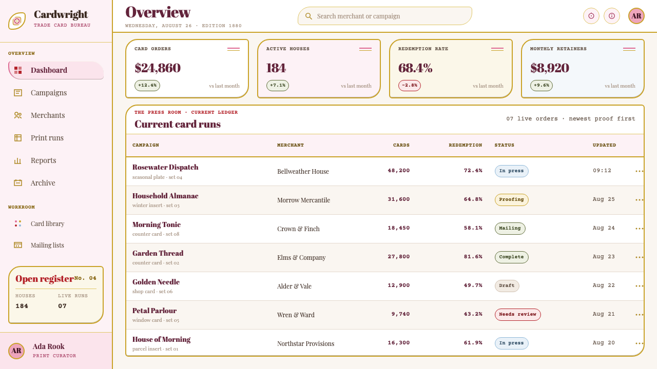
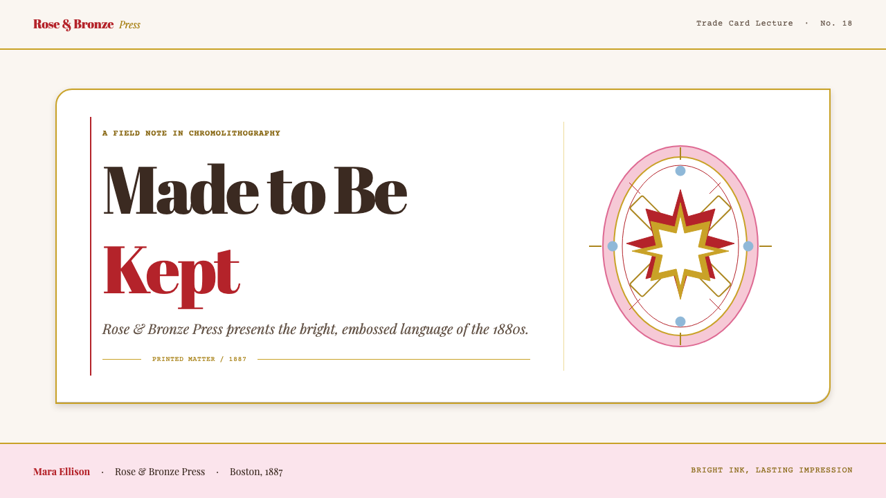
For presentation slides, a cover can be a framed, centred card with a scalloped edge, a medallion for the title and flat gold lettering over carmine. Content slides work as smaller cards on a patterned ground, each with its own border and a single message. Data slides can use bold, flat-coloured pie and bar charts in the red-and-gold palette, framed like an illustrated certificate. Keep one centred axis throughout so that the deck feels ceremonial.
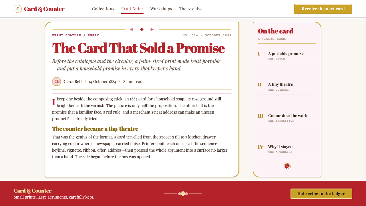
For web interfaces, the style suits e-commerce for gifts, bakeries, stationers, florists and heritage products, as well as seasonal campaigns. Product cards can take scalloped or notched frames, and hero sections can be built as a single large trade card. Pricing and offers sit naturally on card-like tiers, with ribbon-style banners for highlights. Fill backgrounds with subtle pattern rather than leaving them blank, and keep gold as a flat colour on buttons and borders.
For editorial and marketing work, the style excels at invitations, loyalty cards, packaging inserts, newsletters with a nostalgic tone and heritage-brand storytelling. Use large centred headlines, mixed display faces and ornamental dividers. Illustrations of flowers, ribbons and cheerful figures bring the right register. Because the style is so decorative, it works best in small formats and short messages, where its richness reads as delight rather than clutter.
A common mistake is to leave generous whitespace, which immediately reads as modern and removes the genre's abundance. Another is to render the gold with a shiny gradient, a glossy bevel or a glow, when the real thing is flat and opaque. Others include using muted sepia tones to look old, picking a single clean sans-serif, or breaking the symmetry. The genre also carried offensive caricature in its day, so draw on its florals, ribbons and sentimental subjects and leave those behind.
Victorian Chromo Trade Card — FAQ
What is a Victorian chromo trade card?
It is a small advertising card, popular in the American 1880s, printed in many colours by chromolithography on glazed stock and often embossed and die-cut into a decorative outline. Merchants and manufacturers handed them out to promote soap, thread and patent medicine, and people kept them in albums. As a design style it means gold and red, filled surfaces and centred symmetrical layouts.
Why is the gold flat instead of shiny?
Because the original gold was bronze-powder ink printed as a flat, opaque colour. It was not a gradient trying to imitate reflected light. In digital terms, use a solid metallic-looking colour with no bevel, glow or highlight. The effect is richer and more authentic, and it keeps the card feeling printed rather than rendered.
Why does the style avoid whitespace?
Because printers of the period did not regard whitespace as a design choice. The paper was bought, so it was printed on, and an empty area was a missed chance to sell. This outlook shaped the genre: borders, patterns and flourishes fill every gap. Modern designers can use gentle patterns and inner frames to honour the logic without making a layout unreadable.
Is this the same as general Victorian or Art Nouveau style?
No. It is a specific print genre, the American chromolithographed trade card of the 1880s. Art Nouveau came later, with flowing organic lines and subdued colour harmonies, while this style is symmetrical, saturated and crowded with ornament. If you want sinuous plant forms and muted tones, this is the wrong reference; if you want gold, rose and a card-shaped commercial keepsake, it is the right one.
Can the style work in a modern digital product?
Yes, in the right places. It is a good fit for gifts, hospitality, seasonal campaigns and heritage brands, and for contained moments such as a landing section, a loyalty card or an announcement. For dense tools and data-heavy screens, use a restrained version: keep the red and flat gold for accents and frames, and give long reading text a calm background.
Related design styles
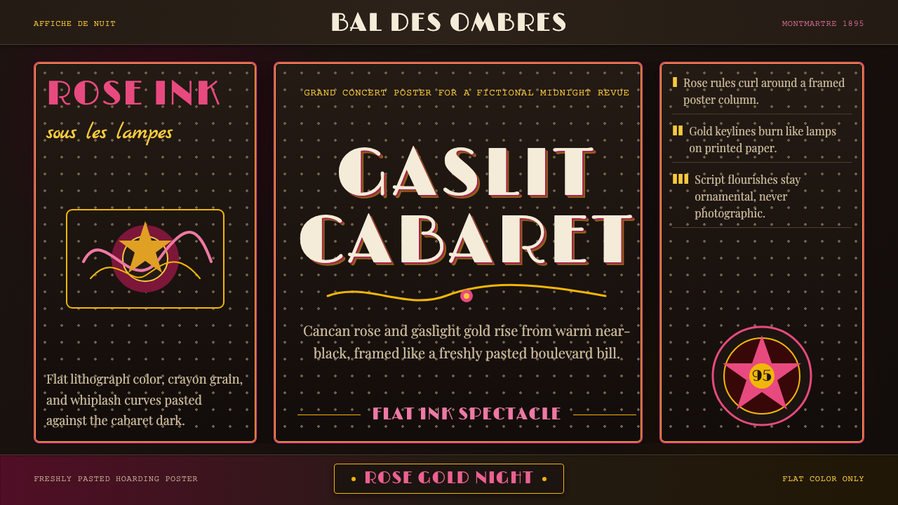 Belle Époque ParisCabaret night glows. Rose ink and gaslight gold curl across warm near-black p…
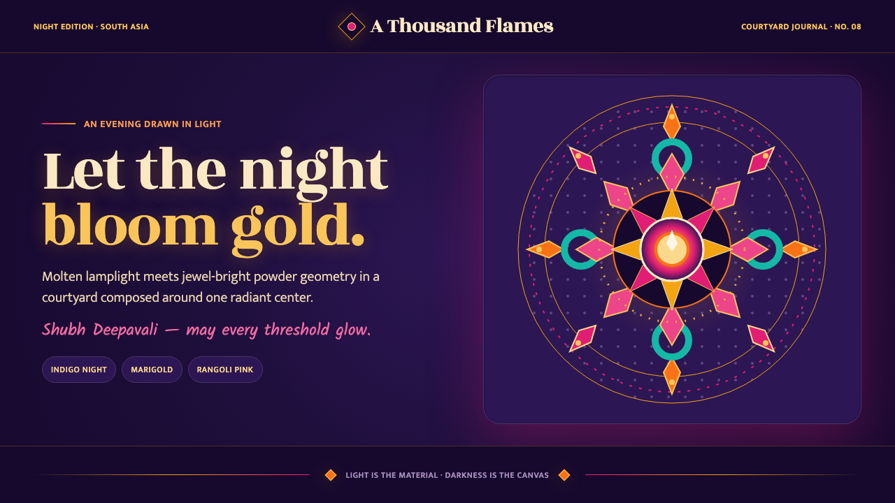 Diwali Festival of LightsNight blooms from within. Molten gold and jewel-bright rangoli radiate across…
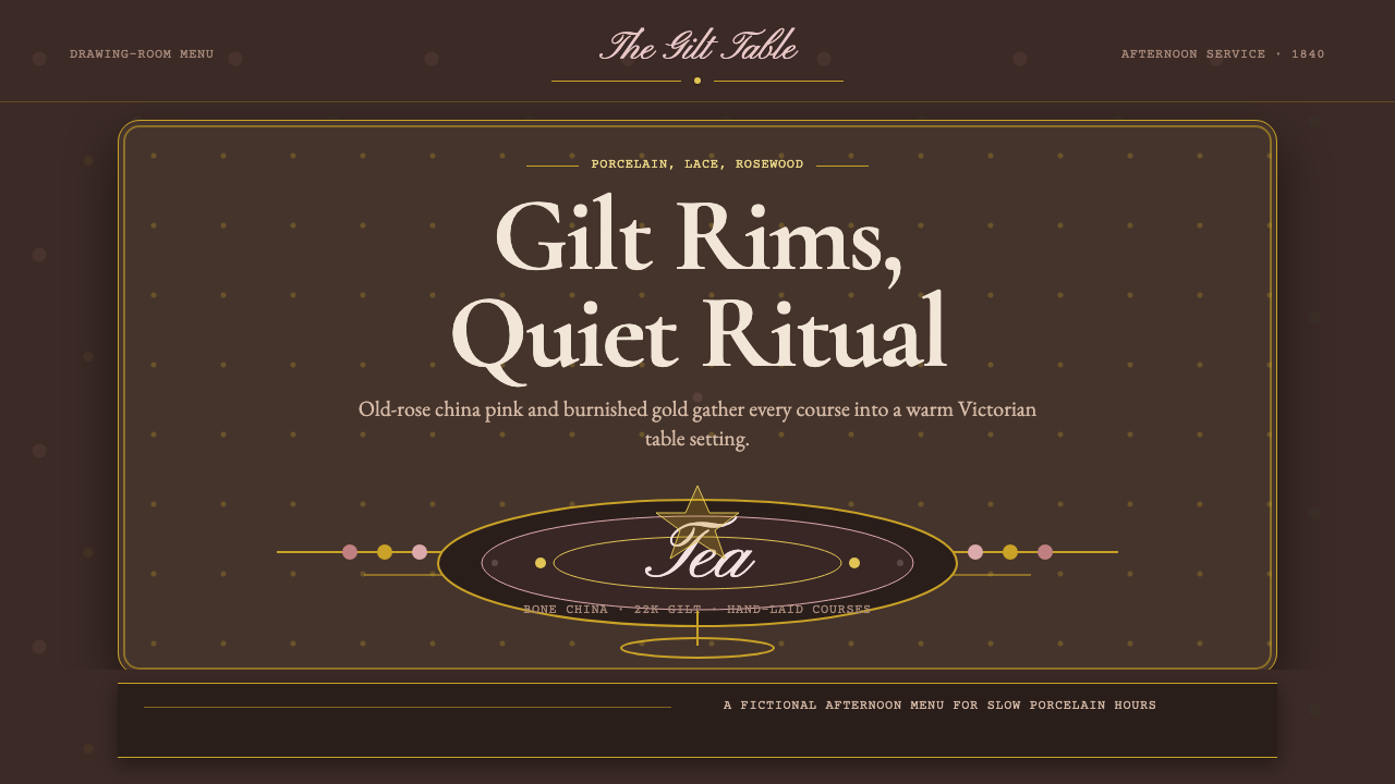 English Afternoon TeaOrnament is the ritual. Old-rose porcelain, gilt rims, and script rest on ros…
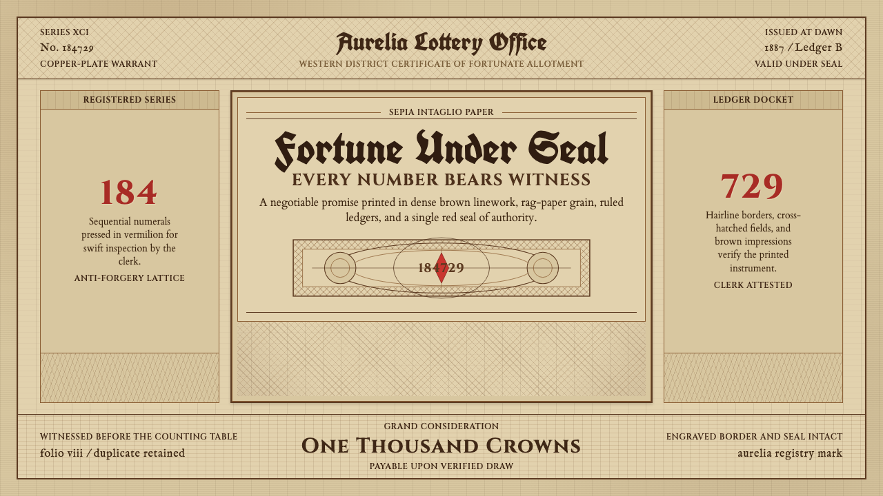 Engraved Lottery TicketLegal gravity in sepia. Guilloche borders, blackletter type, and a vermilion…
 Kazan Tatar TileworkOrnament held to its proper place. Turquoise tulip bands cut across quiet lim…
 Moroccan Mint TeaCeremony glows in brass. Mint green, Cinzel type, and zellige geometry frame…