What is Zelda Ocarina of Time?什么是 Zelda Ocarina of Time?
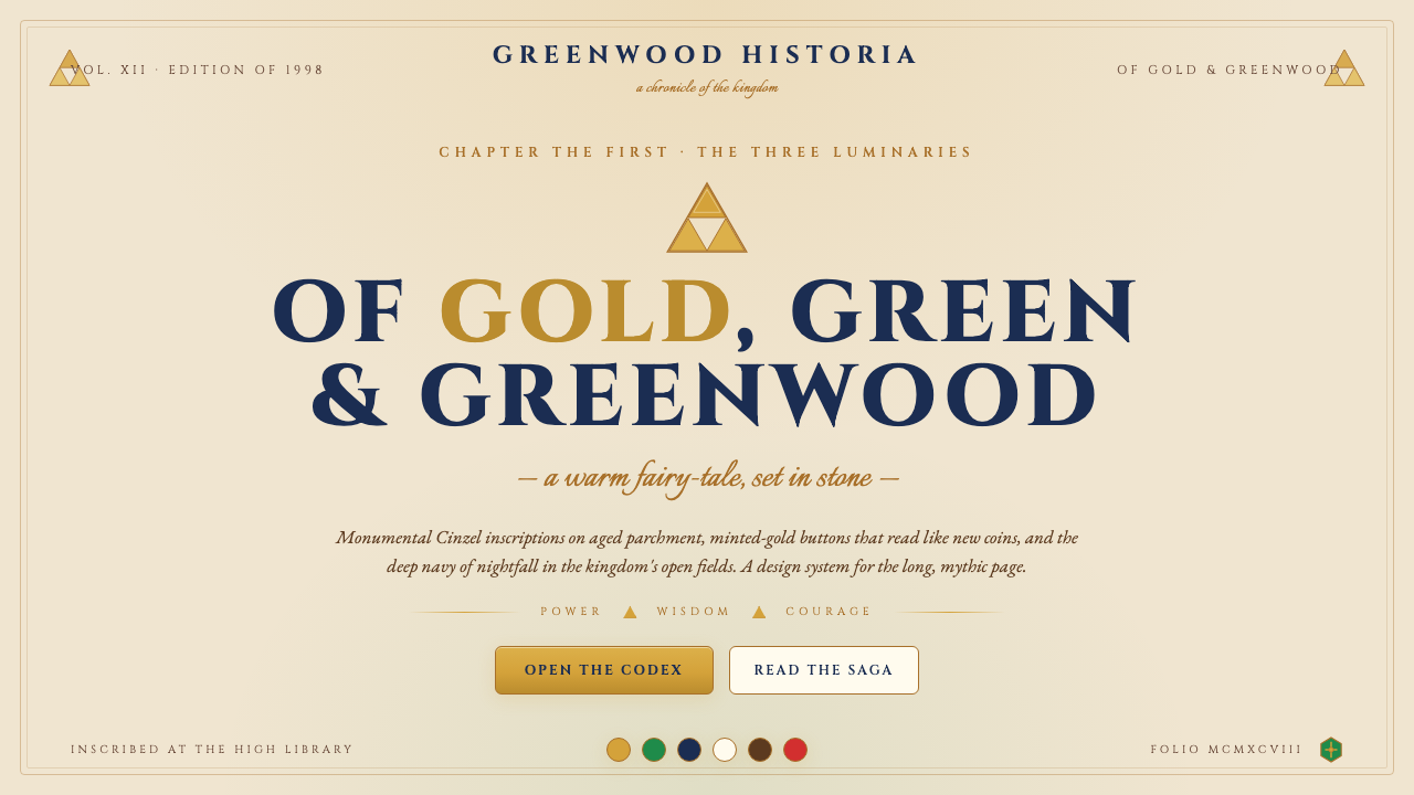
Ocarina of Time distilled a quarter-century of mythic Zelda imagery into a single, instantly legible visual language — parchment warmth, Triforce gold, and the deep navy of Hyrule's midnight sky.《时之笛》将四分之一个世纪的海拉鲁神话浓缩为一套一眼可辨的视觉语言——羊皮纸的温度、力之三角的金色,以及海拉鲁原野午夜天空的深靛蓝。
Zelda Ocarina of Time in briefZelda Ocarina of Time 速览
The Zelda Ocarina of Time design system is a warm-fantasy-medieval aesthetic drawn directly from the visual world Nintendo established in its landmark 1998 Nintendo 64 title. It translates the game's core imagery — golden Triforce, cream-parchment surfaces, Hyrule-green shield motifs, and the deep navy of nightfall over Hyrule Field — into a coherent UI and graphic design language suitable for contemporary layouts.《塞尔达传说·时之笛》设计系统是一套温暖奇幻的中世纪美学,直接脱胎于任天堂1998年这部划时代N64作品所构建的视觉世界。它将游戏的核心意象——金色力之三角、米色羊皮纸般的界面、海拉鲁绿盾牌纹样,以及海拉鲁原野夜幕降临时的深靛蓝——转化为一套适用于当代版面与界面设计的连贯视觉语言。
Where many gaming-derived aesthetics lean on gritty realism or retrofuturist nostalgia, this system occupies a different register: regal and warm, anchored in a sense of ancient legend rather than technology. Monumental serif inscriptions evoke stone carvings and royal proclamations. Gold-tinted interactive elements read like minted coins. Dividers and ornamental rules hint at the Triforce silhouette without reproducing it literally. The result is a system that feels ceremonial without being heavy, fantasy-inflected without being garish.许多游戏衍生美学依赖粗砺写实或复古未来主义,这套系统却占据了截然不同的频道:高贵而温暖,根植于古老传奇而非技术感。气势磅礴的衬线铭刻字体唤起石刻与王室宣告。金色调的交互元素如同刚铸的硬币。分隔线与装饰性线条隐约指向力之三角的轮廓,却不做字面复制。最终呈现出的系统感觉庄重而不沉重,带有奇幻色彩却不俗艳。
The style works across a surprisingly broad range of applications precisely because its mythology is universally legible. A full generation of users grew up with the Ocarina of Time visual world, and the resonance it carries — weight, adventure, earned achievement — maps naturally onto products that want to convey those same qualities: launch pages for ambitious projects, educational platforms with a sense of journey, gaming communities, and any brand that wishes to signal depth and longevity rather than novelty.这套风格之所以能跨越相当宽广的应用场景,正因为它所承载的神话具有普遍可读性。整整一代用户伴随《时之笛》的视觉世界成长,它所携带的重量感、冒险感与成就感,能自然映射到那些希望传递同类品质的产品上:雄心项目的发布页、具有旅程感的教育平台、游戏社区,以及任何希望传递深度与历久弥新感而非追求新奇的品牌。
See the Zelda Ocarina of Time design system查看 Zelda Ocarina of Time 完整设计系统
Where does Zelda Ocarina of Time come from?Zelda Ocarina of Time 从何而来?
The Legend of Zelda series was born in 1986, conceived by Shigeru Miyamoto and Takashi Tezuka at Nintendo in Kyoto, Japan. Miyamoto has spoken often about the childhood experience of exploring the countryside near his home in Sonobe — pushing through dense undergrowth, discovering a cave, entering it tentatively with a lantern — as the emotional blueprint for the entire franchise. That sense of scale, mystery, and intimate bravery found its visual expression almost from the start: parchment-colored interface panels, gold borders, a royal crest that would eventually become the Triforce, and map screens that felt like genuine artifacts from an imagined civilization.《塞尔达传说》系列诞生于1986年,由在日本京都任天堂工作的宫本茂与手冢卓志共同构思。宫本茂多次谈及童年在家乡园部附近的乡野探险经历——拨开茂密灌木、发现洞穴、提着提灯战战兢兢地走进去——那是整个系列的情感蓝图。这种对于规模感、神秘感与亲历性勇气的感知,几乎从一开始就找到了视觉表达:羊皮纸色调的界面面板、金色边框、日后演变为力之三角的王室徽章,以及那些感觉像是来自某个想象文明真实文物的地图画面。
Ocarina of Time, released in November 1998 for the Nintendo 64, was the franchise's full entry into three-dimensional space, and it arrived under enormous creative pressure. Directed by Miyamoto and produced with the oversight of a young Eiji Aonuma — who would go on to become the series' long-running creative director — the game had to carry the entire weight of the Zelda visual canon into a new dimensional register while remaining immediately recognizable. The team worked in Kyoto through a famously grueling development period, extending across nearly three years, and the aesthetic decisions made under that pressure became canonical for decades.1998年11月登陆任天堂64的《时之笛》,是这个系列向三维空间的全面跃迁,它承载着巨大的创作压力而来。宫本茂执导,年轻的青沼英二参与监制——他日后将成为这个系列长期的创意总监——这款游戏必须将塞尔达视觉典范的全部重量带入一个全新的维度,同时保持一眼可辨的辨识度。团队在京都经历了一段以艰苦著称的开发周期,历时近三年。在那种压力下做出的美学决策,此后数十年间都成为了系列的标准。
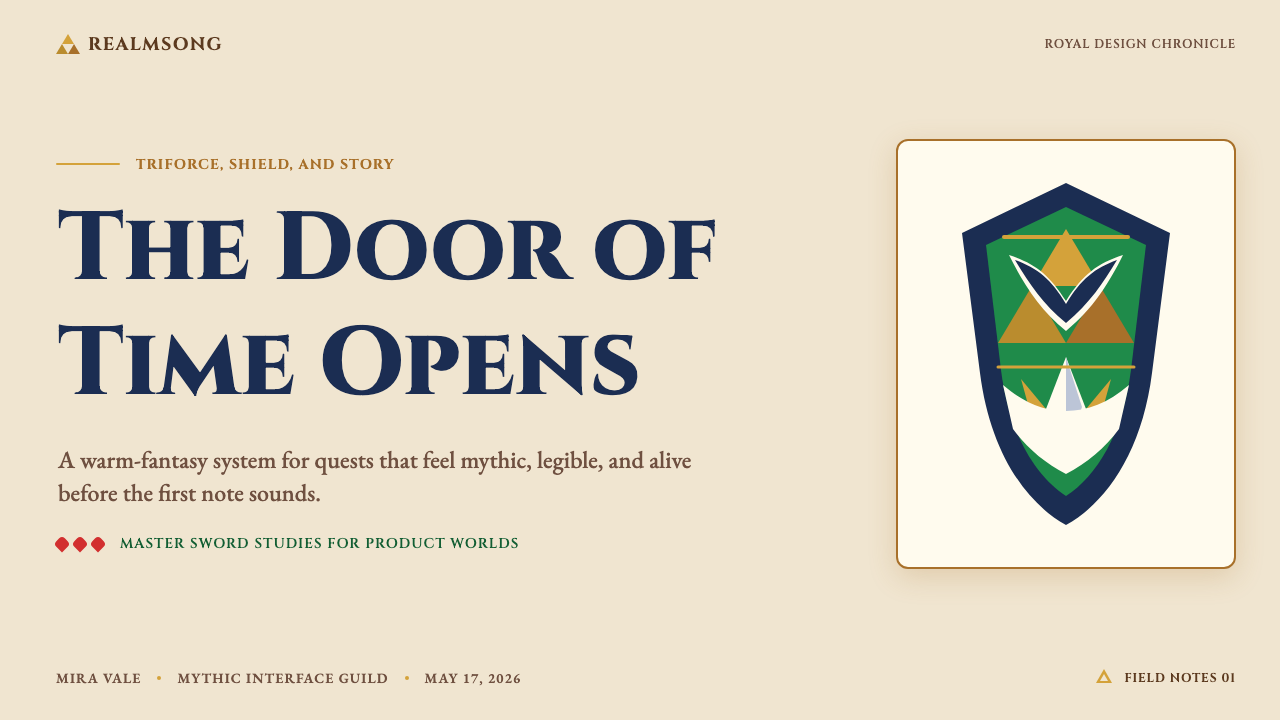
The game's visual identity crystallized around a small set of irreducible symbols. The Triforce — three golden triangles arranged in a larger triangle — had appeared in earlier Zelda titles but became truly iconic in Ocarina of Time, where it appeared in every interface panel, as the background of the inventory, and as the emblem on Link's hand that glows at pivotal story moments. The parchment palette — warm cream and aged ivory rather than pure white — gave every screen a sense of physical materiality, as though the player were reading from an ancient manuscript rather than staring at a CRT display. Nighttime sections introduced the deep navy that now stands as the system's shadow tone.游戏的视觉身份在一组不可再简化的符号中凝固成形。力之三角——三个金色三角形排列成更大的三角形——在早期塞尔达作品中已有出现,但在《时之笛》中真正成为标志:它出现在每一个界面面板、作为道具栏的背景,以及在关键剧情时刻在林克手背上发光的徽章。羊皮纸色调——温暖的奶油色与做旧的象牙色而非纯白——给每个画面带来了物理质感,仿佛玩家在翻阅一部古老手稿而非盯着CRT屏幕。夜间场景引入的深靛蓝,如今成为这套系统的阴影基调。
Eiji Aonuma's long stewardship of the Zelda series after Ocarina of Time — through Wind Waker, Twilight Princess, Skyward Sword, and into Breath of the Wild and Tears of the Kingdom in 2023 — ensured that the 1998 visual vocabulary was not a historical artifact but a living foundation. Each subsequent title has reinterpreted the core palette and emblems in its own register, but the parchment-and-gold base, the Triforce geometry, and the deep navy of night remained constants. The Ocarina of Time iteration of that system is the one closest to the original medieval-manuscript influence, the most legible to the widest audience, and therefore the most transferable into contemporary design contexts.青沼英二在《时之笛》之后对塞尔达系列的长期掌舵——历经《风之杖》《黄昏公主》《天空之剑》,直至2023年的《王国之泪》——确保了1998年的视觉词汇不会成为历史遗物,而是始终作为活着的基础延续。每一部后续作品都以自身的方式重新诠释核心色调与徽章,但羊皮纸与金色的底色、力之三角的几何结构,以及夜晚的深靛蓝始终是恒定的常量。这套系统在《时之笛》时期的形态,是最接近中世纪手稿原始影响的版本,也是面向最广泛受众时辨识度最高的版本,因此也是移植进当代设计语境时最具可操作性的版本。
What defines the Zelda Ocarina of Time look?Zelda Ocarina of Time 的视觉特征是什么?
Color Palette色彩体系
The system is built on four foundational tones: parchment cream (the dominant ground, warm and aged rather than clinical white), Triforce gold (the primary accent, carrying authority and interactivity), Hyrule deep navy (the shadow tone, used for nighttime panels and depth), and natural black for text and fine line work. Forest greens appear as secondary accents, referencing the Kokiri Forest and the Hylian shield, but always in service of the four core tones rather than competing with them. Saturation is moderate — the gold is rich but not garish, the navy is deep but not cold.这套系统建立在四种基础色调之上:羊皮纸奶油色(主导底色,温暖做旧而非临床白)、力之三角金色(主要强调色,承载权威感与交互性)、海拉鲁深靛蓝(阴影基调,用于夜间面板与深度感),以及用于文字与细线的自然黑。森林绿作为次要强调色出现,引用科奇里森林与海拉鲁盾牌,但始终服务于四种核心色调而非与之竞争。饱和度适中——金色浓郁而不俗丽,深蓝幽深而不寒冷。
Typography字体排印
Inscriptional serif letterforms with classical proportions carry the primary display weight — the kind of type that reads like a carved stone tablet or illuminated manuscript heading. Body text and UI labels shift to a clean, readable companion face with modest serifs or a humanist sensibility, maintaining warmth without sacrificing legibility at small sizes. The contrast between the monumental display style and the understated body face is central to the system: it communicates that the content occupies a world where epic and intimate coexist. All-caps or small-caps settings reinforce the ceremonial register in section titles and navigation items.具有古典比例的铭刻风格衬线字体承担主要展示性字重——那种读起来像石刻碑文或泥金手抄本标题的字体。正文与界面标签转向简洁可读的配套字体,带有适度的衬线或人文主义气质,在小字号下保持温度而不牺牲易读性。气势磅礴的展示字体与低调的正文字体之间的反差,是这套系统的核心:它传达出内容存在于一个史诗与亲历并存的世界里。全大写或小型大写设定在节标题与导航项目中强化了仪式感的格调。
Ornament and Emblem纹样与徽章
Unlike purely modernist systems, this aesthetic permits — and indeed requires — controlled ornament. Thin geometric border rules frame panels and cards, referencing the inventory screens and dialogue boxes of the original game. Triforce-adjacent triangular motifs appear in dividers and bullet markers without being literal reproductions. Wax-seal-style circular emblems work as avatar frames or badge components. The principle governing ornament is restraint through geometry: every decorative element derives its form from the same angular, triangular vocabulary as the primary symbol, so the system remains visually coherent even when ornamented.与纯粹的现代主义系统不同,这套美学允许——事实上需要——有节制的装饰。纤细的几何边框线条勾勒面板与卡片,引用原作的道具栏与对话框。与力之三角相关的三角形母题出现在分隔线与项目符号中,而非字面复制原型。蜡章风格的圆形徽章适合作为头像框或徽章组件。装饰的管控原则是通过几何实现克制:每个装饰元素都从与主符号相同的角形、三角形词汇中派生其形态,因此系统即便有装饰也保持视觉连贯。
Surface and Texture表面与质感
The parchment ground is not a flat neutral — it carries subtle warmth and a sense of age, as though surfaces have been handled and turned in light over time. This tactile suggestion is achieved through slightly off-white tones and warm undertones rather than simulated grain or explicit texture maps. Card and panel backgrounds read as aged pages or weathered stone, not as digital flat surfaces. This quality distinguishes the system from both clinical white-space minimalism and from overt skeuomorphism: the material suggestion is present, but it is carried by color temperature and tone rather than by rendered texture.羊皮纸底色不是一个平淡的中性色——它承载着微妙的温度感与岁月感,仿佛表面在光线中被反复翻阅经年。这种触感暗示通过略微偏暖的白色调与温暖的底色来实现,而非模拟颗粒或明确的纹理贴图。卡片与面板背景读起来像是做旧的书页或风化的石头,而非数字平面。这种品质将这套系统与临床的留白极简主义和明显的拟物风格区别开来:材质暗示是存在的,但它由色温与色调承载,而非通过渲染质感呈现。
Light and Shadow光与阴影
Depth is established through warm layering rather than hard-edged drop shadows. Components sit in front of the parchment ground with a sense of gentle elevation — as though cards are illuminated scrolls resting on a table surface. When directional shadow is used, it is soft and amber-tinted, consistent with firelight or candlelight rather than the cool, diffuse shadows of neutral design systems. This quality reinforces the medieval-interior atmosphere without resorting to literal candle illustrations.深度通过温暖的层叠感而非硬边投影来建立。组件浮于羊皮纸底色之上,带有一种轻柔的立体感——仿佛卡片是放置在桌面上被照亮的卷轴。当使用方向性投影时,它是柔和的琥珀色调,与火光或烛光一致,而非中性设计系统中那种冷漠、漫射的阴影。这种品质在无需字面蜡烛插图的情况下强化了中世纪室内的氛围。
Iconography图标语言
Icons within the system favor angular, slightly heraldic forms over rounded, friendly silhouettes. Shield shapes, sword outlines, ocarina silhouettes, and navigation compasses all serve as recognizable reference points, but they are used sparingly and always stylized to the same geometric register as the Triforce. Functional UI icons — arrows, close buttons, toggles — are drawn with clean lines and a slight angularity that maintains consistency with the display typography. Rounded icons would undermine the regal weight of the system; this is an aesthetic that has earned its authority.系统内的图标倾向于带棱角、略具纹章感的形态,而非圆润友好的剪影。盾牌轮廓、宝剑剪影、时之笛轮廓与导航罗盘都可以作为可辨识的参照点,但用量克制,并始终被风格化至与力之三角相同的几何格调。功能性界面图标——箭头、关闭按钮、切换开关——以简洁线条与轻微棱角感绘制,与展示字体保持一致。圆润的图标会削弱这套系统的高贵分量;这是一套已经赢得其权威的美学。
Spatial Rhythm空间节奏
Layouts favor generous margins and a sense of ceremonial breathing room — the compositional equivalent of an illuminated manuscript's wide vellum borders. Content does not crowd the edges. Section breaks are deliberate and marked, using ornamental rules or geometric spacers rather than raw whitespace alone. The grid underlying the system is not rigid-Swiss-column-counting but rather a looser, more proportional sense of center-weighted hierarchy, where the eye moves from the primary emblem or headline downward through supporting information in a clearly ordered sequence.版面倾向于宽裕的边距与仪式性的呼吸空间——如同泥金手抄本宽阔的羊皮纸边界在构图上的等价物。内容不拥挤边缘。段落分隔是刻意为之、有所标记的,使用装饰性线条或几何间隔元素,而非单纯的留白。支撑这套系统的网格不是严格的瑞士式列计数,而是一种更宽松、更注重比例的中心加权层级感——视线从主要徽章或标题开始,向下经过支撑性信息,以清晰有序的序列移动。
See the Zelda Ocarina of Time design system查看 Zelda Ocarina of Time 完整设计系统
Who shaped Zelda Ocarina of Time?谁塑造了 Zelda Ocarina of Time?
Miyamoto is the architect of the Zelda franchise's foundational emotional logic. His childhood experiences exploring the hills and caves near Sonobe, combined with his background in fine arts at Kanazawa College of Art, shaped the franchise's insistence on environmental storytelling and a sense of wonder communicated through visual scale rather than explicit instruction. His co-creation of the original Legend of Zelda in 1986 with Takashi Tezuka established the parchment-and-gold visual grammar that would reach its fullest expression in Ocarina of Time. Miyamoto's broader influence on Nintendo's design culture — favoring intuitive, legible systems over complex ones — permeates the 1998 title's interface design at every level.宫本茂是塞尔达系列情感逻辑的奠基建筑师。他童年在园部附近山野洞穴间的探险经历,加上在金泽美术工艺大学的纯艺术背景,塑造了这个系列对环境叙事的坚持,以及通过视觉规模而非明确指引传递惊奇感的执念。他与手冢卓志于1986年共同创作的原版《塞尔达传说》,确立了羊皮纸与金色的视觉语法,而这套语法在《时之笛》中达到了最完整的表达。宫本茂对任天堂设计文化更广泛的影响——偏好直觉可读的系统而非复杂系统——在1998年这部作品的界面设计中渗透于每一个层面。
Aonuma joined the Ocarina of Time team as a dungeon designer and later co-directed the project with Miyamoto, going on to serve as the series' chief creative director from Wind Waker onward for over two decades. His role in the visual history of the franchise is as much about stewardship as invention: it was Aonuma's sustained oversight that prevented the Ocarina of Time aesthetic from becoming a frozen historical relic, instead ensuring that each subsequent title reinterpreted the 1998 palette and symbolic vocabulary in ways that kept it alive and generative. His 2023 production of Tears of the Kingdom demonstrates how far the foundational visual language can be stretched while remaining anchored in the same Triforce-and-parchment world.青沼英二以地牢设计师身份加入《时之笛》团队,后来与宫本茂共同执导这部作品,并从《风之杖》起担任系列首席创意总监长达二十余年。他在这个系列视觉史中的角色,关乎守护与发明同样重要:正是青沼英二持续的监管,使《时之笛》的美学没有成为一件冻结的历史遗物,而是确保每一部后续作品都以重焕生机的方式重新诠释1998年的色调与符号词汇。他2023年制作的《王国之泪》展示了这套基础视觉语言在始终根植于同一个力之三角与羊皮纸世界的同时,能被拉伸到多远的距离。
Tezuka co-created the original Legend of Zelda alongside Miyamoto and served as director of Zelda II: The Adventure of Link. His contribution to the franchise's visual identity lies in the earliest choices about how the world of Hyrule should be represented — the map aesthetics, the item iconography, and the interface panels that established the parchment-and-gold convention before it had a name. The 1986 visual grammar Tezuka and Miyamoto established was already so coherent that subsequent games, including Ocarina of Time, were largely elaborating and dimensionalizing a vocabulary that had been stable from the start.手冢卓志与宫本茂共同创作了初代《塞尔达传说》,并担任《塞尔达传说2:林克的冒险》的导演。他对这个系列视觉身份的贡献,在于关于海拉鲁世界应如何呈现的最早选择——地图美学、道具图标,以及在这套约定尚未有名字之前便确立了羊皮纸与金色惯例的界面面板。手冢与宫本茂于1986年建立的视觉语法已经如此连贯,以至于后续作品——包括《时之笛》——大体上都是在精化和立体化一套从一开始就已稳定的词汇。
While Kondo's primary contribution is musical — the Zelda main theme, the Ocarina melodies, the ambient field music — his work shaped the emotional temperature of the visual world in ways that are difficult to overstate. Designers working in the Ocarina of Time aesthetic are implicitly designing for a world where Kondo's music plays: the warmth of the field theme corresponds directly to the parchment palette, the solemnity of the dungeon music corresponds to the deep navy, and the brightness of the fairy fountain corresponds to the Triforce gold. Understanding the music is not a requirement for using the visual system, but it explains why the emotional register of the colors feels so precisely calibrated.近藤浩治的主要贡献是音乐性的——塞尔达主题旋律、时之笛的乐曲、原野的环境音乐——但他的作品以难以言明的方式塑造了视觉世界的情感温度。在《时之笛》美学中工作的设计师,实际上是在为一个近藤的音乐在其中回响的世界做设计:原野主题的温暖直接对应羊皮纸色调,地牢音乐的庄严对应深靛蓝,精灵泉音乐的明亮对应力之三角的金色。理解这些音乐并非使用视觉系统的前提,但它解释了为何这套色彩的情感格调感觉如此精准校准。
Nakano served as the primary character designer and concept artist for Ocarina of Time, producing the official promotional and box art that introduced many players to the game's visual world before a single frame of gameplay was seen. His illustrations — featuring Link in the Kokiri Forest, the Triforce glowing on an outstretched hand, the silhouette of Hyrule Castle against a stormy sky — established the tonal range of the system: from intimate woodland warmth to epic mythological weight. The promotional imagery Nakano produced has proven remarkably durable, and many contemporary interpretations of the Ocarina of Time aesthetic draw directly on his compositional choices about scale, light, and color temperature.中野佑介担任《时之笛》的主要角色设计师与概念艺术家,创作了官方宣传与盒装艺术图,让许多玩家在接触到任何一帧游戏画面之前便已熟知这个游戏的视觉世界。他的插图——林克置身科奇里森林、力之三角在伸出的手掌上发光、海拉鲁城堡的剪影映衬着暴风雨的天空——确立了这套系统的色调范围:从亲密的林间温暖到史诗神话的重量。中野创作的宣传图像展现出非凡的耐久性,许多当代对《时之笛》美学的诠释都直接援引了他关于规模、光线与色温的构图选择。
How do you use Zelda Ocarina of Time today?今天怎么用 Zelda Ocarina of Time?
The Ocarina of Time design system transfers most naturally to contexts where a sense of earned grandeur, adventure, and historical depth is the desired emotional register. The system carries genuine thematic weight — it should not be applied ironically or to content that undercuts its ceremonial seriousness. Used correctly, it signals that whatever it frames is significant: a product launch worthy of legend, an educational journey with real stakes, a community organized around shared dedication.《时之笛》设计系统最自然地移植到那些将经由努力赢得的宏大感、冒险感与历史深度作为目标情感格调的场景中。这套系统承载着真实的主题分量——不应被反讽地使用,也不应应用于消解其仪式庄重性的内容。正确使用时,它传达出被它框定的任何事物都是重要的:值得成为传奇的产品发布、有真实赌注的教育旅程、围绕共同投入而组织的社群。
For presentation slides, the system excels on both cover and section-break slides. A cover built in this system typically places a large central Triforce-adjacent emblem on a deep navy ground, with the title set in monumental inscriptional type and a secondary line of smaller, warmer text beneath — mimicking the hierarchy of a royal proclamation. Content slides work best on the parchment ground, with section headers in the display serif and body text in a warm, readable companion face. Data visualizations should adopt the palette's four core tones for category differentiation, with gold reserved for the primary data series or the most important metric. Charts and graphs can be treated as heraldic objects — given a thin geometric border and placed on a slightly elevated card surface.在演示文稿中,这套系统在封面与节分隔页上表现最为出色。以这套系统构建的封面,通常在深靛蓝底面上放置一个大型居中的力之三角相关徽章,标题以气势磅礴的铭刻字体排布,其下是一行更小、更温暖的次级文字——模拟王室宣告的层级结构。内容幻灯片在羊皮纸底色上效果最佳,节标题使用展示衬线字体,正文使用温暖可读的配套字体。数据可视化应采用色板的四种核心色调进行类别区分,金色保留给主数据系列或最重要的指标。图表可以被当作纹章对象处理——加上纤细的几何边框,置于略微隆起的卡片表面上。
For web interfaces, the system is well-suited to landing pages for ambitious products, game community portals, educational platforms with a sense of progression, and any dashboard that wants to communicate authority without coldness. Navigation bars work with the parchment-and-dark-navy contrast: a cream header with gold typography for the wordmark, deep navy for active states. Cards use the warm layered shadow approach — not the hard-offset drops of modernist systems, but a gentle, amber-lit elevation. Pricing tiers benefit from the gold-versus-navy contrast for tier hierarchy: the premium tier marked in gold on navy, the standard tier in parchment-and-black.在网页界面中,这套系统适合雄心产品的落地页、游戏社区门户、具有进阶感的教育平台,以及任何希望传递权威感而不显寒冷感的仪表板。导航栏利用羊皮纸与深靛蓝的对比:奶油色标题栏配金色字体标识,深靛蓝用于激活状态。卡片使用温暖的层叠阴影方式——不是现代主义系统的硬边偏移投影,而是一种柔和的琥珀色调立体感。定价套餐等级受益于金色与靛蓝的对比来体现层级:高级套餐以靛蓝底金字标记,标准套餐以羊皮纸底黑字呈现。
For editorial and marketing design, the Ocarina of Time system produces exceptionally strong results in contexts where a sense of myth, journey, or achievement is the narrative through-line: game reviews, retrospective features, annual report design for ambitious organizations, and launch campaigns where the product wants to be perceived as genuinely important. Full-spread layouts work well with a single large emblem anchoring one corner and the main headline filling the remaining field in large inscriptional type. Marketing pages can alternate between deep-navy and parchment-cream full-width sections, with gold used consistently as the call-to-action color throughout.在编辑与营销设计中,《时之笛》系统在神话感、旅程感或成就感是叙事主线的场景中产出异常强劲的效果:游戏评测、回顾性专题、雄心组织的年度报告,以及希望产品被视为真正重要之物的发布活动。全版面布局适合以单一大型徽章锚定一角,主标题以大型铭刻字体填充其余空间。营销页面可以在深靛蓝与羊皮纸奶油色的全宽区块之间交替,金色在全篇始终如一地用作行动号召色。
A common mistake when applying this system is overloading the ornament. The system permits decorative borders and geometric emblems, but every added element should earn its place by reinforcing the spatial hierarchy rather than simply filling visual silence. A border that frames a hero section is purposeful; a border that frames every single card on a data page is noise. A second frequent error is desaturating the gold into a pale yellow or an orange-adjacent tone — the gold in this system is rich and specific, carrying the authority of the Triforce, and deviating from it toward safer, more neutral tones loses the system's central symbolic weight. The parchment ground should also remain warm; a cool or blue-tinted off-white reads as clinical and entirely breaks the medieval atmosphere.应用这套系统时最常见的错误是装饰过载。系统允许装饰性边框与几何徽章,但每个增加的元素都应通过强化空间层级而非单纯填充视觉沉默来赢得其存在的正当性。框定英雄区块的边框是有目的的;框定数据页面每一张卡片的边框就是噪音。第二个常见错误是将金色去饱和成浅黄或偏橙的色调——这套系统中的金色是浓郁而特定的,承载着力之三角的权威,将其偏向更安全、更中性的色调会失去系统核心的象征分量。羊皮纸底色也应保持温暖;偏冷或偏蓝的非纯白色读起来像是临床的,完全破坏中世纪的氛围。
See the Zelda Ocarina of Time design system查看 Zelda Ocarina of Time 完整设计系统
Zelda Ocarina of Time — FAQZelda Ocarina of Time · 常见问题
How does this system differ from generic fantasy or medieval design?这套系统与泛化的奇幻或中世纪设计有何不同?
Generic fantasy design typically leans on textured stone backgrounds, serif typefaces that mimic hand-lettered manuscripts, and a chaotic abundance of ornament — dragon motifs, runic borders, aged-leather effects. The Ocarina of Time system is more restrained and more symbolic. It is organized around a small set of irreducible emblems (the Triforce above all), a limited and specific palette (parchment, gold, navy, green), and a clear geometric order underlying all ornamental elements. The result feels mythic rather than costumed — the difference between a coat of arms and a Halloween decoration.泛化的奇幻设计通常倚重纹理石块背景、模拟手绘手稿的衬线字体,以及丰盛甚至混乱的装饰——龙形纹样、如尼文边框、做旧皮革效果。《时之笛》系统更为克制,也更具象征性。它围绕一组不可再简化的徽章(首先是力之三角)、有限而特定的色调(羊皮纸、金色、靛蓝、绿色),以及贯穿所有装饰元素的清晰几何秩序来组织。结果感觉是神话性的而非服装性的——如同纹章与万圣节装饰之间的差别。
Can the system work in dark mode?这套系统能在深色模式下使用吗?
Yes, and the system already contains its own dark-mode logic in the deep-navy night palette. A dark variant centers the deep navy as the primary ground, uses Triforce gold as the dominant accent and for all interactive elements, and brings parchment cream forward as the primary text and surface color against the dark field. This inversion closely mirrors the game's own nighttime interface panels and requires no invented components — the night palette is native to the system. What to avoid: introducing pure black grounds. The system is built on deep navy, not on optical black; substituting true black loses warmth and breaks the medieval atmosphere just as surely as a cool off-white does on the light variant.可以,而且这套系统已经在深靛蓝夜色调中内置了自己的深色模式逻辑。深色变体以深靛蓝为主要底色,将力之三角金色作为主导强调色与所有交互元素的色彩,并将羊皮纸奶油色作为深色底面上的主要文字与表面色提到前台。这种反转与游戏自身的夜间界面面板极为相近,无需发明任何新组件——夜色调是这套系统的原生成分。需要避免的:引入纯黑底色。这套系统建立在深靛蓝之上,而非光学黑;以真正的黑色替代会失去温度感,并与浅色变体中偏冷的非纯白一样确定地破坏中世纪的氛围。
Is this system appropriate for non-gaming brands?这套系统适合非游戏品牌使用吗?
Entirely, provided the brand's values are compatible with the system's emotional register: grandeur, depth, earned authority, a sense of journey or legacy. It has been used effectively in educational platforms, publishing, food and beverage brands that emphasize craft or heritage, travel and adventure companies, and technology products that want to communicate longevity rather than novelty. What it does not suit: brands that depend on clinical efficiency, minimal-tech positioning, playful approachability, or ironic detachment. The system makes a serious claim about the weight and significance of what it represents — that claim should be one the brand can back.完全适合,前提是品牌的价值观与这套系统的情感格调相容:宏大感、深度、经由努力赢得的权威,以及旅程感或传承感。它已被有效应用于教育平台、出版业、强调工艺或传承的餐饮品牌、旅行与冒险公司,以及希望传递历久弥新感而非新奇感的科技产品。它不适合的场景:依赖临床效率、极简科技定位、轻盈亲切感或反讽式疏离感的品牌。这套系统对它所呈现之物的重量与重要性提出了严肃的主张——品牌应当有能力为这一主张背书。
How should photography and illustration be handled within this system?在这套系统中应如何处理摄影与插图?
Photography works best when treated to match the system's warm palette: images are color-graded toward amber and gold tones, with shadows deepened toward the navy end of the spectrum rather than toward neutral gray or cool blue. High-contrast treatments that read like illuminated-manuscript miniatures are effective. Illustration should favor clean vector forms with the geometric angular sensibility of the system's iconography — not soft painterly renderings or rounded cartoon styles. When figurative human illustration is used, a treatment that reduces figures to slightly stylized, heroic proportions works better than naturalism. All imagery should be framed with deliberate intent, as though the image itself is an artifact worthy of a carved border.摄影在经过色调处理以匹配系统温暖色调时效果最佳:图像被调色至琥珀和金色色调,阴影加深至靠近靛蓝端的光谱,而非朝向中性灰或冷蓝。读起来像泥金手抄本小型插图的高对比度处理效果出色。插图应偏向干净的矢量形态,带有系统图标语言的几何棱角感——而非柔和的绘画式渲染或圆润的卡通风格。使用具象人物插图时,将人物简化为略带风格化、英雄比例的处理方式,比写实主义更适合这套系统。所有图像都应以刻意的意图来框定,仿佛图像本身是一件值得雕刻边框的文物。
What is the right way to handle multiple content tiers or categories within this system?在这套系统中,如何正确处理多个内容层级或类别?
The system's palette provides natural tier differentiation without requiring additional colors. Gold reads as premium or primary — the default choice for the highest-value content, the most important call to action, or the leading tier in a pricing table. Deep navy reads as authoritative and structural — appropriate for secondary emphasis, featured states, or a professional tier. Parchment cream is the neutral ground that everything else sits on. Forest green serves as a fourth tier accent for ecological, growth, or supplementary categories. This four-tone hierarchy is enough to handle most content structures; introducing additional colors weakens the system's symbolic coherence. If a fifth category is unavoidable, use a desaturated or lighter variant of one of the four core tones rather than introducing a fifth hue.这套系统的色板无需引入额外颜色便可提供自然的层级区分。金色读作高级或主要——默认用于最高价值内容、最重要的行动号召,或定价表中的领先套餐。深靛蓝读作权威且具结构感——适合次要强调、特色状态,或专业套餐。羊皮纸奶油色是其他所有内容所坐落的中性底色。森林绿作为第四层级强调色,适合生态、成长或补充性类别。这四色层级足以处理大多数内容结构;引入额外颜色会削弱系统的象征连贯性。如果第五个类别不可避免,应使用四种核心色调之一的去饱和或更浅变体,而非引入第五种色相。
Related design styles相关设计风格
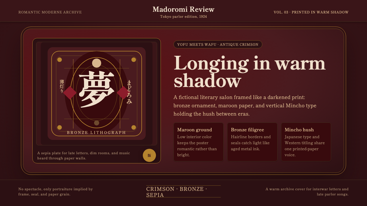 Taishō RomanLonging framed in bronze. Maroon ground, Mincho type, and sepia ornament hush…眷恋被青铜裱起:绛红底、明朝体与旧纸纹样让画面静下来。
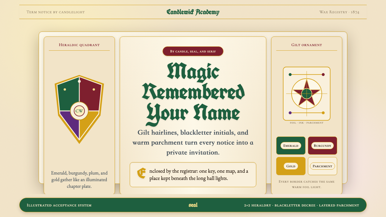 Harry Potter IllustratedMagic arrives by parchment. Emerald, burgundy and gilt borders frame blacklet…魔法随羊皮纸抵达:翡翠绿与酒红分区,金箔边框托起黑体法令。
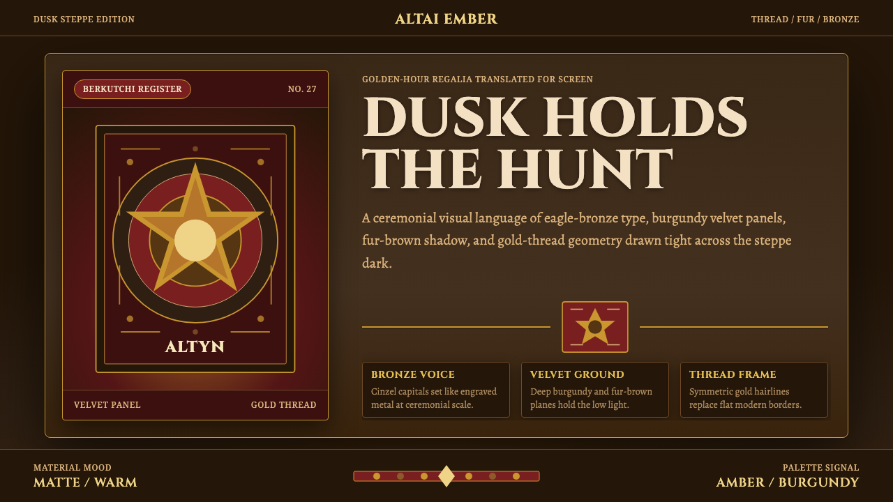 Kazakh Eagle HunterGolden hour feels handmade. Burgundy velvet, bronze type, and gold-thread bor…手作的黄金时刻。酒红丝绒、古铜字与金线边框托住暮色。
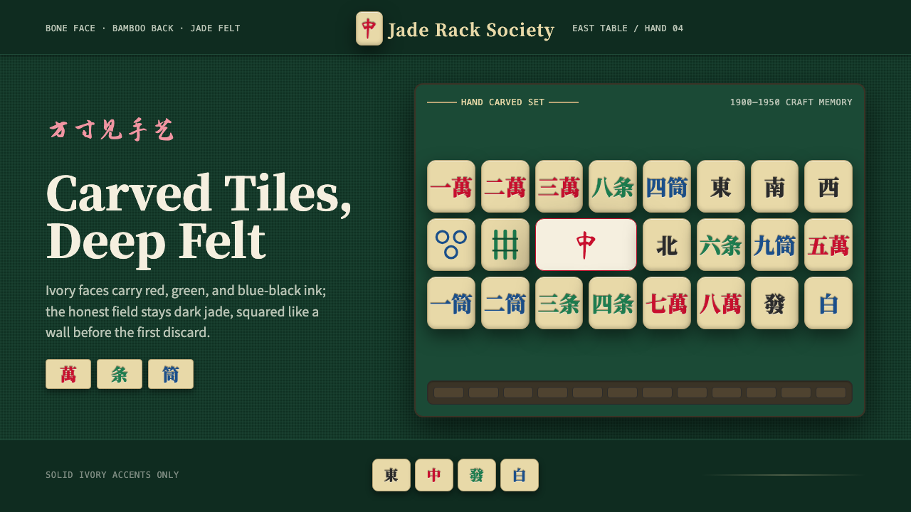 Mahjong Tile SetTactile craft on jade felt. Ivory tiles carry red, green, and blue ink in a h…翠绿毡面上的手工触感:象牙牌面承载红绿蓝三色刻墨。
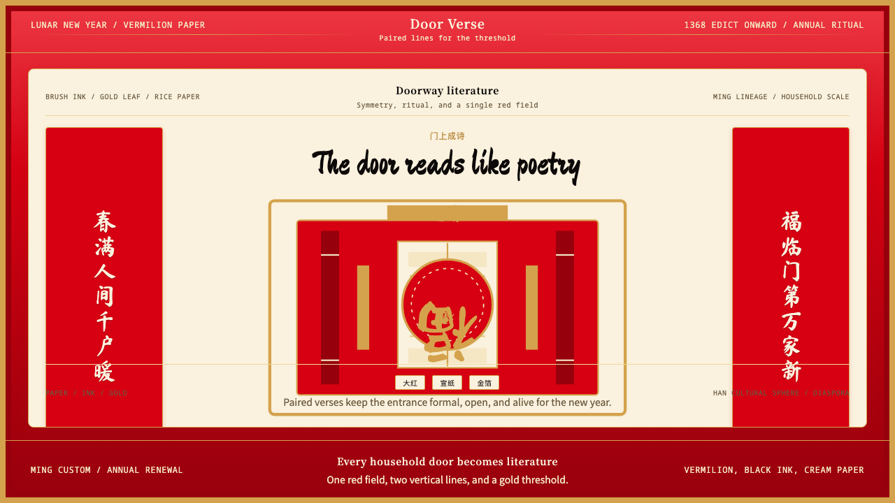 Chinese Spring Festival Red CoupletLiterature on the door. Vermilion paper, vertical pairs, and gold calligraphy.门上成诗。大红纸、竖联对称与金墨呼应。
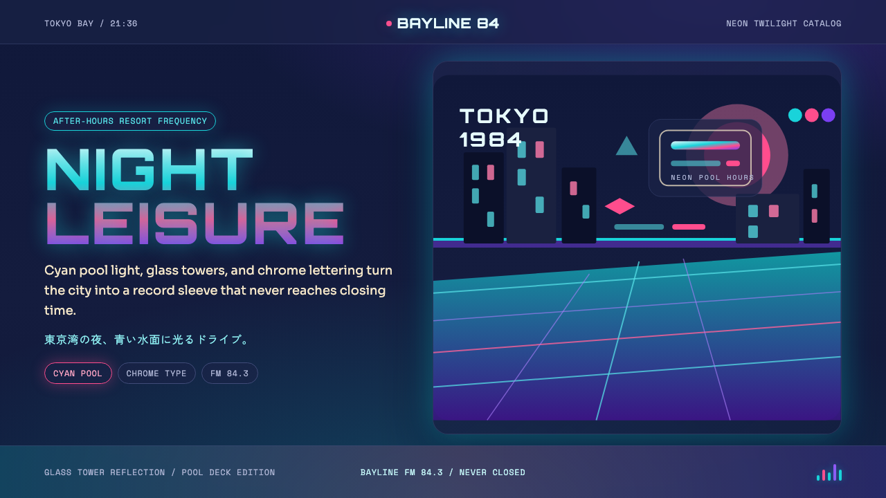 City Pop TokyoNeon leisure after dark. Cyan pool lines, chrome Orbitron, and pink-purple du…夜色霓虹的闲适。青蓝泳池线、镀铬字和粉紫暮光。