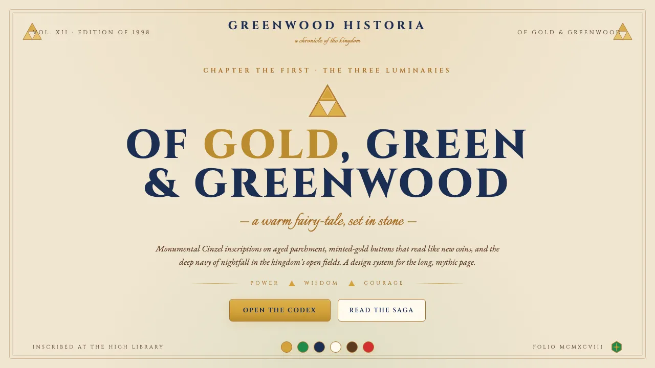
About Zelda Ocarina of Time
Ocarina of Time (Nintendo, 1998) gave the Zelda canon its 3D voice and locked in the visual language fans still recognize a quarter-century later: gold Triforce, Hyrule-green Hylian shield, cream parchment, and the deep navy of nightfall in Hyrule Field.
This system translates that warm-fantasy-medieval gravity into UI: monumental Cinzel inscriptions sit on aged-cream pages, gold CTAs read like minted coins, and every divider hints at the Triforce silhouette. It's Nintendo at its most mythic — fairy-tale, but with the weight of an ancient saga.
- Origin
- Kyoto, Japan (Nintendo HQ); global influence
- Era
- Zelda founded 1986; Ocarina of Time 1998 (canonical 3D debut); canon ongoing through Tears of the Kingdom 2023
- Key figures
- Shigeru Miyamoto · Takashi Tezuka · Eiji Aonuma
- Movements
- Nintendo Zelda canon · action-adventure-RPG foundation · warm-fantasy mythology
Zelda Ocarina of Time design spec
Colors
Typography
The other 11 sections — buttons, cards, spacing, motion, techniques and more — open once you unlock. Download the DESIGN.md or send it to your AI in one click. Unlock once, yours forever.
Sign up nowStyles similar to Zelda Ocarina of Time
Also inspired by film, games & music, with a close feel.
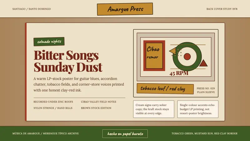 Dominican Bachata & Perico RipiaoPlainspoken warmth. Kraft stock, red clay serif, and typewriter credits carry the amargue.
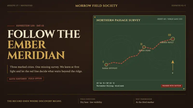 Raiders Expedition (1981)Adventure stays mid-journey. Red routes cross saddle leather under tarnished brass rules.
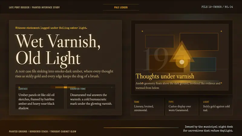 Disco ElysiumNoir rot glows from within. Amber Caslon type cuts through varnish-dark umber.
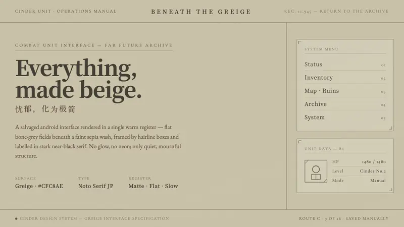 NieR: AutomataSci-fi that refuses neon. Flat greige fields under sepia wash, hairline boxes, near-black serif.