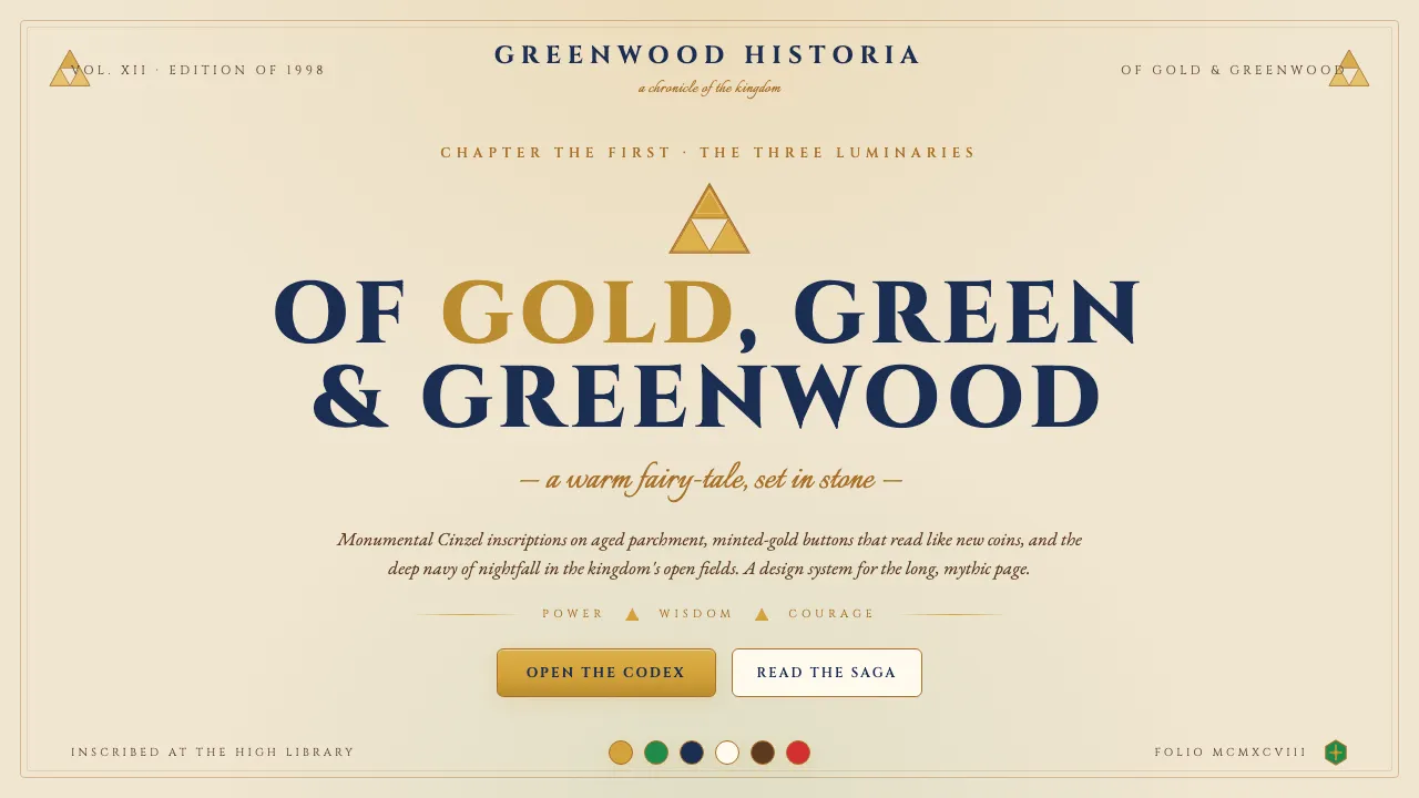
关于 Zelda Ocarina of Time
1998 年,任天堂在京都为《塞尔达传说·时之笛》定下了延续至今的视觉范式:金色的力之三角、Hyrule 绿的海拉鲁盾、米色羊皮的大地、与海拉鲁原野夜空的深靛蓝。它不像同时代的任何一款游戏,反而更像一本被反复翻阅的中世纪传奇——温暖、克制、有重量。
这套设计系统把那份"温暖奇幻的庄严感"翻译进界面:Cinzel 的碑铭字体落在做旧的米色页面上,金色按钮像是新铸的硬币,每一处分隔线都藏着力之三角的轮廓。它属于宫本茂、青沼英二,属于林克拔出大师之剑的那一刻——童话,却背负着古老史诗的份量。
- 来源
- 日本京都
- 年代
- Zelda founded 1986; Ocarina of Time 1998 (canonical 3D debut); canon ongoing through Tears of the Kingdom 2023
- 代表人物
- Shigeru Miyamoto · Takashi Tezuka · Eiji Aonuma
- 所属运动
- Nintendo Zelda canon · action-adventure-RPG foundation · warm-fantasy mythology
Zelda Ocarina of Time 的设计规格
和 Zelda Ocarina of Time 相似的风格
同样来自影视 · 游戏 · 音乐,气质相近。