What is Sinhala Ola-Leaf?
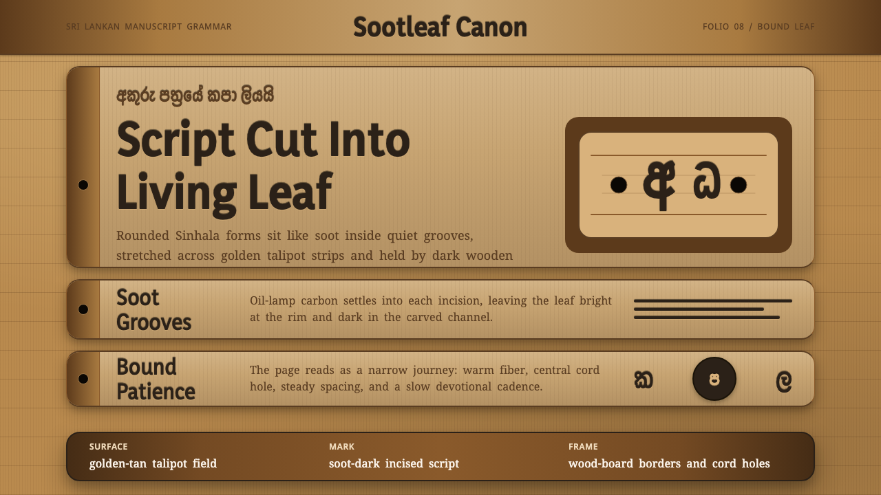
Before paper, monks wrote on living palm leaf — soot pressed into hand-cut grooves, bound between carved wood, a page made of patience.
Sinhala Ola-Leaf in brief
Sinhala Ola-Leaf is a design language drawn from the puskola pot — the traditional Sri Lankan palm-leaf manuscript, a writing surface made not from processed paper but from dried strips of talipot palm leaf, incised letter by letter and rubbed with lamp-black soot until the script blooms dark inside the carved grooves. This is a devotional writing technology developed and sustained by Theravada Buddhist monastic scribes to transmit the Pali canon and other texts across centuries in a tropical climate hostile to paper's survival.
The physical object dictates the visual grammar entirely. A page is a long, narrow, horizontal strip of golden-tan leaf, fibrous and unevenly toned rather than smooth and uniform, threaded through a single central binding hole and pressed between carved wooden cover boards that protect the stack of leaves when not in use. Letterforms in the Sinhala script are famously rounded — a consequence, tradition holds, of the stylus needing to avoid cutting straight lines that would split the fibrous leaf along its grain — and this rounded quality appears throughout the visual system as a formal signature.
The system carries this scribal patience directly onto the screen: soot-dark text sitting on a living leaf-brown ground, wood-board framing at the edges of content areas, and the long horizontal rhythm of a leaf strip organizing layout into narrow, unhurried bands. The overall mood is tactile, devotional, and slow — deliberately resistant to the instant, frictionless feel of most contemporary digital interfaces.

Where does Sinhala Ola-Leaf come from?
The palm-leaf manuscript tradition in Sri Lanka forms part of a much broader South Asian and Southeast Asian practice of writing on prepared leaves of the talipot or palmyra palm, a technology that predates paper's arrival in the region by many centuries and that Theravada Buddhist monastic communities specifically relied on to preserve and transmit the Pali canon — the core scriptural collection of Theravada Buddhism — as well as historical chronicles, medical texts, and astrological works. This tradition remained continuously active across Sri Lanka's medieval and early-modern periods, well into the era before widespread paper and print adoption.
Producing a puskola pot began with harvesting and processing talipot palm leaves: cutting them to size, boiling or steaming them to soften the fibers, drying and pressing them flat, and cutting them into long, uniform strips. A scribe — typically a monk trained in the practice within a monastic setting — then used a sharp metal stylus to incise the text letter by letter directly into the leaf's surface, a slow, physically demanding process requiring precise pressure to score the fiber without tearing it.
Once the full text was incised, the scribe rubbed a mixture of oil-lamp soot and oil across the leaf's surface and wiped away the excess, leaving the black pigment lodged only within the carved grooves of the letterforms — a process that made the text permanently legible while leaving the surrounding leaf surface its natural golden-tan color. Finished leaves were stacked, a hole bored through the stack for a binding cord, and the whole bundle pressed between a pair of carved wooden boards that served as covers, protecting the fragile leaves from handling damage and the elements.
The rounded quality of Sinhala letterforms is often explained, in both scholarly and popular accounts, as a direct adaptation to this medium: straight strokes cut across a palm leaf's parallel fiber grain risk splitting the leaf, so scribes favored curved, looping letterforms that could be incised without following the grain's straight lines. Whether or not this is the full historical explanation, the rounded Sinhala script and the palm-leaf medium remain inseparably linked in the visual imagination of the tradition, and monastic copyists preserved this scribal culture as an act of religious transmission rather than mere record-keeping.
What defines the Sinhala Ola-Leaf look?
Color
A warm golden-tan leaf color serves as the dominant ground, uneven in tone the way a natural, dried palm leaf is uneven — never a flat, uniform beige. Soot-dark text sits within this ground as the primary figure, with wood-brown from the carved cover boards providing a slightly darker framing tone at the edges of content.
Rounded Letterforms
Curved, looping letterforms — echoing the Sinhala script's own rounded structure — define the style's typographic signature, whether rendered in the script itself or borrowed into accompanying Latin type as a rounded, soft-edged letterform choice. Sharp, angular type works directly against the style's core visual logic.
Long Horizontal Bands
Content is organized into long, narrow horizontal bands echoing the shape of a single leaf strip, rather than tall vertical columns or square blocks. This horizontal rhythm should feel unhurried and evenly paced, one strip following another the way leaves stack in a bound manuscript.
Central Binding Motif
A small central marker — echoing the bored binding hole through which a cord threads the leaves together — can serve as a recurring compositional anchor, appearing as a subtle central point of reference within a band rather than a decorative flourish.
Carved Wood-Board Framing
Edges of content areas or major sections can be framed with a wood-toned border evoking the carved cover boards that protect a bound manuscript, giving structural sections a sense of being held and protected rather than floating freely.
Fibrous, Uneven Texture
Surfaces should suggest the fibrous, tonally uneven quality of a real dried leaf rather than a perfectly smooth digital gradient — subtle variation in the ground tone signals the handmade, organic origin of the medium and distinguishes it from a flat beige color field.
Devotional Patience
Pacing and density should feel deliberate rather than rushed — generous space between lines of text, an unhurried reading rhythm, and a general absence of the dense, high-velocity information layouts common in modern interfaces. This reflects the physical reality that incising a manuscript letter by letter demanded enormous patience from the original scribes.

Who shaped Sinhala Ola-Leaf?
Monks trained within Theravada monastic institutions across Sri Lanka served as the primary scribes of the puskola pot tradition, treating manuscript copying as a devotional act of scriptural transmission rather than a purely clerical task. Their patient, letter-by-letter incising practice is the direct physical origin of the style's slow, tactile visual logic.
Generations of scribes specifically dedicated to preserving the Pali canon — the core scriptural collection of Theravada Buddhism — relied on the palm-leaf medium as the primary vehicle for transmitting these texts across centuries in a tropical climate where paper degraded quickly. Their work preserved not just texts but the entire visual and material culture the style now draws on.
The broader tradition of palm-leaf manuscript-making across South Asia — shared, with regional variation, across Sri Lanka, southern India, and other Theravada Buddhist regions — supplied the underlying material technology (leaf preparation, stylus incision, soot rubbing) that the Sinhala tradition adapted into its own distinct scribal and artistic practice.
How do you use Sinhala Ola-Leaf today?
Sinhala Ola-Leaf transfers well to any digital product wanting to signal patience, devotion, and organic craft rather than speed or slickness — meditation and mindfulness applications, cultural heritage and archival platforms, educational tools about Buddhist or South Asian textual traditions, or slow-living and journaling products that want a tactile, handmade feel. Because the style is drawn from a specific and living religious and cultural tradition, applying it respectfully means preserving its unhurried pacing rather than compressing it into a fast, dense modern layout.
For presentation slides, a cover works well built on a warm, unevenly toned leaf-brown field with a centered soot-dark title set in rounded letterforms, and a subtle wood-toned border framing the whole composition — echoing a manuscript's carved cover board. Content slides should adopt the long horizontal band rhythm: a few wide, shallow rows of content rather than tall columns, with generous line spacing standing in for the patient pacing of hand-incised text. Data content should be minimal and simply presented, since the style's organic, uneven textures work against the crisp precision data visualization typically requires.
For web interfaces, the style suits landing pages, about pages, and long-form reading experiences — a meditation app's onboarding flow, a cultural archive's introduction page, a slow-journaling tool's writing surface — far better than data-dense dashboards. A hero section might use a leaf-brown ground with rounded typography and a single central binding-hole-inspired accent mark, with wood-toned framing at the section's edges rather than a hard digital border.
For editorial and marketing work, the style rewards long-form, contemplative content: an essay on mindfulness, a cultural history feature, or a heritage brand's founding story. Pull quotes read well in rounded letterforms against the leaf-brown ground, and imagery should favor close, tactile detail — leaf texture, carved wood grain, the incised grooves of a script — over polished, high-gloss product photography.
A common mistake is flattening the leaf-brown ground into a uniform, smooth beige, which loses the organic, handmade quality the style depends on — subtle unevenness in tone is a feature, not noise to be cleaned up. A second common mistake is pairing the style with sharp, high-velocity modern UI patterns (dense data tables, rapid animation, aggressive calls to action), which directly contradicts the devotional patience the entire visual language is built to express.

Sinhala Ola-Leaf — FAQ
Why are the letterforms in this style so rounded?
Tradition attributes this to the physical constraints of the medium: incising a straight line across a palm leaf's parallel fiber grain risks splitting the leaf, so scribes favored curved, looping strokes that could be cut without following the grain's direction. This physical origin story is why the style treats rounded letterforms as a non-negotiable signature rather than an optional decorative softening.
Is this style specific to Sri Lanka, or shared across South Asia?
Palm-leaf manuscript-making as a broad technology was shared across South and Southeast Asia, but the specific scribal tradition this style draws on — the Sinhala puskola pot, its rounded script, and its association with Theravada monastic transmission of the Pali canon — is specifically Sri Lankan, even as it shares underlying material techniques with related traditions elsewhere in the region.
Can this style work with bright, saturated colors?
No — the palette must stay within the warm, muted, earthy range of dried leaf, soot, and carved wood. Bright or saturated colors immediately break the connection to the physical manuscript object and shift the mood from devotional and organic toward something more decorative or commercial, undermining the entire premise of the style.
How should pacing and density be handled in this style?
Generously and unhurriedly. The style's entire premise is built on the patience required to incise a manuscript letter by letter, so dense, fast-scrolling layouts or aggressive information density work against its core logic. Content should be given room to breathe, organized into long horizontal bands with generous spacing, echoing the deliberate pace of hand-copying a text.
What kind of products should avoid this style?
Fast-paced, transactional, or data-dense products — trading platforms, real-time dashboards, high-velocity e-commerce checkouts — sit uneasily with this style's core value of devotional patience. It is best reserved for contexts genuinely oriented around slowness, reflection, cultural heritage, or craft, where an unhurried, tactile visual language actually supports the product's purpose rather than fighting against it.
Related design styles
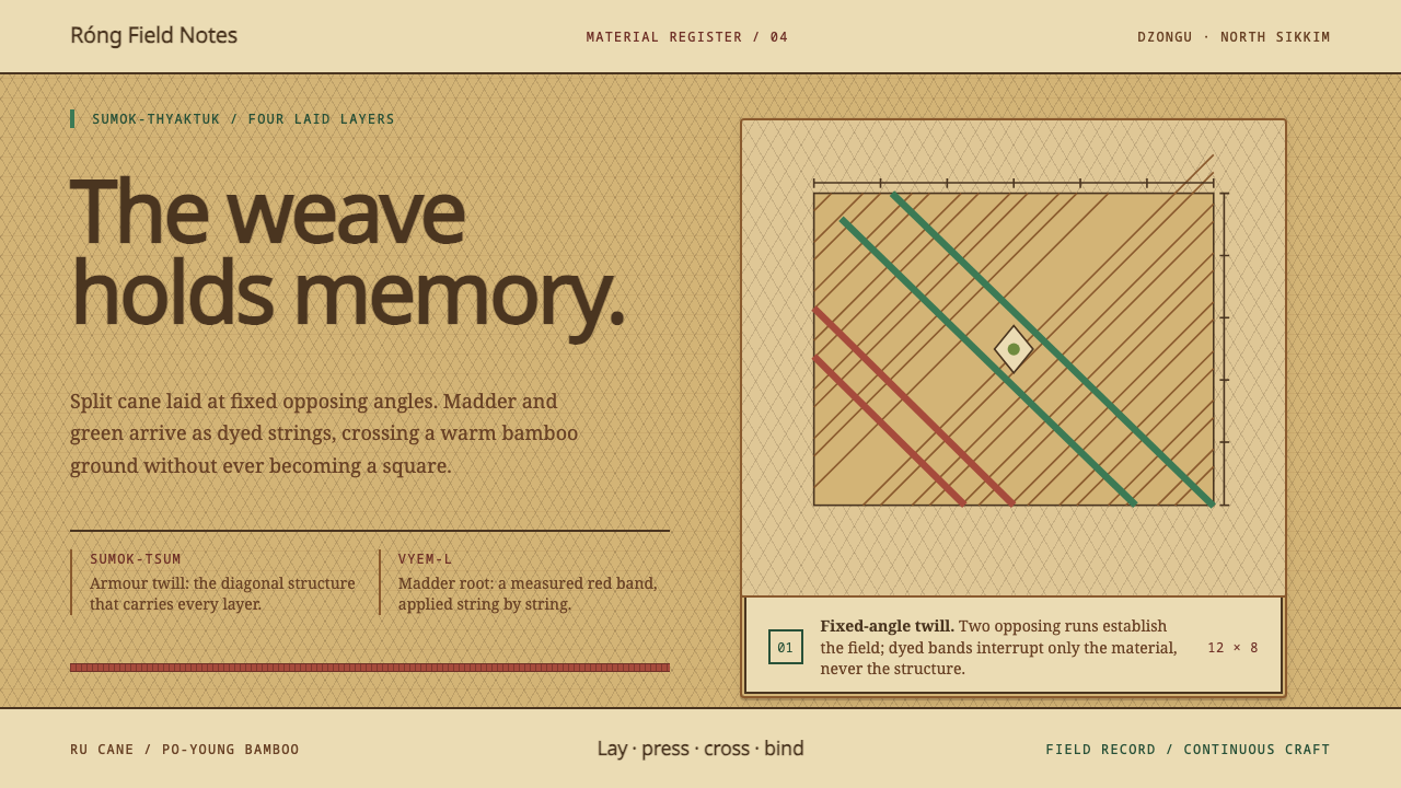 Lepcha Bamboo CraftThe weave holds memory. Madder and green bands cross split-bamboo diagonal tw…
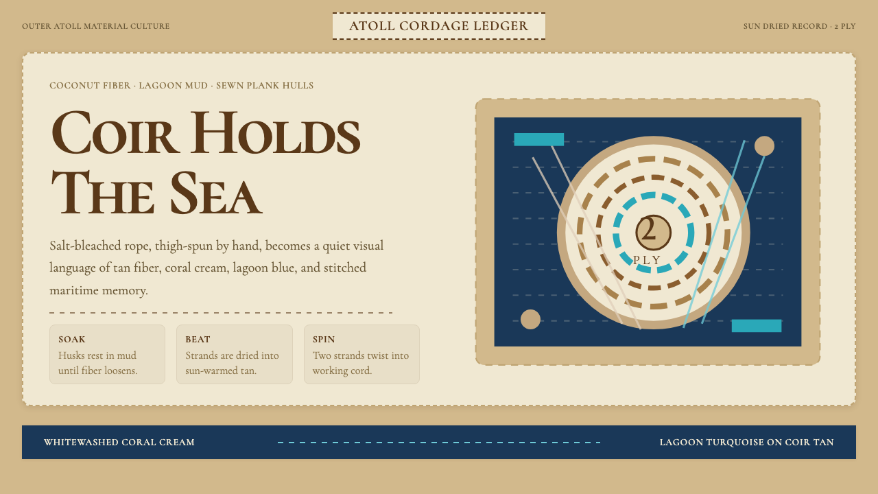 Maldivian Coir (Coconut Rope)Ocean-tested craft. Coir tan, coral cream, Cormorant type, and dashed seam ge…
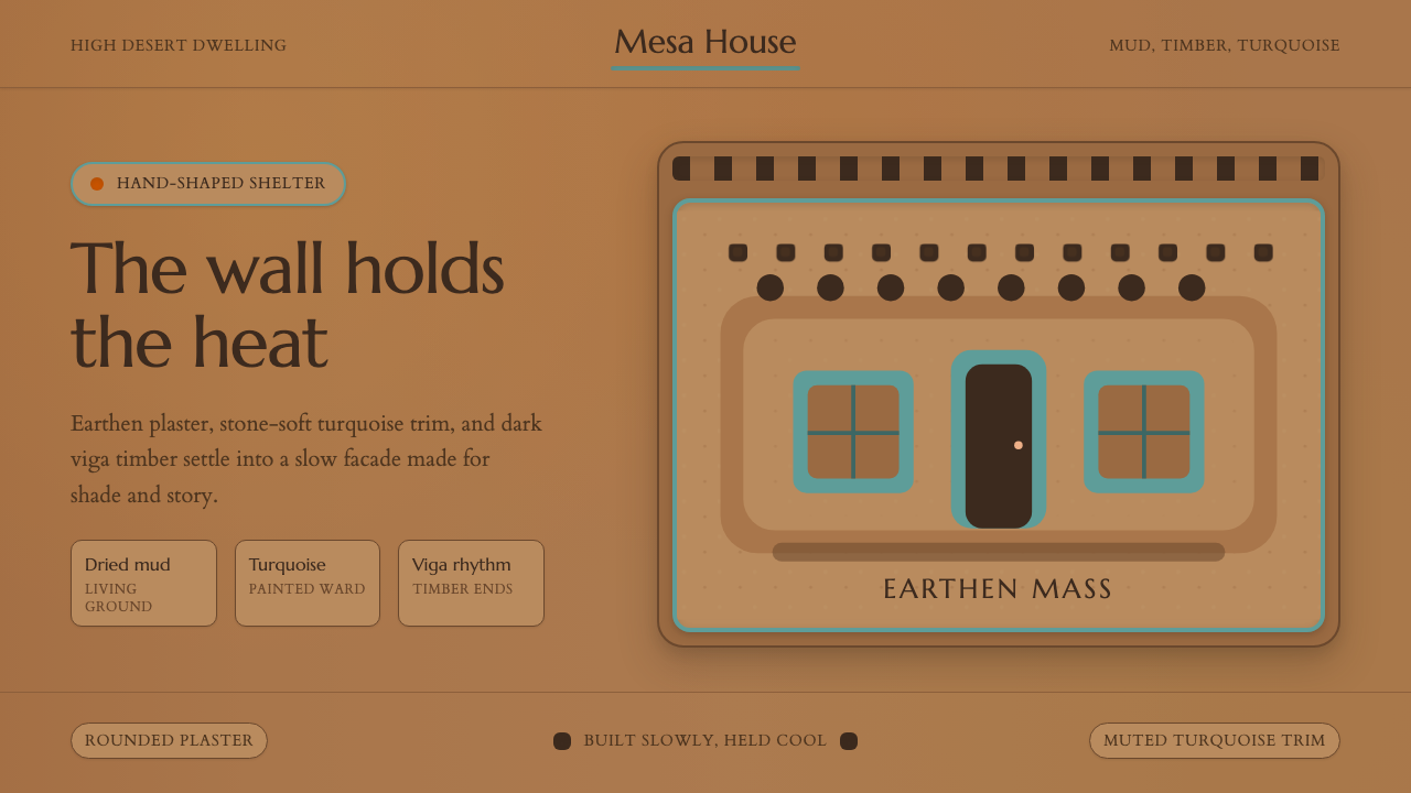 Adobe Pueblo SouthwestFeels made by hand. Earthen tan, turquoise trim, and viga rhythm shape the fr…
 Bashkir Wild HoneyA working forest held on one axis. Pale tamga cuts and honey gold rise throug…
 Botswana Coiled BasketThe pattern keeps travelling. Bark-brown stepped bands wind across a straw co…
 Guaraní Takuara BasketPattern is a record, not garnish. Honey bamboo and soot strips lock into a co…