What is Peranakan Shophouse Pastel?
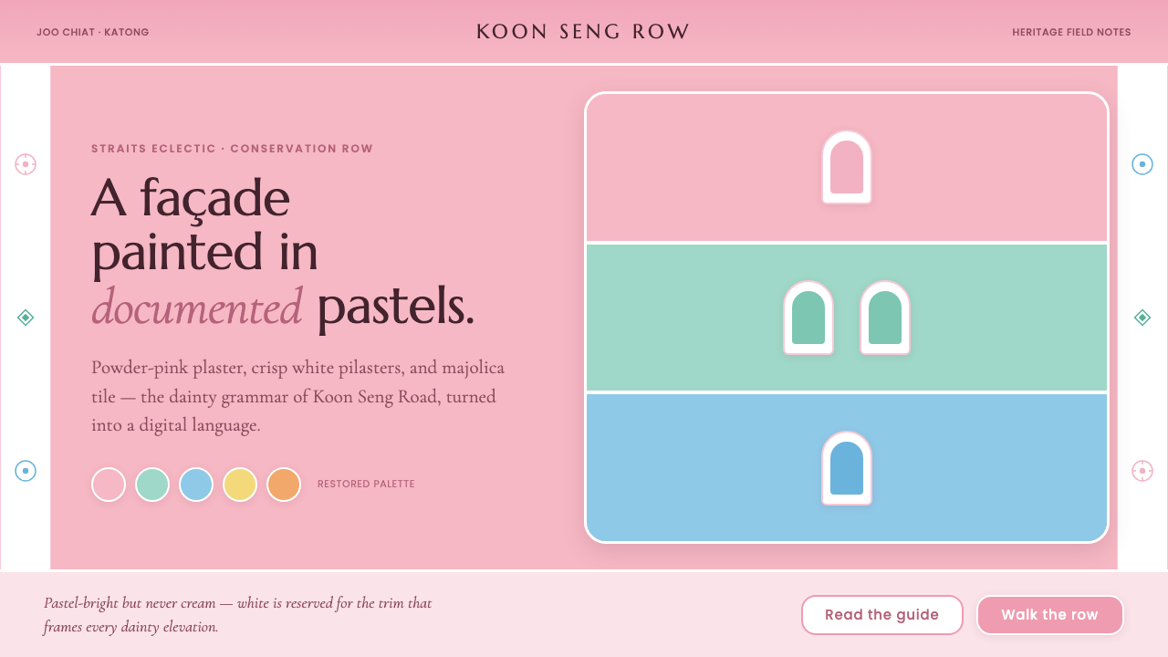
Peranakan Shophouse Pastel turns the Straits-eclectic terrace into a digital streetscape: powder-pink walls, white architectural trim, and majolica pattern held in poised ornamental order.
Peranakan Shophouse Pastel in brief
Peranakan Shophouse Pastel draws from the shophouses of Koon Seng Road in Singapore’s Joo Chiat and Katong districts. These two-storey terraces, built mainly during the 1920s and 1930s, are recognized for powder-pink and rose facades framed by white pilasters, ornate plaster cornices, and majolica tile panels.
The system translates that architectural vocabulary into a digital language that is pastel-bright but never cream. Pink establishes the atmosphere and broad surface; white is reserved for crisp trim, framing, separators, and other elements that clarify structure. The result is decorative without becoming soft-edged, and cheerful without losing architectural discipline.
Its visual identity depends on the relationship between surface and frame. A pastel field should feel like plaster, while a white edge should feel like a pilaster, cornice, or clean architectural reveal. Majolica-inspired pattern introduces rhythm and detail, but ornament remains concentrated and purposeful. The page should resemble a carefully maintained heritage facade rather than a loose collection of nostalgic decorations.
Where does Peranakan Shophouse Pastel come from?
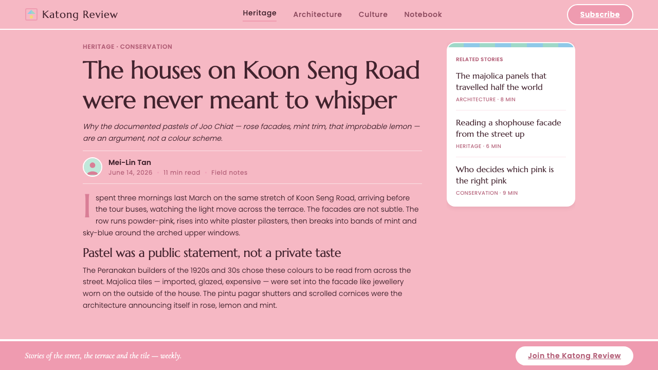
The reference comes from Singapore’s Joo Chiat and Katong districts, especially Koon Seng Road, whose Peranakan shophouses form one of the city’s most photographed heritage rows. The architectural subject belongs to the period from 1900 to 1950, with the defining terrace construction concentrated in the 1920s and 1930s. Its identity is therefore tied to a specific place, building type, and historical moment rather than to generic pastel nostalgia.
Peranakan, or Straits Chinese, merchant families are among the key figures behind the cultural world represented by this style. The shophouse is not presented as an isolated object but as a repeated urban frontage: adjoining facades, shared street presence, and a continuous rhythm of openings, pilasters, cornices, and panels. The digital system preserves that sense of an ordered row, where each surface contributes to a larger streetscape.
Shophouse master builders form another essential part of the origin story. Their work produced the architectural framework that allows ornament to remain legible: vertical pilasters give the facade a clear skeleton, plaster cornices finish the upper edge, and decorative panels occupy deliberate zones within the composition. In a digital adaptation, this translates into strong framing, stacked sections, and visible relationships between container and content.
Majolica tile importers complete the source material’s circle of influence. The tile panels bring a distinct ornamental register into the otherwise disciplined facade, introducing pattern as an architectural insert rather than as an all-over surface. Together, Straits eclectic architecture, Peranakan shophouse design, and majolica tilework create a language that is simultaneously local, commercial, ornamental, and highly structured.
What defines the Peranakan Shophouse Pastel look?
Pastel, Never Cream
The palette begins with powder-pink and rose, supported by clear white and restrained dark accents where legibility requires them. The pink should feel deliberate and architectural rather than sugary. Cream is excluded because it softens the crisp relationship between facade and trim; the defining contrast is pastel surface against clean white edge.
Crisp Architectural Framing
White is structural, not atmospheric. It outlines blocks, marks transitions, frames content, and creates the visual equivalent of pilasters and cornices. Framing should be clean and confident, with enough presence to organize the page but never so much that it becomes a decorative border detached from the content inside.
Majolica Pattern
Majolica tilework supplies the style’s most concentrated detail. Pattern belongs in panels, insets, headers, or selected accents where it can be read as an architectural feature. Its role is to add rhythm and locality, not to fill every open area. A restrained tile motif can make a plain interface feel built rather than merely colored.
Ornament in Deliberate Zones
The facades are dainty and ornamental, but their decoration is not evenly distributed. Cornices, pilasters, and tile panels carry the detail while larger wall surfaces remain calm. This creates a useful hierarchy: broad fields establish mood, architectural accents reward attention, and content remains easy to locate within the decorated structure.
Terraced Rhythm
The shophouse reference is fundamentally serial. Repeated facades create continuity, while each individual frontage retains its own ornamental identity. Digital layouts can echo this through related cards, stacked sections, or repeated content frames that share a family resemblance without becoming mechanically identical.
Surface Against Edge
The style depends on a tactile contrast between plaster-like fields, crisp painted trim, and patterned tile inserts. In digital work, this means surfaces should remain visually distinct from their framing elements. Depth comes from adjacency, proportion, and pattern placement rather than from heavy effects or simulated material complexity.
Who shaped Peranakan Shophouse Pastel?
Peranakan, or Straits Chinese, merchant families are central to the cultural identity behind the shophouses. Their presence anchors the style in a lived commercial streetscape rather than an abstract decorative vocabulary. The digital translation should therefore feel social and urban, with ornamental facades understood as part of an active row of businesses and homes.
The master builders established the repeated architectural framework that makes the style recognizable: adjoining terraces, vertical pilasters, plaster cornices, and carefully placed facade details. Their contribution is the underlying order that allows ornament to feel integrated instead of applied after the fact.
Majolica tile importers brought the patterned panel into the shophouse vocabulary. Their role is reflected digitally whenever a tile-like motif appears as a selected inset, border, or ornamental interruption. Pattern becomes a sign of place and craft, not a generic background texture.
How do you use Peranakan Shophouse Pastel today?
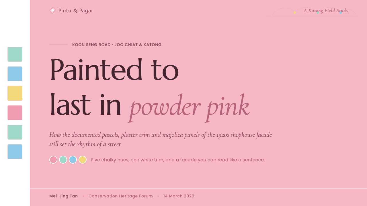
For presentation slides, use the pastel facade logic across the whole sequence. A cover can establish the mood with a broad powder-pink or rose field, a crisp white frame, and a title treated as part of the architecture. Content slides should use white lines, pilaster-like side structures, and calm surfaces to separate information. Data slides can turn charts, comparison blocks, or highlighted figures into majolica-like panels, using ornament selectively so the information remains primary.
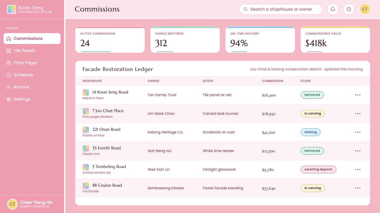
For web interfaces, the style suits dashboards and pricing pages that need warmth without losing organization. Keep the main field pastel-bright, use white to frame navigation, cards, tables, and important transitions, and reserve tile-inspired pattern for selected states or featured areas. Pricing tiers can behave like neighboring shophouse facades: related in structure, individually distinguished through surface color, panel detail, or a carefully chosen ornamental accent.
For editorial and marketing work, translate the facade into a page rhythm. Use broad pastel surfaces for opening sections, white architectural framing for metadata and pull quotes, and majolica-inspired panels for feature moments. Campaign pages can alternate calm wall-like fields with more concentrated ornamental areas, allowing the decorative vocabulary to create recognition while keeping headlines, product information, and calls to action sharply legible.
The style also works well for heritage, hospitality, food, cultural, and neighborhood-oriented communication because its visual language carries a strong sense of place. Use repeated frames to suggest a row of adjoining buildings, vary the ornamental details between sections, and let the typography sit clearly inside the architectural structure. The system feels most convincing when every decorative decision appears to belong to a facade, panel, or threshold.
The common mistake is to make the work generally soft, beige, and nostalgic. Cream backgrounds, uncontrolled pastel variety, random floral decoration, and tile patterns spread across every surface all weaken the reference. Peranakan Shophouse Pastel depends on powder-pink and rose, crisp white trim, and ornament placed in clear architectural zones. Remove anything that does not strengthen that relationship.
Peranakan Shophouse Pastel — FAQ
Is Peranakan Shophouse Pastel simply a pink-and-white color palette?
No. Color is only the entry point. The style depends on the architectural relationship between broad pastel surfaces and crisp white framing, supported by repeated terrace rhythm, plaster-like ornament, and selected majolica pattern. Without that structure, pink and white become generic styling rather than a translation of the shophouse facade.
Why must the palette be pastel but never cream?
Cream changes the contrast that gives the system its identity. The reference relies on powder-pink and rose surfaces being clearly outlined by white pilasters and trim. A creamy ground makes the frame less decisive and shifts the mood toward generalized vintage softness. The intended feeling is pastel-bright, crisp, and architectural.
How should majolica tilework be translated into a digital interface?
Treat it as an inset architectural feature. Tile-inspired motifs can frame a featured card, distinguish a section, interrupt a plain field, or mark a special state. They should not become a continuous wallpaper behind all content. The strongest translation keeps the pattern visible enough to establish locality while leaving generous calm areas for reading and interaction.
Can this style support functional dashboards and pricing pages?
Yes, provided the ornament follows the information structure. White framing can clarify navigation and grouping, while pastel surfaces distinguish related areas and majolica accents identify featured content. The style is strongest when decoration reinforces hierarchy rather than competing with it. Tables, metrics, and pricing tiers should remain easy to scan inside the architectural frame.
Can the system work on a dark background?
It is conceived as a light-ground system, so a dark inversion should be treated cautiously. The defining relationship is between pastel facade color and crisp white trim, not between luminous accents and a dark field. A dark adaptation may be possible for a limited feature, but using it across the entire interface would move the work away from the intended heritage-row character.
Related design styles
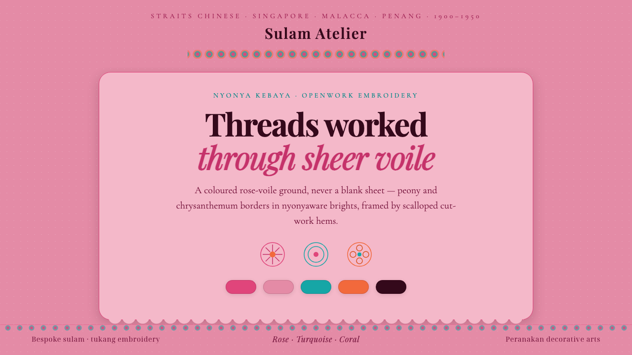 Nyonya Kebaya EmbroideryCraft, never a blank sheet. Rose-voile ground in turquoise sulam openwork, hi…
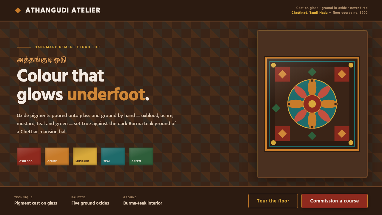 Chettinad Athangudi TilesColour that glows underfoot. Five ground-oxide tones on dark teak in bordered…
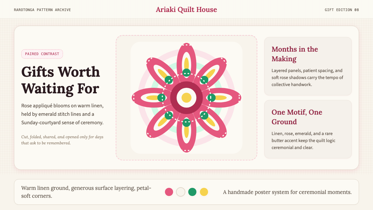 Cook Islands TivaivaiPatient generosity. Rose appliqué geometry blooms on linen with emerald stitc…
 Maldivian Liye Laa Jehun LacquerThree lac colours, nothing else. Glossy oxblood scraped through to yellow scr…
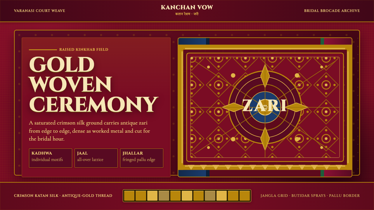 Banarasi Brocade SareeBridal maximalism, woven dense. Crimson silk grid carries raised antique-gold…
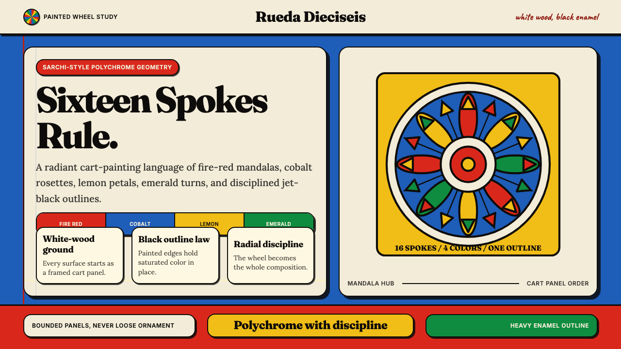 Costa Rican Oxcart Sarchí 1900Geometry sings. Fire red, cobalt, lemon and black outlines turn the wheel int…