What is Simón Vélez Bamboo?
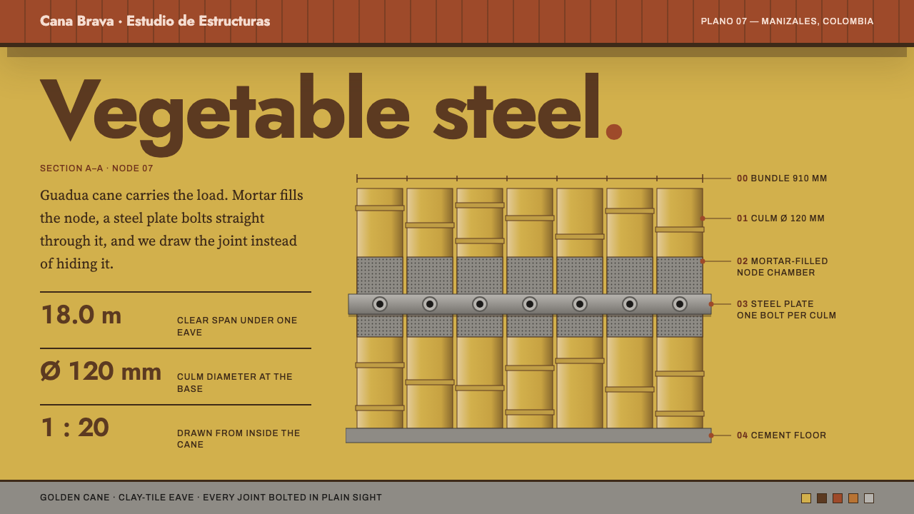
Simón Vélez made Colombian giant bamboo carry real structural load, and this system borrows his architecture's logic: golden cane, a heavy terracotta eave, and joints drawn openly as the main event.
Simón Vélez Bamboo in brief
Simón Vélez Bamboo is a design language derived from the buildings of the Colombian architect Simón Vélez, who is known for using guadua, a giant bamboo native to the Andean region, as a primary structural material. Unlike craft traditions that treat bamboo as a decorative weave or as a resort aesthetic, Vélez treats it as engineering: columns, beams and roof trusses made from cane.
The design system starts from the interior of one of his buildings. The page is the golden color of sun-cured cane, the ink is the dark brown of aged culms and joint shadows, and the accents come from terracotta roof tile, copper flashing and grey cement. A heavy roof band overhangs the content, panels read like canes laid side by side, and connections are drawn as steel plates bolted through mortar-filled nodes.
The result is warm, tactile and unusually honest. It does not hide how things are held together. Where most interfaces try to make structure invisible, this one makes it the central visual subject, in the same way Vélez does when he leaves bolts, plates and grout exposed as the proud signature of a building.

Where does Simón Vélez Bamboo come from?
Simón Vélez works mainly in Manizales and Bogotá, Colombia. His technique matured through the 1980s and 1990s, building on the Colombian bahareque tradition, an older way of constructing walls and houses from cane and earth that is common in the coffee-growing highlands. In that tradition, bamboo and earth were already everyday building materials, but they were mostly used in modest, vernacular structures. Vélez extended the same materials into a modern architecture of wide spans and generous roofs.
The key technical idea is the joint. Bamboo is hollow and can split under load where it is pierced or compressed. Vélez's solution was to fill the nodes with cement mortar and to connect members with steel bolts and plates, so that forces pass through a solid core rather than through the thin wall of the cane. This is the basis of the phrase vegetable steel, used for bamboo that is made to behave like a structural member. The joint is therefore both the engineering solution and the visual signature, and this design system gives it the same prominence.
Internationally, his work became widely visible with the ZERI Pavilion at Expo 2000 in Hannover, a large bamboo structure created in connection with Gunter Pauli, founder of the Zero Emissions Research Initiative. The pavilion showed a European audience that cane could form an expansive public building with monumental roof lines. Marcelo Villegas, a Colombian architect, is a collaborator associated with the same tradition of bamboo building in Colombia, and his name is often linked with Vélez in discussions of the country's modern bamboo architecture.
The movement behind this is often described as Latin American critical regionalism, an approach that uses local materials and skills to make modern buildings with a sense of place rather than copying international styles. It is also part of a broader field of bamboo and earth structural engineering that tries to turn fast-growing, low-carbon materials into reliable architecture. The design system distils this: it is not about a holiday atmosphere or woven craft, but about structure, roofs, sections and honest connection details.
What defines the Simón Vélez Bamboo look?
Golden cane ground
The page is a warm, golden yellow-brown, the color of cane cured in the sun. It is not a flat sunny yellow but a deep, slightly muted gold, with the faint natural variation of grown material. It gives the whole interface a tactile, organic warmth, and it sets the tone for everything placed on it: text, panels and drawings all sit on a surface that feels like a dried culm.
Aged-culm brown ink
Text and linework are a dark, warm brown rather than black. It echoes the darker tone of aged canes and the shadows at their joints. This softens contrast just enough to keep the page feeling natural, while remaining fully legible against the gold. Pure black would feel industrial and cold; this brown feels like a drawing made on a site.
Terracotta eave band
A thick horizontal band of terracotta red sits across the top of the layout like the overhanging roof of a bamboo house. It shelters the content below and gives the page a strong top edge. The reference is the long eaves characteristic of his buildings, which protect the cane from rain and sun. In the interface the band carries navigation or a title, and it is the system's heaviest visual element.
Panels as canes laid side by side
Cards and columns are tall, narrow and adjacent, reading like a row of canes. Edges are straight, corners are almost square and spacing between panels is tight, with a subtle vertical rhythm. The arrangement suggests a screen, a ceiling or a wall made of repeated stalks, and it gives content a strong sense of structure and direction.
Joints drawn openly
Connections are illustrated like a construction detail: steel plates, bolt heads, mortar-filled nodes and the hollow section of a cane. Dividers, tabs and buttons can show a small joint motif. The message is that how things are connected is worth showing, and that honest assembly is itself beautiful. Detail drawings use thin, precise lines against the gold.
Copper and cement accents
Small touches of oxidised copper and cool cement grey punctuate the warm palette. Copper stands for flashing and hardware; cement stands for floors and mortar. They appear in thin rules, tags and secondary states, bringing a mineral counterpoint to the organic gold and keeping the palette from becoming monotone.
Section drawing logic
Layouts are organised like architectural sections rather than elevations: you see the roof, the structure beneath it and the ground, all cut open at once. Hierarchy is vertical, from the heavy roof band down through content to a grounded base. This gives pages a strong sense of gravity, as though everything is literally supported.

Who shaped Simón Vélez Bamboo?
Colombian architect who made guadua bamboo a credible structural material for large buildings. His filled nodes, bolted steel plates and generous roofs define the visual and technical language this system is built on.
Colombian architect associated with the same school of bamboo building. His name is commonly linked with Vélez when discussing the country's modern bamboo architecture and its rise from vernacular to recognised design.
Founder of the Zero Emissions Research Initiative and the figure connected with the ZERI Pavilion at Expo 2000 in Hannover. The pavilion carried Vélez's work to an international audience and tied bamboo to ideas of sustainability.
How do you use Simón Vélez Bamboo today?
For slides, the style suits architecture, sustainability, materials science, craft-meets-technology and regional development presentations. A cover can use the golden ground with a thick terracotta band across the top and a title beneath. Content slides can be arranged as vertical panels like canes, each carrying one idea. For data slides, use thin brown lines on the gold and mark key numbers with copper or terracotta; diagrams can borrow the look of a construction detail, showing how parts connect.
For web interfaces, the language fits documentation sites, material libraries, construction and engineering tools, and brands built around natural or low-carbon products. Use the terracotta band as a persistent header, keep sections as tall panels, and show system architecture or process as joint-and-plate diagrams. Keep controls simple and square-cornered, with brown outlines and copper hover states. The style is especially good for developer or technical audiences who appreciate seeing how things are put together.
For editorial and marketing, pair the system with photographs of cane interiors, roof structures and hands working with materials. Long captions that explain construction methods fit well. Case studies, sustainability reports and exhibition pages can lean on the section-drawing layout. Tone should be grounded and practical, proud of craft but not romanticising it.
A common mistake is to treat the style as a resort or spa aesthetic, with light woven textures, palm leaves and a relaxed mood. That is exactly what this system is not. Another is to hide the joints and use bamboo only as a decorative pattern, losing the structural honesty that defines it. A third is to saturate the page with terracotta, so that the roof band no longer reads as a heavy cap. Finally, avoid replacing the brown ink with pure black, which breaks the organic warmth.

Simón Vélez Bamboo — FAQ
What is guadua and why does it matter?
Guadua is a giant bamboo native to the Andean region and widely used in Colombia. It is strong, fast-growing and light, which makes it attractive as a building material. Simón Vélez showed that, with the right joints, it can carry real structural loads and form large buildings.
What does vegetable steel mean?
It is a phrase for bamboo that has been made to behave like a structural material comparable to steel, by filling its nodes with mortar and connecting it with bolts and plates. In this design system, the idea becomes the visual rule that joints should be drawn openly and treated as the main subject.
Is this the same as a tropical or eco-resort style?
No. Resort styles tend to emphasise relaxation, woven textures and leafy imagery. This system emphasises engineering, sections, roofs and connection details. The warmth comes from materials and color, but the mood is that of a building site and a drawing board.
Why use brown instead of black for text?
Brown echoes the dark tone of aged cane and the shadows at joints, keeping the page organic and warm. It remains legible against the golden ground but avoids the harsh, industrial feeling of pure black. It also ties the text visually to the material the system is based on.
What kinds of projects benefit most from this style?
Projects that tell a story about structure, materials or sustainability: architecture portfolios, engineering documentation, low-carbon product brands, craft institutions and educational exhibitions. It is a poor fit for fast, glossy consumer apps or anything that wants to feel futuristic and weightless.
Related design styles
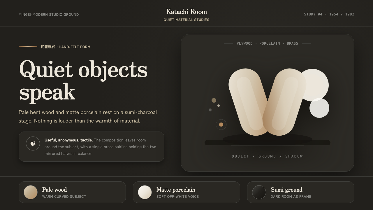 Sori Yanagi ButterflyQuiet objects speak. Pale plywood and matte porcelain glow on a sumi-charcoal…
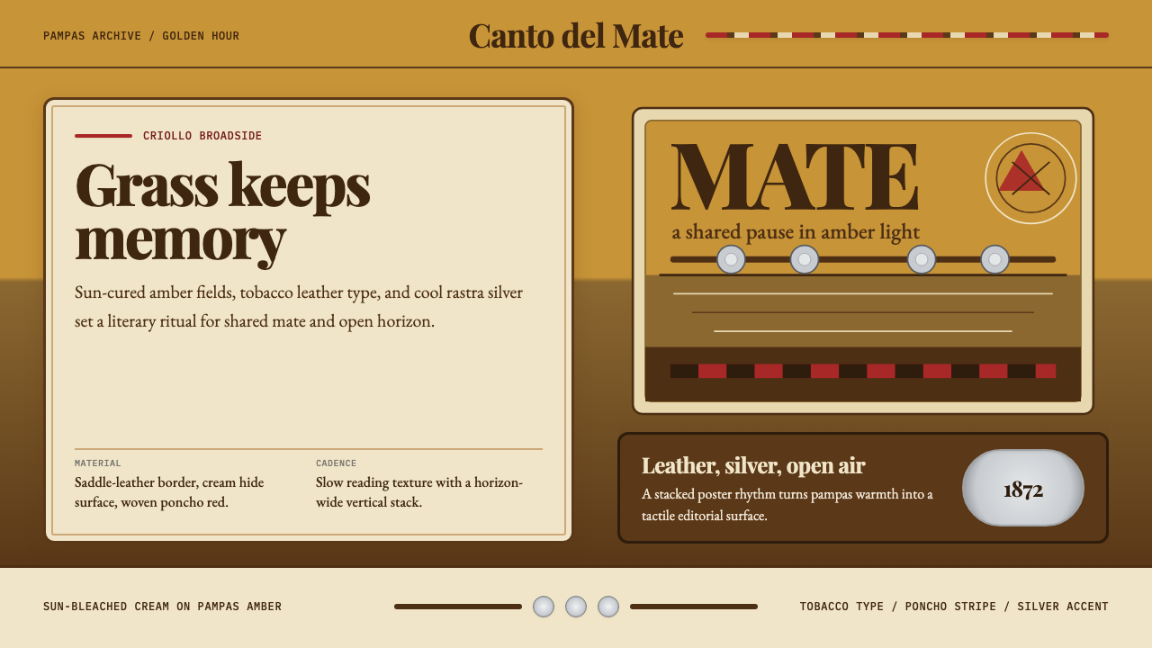 Argentine Gaucho (Pampas Mate Culture)Open grassland, printed warm. Amber fields, Playfair serif, and silver rastra…
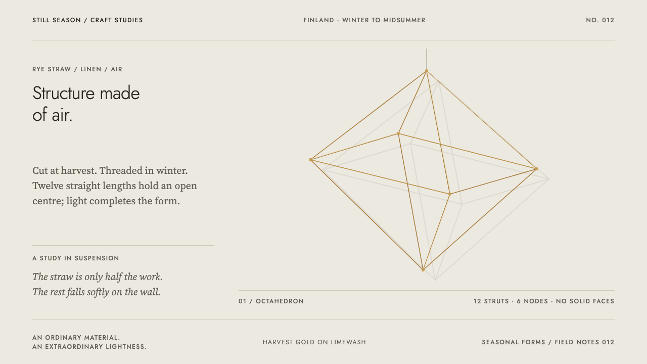 Finnish HimmeliAlmost entirely air. Straw-gold struts and a faint offset shadow on cool lime…
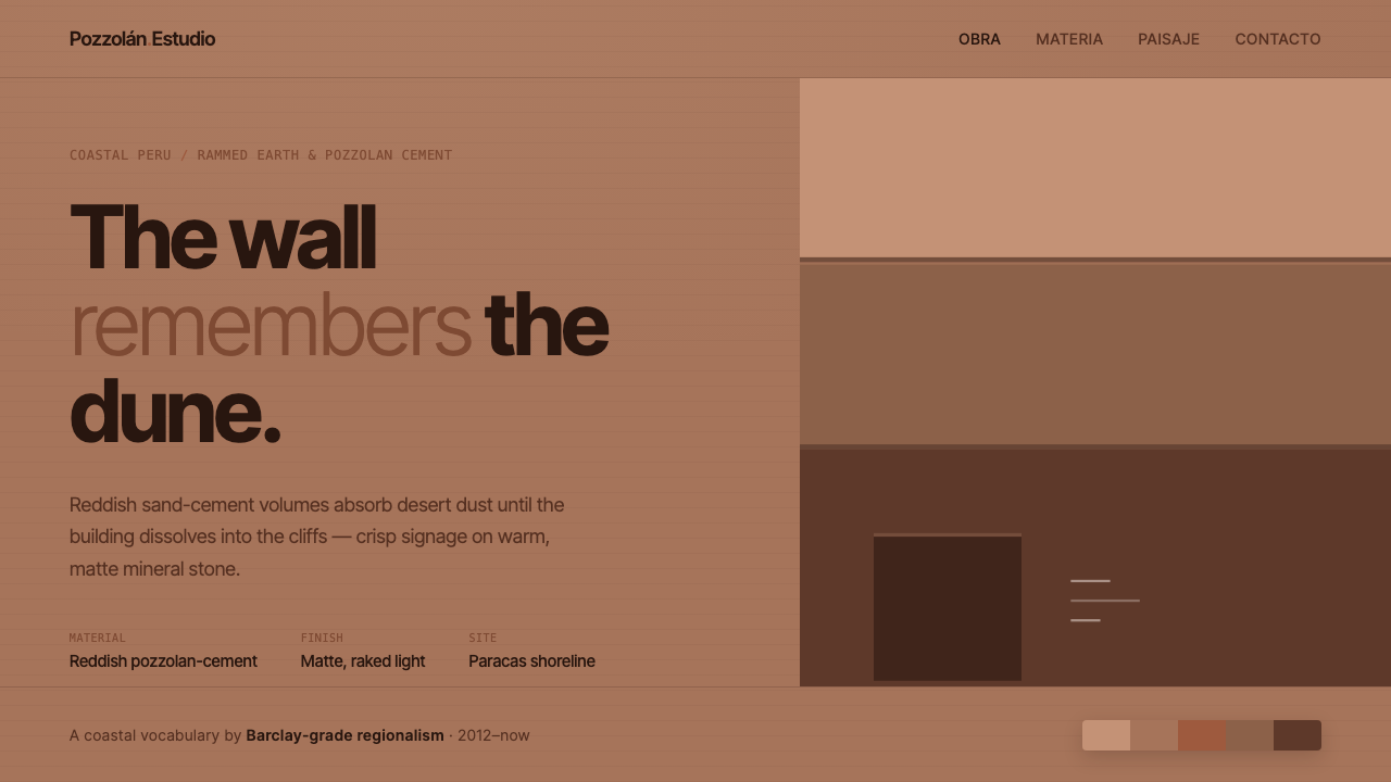 Peruvian Contemporary Adobe-ModernThe building dissolves into the dune. Reddish pozzolan-cement planes, matte r…
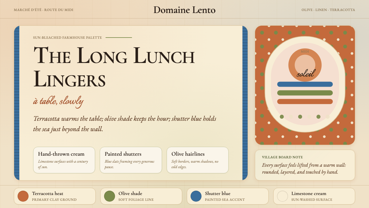 Provençal MediterraneanWarmth refuses the clock. Terracotta, olive lines, and shutter blue frame slo…
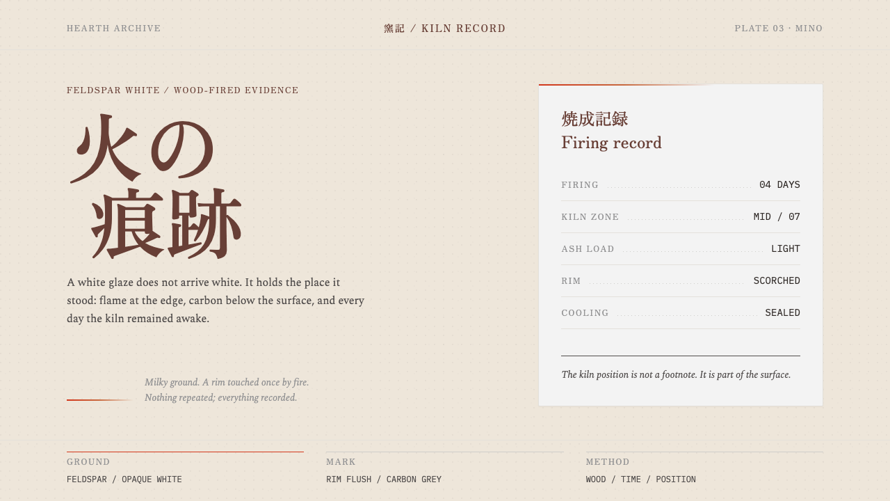 Anagama Shino GlazeFire leaves evidence, not decoration. Milky feldspar ground meets a sparse ki…