What is Peruvian Contemporary Adobe-Modern?
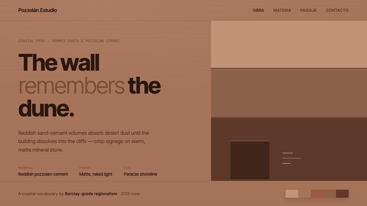
The building dissolves into the dune: reddish earth-toned planes, matte desert light, and signage reduced to its clearest possible form.
Peruvian Contemporary Adobe-Modern in brief
Peruvian Contemporary Adobe-Modern distills the coastal architecture associated with Barclay & Crousse in Lima and Paracas. Its visual language joins reddish pozzolan-cement, rammed-earth volumes, and desert-sand color with restrained modernist composition. The result is neither rustic imitation nor polished international minimalism. It is a contemporary architecture of absorption, where the building takes on the color and stillness of the coast.
The material palette is warm, dusty, and matte. Volcanic ash and red sand tint concrete and earth surfaces toward terracotta, rust, and sun-baked clay. Planes remain broad and quiet, allowing raking desert light to reveal mass through changing brightness rather than through ornament, texture, or decorative pattern. The building appears shaped by the landscape around it.
Typography provides the necessary counterpoint. Crisp sans-serif signage sits against heavy earth-toned surfaces, introducing legibility and human scale without competing with the material field. Nothing is added for visual richness alone. Every edge, opening, label, and plane is treated as part of a calm, precise system grounded in contemporary Peruvian rammed-earth architecture, adobe-modern minimalism, and critical regionalism.
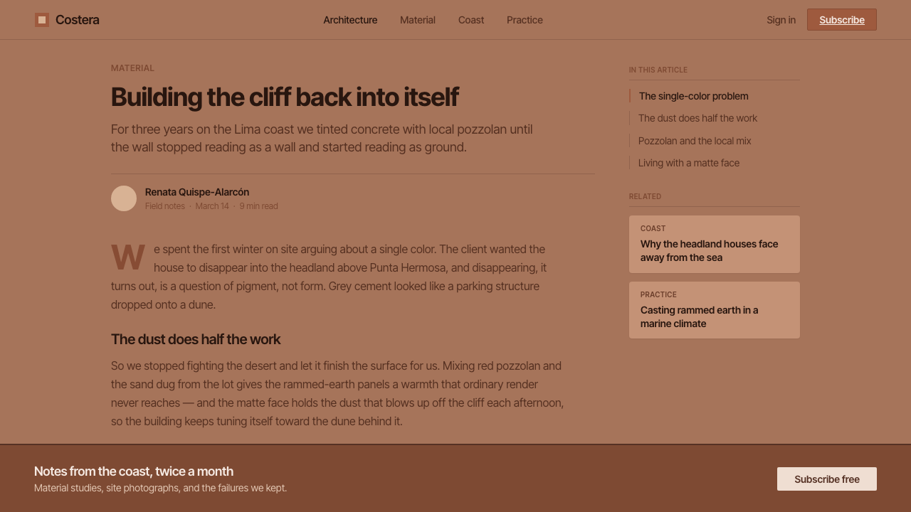
Where does Peruvian Contemporary Adobe-Modern come from?
The style belongs to the contemporary period, associated with Barclay & Crousse’s coastal works from around 2012 onward and situated within a broader 2010–now design context. Its geographical center is coastal Peru, especially Lima and Paracas, where desert, dust, cliffs, and intense lateral light form an inseparable part of the architectural imagination.
Its material language draws from contemporary Peruvian rammed-earth architecture and from the visual memory of adobe construction. Reddish pozzolan-cement and rammed earth are not treated as neutral structural substances hidden beneath a finish. Their color and matte presence become the visible identity of the building. Sand and volcanic ash give the surfaces a local register without turning them into historical replicas.
The style also reflects critical regionalism: modern architecture remains geometrically controlled and materially disciplined, but it is not detached from place. The red planes answer the dunes and cliffs of the Peruvian shore. Broad masses seem to continue the terrain, while deep tonal quietness prevents the building from becoming an imported object placed against the landscape.
From these conditions emerges an adobe-modern minimalism defined by subtraction. Decoration disappears, glossy surfaces recede, and light becomes the active ornament. The architecture is contemporary because its forms and signage are precise; it is regional because its color, mass, and atmospheric character belong unmistakably to the coastal desert.
What defines the Peruvian Contemporary Adobe-Modern look?
Earth-Tinted Color
The palette centers on reddish terracotta, rust, dust, and sun-baked clay, with warm off-whites and restrained dark neutrals for contrast. Color should feel absorbed into the material rather than painted on top of it. Saturation remains muted and mineral, allowing the architecture to sit inside the landscape instead of announcing itself above it.
Matte Mass
Volumes are broad, solid, and visually quiet. Rammed earth and pozzolan-cement planes read as substantial masses rather than thin skins. Surfaces should hold light softly without gloss, reflection, or simulated texture. The sense of weight comes from continuous planes, deep openings, and the disciplined relationship between void and wall.
Raked Light
Light is treated as a drawing instrument. Raking illumination moves across matte planes and makes edges, recesses, and changes in depth legible. The effect is quiet but never flat: time and atmosphere animate the same earth-toned surface without requiring gradients, ornament, or dramatic artificial effects.
Crisp Signage
Typography is restrained, sans-serif, and sharply legible. Signage functions as a precise layer placed against the rougher visual weight of earth and cement. Letterforms should not introduce personality through flourish; their authority comes from spacing, alignment, contrast, and the confidence of being exactly where they need to be.
Landscape Continuity
The building should feel related to the dune, cliff, and coastal desert rather than merely photographed beside them. Its color and mass continue the visual field of the site. This does not mean camouflage or literal imitation; it means choosing planes, openings, and tonal relationships that allow architecture and terrain to read as one connected environment.
Constructive Restraint
Every visible decision should support mass, light, orientation, or communication. Decorative borders, glossy accents, ornamental icons, and expressive surface effects weaken the system because they interrupt its material logic. Restraint is not emptiness here; it is the method that lets earth, shadow, and type carry the entire composition.
Who shaped Peruvian Contemporary Adobe-Modern?
Barclay & Crousse are the architectural practice whose coastal work provides the source reference for this design language. Their reddish pozzolan-cement and rammed-earth volumes, tuned to the desert sand and dust of coastal Peru, establish the central relationship between contemporary form, matte material, and landscape continuity.
Sandra Barclay is one of the two named key figures behind the coastal practice. In this style, her association with the work is represented through architecture that treats earth-toned material, desert light, and regional setting as a unified design problem rather than separate layers of decoration.
Jean Pierre Crousse is the second named key figure associated with the source practice. His place in this design language is expressed through disciplined contemporary massing, clear signage, and the refusal of ornament, allowing the coastal landscape and material character to remain the dominant experience.
How do you use Peruvian Contemporary Adobe-Modern today?
This style transfers best when its environmental logic is preserved. Begin with a warm, dusty field, establish a small family of earth-derived surfaces, and let broad planes organize the composition. Use crisp sans-serif type as a navigational instrument. The goal is not to decorate a modern layout with terracotta, but to make every visual decision feel exposed to the same matte desert light.
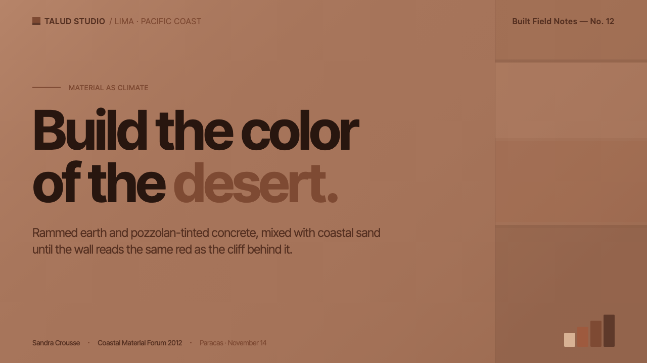
For presentation slides, the cover should establish the landscape relationship immediately: a large reddish plane, a quiet sand-toned field, or a cropped architectural mass can carry the opening while the title remains sharply legible. Content slides should use broad zones, restrained type hierarchy, and generous empty areas. Data slides should feel architectural and diagrammatic, with charts treated as solid fields and labels aligned with the same precision as signage.
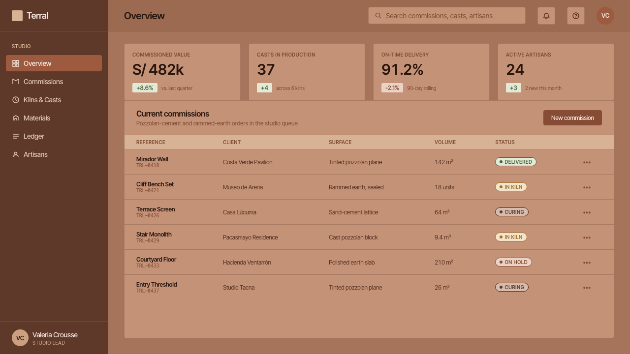
For web interfaces, the system suits dashboards, analytical tools, and pricing pages that need authority without technological gloss. Use earth-toned surfaces for structural regions, near-white grounds for reading areas, and dark neutral type for clarity. Cards should feel like inset planes rather than floating objects. Navigation can remain almost entirely typographic, with color reserved for active states, distinctions, and essential signals.
For editorial and marketing work, pair a narrow, readable text measure with large quiet fields of material color. Section changes can be marked by a shift from sand to terracotta, a deep recess, or a clean rule rather than an ornamental illustration. Marketing pages can use architectural crops, generous margins, and restrained calls to action so the product feels grounded, considered, and connected to place.
The common mistake is treating the style as a terracotta color theme. Bright orange, excessive texture, faux plaster, rustic lettering, and decorative desert imagery quickly turn the system into a mood board. Another mistake is adding soft visual effects that contradict its matte discipline. The correct test is whether the composition still feels calm, weighty, and materially continuous when most decoration is removed.
Peruvian Contemporary Adobe-Modern — FAQ
Is Peruvian Contemporary Adobe-Modern a historic architectural style?
No. It is a contemporary design language associated with Barclay & Crousse’s coastal works from around 2012 onward, within the broader present-day context of coastal Peru. It draws from rammed-earth architecture, adobe-modern minimalism, and critical regionalism, but its forms, signage, and applications are designed for current use.
Does the style require literal adobe or rammed earth?
Not necessarily in every application. The source language is grounded in reddish pozzolan-cement and rammed-earth volumes, so a convincing adaptation should preserve their visual qualities: mineral warmth, matte surfaces, broad planes, and a sense of weight. A digital interface or editorial page can express the system through color, spacing, cropping, and typography without pretending to be a physical wall.
Can it use a dark background?
It can, but the light-ground character is more faithful to the source. A dark background should remain matte and quiet, with reddish earth tones used as planes or signals rather than as glowing accents. Excessive contrast, glossy surfaces, and luminous effects make the work feel digital and theatrical, weakening its relationship to dust, cement, and raking coastal light.
Why is sans-serif typography so important?
The typography supplies crispness against the softness and weight of earth-toned material. Restrained sans-serif lettering keeps signs legible and contemporary without introducing ornamental personality. Its role is structural: align it carefully, give it room, and let contrast and placement establish hierarchy. Decorative or nostalgic lettering pulls the system toward rustic styling.
Where does the style work best?
It works best where material presence, calm authority, and regional identity are useful values: architecture, cultural institutions, hospitality, editorial platforms, analytical interfaces, and considered product brands. It is less effective when the experience depends on gloss, playful ornament, or highly saturated technological energy. Its strength comes from making a product feel grounded and exact.
Related design styles
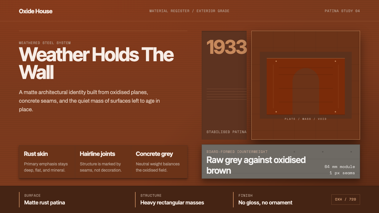 Corten Weathering SteelWeight over ornament. Rust-brown planes and concrete-grey seams make mass vis…
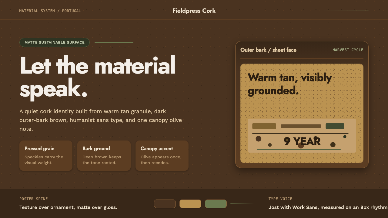 Portuguese CorkGrounded by texture. Cork tan speckles on bark brown, with one olive rule.
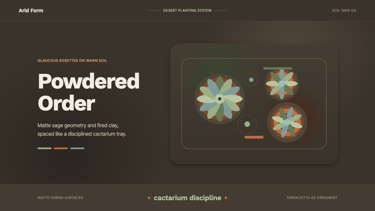 Succulent CactariumQuiet desert order. Sage rosettes and terracotta rings rest on dark warm soil.
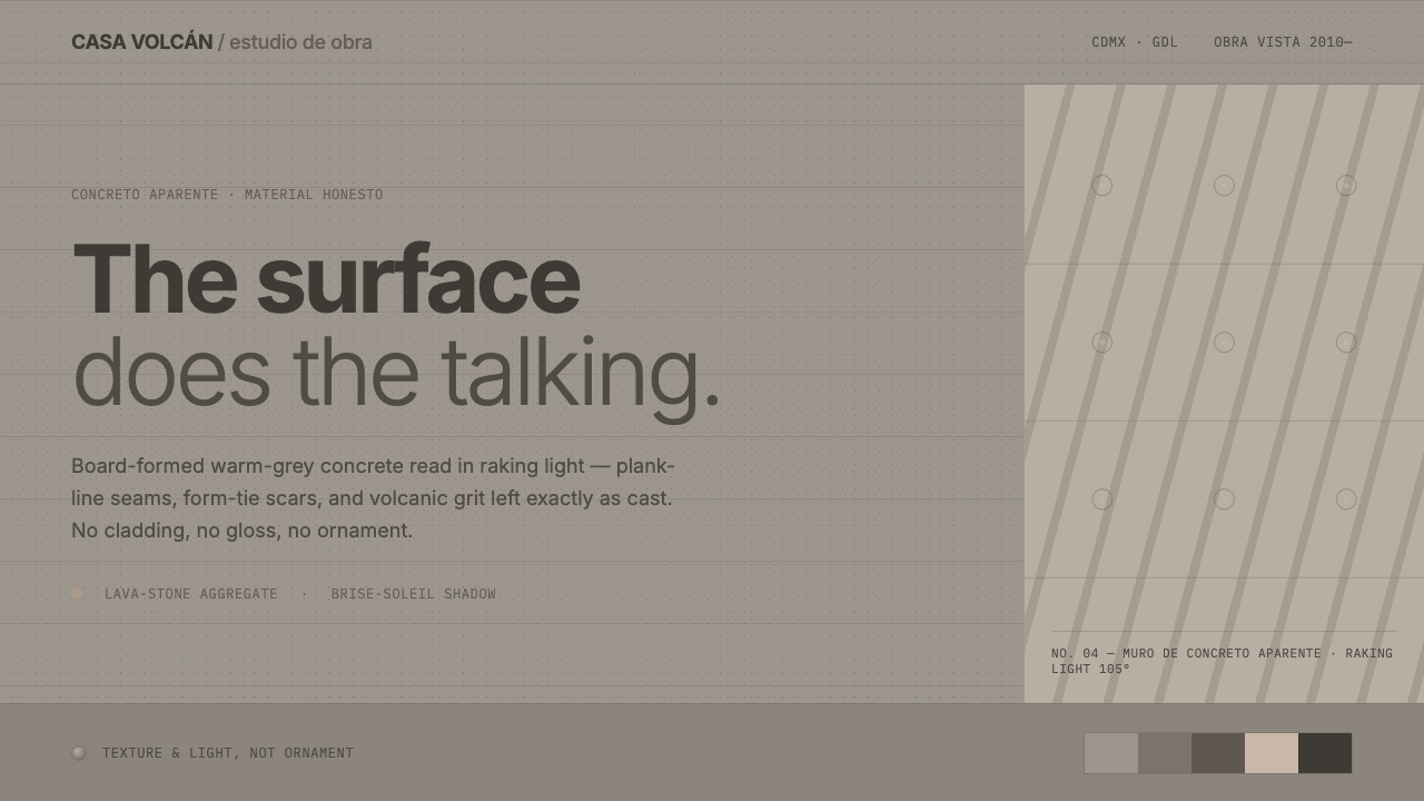 Mexican Concrete BrutalismThe surface does the talking. Board-formed warm-grey concrete, plank seams an…
 Salt Flat UyuniAtmosphere does the work. Blue-grey space, one horizon line, faint salt polyg…
 Aalto Finnish ModernModernism made humane. Birch fields, canary yellow, and soft plywood curves b…