What is Mexican Concrete Brutalism?
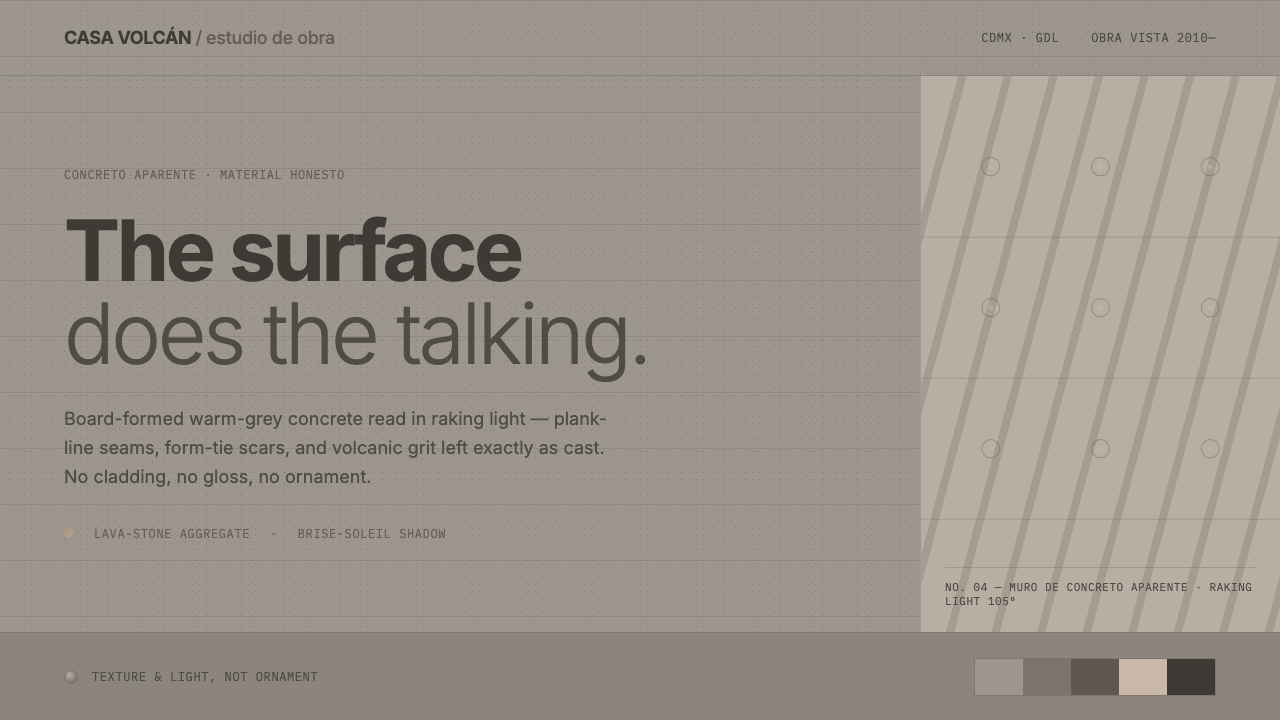
Mexican Concrete Brutalism lets the material remain visible: warm-grey board-formed concrete, volcanic grit, and hard Mexican light become the entire visual argument.
Mexican Concrete Brutalism in brief
Mexican Concrete Brutalism is a contemporary regional language associated with Mexican studio architecture since 2010, particularly the work of Tatiana Bilbao and Frida Escobedo. Its central gesture is simple but demanding: raw board-formed concrete is treated as a finished material rather than a neutral substrate to be covered.
The system values material honesty over visual polish. Pigmented warm-grey concrete keeps the imprint of timber formwork, plank seams, and form-tie marks. Volcanic lava stone contributes a granular physical reference, while hard raking light makes every irregularity legible. The surface is not background; it is the subject.
Its visual vocabulary is deliberately quiet. Broad weathered planes carry the composition, lattice structures create patterned shadow, and plain modern grotesque lettering provides information without competing with the material. Nothing is glossy and nothing is ornamental for its own sake. The design speaks through weight, texture, light, and absence.
Where does Mexican Concrete Brutalism come from?
The style belongs to a contemporary studio practice rooted in Mexico, with Mexico City and Guadalajara named as its principal regional settings within Latin America. The approved movement names are contemporary Mexican concrete architecture and material-honest regional modernism. Since 2010, the work associated with Tatiana Bilbao and Frida Escobedo has provided the source context for this visual language.
Its defining decision is to stop treating concrete as an unfinished stage. Board-formed concrete arrives from the formwork already carrying a record of its making: timber grain, plank divisions, seams, and the marks left by form ties. Pigmentation shifts the material toward a warm grey, giving the surface character without disguising its structural origin.
The Mexican setting is expressed through light and mineral presence rather than through applied ornament. Volcanic lava stone is read through its grit and granular texture. Hard raking sunlight reveals relief across the concrete, turning seams and small depressions into active visual information. Light does not soften the material; it makes the material speak more clearly.
The design system distills these architectural observations into a controlled visual grammar: quiet planes of weathered concrete, plank-line texture, form-tie marks, lattice shadow play, and plain modern grotesque signage. It is not a decorative imitation of a building site. Its purpose is to preserve the directness of the material while translating that directness into interfaces, editorial compositions, presentations, and identity work.
What defines the Mexican Concrete Brutalism look?
Warm-Grey Concrete
The dominant color is a pigmented warm grey derived from board-formed concrete. It should feel mineral, quiet, and slightly weathered rather than polished or synthetic. Lighter and darker shifts come from the material surface itself, from seams, grit, and light, not from decorative color effects. The palette remains restrained so texture can carry the visual hierarchy.
Board-Form Texture
Timber formwork is not erased after casting. Plank lines, seams, and form-tie marks remain as evidence of construction and become the surface's graphic language. Texture should read as embedded and structural, with an irregular rhythm that resists perfect repetition. The effect is tactile even when represented in a flat digital composition.
Volcanic Grit
Volcanic lava stone is expressed through granular presence rather than literal illustration. The surface may feel rough, porous, and mineral-rich, but the grit should support the concrete field instead of becoming a pattern pasted on top. Its role is to deepen the material reading and connect the visual system to the regional ground named in the source.
Raking Light
Hard raking light is essential because it reveals relief. It catches the edges of plank seams, picks up the formwork record, and makes shallow texture visible without requiring ornament. The light should feel direct and physical, creating clear transitions between exposed planes and recessed marks. Soft atmospheric glow would weaken the system's material authority.
Lattice Shadow
Lattice structures introduce a measured layer of shadow without adding surface decoration. Their shadows break broad concrete planes into shifting fields while preserving the underlying quietness. The pattern should remain architectural and legible, not ornamental or theatrical. It works best when shadow feels cast by a real screen and when the concrete remains the receiving surface.
Plain Modern Grotesque
Typography behaves like signage: direct, plain, and clearly set against the material field. A modern grotesque supports the architectural character because it does not introduce historical ornament or glossy personality. Type should organize information with calm authority, leaving the concrete, seams, and shadows to provide atmosphere. Lettering is a functional layer, never a competing texture.
Who shaped Mexican Concrete Brutalism?
Tatiana Bilbao is named in the source as one of the central figures in the contemporary Mexican studio architecture that informs this system. Her relevance here is not a single decorative signature but a practice context in which raw board-formed concrete can be understood as a finished, expressive material within material-honest regional modernism.
Frida Escobedo is identified alongside Tatiana Bilbao as a key figure in the source's contemporary Mexican concrete architecture. Her inclusion anchors the system in a living studio practice since 2010, where surface, construction evidence, regional mineral texture, and strong light are treated as active parts of architectural expression.
Material-honest regional modernism is the broader movement named by the source. It describes the principle that regional character can emerge from honest material behavior, local light, and mineral presence rather than from applied motifs. In this system, that principle becomes a disciplined language of concrete planes, construction marks, lattice shadow, and plain signage.
How do you use Mexican Concrete Brutalism today?
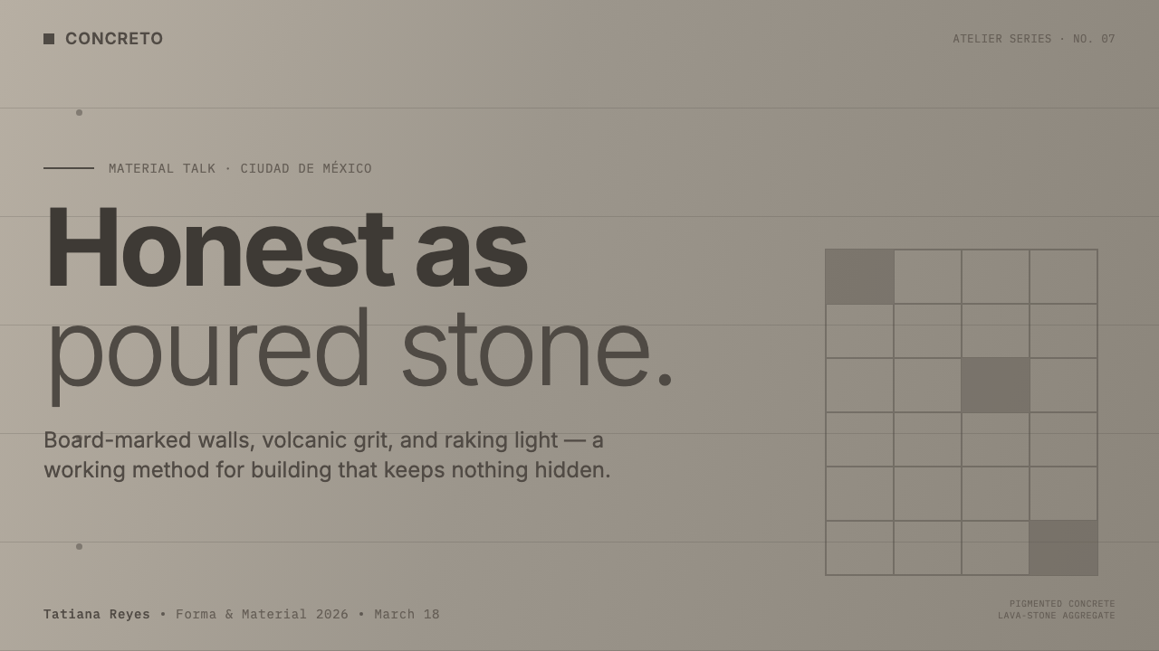
For presentation slides, use the concrete field as the primary compositional ground. A cover can place a quiet warm-grey plane behind a large modern grotesque title, with plank seams or a lattice shadow entering from an edge. Content slides should preserve generous uninterrupted surfaces and let construction marks act as restrained separators. Data slides should feel diagrammatic and material-led: information is organized by planes, lines, and contrast rather than by glossy effects or decorative illustration.
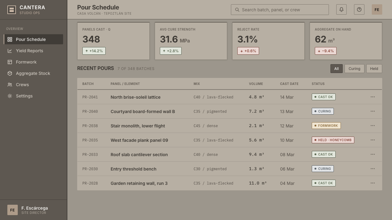
For web interfaces, especially dashboards and pricing pages, treat each panel as a material plane with a clear physical relationship to the others. Warm-grey surfaces can hold dense information, while formwork lines or mineral texture provide continuity across the system. Labels should be plain and sign-like. Interaction states can become changes in contrast, shadow, or surface emphasis, but the interface should never glow, sparkle, or imitate polished stone.
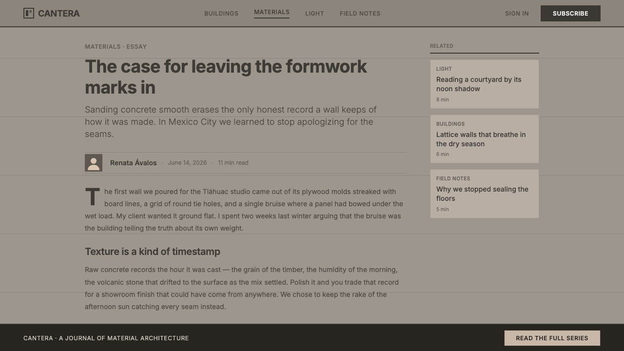
For editorial and marketing work, the style supports large calm fields interrupted by evidence of making. A feature page might pair a broad concrete surface with a narrow text block, a visible seam, and a hard lattice shadow. Marketing copy should be concise and declarative, allowing the texture to establish atmosphere. Photography or imagery, when present, should reinforce raw light, mineral weight, and architectural presence rather than introduce glossy lifestyle polish.
For identity and wayfinding, the strongest approach is typographic and material-led. A plain modern grotesque wordmark can sit directly on a warm-grey field, with formwork lines providing orientation and volcanic grit supplying tactile depth. Keep signs and labels legible at a glance. The regional character should come from surface, light, and construction evidence, not from ornamental motifs added to announce Mexico.
The common mistake is turning concrete into a decorative wallpaper. Overloading every surface with texture, repeating plank seams mechanically, adding glossy highlights, or using dramatic effects makes the system less honest. The material should have quiet areas as well as marked ones. Let the warm-grey plane carry stillness, then use grit, seams, tie marks, and lattice shadow selectively so each physical cue remains legible.
Mexican Concrete Brutalism — FAQ
What makes Mexican Concrete Brutalism distinct from generic concrete styling?
The distinction is not simply the presence of a grey concrete color. This system combines board-formed warmth, timber imprint, volcanic grit, hard raking light, lattice shadow, and plain modern grotesque signage. Its regional character comes from how material and light are allowed to remain visible, not from adding decorative symbols around a concrete-looking surface.
Why should board-formed concrete be treated as a finished material?
Because its surface contains the record of construction. Plank seams, timber traces, and form-tie marks are not defects to conceal; they are the visible evidence that gives the plane its identity. Covering them would remove the very information that distinguishes material-honest regional modernism from a smooth neutral background.
Does the style require literal volcanic lava stone?
The source treats volcanic lava stone as a reference for grit and mineral presence. What matters is preserving that granular, rough reading within the material language, not applying a literal stone image as decoration. The texture should deepen the concrete field and remain subordinate to its structural quietness.
What role does light play in the system?
Hard raking light makes the concrete legible. It reveals shallow relief, strengthens plank seams, and turns form-tie marks into visual information. Lattice shadow adds a second layer of patterned depth. Together, they create variation without requiring gradients, gloss, or ornamental overlays.
How should typography behave in a Mexican Concrete Brutalist composition?
Typography should behave like plain modern signage: direct, legible, and visually disciplined. It should organize information without introducing ornamental personality. The material supplies atmosphere, while the lettering supplies orientation. If the type begins to compete with the concrete, grit, or shadow, the system has lost its balance.
Related design styles
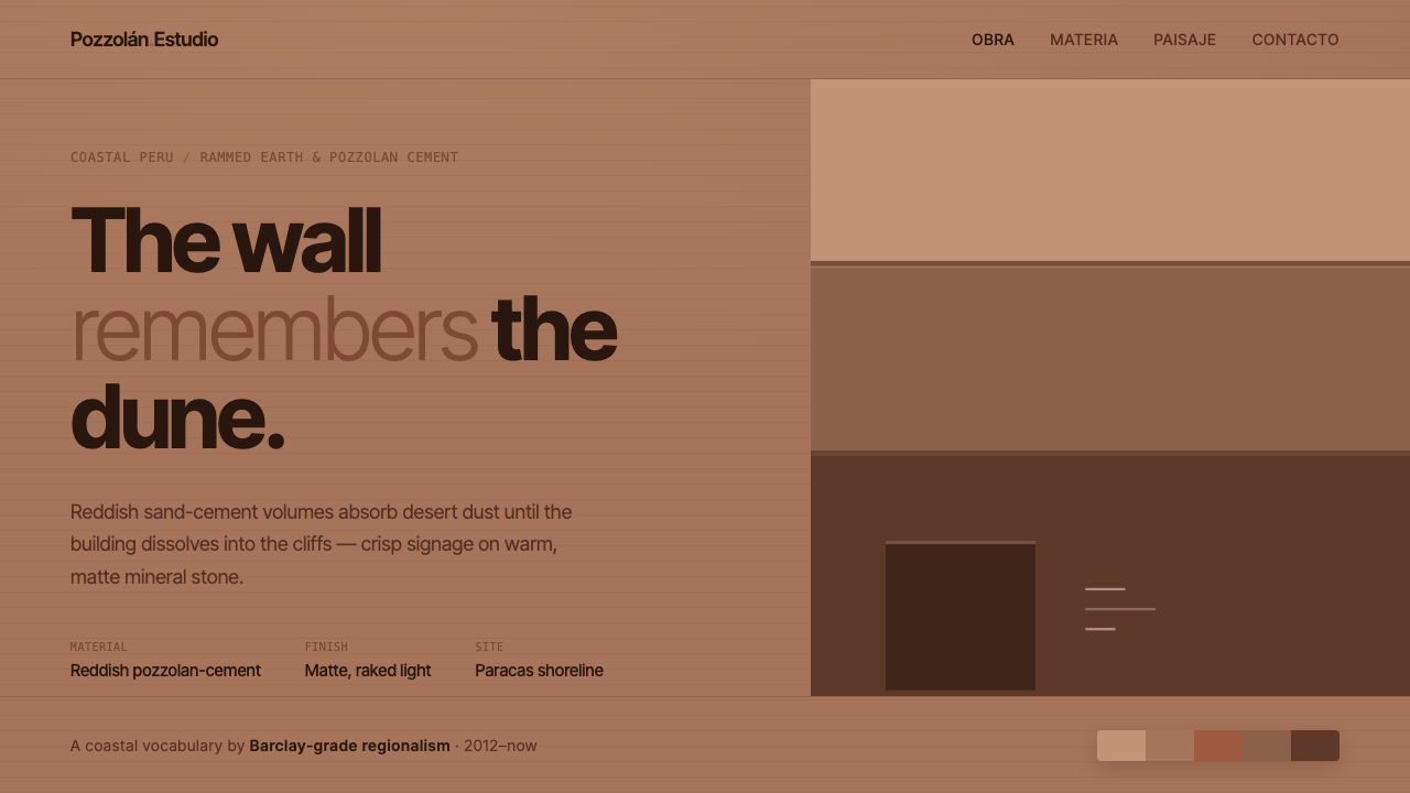 Peruvian Contemporary Adobe-ModernThe building dissolves into the dune. Reddish pozzolan-cement planes, matte r…
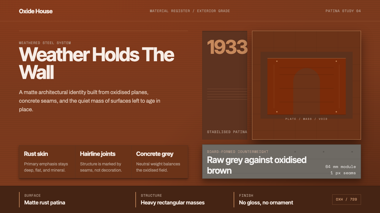 Corten Weathering SteelWeight over ornament. Rust-brown planes and concrete-grey seams make mass vis…
 Elemental Social HousingBuild half a good house, well. Dusty cement-grey panels, hatched bare-frame g…
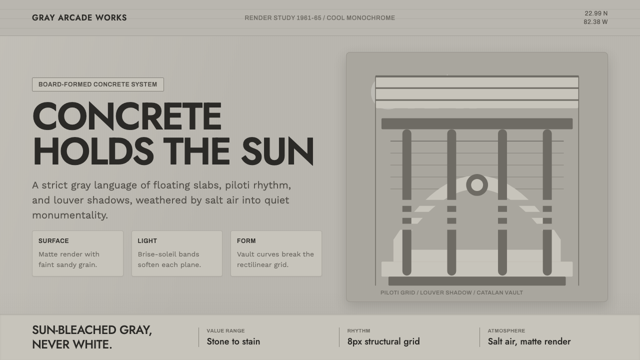 Havana Modernist GrayQuiet monumentality. Jost type, louver bands, and concrete grays hold tropica…
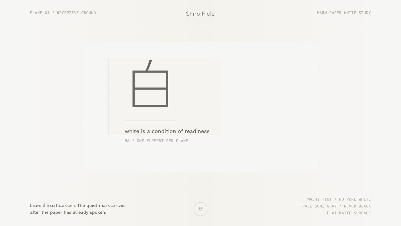 Kenya Hara «White»Emptiness is the subject. Warm washi white holds one pale sumi-gray mark.
 Modern Kufi BrandingRestraint becomes architecture. White Kufi blocks on near-black obey a biling…