What is Kenya Hara «White»?
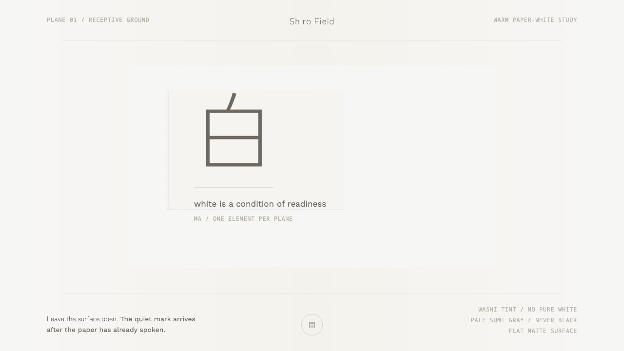
Kenya Hara’s White makes emptiness the subject — warm washi-like white, one pale sumi-gray mark, and a quiet material honesty that lets absence carry the meaning.
Kenya Hara «White» in brief
Kenya Hara’s White is not a palette study built around white as a neutral surface. It treats 白, or shiro, as an active condition of emptiness and 間, or ma: a space that is neither blank nor unfinished, but deliberately held open. The visual field is warm rather than sterile, physical rather than synthetic, and quiet rather than empty of intention.
The system translates that idea into a severe but sensitive interface language. A paper-white ground occupies almost the entire plane, carrying the faint warmth of kraft or newsprint rather than the glare of pure white. Against it sits a single pale sumi-ink gray mark, with enough visual restraint to feel printed, placed, and materially present without becoming an illustration or ornament.
Nothing in White appears to compete for attention. There is no visual rush, no accumulation of decorative devices, and no attempt to fill every available area. The negative space is the content. The mark gains meaning because the field around it remains undisturbed, while the warmth of the ground prevents that restraint from becoming cold or clinical.

Where does Kenya Hara «White» come from?
White belongs to the period from 2010 to the present and is rooted in Japan, within a broader field of Japanese minimalism, ma or emptiness aesthetics, and Muji’s material design. Its central proposition is not that white is a fashionable color, but that whiteness can hold potential, pause, and attention. The surface is therefore treated as a spatial condition before it is treated as a background.
Kenya Hara, identified in the source material as Muji’s art director, is the key authorial figure behind this reading. His approach distinguishes the white of White from both pure white and cream. It is the physical white of washi paper: lightly warmed, materially legible, and capable of carrying a feathered deckled edge. That distinction gives the system its character. The surface is restrained, but it is not generic.
The book White was published by Lars Müller in 2010. Within this context, the book functions as the named source and cultural frame for a design language that values reduction without erasing material presence. The system does not pursue emptiness by making everything flat, glossy, or anonymous. It pursues emptiness by allowing a modest surface and a modest mark to remain legible without competition.
The resulting aesthetic is closely tied to the relationship between shiro and ma. Shiro names the white condition, while ma describes the meaningful interval around and between things. In interface terms, this becomes a discipline of deliberate absence: the ground is allowed to occupy the visual field, a single mark is given room to breathe, and every additional element must justify its presence against the silence of the plane.
What defines the Kenya Hara «White» look?
Washi White
The ground is neither pure white nor cream. It resembles the physical white of washi paper, with a faint warmth comparable to kraft or newsprint. This difference is quiet but foundational: the surface feels held, absorbent, and materially honest rather than luminous or digitally sterile. White is therefore not a color swatch applied behind content. It is the atmosphere in which content is allowed to appear.
Emptiness as Content
Negative space is not leftover territory. It is the primary compositional material. Large uninterrupted fields establish calm, while the absence around the mark creates its scale, distance, and significance. Any layout that fills the plane simply because space is available misses the principle. The empty field must remain visibly intentional, carrying as much meaning as the element placed within it.
The Single Mark
A single quiet mark gives the field a point of attention without breaking its stillness. Rendered in pale sumi-gray, it should feel printed rather than illuminated, and placed rather than decorated. Its power comes from proportion and surrounding silence, not from contrast or visual complexity. The mark can identify, guide, or punctuate, but it should never become a collection of competing signals.
Sumi-Gray Restraint
The gray is pale sumi ink, not a hard digital black and not a decorative charcoal accent. It maintains a modest relationship with the warm ground, allowing the mark to remain legible while preserving the atmosphere of softness. The color should suggest ink settling into paper: quiet, slightly human, and materially connected to the surface. Strong contrast would turn the mark into a command and disturb the intended balance.
Deckled Material Edge
The deckled, feathered edge is a reminder that the surface has a body. Even when translated into an interface, White should avoid the impression of a perfectly manufactured plane with no origin. The edge does not need to become a visible texture everywhere. Its role is subtler: it gives the otherwise quiet field a trace of making, so restraint feels tactile rather than merely empty.
Unhurried Composition
White refuses urgency as a visual strategy. There are no busy clusters, rapid shifts, or decorative interruptions competing with the open field. Movement, when required, should feel like a mark arriving or receding within space rather than a sequence of effects. The composition should appear to have enough time around it. This temporal quality is essential: the design asks the viewer to notice, not to chase.

Who shaped Kenya Hara «White»?
Kenya Hara is the central authorial figure in this source material and is identified as Muji’s art director. His reading of 白 as emptiness and 間 gives White its conceptual foundation. He distinguishes the intended white from pure white and cream, locating it instead in the physical, lightly warmed presence of washi paper. The visual system follows that distinction closely: quiet, material, spacious, and unwilling to decorate for its own sake.
Lars Müller is identified as the publisher of the book White, published in 2010. In the approved material, that publication anchors the theme historically and editorially. The publisher’s presence matters because White is not presented as an anonymous interface mood; it is connected to a named book and to a sustained investigation of whiteness, material, emptiness, and visual attention.
白, or shiro, is the conceptual figure at the center of the system. It does not mean an empty color field in the ordinary sense. It names a white that can hold silence, possibility, and material presence. In application, shiro asks the designer to protect the ground from unnecessary activity and to understand whiteness as an active participant in composition rather than a passive container.
間, or ma, names the meaningful interval around and between things. It explains why the open field in White is not absence in the weak sense, and why the single mark can remain visually sufficient. Ma gives space a role: distance becomes structure, silence becomes pacing, and the interval around an element becomes part of what the element communicates.
How do you use Kenya Hara «White» today?
For presentation slides, White is especially strong when the cover makes the ground feel almost boundless and lets a single mark establish the subject. Content slides should preserve that composure: use a quiet field, a restrained typographic presence, and generous intervals between ideas. Data slides should resist the urge to decorate charts with competing colors or dense framing. Let one pale mark, title, or datum carry the visual focus, while the surrounding space clarifies its importance.
For web interfaces, the system suits dashboards and pricing pages that need calm, trust, and deliberate attention. A warm paper-white surface can hold the entire interface, while sumi-gray handles the principal reading task and a single restrained mark identifies the active area or key action. Cards, controls, and panels should not multiply visually. Group only what belongs together, leave the intervals visible, and let hierarchy emerge from placement, quiet contrast, and material atmosphere.
For editorial and marketing work, White supports a voice that is reflective rather than promotional. An article can place a modest headline or mark within a broad field, allowing the page to feel like a held sheet of paper rather than a crowded advertisement. Marketing pages can use the contrast between a warm ground and one pale ink gesture to make a product feel considered and materially honest. The style is particularly effective when the message depends on attention, restraint, and trust.
The common mistake is to imitate the surface while violating the principle. A merely warm background, a paper texture applied everywhere, or a collection of pale gray decorations does not create White. The system depends on emptiness doing real compositional work. If every area receives an element, if the mark becomes dark and commanding, or if the interface accelerates through constant visual changes, the result has borrowed the appearance of restraint without preserving its meaning.

Kenya Hara «White» — FAQ
Is White simply a warm off-white design system?
No. Warmth is important, but it is only the material starting point. The deeper principle is that white represents emptiness and ma, a meaningful interval that actively shapes attention. A warm surface covered with labels, panels, decoration, or competing signals would miss the system. White succeeds when the ground remains present as content and the mark gains significance through the space around it.
Why use pale sumi-gray instead of black?
Pale sumi-gray keeps the mark connected to the paper-like ground. It suggests ink settling into a physical surface rather than a digital command appearing on a screen. Black would create a harder, more declarative contrast and could make the mark feel like an instruction. The gray remains legible, but its restraint protects the atmosphere of emptiness and prevents the focal element from overwhelming the field.
Can this style include more than one element on a plane?
It can, but every addition should be weighed against the system’s central discipline: one quiet mark within meaningful emptiness. The point is not to enforce a mechanical prohibition. The point is to preserve the feeling that the ground has room to speak. When several elements are necessary, they should remain quiet, materially related, and clearly organized so the intervals between them continue to carry meaning.
Does White require visible paper texture or deckled edges everywhere?
No. The deckled, feathered edge expresses material honesty, but it should not become a decorative filter applied indiscriminately. Its role is to remind the viewer that the field has a physical character and an origin. If texture appears everywhere, it can compete with the emptiness and turn materiality into surface effect. The better approach is to preserve the suggestion of paper without making texture the subject.
What kind of product is best suited to this aesthetic?
White is best suited to products and messages that benefit from calm attention, material trust, and a sense of considered restraint. It can support reflective editorial work, quiet product communication, focused dashboards, and pricing experiences that do not want to feel aggressive. It is less suitable when the experience depends on visual abundance, rapid urgency, or constant decorative stimulation. The decisive question is whether emptiness can genuinely carry part of the product’s meaning.
Related design styles
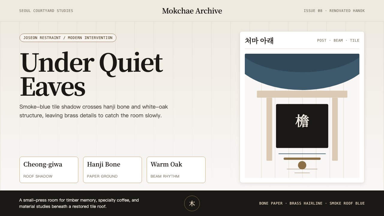 Korean Hanok Eaves RevivalJoseon restraint, not generic minimalism. Smoke-blue eaves cross hanji bone a…
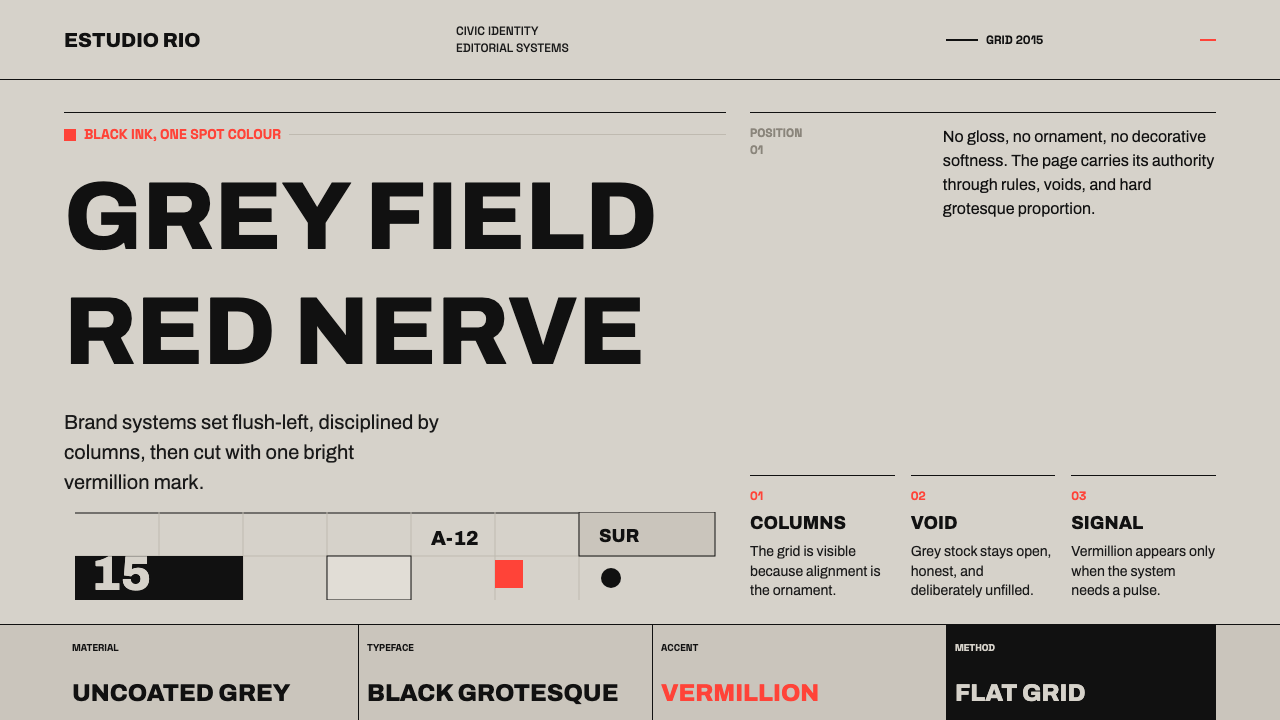 Buenos Aires Branding StudioRigour with nerve. Black grotesque on warm grey, pierced by one vermillion ma…
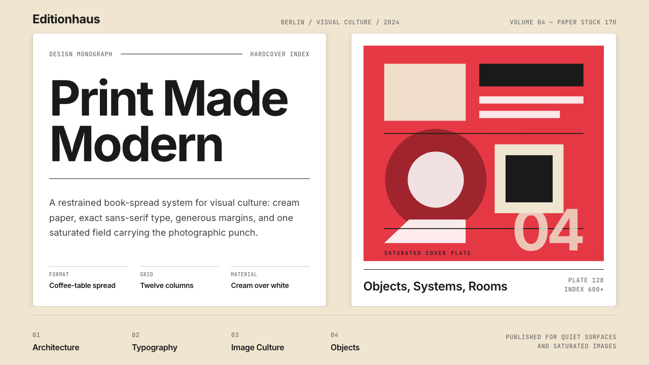 Gestalten Design BookCoffee-table calm. Cream paper, tight sans, one saturated block, and a strict…
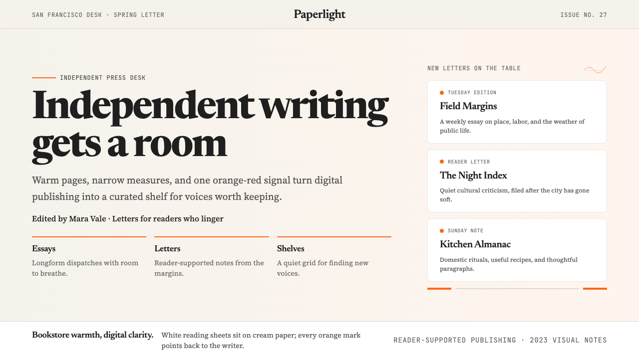 Substack 2023Writing feels shelved, not streamed. Cream paper, Newsreader serif, and one o…
 Basecamp / 37signalsQuiet craft, strong opinions. Cream paper, tight sans type, yellow and coral…
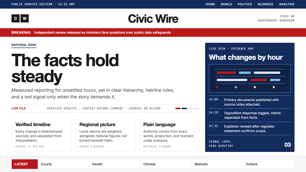 BBC NewsPublic trust, stripped bare. Red alerts, deep navy and hairline grids make ur…