What is Buenos Aires Branding Studio?
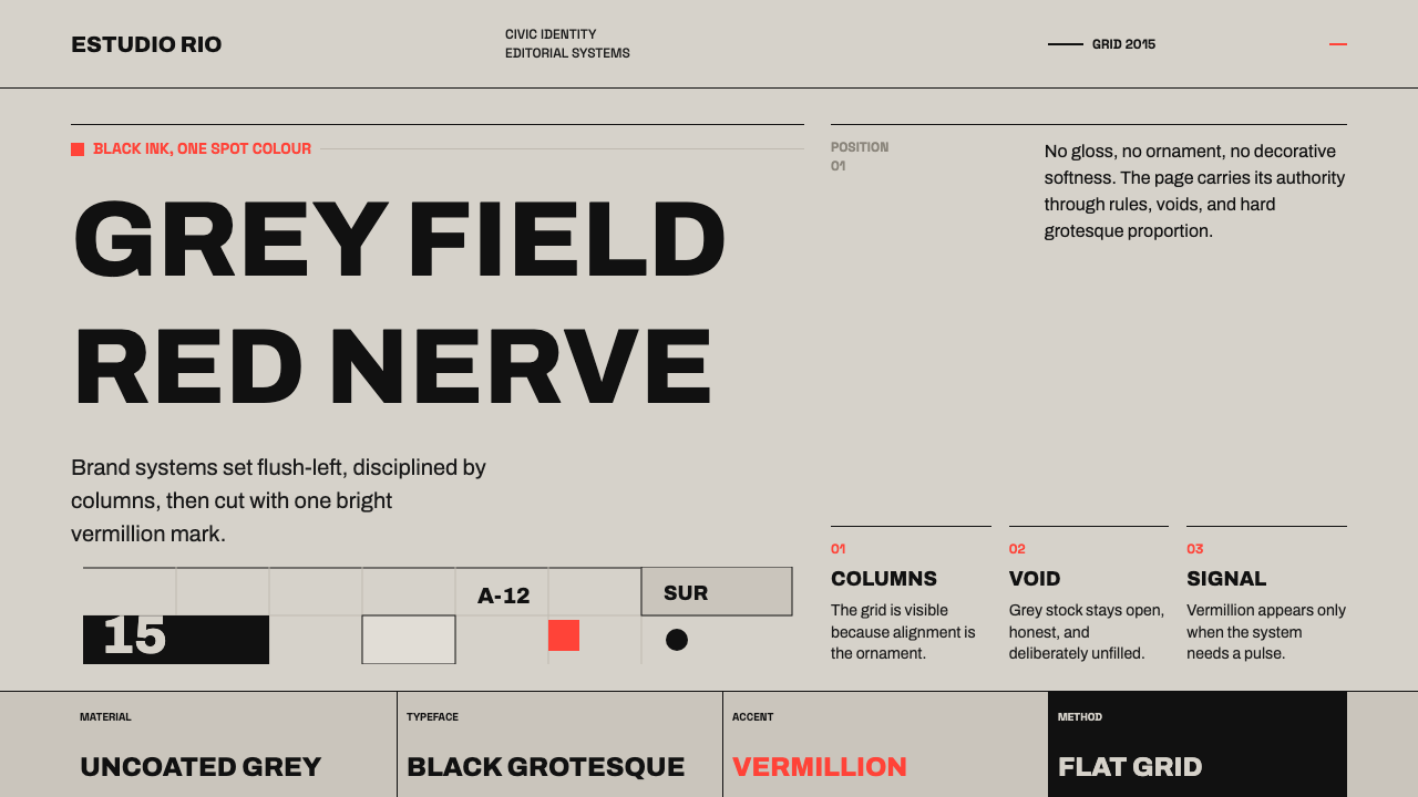
Contemporary Buenos Aires branding pairs unyielding black type with a warm grey field, then dares to leave most of that field empty.
Buenos Aires Branding Studio in brief
The contemporary Porteño branding scene — Porteño referring to a resident of the port city of Buenos Aires — is built on a deceptively simple pairing: confident black grotesque type set on warm, light-grey uncoated stock, with the entire palette disciplined down to a single bright accent, an Argentine vermillion. Nothing about the look is loud in the conventional sense. It is loud the way a single, well-placed word in an otherwise silent room is loud — through contrast and restraint rather than density and decoration.
The scene descends from the civic-signage rigour of designer Ronald Shakespear and is carried forward today by studios such as Asís, which apply the same editorial discipline to contemporary branding work. The lineage matters: this is not a decorative style invented for its own sake, but a design logic originally built for public wayfinding and civic identity — systems that had to work at a glance, under pressure, for strangers — later adapted into branding, where that same clarity now reads as confidence and taste rather than mere legibility.
Structurally, the look leans on Swiss-influenced columnar grids, large flush-left headlines, and generous negative space, with small dingbat marks used as punctuation rather than illustration. There are no gradients, no shadows, and no applied decoration anywhere in the system — only flat editorial structure, and the nerve to let a warm grey field sit empty when nothing needs to be said there.
Where does Buenos Aires Branding Studio come from?
This style is a contemporary movement, generally dated from around 2010 to the present, but its lineage runs back to the 1970s civic design work of Ronald Shakespear. Shakespear's practice focused on the kind of public-facing design that has to succeed under the hardest conditions possible: signage and identity systems for hospitals, transit, and civic institutions, where a design has to be read correctly by a stranger, at speed, often under stress, with no margin for ambiguous hierarchy or decorative distraction.
That civic design tradition placed enormous weight on typographic clarity and structural honesty — a strict grid, one dominant typeface, and color used only when it carried functional meaning, never as embellishment. Over subsequent decades, this rigor migrated from wayfinding and public institutions into commercial branding, carried by designers trained in or influenced by that civic lineage, until it became recognizable as a distinct regional voice within contemporary Latin American graphic design.
Studios such as Asís represent the current generation of this lineage, applying the same columnar-grid, flush-left, single-accent-color discipline to brand identities, editorial work, and cultural institutions across Buenos Aires today. The Swiss International Typographic Style is a clear formal influence throughout — the same commitment to grid, hierarchy through scale and weight rather than ornament, and grotesque sans-serif type — but it has been filtered through a distinctly Latin American editorial branding sensibility, with a warmer, less clinical ground tone and a single, culturally specific accent color standing in for the Swiss tradition's more varied palette.
The result is a regional design language that reads as internationally fluent — anyone trained in Swiss-influenced grid systems will recognize its bones immediately — while remaining identifiably Porteño in its choice of a warm uncoated paper tone and its confidence in leaving a field empty rather than filling it.
What defines the Buenos Aires Branding Studio look?
Black Grotesque Type
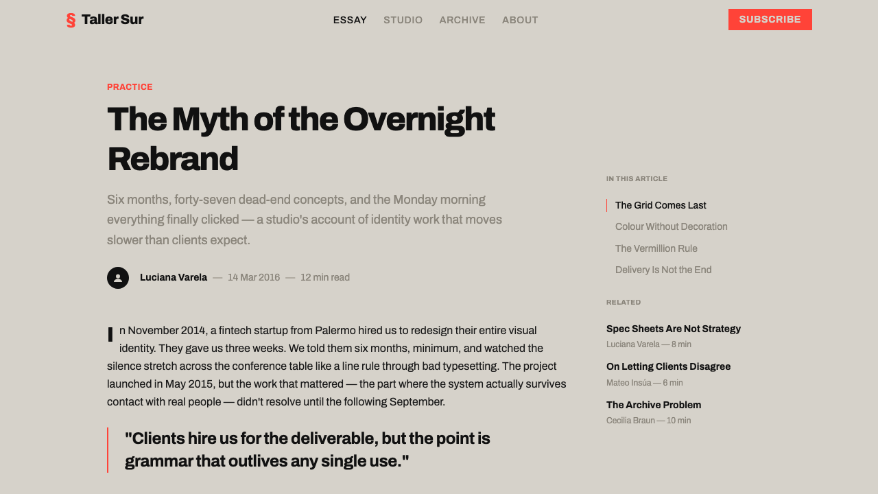
Type is set in a confident, unadorned grotesque sans-serif, always in solid black rather than a softened dark grey. The letterforms are treated as structural elements in their own right — large, flush-left headlines carry as much visual weight as any graphic mark on the page, and no secondary typeface is introduced to compete with this single, disciplined voice.
Warm Grey Ground
The dominant background is a warm, light, uncoated-paper grey rather than clean white or cool grey. It reads as tactile and considered, closer to the feel of quality print stock than a digital default, and it gives the black type and the single accent color somewhere warm and quiet to sit.
Single Vermillion Accent
Exactly one bright, saturated accent color — an Argentine vermillion — is permitted in the system, and it is used with extreme discipline: a single mark, a single word, a single graphic element, never spread across multiple competing areas. Its rarity is what gives it force.
Columnar Grid
Layouts sit on a strict, Swiss-influenced columnar grid, with text and graphic elements aligned to consistent vertical divisions rather than placed freely. The grid is felt rather than seen — nothing is decorated to draw attention to its structure — but every alignment in the finished composition traces back to it.
Flush-Left Headlines
Headlines are set large and aligned to the left margin rather than centered, giving compositions a clear, consistent starting point for the eye and an editorial, newspaper-like authority rather than a symmetrical, poster-like formality.
Generous Negative Space
Large areas of the warm grey ground are deliberately left empty, with no filler pattern, texture, or secondary graphic used to justify the space. This emptiness is treated as confidence rather than absence — a demonstration that the composition does not need to be filled to feel complete.
Dingbat Punctuation
Small dingbat marks — simple geometric symbols — appear as punctuation within the editorial system, marking section breaks, bullet points, or emphasis, rather than functioning as decorative illustration. Their role is grammatical, not ornamental.

Who shaped Buenos Aires Branding Studio?
Shakespear's 1970s civic-signage practice — wayfinding and identity systems for hospitals, transit, and public institutions — established the typographic rigor and structural honesty that the entire contemporary Porteño branding scene descends from, treating design clarity as a public responsibility rather than a stylistic choice.
Asís is among the studios carrying this lineage forward today, applying the same columnar-grid, flush-left, single-accent-color discipline that originated in civic signage work to contemporary branding, editorial, and cultural-institution projects across Buenos Aires.
The Swiss International Typographic Style is the clearest formal influence on this Argentine scene, contributing the grid discipline, the reliance on scale and weight rather than ornament for hierarchy, and the choice of grotesque sans-serif type — all filtered here through a warmer, more editorially Latin American sensibility.
As a broader regional movement, Latin American editorial branding provides the context in which this Buenos Aires scene sits — a tradition of applying magazine and newspaper editorial logic, rather than poster or advertising logic, to brand identity work.
How do you use Buenos Aires Branding Studio today?
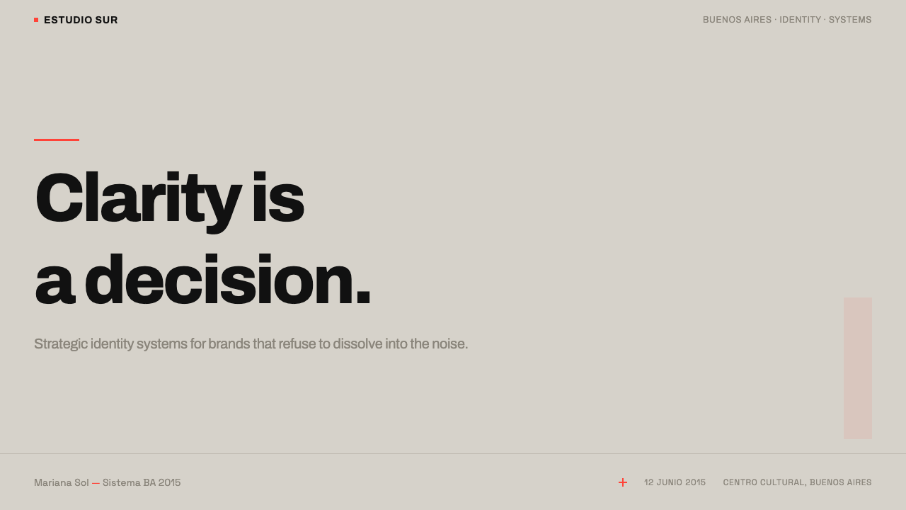
For presentation slides, this theme rewards confidence over decoration. A cover slide should be built almost entirely from type: a large, flush-left title in black grotesque on the warm grey ground, with a single vermillion mark — a dingbat, a rule, or one accented word — as the only color note. Content slides should keep the columnar grid visible through consistent left alignment across every slide, using scale and weight rather than color to distinguish a slide's main point from its supporting detail. Data slides suit this system particularly well: a single chart rendered in black with one vermillion highlight on the most important bar or data point reads as more authoritative than a fully multicolored chart, because the restraint signals that every color choice was deliberate.
In web interfaces, the approach is well suited to dashboards and pricing pages that want to project editorial authority rather than playful friendliness. A dashboard built on this system keeps its background in warm light grey, sets all data labels and body copy in black grotesque type, and reserves vermillion exclusively for the single most important alert, action, or active state — never for general iconography or decorative accents. Pricing pages benefit from the same restraint: a recommended plan can be marked with one small vermillion dingbat rather than a colored border or badge, letting typographic hierarchy alone communicate ranking wherever possible.
For editorial and marketing layouts, this is close to the style's home territory, since it descends from print and civic-signage design in the first place. Long-form articles benefit from the columnar grid directly — a strict measure for body text, flush-left headlines breaking cleanly across columns, and dingbat marks used as section dividers instead of decorative rules. Marketing pages should resist the temptation to add photography or illustration as the primary visual; type and one accent mark, given enough negative space, can carry a landing page on their own.
The system also suits cultural institutions, publishers, and civic or public-sector brands, where the lineage in wayfinding and public communication gives the aesthetic an inherent credibility — a look that reads as trustworthy and legible rather than merely stylish, which matters for institutions that need to be taken seriously by a broad public.
The most common mistake is treating the warm grey ground as a blank canvas to be filled — adding secondary colors, background patterns, or multiple accent tones because a layout 'feels empty.' The entire discipline of this style depends on the nerve to leave that field alone; filling it defeats the purpose and produces a busier, less confident result than a conventional colorful layout would. A second mistake is softening the black type toward dark grey for a 'friendlier' feel — the system depends on genuine, unambiguous black to hold its own against the accent color and the warm ground.
Buenos Aires Branding Studio — FAQ
Why is only one accent color allowed in this system?
Because the accent's power comes entirely from its rarity. If vermillion appeared throughout a layout the way it might in a more conventional multicolor brand system, it would stop functioning as a signal and simply become one more decorative color among several. Restricting the palette to black, warm grey, and a single accent forces every use of that accent to be a deliberate decision, which is exactly the discipline this style inherits from its civic-signage origins, where color had to carry real functional meaning.
Is this style just minimalism with an Argentine accent color?
It is more specific than generic minimalism. The style carries a distinct lineage from civic wayfinding design, a particular commitment to Swiss-influenced grid structure, and a warm, uncoated-paper ground tone that differentiates it from the cooler, often whiter grounds typical of international minimalist branding. It is minimal in the sense of being disciplined and unornamented, but its typographic authority, editorial grid logic, and specific warm-grey-plus-vermillion palette are what make it identifiably Porteño rather than minimalism in general.
Can this system work with a different accent color instead of vermillion?
The underlying discipline — one bold accent color, used sparingly, against black type and a warm neutral ground — can transfer to a different hue. What should not change is the ratio: a single dominant accent used rarely, never two or three accent colors competing for attention. Swapping vermillion for another saturated, culturally resonant color preserves the system's logic even if the exact reference to Buenos Aires shifts.
Does this style require print or can it be fully native to digital products?
It translates well to digital products, though its origins are in print and physical signage. The core principles — strict grid alignment, flush-left hierarchy, a single restrained accent color, and genuine negative space — are layout logic, not print-specific techniques, and apply directly to web and app interfaces. The main adaptation is ensuring the warm grey ground still reads as warm and tactile on-screen rather than washing out to a flat digital neutral.
What kind of brands or products should avoid this style?
Brands that depend on visual warmth through color variety, playful illustration, or photographic richness will find this system too restrictive — its entire identity rests on withholding decoration, and forcing in additional colors or imagery undermines the discipline that makes it work. It is also a poor fit for products that need to communicate multiple simultaneous states or categories through color coding, since the system deliberately has only one color available for that purpose.
Related design styles
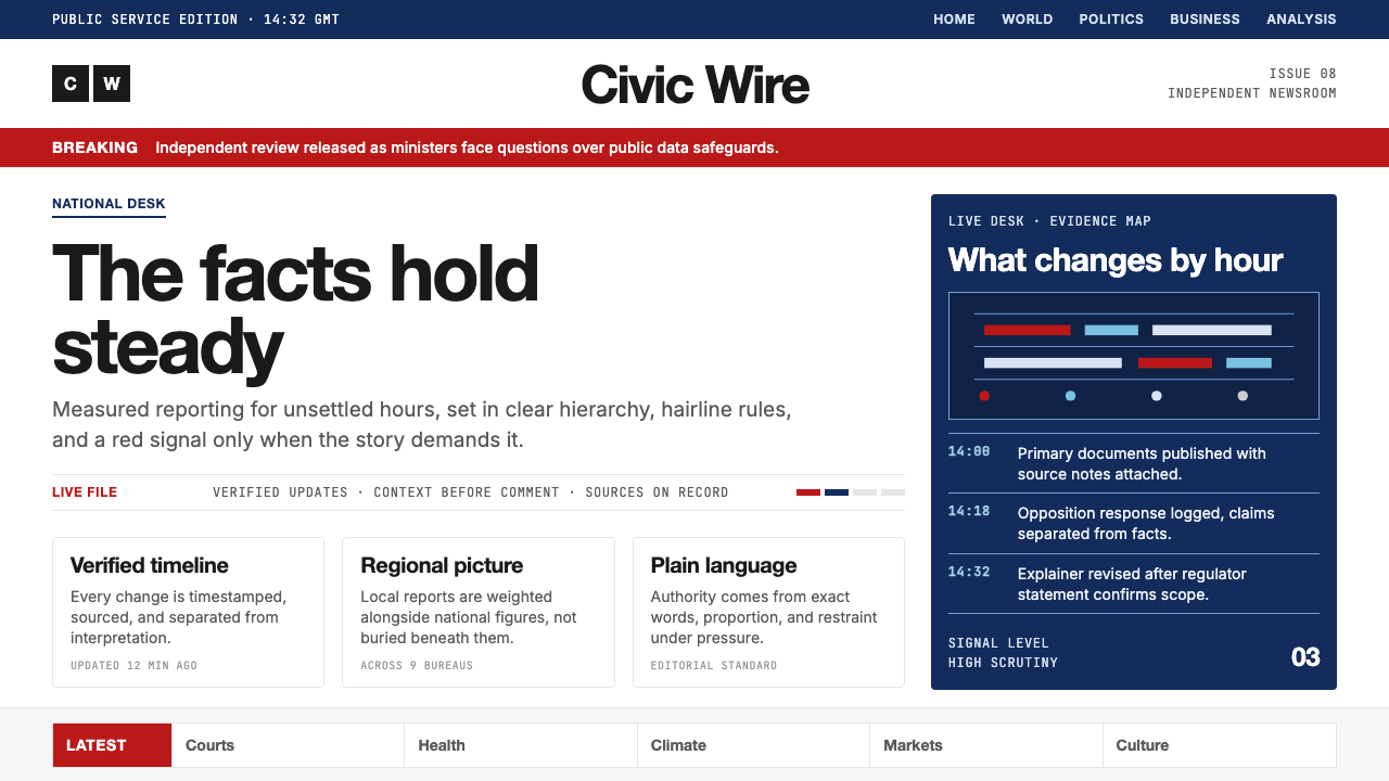 BBC NewsPublic trust, stripped bare. Red alerts, deep navy and hairline grids make ur…
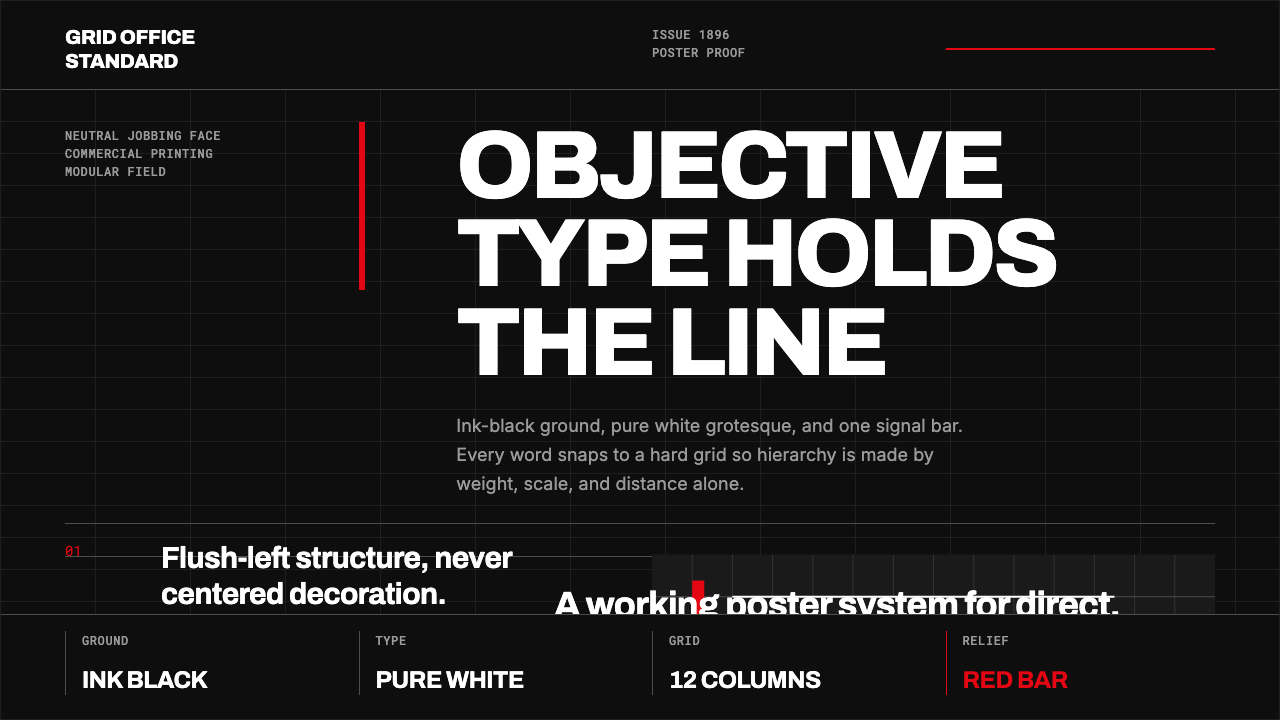 Akzidenz-Grotesk BertholdObjectivity in black ink. White grotesque type, hard grid, one rationed red b…
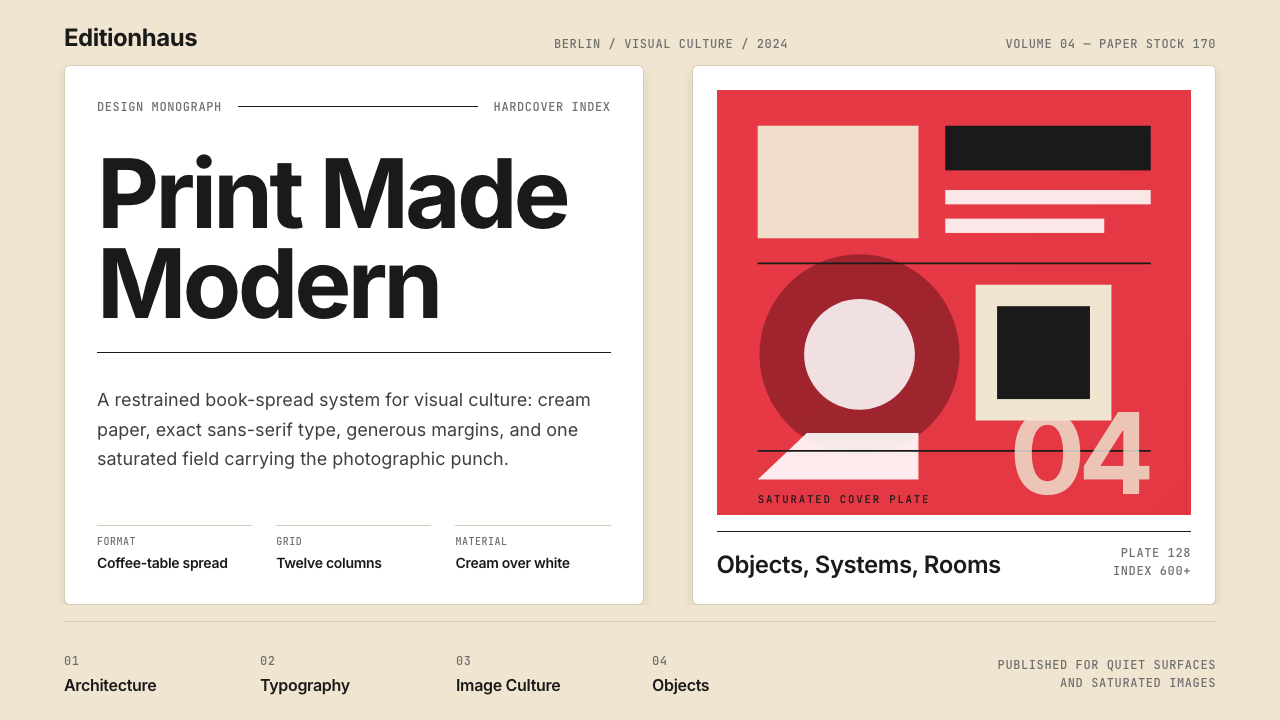 Gestalten Design BookCoffee-table calm. Cream paper, tight sans, one saturated block, and a strict…
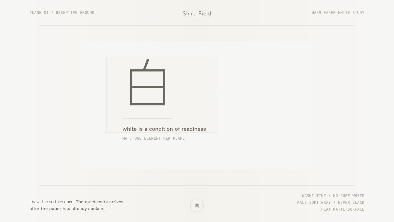 Kenya Hara «White»Emptiness is the subject. Warm washi white holds one pale sumi-gray mark.
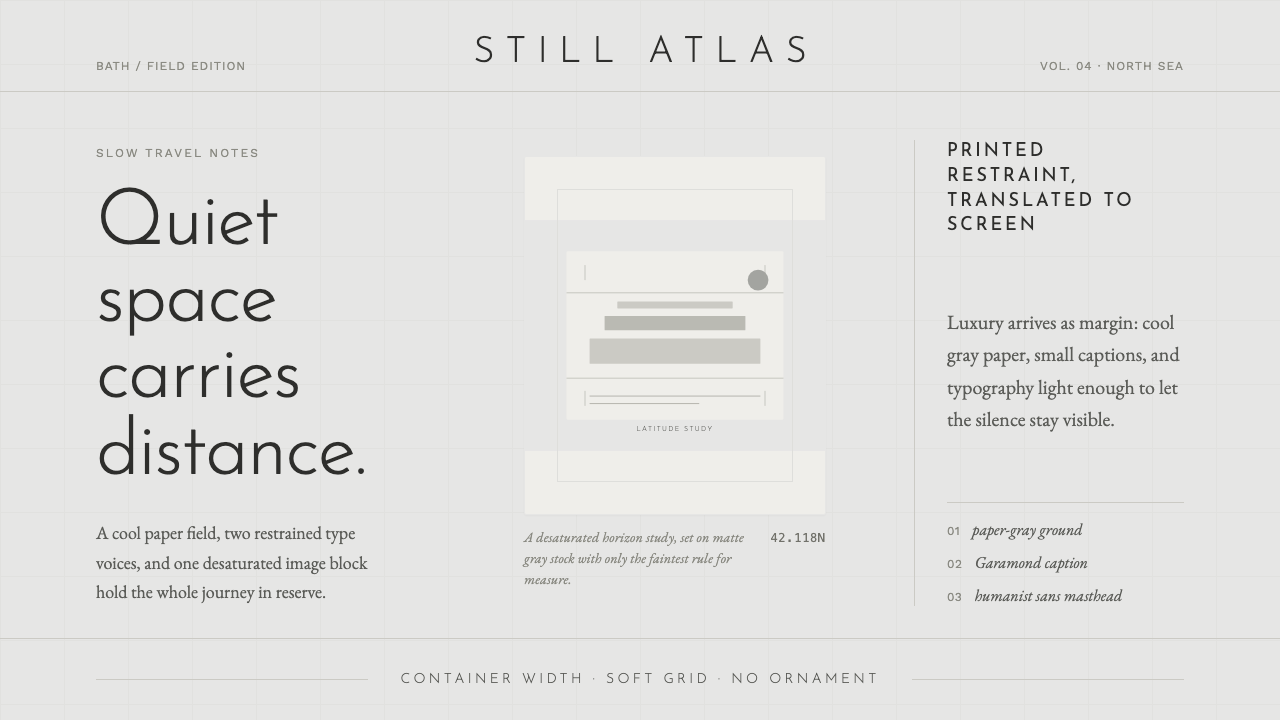 Cereal Magazine MinimalLuxury as margin. Cool paper-gray, light sans, and Garamond captions hold the…
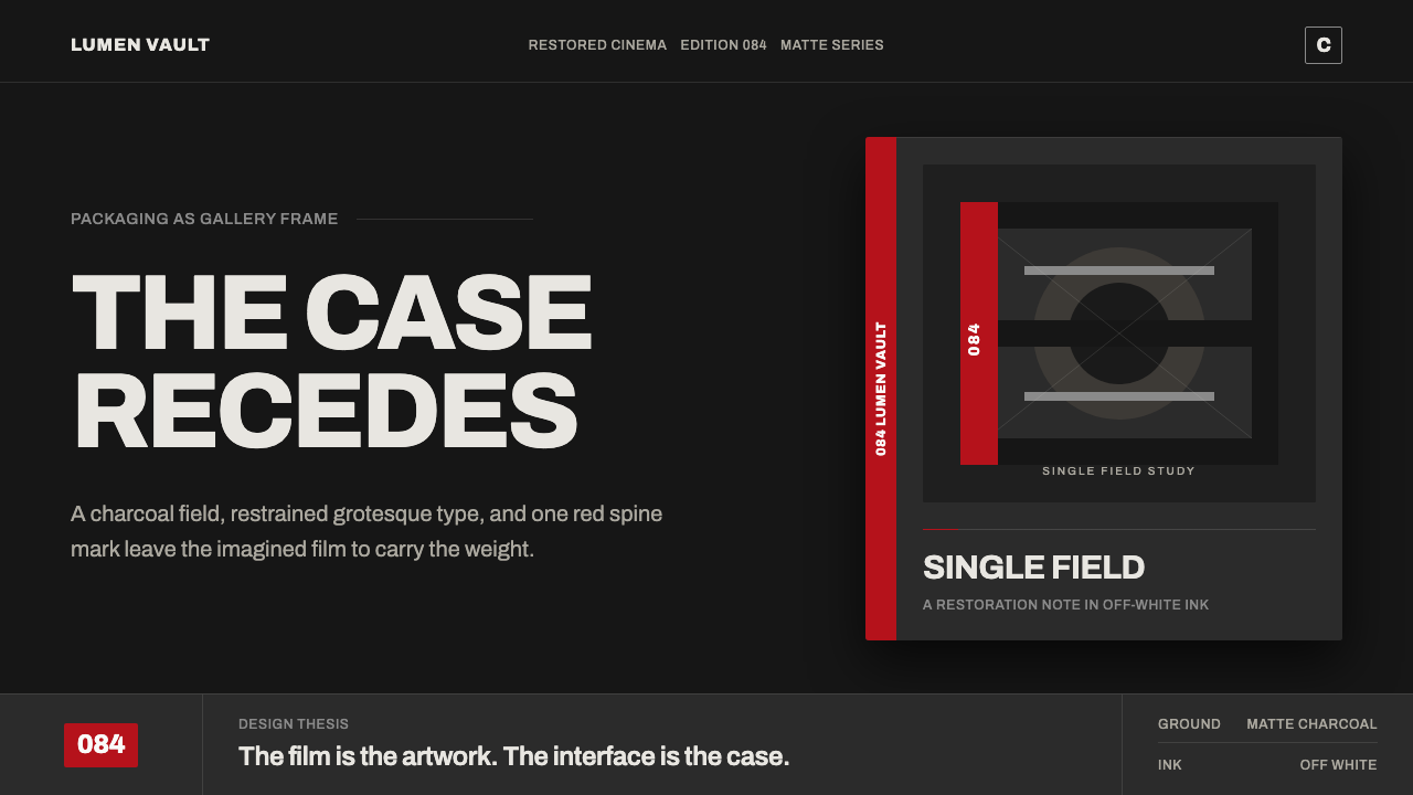 Criterion ArthouseThe case disappears. Charcoal field, off-white Archivo, hairline rules, one r…