About Buenos Aires Branding Studio
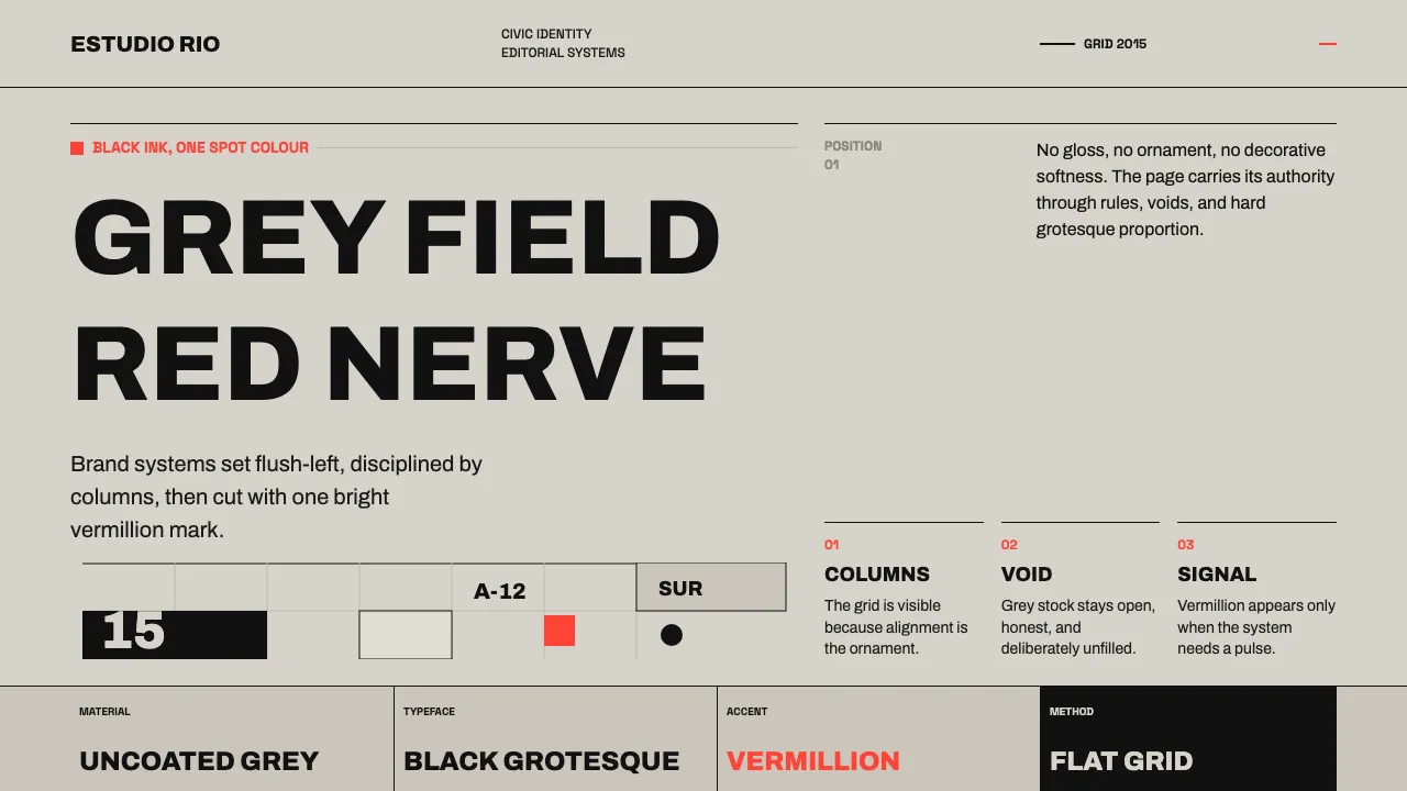
The contemporary Porteño branding scene descends from Ronald Shakespear's civic-signage rigour and is carried forward by studios like Asís. The look is uncompromising: confident black grotesque type set on warm light-grey uncoated stock, disciplined to a single bright Argentine vermillion spot colour.
Swiss-influenced columnar grids, large flush-left headlines, generous negative space, and dingbat marks as punctuation define the voice. No gradients, no shadows, no decoration — only flat editorial structure and the nerve to leave the grey field empty.
- Origin
- Buenos Aires, Argentina (Latin America)
- Era
- 2010–now (contemporary; lineage from Ronald Shakespear's 1970s civic work)
- Key figures
- Ronald Shakespear · Asís
- Movements
- Swiss / International Typographic Style · Latin American editorial branding
Buenos Aires Branding Studio design spec
Colors
Typography
The other 11 sections — buttons, cards, spacing, motion, techniques and more — open once you unlock. Download the DESIGN.md or send it to your AI in one click. Unlock once, yours forever.
Sign up nowStyles similar to Buenos Aires Branding Studio
Also inspired by design movements, with a close feel.
 Paulista BrutalismStructural honesty, made heavy. Mineral grays, Inter grids, and walnut cantilever shadows.
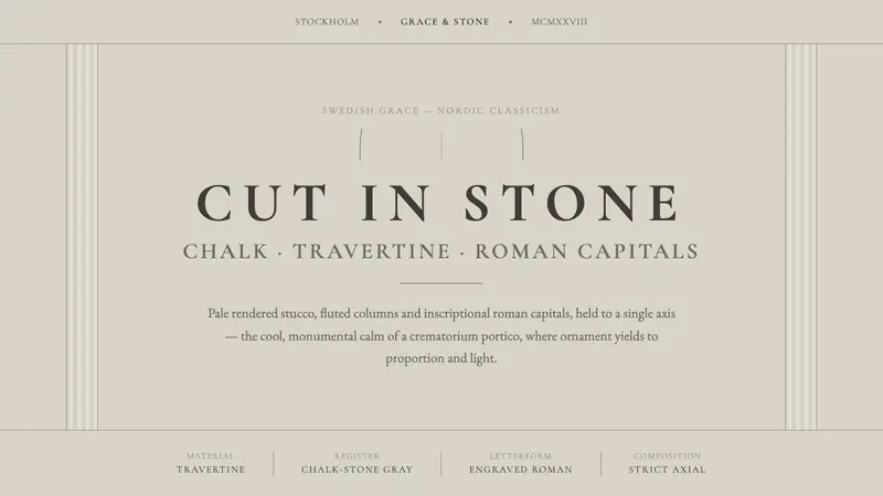 Nordic Classicism (Asplund)Stone, not cream. Engraved Trajan capitals on cool chalk stucco, fluted columns, strict axial calm.
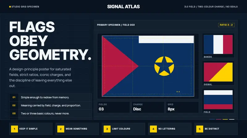 Vexillology Flag DesignDiscipline made visible. Old Glory blue, red and yellow sit on a strict dark grid.
 Jasper Morrison Super NormalRefuses spectacle. Matte greige ground, plain Helvetica, gentle 20px radii — value lives in use.