What is Anagama Shino Glaze?
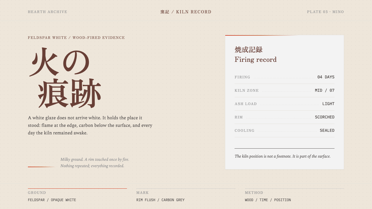
Shino is Japan's first white glaze, and it never appears alone: the pot comes with a kiln record, because fire, not the potter, decides how each one looks.
Anagama Shino Glaze in brief
Anagama Shino is a design language drawn from the first white glaze in Japanese ceramics. Shino is made from ground local feldspar, laid on thick and fired for days in a wood-burning tunnel kiln at Mino. It emerges milky and opaque, pinholed like the skin of a citron, blushing orange-red where fire reached the rim and the edge of the glaze, and spotted charcoal grey where carbon was trapped in the surface. The glaze looks soft, but it is made by something violent: days of flame and ash.
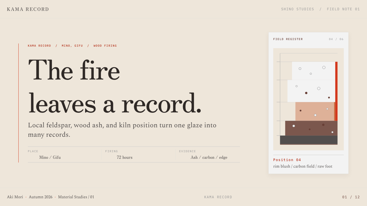
The design system takes one idea from this: fire leaves evidence, not decoration. Because the colour of each pot depends entirely on where it stood in the kiln, the pot is never shown alone. A soft, off-axis form sits on a generous empty ground, and beside it stands a square, sparse record card listing firing days, kiln position and ash load. Hairline rules divide the card. There is no ornament and the margins are wide. The pairing of object and record is the system's signature.
The mood is quiet, tactile and a little austere. A milky off-white dominates, warmed rather than brightened. The orange-red is rationed to the edges where fire would plausibly have touched; it never floods an area. The grey appears as a few spots. The type is set in a Mincho-style serif, because that is how museum labels are traditionally set. Everything on the page behaves as if it belongs in a catalogue of fired objects, where information is a form of respect for the thing described.
Where does Anagama Shino Glaze come from?
Shino belongs to the Momoyama period, roughly 1573 to 1615, at the kilns of Mino in what is now Gifu Prefecture. It was the first white glaze in Japanese ceramics: a feldspar glaze laid thickly over the body and fired for days. The potters of Mino worked in anagama, long tunnel-shaped wood-burning kilns whose name literally refers to a hole or cave. In such a kiln, fire is not a controlled instrument but a collaborator with its own habits.
Two traditions named in the source explain why the glaze mattered. The first is Momoyama tea ceramics and wabi-cha, the approach to tea that valued plain, imperfect, quietly made objects over polished display. A bowl with a thick milky glaze, a visible pinhole texture and a blush of fire colour suited that taste: it looked like something that had happened, not something that had been decorated. The second is Mino ware itself, the regional ceramic production of the Mino kilns, within which Shino is one of the most recognisable products.
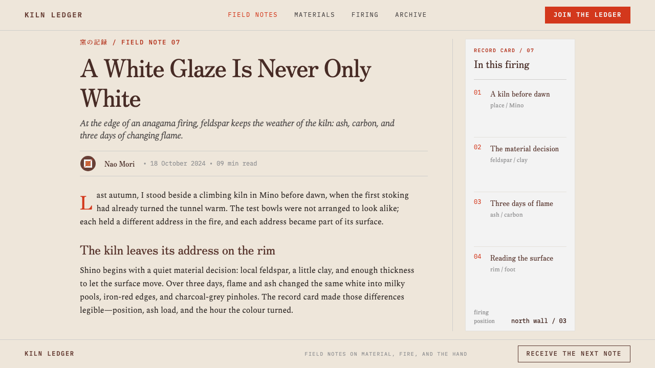
The wood-firing process turns the kiln into a co-author. In an anagama the flame travels through a long chamber and carries ash with it. Pots near the firebox, in the middle or toward the back each receive different flame, different ash and different amounts of trapped carbon. The orange-red blush, the grey spotting and the density of pinholes are therefore records of position. This is why the record card in the design is not a gimmick: for a Shino pot, where it stood is part of what it is.
The tradition was revived from 1930. The source names three figures around it: Arakawa Toyozō and Katō Tōkurō, twentieth-century potters associated with recovering Mino's old glazes, and Furuta Oribe, the Momoyama tea master whose taste shaped Mino's tea wares. Their names mark the two ends of the story: a Momoyama taste for imperfection and a modern effort to understand and reproduce it. The design system sits inside that continuity, borrowing the discipline of the museum label and the humility of the tea bowl.
What defines the Anagama Shino Glaze look?
Milky Feldspar Ground
The base tone is a soft, opaque, warm white, thick rather than glassy, like glaze laid on in a heavy coat. It is not the clean white of paper but the creamy white of fired feldspar, slightly dense, slightly uneven. The ground occupies most of the page and carries nothing: generous empty space is part of the glaze's character, because the eye needs somewhere quiet to rest between the few things that are shown.
Citron-Skin Pinholes
Tiny pits pepper the surface like the skin of a citron. In the glaze they are the marks left where gas escaped during firing; in the design they become a fine, irregular, almost granular texture that is felt rather than seen. It should appear as a quiet tactile quality, never as a pattern. Where it is used at all, it is dense in some areas and sparse in others, as the original would be.
Fire Colour at the Edges
Orange-red appears only where fire reached: on the rim and at the edge of the glaze. It is a blush, a warm flush on a pale surface, not a fill and not a stripe. The restraint is essential. One edge with a flush of fire colour looks like evidence; a large area of the same colour looks like decoration. The system keeps it to margins and boundaries, and lets the rest of the page stay quiet.
Carbon-Grey Spotting
Where carbon was trapped in the glaze it leaves a cool, charcoal-grey spot. These marks are few and scattered, and they offset the warmth of the fire colour with a cooler, quieter note. In the layout they should read as occasional, irregular accents, small enough to be mistaken for a speck. They are a reminder that the surface was formed by accident and atmosphere as much as by intention.
Off-Axis Soft Form
The object is asymmetrical and soft-edged, placed off the central axis of the page. It is not a hard geometric figure but a form with a slight lean, a slightly heavy shoulder, an edge that wavers. It sits on the empty ground like a thing set down, not like a thing enthroned. The asymmetry is part of the wabi-cha sensibility that the glaze belongs to: perfection is not the goal.
The Kiln Record Card
Beside the object stands a square, sparse card with a few labelled lines: firing days, kiln position, ash load. It is the other half of the system. Without it the pot would be a pretty picture; with it the pot becomes a documented result of a particular fire. The card is small, regular and quiet, with hairline rules and ample inner margins, and it contrasts deliberately with the irregular form beside it.
Hairline Rules and Museum-Label Serif
Every divider is a hairline; there are no heavy rules, no borders, no ornaments. The type is a Mincho-style serif, the kind used on museum labels, set small and calm. Together the hairlines and the serif give the page the dignity of a catalogue entry: the object is respected by being described, not by being decorated. Margins are wide, because crowding would contradict the system's quiet.
Who shaped Anagama Shino Glaze?
Arakawa Toyozō is one of two twentieth-century potters named in the source in connection with Shino's revival from 1930. For designers, his significance is an attitude: recovering a lost glaze is an act of close looking and patient reconstruction, not of imitation. The record-card logic of this system, in which the history of one firing is part of the object, is in the same spirit as the careful study that revival required.
Katō Tōkurō is the second twentieth-century potter the source associates with the revival of Mino's old glazes. Together with Arakawa he represents the modern, studied side of the tradition: potters who made Shino again with full awareness of its history. Their presence in the story explains why the system treats Shino as a living practice with documentation, rather than as a frozen antique.
Furuta Oribe was a Momoyama tea master whose taste shaped Mino's tea wares. He stands for the demand side of the story: the tea culture of wabi-cha that valued bowls which looked as if they had happened rather than been decorated. His place in the source's list reminds us that Shino's appeal was never purely technical. It was a matter of taste, of what a society chose to admire in a fired object.
How do you use Anagama Shino Glaze today?
Anagama Shino is a model for designs that want to show a thing together with the evidence of how it came to be. Its lessons are restraint, asymmetry, rationed warmth and the habit of pairing an object with a record. Applying it well means committing to empty space and to a small number of quiet marks, not just washing the page in cream.
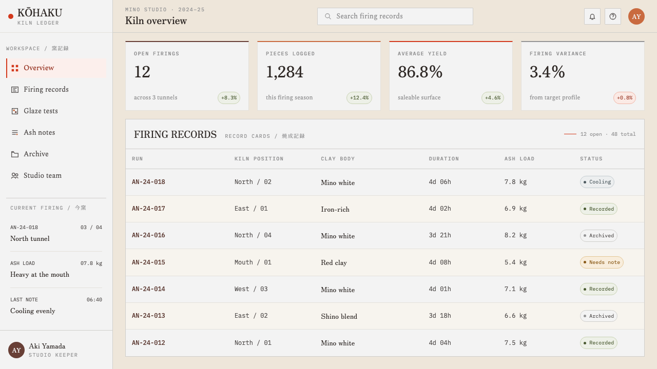
For presentation slides, a cover can place a soft, off-axis form or photograph on a large empty ground at one side, with a square record card at the other side carrying the title, date and a couple of labelled facts. Content slides work as one subject paired with its record: a single idea on the ground, its supporting facts in a small ruled card. Data slides suit sparse tables in hairline rules rather than heavy charts, and a single mark in fire-red at an edge may flag the one figure that matters.
For web interfaces, the style fits product pages for ceramics, craft, food and other provenance-driven goods, and dashboards in which each headline number should come with its context. Cards should be square, flat and ruled in hairlines, with wide margins and no shadows. Pricing can be presented as a small record: label, value, label, value. Use the Mincho-style serif for titles and captions, with a calm fallback serif, and keep fire colour for rims, underlines and the occasional edge.
For editorial and marketing work, think museum catalogue, auction note, craft journal or process diary. Each spread should hold one object and one record, with generous margins and a caption in the label style. Campaigns about slow making, provenance or limited batches can use the record card as their central device, because it turns variation between pieces from a flaw into a feature. The page should feel documented, not advertised.
The most common mistake is to flood the page with the orange-red because it looks warm and inviting. Fire colour is evidence at the edges; as a fill it becomes decoration. Other errors include centring and symmetrising the object, adding ornament to the card, simulating a glossy photorealistic glaze, crowding the margins, and showing the object without its record. A system that works through quiet and omission should never be given extra voices.
Anagama Shino Glaze — FAQ
What does anagama mean, and why does it matter for the design?
Anagama is a long, tunnel-shaped wood-burning kiln whose name refers to a hole or cave. In it the flame travels the length of a chamber and carries ash, so a pot's colour depends on where it stood. That is the whole logic of the design: the object cannot be understood without its position and firing record. The word signals that the style is about outcomes produced by fire and place, not by a designer's decision alone.
Why is the pot never shown alone?
Because its colour depends entirely on where it stood in the kiln. Two pots from the same batch can look very different, so the pot alone is only half the information. The record card, with firing days, kiln position and ash load, supplies the other half. Pairing them turns a picture into a documented result and makes variation between pieces something to read rather than something to hide.
Is the orange-red a fill colour?
No. In the glaze it blushes only where fire reached the rim and the edge of the glaze, and the design follows suit. Fire colour belongs to edges, underlines and boundaries, as a flush on a pale surface. Used as a large fill it stops being evidence and becomes decoration, which contradicts the system's central idea that fire leaves evidence, not decoration.
Why is the type a Mincho-style serif?
Because museum labels are traditionally set that way, and the system borrows the authority of the label. A Mincho-style serif is calm, precise and unshowy, which suits a page that describes rather than advertises. It pairs well with hairline rules and wide margins. In languages or settings where Mincho is unavailable, a restrained, finely drawn serif can stand in, as long as it stays small and quiet.
Does the style only work for ceramics, and can it be used on dark backgrounds?
It is not limited to ceramics. Any subject that benefits from being shown with its provenance — food, textiles, products made in small batches, research results — can use the object-plus-record pairing. The milky pale ground is central, however. A dark inversion would lose the feldspar white that gives the style its identity, so if a dark layout is required, keep the record card and object on pale panels.
Related design styles
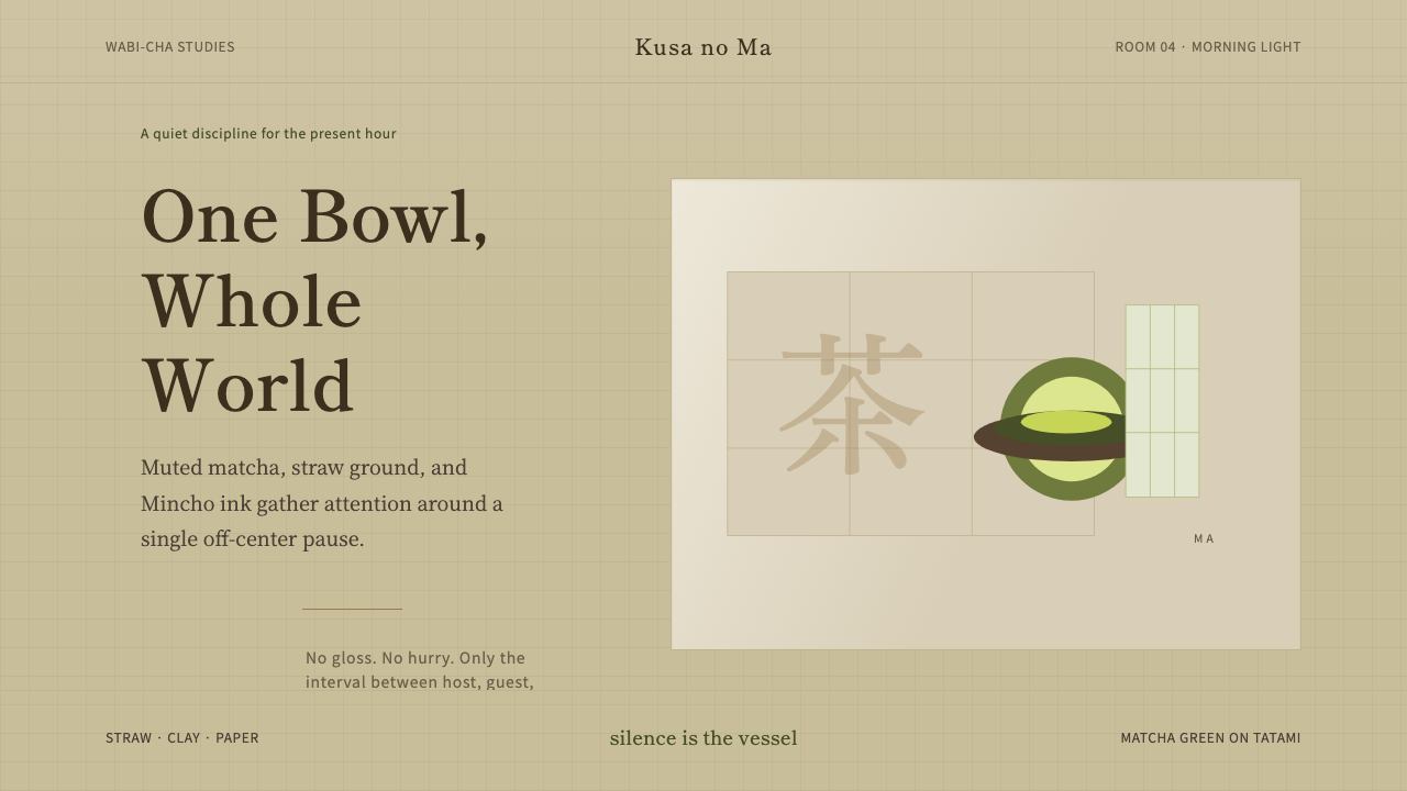 Japanese Tea CeremonyStillness has weight. Tatami straw, matcha green, and Mincho type leave room…
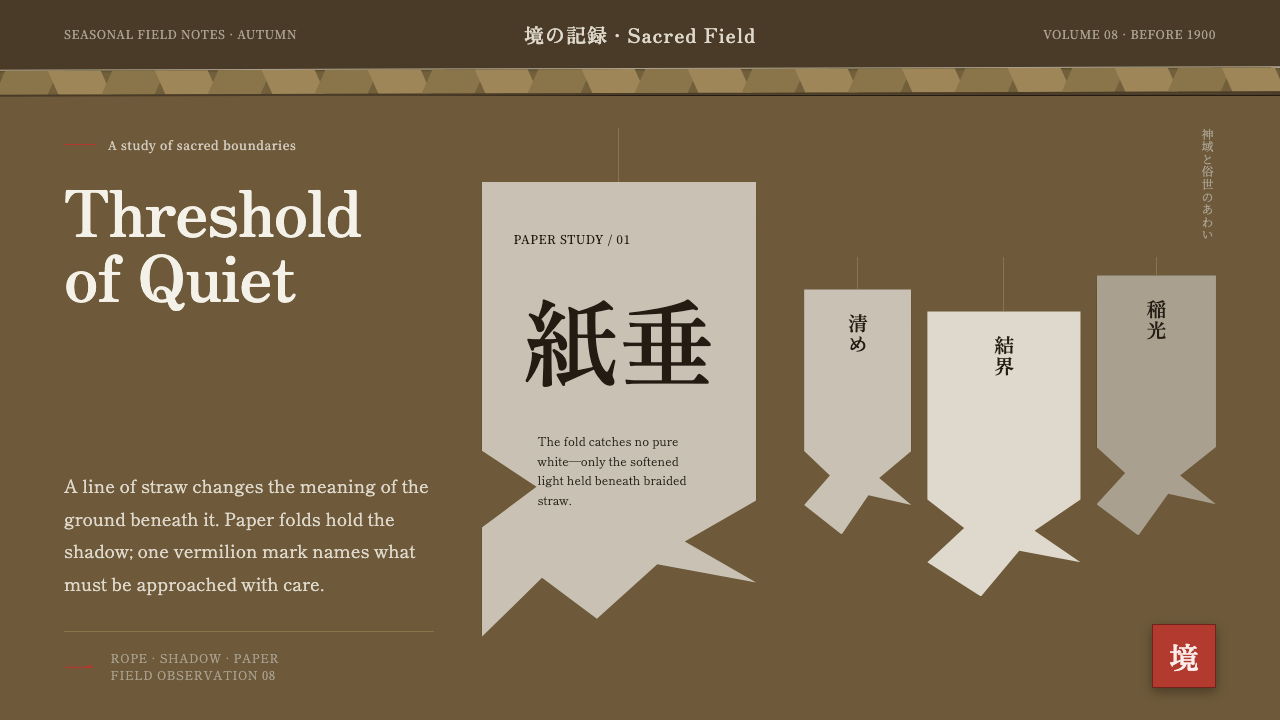 Shinto Shide Paper StreamerQuiet becomes sacred. Shadowed washi hangs from a straw-gold line, marked onc…
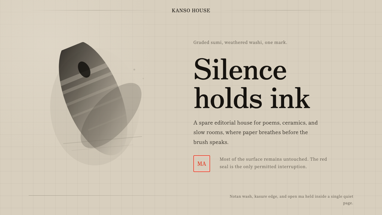 Sumi-e Ink WashRestraint carries weight. Washed black ink floats on oatmeal washi, anchored…
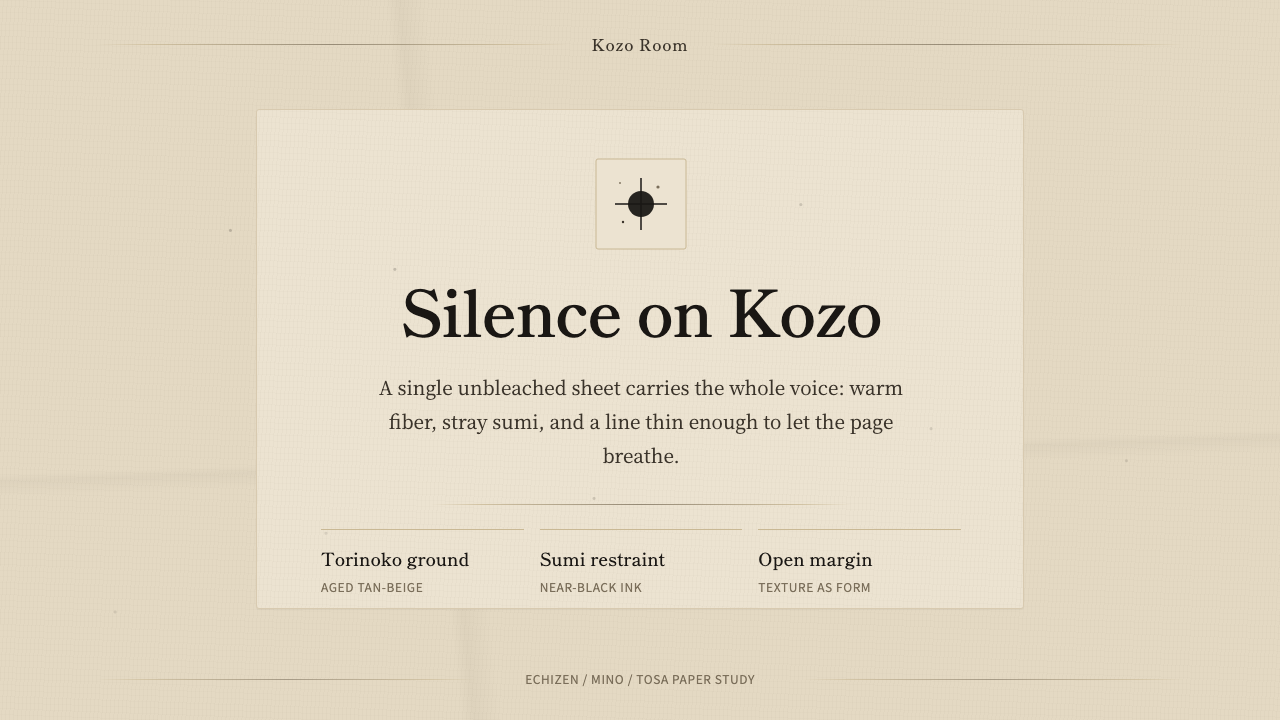 Washi Paper MinimalQuiet is material. Warm kozo grain, sumi specks, and hairline rules hold the…
 Wool FeltingHandmade stillness. Oatmeal-gray felt, humanist serifs, and soft rolled panel…
 Beni Ourain Berber CarpetRestraint feels tactile. Greige wool field, Oswald type, and a loose charcoal…