What is Silent Running?
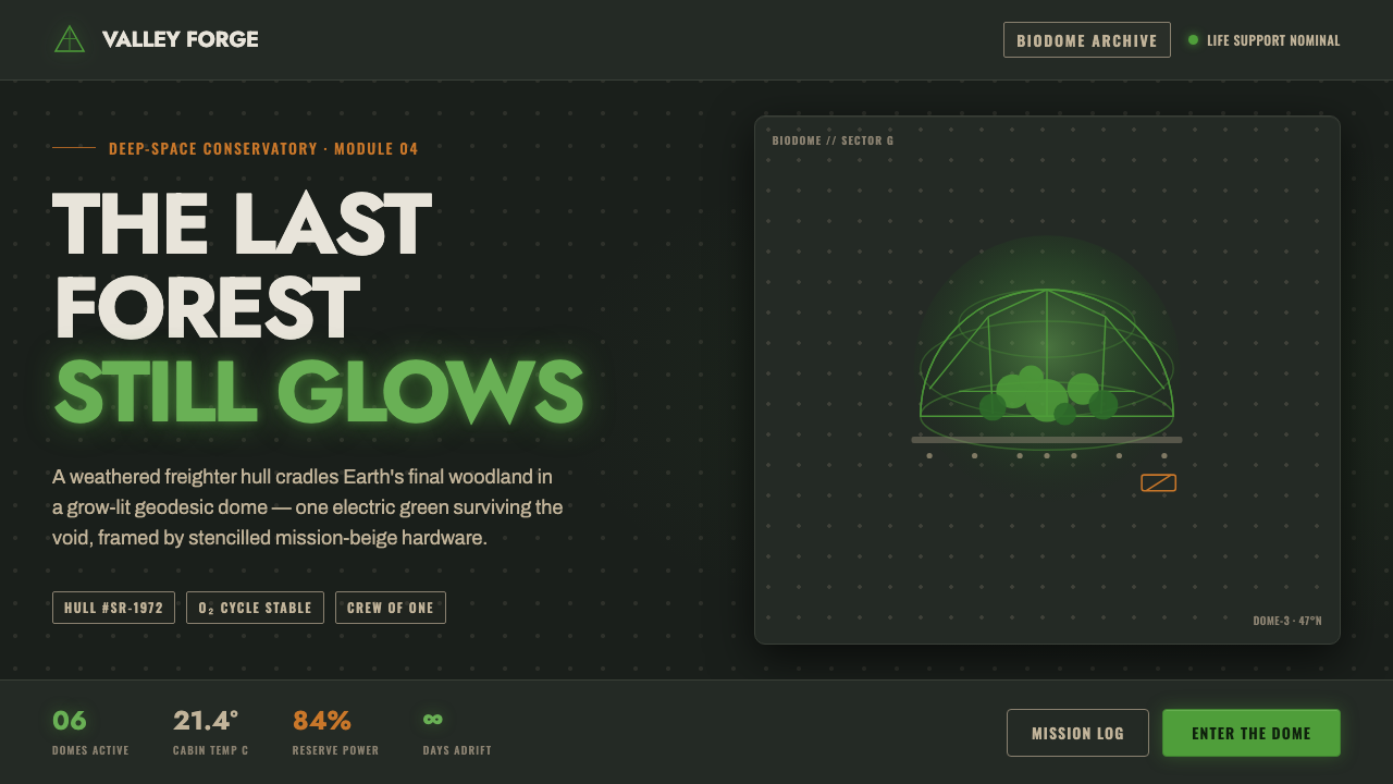
Silent Running turns a freighter hull into a tomb for the old Earth, then lets one glowing forest green become its last living signal.
Silent Running in brief
Silent Running is a dark ecological science-fiction language drawn from Douglas Trumbull’s 1972 film: Earth’s last forests survive inside geodesic biodomes carried through space by the freighter Valley Forge. Its emotional force comes from enclosure. Living foliage is precious because it is surrounded by engineered darkness, riveted metal, and the silence of an industrial vessel.
The visual system is built on a severe contrast between a near-black spacecraft hull, a luminous forest green, and weathered NASA-beige hardware. The green belongs to life rather than decoration. Beige belongs to machinery, maintenance, and human-made infrastructure. Everything else recedes into the hull, allowing the forest to read as a fragile, almost electrical presence.
Typography follows the same ethic. Geometric Futura-clone lettering and industrial stencil marks feel made for labels, equipment, and working surfaces. The tone is utilitarian and grease-pencil honest: clear, physical, and unpolished without becoming careless. Nothing should feel ornate, luxurious, or digitally weightless.
Where does Silent Running come from?
The style begins with Silent Running as a 1972 ecological vision and Douglas Trumbull’s directorial debut. Its premise gives the visual language its central tension: the last forest is not placed in an open landscape but sealed inside a geodesic dome and carried by a freighter. Nature is therefore framed as both sanctuary and endangered cargo.
Its regional identity is North American, specifically American, and its technical vocabulary belongs to the practical-effects science fiction of the 1970s. The spacecraft is not imagined as a clean abstraction. It is understood through hull plates, rivets, worn surfaces, hardware, and the visible evidence of use. The result is a future that feels built, serviced, and inhabited.
The NASA-realist modeling tradition supplies the system’s industrial credibility. Hardware is not ornamental scenery; it establishes scale, function, and history. Against that beige machinery, the forest dome becomes more vivid. The contrast is not merely chromatic but ethical: engineered matter surrounds the living world, while the living world supplies the only sense of renewal.
Practical effects complete the visual attitude. Surfaces should appear tangible, marks should seem applied by workers, and light should feel trapped within a physical environment. When translated into interface design, the goal is not to imitate a film prop literally. It is to preserve the relationship between worn industrial enclosure and protected organic life.
What defines the Silent Running look?
Hull Ground
The ground is near-black, dense, and light-absorbing, like the interior skin of a freighter. It should make panels, labels, and green illumination feel embedded in an object rather than floating on a neutral canvas. Darkness supplies the enclosure that gives every living or luminous element its significance.
Living Green
Forest green is the emotional and visual signal of life. It may glow against the hull, but the glow should remain concentrated and purposeful. Green marks the biodome, the protected organism, or the surviving natural system; it is not a general accent scattered across every control and label.
Weathered Beige
NASA-beige hardware introduces a tired, serviceable warmth into the dark system. Beige belongs on equipment, structural panels, worn housings, and practical labels. It should feel beaten and handled rather than creamy or decorative, providing a material bridge between the black hull and the green forest.
Riveted Material
Rivets, seams, plates, and battered surfaces make the interface feel assembled. Depth comes from construction and wear, not from polished gloss. A panel can be separated by a seam, a label can sit inside a metal field, and a hard edge can suggest where one piece of the vessel meets another.
Utility Type
Geometric Futura-clone lettering carries headings and essential interface language with clean, engineered confidence. Industrial stencil lettering handles identifiers, warnings, and equipment-like metadata. The two voices can coexist, but neither should become ornamental: every letter must feel legible, applied, and accountable to a task.
Dome Against Hull
The geodesic dome supplies the organic system’s defining geometry, while the freighter contributes panels, seams, and mechanical enclosure. Their opposition should remain visible. Rounded or faceted forms can hold the forest, while rigid surrounding structure makes its vulnerability and rarity unmistakable.
Who shaped Silent Running?
Trumbull is the director of Silent Running and the authorial source of this visual world. His directorial debut gives the system its elegiac balance: practical spacecraft hardware is never separated from the emotional problem of preserving Earth’s last forests. In design terms, he represents the union of industrial construction, ecological grief, and tactile science-fiction realism.
Bruce Dern is identified in the source as one of Silent Running’s key figures. His place in the system keeps the machinery from becoming the whole subject. The hull, labels, and biodome are ultimately arranged around human attention and human responsibility toward a living world that can no longer be taken for granted.
Joan Baez is also named as a key figure in the source material, reinforcing the film’s elegiac and culturally resonant register. For a design system, her inclusion suggests that Silent Running should not be reduced to technical retro-futurism. Its darkness carries mourning, memory, and the fragile persistence of beauty.
How do you use Silent Running today?
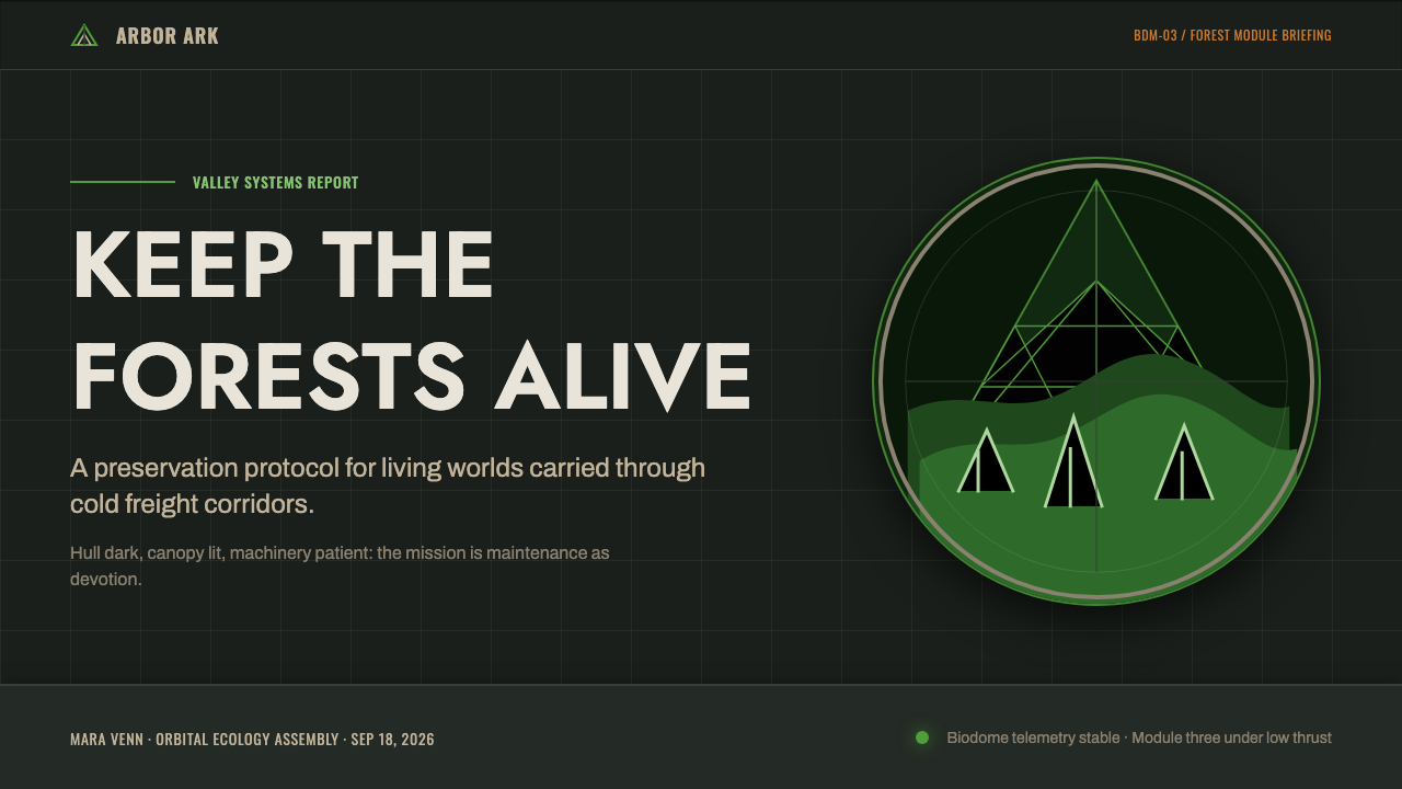
For presentation slides, use the near-black hull ground as the field for both cover and content pages. A cover can place a restrained title beside a glowing green dome or a beige industrial marker, creating immediate tension between enclosure and life. Content slides should rely on clear geometric zones, utilitarian labels, and a narrow range of type voices. The system feels strongest when the slide appears assembled from working panels rather than decorated with cinematic effects.
Data slides should make information feel like telemetry from a living vessel. Use beige for structural context, green for the surviving or active condition, and near-black for the surrounding field. Charts should remain legible and spare, with the green reserved for the data that matters most. Avoid turning every category into a different bright color; the point is to make life stand out against machinery.
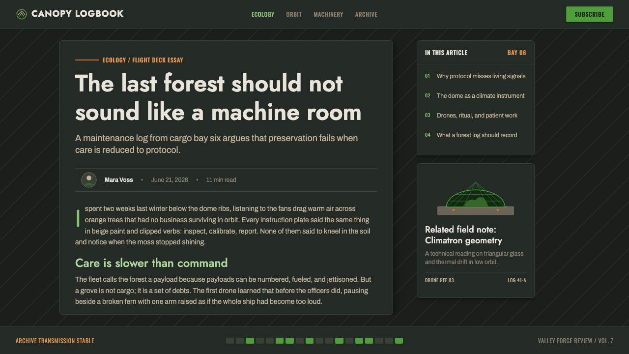
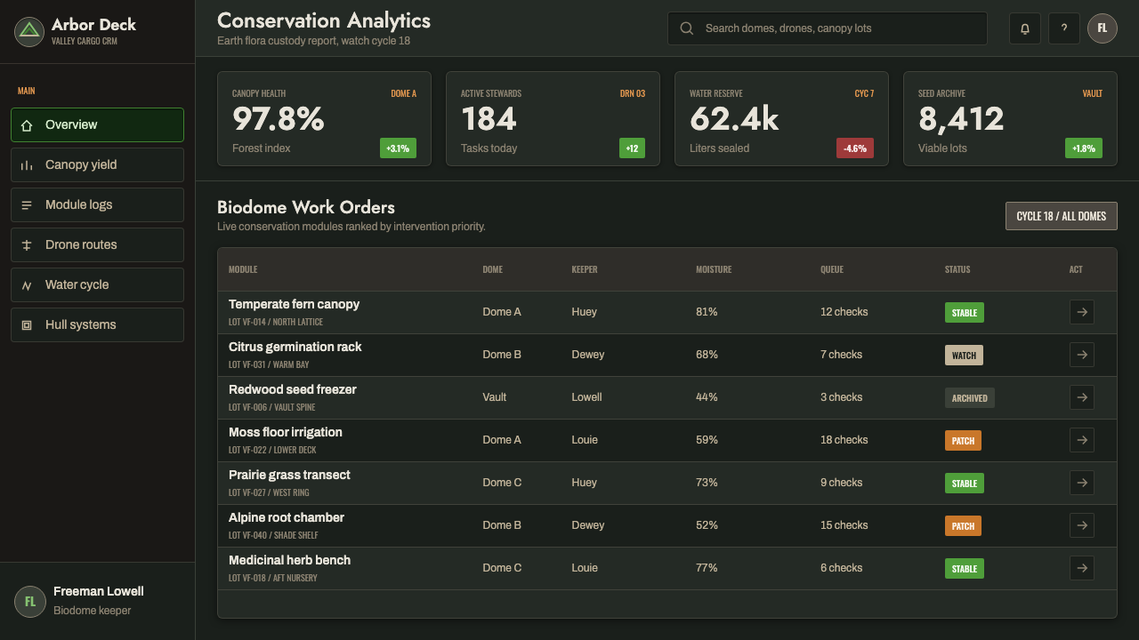
For web dashboards and pricing pages, Silent Running works when the product benefits from a sense of mission, monitoring, or scarce resources. Dark panels can organize dense information, while beige labels and riveted divisions establish a serviceable industrial hierarchy. Forest green is especially effective for active states, protected capacity, successful preservation, or the most important call to action. Pricing tiers should feel like compartments in a vessel, not glossy consumer cards.
Editorial and marketing work can use the style as a narrative frame. Open with a dark field, a concise geometric headline, and a single green image or signal; then let beige notes, captions, and stencil-like metadata build the sense of an operational archive. Campaign pages benefit from the contrast between the threatened forest and the machinery enclosing it, especially when the message concerns preservation, infrastructure, ecology, or long-term responsibility.
The common mistake is treating Silent Running as a generic dark sci-fi skin. Adding random neon accents, polished chrome, futuristic interface decorations, or excessive distress destroys the specific contrast that makes the style work. Keep the green meaningful, keep beige physical rather than luxurious, and let wear support the sense of use. If every surface glows or every label looks distressed, the forest loses its role as the rare living signal.
Silent Running — FAQ
What is the defining contrast in Silent Running?
It is the contrast between the near-black, riveted freighter hull and the luminous forest green of the protected biodome. Weathered NASA-beige hardware mediates between them. The darkness represents enclosure and industrial isolation; the green represents the last living forest.
Is this simply a retro-futurist spacecraft style?
No. Its spacecraft language comes from 1970s practical-effects science fiction and NASA-realist modeling, but its emotional center is ecological. Hardware matters because it encloses and protects a living world. Without that relationship, the result becomes generic industrial nostalgia.
How should the glowing green be used in an interface?
Use it as a meaningful signal for life, activation, preservation, or priority. It should remain rare enough to attract attention against the dark hull. If green appears on every button, chart, and label, it stops representing the forest and becomes ordinary decoration.
What typography belongs to this style?
Geometric Futura-clone type works for headings and primary interface language, while industrial stencil lettering suits identifiers, warnings, and equipment metadata. Both should feel functional, applied, and physically situated. Ornate display lettering or polished luxury typography breaks the system’s utilitarian honesty.
Where does Silent Running work best, and where does it struggle?
It suits dashboards, monitoring tools, ecological projects, preservation work, infrastructure products, and campaigns about responsibility or scarce resources. It struggles when a product needs softness, luxury, playful abundance, or a broad expressive palette. Its strength is disciplined contrast, not universal friendliness.
Related design styles
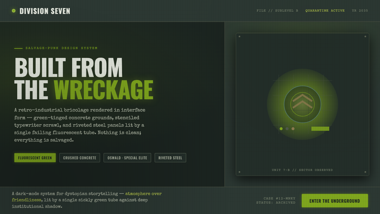 12 MonkeysBuilt from the wreckage. Sickly fluorescent green on crushed-black concrete,…
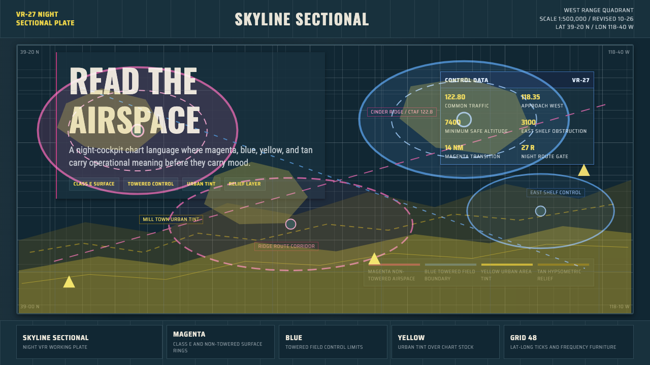 Aeronautical ChartReads like cockpit data. Magenta-blue airspace rings cut through dense dark-c…
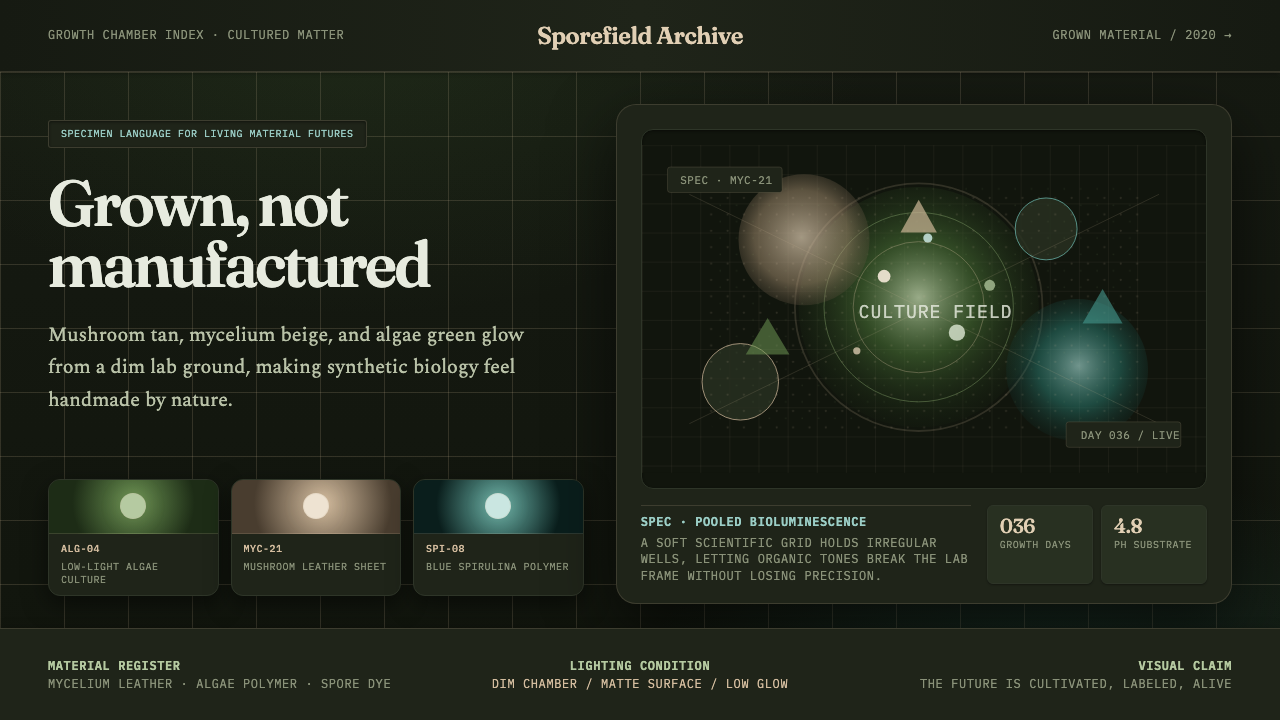 Biopunk GrownLife replaces industry. Algae green glows on chamber dark with serif voice an…
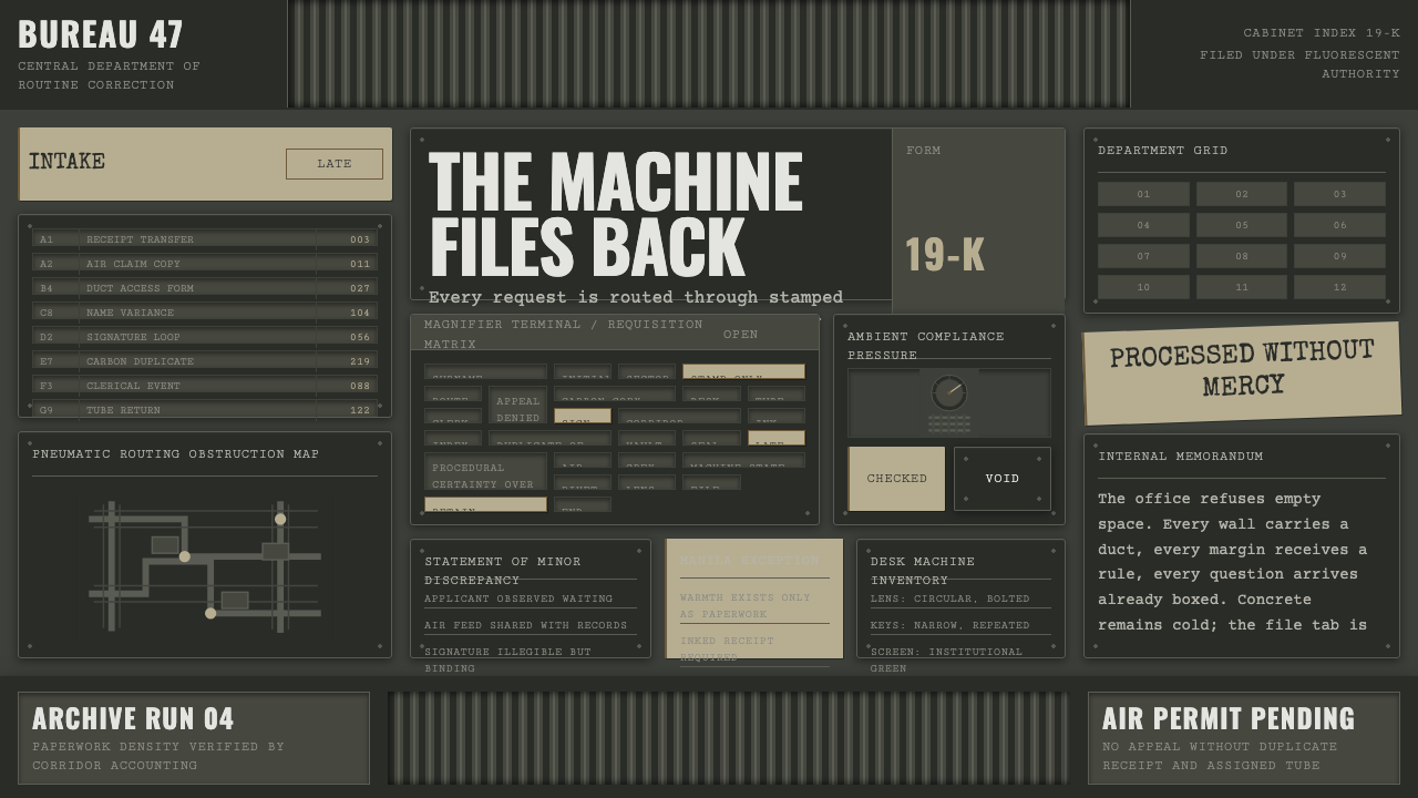 Brazil (1985)Bureaucracy turns hostile. Gray-green grids, duct bands, and manila stamps cr…
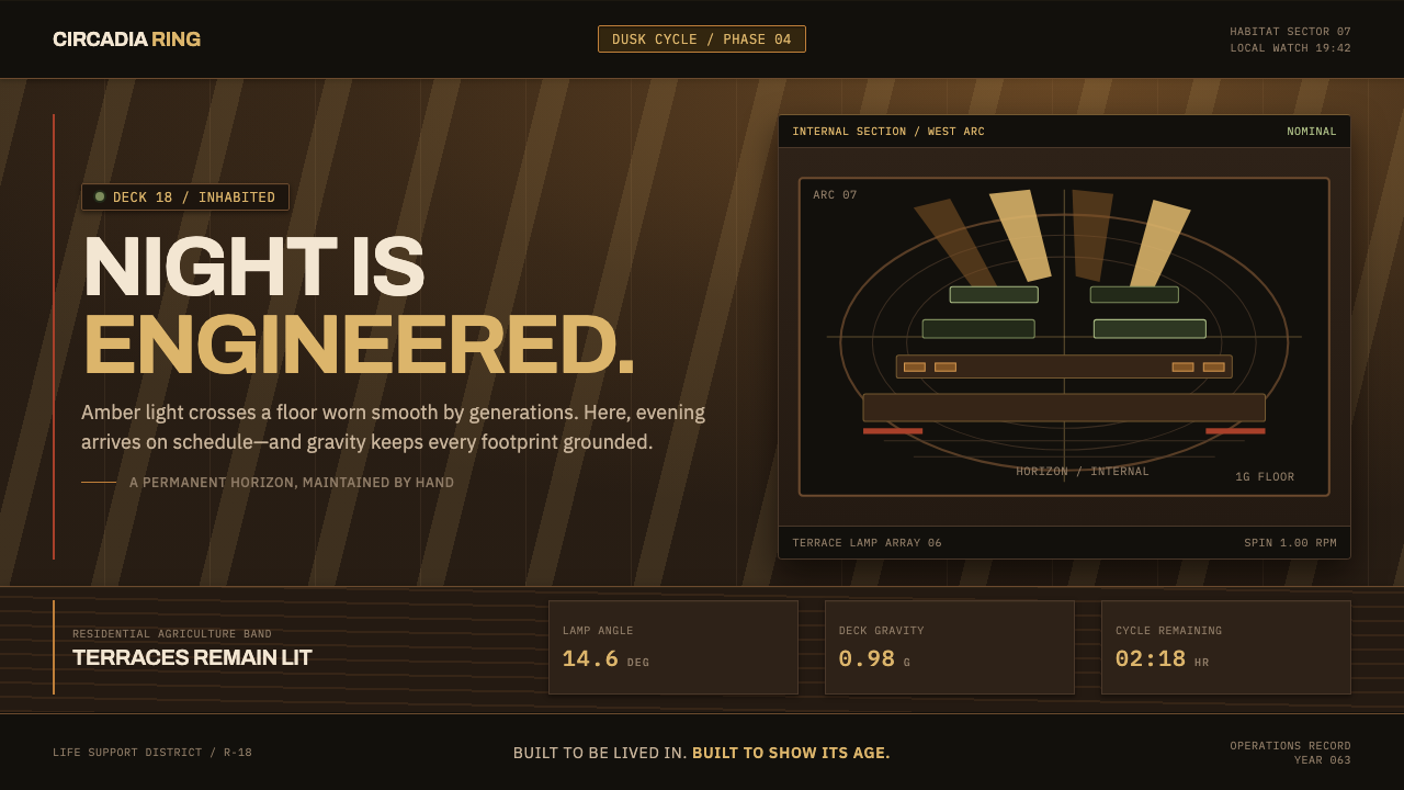 Generation Ship InteriorNight is engineered. Amber louvres rake across timber decks and stacked habit…
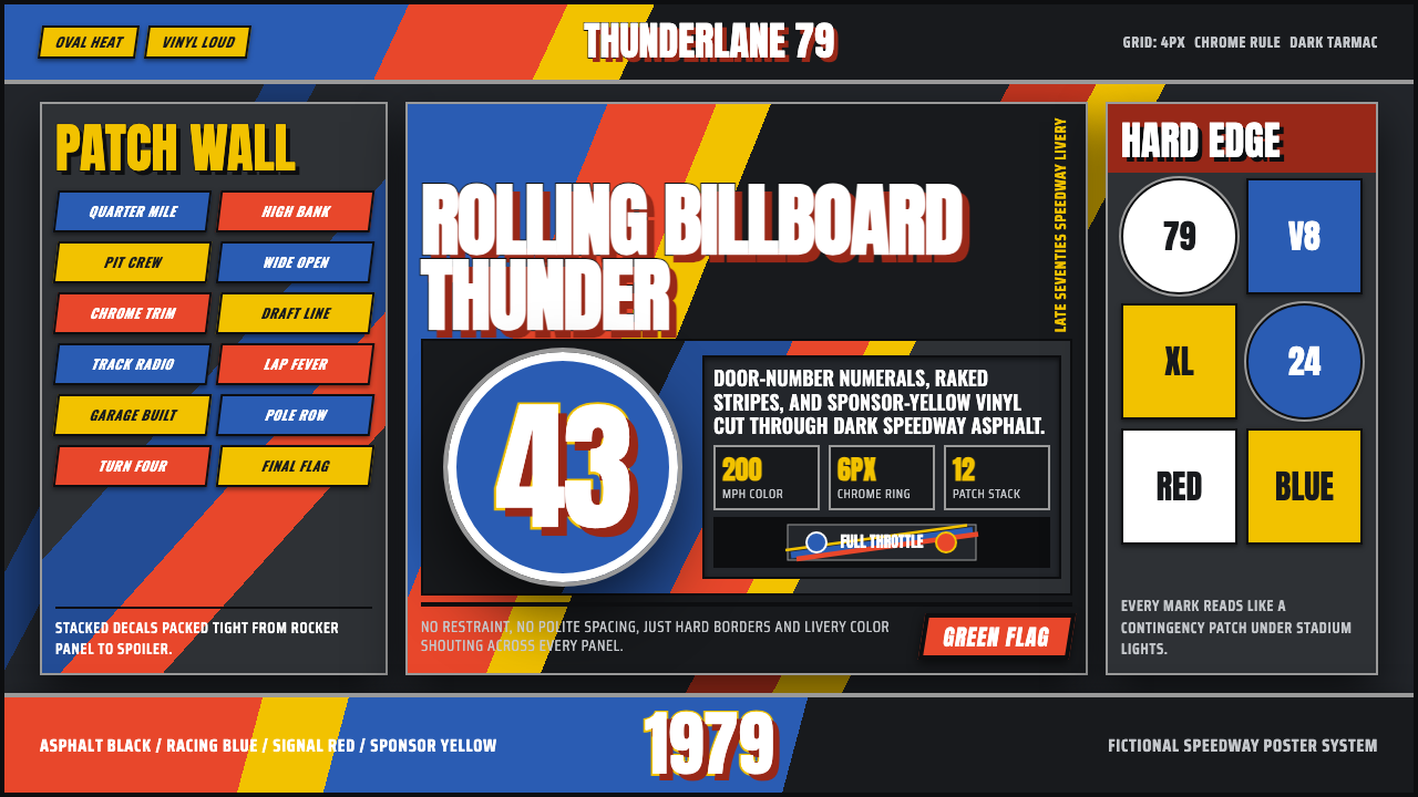 NASCAR Stock CarLoud as a rolling billboard. Blue, red, and sponsor yellow collide in a hard-…