What is Generation Ship Interior?
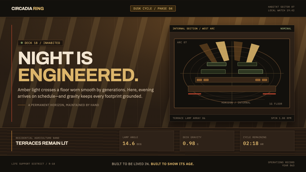
Generation Ship Interior renders permanent life inside a slowly spinning ring — waxed timber decks, terraced fields, and an engineered amber sun that rises because a lamp tells it to.
Generation Ship Interior in brief
Generation Ship Interior is built from a single historical image: the cutaway paintings NASA Ames commissioned in 1975 to show, in concrete terms, what it would feel like to live permanently inside a rotating space habitat. The brief was not cinematic. It was closer to civil engineering — if people were going to spend their whole lives, and raise children who would never set foot on Earth, inside a spinning ring, then the ring needed a floor, and the floor needed to look like somewhere a person could actually stand.
The resulting aesthetic refuses almost every convention of screen science fiction. There is no chrome, no cold blue accent glow, no holographic interface hovering in mid-air. Instead the ground is dusk-toned hardwood, waxed and walked, and the light is unmistakably artificial in the best sense — warm, angled, and directional, arriving in raking bands rather than as flat, shadowless fill. The curvature of the ring itself becomes a compositional device, rendered as stacked habitat bands that recede toward a horizon that bends upward instead of vanishing into distance.
What makes the system distinct is its insistence on wear. This is not a freshly built showroom; it is infrastructure that has been lived in for a generation. Wood grain shows the paths people actually walk. Edge trim is dinged at the corners where carts and elbows have passed a thousand times. Signage is stencilled, and it has been touched up and repainted rather than replaced, because paint is cheaper than new signs when you cannot order more from a supplier that no longer exists.
Where does Generation Ship Interior come from?
The starting point is a real engineering exercise. In 1975, a joint NASA Ames and Stanford University summer study set out to answer a direct question: what would it actually take for people to live permanently away from Earth. The answer that emerged was architectural before it was mechanical — a large ring, spun on its axis so that centrifugal force stood in for gravity, its interior treated not as a cramped vehicle cabin but as inhabitable ground with a floor, a sky, and weather-like light.
Physicist Gerard K. O'Neill chaired the study, and the reasoning that shaped it was practical rather than speculative. A ship meant for one voyage can be built like a machine; a habitat meant to hold generations who will be born, work, farm, and die inside it has to be built like a place. That distinction — vehicle versus settlement — is the entire premise the visual system inherited, and it is why the aesthetic favors timber and terraces over sleek control-panel surfaces.
To communicate that idea, NASA turned not to draftsmen but to painters. Don Davis and Rick Guidice were commissioned to render the interior in oil, and their paintings are the direct source of the style: hardwood decking underfoot, farm terraces climbing a floor that curves upward at both ends, and daylight fed down from an overhead mirror system through angled louvres rather than falling from an open sky. Oil paint gave the scenes a warmth and material specificity that a technical diagram could not — these were meant to look like a place worth living in, not a cross-section worth studying.
The study's findings were compiled into NASA's official published record, SP-413, released in 1977, with Richard D. Johnson's name attached to the report that carried the interior paintings to a wider readership. That publication matters to the style's identity: this was filed as an engineering document, not a piece of speculative fiction, and it sits within a broader current of nineteen-seventies NASA technical illustration — infrastructure diagrams rendered with enough craft and conviction that they read as a coherent, believable vision of an inhabited future rather than a blueprint.
What defines the Generation Ship Interior look?
Engineered Light
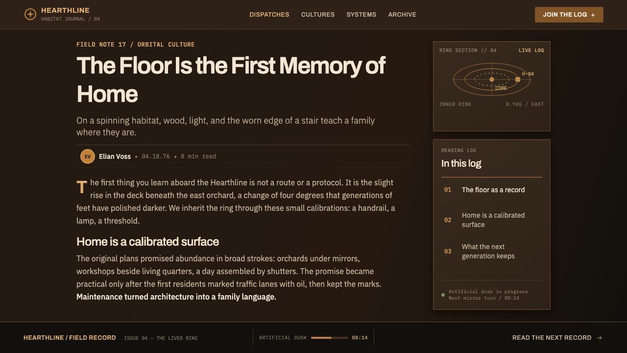
Every light source in this system is legible as artificial — a lamp standing in for a sun, not simulating one perfectly. Illumination arrives warm and amber, and it is directional rather than ambient, raking across surfaces at an angle instead of filling a room evenly. Night and day are administrative decisions, not astronomical facts, and the light is allowed to look like it.
Timber Ground
The base surface is dusk-toned hardwood rather than metal, composite, or anything reflective. Choosing timber over chrome is the system's central material argument: this is a place meant for permanent occupation, and permanent occupation calls for surfaces that age gracefully underfoot rather than surfaces built to look new forever.
Wear and Patina
Every walkable surface carries evidence of use — grain worn smooth along foot traffic lines, edge trim dinged at corners, signage stencilled and visibly repainted over itself rather than swapped for something crisp. The wear is not decorative distress; it is the visual proof that generations, not a single crew, have lived here.
Stacked Habitat Bands
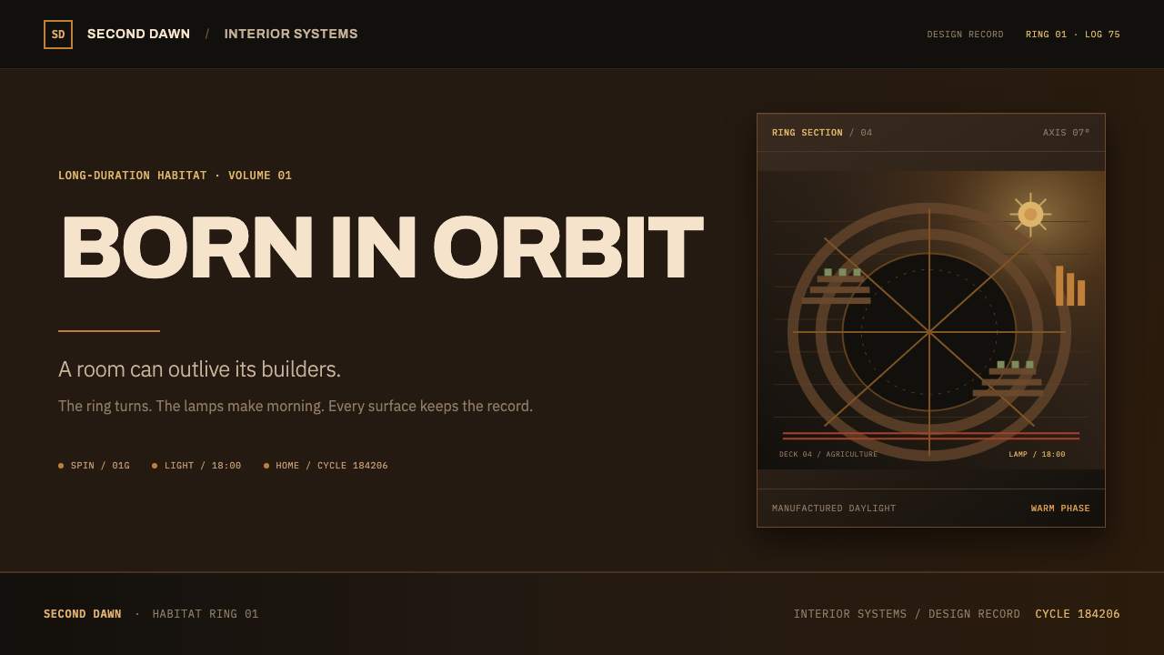
The ring's curvature is rendered as a sequence of layered terraces and bands rather than a single flat plane, giving any composition a natural, receding rhythm. This banding becomes the system's primary organizing device for structuring information, standing in for the grid lines a flatter style would use.
Raking Louvres
Light is filtered and directed through slatted louvres rather than delivered as an even wash, cutting illumination into visible bands across decks and terraces. The louvre is treated as a structural fixture in its own right — a piece of engineered infrastructure, not an atmospheric effect.
Refusal of Sci-Fi Convention
The system deliberately excludes the visual shorthand most digital sci-fi reaches for: no mirrored metal, no cold blue accents, no floating holographic panels. Warmth and material weight replace those cues, because the source material describes a home, not a spacecraft cockpit.
Repainted Signage
Wayfinding and labels are treated as stencilled paint rather than printed graphics, built up in visible layers where old lettering has been touched up rather than discarded. This gives typography a handmade, maintained quality rather than a manufactured one.
Who shaped Generation Ship Interior?
O'Neill chaired the 1975 NASA Ames and Stanford summer study that asked what a permanent off-Earth habitat would require, and the rotating-ring answer that emerged from his leadership is the structural premise the entire visual system is built on — an inhabited settlement rather than a travelling vehicle.
Davis was one of two painters NASA commissioned to render the interior of the proposed habitat in oil. His paintings gave the abstract engineering proposal a lived-in, materially specific look — waxed timber, terraced farmland, warm directional light — that later technical illustration could only reference, not improve on.
Guidice painted alongside Don Davis, producing the other half of the interior views that defined how a rotating space settlement was imagined from the inside. His work shares the same commitment to material warmth over mechanical sheen, and together the two painters' canvases remain the visual source every derivative of this style points back to.
Johnson's name is attached to NASA's official published account of the study, SP-413, released in 1977. That publication carried Davis and Guidice's interior paintings beyond the study group itself, cementing the look as an engineering record rather than a speculative illustration.
How do you use Generation Ship Interior today?
On presentation slides, this system reads best as an argument for permanence over novelty. A cover slide can use a wide terraced band receding toward a curved horizon, with the title set in warm, high-contrast type against the dusk timber ground. Content slides should keep the stacked-band structure as the organizing grid — one band per major point — rather than reverting to conventional bullet lists, and data should be shown as physical quantities laid across those bands: yields, populations, distances, resembling a settlement's operating log rather than a corporate chart.
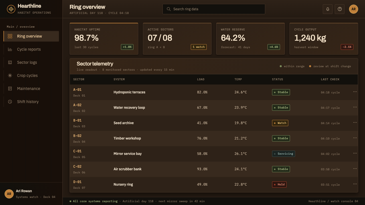
For web interfaces, the style suits dashboards and systems that monitor something ongoing and long-lived — infrastructure, agriculture, energy, logistics. Keep backgrounds dark and warm rather than neutral grey, let primary navigation sit on a raised timber band, and reserve the amber accent for states that genuinely need attention rather than decorating every interactive element with it. Card components should read as physical panels with a directional light source, not flat colored rectangles.
In editorial and long-form contexts, the wear-and-patina principle becomes a storytelling device: pull quotes can sit inside a stencilled, slightly repainted-looking label rather than a clean rule, and section breaks can be marked with a banded terrace motif instead of a plain horizontal line. The effect should suggest a document that has been consulted and annotated over time, not one freshly printed.
Marketing pages benefit from leaning into the founding tension of the whole system — permanence versus a frontier setting. A hero section can pair a wide terraced-band illustration with copy that emphasizes durability, continuity, or generational thinking, since those are the values the aesthetic was built to communicate in the first place.
The most common mistake is treating this as generic 'warm sci-fi' and reaching for gradients or soft ambient glow to suggest atmosphere. The system's entire identity depends on hard, directional, lamp-like light and flat, honest material surfaces; softening either one collapses the distinction between an engineered habitat and a movie set, which is precisely the distinction this style exists to preserve.
Generation Ship Interior — FAQ
Is this the same as generic retro-futurist or 'NASA-core' design?
Not quite. Generic retro-futurism tends to borrow control-panel switches and mission-patch graphics from spacecraft cockpits. This system is specifically about a habitat, not a vehicle — its reference point is a settlement people never leave, which is why timber, terraces, and wear matter more here than dials and switches.
Why amber, warm light instead of the cool blue most sci-fi interfaces use?
Because the source paintings depicted an engineered sun, and sunlight reads as warm, not cold. Cool blue in screen design usually signals technology or machinery; this system is explicitly arguing that the interior is a home, so its light follows the logic of a lamp illuminating a lived space rather than a console illuminating a control room.
Does the style require a dark background?
Effectively yes. The system depends on directional light being visibly distinct from its surroundings, which only reads clearly against a dusk-toned or dark ground. On a bright, evenly lit background, the raking amber light loses the contrast that makes it legible as engineered rather than ambient.
Can this style work for products that have nothing to do with space?
Yes, for anything built around long-term, ongoing systems rather than one-off transactions — infrastructure monitoring, agricultural platforms, resource management, or any product whose core value proposition is durability and continuity rather than speed or novelty.
What is the single biggest mistake when applying this style?
Skipping the wear. It is tempting to keep the warm timber and amber light but present everything pristine and new, which erases the point entirely. The style is not about a spaceship interior; it is about a settlement that has been inhabited long enough to show it.
Related design styles
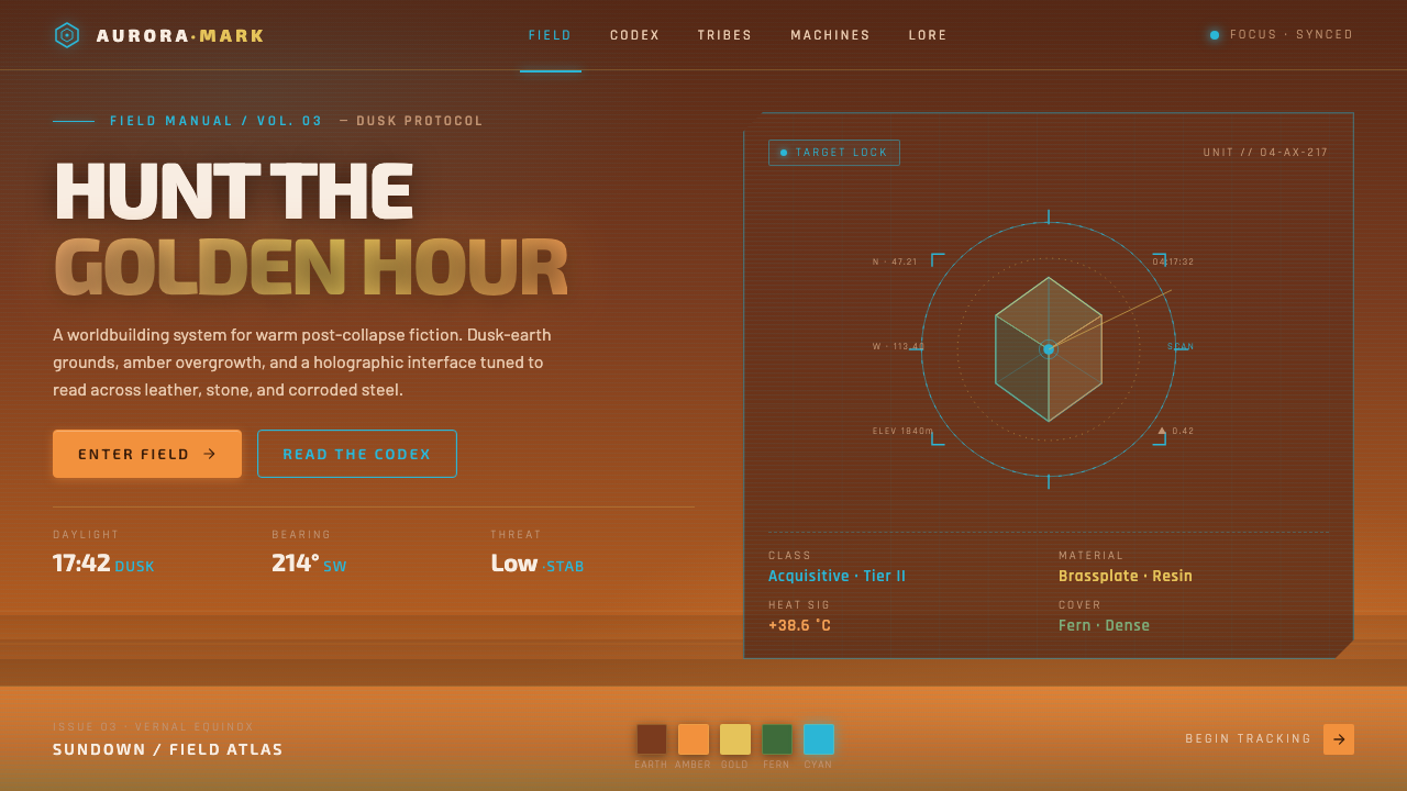 Horizon Zero DawnGolden-hour post-apocalypse. Dusk-earth grounds, amber overgrowth, glowing ho…
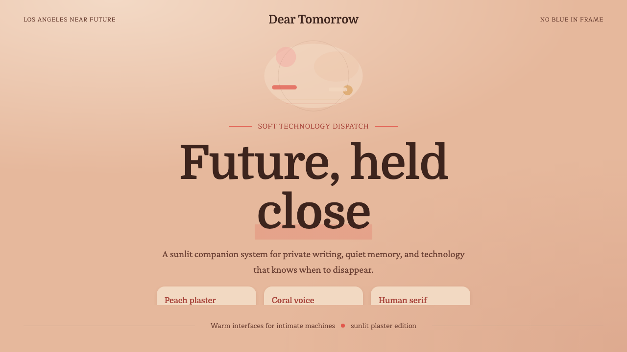 Her — Soft FutureTender future, no chill. Peach plaster, coral serif type, and soft stacked sp…
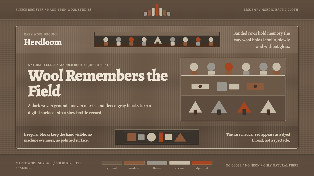 Estonian Folk Tapestry (Anu Raud)Quiet wool carries memory. Banded fleece browns and Alegreya type move like a…
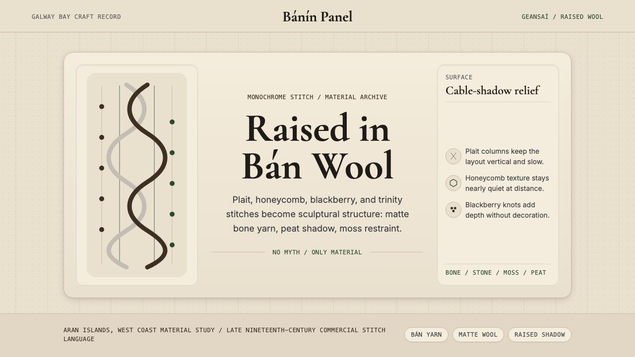 Irish Aran Island Cable KnitMaterial honesty raised in wool. Bone ground, moss ink, and cable columns cas…
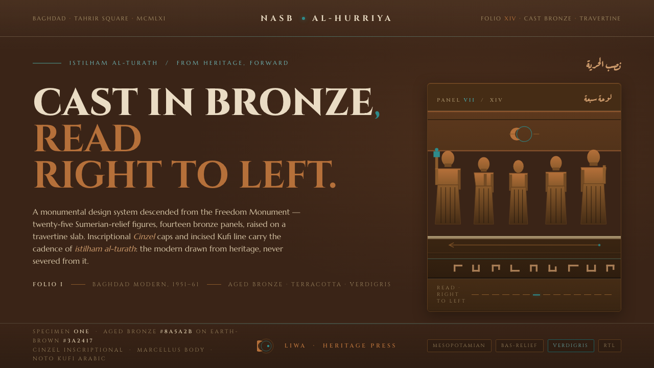 Jewad Selim Baghdad ModernCast in bronze, read right to left. Aged-bronze grounds, incised Kufi line, v…
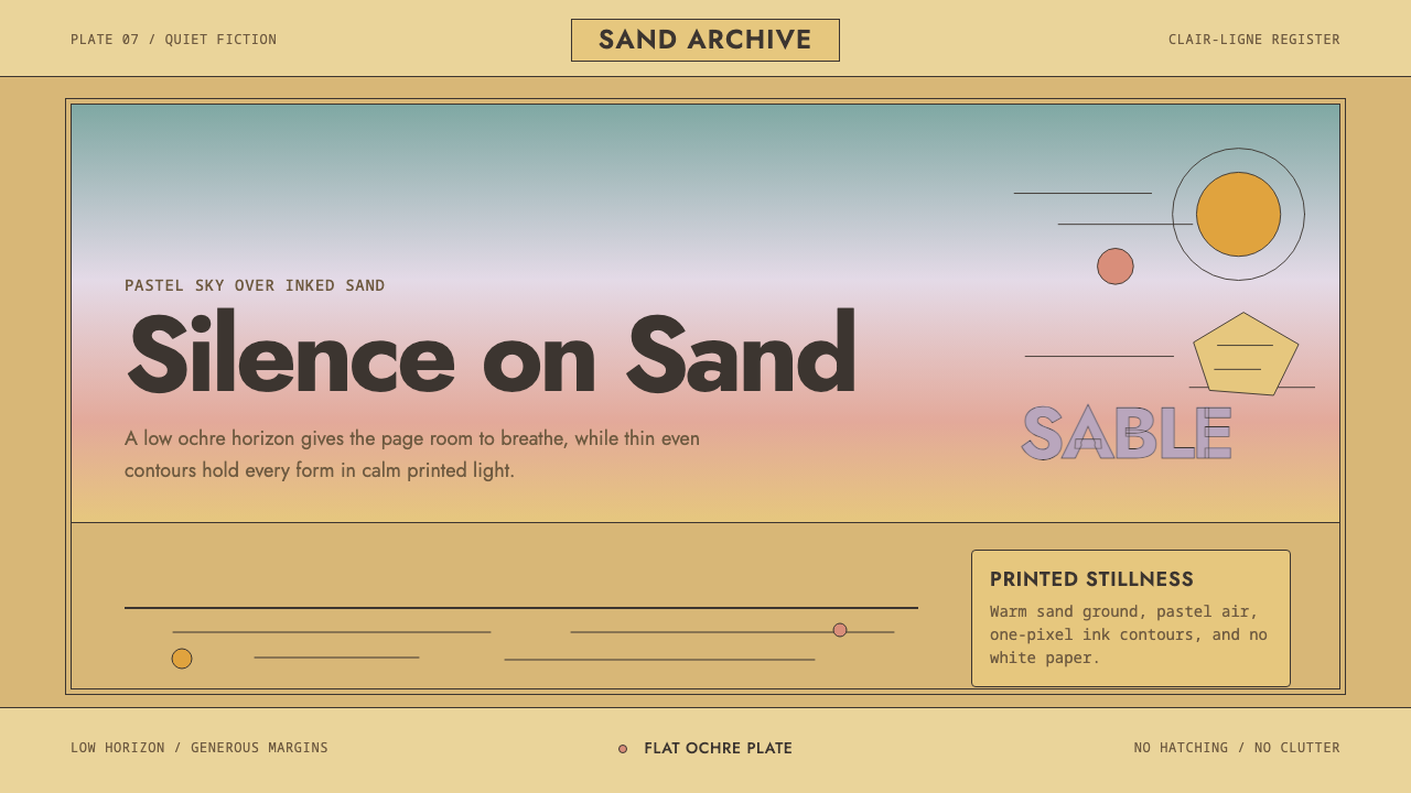 Sable (Mœbius)Still desert science fiction. Ochre ground, pastel sky, and thin ink contours…