What is Jewad Selim Baghdad Modern?
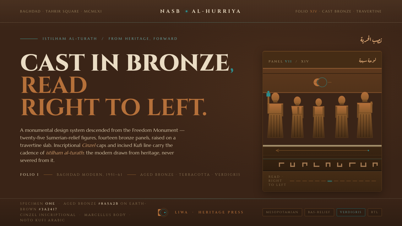
Cast in bronze and read from right to left, Jewad Selim Baghdad Modern turns Sumerian memory into a dark, tactile language of incised line, earth, and turquoise metal.
Jewad Selim Baghdad Modern in brief
Jewad Selim Baghdad Modern is a dark, material-led design language derived from the Baghdad Modern Art Group and Jewad Selim’s Freedom Monument. It translates the monument’s bronze castings, raised stone base, incised line, and relief-like sequence into a screen system. The result feels archaeological without becoming nostalgic: history is carried by surface, direction, and weight rather than by pasted-on motifs.
The style is built around a deliberate tension between ancient source and modern construction. Sumerian relief supplies the sense of compressed narrative and frontal form; European modernism supplies reduction, order, and the confidence to let a few strong elements carry the composition. Its governing idea is istilham al-turath: drawing inspiration from heritage while making a present-tense visual language.
On screen, deep aged-bronze and earth-brown grounds establish gravity. Red clay and ochre extend the Mesopotamian earth register, while turquoise and verdigris appear as living mineral accents on cast metal. Kufi-like lines behave as incisions, not decoration. The eye should encounter a procession: forms, labels, and emphasis move from right to left, echoing Arabic reading and the narrative cadence of bas-relief.
Where does Jewad Selim Baghdad Modern come from?
In 1951, sculptor Jewad Selim founded the Baghdad Modern Art Group in Baghdad, Iraq, around the credo istilham al-turath, or drawing inspiration from heritage. The group’s position was neither a retreat into the past nor a rejection of modernity. It treated inherited visual culture as active material: something that could be studied, transformed, and made relevant to a modern artistic language.
The defining reference is Selim’s Freedom Monument on Tahrir Square. The work fuses Sumerian relief with European modernism through fourteen bronze castings depicting twenty-five figures, set on a raised travertine slab. Its narrative is read from right to left like Arabic, so movement through the monument is part of its meaning. The monument commemorates the 1958 revolution.
The resulting vocabulary belongs to several connected currents: Baghdad modernism, istilham al-turath, and the revival of Sumerian relief. Its modernity lies in synthesis. Ancient relief is not copied as historical ornament; it is reorganized through contemporary simplification, sculptural mass, and a deliberately legible sequence of forms. Bronze, earth, and turquoise therefore function as carriers of memory as much as visual choices.
The Freedom Monument was unveiled in 1961, completing the period associated with the Baghdad Modern Art Group from 1951 to 1961. The digital design system distills this legacy rather than reproducing the monument literally. It retains the sense of cast weight, raised and incised surface, earth-bound color, and right-to-left narrative flow, translating a public sculptural statement into a language for screens, interfaces, editorial pages, and presentations.
What defines the Jewad Selim Baghdad Modern look?
Ground and Color
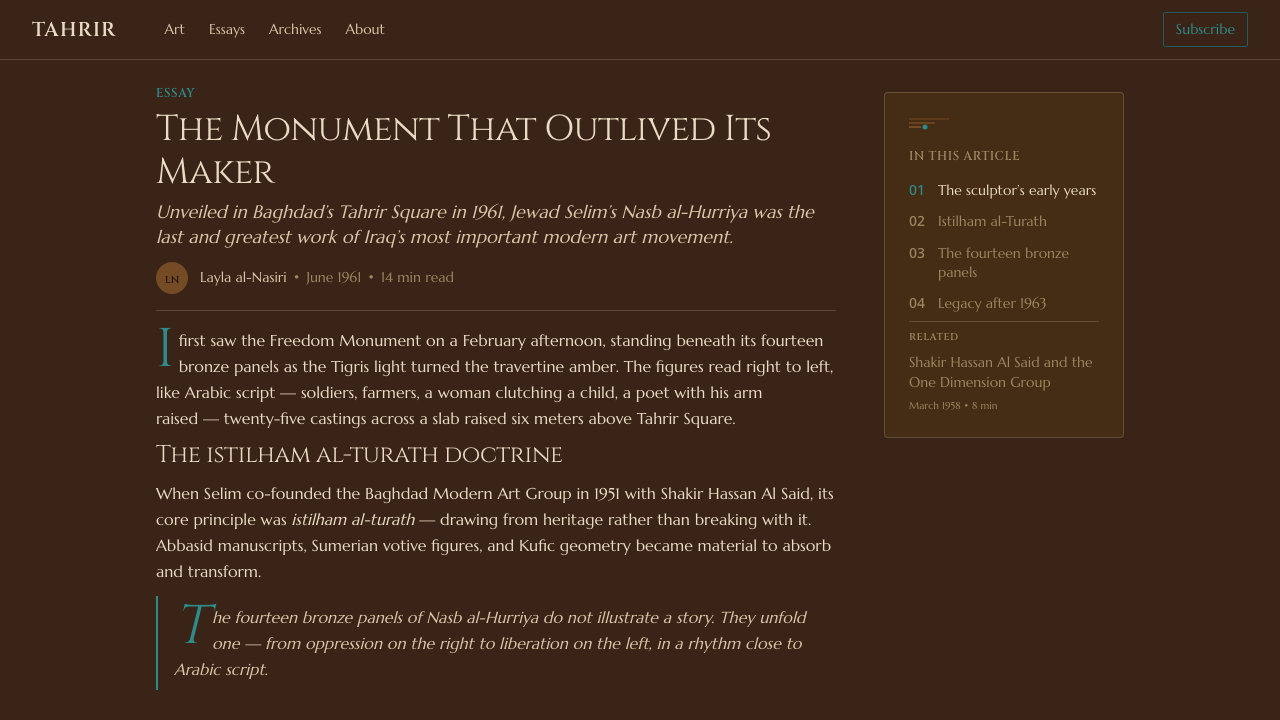
Color begins in the ground rather than the accent. Deep aged bronze and earth brown carry most surfaces; red clay and ochre keep the field within a Mesopotamian earth register. Turquoise and verdigris are reserved for moments that should feel like mineral caught on cast metal. Off-white and pure white are excluded, so contrast comes from darkness, patina, and disciplined points of brightness.
Incised Typography
Typography should feel cut into a surface or set as a structural inscription. The Kufi reference gives letters a squared, architectural discipline, while the surrounding darkness makes every mark feel deliberate. Latin text can remain contemporary and readable, but its arrangement should borrow the confidence of carved line: firm edges, clear grouping, and little interest in ornamental softness.
Relief and Depth
Depth is expressed through the relationship between raised form, recessed line, and broad ground. Panels, labels, and interface elements should appear layered like a shallow bas-relief, with hierarchy created by physical suggestion rather than atmospheric illusion. The visual goal is not photorealistic bronze, but the impression that information has been cast, pressed, or incised into a durable surface.
Right-to-Left Flow
The composition carries a right-to-left cadence, following the monument’s relation to Arabic reading. This does not require every language to reverse its text direction. Instead, the major visual sequence, image progression, and hierarchy can begin on the right and move across the field like a procession of relief figures. Direction becomes a narrative device rather than a decorative gesture.
Monumental Scale
The style needs calm fields and emphatic forms. Large areas of dark ground give individual marks the authority of carved figures on a raised slab, while isolated turquoise accents act as points of attention rather than continuous decoration. Compositions should feel civic and enduring, with enough visual silence for a title, figure, or statement to carry weight.
Patina and Accent
Aged bronze is the dominant condition, not a background color waiting to be covered. Surface variation should suggest time, casting, and contact with earth. Verdigris and turquoise add life precisely because they are scarce. When every component glows equally, the system loses its material hierarchy; when the accent is carefully placed, it reads as mineral emergence from metal.
Who shaped Jewad Selim Baghdad Modern?
Selim was the sculptor who founded the Baghdad Modern Art Group in 1951 and created the Freedom Monument on Tahrir Square. His work joined Sumerian relief with European modernism, turning inherited forms into a modern public language. In this design system, his role is the central bridge between heritage, sculpture, civic memory, and contemporary visual construction.
The Baghdad Modern Art Group formed around the principle of istilham al-turath, drawing inspiration from heritage. Its historical importance within this style is not a catalogue of decorative motifs, but a method: look to the region’s visual inheritance, then remake it through the needs of modern art. The system carries that method through material, sequence, and reduction.
The Freedom Monument is the defining sculptural source: fourteen bronze castings of twenty-five figures on a raised travertine slab, unveiled in 1961 and commemorating the 1958 revolution. Its fusion of Sumerian relief, modernist construction, and right-to-left narrative movement gives the digital style its strongest structural ideas. It is treated as a compositional model, not merely an image to imitate.
How do you use Jewad Selim Baghdad Modern today?
As a general system, begin with the ground: a dark aged-bronze or earth-brown field, then establish hierarchy through cast-like layers, incised lines, and rare turquoise or verdigris accents. Keep the narrative movement intentional. A page should feel like a sequence being encountered, not a pile of cultural references. The strongest applications allow material, direction, and restraint to do the explanatory work.
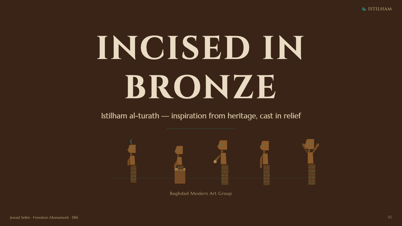
For presentation slides, the cover can behave like a monument: a quiet dark field, one emphatic relief-like form, and a title that appears inscribed rather than floating. Content slides should preserve that hierarchy with broad grounded areas, firm Kufi-inspired rules, and a clear right-to-left visual cadence. Data slides can treat charts, figures, and labels as a procession of cast elements, using turquoise only to identify the most important movement, category, or conclusion.
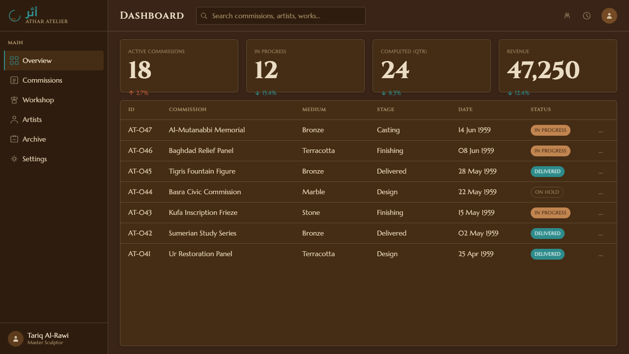
For web interfaces, the style suits dashboards and pricing pages that need gravitas and strong grouping. Use aged-bronze surfaces for the primary frame, earth-brown layers to separate panels, and turquoise or verdigris for active states, selected plans, or key actions. Cards should feel like plaques or relief blocks rather than weightless glass. Navigation can echo the right-to-left rhythm visually while keeping each language’s text direction correct.
For editorial and marketing work, build the page as a continuous relief narrative. A feature article can open with a monumental title, move through compact story panels, and use incised rules or mineral accents to mark transitions. A campaign page can present a product, event, or public message against the dark bronze ground, letting red clay and ochre establish warmth while turquoise gives the call to action a precise point of energy.
The common mistake is to turn the style into generic ancient ornament. Overusing turquoise, filling every surface with pseudo-relief, adding random script-like marks, or returning to cream and pure white breaks the system’s logic. Another failure is preserving a default left-to-right composition when the design is meant to carry right-to-left narrative flow. The reference is strongest when heritage is structural: in material, sequence, and restraint.
Jewad Selim Baghdad Modern — FAQ
Is this a literal reconstruction of the Freedom Monument?
No. It is a screen-oriented distillation of the monument’s governing ideas: bronze weight, raised and incised surface, earth-bound color, modernist reduction, and right-to-left narrative movement. The purpose is not to reproduce every figure or sculptural detail, but to carry the monument’s way of organizing memory into a contemporary design system.
Does every layout need to run right to left?
The visual cadence should echo right-to-left movement, but text direction should remain appropriate to the language being used. A Latin-language interface does not need reversed sentences. Instead, begin the major visual sequence on the right, let emphasis travel across the field, and use the direction as a compositional and narrative principle rather than a mechanical rule.
Why are off-white and pure white excluded?
Because the system belongs to a Mesopotamian earth register expressed through bronze, red clay, ochre, and turquoise. A white ground would shift the atmosphere toward a lighter editorial or gallery language and weaken the sense of cast material. Contrast should come from the relationship between dark ground, patinated surface, recessed line, and carefully placed mineral accent.
How prominent should turquoise be?
It should remain an accent, like mineral color appearing on cast metal. Turquoise can identify interaction, emphasis, or a key narrative turn, but it should not become the main field. If every panel and control uses the same bright accent, the aged bronze loses authority and the turquoise no longer feels like an emergence from the material.
Where does Jewad Selim Baghdad Modern work best?
It works best where cultural memory, public meaning, and durable structure matter: heritage and history projects, exhibitions, editorial storytelling, civic communication, events, and interfaces that need a serious material presence. It is less suitable when the product depends on airy neutrality, soft intimacy, or bright commercial cheer. The style succeeds when its gravity matches the subject.
Related design styles
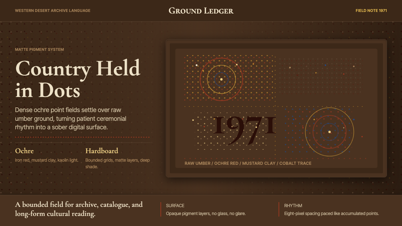 Aboriginal Dot Painting (Papunya 1971)Ochre memory, held steady. Raw umber ground, Cormorant type, disciplined dot-…
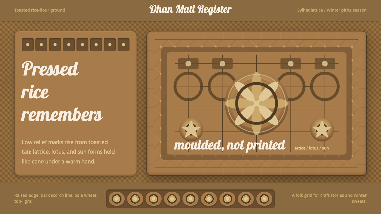 Bangladeshi Nakshi Pitha MotifsWarm relief, never print. Galada type and tan lattice press rice-flour craft…
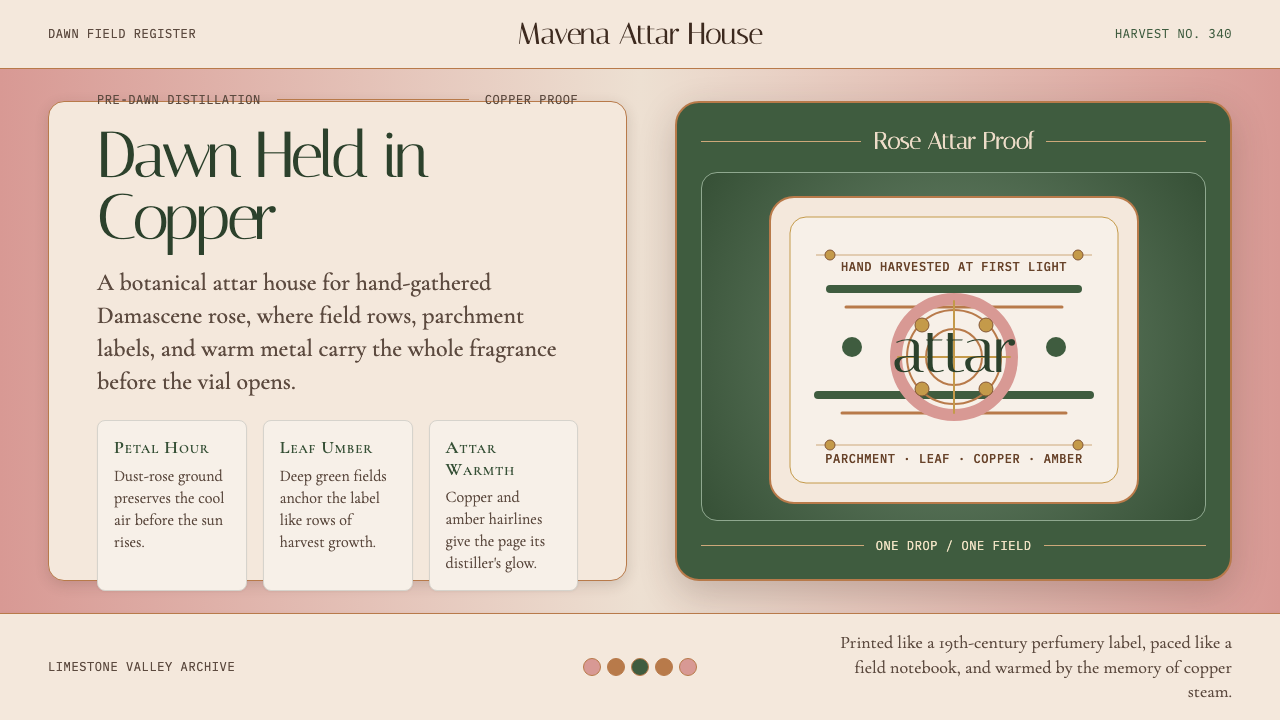 Bulgarian Kazanlak Rose ValleyDawn feels distilled. Dust-rose ground, leaf green, and copper label geometry…
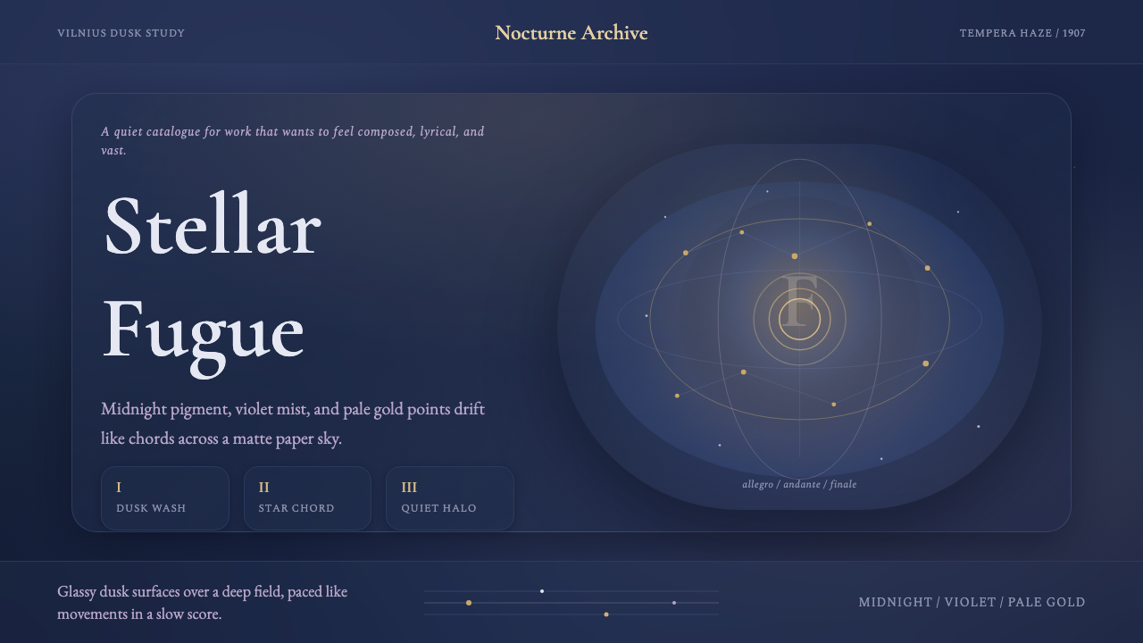 Čiurlionis SymbolismCosmos becomes music. Midnight blue-violet washes and pale gold stars drift i…
 Hurufiyya Letter ArtArabic letters as pure gesture. Ochre and crimson strokes dissolve across oil…
 Irish Aran Island Cable KnitMaterial honesty raised in wool. Bone ground, moss ink, and cable columns cas…