What is Horizon Zero Dawn?
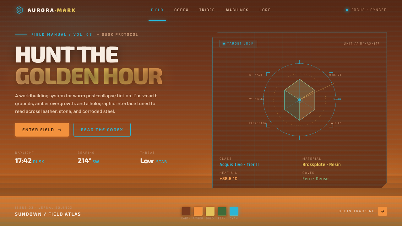
Horizon Zero Dawn turns the post-apocalypse toward the setting sun — a reclaimed earth of amber wilderness, tribal materiality, and cyan holograms suspended between living leaves and dead machines.
Horizon Zero Dawn in brief
Horizon Zero Dawn is a post-apocalyptic eco-science-fiction aesthetic established by the 2017 action RPG. Its world combines the ruins of a fallen technological civilization with wilderness vigorous enough to cover, soften, and eventually absorb those remains. Instead of the ash, concrete, and colorless scarcity typical of post-apocalyptic imagery, it favors golden-hour warmth: dusk-dark earth, amber light, green overgrowth, weathered leather, bone, and luminous cyan interfaces.
The style depends on a sustained tension between nature and technology. Tribal societies appear materially connected to the land, while advanced machines and holographic systems preserve fragments of a civilization beyond ordinary understanding. Neither side is treated as a decorative layer. Vegetation establishes scale, age, and recovery; machinery introduces danger, buried history, and angular precision. Their coexistence makes the world feel inhabited rather than merely ruined.
Visually, warmth is the governing atmosphere and cyan is the clarifying interruption. Sunlit haze, earthen darkness, and amber vegetation form a continuous environmental field. Against it, holographic information appears faceted, translucent, and emissive, as though projected directly into the landscape. The interface is futuristic without becoming sterile because it never escapes the colors, textures, and uneven surfaces of the surrounding earth.
Where does Horizon Zero Dawn come from?
The aesthetic originates in Horizon Zero Dawn, released in 2017 by Guerrilla Games, a studio based in Amsterdam, Netherlands. Its fictional geography draws on the North American Rocky Mountains, but its defining premise is temporal rather than merely regional: this is a far-future earth after technological civilization has fallen and the wilderness has returned. The resulting landscape is not presented as an empty terminal ruin. It is an active environment in which ecological reclamation and surviving technology occupy the same ground.
That premise reverses the usual visual priorities of post-apocalyptic fiction. The fallen world is not dominated by dead infrastructure; living terrain commands the image. Overgrowth surrounds the remains of technology, while amber dusk gives devastation the visual character of renewal. The remnants of machinery still matter, but they are understood through their contrast with soil, foliage, leather, and bone. Technology becomes stranger precisely because the natural world around it feels warm, tangible, and complete.
The social dimension is carried by Aloy and the tribal cultures surrounding her. The Nora tribe embodies an earthbound visual language of natural materials and close contact with wilderness, while the Carja sun-kingdom introduces a more explicitly solar identity. Together they make the golden-hour palette culturally meaningful rather than merely atmospheric: sunlight can suggest land, ritual, authority, survival, and orientation. Aloy stands at the junction of these human systems and the advanced technological layer, making the contrast between hand-worked material and holographic information central to the style.
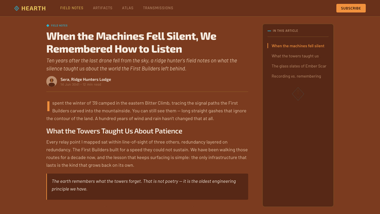
Three connected art-direction currents emerge from this foundation: post-apocalyptic eco-science fiction, holographic interface design, and the opposition between machines and nature. The first gives the world its reclaimed landscapes; the second supplies its cool, luminous informational language; the third prevents either from settling into visual comfort. The enduring identity of Horizon Zero Dawn comes from keeping all three active at once. Remove the wilderness and the interface becomes generic science fiction; remove the technology and the setting becomes historical fantasy; remove the tension and the world loses its mystery.
What defines the Horizon Zero Dawn look?
Golden-Hour Palette
The palette begins with dusk-dark earth, weathered brown, amber light, and dense reclaimed green. Warmth is broad and atmospheric rather than confined to isolated accents: it passes through sky, vegetation, skin, ruins, and dust, making the entire world appear touched by a low sun. Cyan is reserved for technological information and therefore reads as an event whenever it enters the frame.
Reclaimed Landscape
Nature must appear to have agency. Grass, vines, trees, and uneven terrain do more than decorate ruins; they interrupt outlines, obscure former functions, and establish that the land has continued without its previous civilization. The strongest compositions allow organic growth to dominate the silhouette while technological remains emerge only in fragments, producing discovery rather than immediate explanation.
Holographic Cyan
Interface elements are cool, luminous, translucent, and sharply faceted. They appear projected rather than printed, often suggesting layers of information hovering at different depths. Their geometry should remain precise, but not heavy: thin luminous structures, fragmented panels, and selective symbols feel more appropriate than solid opaque containers. The surrounding warm darkness supplies the contrast that makes the hologram believable.
Tribal Materiality
Leather, bone, fiber, wood, and other visibly worked natural materials anchor the human world. Their appeal lies in irregularity, layering, repair, and evidence of the hand. This tactile vocabulary prevents the setting from becoming a display of machines alone. In graphic applications, it can be suggested through weathered edges, assembled forms, and material contrast, but should not become ornamental primitivism.
Machine Geometry
Machines introduce articulated silhouettes, repeated mechanical segments, and purposeful angularity into landscapes otherwise shaped by erosion and growth. Their forms should feel engineered, mobile, and potentially dangerous rather than like passive industrial debris. Repetition creates systemic intelligence; interruption by foliage and earth makes that intelligence feel ancient, hidden, and only partially understood.
Atmospheric Depth
Depth comes from warm haze, layered terrain, dark foreground masses, and distant forms softened by dusk. This is not a clean technical void; air has color and the landscape has weight. Holographic elements can cut through that depth with unusual clarity, creating a useful hierarchy in which environmental information recedes while active technological information moves toward the viewer.
Balanced Duality
The style succeeds when no single component explains the whole image. Warmth without technology becomes pastoral adventure; cyan interfaces without earth become sterile futurism; ruins without vigorous growth become conventional apocalypse. Every composition should preserve a visible negotiation between recovery and collapse, handcraft and computation, sunlight and emission, familiarity and incomprehensible machinery.

Who shaped Horizon Zero Dawn?
The Amsterdam-based developer established the visual system through the 2017 action RPG. Its central art-direction achievement was not any single landscape, machine, or interface, but the integration of all three into a coherent far-future world. The studio made ecological reclamation visually dominant while preserving technological mystery, allowing natural warmth and engineered danger to occupy the same composition.
Aloy is the human bridge between earthbound tribal life and the technological systems embedded in the landscape. Through her, leather, bone, wilderness, machinery, and holographic information can appear within one visual field without feeling arbitrary. Her position at the meeting point of those worlds gives the style its investigative character: technology is encountered, read, and questioned rather than accepted as ordinary infrastructure.
The Nora tribe anchors the aesthetic in natural material, wilderness, and an earth-oriented social identity. Its presence gives visual credibility to the hand-worked side of the design system and establishes a human scale against vast terrain and advanced machines. In adaptations, the Nora dimension is best expressed through tactile construction and environmental belonging, not through superficial tribal patterning.
The Carja sun-kingdom makes the solar dimension of the world explicit. It connects amber illumination and golden-hour atmosphere with culture and authority, ensuring that sunlight functions as more than attractive environmental color. Within the broader system, the Carja contribution supports ceremonial composition, radiant focal points, and a sense that the sun organizes both visual hierarchy and human meaning.
How do you use Horizon Zero Dawn today?
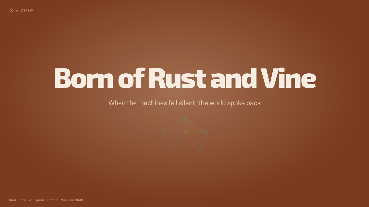
For presentation slides, the style works best when the cover behaves like an environmental reveal. Use a broad dusk-earth field or reclaimed landscape, let amber illumination establish the title area, and introduce a restrained cyan holographic element as a signal of hidden technology. Content slides should simplify that relationship: warm dark grounds, clear text hierarchy, one environmental texture or silhouette, and light faceted structures that organize information without enclosing everything in conventional boxes.
Data slides should treat charts as discovered technological readings rather than ordinary office graphics. Lines, nodes, segmented arcs, and selective labels can glow against a warm, terrain-like ground, while categories are distinguished through brightness, shape, and placement. Keep the underlying information legible and calm; the holographic treatment should clarify relationships, not dissolve them into atmospheric effects. A small amount of amber can connect annotations to the surrounding world.
For web interfaces, Horizon Zero Dawn is particularly effective for dashboards, monitoring views, exploration tools, and pricing pages built around distinct paths or capabilities. Use an earthen dark base and reserve luminous cyan for active states, selected controls, live readings, and primary actions. Pricing tiers can be differentiated through tribal, solar, or technological emphasis, but their structure must remain comparable. Angular panels and translucent overlays should feel suspended over the environment rather than stacked like generic glass cards.
Editorial and marketing applications benefit from the style's narrative contrast. Long-form pages can alternate immersive landscape sections with focused holographic information passages, allowing readers to move between atmosphere and analysis. Feature stories should use close material details, overgrown silhouettes, and machine fragments as evidence of the world rather than as decorative wallpaper. Marketing pages can frame a product as a tool for orientation or discovery, with amber imagery creating emotional invitation and cyan interface moments carrying explanation and action.
The most common mistake is to reduce the style to a dark background with neon cyan decoration. That removes the ecological and cultural half of the system and produces generic game-interface futurism. Another error is covering every surface with foliage, scratches, polygons, and glow at once. Authentic application requires hierarchy: warm nature should establish the world, material detail should make it tangible, and cool technology should appear selectively enough to remain strange, informative, and valuable.
Horizon Zero Dawn — FAQ
Is Horizon Zero Dawn simply a cyberpunk style placed in the wilderness?
No. Both styles can use luminous interfaces and advanced technology, but Horizon Zero Dawn is organized around ecological reclamation, tribal materiality, and golden-hour warmth rather than dense urban infrastructure. Its technology feels buried, encountered, and partially unknowable. The wilderness is not a scenic backdrop for futuristic hardware; it is the dominant living system within which that hardware has become strange.
Can the style work without character imagery?
Yes, provided the human and environmental dimensions remain visible through material and scale. Weathered natural surfaces, signs of hand assembly, pathways through overgrowth, and interfaces positioned as tools of observation can imply a human presence. Without those cues, a machine-and-landscape composition may become impersonal science fiction. The viewer should sense that someone inhabits, reads, and survives within the world.
How much holographic cyan should an interface use?
Enough to establish technological presence, but not enough to recolor the entire world. Cyan is most effective when assigned to information that is active, selected, newly discovered, or actionable. If every border, paragraph, icon, and surface emits the same light, the distinction between interface and environment disappears. The warm field should remain dominant so that cool luminosity retains meaning and visual force.
Does every application need literal ruins, plants, and machines?
No. The style can be translated through relationships rather than literal illustration. Warm atmospheric grounds can represent the reclaimed world; irregular tactile forms can carry natural and tribal materiality; precise cyan facets can represent technological information. Literal imagery is useful for immersive covers and campaigns, while abstract translation is usually more effective for dense interfaces and editorial pages. What must survive is the tension among those visual roles.
Where does the style struggle?
It struggles when a product requires bright neutrality, conventional corporate restraint, or an atmosphere free of narrative implication. The dusk palette can feel heavy, while weathering and holographic effects can distract from routine transactional tasks. It is strongest when discovery, survival, monitoring, landscape, or hidden systems are relevant ideas. In utilitarian contexts, use its hierarchy and warm-cool contrast sparingly rather than importing the entire fictional world.
Related design styles
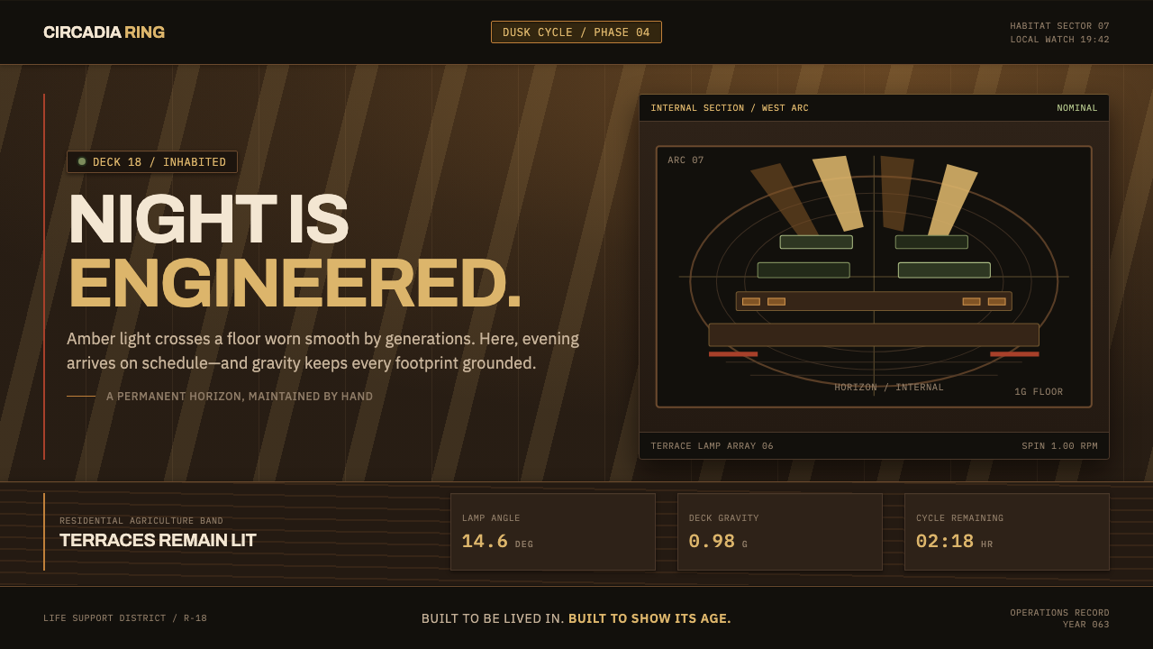 Generation Ship InteriorNight is engineered. Amber louvres rake across timber decks and stacked habit…
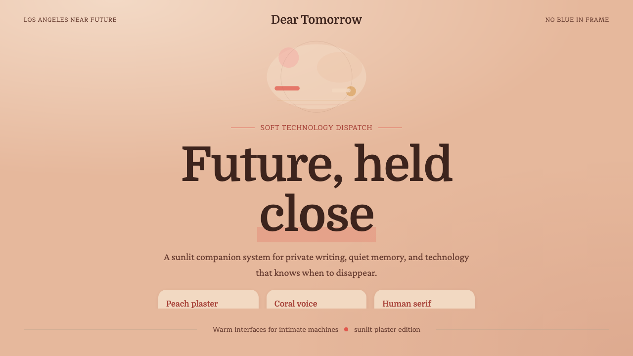 Her — Soft FutureTender future, no chill. Peach plaster, coral serif type, and soft stacked sp…
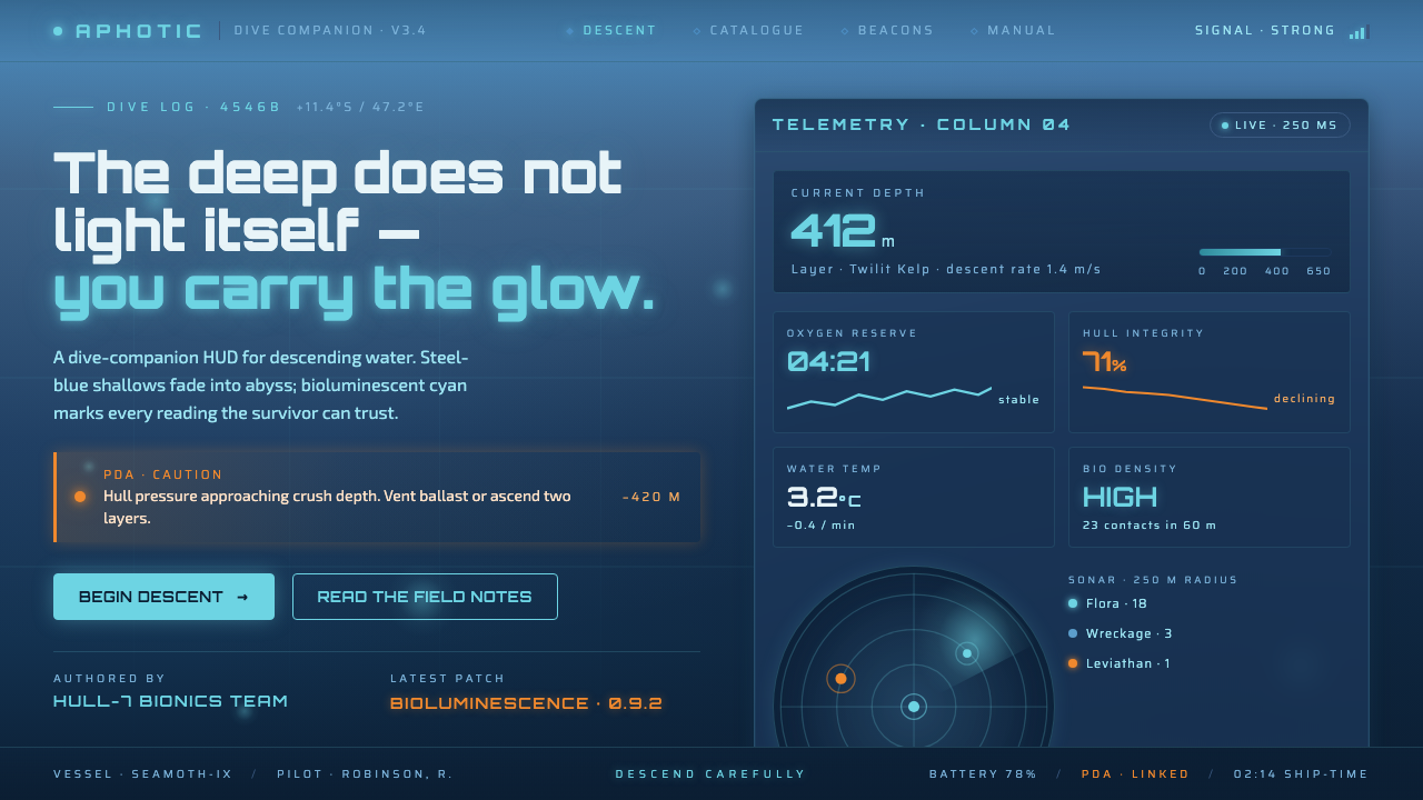 Subnautica DeepThe deep does not light itself. Steel-blue gradient into abyss, cyan glow, on…
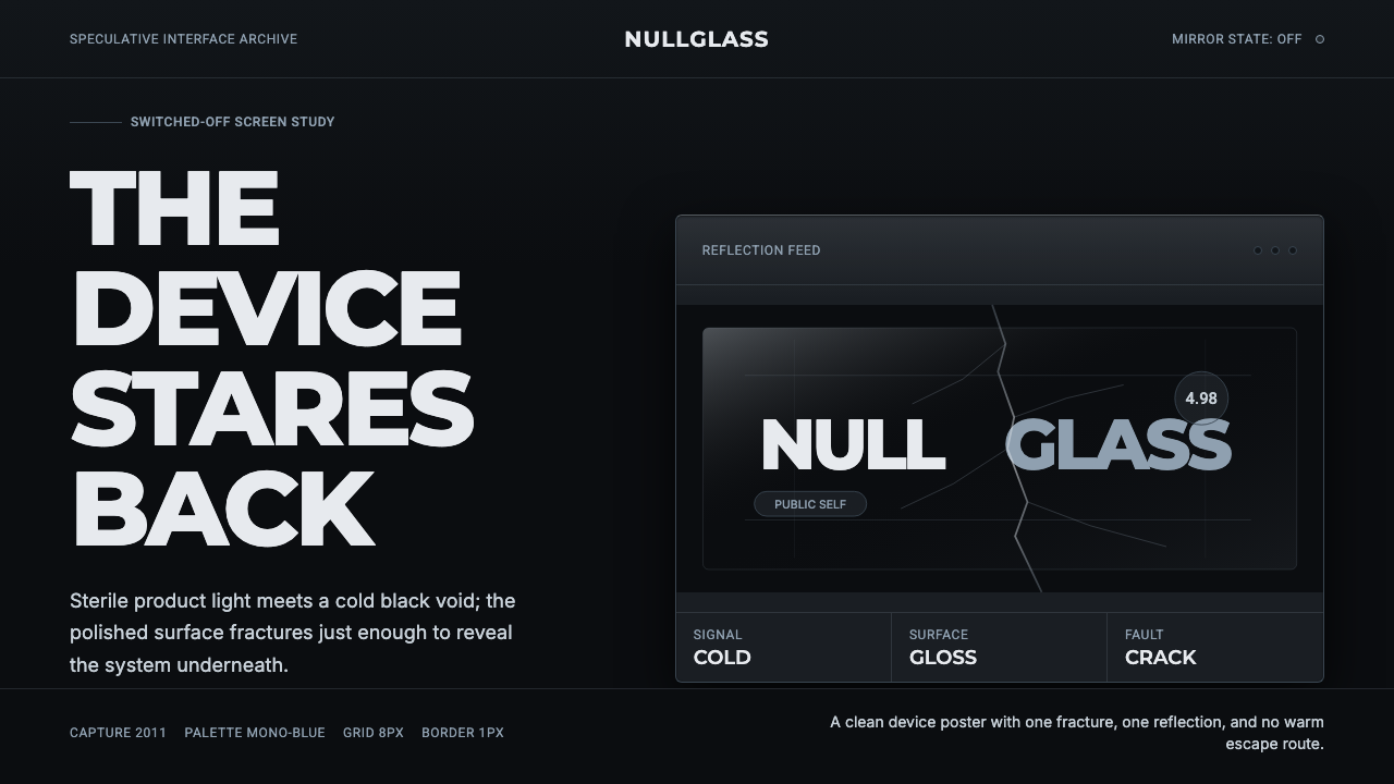 Black MirrorSterile tech turns accusatory. Screen-black, cold Montserrat, and a single gl…
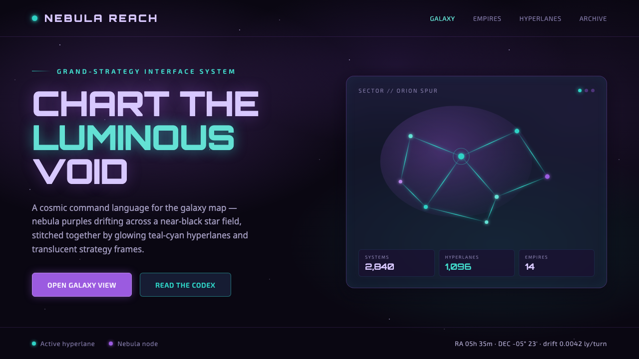 StellarisQuietly grand cosmic command UI. Nebula purples on near-black void, teal-cyan…
 Annihilation (The Shimmer)Beautifully wrong. Dusk black carries pink, teal, and lilac refraction throug…