What is Subnautica Deep?
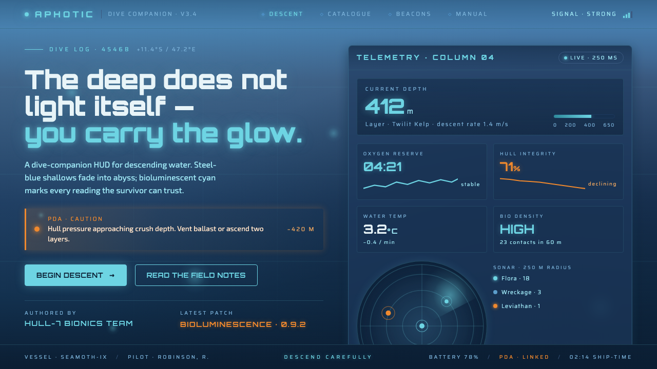
Subnautica Deep treats darkness as depth: steel-blue water falls into an abyss, cyan bioluminescence marks the way, and one PDA-orange spark keeps the survivor oriented.
Subnautica Deep in brief
Subnautica Deep is a dark science-fiction survival aesthetic drawn from the alien ocean of planet 4546B. Its visual world is not simply blue and black; it is a descending environment in which steel-blue shallows gradually give way to deep-water blue and then to a near-black abyss. The transition creates the style’s primary emotional movement: the further the eye travels, the greater the pressure, mystery, and uncertainty.
The palette is illuminated from within rather than from above. Aquamarine cyan and related bioluminescent tones appear as living traces in the water, suggesting flora, equipment, and unknown activity without turning the scene into a brightly lit interface. Against this cold field, a single warm PDA-orange accent becomes unusually powerful. It reads as warning, orientation, and human presence all at once.
The interface is imagined as a survivor’s PDA dive computer. Panels feel like instruments operating inside an ocean rather than windows placed over an ocean. Depth is the organizing principle: surfaces, labels, controls, and signals should seem to descend from the shallows toward darkness, with cyan glow providing selective visibility. Cream, pure white, decorative warmth, and unrelated color noise have no place in the system.
Where does Subnautica Deep come from?
Subnautica Deep originates in Subnautica, whose full release arrived in 2018 from Unknown Worlds Entertainment. The setting is a fictional ocean planet, 4546B, and the aesthetic begins with the player’s physical condition: isolated inside an immense alien sea, moving through layers of water whose visibility and atmosphere change as depth increases. The environment is therefore not a backdrop to the design language. It is the design language.
Its visual movement belongs to alien-ocean survival science fiction. Rather than presenting science fiction through sterile laboratories, polished spacecraft, or expansive star fields, it locates futurity inside pressure, darkness, equipment, and biological strangeness. The world feels technologically mediated but not technologically comfortable. Every illuminated surface exists because something is emitting light, recording information, or trying to keep a person alive.
Bioluminescence-driven environment art supplies the style’s signature source of illumination. Flora and other oceanic forms are not merely decorative color accents; their glow establishes a hierarchy of attention inside the darkness. Cyan is consequently both atmospheric and functional. It makes the environment legible while preserving the sense that most of the ocean remains unseen. The glow should feel discovered, intermittent, and embedded in the ecosystem rather than sprayed evenly across the composition.
The warm-on-cold contrast is completed by the Seamoth and PDA HUD design. The cold oceanic field establishes the surrounding world, cyan luminance identifies readable or active information, and the PDA-orange spark cuts through as a rare human-centered signal. This contrast turns interface color into narrative: the ocean is vast and alien, the cyan belongs to its living and technological systems, and orange marks the survivor’s immediate concern.
What defines the Subnautica Deep look?
Depth Gradient
The defining structure is a downward tonal journey from steel-blue shallows through deep-water blue into near-black. The gradient should feel environmental, not ornamental: it establishes pressure, distance, and the gradual loss of certainty. The upper field may retain enough blue to suggest water and movement, while the lower field absorbs detail and makes every surviving signal feel more consequential.
Bioluminescent Cyan
Cyan is the style’s principal luminous language. It appears as an aquamarine trace, glow, edge, or signal against the dark oceanic field. Its purpose is not to brighten everything but to reveal selected information and living forms. Cyan should therefore remain concentrated, allowing darkness to occupy most of the composition and making each luminous element feel active, submerged, and discovered.
PDA Orange Signal
Warm orange is reserved for the single human-centered spark in the system. It can identify a warning, a priority, or an immediate HUD concern, but it should never become a second general-purpose palette. Its power comes from scarcity and temperature. After the eye has adapted to steel blue and cyan, orange feels close, urgent, and unmistakably tied to the survivor’s point of view.
Instrument Panels
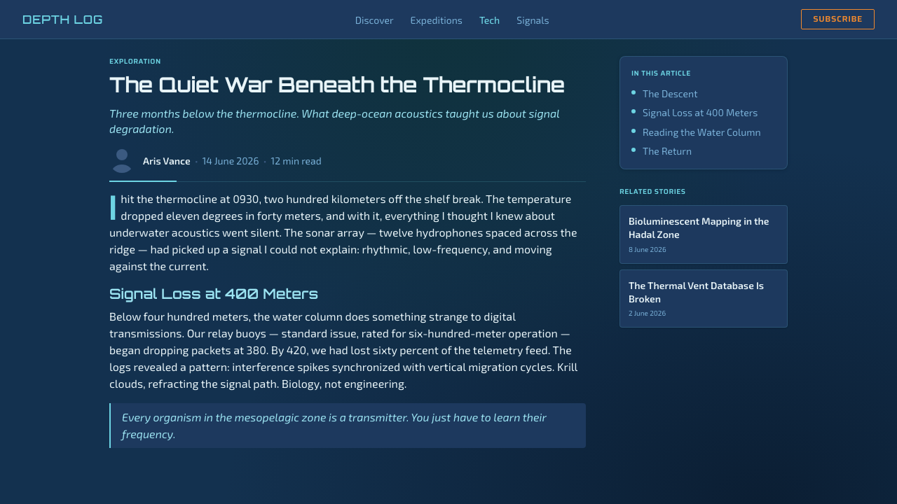
Surfaces should read as parts of a dive computer: cool, translucent in feeling, and illuminated by internal signals. Panels organize information without becoming solid cards floating above the scene. Borders, labels, and active states should feel calibrated and functional, as though they belong to equipment designed for survival. The interface may be quiet, but it is never ornamental or luxurious.
Selective Visibility
Darkness is not empty space; it is an active material that withholds information. Details should emerge only where cyan glow, a panel signal, or the orange HUD accent gives the eye permission to see. This creates a controlled rhythm between legibility and obscurity. Excessive brightness breaks the fiction by making the entire ocean equally available at once.
Cold Oceanic Materiality
The material impression is wet, submerged, metallic, and slightly alien. Steel-blue fields can carry the weight of water and machinery, while cyan edges suggest reflected energy or living organisms. Surfaces should avoid cozy paper, polished luxury, or warm domestic texture. Even a quiet panel should feel like it is operating under pressure, surrounded by a larger environment that cannot be fully controlled.
Who shaped Subnautica Deep?
Unknown Worlds Entertainment is the developer associated with Subnautica’s full release in 2018 and the broader alien-ocean survival science-fiction setting. The studio’s contribution to this aesthetic is a world in which environment, survival equipment, and interface are inseparable: the player reads the ocean through instruments while the instruments remain visually shaped by the ocean.
The Seamoth and PDA HUD design represents the interface side of Subnautica Deep. Its visual logic places cold oceanic panels, cyan luminance, and a warm orange HUD accent into a single survival-oriented system. The design does not float independently from the world; it translates the survivor’s submerged condition into readable signals, depth awareness, and urgent points of attention.
The bioluminescent ecosystem art team is responsible, in the source material’s terms, for the living visual field that makes darkness legible. Their work establishes cyan glow as both environmental identity and navigational evidence. Flora and oceanic forms become points of life inside the abyss, preserving mystery while preventing the deep from becoming visually inert.
How do you use Subnautica Deep today?
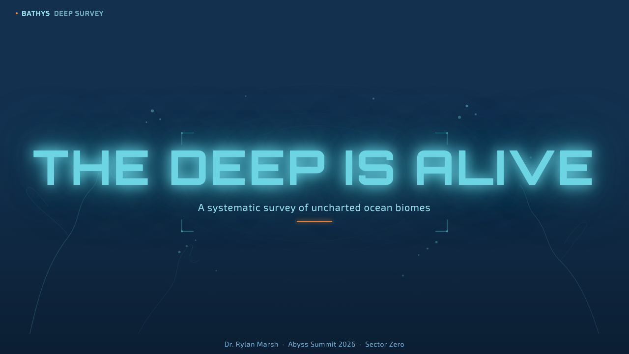
For presentation slides, Subnautica Deep works best when the cover establishes the descent immediately. Use a steel-blue field that darkens toward one edge or lower region, then place the title where cyan illumination can reveal it without flattening the surrounding darkness. Content slides should behave like PDA readouts: restrained panels, cool labels, and clear information groups separated by atmosphere rather than decorative rules. Data slides can use cyan for active measures or discovered signals, while the PDA-orange accent marks the one value, warning, or decision that deserves immediate attention.
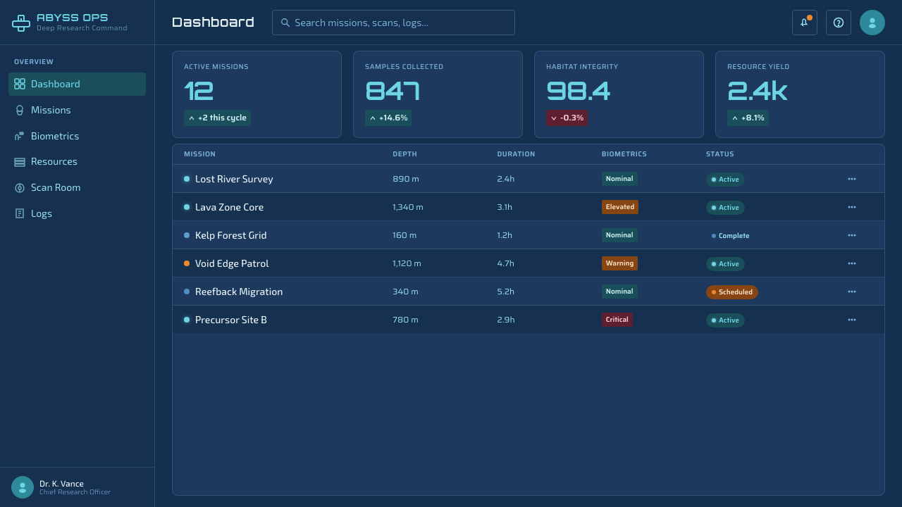
For web interfaces, the style is especially effective for dashboards, monitoring tools, exploration products, and pricing pages that want to feel technical, immersive, or mission-oriented. A dashboard can use dark oceanic surfaces as its base, with cyan reserved for live states, navigation emphasis, and readable data paths. Pricing pages should avoid making every tier equally luminous; let one plan or action carry the orange priority signal while the remaining choices stay within the cold blue-and-cyan system. The result should feel like selecting equipment before a dive, not browsing a brightly lit retail catalog.
For editorial and marketing work, the aesthetic supports narratives about discovery, risk, technology, survival, and the unknown. An article can move from a more visible steel-blue opening into progressively darker sections, allowing cyan captions, diagrams, or quotations to appear as found evidence. Marketing campaigns can treat a single orange call to action as the human spark inside a larger oceanic field. Photography or illustration should be cropped and framed as submerged evidence, with darkness protecting the sense that the full world extends beyond the visible image.
The same language can organize product storytelling: shallow water introduces the promise, deeper blue introduces complexity, and the abyss represents the unresolved problem or frontier. This is useful for launch pages and campaign narratives because the visual progression carries meaning without requiring constant explanation. Keep the cyan glow close to the information it illuminates, and allow large areas to remain quiet. The style becomes persuasive when the viewer feels invited to descend, not when every surface competes for attention.
The common mistake is treating Subnautica Deep as permission to fill a dark layout with neon effects. Too much cyan removes the darkness that gives cyan its meaning; too much orange turns the human warning signal into ordinary decoration; too many glowing borders make the PDA logic feel like a nightclub interface. Another mistake is using a flat dark background with no sense of descent. The style depends on layered depth, selective visibility, and a disciplined warm-on-cold contrast. Without those relationships, the result is merely a generic sci-fi theme.
Subnautica Deep — FAQ
Is Subnautica Deep simply a blue-and-black color scheme?
No. Blue and black are only the surface description. The defining idea is descent: steel-blue shallows transition into deep-water blue and then near-black, while cyan appears selectively as bioluminescent evidence. The PDA-orange accent introduces a warm human signal inside that cold environment. Without the depth movement, selective visibility, and disciplined contrast, a blue-and-black layout will not carry the same meaning.
Why is the orange accent so limited?
Orange represents the survivor’s immediate point of view inside an otherwise alien oceanic system. Its warmth and rarity make it read as warning, priority, or human intervention. If it is distributed across ordinary labels and controls, it loses that narrative role and becomes generic decoration. The accent is effective because the surrounding palette is cold, dark, and largely illuminated by cyan.
Can the style work without visible bioluminescent imagery?
Yes, but the interface must preserve the logic of bioluminescence. Cyan signals should feel embedded, selective, and purposeful rather than applied as a general glow effect. A darkening oceanic field, instrument-like panels, and carefully placed luminous details can imply the ecosystem even when no flora is shown. What matters is that light appears to reveal something inside darkness.
Does Subnautica Deep suit every product or brand?
It is best suited to products that value exploration, technical competence, monitoring, survival, discovery, or a sense of the unknown. It can be compelling for dashboards, tools, campaigns, and interfaces that want to feel immersive and mission-oriented. It is less suitable for products whose promise depends on domestic warmth, softness, cheerful openness, or abundant visual clarity. The style asks the audience to enter an atmosphere of pressure and uncertainty, so that emotional contract should match the product.
Related design styles
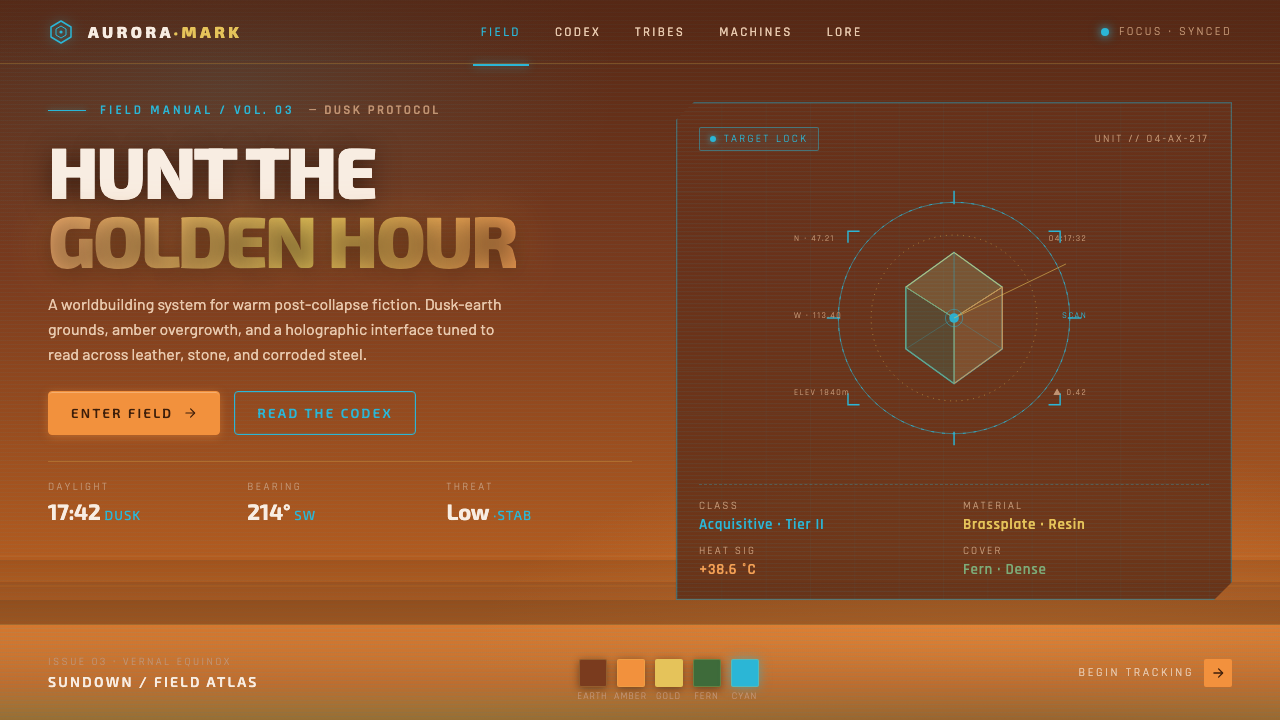 Horizon Zero DawnGolden-hour post-apocalypse. Dusk-earth grounds, amber overgrowth, glowing ho…
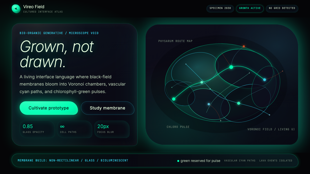 Bio-Organic GenerativeInterfaces feel cultured. Void black, Voronoi membranes, and neon chlorophyll…
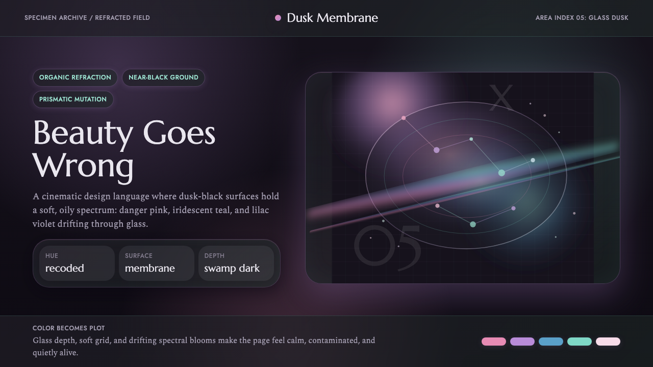 Annihilation (The Shimmer)Beautifully wrong. Dusk black carries pink, teal, and lilac refraction throug…
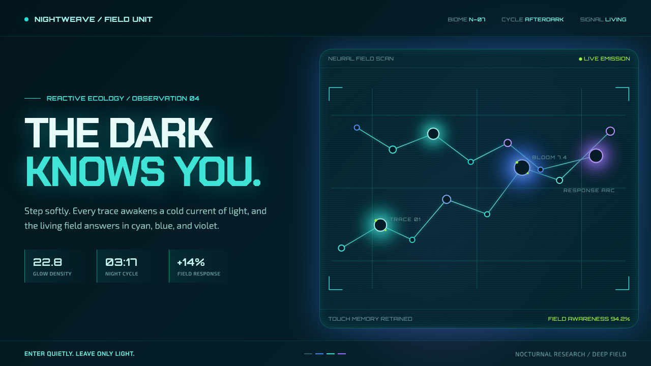 Avatar — Pandora Bioluminescence (2009)The forest knows you are there. Cyan light blooms across a deep-teal living f…
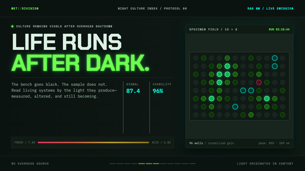 Biopunk WetwareLife emits after dark. GFP green and transilluminator cyan pulse across black…
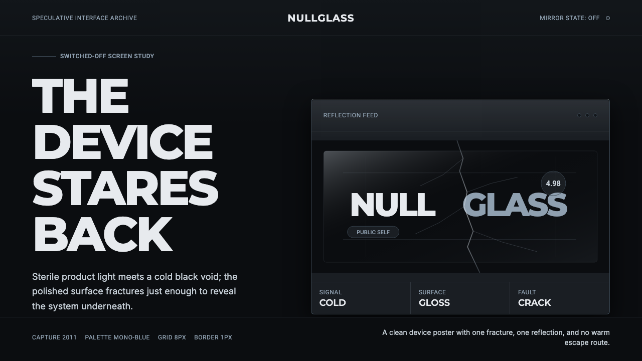 Black MirrorSterile tech turns accusatory. Screen-black, cold Montserrat, and a single gl…