What is Biopunk Wetware?
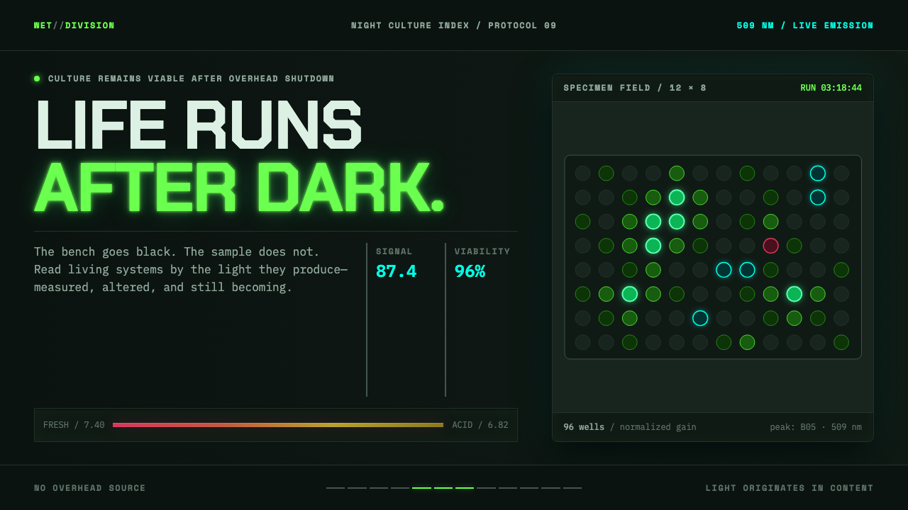
Biopunk took cyberpunk's console and put it inside the body — the bench replaced the terminal, and life itself became the thing that glows in the dark.
Biopunk Wetware in brief
Biopunk Wetware is a visual language documented from real molecular-biology laboratories rather than invented as science-fiction set dressing. Where cyberpunk imagined consoles, chrome, and neural implants, biopunk moves the same anxieties and the same genre logic inside the skin: the workstation becomes a lab bench, the cybernetic implant becomes a culture flask, and the hacker becomes a biologist working with living material rather than code.
The palette is drawn directly from what a working molecular biology lab actually looks like with the overhead lights off. Grounds run near-black with a faint green cast — the color of a darkened bench, not a stylized void. Green and cyan carry the glow of green fluorescent protein and a UV transilluminator, the two light sources that actually illuminate real lab benches at night. Pink appears as fresh phenol-red growth medium, which shifts toward amber as cells metabolize and the medium acidifies — one of the most recognizable color transitions in a working wet lab. Deep red stands in for tissue and vasculature, holding the sense that something here is alive amid all the fluorescence.
The single governing rule is that light comes from within the content, never from above. A cream or white background is never used, because darkness is the precondition that makes fluorescence visible at all — brighten the ground and the entire color logic of the system collapses.

Where does Biopunk Wetware come from?
The word wetware itself comes from science fiction: novelist Michael Swanwick coined it in his 1987 novel Vacuum Flowers, using it to describe biological, organic computing substrates as a counterpart to the hardware and software of conventional machines. The term gave the emerging genre its vocabulary before the genre had fully formed its visual identity.
Biopunk developed through the 1990s as a direct offshoot of cyberpunk, sharing the parent genre's fascination with corporate power, bodily modification, and underground technical subcultures, but relocating the site of transgression from silicon into cells, genomes, and tissue. Writers including Paul Di Filippo contributed to shaping this direction, extending cyberpunk's DIY-hacker ethos into biological material as the new frontier for both radical experimentation and corporate exploitation.
The genre's visual imagination owes a separate debt to H. R. Giger, whose biomechanical art fused organic tissue and industrial machinery into a single unsettling surface. Giger's work supplied biopunk with a way of picturing the body and the machine as continuous with each other, rather than opposed, well before DIY biology labs existed to be photographed.
From roughly 2005 onward, the DIYbio movement — community laboratories where amateur and semi-professional biologists worked outside traditional institutional settings — gave the genre something science fiction alone could not: a real, photographable set of spaces to draw from. This system's palette is documentation of those spaces, not an artist's extrapolation of them — the fluorescent greens, the transilluminator cyan, and the acidifying pink of phenol-red medium are genuine features of working community labs, carried into this system unaltered.
What defines the Biopunk Wetware look?
Near-Black, Green-Cast Ground
The base surface is a very dark tone carrying a faint green cast, matching the appearance of a real lab bench with the overhead lights switched off. It is not a pure, neutral black — the green tint is what makes it read as a genuine darkened laboratory rather than a generic dark theme.
GFP Green and Transilluminator Cyan
Green and cyan are used as the primary glowing accents, corresponding directly to the emission color of green fluorescent protein and the blue-to-cyan glow of a UV transilluminator — the two actual light sources present on a working bench at night. These colors should always read as light being emitted, not paint being applied.
Phenol-Red Pink Shifting to Amber
Pink stands in for fresh growth medium, and the same hue is understood to drift toward amber as cells metabolize and the medium acidifies over time. This is one of the most recognizable color cues of an active wet lab, and using it signals biological process rather than a static decorative pink.
Deep Red for Living Tissue
A deep, muted red is reserved for elements that represent tissue and vasculature, functioning as an anchor of biological reality within a field otherwise dominated by synthetic fluorescent light. Its restraint keeps it distinct from the brighter, glowing accent colors.
Light Emitted From Within Content
Every glow in the system originates from the content itself — a culture, a sample, a readout — rather than from an implied external light source such as a lamp or window. This inversion of normal lighting logic is the system's most fundamental rule, and it is what makes darkness a functional requirement rather than a stylistic mood.
No Bright Grounds, Ever
Cream and white backgrounds are excluded entirely, not as a stylistic preference but as a functional necessity — fluorescence is only visible against darkness, and any bright ground would flatten the entire color system into meaninglessness.
Documentary, Not Invented, Palette
Every color in the system corresponds to something that genuinely appears in a working molecular biology lab — a real reagent, a real light source, a real biological process — rather than an artist's imagined palette for a fictional laboratory.

Who shaped Biopunk Wetware?
Swanwick coined the term wetware in his 1987 novel Vacuum Flowers, describing biological computing substrates as the organic counterpart to conventional hardware and software. The word gave the emerging genre its central vocabulary and its founding conceptual move: treating the body itself as a kind of machine.
Di Filippo is credited among the writers who helped shape biopunk's direction through the 1990s, extending cyberpunk's underground, hacker-driven sensibility into biological material as a new site of both experimentation and exploitation.
Giger's biomechanical art fused organic tissue with industrial machinery into a single disquieting visual surface, supplying biopunk with a way of imagining flesh and mechanism as continuous rather than opposed — a visual precedent that predates the real DIYbio laboratories this system also draws from.
How do you use Biopunk Wetware today?
This system works powerfully for presentation decks about biotechnology, synthetic biology, or any subject that wants to signal cutting-edge, slightly transgressive scientific work rather than clinical sterility. A cover slide benefits from a single glowing green or cyan element — a diagram of a molecule, a stylized culture flask — floating against the near-black, green-cast ground, with the title set in a clean, high-contrast typeface that reads as legible rather than decorative. Content slides should keep the darkness constant throughout the deck rather than switching to a light background for text-heavy pages; use the phenol-red-to-amber color shift as a genuinely useful device for showing progression or change over time in a diagram or timeline.
For web interfaces, the aesthetic suits biotechnology products, laboratory information systems, and any platform working in genomics, synthetic biology, or life-sciences research. Keep the near-black green-cast ground as the permanent default rather than an optional dark mode, and treat green and cyan as functional signal colors — success states, active processes, live data — rather than general brand accents. Card and panel elements should appear to emit their own light rather than being lit by an implied external source, which usually means avoiding conventional soft drop shadows in favor of a subtle glow.
In editorial and long-form content, the style supports feature writing on biohacking, synthetic biology, and the DIYbio movement, where the fluorescent color logic reinforces the sense that the reader is looking at real laboratory material. Photography, where used, should be treated as if lit only by the fluorescence or transillumination present in the frame itself, never brightened with conventional studio lighting.
For product packaging or marketing tied to biotechnology and life-sciences brands, the loaded palette of green, cyan, and shifting pink-to-amber offers a distinctive alternative to the clinical white-and-blue palette common to the pharmaceutical and biotech industries, signaling something closer to underground experimentation than corporate research.
The most common mistake is applying the glowing colors on top of a bright or neutral-grey background, which destroys the fundamental logic of the system — fluorescence only reads as fluorescence against genuine darkness. A second common error is treating the palette as purely decorative neon rather than documentary: authentic biopunk wetware ties each color to a specific real laboratory phenomenon, and mixing in unrelated neon hues for visual variety dilutes that grounding.
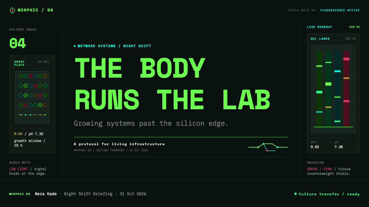
Biopunk Wetware — FAQ
Why is darkness a functional requirement rather than a style choice in this system?
Because the entire palette depends on colors reading as emitted light — the glow of fluorescent protein, the cyan of a transilluminator — and light only reads as glowing when it appears against real darkness. Put the same green or cyan on a bright background and it becomes ordinary paint rather than emitted light, which collapses the system's core visual logic.
Is biopunk the same as cyberpunk with a green palette?
No. The two genres share an ancestry and a suspicion of corporate power, but biopunk relocates the site of transgression from silicon and implants into cells, genomes, and living tissue — the wetware coined by Michael Swanwick. Its visual references come from real molecular biology labs and the DIYbio movement, not from chrome, neon signage, or urban night scenes.
Why does the pink shift toward amber matter so much?
Because it documents an actual biological process — phenol-red growth medium genuinely changes color as cells metabolize and the medium acidifies, making it one of the most recognizable visual cues in a working wet lab. Using this shift signals that the system is built from observation of real laboratory work, not an invented palette.
Can this style work for a general technology brand, not specifically biotech?
It is possible for technology brands that want to signal experimental, underground, or bleeding-edge character, but the palette's specific meanings — GFP green, transilluminator cyan, phenol-red pink — will read most authentically when the product has some genuine connection to biology, chemistry, or life sciences. Applied to an unrelated product, the palette risks reading as unearned decoration rather than documentation.
Does this style suit consumer health or wellness apps?
Generally not. The style's near-black grounds, clinical-but-underground fluorescent palette, and lab-bench-at-night mood project experimentation and edge rather than reassurance and calm, which is usually what consumer health and wellness products need to communicate. It is a much better fit for research tools, laboratory software, and biotechnology brands aimed at scientific or technical audiences.
Related design styles
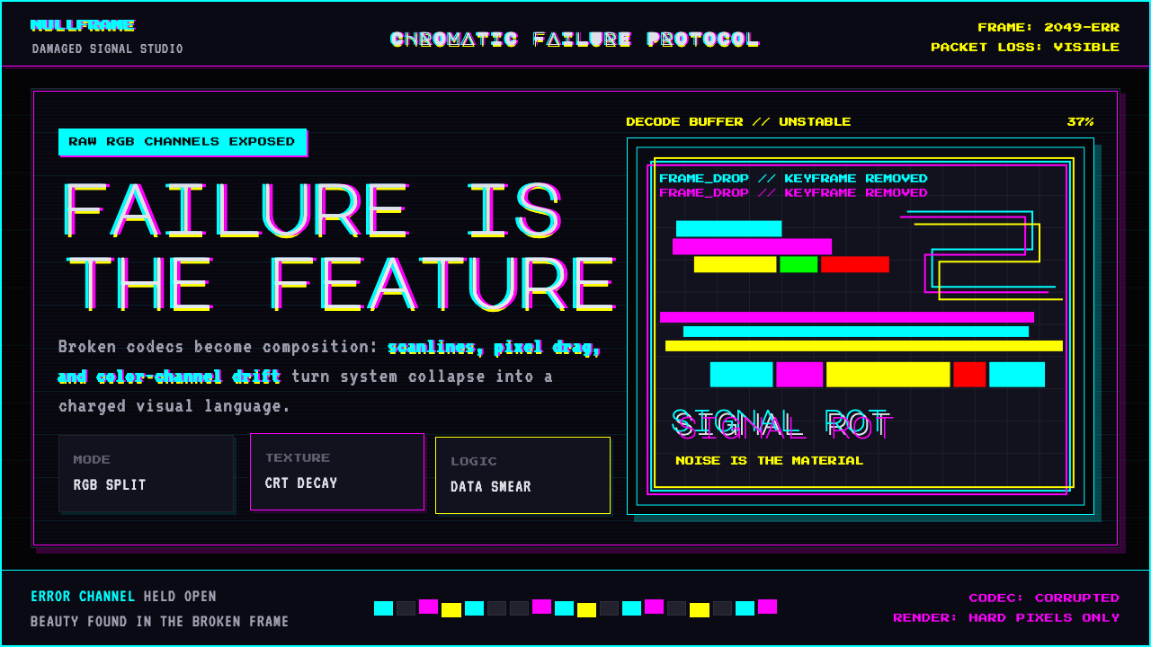 Glitch DatamoshErrors as composition. Corrupted JPEGs, RGB splits, scanlines — failure treat…
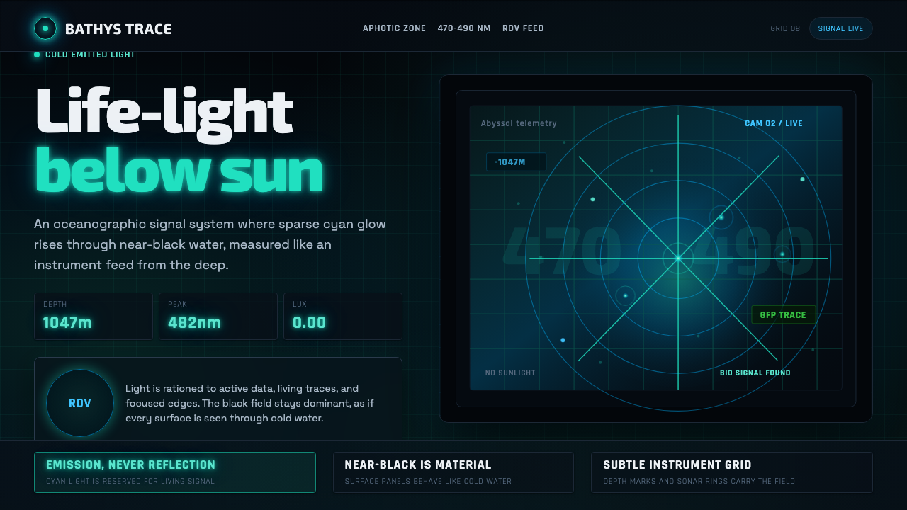 Abyssal BioluminescenceDark carries the signal. Electric cyan pins and Exo 2 readouts surface from a…
 Mad Max Fury Road (2015)Built to roar. Molten saffron cuts through petrol teal, riveted grids, and ha…
 ObserverTech, but corrupted. Neon magenta and acid green tear through rain-black conc…
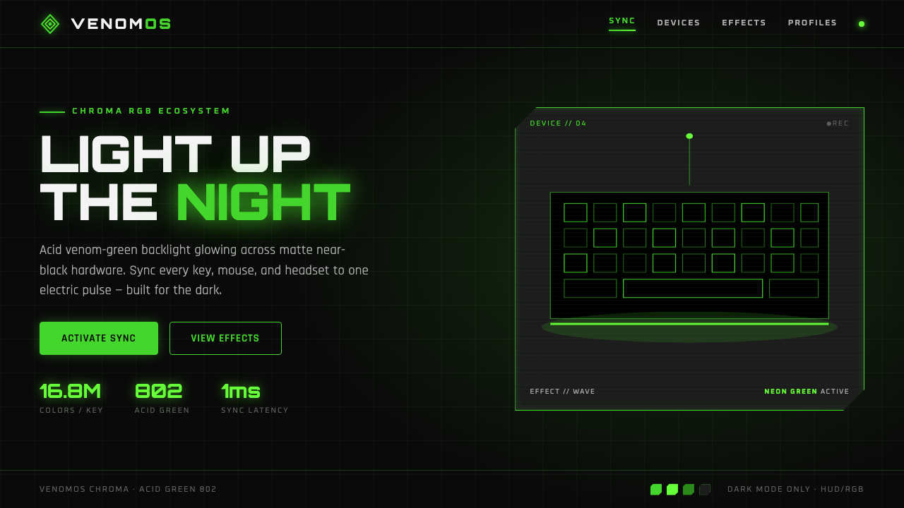 Razer Chroma GreenEsports gear at night. Acid Pantone-802 green burns on matte black via RGB gl…
 SinofuturismCopy becomes future. Jade-cyan grids, red signage, and Orbitron data stack th…