What is Sikkim Monastery Murals?
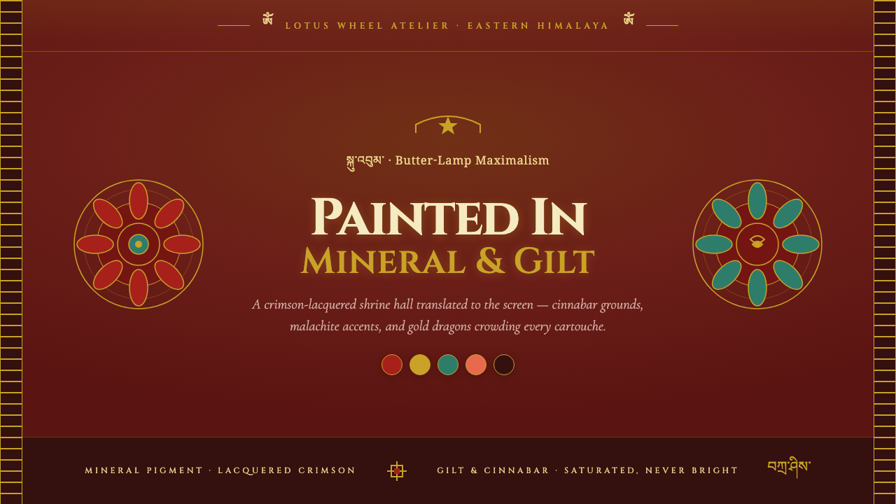
Sikkim Monastery Murals turn the shrine hall into a field of crimson, gold, mineral blue, and mandala order — a maximalist language shaped by devotion, symmetry, and the glow of butter lamps.
Sikkim Monastery Murals in brief
Sikkim Monastery Murals distill the visual atmosphere of Rumtek, the principal Kagyu gompa of Sikkim, into a digital design language. Its foundation is a deep crimson-maroon ground, enriched with gilt-gold ornament, mandala symmetry, lotus-throne framing, gold dragons, and brocade banners. The result is not quiet minimalism or contemporary luxury. It is butter-lamp maximalism: saturated, ceremonial, layered, and deliberately abundant.
The style draws its authority from the meeting of architectural interior, devotional painting, and material color. Rumtek is described through crimson-lacquered pillars, gilt detailing, golden spires, and walls covered in Vajrayana murals made with mineral pigments. Cinnabar reds, azurite blues, malachite greens, and coral oranges create a palette that feels extracted from stone and earth rather than mixed for a neutral interface.
Digitally, the system translates the shrine hall into a structured field of framed content. Deep red establishes the atmosphere, gold marks importance and ritual focus, and symmetrical arrangements create compositional stability. Ornament is not scattered randomly; it gathers around titles, cards, panels, and central focal points as though each interface element were being placed within a ceremonial architectural setting.
Where does Sikkim Monastery Murals come from?
The source places this visual tradition in Sikkim, in the eastern Himalayas, across the period from 1950 to 1990. The present Rumtek complex was completed in the 1960s. Its setting matters because the design language is not an abstract fantasy of Himalayan ornament; it is grounded in a named monastic environment whose crimson surfaces, golden architectural details, and painted walls establish the system’s visual foundation.
Rumtek is identified as the principal Kagyu gompa of Sikkim. The named historical figure associated with the source is the 16th Karmapa, Rangjung Rigpe Dorje. His inclusion places the style within a specific Karma Kagyu and Vajrayana context rather than treating monastery imagery as a generalized decorative category.
Two movements define the source tradition: Karma Kagyu Vajrayana Buddhist art and the Tibetan mineral-pigment mural tradition. Together they explain the system’s combination of devotional geometry and material intensity. The mandala supplies symmetry and ordering force, while mineral pigments supply the saturated red, blue, green, and orange vocabulary that gives the walls their visual density.
The digital design system is therefore an act of distillation. It does not reproduce an entire mural or imitate every architectural detail. Instead, it carries forward the strongest formal signals: the deep crimson ground, gilt borders, central symmetry, lotus-throne framing, dragons, brocade banners, and the sense that every surface can participate in ornament. Its purpose is to make a screen feel like a ceremonial interior without losing hierarchy or usability.
What defines the Sikkim Monastery Murals look?
Crimson Mineral Ground
The dominant ground is deep crimson-maroon, recalling lacquered pillars and the saturated atmosphere of a shrine hall. It should feel dense and absorptive rather than flatly fashionable. Cinnabar red carries the strongest emotional charge, while darker maroon establishes depth and allows gold, blue, green, and coral details to emerge with ceremonial force.
Gilt Ornament
Gold is the system’s principal accent and its clearest signal of importance. Use it for borders, titles, separators, emblematic motifs, and selected highlights rather than covering every surface equally. The impression should be worked metal or painted gilding: precious because it is concentrated, legible because it catches the eye against the crimson ground.
Mandala Symmetry
Composition is organized around a stable center, with visual weight radiating outward through mirrored panels, nested frames, and balanced motifs. Symmetry gives the maximalism a governing principle. Without it, dragons, banners, borders, and color fields can become mere accumulation; with it, abundance reads as ceremonial order.
Lotus-Throne Framing
Content should appear held, presented, or enthroned rather than left floating in open space. Lotus-inspired framing can surround a title, central image, key statistic, or featured message. The frame creates reverence and focus, but its silhouette should remain readable enough that the content inside is not swallowed by ornament.
Ceremonial Typography
Cinzel capitals provide the typographic voice: carved, formal, and architectural. Uppercase titles work best as inscriptions or ceremonial labels, while supporting text should be quieter and more open for reading. Typography gains authority through spacing, alignment, and placement within the frame, not through competing type styles.
Layered Devotional Density
The style welcomes richness: borders can sit inside borders, banners can overlap fields, and ornamental motifs can repeat across a page. Yet density must be layered, not noisy. Establish a dominant frame, a secondary pattern, and a small number of focal details so the eye can move from architecture to content to accent in a deliberate sequence.
Who shaped Sikkim Monastery Murals?
The source names the 16th Karmapa, Rangjung Rigpe Dorje, as the key historical figure for this style. His presence anchors the visual system in the Karma Kagyu lineage and keeps the design connected to a specific Vajrayana monastic context rather than an anonymous fantasy of Himalayan ornament.
Rumtek provides the central spatial reference: crimson-lacquered pillars, gilt detailing, golden spires, and walls covered with mineral-pigment Vajrayana murals. In the digital system, its shrine-hall atmosphere becomes the deep ground, the layered framing, and the sense that every surface belongs to a larger ceremonial composition.
Karma Kagyu Vajrayana Buddhist art supplies the devotional and geometric framework. Its role in this design language is expressed through centered composition, mandala symmetry, lotus-throne framing, and the disciplined placement of symbolic ornament around a focal subject.
The Tibetan mineral-pigment mural tradition gives the palette its physical credibility. Cinnabar reds, azurite blues, malachite greens, and coral oranges feel saturated because they are treated as material colors with weight and presence, not as arbitrary digital accents.
How do you use Sikkim Monastery Murals today?
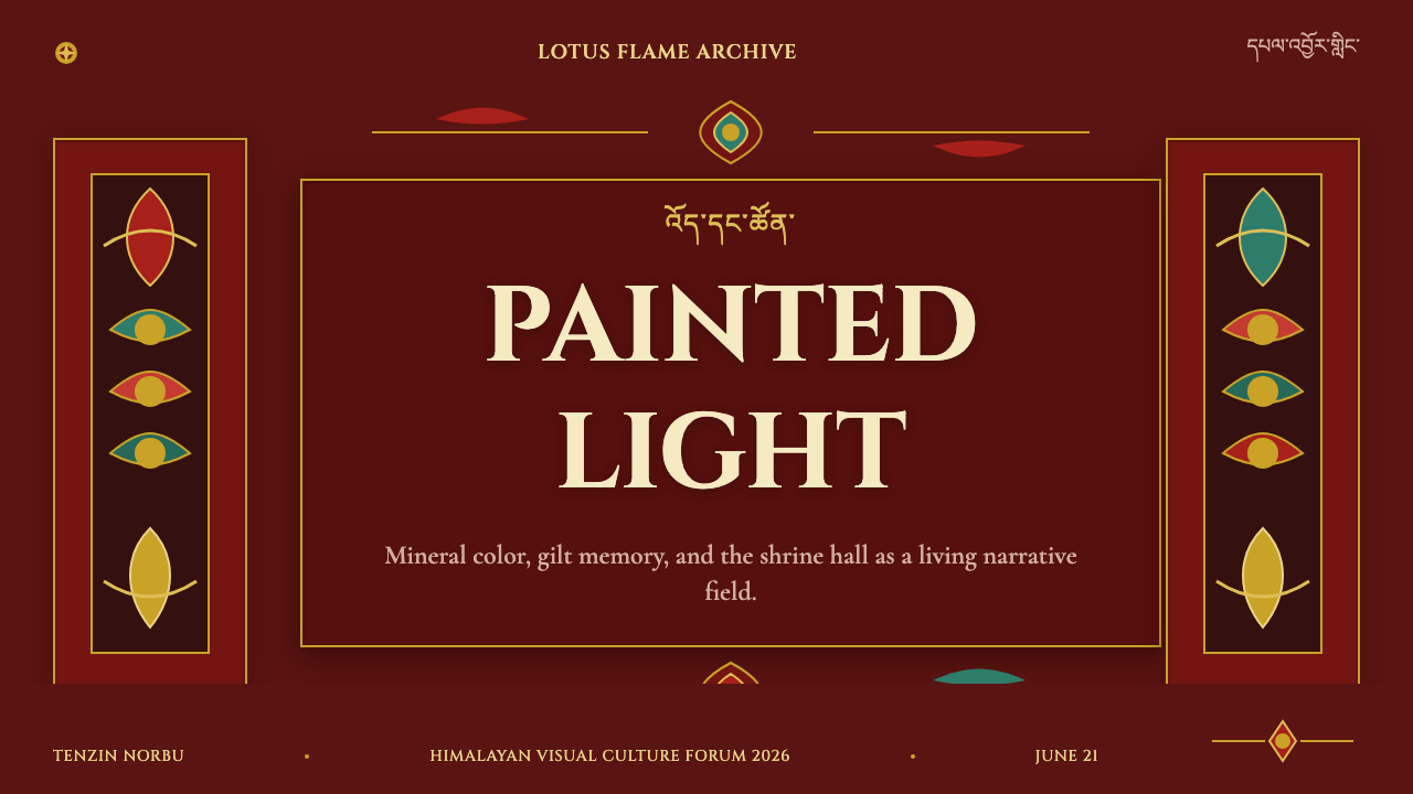
For presentation design, use the style most fully on the cover, where a deep crimson field can support a centered title framed by gilt ornament, a lotus-throne silhouette, or a symmetrical banner system. Content slides should preserve the same ceremonial frame but reduce the number of motifs around paragraphs. Data slides can treat charts as mandala-like compositions: a clear center, balanced surrounding labels, and gold reserved for the most important measure or comparison.
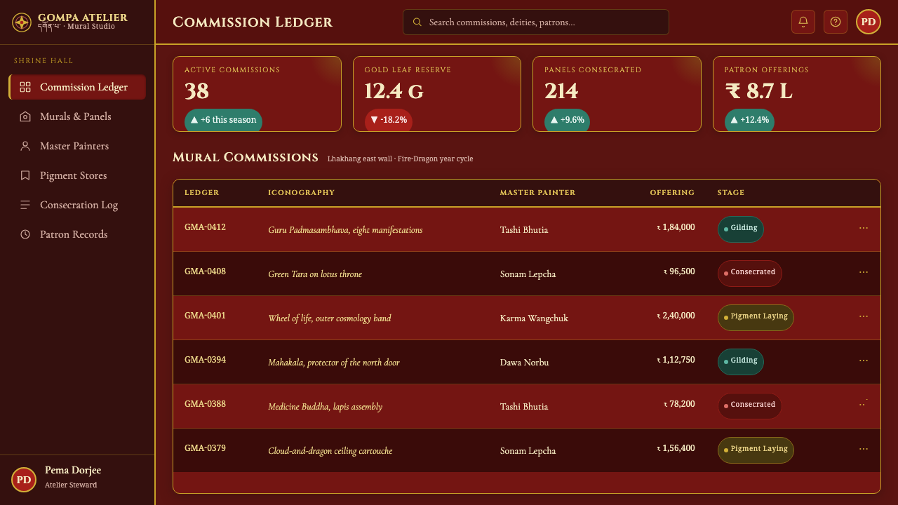
In web interfaces, Sikkim Monastery Murals suit dashboards, analytics tools, cultural archives, and premium product pages that can carry a strong atmosphere. Keep the dark crimson-maroon ground consistent, use gold for active states and primary actions, and place panels inside visibly ordered frames. Pricing pages can give each tier a distinct ornamental hierarchy, but the most valuable plan should be emphasized through position, framing, and concentrated gold rather than through an indiscriminate increase in decoration.
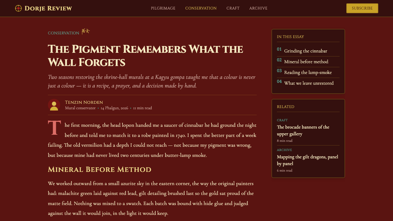
For editorial and marketing work, the style supports immersive, story-led layouts. A feature article can begin with a full ceremonial title block, then move into framed reading sections separated by banner-like rules or restrained gilt motifs. Marketing pages can use gold dragons, brocade banners, and mineral-color accents as recurring visual anchors, especially around product launches, cultural programming, or experiences that benefit from an atmosphere of ritual and rarity.
The system also works well for data-rich content when hierarchy remains explicit. Use the crimson ground as the field, gold as the signal of priority, azurite blue and malachite green as secondary categories, and coral orange for a distinct point of attention. A chart should still be immediately legible; ornamental borders may establish context, but they should never compete with the values, labels, or central conclusion.
The common mistake is confusing maximalism with unrestricted accumulation. Covering every region with gold, using every mineral color at once, or adding dragons, banners, borders, and mandalas without a dominant center produces visual noise rather than devotional density. Another failure is using Cinzel capitals for every sentence, which turns the entire interface into a display inscription. Choose a primary frame, a clear focal point, and a controlled set of accents; abundance needs hierarchy to remain persuasive.
Sikkim Monastery Murals — FAQ
Is this simply a dark luxury style?
No. Its dark ground and gold accents may resemble luxury design, but the governing logic is devotional and spatial rather than commercial. The identity comes from Rumtek’s crimson-lacquered shrine hall, Vajrayana mural tradition, mandala symmetry, lotus-throne framing, and mineral-pigment palette. Remove those relationships and the result becomes generic dark ornament.
Can the style work with a lighter background?
A lighter variation is possible, but it will move away from the source atmosphere. The defining digital translation uses a deep crimson-maroon ground because that ground carries the butter-lamp-lit, saturated shrine-hall feeling. If a lighter field is required, retain gilt framing, central symmetry, mineral-color accents, and lotus-based structure so the identity remains connected to the source.
How should gold be used without making the interface unreadable?
Treat gold as a hierarchy signal, not as a universal fill. Concentrate it on titles, borders, active states, primary actions, and selected ornaments. Let the crimson ground carry most of the visual field, and keep supporting text quieter than the ceremonial display elements. Gold becomes more convincing when it appears selectively against a stable dark field.
Why use Cinzel capitals for this design system?
Cinzel capitals reinforce the architectural and inscriptional character described by the source. They work best for titles, section names, labels, and other high-attention moments where the interface needs a ceremonial voice. They should not be forced into every paragraph. Supporting copy needs openness and restraint so the display typography can retain its authority.
Does maximal ornament suit every product?
No. The style is strongest when a product can support ceremony, cultural atmosphere, visual richness, or a sense of rarity. It suits cultural interfaces, immersive editorial work, special collections, and carefully positioned premium experiences. It may struggle where speed, neutrality, or extremely plain communication is the primary value. The question is not whether the ornament can be executed, but whether the product’s character can carry it.
Related design styles
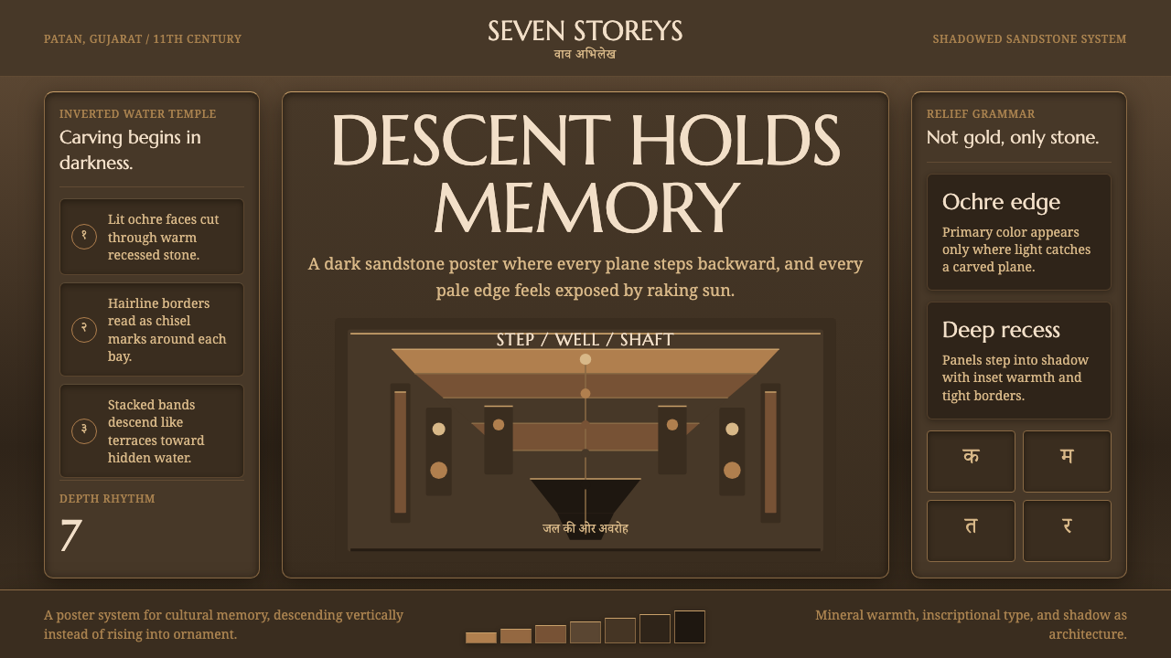 Indian StepwellStone descends into shadow. Ochre serif type and stacked terraces carve the f…
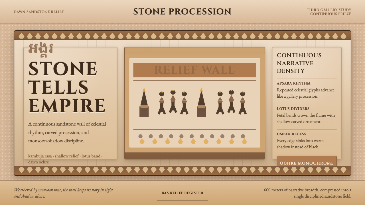 Khmer Angkor Wat ReliefStone remembers everything. Ochre friezes, Cinzel capitals, and lotus bands h…
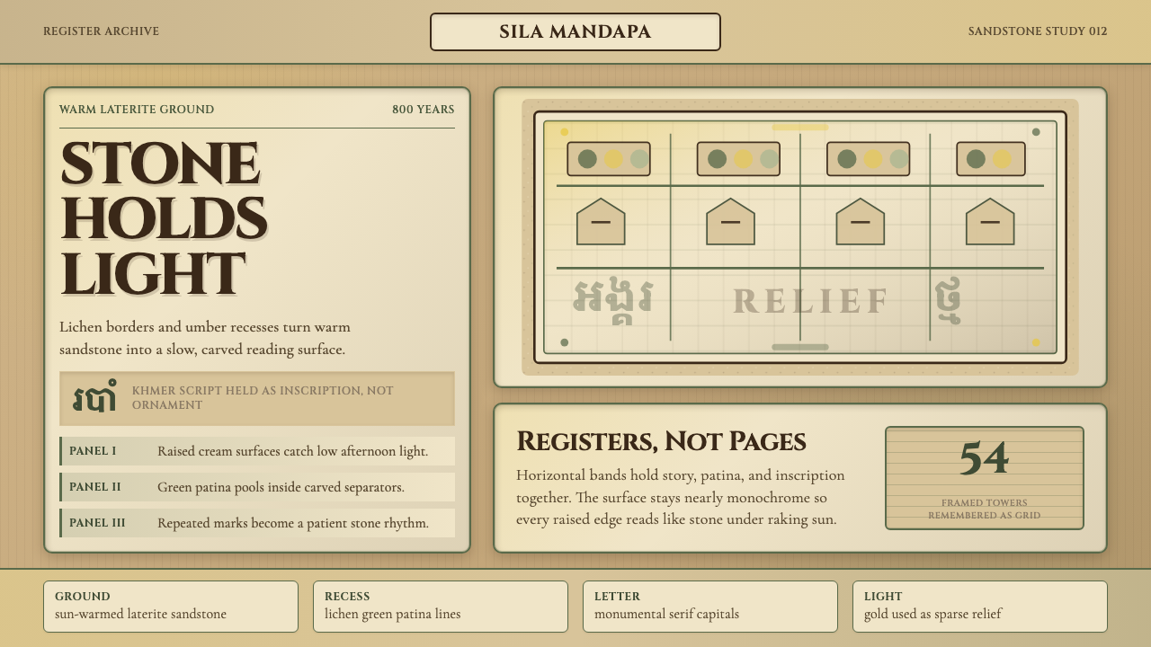 Khmer Apsara Relief (Bayon)Contemplative stone weight. Cinzel capitals sit on sandstone registers with l…
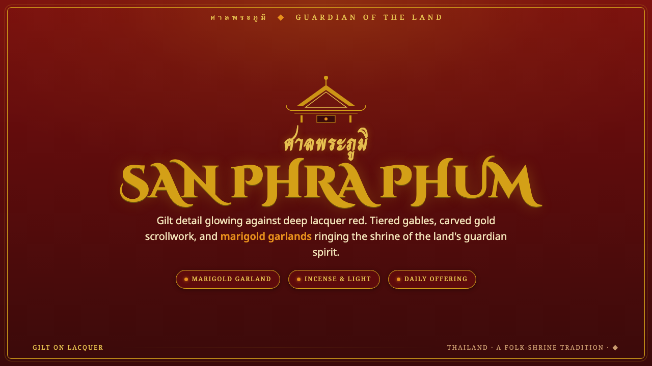 Thai Spirit HouseDevotion in gilt and lacquer. Gold scrollwork and tiered gables glowing on a…
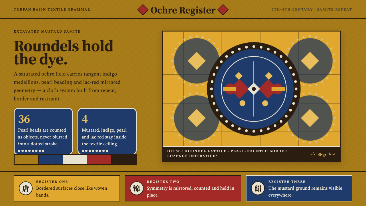 Astana Tomb SilksDye survives as structure. Mustard ground, indigo roundels and pearl beads lo…
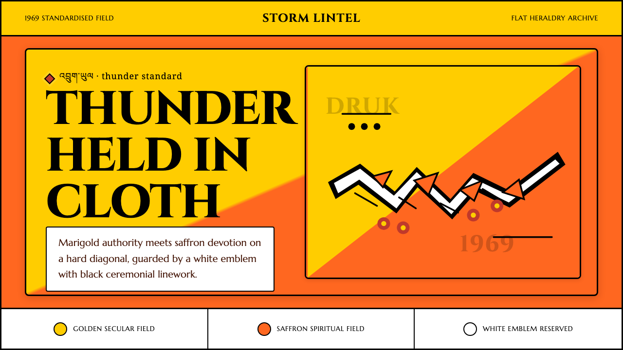 Bhutan Thunder Dragon FlagHeraldry hits like thunder. Marigold and saffron split hard around a white em…