What is Sidi Bou Said Blue?
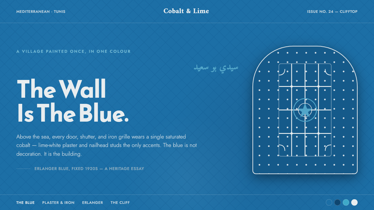
The village is the blue: Sidi Bou Said turns saturated cobalt-cyan, lime-white plaster, and wrought-iron pattern into a complete Mediterranean visual language.
Sidi Bou Said Blue in brief
Sidi Bou Said Blue takes its identity from the Tunisian clifftop village near Carthage and Tunis, where whitewashed houses set their doors, shutters, and wrought iron against a single saturated cobalt-cyan. The result is not a palette placed on architecture as decoration. The architecture itself appears to have been composed from blue, white, and iron.
In a digital application, the ground becomes the blue. Lime-white plaster functions as the main contrast, framing content with the clarity of painted architectural trim. Iron-black studs, curled metalwork, and mashrabiya lattice supply the finer register: repeated marks that give the field rhythm without competing with its dominant color.
Typography completes the regional character. Reem Kufi and Amiri bring a Maghrebi-Arabic display presence, while Jost supplies a clean Mediterranean Latin sans serif. Together they keep the system bilingual in spirit as well as language: ornamental pattern remains structural, lettering remains legible, and the cobalt field is treated as the wall of the composition rather than a small accent.
Where does Sidi Bou Said Blue come from?
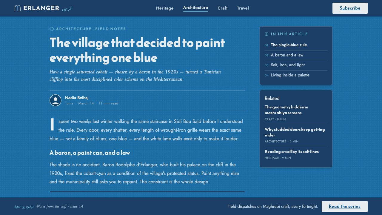
Sidi Bou Said is a Mediterranean clifftop village in Tunisia, situated near the historical landscape of Carthage and the city of Tunis. Its visual identity is architectural and environmental at once: lime-white plaster establishes the broad field, while painted blue doors, shutters, and wrought iron create a concentrated counterpoint. The village reads as a unified surface rather than a collection of unrelated facades.
The blue-and-white codification belongs to the period from 1900 to 1950, with the decisive blue established in the 1920s by Baron Rodolphe d Erlanger. This historical anchor matters because the color is not an arbitrary modern interpretation. Tunisian blue is presented as a local visual fact, tied to the village and its built surfaces.
The style sits within a wider Tunisian Mediterranean vernacular and carries the influence of Andalusian-Ottoman decorative tradition and Maghrebi blue-and-white architecture. Those references explain why the system can hold both restraint and ornament: the large color fields are calm and architectural, while iron curls, nailhead studs, and lattice patterns introduce craft, repetition, and regional specificity.
As a design style, Sidi Bou Said Blue should preserve that relationship between field and detail. The cobalt-cyan ground does most of the visual work. White plaster frames and iron-black marks clarify its edges. Reem Kufi, Amiri, and Jost translate the village into a typographic system without turning it into a generic coastal theme.
What defines the Sidi Bou Said Blue look?
Cobalt-Cyan Ground
The defining color is saturated cobalt-cyan, used as the field rather than as an accent. It should feel painted and continuous, like a village wall or shutter seen at close range. Its strength comes from coverage and consistency. Additional colors should remain subordinate, allowing the blue to establish atmosphere, hierarchy, and identity before any motif or text appears.
Lime-White Framing
Lime-white plaster is not a neutral background in the ordinary sense. It behaves like architectural trim: a clean border, inset panel, or raised frame against the blue. White areas should be crisp and generous, providing rest without dissolving the composition. The contrast is Mediterranean and material, closer to painted plaster than to a polished interface surface.
Wrought-Iron Detail
Wrought iron supplies the dark punctuation of the system. Curled metalwork, nailhead studs, and compact ornamental marks can divide, anchor, or protect a white frame. Their character is handmade and slightly tactile, but their use remains disciplined. Iron should sharpen the blue-and-white field through repeated accents, not become a separate decorative layer with its own competing palette.
Lattice Rhythm
Mashrabiya lattice introduces a patterned rhythm without requiring illustration. Its repeated openings and crossings can appear in panels, dividers, cards, or framing devices. The motif works best when it is partially visible or interrupted by content, echoing architectural screens rather than becoming wallpaper. It gives the style a sense of craft, shade, and enclosure while preserving legibility.
Regional Typography
Reem Kufi and Amiri carry the Maghrebi-Arabic display register, giving headings and labels a cultural voice that generic geometric lettering cannot provide. Jost balances them with a clean Latin sans serif for English and supporting interface text. The pairing should feel intentional and architectural: display type establishes place, while the Latin companion keeps information open and navigable.
Painted Depth
Depth should come from frames, overlaps, inset fields, and the contrast between plaster white and iron black. Avoid effects that make the surface feel glossy, metallic, or artificially luminous. Sidi Bou Said Blue is atmospheric because of its painted material language: a strong wall, a white edge, a dark fastening, and a patterned screen. The visual depth remains tactile and composed.
Who shaped Sidi Bou Said Blue?
Baron Rodolphe d Erlanger is the key historical figure attached to the style. He fixed the Tunisian blue in the 1920s, giving the village its decisive chromatic identity. In this design system, his role is represented by the insistence that the cobalt-cyan is foundational rather than optional: it is the surface from which the rest of the composition proceeds.
Sidi Bou Said is both the place and the visual subject. Its Mediterranean clifftop setting near Carthage and Tunis provides the cultural and architectural frame for the blue-and-white language. The style should therefore feel spatial and built, with fields, frames, openings, and thresholds rather than a flat collection of seaside colors.
Tunisian blue is the central chromatic idea: a saturated cobalt-cyan applied across doors, shutters, and related surfaces. It is more specific than a generic blue and more architectural than a decorative accent. Its purpose is to create a unified visual climate in which white and iron details remain legible as framing elements.
Mashrabiya lattice is the recurring patterned figure. Its crossings and openings express the decorative tradition named in the source material while remaining useful as a screen, divider, or framing motif. Used with restraint, it gives the composition regional character without overwhelming the cobalt field or reducing the system to surface ornament.
How do you use Sidi Bou Said Blue today?
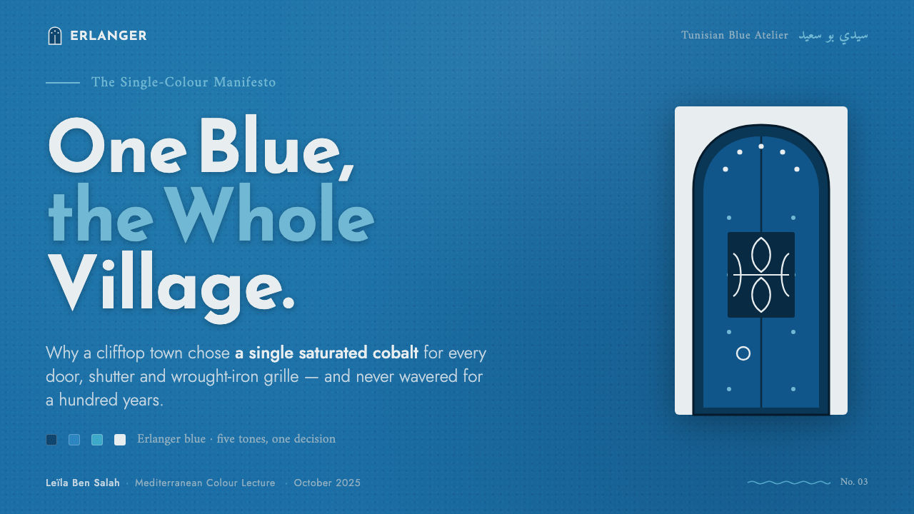
For presentation covers, let the cobalt-cyan field occupy the page as an architectural ground. Set the title in a strong white frame or against a lime-white panel, with Reem Kufi or Amiri establishing the display voice and Jost supporting Latin text. A small iron-black stud, curl, or lattice fragment can anchor the corner, but the cover should remain dominated by the blue.
Content slides should use white framed areas to organize reading rather than relying on many independent cards. Headings can alternate between the Arabic display register and the clean Latin companion, while iron-black rules or studs provide quiet structural punctuation. On data slides, charts should behave like painted architectural elements: white forms on blue, blue forms within white, and lattice used only where it clarifies grouping or sequence.
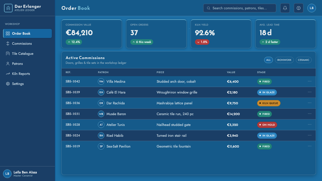
For web interfaces, the style suits dashboards and pricing pages that need a memorable visual identity with strong hierarchy. Use the saturated blue as the primary environment, lime-white for readable panels and selected controls, and iron-black for text, borders, and status marks. Cards should feel inset or framed rather than softly floating. Pricing tiers can be differentiated through framing and typographic emphasis while keeping the blue field continuous across the page.
Editorial and marketing layouts can treat the page as a sequence of village facades. A white plaster panel may hold the article body, a blue field may carry a section opening, and an iron lattice may mark a transition or metadata area. The style works especially well when copy is given generous breathing room and the decorative vocabulary is repeated consistently across headlines, call-outs, invitations, and campaign panels.
The common mistake is treating Sidi Bou Said Blue as a generic coastal palette: blue background, white text, and random ornamental icons. That misses the architectural logic. The blue must be the field, white must frame and clarify, iron must punctuate, and lattice must repeat with purpose. Adding unrelated colors, glossy effects, or excessive pattern weakens the place-specific identity that makes the system distinctive.
Sidi Bou Said Blue — FAQ
Is Sidi Bou Said Blue simply a blue-and-white palette?
No. Blue and white establish the broad architectural field, but wrought-iron black, curled metalwork, nailhead studs, and mashrabiya lattice complete the language. The style depends on the relationship between a saturated ground, a framing light surface, and repeated dark details. Without that relationship, the result becomes a generic coastal treatment rather than a place-specific system.
Why must the blue act as the background rather than an accent?
The source identity comes from houses whose doors, shutters, and ironwork are set within a village-wide blue-and-white environment. Making blue a small accent reverses that hierarchy. The digital page should feel as if the viewer is standing before the painted surface itself, with white plaster and iron details placed into the field.
How should the Arabic and Latin typefaces work together?
Reem Kufi and Amiri should carry the Maghrebi-Arabic display register, especially in prominent headings or cultural labels. Jost should provide the clean Latin voice for English and supporting interface information. The pairing works when each family has a clear role. Mixing them without hierarchy, or replacing the regional display register with generic geometric type, removes much of the style’s character.
Can the style use patterns across the entire interface?
It can appear repeatedly, but it should not become an uninterrupted wallpaper. Mashrabiya lattice is strongest when used as a partial screen, divider, framing fragment, or background interruption. Its purpose is to suggest craft and enclosure while preserving the dominance of the cobalt field and the readability of the content.
What makes an application feel inauthentic?
The style loses authenticity when the blue becomes a minor highlight, when white is treated as ordinary interface space, or when iron and lattice details are added as unrelated decoration. Glossy surfaces, excessive pattern, and unrelated colors also weaken the material and regional logic. The strongest applications keep the composition architectural: a dominant painted field, clear plaster framing, disciplined iron punctuation, and purposeful typography.
Related design styles
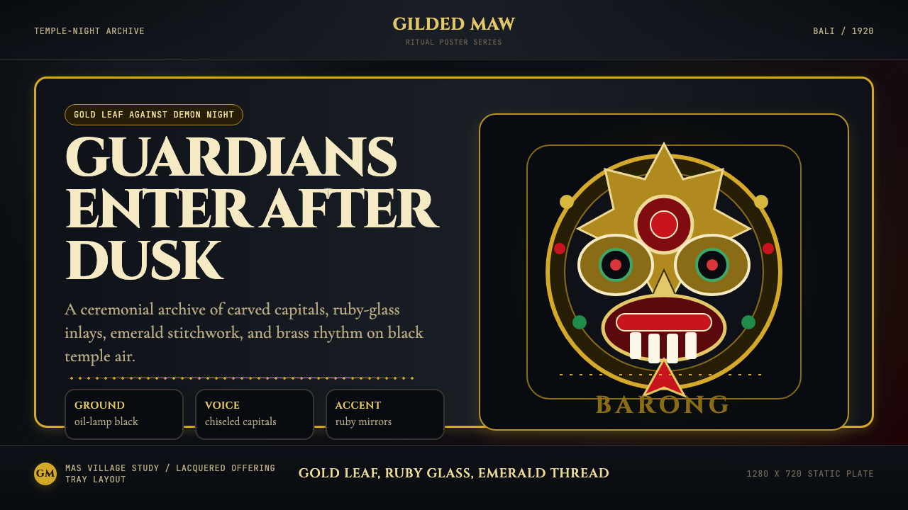 Balinese Barong Mask (1920)Protection glows after dark. Cinzel capitals frame gold, ruby, and emerald ge…
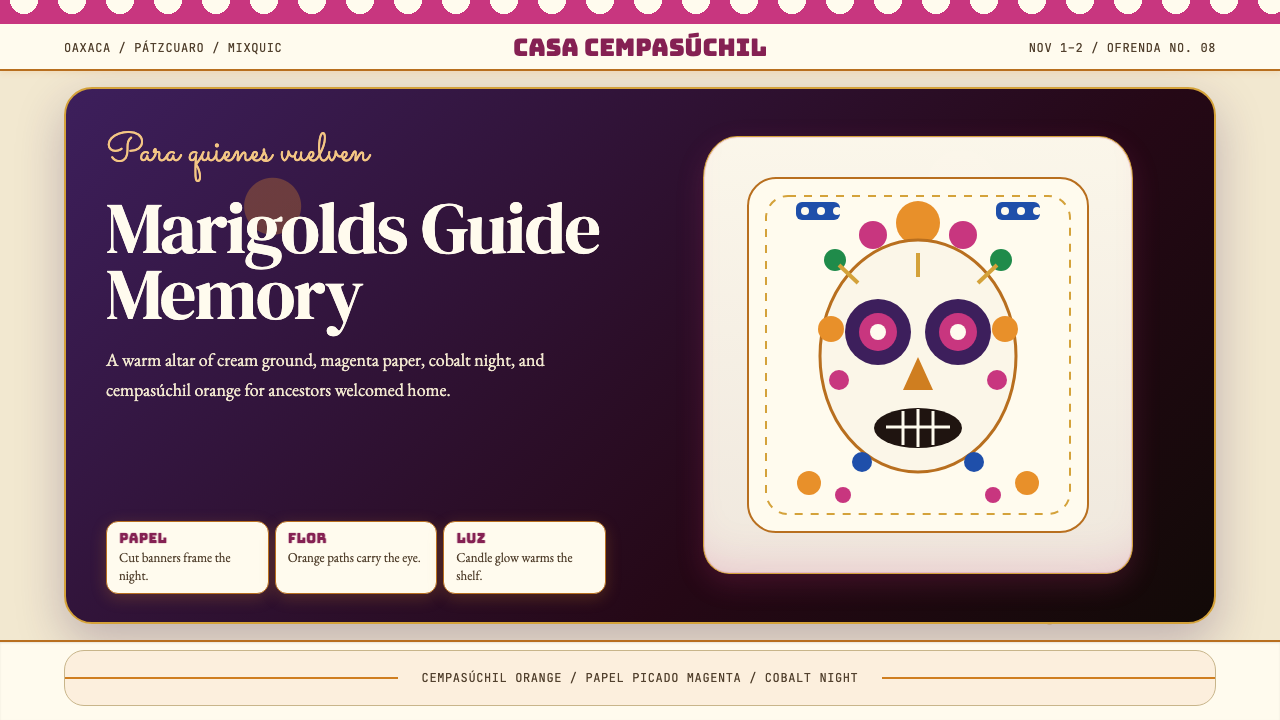 Día de los MuertosRemembrance glows. Marigold orange, magenta papel picado, and cream altar tie…
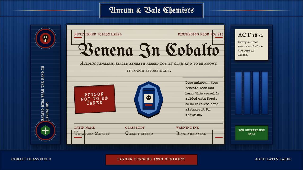 Apothecary Poison LabelDanger made ornate. Cobalt ribs, aged paper, and red POISON rules make fear t…
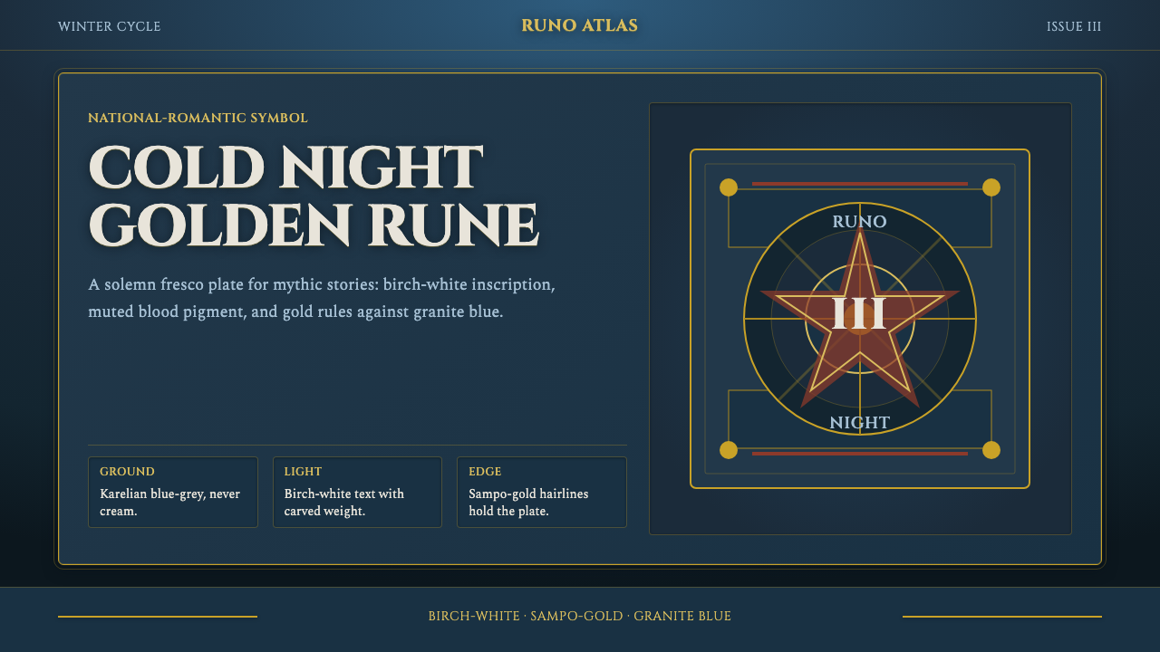 Finnish Kalevala EpicEpic weight in cold night. Birch-white Cinzel, Sampo-gold rules, blue-grey fr…
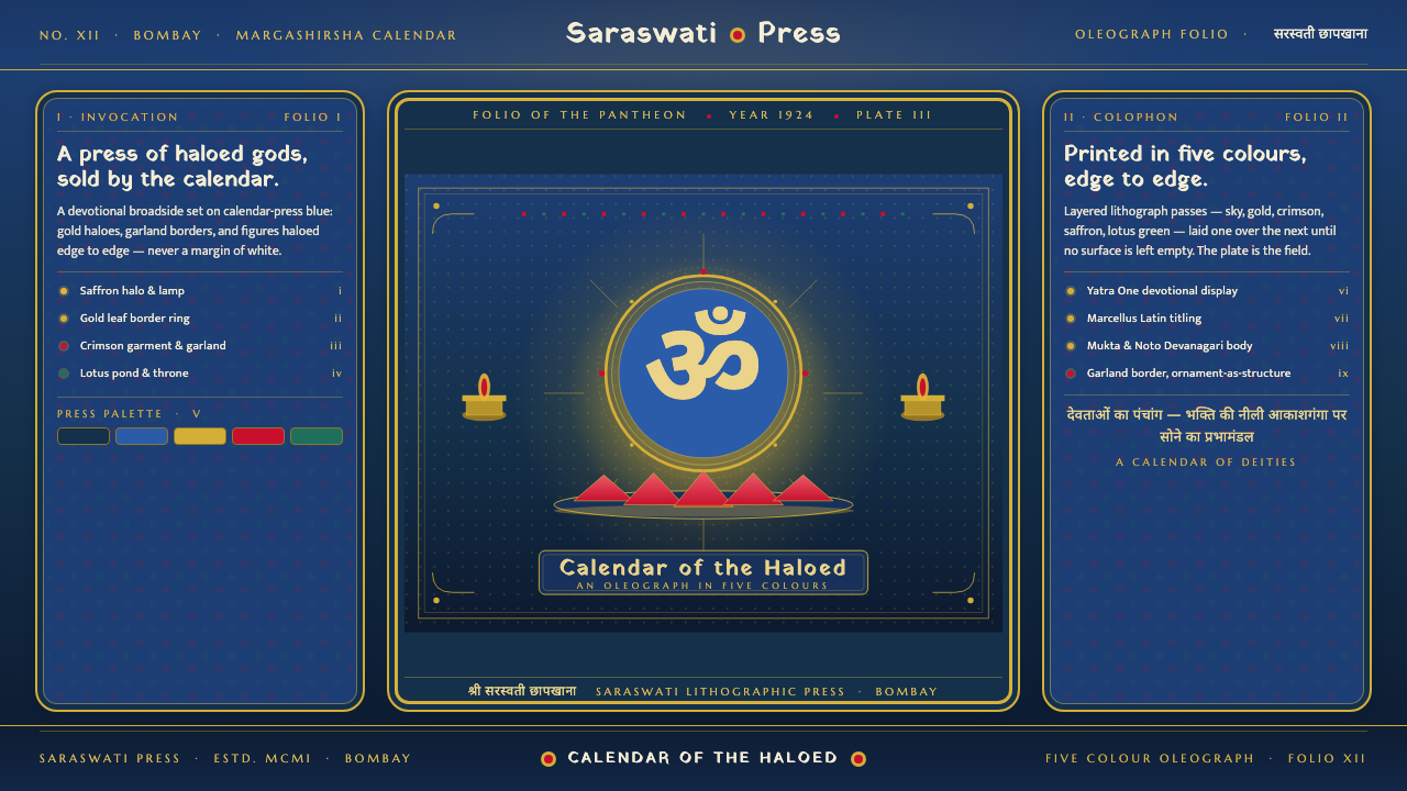 Hindu Pantheon Bazaar PrintDevotional calendar art, edge to edge. Gold halos and garland borders on baza…
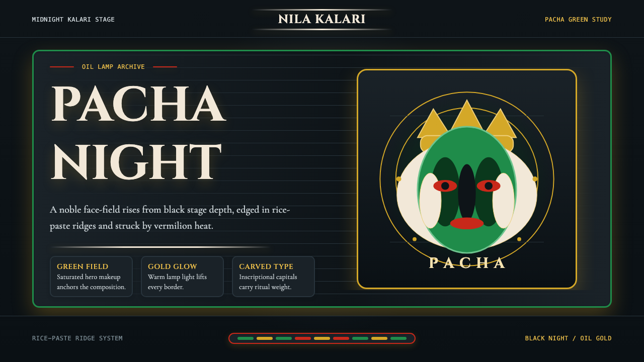 Kerala Kathakali (Pacha Green Makeup)Fierce ceremonial night. Pacha green, vermilion, and oil-gold frame monumenta…