What is Finnish Kalevala Epic?
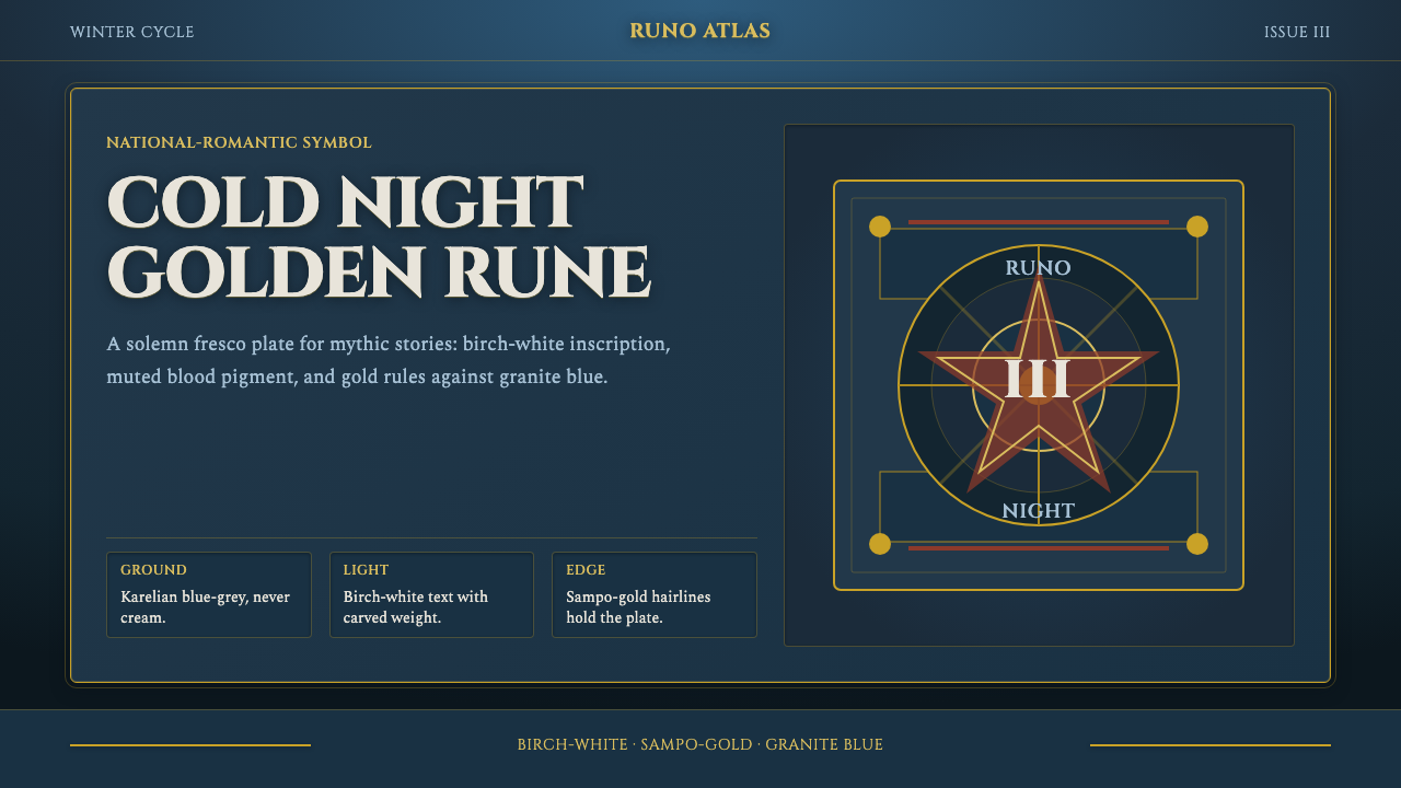
Finnish Kalevala style turns the northern night into national myth — granite-blue darkness, birch-white figures, muted gold, and the solemn weight of fresco.
Finnish Kalevala Epic in brief
Finnish Kalevala Epic is a digital design language distilled from Akseli Gallen-Kallela’s mature Kalevala paintings and frescoes of 1900–1950. Works such as Defense of the Sampo, Lemminkäinen’s Mother, the Aino Triptych, and By the River of Tuonela established its essential atmosphere: muscular Symbolist figures, monumental storytelling, and pale bodies or garments emerging from a cold Karelian darkness.
The style belongs to Finnish National-Romanticism, Symbolism, and the culture of Karelian rune-singing. It does not present folklore as delicate fantasy. Myth arrives with physical mass: figures feel carved or painted into broad surfaces, gestures carry ritual consequence, and landscapes become psychological territories rather than picturesque backgrounds.
In digital form, the system uses a cold blue-grey forest ground rather than cream, weighty fresco-flat panels, solemn serif titling, and restrained accents of Sampo gold, ochre flesh, and muted blood-red. Its contrasts are luminous but never glossy. The result feels ancient without becoming antiquarian, national without relying on flags, and dramatic without surrendering to decorative fantasy.
Where does Finnish Kalevala Epic come from?
The style’s cultural ground is Karelia, identified in the source tradition as the heartland of the Kalevala. Karelian rune-singers stand at the beginning of this visual lineage: before the epic became a subject for monumental painting, it existed as sung inheritance, carried through voice, repetition, and communal memory. Elias Lönnrot belongs to the same chain of transmission, linking the rune tradition to the epic framework that later artists could approach as a national cultural source.
Akseli Gallen-Kallela transformed that inheritance into a national visual language. Rather than illustrating myth as a distant literary episode, his Kalevala cycle gives it bodily and environmental force. In Defense of the Sampo, Lemminkäinen’s Mother, the Aino Triptych, and By the River of Tuonela, mythic action is fused with northern terrain, cold darkness, muscular anatomy, and grave stillness. The figures do not merely inhabit Finland’s imagined past; their scale and severity make that past feel physically present.
The resulting language sits at the meeting point of Finnish National-Romanticism and Symbolism. Its national character comes through Karelian landscape, rune culture, and the Kalevala rather than through conventional patriotic emblems. Its Symbolism appears in the way color, posture, darkness, and landscape carry meanings larger than literal description. Blue-grey is not simply weather; it is remoteness, night, and fate. Gold is not ordinary luxury; it belongs to the charged world of the Sampo.
Gallen-Kallela’s mature cycle and the Jusélius and Paris frescoes supplied the monumental surface from which the digital style draws. Fresco encourages broad shapes, compressed depth, and figures that appear bound to architecture. Translated into interface design, these qualities become dense panels, restrained layering, and compositions that feel built into the screen rather than placed lightly upon it. The historical medium therefore survives not as imitation, but as a principle of weight.
What defines the Finnish Kalevala Epic look?
Northern-Night Color
The ground is a cold forest blue-grey approaching granite darkness, never cream. Birch white provides the clearest light, while muted Sampo gold, ochre flesh, and restrained blood-red supply warmth without breaking the nocturnal atmosphere. Color should feel mineral, wintry, and weathered rather than bright or polished.
Fresco-Flat Panels
Content sits in broad, weighty fields that recall painted walls. Depth is compressed; panels feel dense and architectural rather than airy or card-like. Separation comes through changes in darkness, framed pictorial fields, and strong edges, preserving the impression that every section belongs to one continuous monumental surface.
Solemn Serif Type
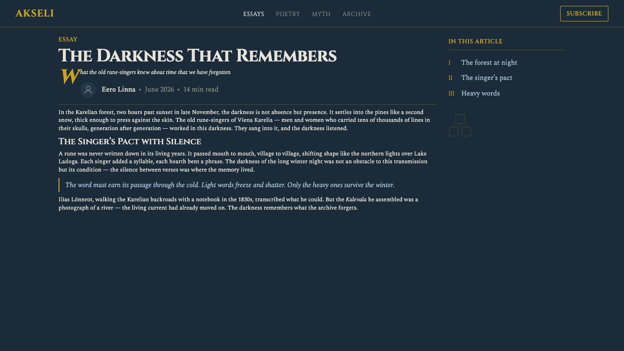
Titles use a formal serif voice with carved, inscriptional authority; Cinzel expresses the intended birch-white monumental tone. Headings should stand apart like names in an epic cycle, while supporting text remains quieter and compact. The hierarchy depends on gravity, spacing, and contrast, not typographic novelty.
Epic Figure and Gesture
Human presence is muscular, frontal, and consequential. Even a still figure should appear caught within fate, mourning, defense, or passage. Cropping may emphasize shoulders, hands, and faces, allowing bodily mass and gesture to carry narrative force without requiring a crowded illustrative scene.
Gold as Sacred Structure
Gold is used as a rule, contour, emblematic accent, or point of mythic concentration. It should never spread into generalized luxury. Against blue-grey darkness, a restrained gold line can organize a panel, mark an important title, or suggest the charged presence of the Sampo without depicting it literally.
Symbolic Landscape
Forest, river, stone, and night operate as emotional structures rather than scenic decoration. Backgrounds should feel deep yet simplified, with large tonal masses suggesting Karelian wilderness. The landscape surrounds the subject like destiny: cold, ancient, and indifferent, but never visually incidental.
Who shaped Finnish Kalevala Epic?
Gallen-Kallela is the central visual figure of the style. His Kalevala paintings and the Jusélius and Paris frescoes established the combination of monumental anatomy, compressed pictorial space, northern blue-grey darkness, and symbolic color on which the design system depends. His achievement was not merely to illustrate an epic, but to make its world function as a national visual language.
Lönnrot represents the link between Karelian rune tradition and the Kalevala as a coherent cultural source. Within this design history, his importance lies in transmission: the sung material could become an epic framework, and that framework could later become a field for national-romantic painting, symbolism, and modern visual reinterpretation.
The rune-singers are the collective cultural source beneath the named artists and interpreters. Their practice situates the Kalevala in living voice, repetition, and memory rather than in imagery alone. For designers, this origin suggests rhythm, recurrence, and concentrated symbolic motifs: visual structures should feel recited and remembered, not merely decorated.
How do you use Finnish Kalevala Epic today?
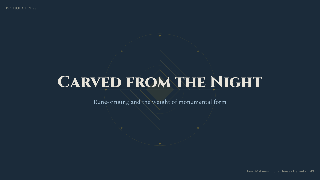
For presentation covers, begin with a dark Karelian field and one monumental focal image or silhouette. Set the title in solemn birch-white serif type, then use a thin gold rule to establish ceremonial order. Content slides should retain the same fresco-like surface, with broad text regions and strong tonal divisions instead of floating pale cards.
Data slides benefit from the style’s sense of carved hierarchy. Charts should use blue-grey tonal families for context, birch white for essential labels, and muted gold or blood-red for the single fact that requires attention. Avoid making every category equally luminous. The visual argument should emerge from darkness with the same concentration as a figure in Gallen-Kallela’s paintings.
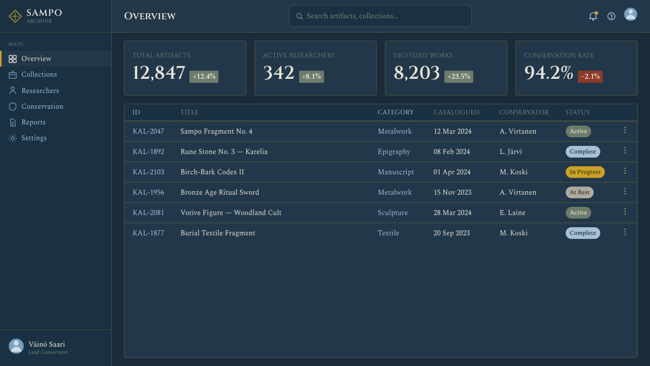
For dashboards and pricing interfaces, the style works best when information is grouped into weighty, clearly bounded panels. Gold can mark a selected plan, primary action, or critical metric, while the remaining interface stays cold and restrained. Serif display type should be reserved for page titles and decisive totals; routine controls need a quieter voice so the interface remains usable.
Editorial and marketing layouts can treat each section as an episode within an epic cycle. Large imagery, solemn headings, and short blocks of text create narrative pauses, while recurring gold rules provide continuity. Product claims should be framed as acts, trials, defenses, or transformations only when the subject genuinely supports such gravity; otherwise the style can overpower the message.
The most common mistake is turning the theme into generic Nordic fantasy. Bright treasure gold, decorative runes, misty gradients, ornate medieval borders, and crowded mythic illustration weaken its specific character. Authentic application depends on cold blue-grey darkness, fresco-like compression, muted accents, and emotional severity. The goal is not magical spectacle, but the feeling of a national epic made physically present.
Finnish Kalevala Epic — FAQ
Is Finnish Kalevala Epic simply a general Nordic fantasy style?
No. Its source is specifically Finnish and Karelian: the Kalevala, rune-singing, Finnish National-Romanticism, Symbolism, and Gallen-Kallela’s paintings and frescoes. Generic Nordic fantasy often favors decorative runes, luminous magic, mist, and elaborate medieval detail. This style is colder, flatter, more monumental, and more restrained. Its power comes from emotional and pictorial weight rather than supernatural spectacle.
Why should the background remain cold and dark rather than cream?
Because the northern-night ground is structural to the style. Birch white, ochre flesh, muted red, and Sampo gold acquire their meaning by glowing against granite-blue darkness. A cream background changes the emotional climate: the work becomes warmer, more archival, and less connected to deep forest, river, stone, and the long Karelian night.
Can the style use photography?
Yes, if photography is treated as a monumental pictorial field rather than casual documentation. Choose images with strong bodily gesture, severe landscapes, or broad tonal masses, then crop them decisively and integrate them into the blue-grey surface. Bright lifestyle photography, glossy product lighting, and busy scenic detail tend to conflict with the fresco-like compression and symbolic gravity.
How should gold and blood-red be balanced?
Both are accents held under the authority of the dark ground. Gold is best for sacred structure, emphasis, and continuity; blood-red introduces danger, conflict, or emotional consequence. Neither should become a broad decorative fill. When both appear, assign them different roles and allow one to dominate, so the page preserves solemn hierarchy rather than becoming theatrical.
What kinds of products suit Finnish Kalevala Epic best?
It suits cultural archives, historical storytelling, literary projects, exhibitions, premium editorial experiences, and products that need seriousness, endurance, or mythic scale. It is less natural for cheerful social tools, playful children’s interfaces, or services built around effortless speed and casual friendliness. The style asks users to pause and enter an atmosphere; it should be chosen when that gravity supports the product’s purpose.
Related design styles
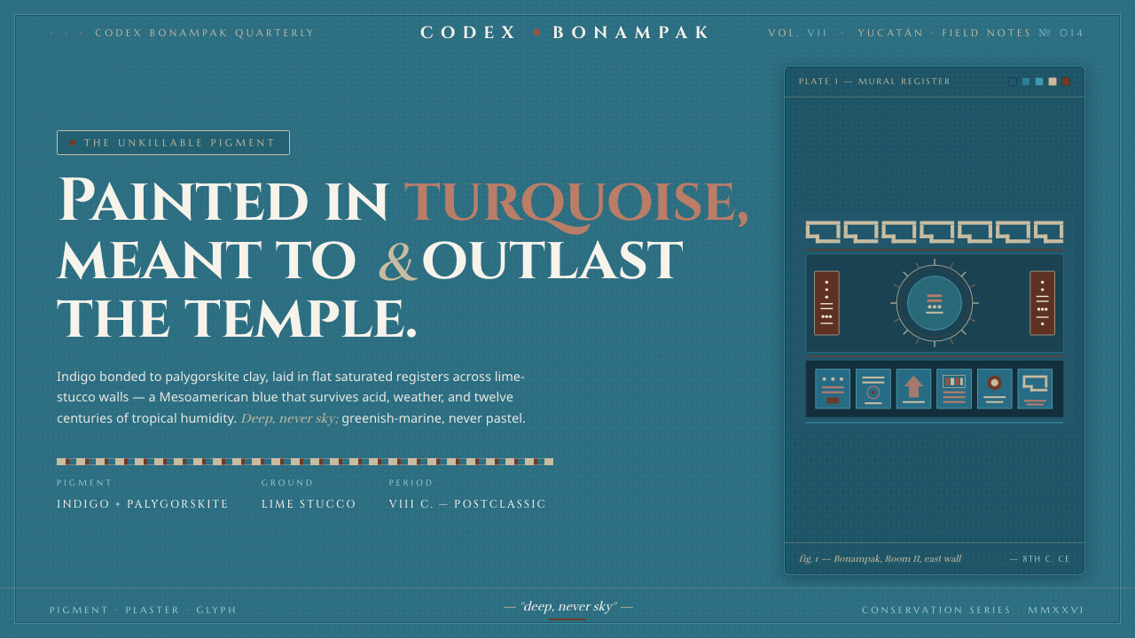 Maya Blue PigmentDeep, never sky. Saturated turquoise mural fields, ochre cartouches, carved-s…
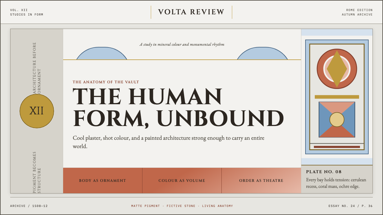 Michelangelo Sistine Ceiling (1512)Paint becomes monumental. Coral, cerulean and ochre figures strain against a…
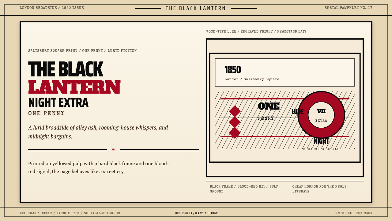 Penny Dreadful Victorian Headline (1850)Cheap terror in full cry. Condensed wood-type, black borders, and one blood-r…
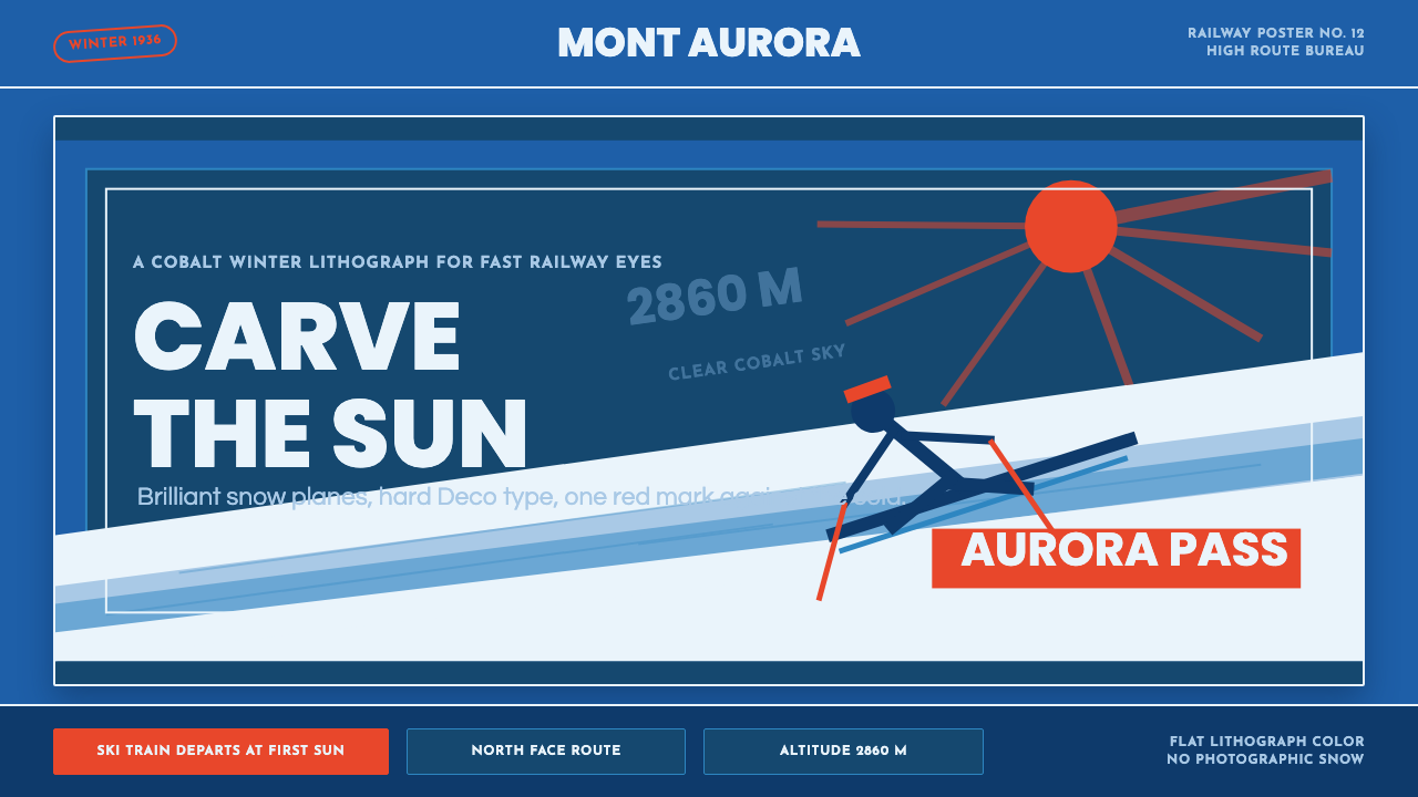 Alpine Ski PosterCold speed sells winter. Cobalt sky, snow planes, sun rays, and one resort-re…
 Bigouden CoiffeIdentity stands tall. Starched linen rises over matte black, edged in saffron…
 Game of Thrones (2011)Power is forged cold. Chiseled Roman capitals divide ember from glacial ice o…