What is Bigouden Coiffe?
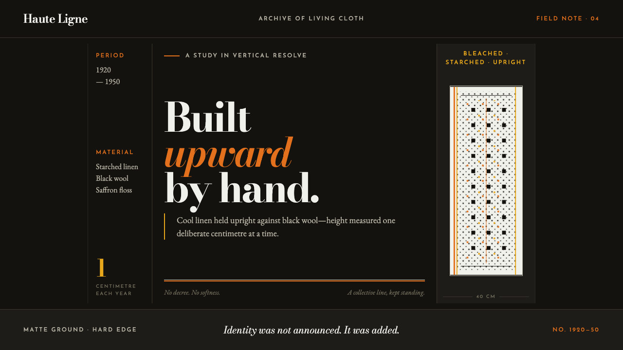
The tallest headdress in Europe was not designed by any single hand — it was grown, a centimetre a year, by a region that refused to stop standing up straight.
Bigouden Coiffe in brief
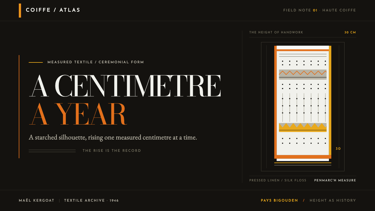
Bigouden Coiffe is a design language taken from the tallest traditional headdress in Europe, worn by women of the Pays Bigouden in Finistère, Brittany. The coiffe is a rectangle of starched lace that, after 1920, grew roughly a centimetre taller every year — passing 30 centimetres, then reaching 40 centimetres at Penmarc'h by the end of the Second World War. No authority decreed this growth. The women of Pont-l'Abbé and the surrounding villages simply kept building the headdress upward, year after year, as an unbroken statement of regional identity.
This system takes that vertical decision literally and applies it to every element of a layout: narrow columns instead of wide ones, headlines stacked rather than run horizontally, tight leading that compresses text into upright columns, and height given generously in places where width would be the easier, more conventional choice. The ground beneath all of this is a dead-matte black broadcloth or velvet — the same fabric, the vouloutenn ribbon, that appears in Bigouden daily dress.
Against that black sit bleached, blue-whitened linen — a cold white, never a warm ivory — alongside saffron and bright yellow embroidery floss, bottle green, and scarlet, the palette of an embroidered gilet worn as everyday festive dress. The lace itself is never soft or drooping in this system: it is starched, pressed, and structurally upright, and any application that turns it into a romantic, flowing trim misunderstands the entire character of the garment it is drawn from.
Where does Bigouden Coiffe come from?
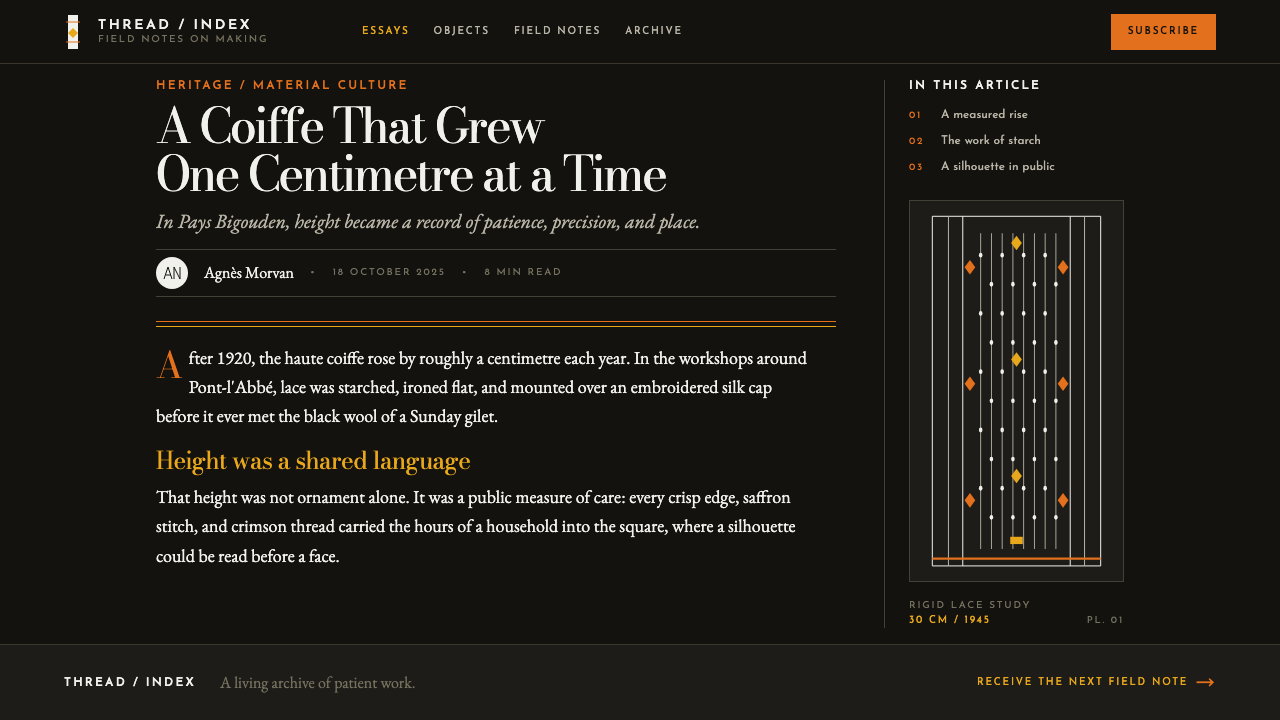
The tradition traces to the period between 1900 and 1950, with the coiffe's defining vertical growth concentrated between 1920 and 1960 and its historical peak reached in the mid-1940s. The Pays Bigouden — centered on Pont-l'Abbé, Penmarc'h, and Loctudy in Finistère — is one of the most visually distinct regional-costume traditions in Brittany, and the coiffe is its single most recognizable feature.
The people responsible for this escalation were the brodeurs of Pont-l'Abbé, the embroiderers whose work on the gilets, collars, and aprons of Bigouden festive dress ran in parallel with the headdress's growth. Their embroidery supplied the saffron, yellow, bottle-green, and scarlet vocabulary that this system pairs with the coiffe's cold white and dead-matte black.
The coiffe's growth coincided with, and has been understood as part of, a broader interwar revival of regional identity across Lower Brittany, a period when a number of Breton communities intensified rather than abandoned visible markers of local distinctiveness even as national and urban culture pressed toward homogenization elsewhere in France.
The tradition's continued visibility into the contemporary period owes a great deal to the photographer Charles Fréger, whose documentary work on European folk costume has brought renewed attention to garments like the Bigouden coiffe, situating it within a wider, ongoing visual record of regional dress traditions across the continent rather than treating it as a closed historical curiosity.
What defines the Bigouden Coiffe look?
Vertical-First Composition
Every structural decision defaults to height over width: narrow columns, stacked headline blocks, and tight leading that pulls text upward into tall, compressed columns. This mirrors the coiffe's own decades-long decision to keep growing taller rather than wider.
Dead-Matte Black Ground
The base surface is a completely non-reflective black, matching the broadcloth and velvet — the vouloutenn ribbon — worn daily by Bigouden women. It is never a soft charcoal or a glossy black; the matte quality is essential to reading as genuine fabric rather than a printed dark background.
Cold, Blue-Whitened Linen
White elements carry a distinct cool, blue-tinged cast rather than a warm ivory or cream. This specific whiteness comes from the bleaching process applied to the coiffe's starched linen, and substituting a warm white misrepresents the material entirely.
Starched, Upright Lace
Where lace appears, it must read as stiff, pressed, and structurally standing — never soft, flowing, or drooping. This upright quality is the coiffe's defining physical characteristic, and softening it into romantic drapery contradicts the entire premise of the style.
Embroidered Gilet Accent Palette
Saffron, bright yellow, bottle green, and scarlet appear as accents against the black-and-white foundation, drawn directly from the embroidery on a Bigouden festive gilet. These colors appear as concentrated points of embroidery-like detail, not as broad washes of color.
No Pastel Softening
None of the accent colors are ever muted toward pastel. The palette stays at the saturation of dyed embroidery floss, holding the same confident intensity as the thread it is drawn from.
No Pastoral or Seaside-Tourism Filter
This style deliberately excludes any soft, romanticized French-countryside or coastal-tourism visual treatment — warm sunlit tones, gentle gradients, casual lifestyle photography. The coiffe's own character is stiff, upright, and formal, and the system holds to that rather than a tourist-brochure interpretation of Brittany.
Who shaped Bigouden Coiffe?
These embroiderers produced the saffron, yellow, bottle-green, and scarlet needlework on Bigouden gilets, collars, and aprons that runs in parallel with the coiffe's own vertical growth. Their work supplies this system's entire accent palette, drawn directly from real embroidery rather than an invented color scheme.
Fréger's documentary photography of European folk costume brought renewed contemporary attention to garments including the Bigouden coiffe, preserving and circulating a visual record of the headdress and its regional context well beyond its own historical period.
Named as one of the movements this style belongs to, this revival describes the broader interwar context in which Bigouden and other Breton communities intensified visible markers of local identity, situating the coiffe's growth as part of a wider regional assertion rather than an isolated local custom.
How do you use Bigouden Coiffe today?
This system is a natural fit for presentation decks that need to make a statement of identity or conviction rather than present neutral information. A cover slide benefits from a single tall, narrow column of stacked type against the dead-matte black ground, with one accent color — saffron or scarlet — used sparingly at a single point of emphasis, the way embroidery marks a specific point on a gilet rather than covering the whole garment. Content slides should resist the pull toward wide, horizontal layouts; keep text columns narrow and let height do the organizational work that width usually does in conventional slide design.
For web interfaces, the aesthetic suits brands built around conviction, heritage, and formal presence — cultural institutions, premium craft goods, publications with a strong editorial point of view. Navigation and headline elements should favor vertical stacking and tall proportions over wide horizontal banners, and the cold blue-white should be used consistently rather than substituted with a warmer neutral, since the temperature of the white is part of the system's specific identity. Accent colors belong on small, precise interface elements — a status indicator, an icon, a single highlighted word — echoing embroidery's role as concentrated detail rather than broad coverage.
In editorial and marketing content, the style supports feature writing about regional identity, craft tradition, and conviction-driven culture. Pull quotes work well set in tall, narrow blocks against the black ground, and photography — where used — should preserve the stiff, upright, formal quality of the subject rather than being softened with warm lifestyle lighting or casual framing.
The style also translates well into poster and printed program design for cultural and heritage events, where a single tall column of stacked type against black, with embroidery-toned accents at specific points, reproduces the visual confidence of the coiffe itself far more effectively than a wide, horizontally balanced layout would.
The most common mistake is softening the coiffe's starched, upright lace into a flowing, romantic decorative trim, or drifting the palette toward a generic 'French countryside' warmth with golden light and pastel tones. Both moves erase the specific, formal stiffness that defines this tradition. A second common error is defaulting to wide, horizontal layouts out of habit — this style's entire identity depends on choosing height where width would be the easier, more conventional option.
Bigouden Coiffe — FAQ
Why does this style insist on tall, narrow columns instead of conventional wide layouts?
Because the coiffe itself is a decades-long, community-wide commitment to height over width — the headdress grew taller every year rather than wider. Applying that same logic to layout, favoring vertical stacking and narrow columns even where a wide layout would be the conventional default, is what makes the system read as genuinely drawn from the coiffe rather than a generic dark-and-gold decorative theme.
Why must the white carry a cool, blue-tinged cast rather than a warm ivory?
Because the specific whiteness of bleached, starched linen used in the historical coiffe carries this cool cast, and it is a documented, specific material fact rather than an arbitrary stylistic choice. A warm ivory white would read as a generic 'lace' aesthetic rather than the particular fabric this system is drawn from.
Can the accent colors be used broadly across a layout rather than as small points of detail?
Doing so breaks the system's core logic. In the source material, saffron, yellow, bottle green, and scarlet appear as embroidery — concentrated, hand-worked detail on specific parts of a garment — never as broad fields of color. Spreading these hues across large areas turns embroidery-like precision into generic decoration and loses the sense of hand-applied craft that defines the palette.
Does this style suit a warm, friendly consumer brand?
Generally not. Its dead-matte black ground, cold white, stiff upright forms, and deliberate avoidance of pastoral warmth project formality and conviction rather than approachability. It suits brands built on heritage, craft seriousness, and cultural identity far better than it suits products that need to feel casual, soft, or immediately friendly.
Is this the same as generic 'Breton stripe' or French maritime style?
No. The widely known Breton stripe belongs to maritime workwear and casual fashion, built around horizontal navy-and-white bands and a relaxed, seaside mood. Bigouden Coiffe comes from a specific, formal regional costume tradition — vertical, starched, embroidered, and black-grounded — with no relationship to horizontal stripes or maritime casualness. Conflating the two erases what makes this style specific.
Related design styles
 Fijian Masi (Bark Stencil)Stencil memory stays sharp. Soot black and burnt coral strike bark-fibre band…
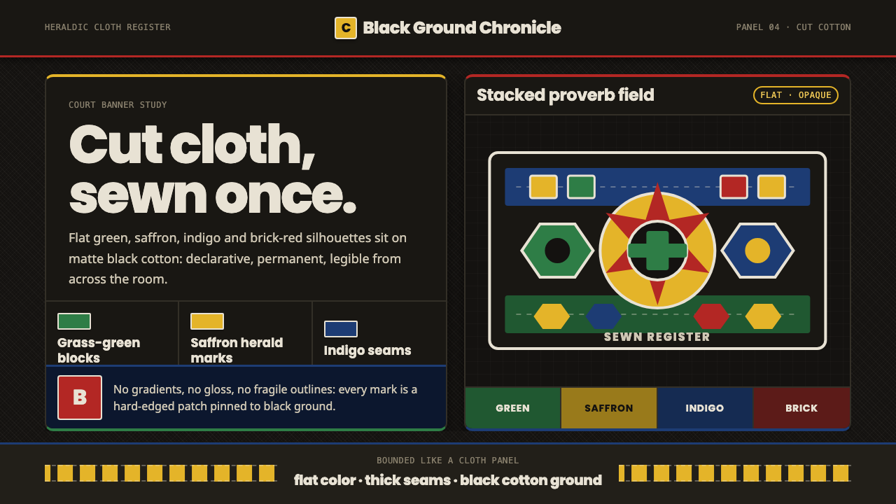 Fon Applique Banner AbomeyRoyal cloth speaks plainly. Flat saffron, green and indigo silhouettes on bla…
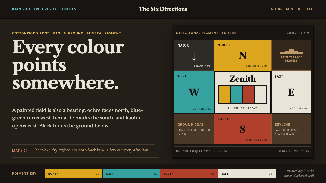 Hopi Katsina TihuEvery colour is a direction. Matte mineral fields meet in smoke-black keyline…
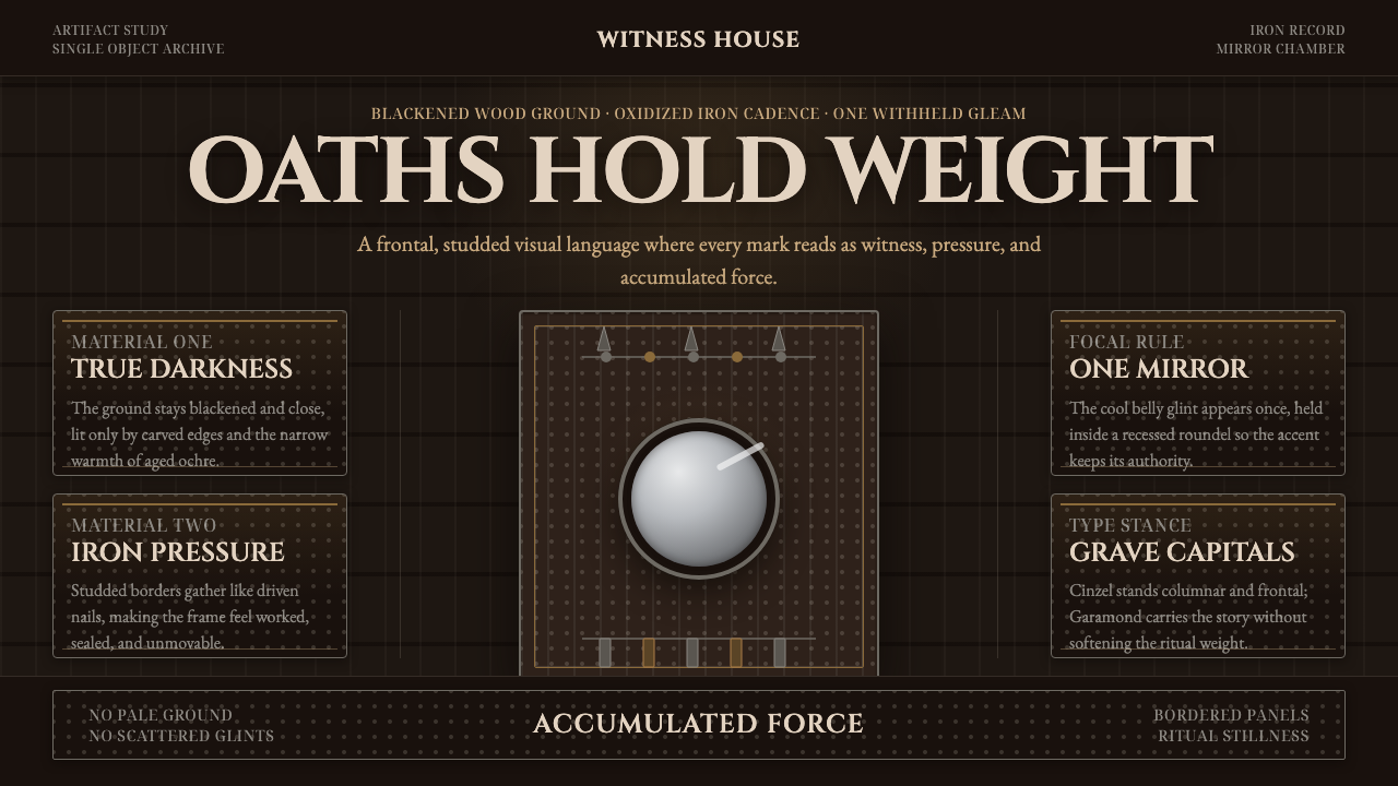 Kongo Nkisi Nkondi FigurePower accumulates in darkness. Black wood, iron studs, and one mirror glint h…
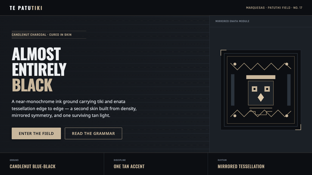 Marquesan Tatu PatternDensity as authority. Tiki and enata tessellation inked into blue-black, lit…
 Mixtec Turquoise MosaicDarkness wears a jewel skin. Turquoise tesserae crack open with red and shell…