What is Calçada Portuguesa?
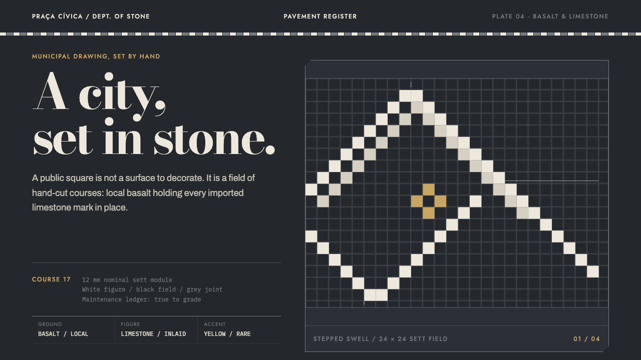
Calçada portuguesa is drawing at the scale of a city: small white limestone cubes set by hand into black basalt, so that every curve climbs in steps and every figure is part of the ground.
Calçada Portuguesa in brief
Calçada portuguesa, literally Portuguese pavement, is a tradition of street paving in which a calceteiro, a pavement-setter, cuts small cubes of stone by hand, beds them in sand and lime, and sets them into patterns: waves, stars, compass roses, anchors and caravels. It is drawing carried out at the scale of a city, in a material that has to survive feet, rain and traffic.
This version comes from Ponta Delgada, on the island of São Miguel in the Azores. The mainland tradition lays white limestone figures on a dark field, and Ponta Delgada keeps the picture but inverts the supply chain: the black basalt for the ground is quarried on the island itself, while the limestone for the figures is shipped in from Portugal. The pale pattern is therefore the imported material, and the dark ground is the island's own volcanic rock.
Visually, the system takes the pavement literally. The page is basalt, dark and dry and heavy. Every figure is quantised to the grid of the stones, so a curve climbs in stepped courses instead of sliding along a smooth line. Panels are inlaid into the ground rather than floated above it. It is municipal infrastructure with a maintenance line in the budget, and it is meant to read that way rather than as a tourist postcard.
Where does Calçada Portuguesa come from?
The story begins in 1842 with a trial pavement, a first experiment in laying a street as a deliberate pattern rather than as plain paving. The name attached to it is Eusébio Pinheiro Furtado. What began as a trial turned into a recognisable Portuguese street surface, one that a city could treat as its own signature.
In the Azores the tradition became a civic programme. From about 1900 to 1950, Ponta Delgada paved its public spaces in patterned stone, and the work did not stop when that period ended: the pavement is still laid and repaired today. That continuity matters for the design language, because this is not a revival or a pastiche. It is a living trade with a working method, a supply chain and a maintenance schedule.
The authorship is collective. The record names the calceteiros of Lisbon and of Ponta Delgada, the pavement-setters who cut, bed and set the stone, rather than any single designer. Patterns pass from workshop to workshop and from hand to hand, and each stone is cut slightly differently from the next, so a finished panel carries the small irregularities of human work inside a strict geometric frame.
Calçada sits beside another strand of Portuguese civic graphics, the azulejo street plate: painted tile panels carrying street names on building walls. The two systems share a public, municipal voice, with upright, clear letters made to be read by passers-by, and they share a maritime imagination, the waves, anchors and caravels of the pavement echoing a country whose history runs through the sea. Together they show what a city looks like when its graphics are made from its own materials.
What defines the Calçada Portuguesa look?
Basalt ground
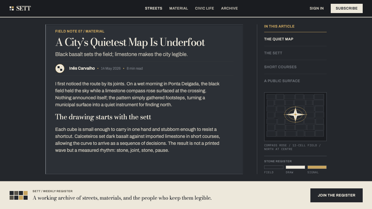
The page is the dark volcanic stone itself: matte, dry and heavy, never glossy. Dark is not a mode here but the substance of the surface, and everything else is defined by contrast against it. The ground should feel quarried rather than painted, with a flat weight that makes lighter figures look set in rather than stuck on.
Limestone figures
Figures are pale limestone, a stone white that reads as mineral rather than as paper or light. Because the limestone is shipped in while the basalt is local, the white is a deliberate, slightly precious inlay on a native ground. Pale shapes are used with discipline: a border, a wave, a star, a lettered plate, never a blanket fill.
Quantised geometry
Every shape is quantised to the grid of the stones. Curves climb in stepped courses, diagonals become staircases, and circles are polygons built from small squares. It is pixel art centuries before screens. The discipline gives the style its unmistakable texture: smooth curves and vector-perfect arcs are alien to it, and a design that cannot survive being pixelated will not survive here.
Inlaid panels
Cards and sections are inlaid slabs of pattern set flush into the ground and framed by dark joints. They do not float, cast shadows or lift on hover. A panel sits in the pavement the way a coat of arms sits in a floor, and the separation between panels is a line of dark stone, not a drop of light.
Maritime repertoire
The motif vocabulary is nautical: waves, stars, compass roses, anchors and caravels. Waves repeat as bands, stars and roses become centrepieces, and anchors and ships act as emblems. Motifs repeat in strict, regular rhythms that read as a border or a runner along a street, which makes them ideal for dividers, frames and headers.
Hand-cut irregularity
Each stone is cut by hand and bedded on sand and lime, so no two are identical. The surface carries slight variations in tone, edge and spacing, and the joints between stones show as dark seams. In a digital translation this means texture and subtle variation inside rigid structure, never mechanical sameness and never dirt for its own sake.
Civic gravity
This is municipal infrastructure, and it carries the weight of that. Type is upright and plain in the manner of azulejo street-plate lettering, and the overall tone is solemn and public rather than playful. It is a surface made to last and be walked on, and the design should feel built rather than decorated.

Who shaped Calçada Portuguesa?
The name attached to the 1842 trial pavement, the first experiment that established the idea of a street laid as deliberate pattern. The record gives little beyond the name and the date, which suits the tradition: the trial matters less as a personal achievement than as the moment the technique entered public life.
The pavement-setters of the mainland tradition, who cut, bed and set white limestone figures into a dark field. Their work establishes the grammar that the Azorean version inherits: a stone, a pattern and a ground, and nothing more.
The island's pavement-setters, who work with local black basalt for the ground and limestone shipped in from Portugal for the figures. They are tied to the civic programme of 1900 to 1950 and are still at work today, which is why this is a living craft rather than a historical style.
How do you use Calçada Portuguesa today?
Calçada portuguesa is a dark, heavy, civic style, and it works best where permanence and place are the message. Its principle is easy to state: treat the page as a ground of dark stone and set everything into it as inlay, with every curve respecting a visible grid.
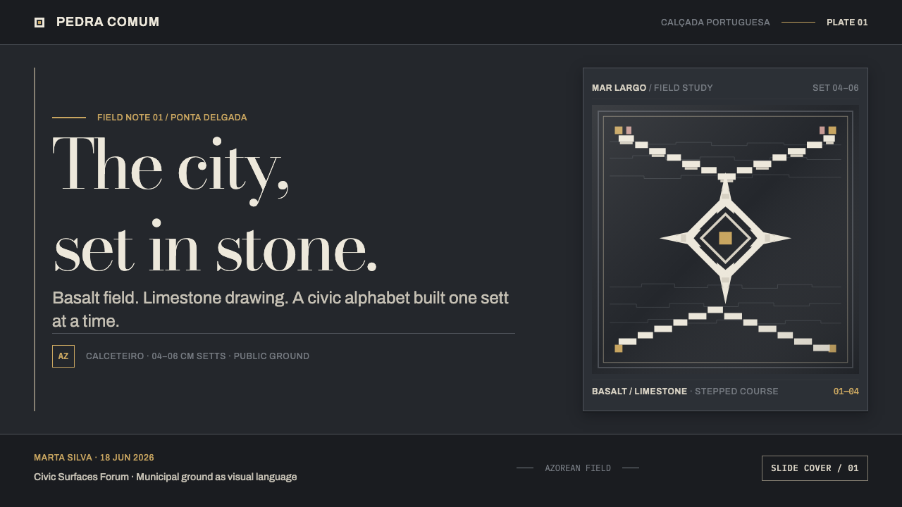
For presentation slides, a cover can be a field of dark basalt with a single inlaid band of wave pattern and a plain, upright title set into it, like an inscription on a plinth. Content slides become a ground with a few inlaid panels, each framed by a dark joint, with pale type on dark stone. Data slides suit stepped, grid-snapped charts: bars and lines built from squares, area charts drawn as terraces, so that the pavement logic becomes the chart's visual identity.
For web interfaces, the style suits heritage projects, museums, cultural institutions, local-government and civic tools, maps and wayfinding, and any product that wants to feel rooted in a city. Build cards as inlaid slabs with flat edges and thin dark joints, make dividers from repeating wave or border bands, and let icons be quantised pictograms. Avoid floating shadows, glass effects and smooth vector curves in decorative elements; they break the illusion that the interface is made of stone.
For editorial and marketing work, it fits long-form pieces about cities, ports, craft, maritime history and public space, as well as campaigns for institutions that want civic gravity. Use pattern bands as running heads and section breaks, set captions in the plain upright manner of a street plate, and keep imagery in sober documentary registers. A single large motif, such as a compass rose, can anchor a page the way it anchors a square.
The common mistake is turning the pavement into a postcard: adding sunset gradients, sea-blue prettiness, soft shadows or decorative flourish to make it charming. The point of the system is its weight and its quantised honesty. The second mistake is drawing smooth curves and then trusting a filter to make them look stepped; the grid has to come first. The third is using the pale figure colour everywhere. Limestone is a deliberate inlay on a dark ground, and when everything is white there is no pavement left.
Calçada Portuguesa — FAQ
How does the Azorean version differ from the mainland tradition?
The picture is much the same: pale limestone figures set into a dark field. What changes is the supply chain. Ponta Delgada quarries its own black basalt for the ground and ships the limestone in from Portugal, so the dark is the island's own stone and the pale pattern is the imported one. For design, that inversion is worth keeping in mind: the ground is the native, dominant material, and the figures are a precious inlay on it rather than the other way round.
Why do curves look stepped in this style?
Because every figure is built from small cubes of stone, and a cube can only sit on a grid. A wave cannot be a smooth line; it has to climb in stepped courses, one stone at a time. That limitation is the style's signature rather than a flaw. In design terms, align shapes to a visible grid, let diagonals read as staircases, and avoid anything that depends on smooth anti-aliased arcs.
Does the style work on a light background?
It is dark by nature. The page is basalt, and the logic of the whole system comes from pale stone set against it. Reversing it to a pale ground with dark figures is possible in principle, but it changes the story and loses the weight that makes the style distinctive. If a light layout is unavoidable, keep a dark pavement band or panel as the visual anchor and let the pale ground play a supporting role.
How do I use it without looking like a tourist postcard?
Think infrastructure, not scenery. Keep the palette to dark stone and pale stone, use a small set of motifs repeated with regular rhythm, set text in plain upright lettering, and avoid sunsets, gradients, soft shadows and sea-blue prettiness. A postcard flatters a place; a pavement simply carries it. The more the design looks like a municipal surface that someone will have to maintain, the more convincing it becomes.
Where does the style struggle?
It struggles with very dense interfaces, where small pale type on dark stone and a stepped texture can compete for attention, and with playful, lightweight or fast-moving consumer products that want to feel airy. It also fits poorly with photography-heavy layouts, since photographs bring smooth gradients that the pavement logic rejects. Use it where permanence, place and civic seriousness are the point.
Related design styles
 Hungarian Matyó VioletFolk embroidery, maximal. Rose-violet and gold blooms blaze gap-free on near-…
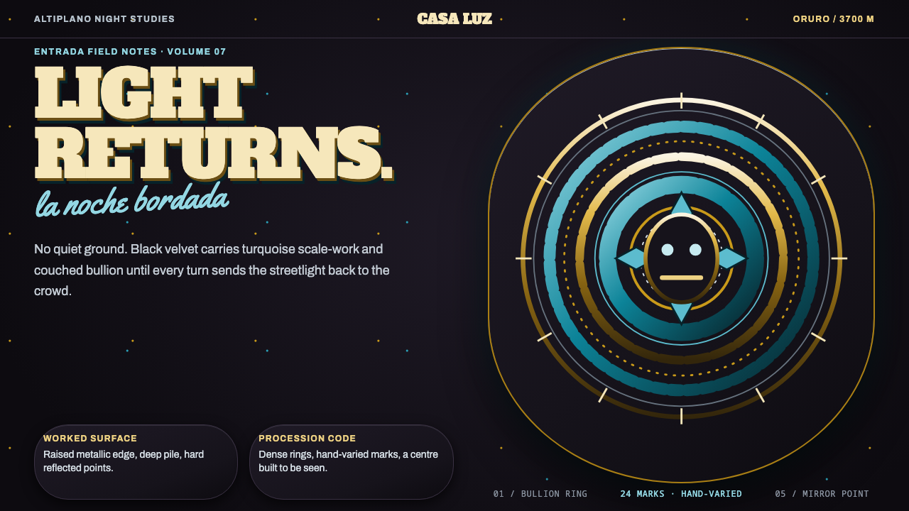 Diablada de OruroDensity throws light back. Turquoise scale-work and bullion rings electrify b…
 Bigouden CoiffeIdentity stands tall. Starched linen rises over matte black, edged in saffron…
 Russian Khokhloma Wood-Red LacquerKiln-fired ornament. Lacquer black, scarlet dots, and Playfair gold curls cro…
 Tiwi Pukumani PoleBlack ground carries ceremony. Ochre bands, pipeclay dots, and hatch stack li…
 Asmat Bisj Ancestor PoleCeremonial vertical force. Lime-white figures rise from dark wood with red-oc…