What is Hungarian Matyó Violet?
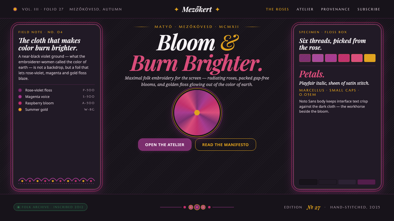
Hungarian Matyó Violet brings the density of folk embroidery to the screen — rose-violet and gold blooms packed against a near-black violet ground.
Hungarian Matyó Violet in brief
Hungarian Matyó Violet is a digital design language derived from Matyó embroidery, the folk craft associated with Mezőkövesd in northern Hungary. Its defining image is the radiating Matyó rose: a dense floral bloom worked in satin-stitch wool and silk floss on black cloth. The result is not a delicate botanical pattern but a saturated field of ornament, with almost no visual gap between one bloom and the next.
The screen translation preserves that maximalism through a near-black violet-cast ground, rose-violet and magenta flowers, and gold accents that suggest summer brightness. Dark space is not treated as empty background; it behaves like cloth, giving the embroidered color somewhere to glow. Content is framed in ornamental serif forms and embroidered cartouches, so even functional information feels enclosed within a crafted textile object.
The style depends on controlled abundance. It is floral without becoming pastoral, ornate without becoming pale or fragile, and theatrical without relying on soft atmospheric effects. The strongest compositions let a concentrated bloom field carry the visual weight, then place text in clear framed zones. Contrast comes from saturation, luminosity, and density rather than from minimal interfaces or wide untouched margins.
Where does Hungarian Matyó Violet come from?
Matyó embroidery belongs to the Hungarian folk-embroidery tradition associated with the Matyó folk community of Mezőkövesd, in Borsod-Abaúj-Zemplén county in northern Hungary. The period attached to this design language is 1900–1950, while the craft received UNESCO recognition in 2012. Those markers establish a specific cultural and regional source rather than a generic idea of Eastern European floral decoration.
The craft is defined materially by dense satin-stitch work using wool and silk floss on black cloth. Its central motif is the Matyó rose, a flower organized around a center and radiating outward. The relationship between colored thread and dark cloth is essential: the black ground, described as the color of earth, does not compete with the blooms. It gives the rose-violet field a deep base and makes every saturated petal appear more luminous.
The visual character comes from accumulation. Floral forms are packed closely, producing a gap-free surface in which ornament becomes atmosphere as well as pattern. Rose-violet and magenta carry the main floral intensity, while gold introduces a warmer, summery flash. The effect is expressive and abundant, but it remains legible because the bloom is organized around a recognizable center and repeated craft logic.
Hungarian Matyó Violet translates these qualities into a contemporary screen system without pretending that a digital interface is a literal textile. The near-black violet page becomes the cloth; saturated floral accents become the embroidered field; ornamental serif display becomes the framing language; and cartouches become containers for content. The result is a design vocabulary that honors the source through density, material suggestion, and color behavior rather than through historical imitation.
What defines the Hungarian Matyó Violet look?
Ground
The ground is near-black with a violet cast, recalling the black cloth of the embroidery while giving the digital surface a nocturnal richness. It should feel dense and tactile in mood, never like a neutral interface gray. Light text and gold details gain their authority from this depth, while the dark field allows saturated blooms to appear almost illuminated from within.
Floral Density
Ornament is packed rather than scattered. Blooms should create a continuous, saturated presence with very little accidental emptiness between forms. This density is the style’s main expressive force: it turns decoration into a field, making the page feel embroidered rather than merely decorated with floral icons.
The Matyó Rose
The Matyó rose provides the system’s organizing motif. Its visual logic is radial: a central flower expands outward through layered petals and surrounding color. Use it as a focal emblem, a repeating border idea, or a visual anchor around a title. Its strength comes from recognizable structure inside abundance, not from botanical realism.
Color
Rose-violet and magenta carry the floral voice, while gold supplies warmth and a sense of summer. The dark violet ground should remain dominant enough to make these accents feel precious. Gold works best as a deliberate glint for borders, labels, or selected details; if it spreads everywhere, it loses the concentrated brilliance that makes the palette distinctive.
Stitch and Material
The screen version should suggest satin stitch through layered color, repeated petal forms, and a sense of directional making. It does not need literal textile simulation. What matters is the impression that color has been placed by hand in a deliberate surface pattern, with the dark ground remaining visible as the supporting cloth beneath the ornament.
Typography
Ornamental serif display gives the system its ceremonial voice. Headings can feel inherited, crafted, and slightly formal, while supporting text should remain calmer and more readable. The contrast is between floral richness and typographic discipline: the type frames the abundance instead of competing with every bloom.
Cartouches and Hierarchy
Content belongs inside crafted-looking zones: cartouches, ornamental panels, framed labels, or floral-edged containers. These devices create hierarchy without stripping away the style’s decorative identity. Use the most elaborate framing for entrances and key statements, then simplify the enclosure as information becomes more operational.
Who shaped Hungarian Matyó Violet?
The embroiderer-women of Mezőkövesd are the direct makers behind the craft vocabulary. Their work is represented here through dense satin stitch, wool and silk floss, the black cloth ground, and the radiating floral discipline of the Matyó rose. The design system should acknowledge that its richness comes from practiced making, not from an abstract decorative algorithm.
The Matyó folk community gives the style its cultural ground. The visual language is not merely a palette or motif library; it belongs to a regional folk-embroidery tradition associated with Mezőkövesd. Digital applications should therefore use the forms with care, preserving their density and identity rather than reducing them to interchangeable floral decoration.
The Matyó rose is the system’s emblematic form: a bloom organized around a center and radiating outward. It gives maximal ornament a stable internal structure. In contemporary layouts it can operate as a seal, a medallion, a border rhythm, or a concentrated field behind a title.
How do you use Hungarian Matyó Violet today?
Hungarian Matyó Violet is strongest when the experience is meant to feel ceremonial, handcrafted, and richly expressive. It suits cultural storytelling, seasonal launches, hospitality, fashion, beauty, and editorial experiences that can accommodate ornament. The governing principle is not to make every surface equally busy, but to let a dense floral field establish the mood while clearer framed zones protect reading and action.
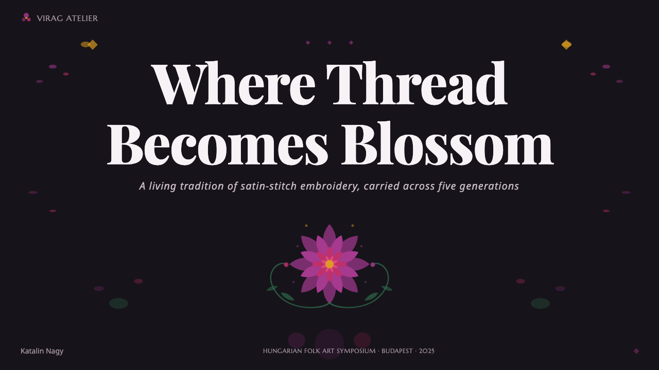
For presentation slides, use the opening slide as an embroidered entrance: a near-black violet ground, a concentrated rose or floral emblem, and an ornamental serif title held inside a cartouche. Content slides should preserve a quieter reading area within the same visual world, using floral borders or corner blooms rather than filling every available surface. Data slides can treat charts as decorated medallions or framed artifacts, with gold reserved for emphasis and rose-violet used to create visual continuity.
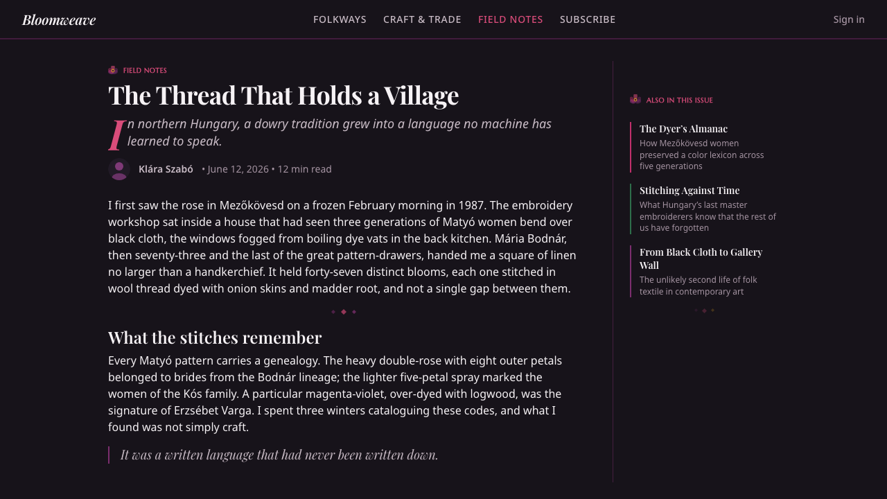
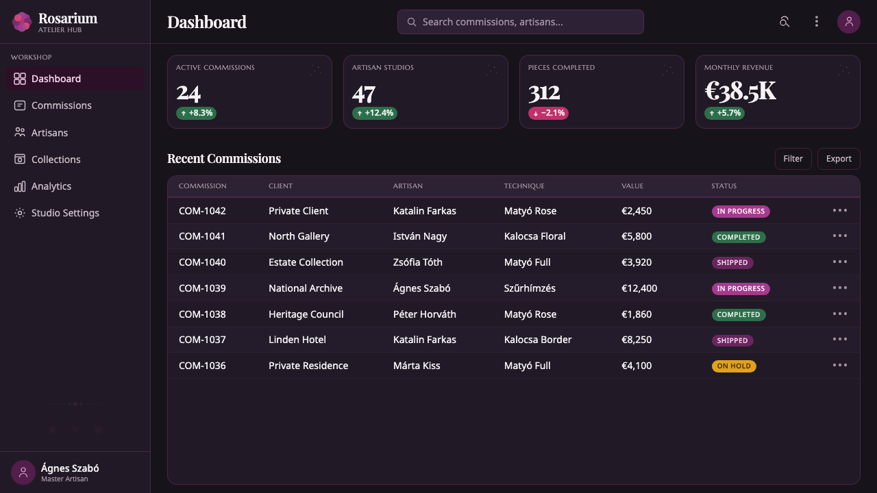
For web interfaces, the system works best for dashboards and pricing pages that need a strong sense of identity. Keep the operational surface legible, then use floral framing for the page header, selected status states, plan highlights, or featured actions. The dark ground can make panels feel like layered cloth, while the brightest accents should identify importance rather than appear on every control. Ornamental serif display belongs to titles and labels; dense body copy needs a calmer companion.
For editorial and marketing work, the style supports a vivid, collectible mood. Articles can use a dark opening spread with a large Matyó rose, then move into framed sections where ornamental details mark transitions and cultural notes. Campaign pages can alternate between full floral fields and quieter dark panels, creating rhythm through density. Gold is especially effective for invitations, badges, dates, and calls to attention when it remains a selective sign of value.
The common mistake is treating Matyó Violet as permission to cover every surface with flowers, magenta, and gold at once. That produces noise rather than embroidery. A convincing application needs a dominant dark cloth-like ground, a clear floral center, and an intentional distribution of ornament. It should also avoid generic folk styling: the Matyó rose, satin-stitch density, black cloth association, and specific rose-violet palette are the features that give the system its identity.
Hungarian Matyó Violet — FAQ
Is Hungarian Matyó Violet the same as using generic folk flowers?
No. Its identity depends on a specific source: Matyó embroidery from Mezőkövesd. The defining combination is the radiating Matyó rose, dense satin-stitch character, wool and silk floss, black cloth ground, and rose-violet floral intensity. Generic flowers may borrow the mood, but they do not carry the same cultural or structural specificity.
Why is the background so dark?
The dark ground recalls the black cloth used in the embroidery and the color of earth associated with that ground. It also performs a practical visual role: rose-violet, magenta, and gold become more luminous and concentrated against it. A pale background would change the relationship from glowing embroidery to ordinary floral decoration.
Can this style be used for a restrained interface?
Yes, if restraint is created through hierarchy rather than by removing the identity of the style. Keep the main operational areas calm, place ornament around entrances and key states, and reserve the brightest colors for meaningful emphasis. The interface can remain clear while the framing, ground, and floral density provide the richer cultural voice.
How should gold be used?
Gold should behave like a selective glint of value. It works well on borders, badges, labels, featured figures, and calls to attention, especially against the near-black violet ground. If every heading, icon, and control receives gold, the accent stops feeling precious and the rose-violet field loses its dominance.
Where does Hungarian Matyó Violet struggle?
It struggles where extreme neutrality, sparse information, or quiet technical authority is the main goal. Its density and ceremonial ornament can feel excessive in highly utilitarian tools or products that need visual silence. It is strongest when the product welcomes craft, cultural specificity, celebration, and a sense that the interface itself has been made rather than merely assembled.
Related design styles
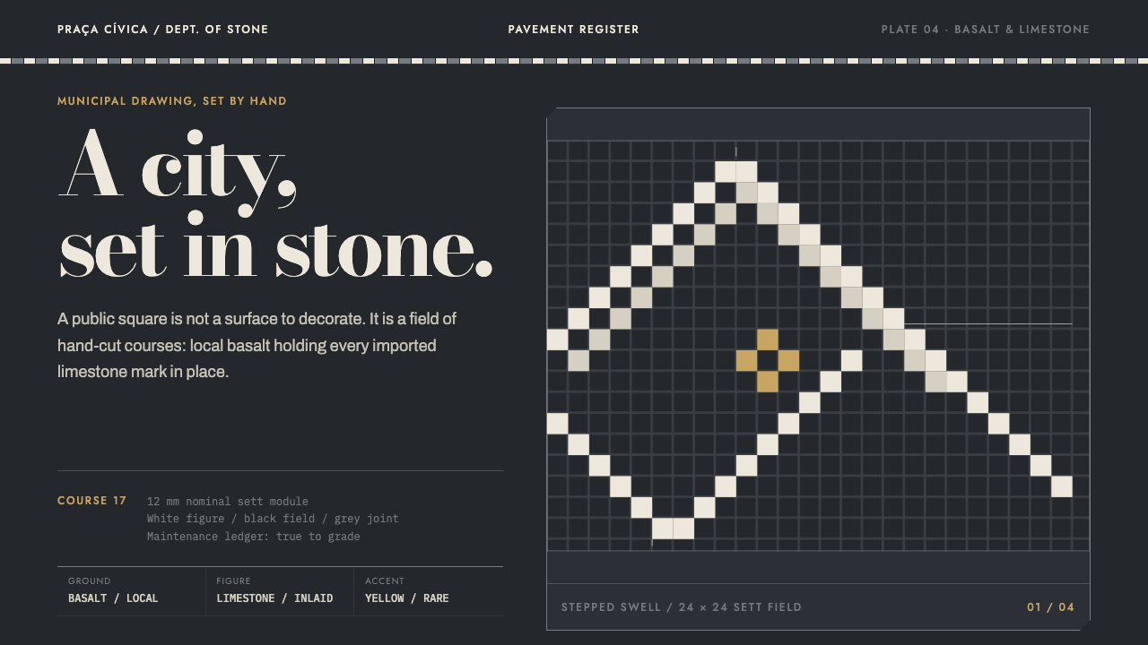 Calçada PortuguesaA city drawn in stone. Stepped limestone courses cut across a basalt grid.
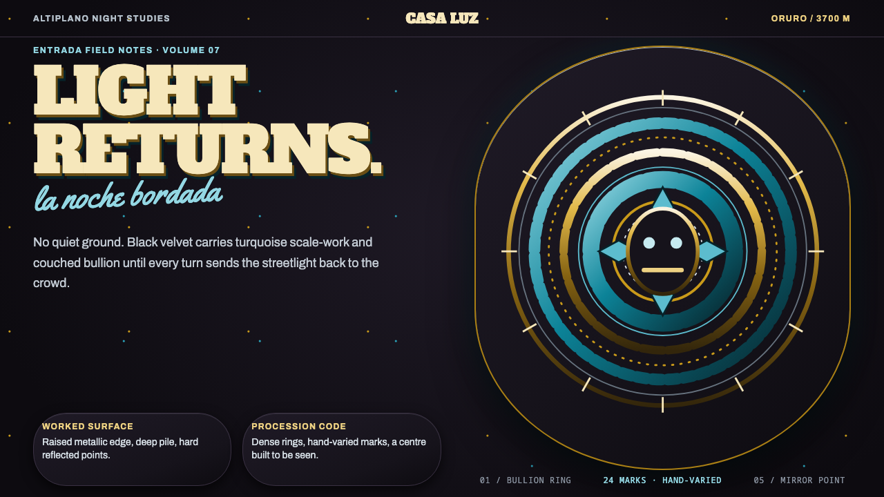 Diablada de OruroDensity throws light back. Turquoise scale-work and bullion rings electrify b…
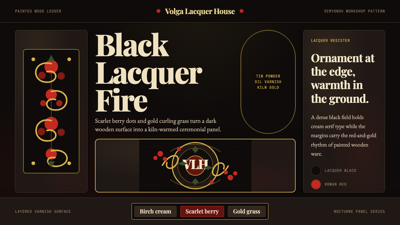 Russian Khokhloma Wood-Red LacquerKiln-fired ornament. Lacquer black, scarlet dots, and Playfair gold curls cro…
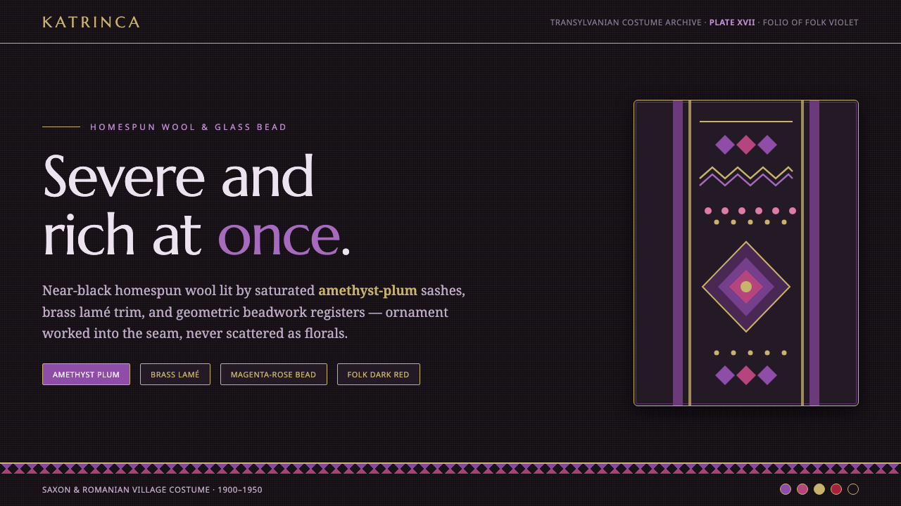 Romanian Folk VioletSevere and rich at once. Near-black homespun wool lit by amethyst-plum and br…
 Russian KhokhlomaOrnament is the message. Antique gold curls and crimson dots crowd a black la…
 Slavic Firebird FolkloreNever bare paper. Crimson-gold firebird plumage glows in gilt folk borders on…