What is Game of Thrones (2011)?
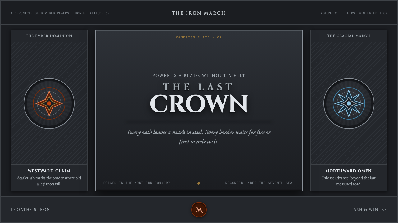
Game of Thrones forges a continental struggle for power into cold metal, where carved Roman capitals stand between dragonfire ember and advancing glacial ice.
Game of Thrones (2011) in brief
Game of Thrones is a dark-fantasy visual language built from forged surfaces, heraldic authority, and weather as emotional pressure. Its ground is brushed gunmetal rather than neutral darkness: a hard, worked surface that suggests armor, blades, gates, and the accumulated weight of dynasties. House sigils appear like die-struck marks pressed into metal, making identity feel inherited, official, and difficult to escape.
The style opposes two kinds of force. Ember is the only real warmth: dragonfire bleeding through the cold, small but dangerous because it promises transformation as much as comfort. Pale glacial ice forms the counterforce, creeping south with the dead and turning winter into a visible political fact. Between them sits the throne, imagined as a mass of blades that rewards ambition while warning against ease.
Its typography is equally severe. Roman capitals read as though quarried from stone or cut into a monumental lintel, not drawn for casual conversation. Symmetry, central axes, sharpened silhouettes, and hard divisions create the impression of a campaign map sealed in wax and carried through a hostile climate. The result is not decorative medieval fantasy; it is prestige television branding shaped as a material argument about power.
Where does Game of Thrones (2011) come from?
The visual world belongs to Game of Thrones, the HBO series that ran from 2011 to 2019 and drew from source novels published from 1996 onward. That span matters because the style is designed to feel both ancient and contemporary: feudal symbols, blades, seals, and heraldry are presented through the controlled finish of premium-cable production rather than through nostalgic costume fantasy.
Its production geography links Belfast and Northern Ireland with Iceland, while its identity also belongs to American premium-cable television. Those locations support the visual opposition at the center of the system. Northern stone, ironwork, and fortified weight imply an inhabited political world; Icelandic ice supplies the larger, impersonal threat that presses against it.
The supplied movements describe the style precisely: dark-fantasy naturalism, heraldic revival, medieval-realist screen design, and prestige-TV branding. Dark fantasy keeps the world cold, consequential, and resistant to ornamental comfort. Heraldic revival gives factions a legible grammar of crests and seals. Medieval realism privileges worn material, stone, steel, and weather over polished storybook fantasy.
George R. R. Martin, David Benioff, D. B. Weiss, Michele Clapton, and Deborah Riley are the key figures associated with this source material. Together, the listed context points to a style that must carry many houses, territories, claims, and threats without losing its central visual law: power is heavy, old, contested, and always exposed to fire and winter.
What defines the Game of Thrones (2011) look?
Forged Ground
The background should feel brushed, hammered, or weathered rather than empty. Gunmetal is the governing sensation: dark, cool, restrained, and visibly worked. It gives type, sigils, and fire a surface to resist, making every bright element appear earned rather than casually decorative.
Ember and Ice
Warmth is scarce and therefore meaningful. Ember should appear as a contained bleed, spark, or edge of dragonfire against the cold field; glacial ice should remain pale, remote, and invasive. These are not cheerful accents but opposing narrative temperatures, each carrying danger.
Chiseled Capitals
Roman capitals are monumental rather than friendly. They should look carved, stamped, or extracted from stone, with enough spacing to let each letter behave like an architectural fragment. The voice is formal and declarative: a title, decree, map label, or oath, never an informal aside.
Heraldic Relief
House identity belongs in seals, crests, impressed marks, and raised relief. A sigil should feel inherited and official, as though it has passed through armor, banners, gates, and correspondence. Avoid playful iconography; the symbol must imply allegiance, territory, and consequence.
Blade Symmetry
Composition favors central axes, bilateral balance, and sharpened division. The effect should resemble a sword, shield, or formal campaign map: stable at first glance, but severe enough to suggest a trap. Rounded softness weakens the system because this world is built on edges and pressure.
Weathered Authority
Material age is essential. Stone, steel, wax, and ice should feel exposed to time and climate, not newly manufactured for display. The visual atmosphere becomes credible when surfaces carry cold, abrasion, and weight while retaining enough order to communicate rank and command.

Who shaped Game of Thrones (2011)?
Martin is listed among the key figures, and the source-novel timeline beginning in 1996 anchors the world beneath the series. In this visual system, that literary continuity is felt through dynasties, inherited sigils, old claims, and a throne whose material menace exceeds any single occupant.
Benioff appears in the supplied group of key figures for the HBO series. His presence belongs to the production context in which a continent-spanning conflict must remain legible on screen, using hard material contrast, house markers, and a persistent visual tension between ember and frost.
Weiss is likewise named as a key figure in the series context. The style associated with that context must hold political struggle and supernatural winter within one durable frame: metallic authority at the center, fire at one margin, and ice advancing from the other.
Clapton is included among the key figures supplied for the production. Within the stated medieval-realist and heraldic framework, clothing, insignia, and material presence belong to the same visual argument as the branded image: rank is worn, allegiance is marked, and warmth is never without risk.
Riley is named among the project’s key figures. The supplied visual world depends on environments that make power architectural: stone, fortification, iron, cold distance, and spaces where a central seat can look less like comfort than a weapon waiting to be claimed.
How do you use Game of Thrones (2011) today?
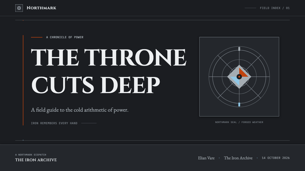
For presentation covers, use a centered or strongly axial composition on a cold metallic field. Let one monumental title carry the page, with a restrained crest, blade-like divider, or distant ember at the edge. The cover should feel sealed and official, as if it announces a campaign rather than invites casual browsing. Keep the principal contrast between cold ground and one controlled source of heat.
For content slides, turn the system into a hierarchy of decrees and map labels. Use chiseled capitals for section-level statements, then quieter supporting text beneath them. Data slides benefit from the same discipline: charts should read as tactical instruments, with glacial and ember cues reserved for meaningful opposition, warning, escalation, or change. Decorative flourishes dilute the feeling of command.
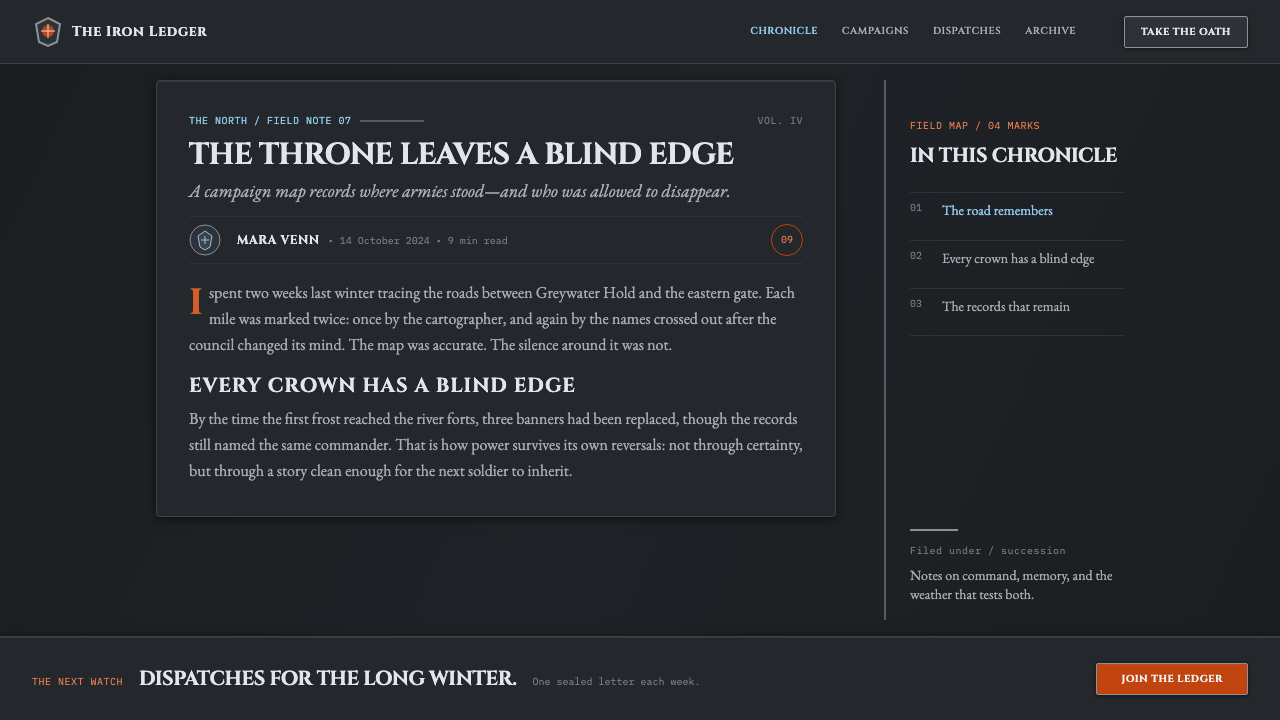
For web interfaces, this style suits strategy dashboards, world-building archives, premium membership pages, and analytical views that need atmosphere without losing structure. Use a dark metal ground sparingly, establish clear panels with hard boundaries, and treat crests or seals as navigation markers for domains, factions, or categories. Interactive emphasis should feel like a forged signal, not a glowing entertainment control.
For editorial and marketing work, frame long-form material as a campaign record. Lead with a severe title, use rules and crests to divide chapters, and allow weathered imagery or embossed motifs to sit in the margins. Marketing pages can alternate between cold authority and carefully rationed ember, making an announcement feel consequential without turning every section into spectacle.
The common mistake is to equate the style with generic darkness. Flat black, random flames, decorative medieval lettering, and excessive battle ornament lose the source’s tension. The system works because cold metal, heraldic order, carved type, ember, and ice are held in deliberate restraint. Fire must remain rare; ice must feel inevitable; every sharp edge must support the claim that power cuts.
Game of Thrones (2011) — FAQ
Is this style simply medieval fantasy?
No. Medieval references are present through heraldry, blades, wax seals, stone, and fortified authority, but the supplied framework is medieval-realist screen design rather than decorative revivalism. The crucial difference is material seriousness. Objects should feel used, cold, political, and exposed to weather, not theatrical props collected for atmosphere.
Can the style work without dragon imagery?
Yes. Dragonfire is one expression of ember, not the only requirement. The deeper structure is the tension between scarce warmth and overwhelming cold. A contained glow, a heated metal edge, or a small fire-like accent can preserve that role if the surrounding field remains metallic, restrained, and threatened by ice.
Why are Roman capitals so important here?
They make language feel monumental and institutional. In the supplied description, the capitals are chiseled from stone, which transforms a title from mere text into a physical assertion. They support the visual claim that houses, territories, and political stakes are older and heavier than the immediate scene.
Does a dark background automatically create the Game of Thrones mood?
No. Darkness alone is empty. The mood comes from a specific material and narrative structure: brushed gunmetal, embossed heraldry, carved capitals, and a controlled opposition between ember and glacial ice. Without those relationships, a dark layout can become generic, sleek, or merely gloomy rather than forged and politically charged.
Where does this style work best in contemporary design?
It works best where authority, conflict, territory, or long-term stakes are central to the message: strategy products, game-world archives, event campaigns, premium dashboards, and editorial narratives. It is less suitable for contexts that require immediate warmth, softness, or everyday ease, because its strongest qualities are pressure, distance, and consequence.
Related design styles
 Disco ElysiumNoir rot glows from within. Amber Caslon type cuts through varnish-dark umber.
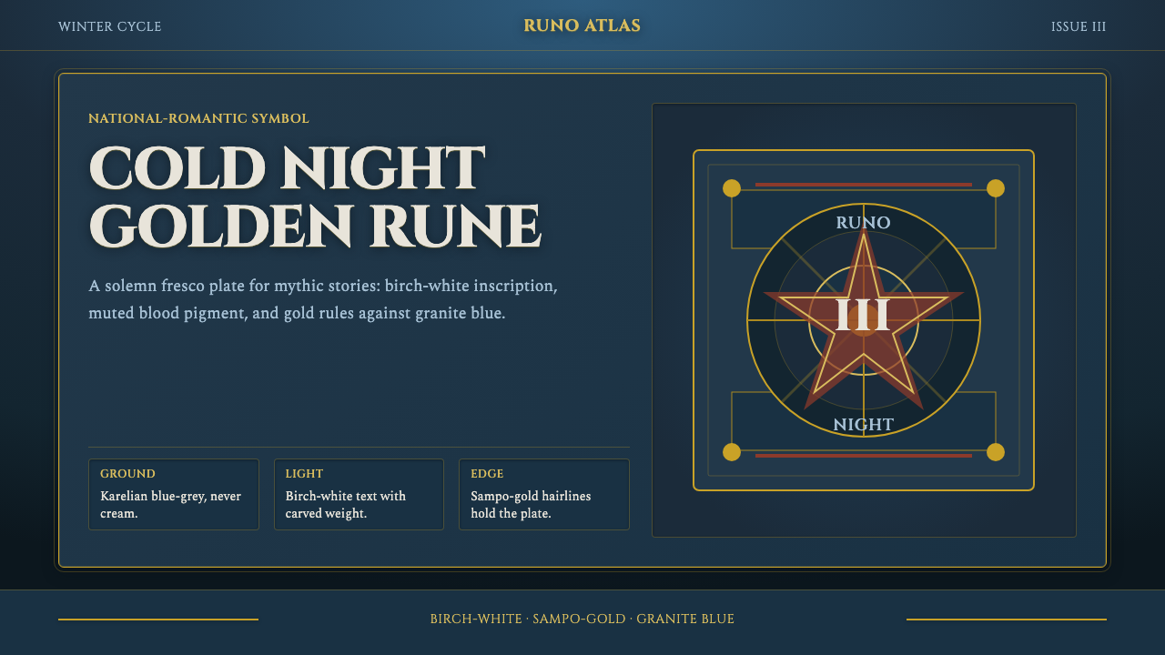 Finnish Kalevala EpicEpic weight in cold night. Birch-white Cinzel, Sampo-gold rules, blue-grey fr…
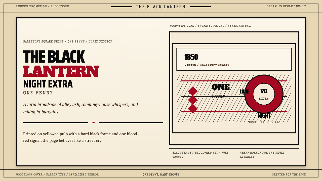 Penny Dreadful Victorian Headline (1850)Cheap terror in full cry. Condensed wood-type, black borders, and one blood-r…
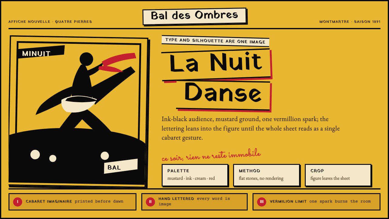 Toulouse-Lautrec Belle ÉpoqueNight becomes gesture. Mustard ground, black silhouette, hand lettering, one…
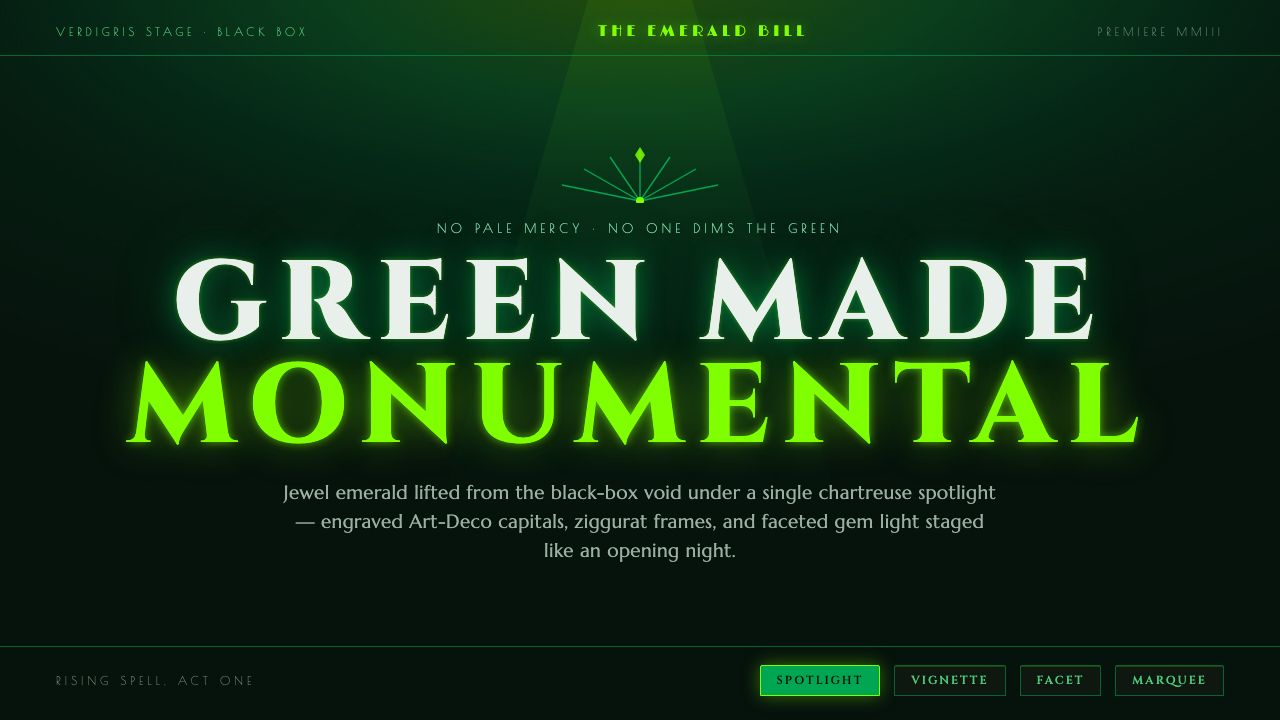 Wicked Elphaba EmeraldGreen made monumental. Jewel emerald spotlit on a black-box void, in engraved…
 Egyptian Political PosterState power shouts. Red poster grids, black keylines, kufic type, gold-green…