What is Michelangelo Sistine Ceiling (1512)?
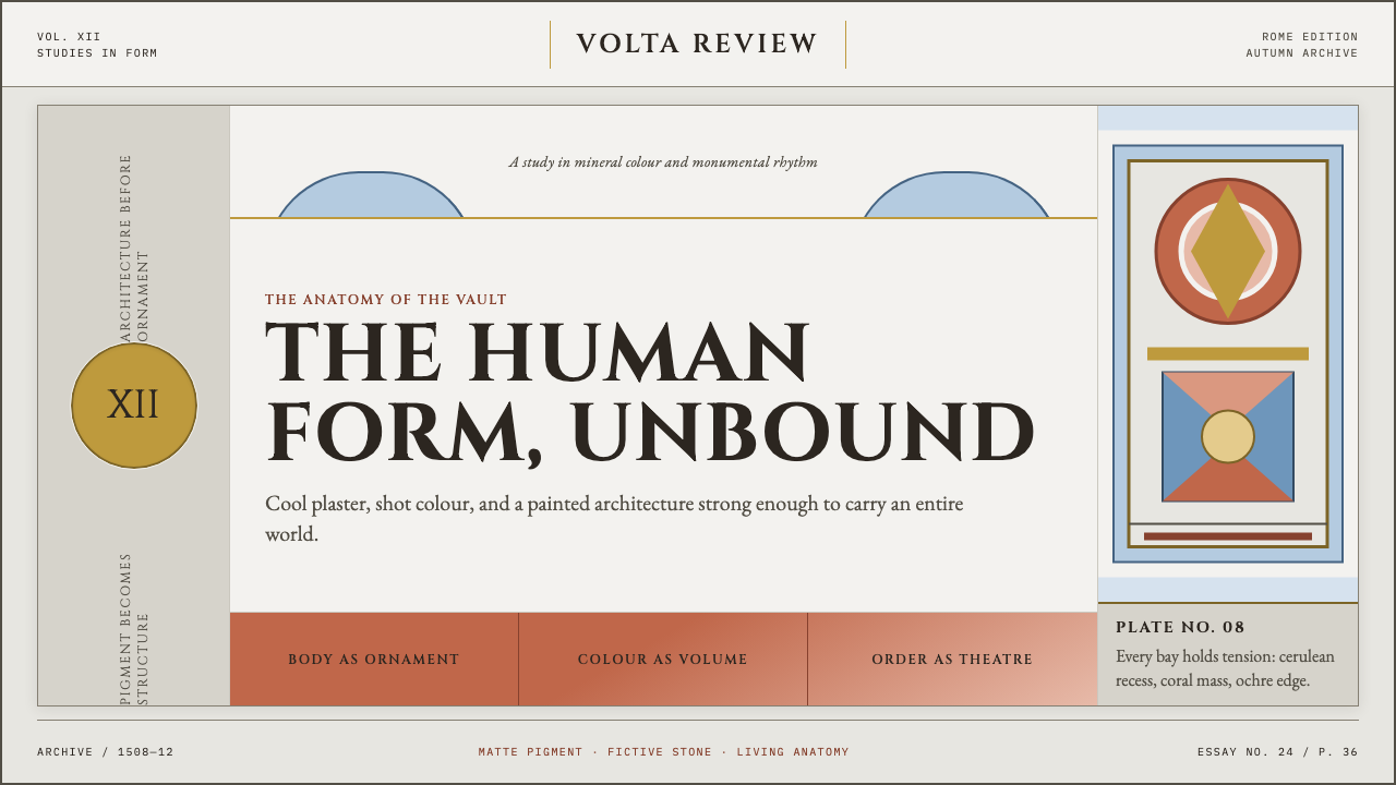
Michelangelo Sistine Ceiling (1512) treats paint as sculpture — coral, cerulean, and ochre figures straining against a cool plaster grid, with not a trace of gloss or gilt anywhere.
Michelangelo Sistine Ceiling (1512) in brief
This is a design system troweled directly onto the vault Michelangelo painted between 1508 and 1512: roughly three hundred figures muscling across a fictive marble architecture on raw lime plaster. Everything sits on a cool gray-white ground, the plaster itself rather than a warm cream or ivory, and the whole composition is built from cangiante coloring, a technique where a fold of drapery shifts to an entirely different hue in shadow rather than simply darkening — coral that turns lilac, not coral that turns brown.
The palette runs coral, apple-green, cerulean sky-blue, and golden ochre, all pitched at a bright, matte intensity rather than a moody, candlelit dimness. This is closer to how the ceiling actually reads today, after a late-twentieth-century cleaning stripped away centuries of soot and darkened varnish and revealed colors far brighter than anyone alive had ever seen on it — startling, high-key, and impossibly alive.
The fictive architecture — painted cornices, pilasters, and thrones that do not exist in physical stone — keeps rigorous, almost obsessive order, dividing the surface into a coherent grid of panels, spandrels, and lunettes. The human figures are the only thing allowed to be unruly: twisting, straining, overlapping the painted architecture's edges. Nothing is glossy and nothing is gilt. This is fresco pigment, weighty and sculptural, closer to carved stone than to the glittering gold-ground mosaics of earlier Christian art.
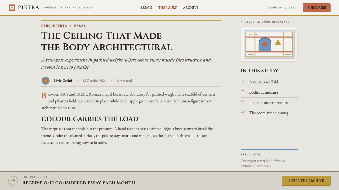
Where does Michelangelo Sistine Ceiling (1512) come from?
Pope Julius II commissioned Michelangelo to repaint the ceiling of the Sistine Chapel starting in 1508. Julius, a forceful patron remembered for using art and architecture to assert papal authority, pushed the project forward despite Michelangelo's own protests that he considered himself a sculptor rather than a painter and had never attempted a fresco of this scale.
That protest undersold his training. As a teenager, Michelangelo had apprenticed in the workshop of Domenico Ghirlandaio, one of the leading fresco painters in Florence, where he would have absorbed the true fresco technique, painting pigment directly into wet plaster so that it binds into the wall itself as it dries, rather than sitting on top as a later coating. That early grounding gave him the technical foundation the Sistine commission would demand at a far larger scale.
The ceiling posed a design problem as much as a painting one: nine central narrative panels from the Book of Genesis had to sit coherently alongside flanking prophets, sibyls, and spandrels filled with the ancestors of Christ, all legible to a viewer standing nearly seventy feet below and looking up at a sharp angle. Michelangelo's solution was quadratura, painted illusionistic architecture, cornices, thrones, and pilasters that do not exist in physical stone, used to impose a coherent grid on an otherwise unmanageable curved surface.
Centuries of candle smoke, dust, and old glue varnish gradually darkened the ceiling into somber browns, the version most people encountered for generations. A major restoration carried out in the 1980s and completed in 1994 removed that grime and revealed the vivid, high-key cangiante palette now associated with the work — a change so dramatic that some observers initially argued the cleaning had gone too far, before scholarly consensus settled on the brighter surface as authentic. The sixteenth-century biographer Giorgio Vasari, whose Lives of the Artists remains the primary early account of Michelangelo's career, had already recorded how overwhelming the ceiling's impact was on viewers even in its later, darker state.
What defines the Michelangelo Sistine Ceiling (1512) look?
Cangiante Color
Shadow is rendered by shifting a color to a different hue entirely rather than simply darkening it — a coral robe turns lilac in its folds, not a deeper coral. This produces a shot-silk shimmer across drapery without any actual sheen or gloss on the surface itself.
Palette
Coral, apple-green, cerulean sky-blue, and golden ochre carry nearly all of the color work, set against a cool gray-white ground rather than a warm cream. The palette is bright and saturated but always matte, never glossy or metallic.
Fictive Architecture
Painted cornices, pilasters, and thrones that do not physically exist impose a rigorous grid on the surface, dividing it into panels, spandrels, and lunettes. This structure is the system's orderly skeleton, holding chaos in check.
Figural Density
Roughly three hundred human figures fill the vault, twisting and overlapping across the fictive architecture's edges. The figures, not the frame, are where all visual energy and ornament concentrate.
Matte, Sculptural Surface
There is no gloss, no metallic sheen, and no gilding anywhere in the system — a deliberate contrast with the gold-ground mosaics of earlier Christian art. Surfaces should read as weighty and carved rather than reflective.
Structure vs. Ornament
The architecture stays rigorously geometric and orderly; the figures alone carry expressive, ornamental energy. Applying this system means keeping a strict structural grid while letting figural or illustrative elements be the only place where movement and drama occur.

Who shaped Michelangelo Sistine Ceiling (1512)?
The sculptor-turned-painter who executed the entire ceiling between 1508 and 1512, largely working alone at great physical cost. His cangiante coloring technique and his treatment of fresco figures as sculptural forms in paint define the system's core visual logic.
The forceful patron who commissioned the ceiling and pushed the project forward against Michelangelo's own reluctance, using large-scale art commissions as a tool for asserting papal authority and prestige.
The leading Florentine fresco painter in whose workshop Michelangelo apprenticed as a teenager, gaining the true fresco technique — pigment applied to wet plaster — that made the Sistine commission technically possible.
The sixteenth-century painter and biographer whose Lives of the Artists remains the primary early account of Michelangelo's life and process, recording contemporaries' overwhelmed reactions to the ceiling even before its late-twentieth-century cleaning.
How do you use Michelangelo Sistine Ceiling (1512) today?
This system suits any context that wants to feel monumental, authoritative, and physically weighty rather than light or decorative — cultural institutions, publishing, and premium editorial brands are natural fits, since the style communicates gravity through structure and figure rather than through logos or icons.
For presentation slides, a cover benefits from a cool gray-white ground with a single bold figure or fragment rendered in the cangiante palette, framed by a hint of fictive architectural molding along one edge. Content slides should keep the same rigorous grid logic as the painted architecture — a strict structural framework with all expressive energy concentrated in imagery or a single data highlight, never in decorative borders.
For web interfaces, the fictive-architecture principle translates into a firm structural grid for navigation and cards, kept deliberately plain and orderly, while any illustrative or photographic content is where richness and movement are allowed to live. Buttons and interactive elements should stay matte and flat, never glossy or gradient-filled, in keeping with the system's rejection of sheen.
For editorial and marketing work, this style rewards large-scale, confident imagery paired with generous negative space rendered in the cool gray-white ground tone, plus pull quotes or headlines treated with the same weight as a carved inscription rather than a light, floating caption.
A common mistake is adding gloss, gradient, or metallic shine to make the palette feel more 'premium' — this directly contradicts the system's identity, which draws its authority from matte, weighty, unglazed surfaces. Another is treating the architectural framing as decorative rather than structural; it should organize the page the way it organizes the ceiling, not simply border it.
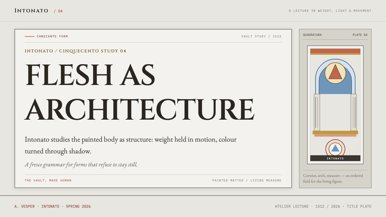
Michelangelo Sistine Ceiling (1512) — FAQ
What exactly is 'cangiante' coloring, and why does it matter?
Cangiante is a coloring technique where a form's shadowed areas shift to a different hue entirely rather than a darker shade of the same color — a coral robe's folds turn lilac instead of deep coral-brown. It matters because it is the mechanism behind the ceiling's shimmering, jewel-like quality: the color shift reads as light and movement without any actual gloss or sheen on the paint surface.
Why does the system insist on no gloss and no gilding?
The ceiling deliberately breaks from the gold-ground mosaic tradition of earlier Christian art, where light and holiness were signaled through literal reflective gold. Michelangelo, trained as a sculptor, instead treats paint as if it were carved stone — weighty, matte, and physical. Introducing gloss or gilt would import exactly the visual logic this system was designed to move past.
Are the bright colors we see today historically accurate, or did the restoration change the work?
Centuries of candle smoke and old varnish had darkened the ceiling into somber browns long before the twentieth century, so most people's mental image of it came from that darkened state. The restoration completed in 1994 removed that accumulated grime rather than repainting anything, and scholarly consensus now holds that the brighter, high-key palette it revealed is the authentic original, not an alteration.
Does applying this style require literally painting human figures?
No — the transferable core is the relationship between a rigorous fictive-architecture grid and a single zone of concentrated expressive energy, plus the cangiante color logic and matte, gilt-free surface treatment. A layout can apply those structural and color principles to photography, illustration, or data visualization without literal figural painting.
Related design styles
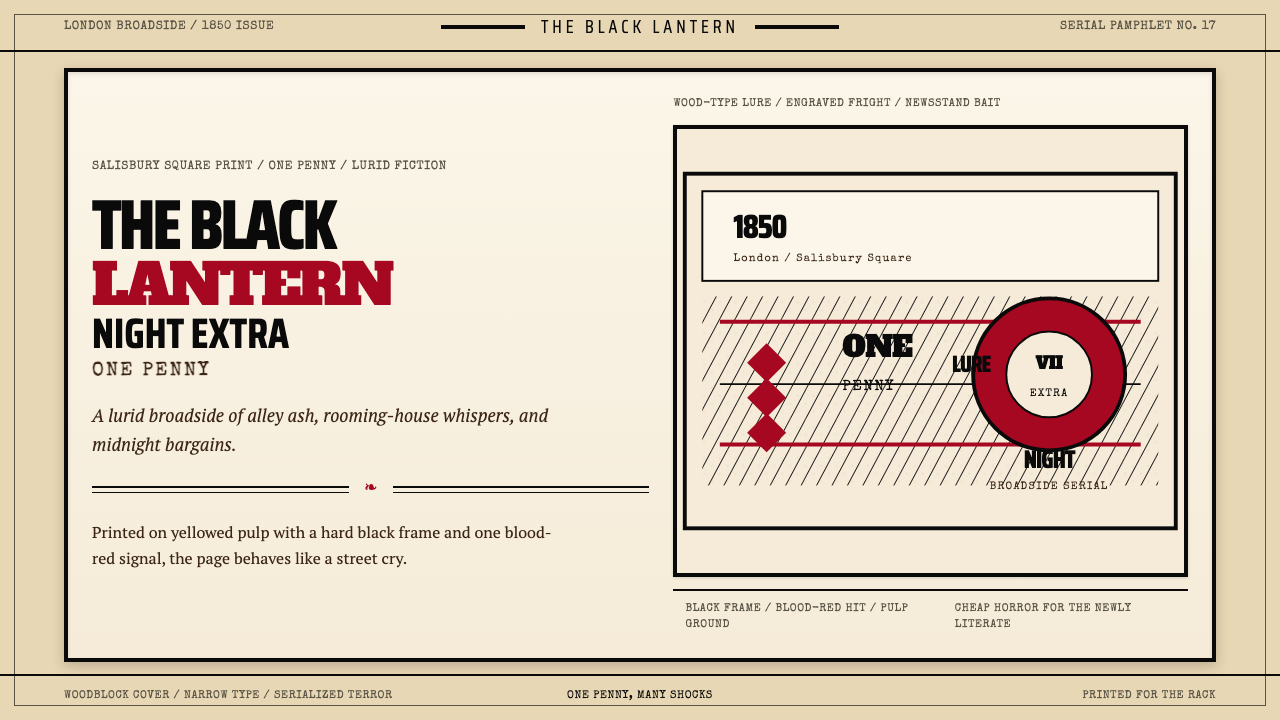 Penny Dreadful Victorian Headline (1850)Cheap terror in full cry. Condensed wood-type, black borders, and one blood-r…
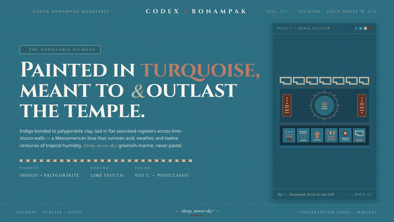 Maya Blue PigmentDeep, never sky. Saturated turquoise mural fields, ochre cartouches, carved-s…
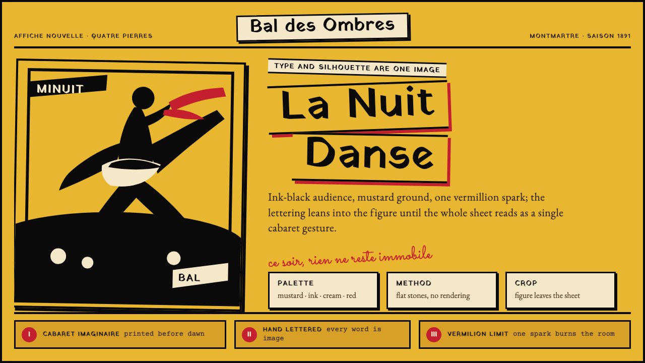 Toulouse-Lautrec Belle ÉpoqueNight becomes gesture. Mustard ground, black silhouette, hand lettering, one…
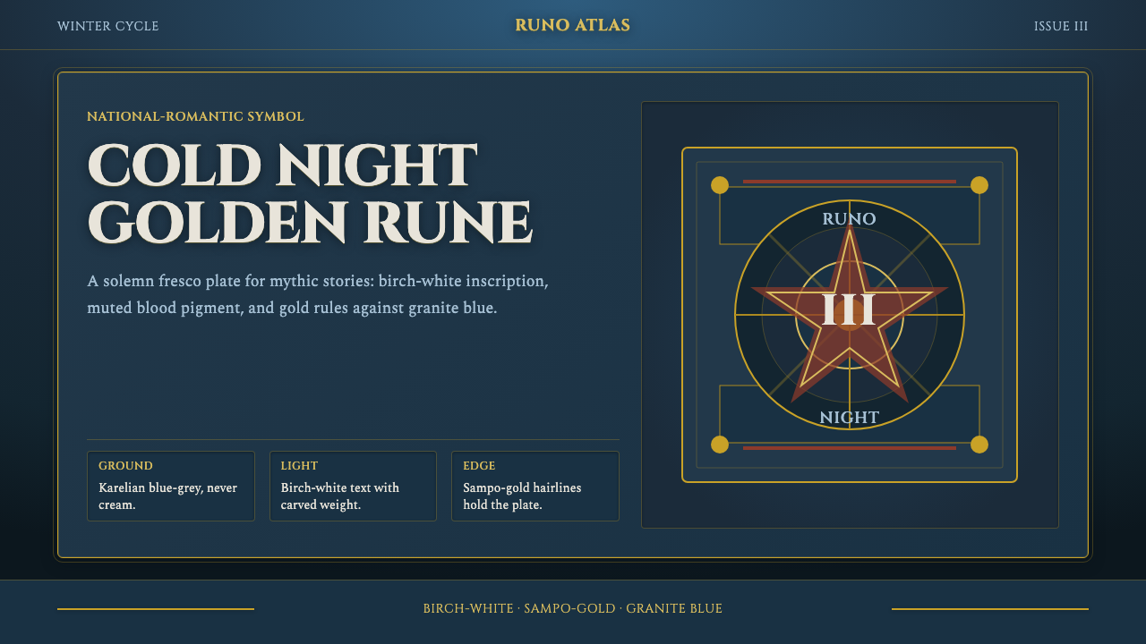 Finnish Kalevala EpicEpic weight in cold night. Birch-white Cinzel, Sampo-gold rules, blue-grey fr…
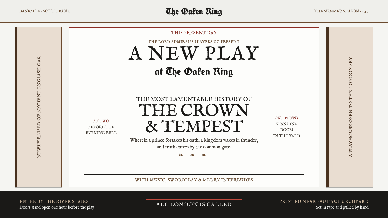 Shakespeare's Globe (1599)One sheet bellows like a barker. Fell type, press-black ink and one struck ox…
 Alice in Wonderland (1865)Madness, impeccably typeset. Scarlet heraldry cuts through a chalky mauve eng…