What is Alice in Wonderland (1865)?
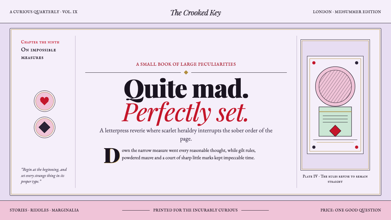
Alice in Wonderland turns Victorian engraving into a disciplined dream: scarlet court heraldry, spade-black authority, and a powdered mauve page that remains perfectly composed while reason slips away.
Alice in Wonderland (1865) in brief
Alice in Wonderland is a storybook-derived visual language rebuilt from John Tenniel’s illustrations for the 1865 first Macmillan edition. Its governing image is not a modern fantasy scene but a printed page: fine wood-engraved linework, tightly controlled cross-hatching, ornamental initials, and figures or emblems that appear to have been pressed into paper rather than painted onto a screen. The interface should feel discovered inside an old volume, where every panel belongs to the same illustrated world.
Its character comes from a deliberate split between dream and court. The dream field is chalky, powdered, and softly muted, led by mauve and rose impressions that suggest aged paper, faded ink, and theatrical unreality. Against it, the Queen’s world arrives in flat heraldic scarlet and spade-black. These court colors are not a general-purpose rainbow; they are interruptions, signals of decree, game rules, accusation, and ceremonial absurdity.
The style is whimsical without becoming casual. Decorative detail is welcome only when it behaves like print craft: a dropped initial opening a passage, a frame suggesting an illustrated chapter, a suit symbol acting as an emblem, or cross-hatching lending a form engraved depth. The central tension is essential: Wonderland is mad, but its typography is exacting. Disorder belongs to the narrative atmosphere; the reading experience remains lucid, deliberate, and quietly formal.
Where does Alice in Wonderland (1865) come from?
The source places this visual world in London, England, and identifies the 1865 first Macmillan edition as its defining edition. That date matters because the style is anchored in a particular printed artifact rather than in an abstract idea of childhood fantasy. A useful contemporary adaptation therefore begins with the page as an object: paper-like grounds, ink-led marks, illustrated margins, and typography that appears to have been considered before any decorative flourish was added.
John Tenniel is the central visual reference. The source describes the interface as Tenniel’s 1865 Wonderland rebuilt, and dates the Tenniel plates from 1864 to 1871. This span gives the style its engraved continuity: line, hatch, silhouette, ornament, and page composition should read as parts of one illustration practice. A digital application does not need to imitate every mark literally, but it should retain the sense that imagery was made by an engraver’s hand and organized for print.
The source places the work at the meeting point of Victorian book illustration, the Golden Age of wood engraving, and English nonsense literature. Those three labels explain why the style can be both elaborate and readable. Victorian illustration supplies the bookish formality; wood engraving supplies the language of line and cross-hatched value; nonsense literature supplies the destabilizing humor, playing-card logic, and dreamlike refusal of ordinary proportion.
Four names are listed as key figures: John Tenniel, Lewis Carroll, the Dalziel Brothers, and Alexander Macmillan. In a public style guide, those credits should remain visible as part of the work’s provenance rather than be flattened into a generic fantasy moodboard. The relevant inheritance is a printed collaboration: literary absurdity, illustrated interpretation, engraving craft, and edition-making converge in a visual system whose apparent eccentricity is held together by exceptionally careful composition.
What defines the Alice in Wonderland (1865) look?
Engraved Linework
Fine linework is the primary image-making device. Forms should appear described by hairline contours, short ruled strokes, and accumulations of marks rather than by smooth painted surfaces. The line is precise but never sterile: it carries the small irregularity and narrative density of an engraved illustration. Use it for borders, creatures, botanical fragments, portrait-like silhouettes, and small explanatory motifs. Avoid glossy rendering or broad digital airbrush effects, which erase the printed premise.
Cross-Hatched Shade
Depth comes from cross-hatching, not atmospheric blur. Parallel marks establish a surface or a shadow; a crossing set deepens it; changes in spacing create a quiet transition between light and dark. This gives illustrations a tactile, hand-worked character while keeping the image legible as ink on paper. Hatching should follow the structure of a form and remain visibly made of lines. It is descriptive evidence, not a decorative texture sprayed uniformly across the page.
Court Heraldry
Scarlet heraldry and spade-black form the sharpest visual register. They belong to the Queen’s court and should enter with purpose: an alert, a rank marker, a decisive action, a chapter interruption, or a suit-based emblem. Their flatness is important. These colors should feel stamped, cut, or printed as ceremonial signs, not illuminated as cinematic effects. The contrast against the subdued dream field creates authority precisely because it is rare and uncompromising.
Powdered Dream Field
Mauve and rose create the dream register: chalky, softly aged, and slightly theatrical rather than sugary or sentimental. This field should support reading instead of competing with it. It can suggest faded paper, a dusk-tinted illustration ground, or a reverie seen through print dust. Keep its mood quiet enough for black engraving to remain crisp. When the dream field becomes too vivid, it stops functioning as atmosphere and begins to overpower the book-derived hierarchy.
Ornamental Typography
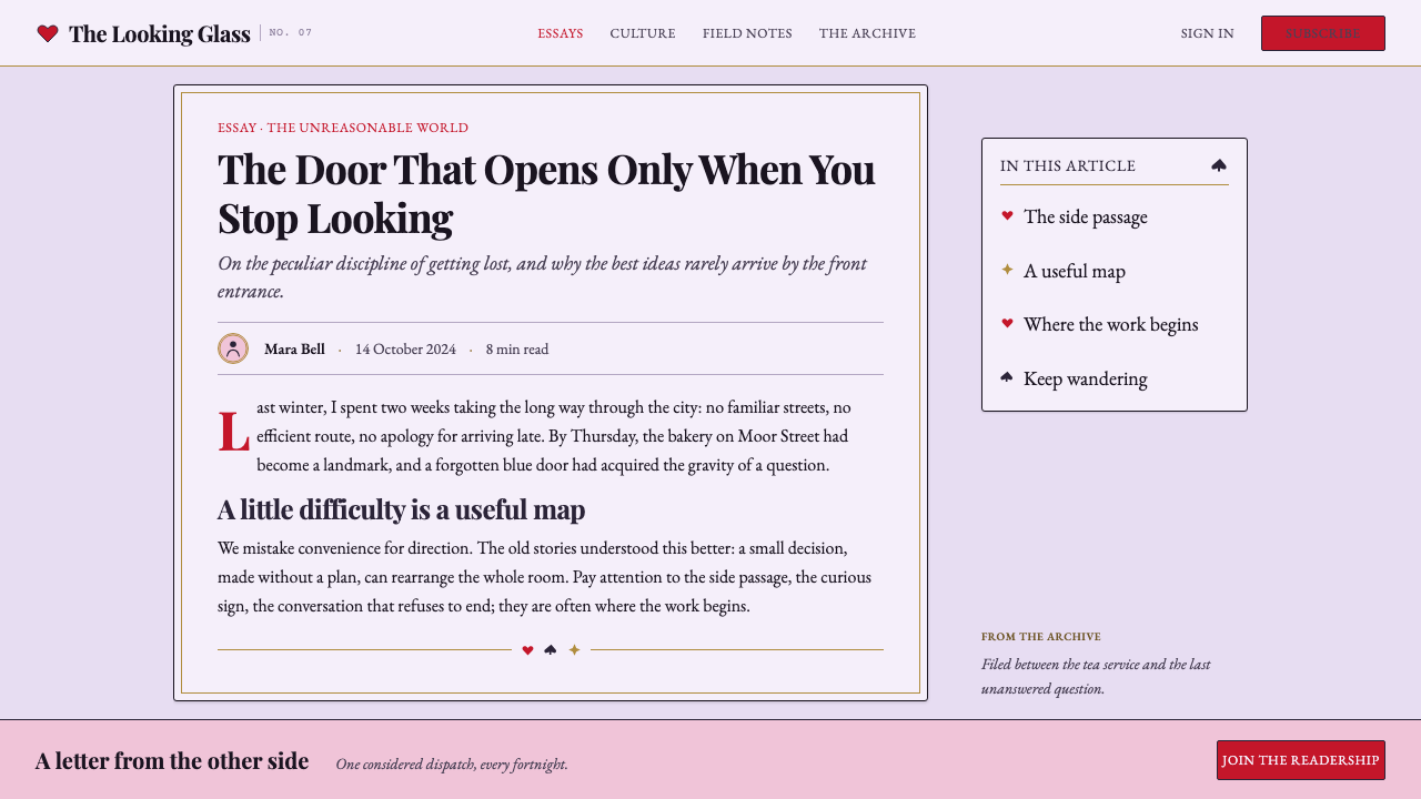
Typography carries the discipline that keeps the style from becoming visual noise. Ornamental drop-caps may introduce a chapter or opening paragraph, but ordinary reading text should remain orderly and composed. The contrast between elaborate initials and calm text blocks creates a storybook cadence: ceremony at the threshold, clarity thereafter. Treat type as part of the printed architecture, aligned with illustration and margin space, rather than as a floating overlay placed after the image is finished.
Playing-Card Motifs
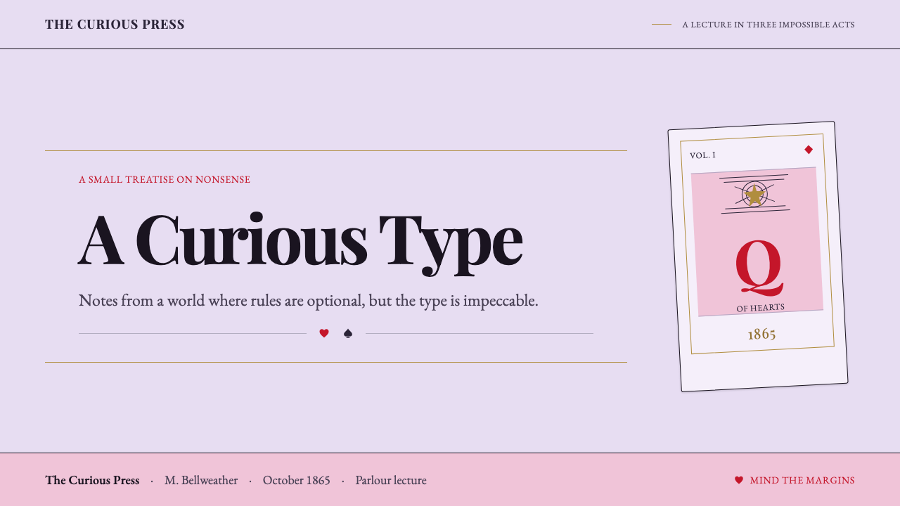
Playing-card heraldry gives the system its most recognizable shorthand. Suits, courtly signs, and marching emblems can organize navigation, metadata, categories, or small interactive states. Their value lies in repetition and symbolic clarity, not in decorative abundance. A single spade-like marker can make a hierarchy feel native to Wonderland; covering every surface with suits makes the result resemble a themed party rather than a coherent edition.

Who shaped Alice in Wonderland (1865)?
Tenniel is the defining visual reference named by the source. The interface language is explicitly described as a rebuilding of his 1865 Wonderland, while the Tenniel plates are dated from 1864 to 1871. His importance here is visual continuity: the engraved line, cross-hatched shade, ornamental page logic, and composed absurdity all need to remain legible as parts of a single illustration-led world.
Lewis Carroll appears among the source’s key figures and alongside the movement label of English nonsense literature. Within this style guide, that association establishes the tonal requirement: visual order must coexist with narrative illogic. The design should permit surprise, reversal, ceremony, and nonsense, but it should express them through deliberate printed structure rather than through arbitrary clutter or comic novelty.
The Dalziel Brothers are included in the source’s list of key figures within the Golden Age of wood engraving context. Their presence keeps craft visible in a style that can otherwise be mistaken for merely antique decoration. The relevant lesson is that engraving-like detail needs structure: marks should describe edges, volume, and material rhythm. It should look constructed through a print vocabulary, not applied as a distressed filter.
Alexander Macmillan is named among the key figures, while the 1865 first Macmillan edition anchors the source’s historical frame. For an interface adaptation, the edition is as important as the image. It calls for the cadence of a made book: clear openings, margins with purpose, text that can be read at length, and illustration that enriches the page without breaking its order.
How do you use Alice in Wonderland (1865) today?
For presentation covers, treat the slide as an illustrated title page. Let a muted mauve-and-rose field establish the dream, then introduce one court-like scarlet or spade-black device with enough space around it to feel printed rather than promotional. A decorative initial, suit emblem, or fine engraved vignette can frame the title, while the title itself remains disciplined and immediately readable. The cover should promise a strange journey without making the audience search for the subject.
For content slides, use typography as the stabilizing system. Begin sections with an ornamental drop-cap or small engraved rule, then set explanation in calm, well-separated text blocks. Illustrations work best as margin companions, chapter markers, or cropped evidence rather than as full-screen wallpaper behind copy. On data slides, preserve the same editorial logic: charts should read first as information, with scarlet, black, and subdued dream tones used to distinguish a limited number of meaningful states. Suit motifs can label categories, but cannot replace clear legends and labels.
For web interfaces, this language suits editorial dashboards, reading tools, curated libraries, and pricing pages that benefit from narrative character without sacrificing hierarchy. Build the interface around a pale, paper-like reading field; use thin engraved dividers and restrained cross-hatched panels to separate information; reserve court colors for important decisions and active signals. Pricing tiers can resemble carefully printed chapter cards, with one heraldic device clarifying emphasis instead of a pile of badges, illustrations, and competing calls to action.
For editorial and marketing work, use the style’s bookmaking logic to create a sequence rather than a collage. Landing pages can open as title pages, move through illustrated chapter-like sections, and end with a formal court-inspired call to action. Long articles benefit from decorative openings, marked quotations, and small narrative motifs placed in the margins. Marketing should retain the sense of a physical edition: the reader is being invited into a world with rules, not confronted by a wallpapered fantasy spectacle.
The common mistake is to equate Wonderland with random eccentricity. Throwing in checkerboards, teacups, suits, ornate borders, and loud red accents all at once destroys the source’s most valuable contrast: madness held inside immaculate typesetting. Do not make every surface ornate, every label theatrical, or every image distressed. Choose whether a moment belongs to the subdued dream or the heraldic court, keep engraved detail purposeful, and let calm reading space make the strange elements more convincing.
Alice in Wonderland (1865) — FAQ
Is this style simply Victorian fantasy?
No. Victorian book illustration is one of its roots, but the style is more specific: it is the 1865 Wonderland print world described through Tenniel’s engraved imagery, ornamental typography, cross-hatched shade, and playing-card heraldry. Generic fantasy often emphasizes spectacle, lush scenery, or magical effects. This system emphasizes the page, the line, the court emblem, and the uneasy coexistence of meticulous order with nonsense.
Can scarlet be used as the main color everywhere?
It should usually remain a court signal rather than a constant background condition. The source assigns flat heraldic scarlet and spade-black to the Queen’s court, while the dream itself belongs to muted mauve and rose. If scarlet fills every section, the distinction disappears and the interface loses its narrative structure. Let the quieter field carry reading; let scarlet arrive where authority, interruption, or a decisive moment is needed.
How should digital illustration imitate wood engraving?
Imitate its logic, not its damage. Use fine contours, visibly directional hatch marks, and tonal depth built from line density. Let marks follow a figure, object, or frame so they explain form. Avoid treating engraving as a blanket vintage texture, because the source describes hairline linework and cross-hatched shading as illustration first and decoration second. The image should still be clear enough to support reading and navigation.
Does the style work for information-dense pages?
Yes, if the bookmaking discipline is preserved. Its strongest tool for dense content is not ornament but typographic order: distinct openings, readable blocks, purposeful margins, and limited heraldic signals. A dashboard or pricing page can use engraved dividers and suit motifs to establish character while allowing labels, values, comparisons, and actions to remain direct. When illustration begins to obscure the information, it has crossed the line from supporting the edition to interrupting it.
What makes an Alice in Wonderland adaptation feel authentic rather than themed?
Authenticity comes from preserving the source’s hierarchy. Start with the engraved book page, then use muted dream color as atmosphere, court heraldry as a deliberate interruption, and ornament as a threshold or structural marker. A themed treatment starts with recognizable props and distributes them everywhere. An authentic adaptation lets linework, page composition, and immaculate typography carry most of the experience, so the strange symbols feel inevitable rather than pasted on.
Related design styles
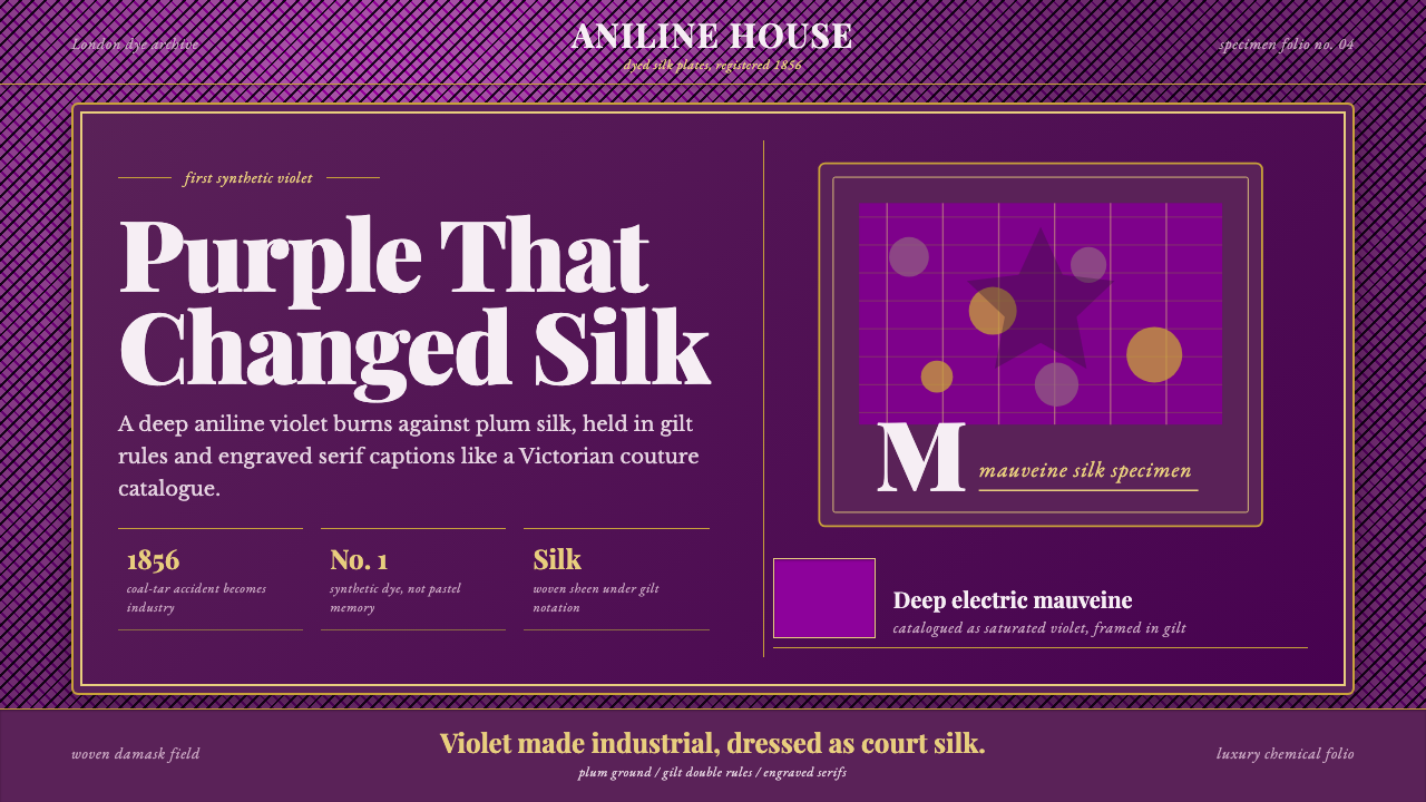 Mauveine (Perkin 1856)Electric purple, framed as luxury. Gilt rules and Playfair serifs turn dye in…
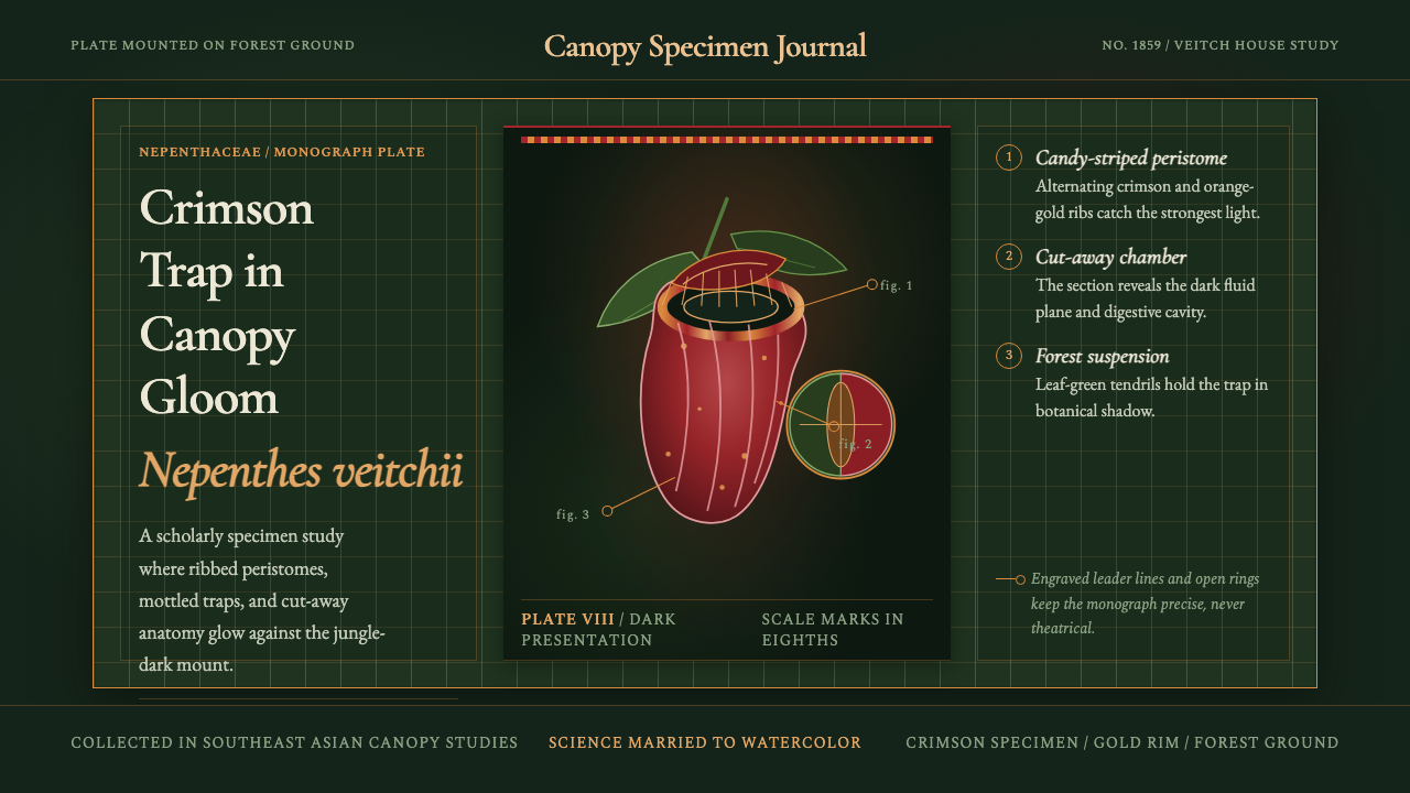 Carnivorous Pitcher PlantBotanical danger glows. Crimson traps and gold rims float on jungle-dark gree…
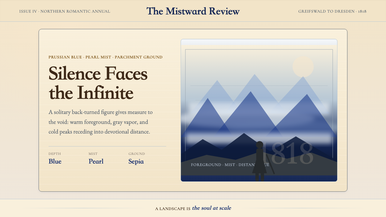 Caspar David FriedrichSilence becomes vast. Prussian blue depth, pearl mist, and parchment framing…
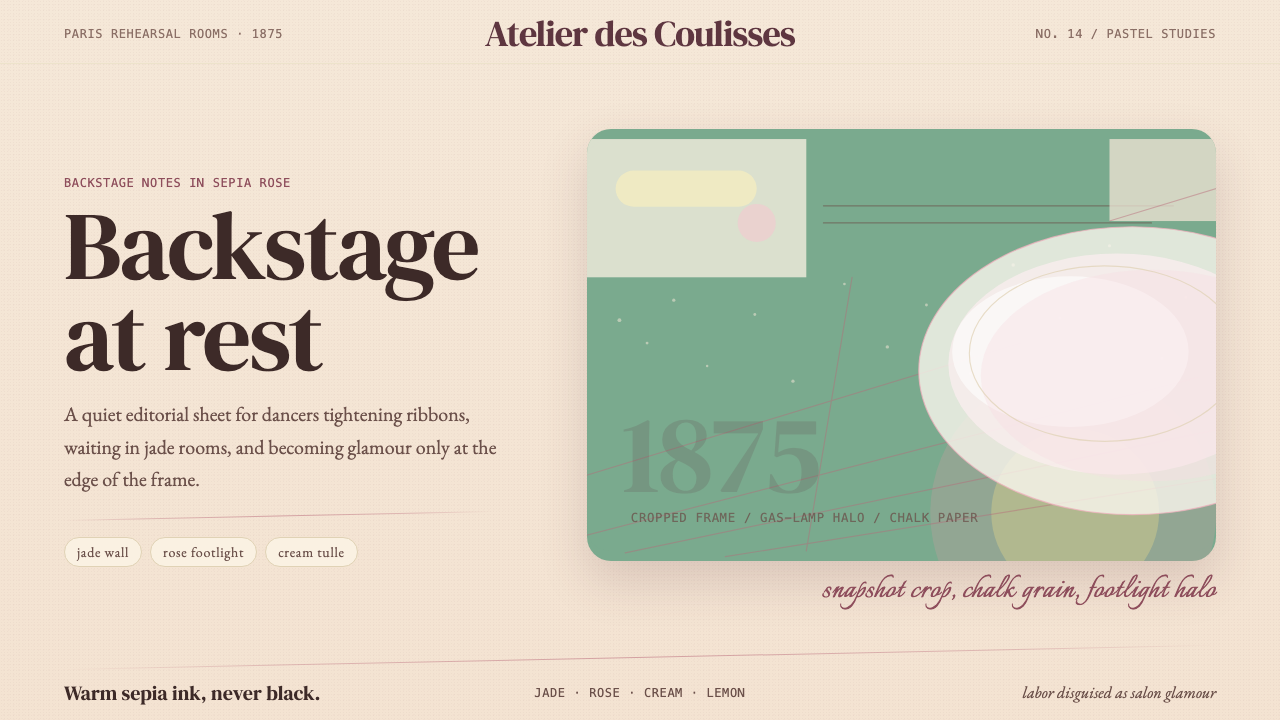 Degas Ballet PastelsBackstage glamour is labor. Jade walls, rose footlights, cropped serifs on cr…
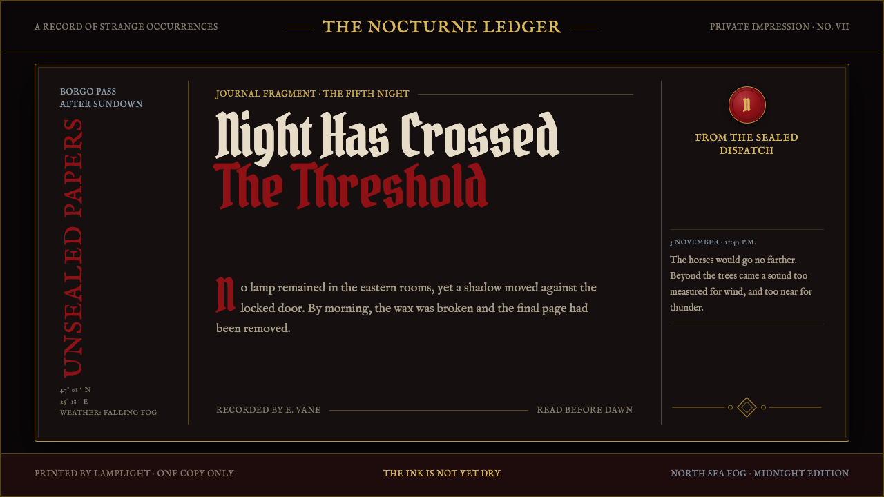 Dracula Gothic (1897)Victorian dread after dark. Blood-red initials and tarnished gilt haunt coffi…
 Dürer WoodcutInk remembers everything. Fraktur titles, rag-paper cream, and cross-hatched…