What is Maya Blue Pigment?
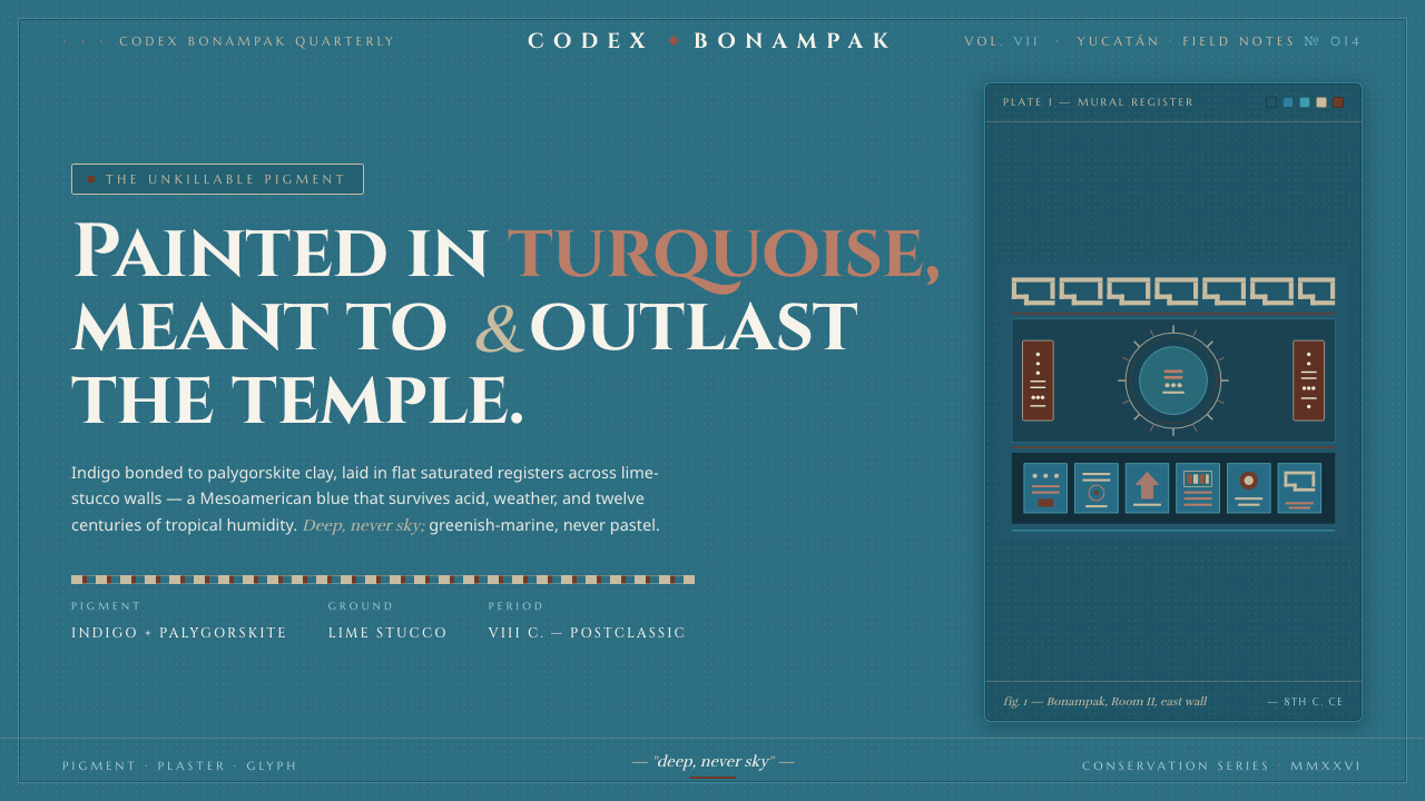
Maya Blue turns mineral endurance into atmosphere — deep turquoise mural fields, warm lime-stucco pauses, ochre signals, and lettering that feels carved rather than printed.
Maya Blue Pigment in brief
Maya Blue is the famously durable Mesoamerican pigment made by bonding indigo to palygorskite clay. It was painted onto lime-stucco mural walls at sites such as Bonampak and Chichén Itzá, where its survival became part of its identity. The authentic color is not a soft or airy sky blue: it ranges from bright turquoise to dark greenish-blue, with a mineral density that makes even luminous passages feel grounded.
As a design system, Maya Blue builds around the visual memory of those mural surfaces. Deep, saturated turquoise becomes the dominant field; warm grey drawn from lime stucco provides a quieter surface for notes and callouts; earth-red ochre supplies a controlled accent. The palette is dark and ceremonial, but not gloomy. Its energy comes from the tension between cool depth, chalky warmth, and the sudden appearance of red.
The system is carried by carved-stone serif titles and glyph-safe sans-serif body text. Headings should feel architectural and incised, while supporting copy remains clear against dense color fields. The overall impression is substantial rather than polished: pigment settled into plaster, marks held by a wall, and every accent treated as part of a larger mural composition.
Where does Maya Blue Pigment come from?
The source of Maya Blue lies in mineral-organic pigment craft: indigo is bonded to palygorskite clay to create a material recognized for exceptional durability. This combination is central to the style’s meaning. The color is not merely a hue selected for atmosphere; it is the visible consequence of a crafted substance designed to hold its character on a surface.
The pigment belongs to the Maya region of Mesoamerica, especially the areas associated with Yucatán and Chiapas. Its era is placed in the Classic and Postclassic Maya world, roughly from the eighth century onward. The relevant visual traditions are Mesoamerican mural painting, glyphic temple art, and the specialized making of mineral-organic pigments.
Maya Blue is closely associated with painted lime-stucco walls. Bonampak and Chichén Itzá serve as important reference points because they connect the pigment to architecture at mural scale: broad fields of color, plaster-like grounds, and marks that belong to a wall rather than a floating screen. In this context, color is architectural. It establishes an environment before it communicates a detail.
The contemporary design interpretation preserves that relationship between material, surface, and mark. Deep turquoise provides the mural field, warm grey recalls lime stucco, and ochre carries the earth-red accent of painted architectural detail. Carved-stone serif titles and glyph-safe sans-serif text translate the contrast between monumental inscription and readable supporting information without pretending to reproduce an archaeological artifact.
What defines the Maya Blue Pigment look?
Pigment Depth
Maya Blue should read as saturated turquoise moving toward greenish blue, never as a pale or weightless azure. Its depth comes from concentration and material presence rather than blackened darkness. Large fields can feel almost atmospheric, but they should retain a dense mineral body, as if color has been worked into plaster and remains visible beneath the surface.
Mural Field
The dominant color behaves like a wall, not a decorative fill. It should establish the visual environment for everything placed on top of it. Text, diagrams, and controls appear embedded within a continuous field, while warm-grey interruptions act like areas of exposed or freshly prepared stucco. The composition gains authority from this sense of architectural continuity.
Stucco Warmth
Warm grey provides relief without becoming a neutral white interface. It carries the chalky, mineral memory of lime stucco and softens the severity of the dark turquoise ground. Use it for explanatory panels, secondary surfaces, and moments where information needs to step forward without competing with the mural field. Its warmth keeps the system historical and tactile.
Ochre Accent
Earth-red ochre functions as a signal, not a second dominant field. It marks calls to action, selected states, important annotations, or a moment of emphasis within a largely cool composition. Because the ground is already saturated, ochre should arrive with intention. Its value lies in contrast and cultural resonance, not in repeated decorative use.
Carved-Stone Type
Titles use serif forms with the authority of carved stone. Letterforms should feel stable, ceremonial, and slightly architectural, with enough presence to hold their own against a large color field. The effect is not ornate historicism; it is the impression of inscription, where every character appears placed into a durable surface and given structural weight.
Glyph-Safe Reading
Supporting text uses a clear sans-serif voice that remains legible when surrounded by dense color and strong display lettering. The sans-serif is not meant to erase the historical reference; it creates a practical counterpoint to the monumental title. Body copy should feel direct and calm, allowing information to remain accessible inside an otherwise ceremonial visual language.
Material Continuity
Every surface should suggest a relationship to plaster, pigment, stone, or painted architectural detail. This does not require literal texture. Flat color can feel material when its contrast, typography, and spacing behave as though they belong to a wall. Avoid glossy effects and weightless decoration; the system is strongest when digital elements appear anchored to a durable surface.
Who shaped Maya Blue Pigment?
Maya mural painters are the primary visual reference for the system’s wall-scale sense of composition. Their work is represented here through broad turquoise fields, architectural continuity, and marks that feel integrated with lime-stucco surfaces rather than placed on top as detached decoration.
Maya pigment-makers represent the material intelligence behind Maya Blue. By bonding indigo to palygorskite clay, they produced a pigment whose durability is inseparable from its visual identity. The design system therefore treats color as crafted substance, not a superficial palette choice.
The muralists associated with Bonampak provide a reference for saturated color operating at architectural scale. In this interpretation, their importance lies in the relationship between pigment, plaster, and the surrounding wall: color establishes a field that can carry detail without losing its monumental presence.
The artisans associated with Chichén Itzá connect Maya Blue to painted architectural surfaces and enduring site-specific craft. Their reference supports the use of warm stucco tones, ochre intervention, and typography that feels set into a built environment rather than floating in an abstract interface.
How do you use Maya Blue Pigment today?
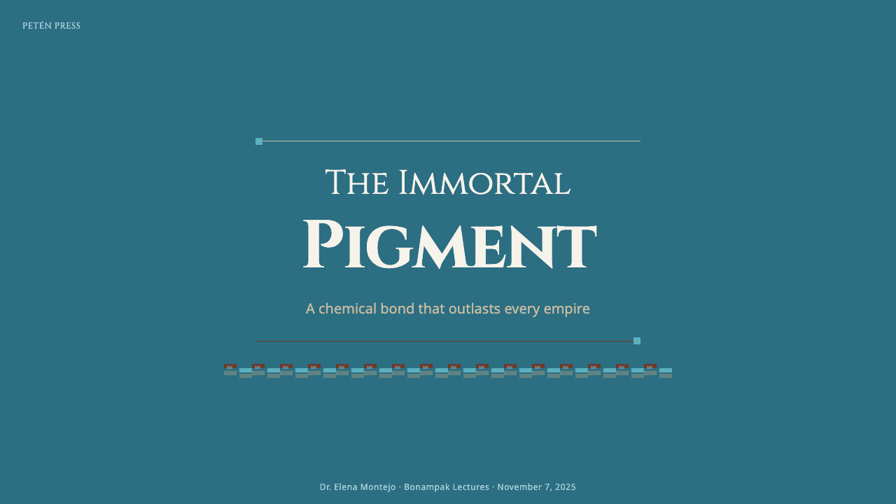
For presentation slides, use the deep turquoise field as an environmental frame rather than a decorative background. Cover slides can place a carved-stone serif title directly into the field, supported by a restrained ochre mark or a warm-grey interruption. Content slides should move between turquoise and stucco surfaces so the deck feels like a sequence of mural panels. Data slides benefit from simple, solid forms: keep the dominant field calm, use warm grey for readable structure, and reserve ochre for the one comparison or result that must be noticed first.
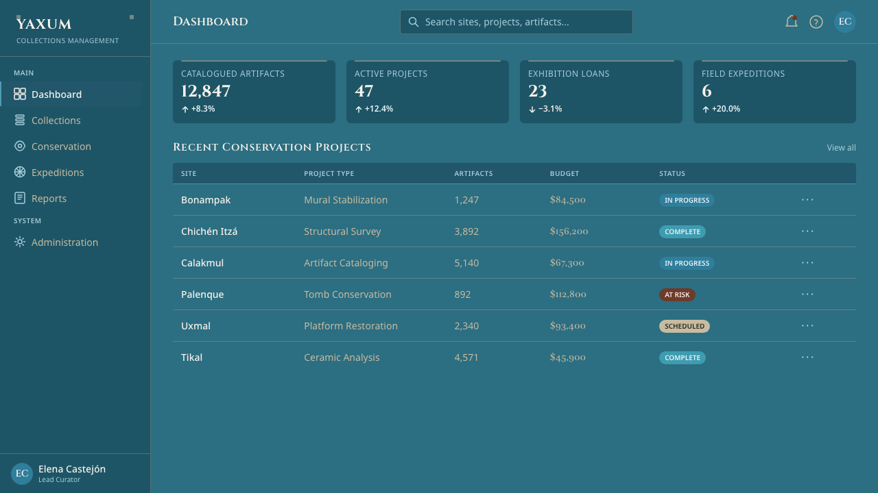
For web interfaces, Maya Blue is especially effective for dashboards and pricing pages that need authority, depth, and clear hierarchy. A dashboard can use turquoise as the primary environment, warm grey for explanatory modules, and ochre for alerts or selected states. Pricing tiers should not become a row of competing colors; keep the system anchored in the mural field and let the accent distinguish the recommended or active choice. Serif titles establish the product’s character, while glyph-safe sans-serif text protects everyday usability.
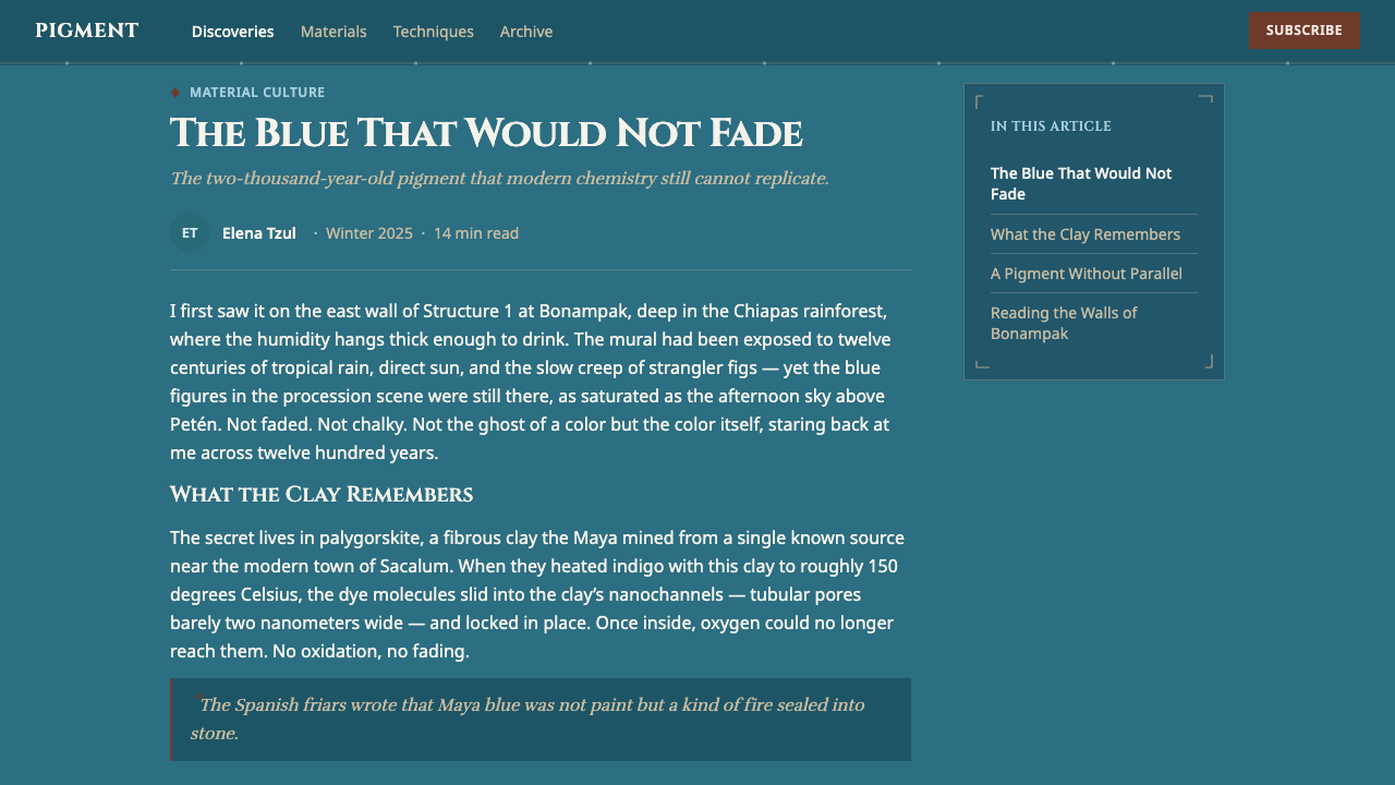
For editorial and marketing work, treat the page as an architectural surface. Long-form articles can begin with a dense turquoise opening field, a substantial serif title, and a warm-grey reading area that gives the body copy relief. Section changes should feel like transitions between painted surfaces, using color fields or restrained rules rather than ornamental motifs. Marketing pages can use ochre sparingly for calls to action, captions, or small moments of emphasis, allowing the dark ground and material contrast to do most of the visual work.
For identity systems and campaign materials, the style supports a strong relationship between monumentality and craft. A wordmark or campaign title can use carved-stone serif forms, while supporting labels remain quiet and legible in sans serif. Imagery should be selected or cropped for broad shape, surface, and color relationship rather than glossy realism. The strongest compositions feel composed around a wall-sized field, with information embedded into it and accents placed like deliberate painted marks.
The common mistake is reducing Maya Blue to generic dark blue with a few red details. That loses the essential distinction between saturated turquoise, lime-stucco warmth, and earth-red ochre. Another failure is using texture, faux antiquing, or excessive ornament to announce the historical reference. The system works through material suggestion, color discipline, carved typographic presence, and clear hierarchy; it should feel rooted without becoming costume.
Maya Blue Pigment — FAQ
What is Maya Blue made from?
Maya Blue is made by bonding indigo to palygorskite clay. The combination is important because its identity comes from both color and durability. In design terms, that means the palette should feel like a crafted material with staying power, not like an arbitrary digital blue selected only for mood.
Is Maya Blue the same as sky blue?
No. Authentic Maya Blue ranges from bright turquoise to dark greenish-blue and should never read as modern sky azure. It has saturation, mineral density, and a darker atmospheric presence. If a treatment feels airy, pastel, or transparently blue, it has moved away from the source material.
Why are warm grey and ochre paired with the blue?
Warm grey recalls the lime-stucco walls on which Maya Blue was painted, giving the system a chalky architectural counter-surface. Earth-red ochre provides the mural accent and introduces warmth into the cool dominant field. The pairing works because each color has a material role: turquoise establishes the wall, grey supports information, and ochre marks emphasis.
Why does the system combine serif titles with sans-serif body text?
The contrast translates two different visual roles from the source: monumental, carved-stone inscription for titles and clear glyph-safe reading for supporting information. Serif titles give the composition weight and ceremony, while sans-serif body text keeps dense material accessible. The pairing should feel deliberate and structural rather than ornamental.
Where does Maya Blue work best, and where can it struggle?
It works best when a product or publication needs depth, authority, material character, and strong hierarchy: dashboards, pricing pages, cultural or educational material, editorial features, and campaign systems. It can struggle when the brief depends on airy neutrality, glossy technology, or playful softness. The style should be chosen when its dense mural atmosphere supports the subject, not simply because dark blue is fashionable.
Related design styles
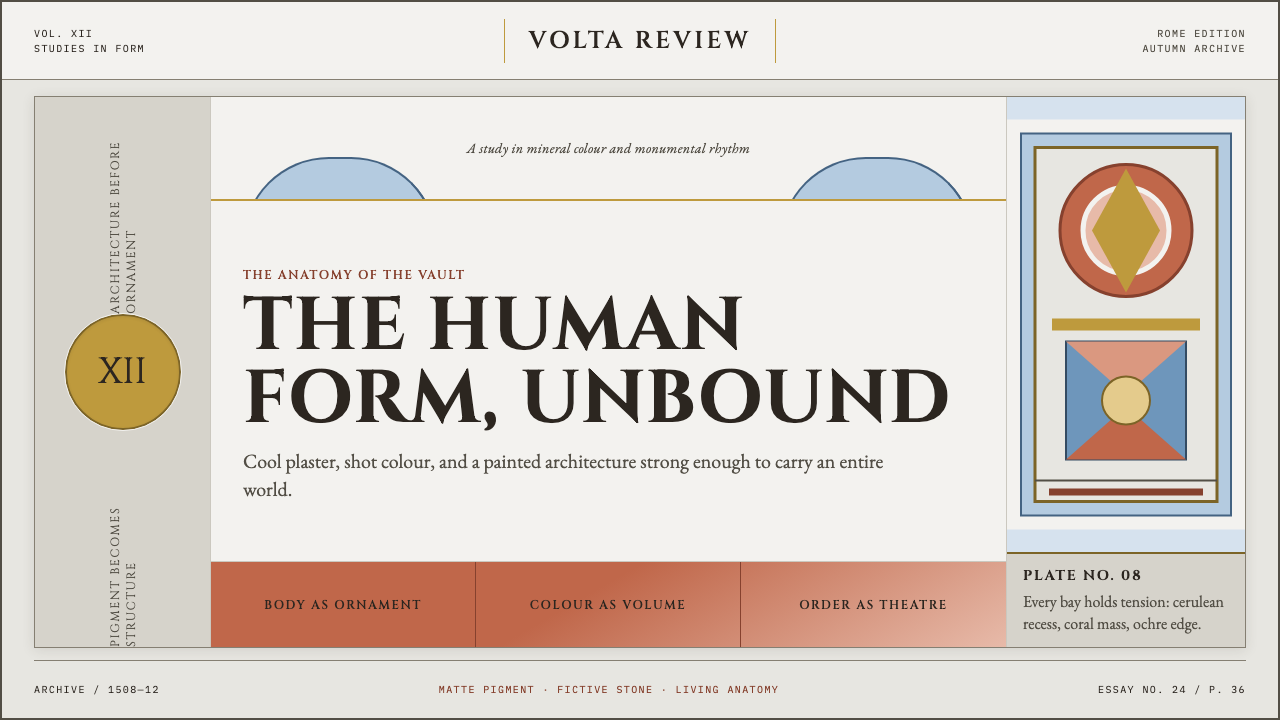 Michelangelo Sistine Ceiling (1512)Paint becomes monumental. Coral, cerulean and ochre figures strain against a…
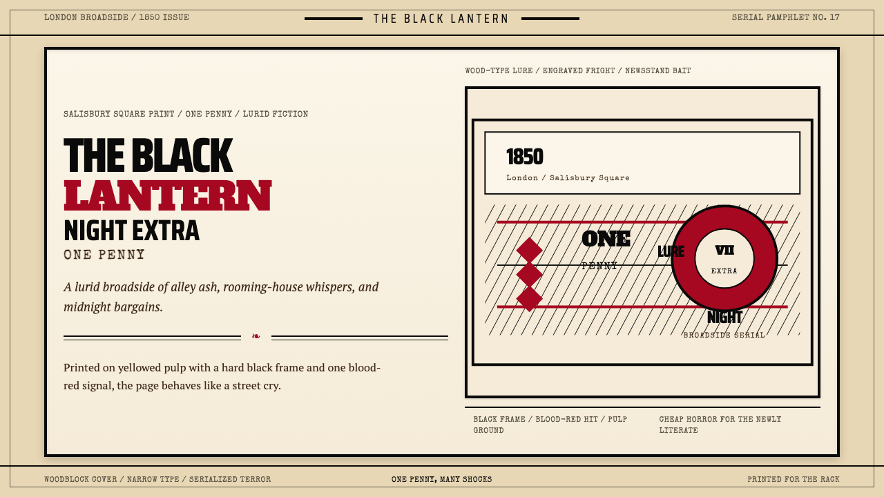 Penny Dreadful Victorian Headline (1850)Cheap terror in full cry. Condensed wood-type, black borders, and one blood-r…
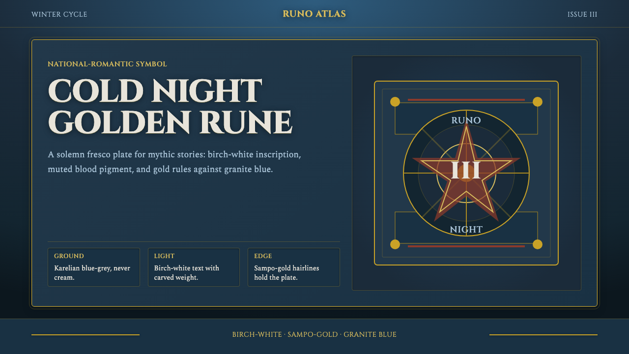 Finnish Kalevala EpicEpic weight in cold night. Birch-white Cinzel, Sampo-gold rules, blue-grey fr…
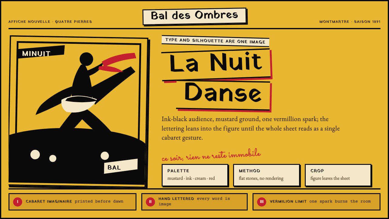 Toulouse-Lautrec Belle ÉpoqueNight becomes gesture. Mustard ground, black silhouette, hand lettering, one…
 Wayuu Mochila CrochetColour speaks in bands. Turquoise, fuchsia and ochre stack on indigo-slate.
 Azerbaijani Mugham Saz BlueMugham night, deeply tiled. Cobalt ground, brass hairlines, arched editorial…