What is Shakespeare's Globe (1599)?
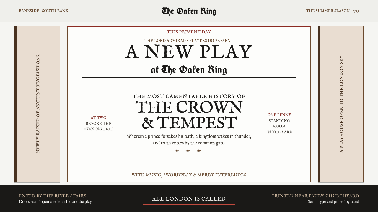
Shakespeare’s Globe turns the playbill into a voice: Fell type, press-black ink, and one oxblood strike calling a crowd toward the stage.
Shakespeare's Globe (1599) in brief
Shakespeare’s Globe is a visual interpretation of an Elizabethan playhouse in the season the Globe opened on Bankside in 1599. Its central object is not a polished brand mark or a theatrical backdrop, but a broadsheet playbill nailed to a post: black ink pressed into rag paper, a public announcement made physical through pressure, grain, and imperfect registration. The style treats the sheet as an active part of the theatre. It must catch the eye at a distance, state the occasion forcefully, and carry the urgency of a barker’s voice.
The system draws its force from letterpress logic. Display lines are stacked in a centered vertical arrangement, with the largest words carrying the announcement and smaller lines supplying supporting information. Blackletter drop initials interrupt the rhythm with ceremonial weight, while printer’s flowers divide blocks without becoming ornamental wallpaper. Small caps perform the work that contemporary headline treatments often perform: they make an announcement feel formal, public, and emphatic while keeping the page rooted in the texture of print.
Its atmosphere is built from material contrast rather than visual polish. Press-black ink sits heavily against the uneven softness of rag paper; timber brown and lime-plaster off-white establish the architectural setting around the page. A single oxblood rule, struck across the top with the slight wrongness of an offset woodblock proof, becomes the sheet’s sharpest gesture. Nothing is glossy, frictionless, or digitally neutral. Every mark should suggest that it was composed in type, inked by hand, and pressed into a surface with a history.
Where does Shakespeare's Globe (1599) come from?
The style begins with the Globe’s opening on Bankside in 1599, within the world of English Renaissance theatre. The Globe belongs to a setting in which theatre was announced publicly and physically: a sheet could be fixed to a post and asked to do immediate work in the street. Its visual language therefore begins with communication under real conditions. The page does not whisper from a private screen; it calls outward from the edge of a playhouse.
Bankside and Southwark provide the architectural and material frame. Oak timber, lime plaster, and the enclosing ring of the playhouse give the design its grounded palette and rough tactile premise. The playbill is not imagined as an isolated rectangle floating on a blank field. It exists among beams, walls, posts, weather, crowds, and the threshold between the city and performance. Timber brown and plaster off-white are consequently not decorative choices so much as environmental facts translated into a print language.
The print tradition around London and St Paul’s supplies the system’s formal machinery: hand-pressed black ink, rag paper, letterpress type, woodcut-like rules, blackletter initials, and printer’s flowers. These elements make hierarchy visible through compression, repetition, and force. An imperfectly struck red rule is meaningful precisely because it does not behave like a clean digital divider. It carries the memory of a separate block, a second impression, and a hand setting the page into motion.
The era runs from 1576 to 1642, with the Globe raised in 1599 and the First Folio printed in 1623. William Shakespeare, Richard Burbage, Isaac Jaggard, John Heminges, and Henry Condell form the named human constellation supplied by this world. Their presence links performance, company life, preservation, and printing without requiring the design to become a portrait gallery. The result is a visual system shaped by English Renaissance theatre, the Lord Chamberlain’s and King’s Men, and the early English letterpress and woodcut playbill.
What defines the Shakespeare's Globe (1599) look?
Press-Black Ink
Black is the dominant voice of the page. It should feel deposited rather than displayed: dense, absorbent, and slightly variable where ink meets the fibers of rag paper. The visual aim is not a flawless dark field but the authority of a hand-pressed impression. Black carries the play title, the body text, the initials, and most structural divisions, creating a sheet that reads first as ink on paper before it reads as a contemporary graphic composition.
Fell Old-Style Type
Period-correct Fell old-style type gives the system its speaking texture. The letterforms do not seek neutral efficiency; they retain the character of a printed voice, with enough formal gravity to make an announcement feel public and theatrical. Small caps are particularly important because they create headline force without abandoning the typographic world of the sheet. Type should appear assembled, impressed, and declared, never sleekly optimized or stripped into anonymous modernity.
Centered Cry
The composition is organized as a centered stack of display lines that grows and contracts from top to bottom. This is not quiet editorial centering; it is a public cry structured into successive beats. Large lines establish the event, smaller lines clarify it, and the accumulated vertical rhythm makes the page feel spoken aloud. The hierarchy should be created through changing scale, spacing, capitalization, and interruption, allowing the sheet to command attention without relying on pictorial spectacle.
Blackletter and Flowers
Blackletter drop initials provide a dense, ceremonial interruption at the beginning of a block, while printer’s flowers act as compact pauses between sections. Neither device should be treated as loose vintage decoration. Each has a clear typographic role: the initial marks entry, and the flower gives the eye a moment to reset before the next announcement. Used sparingly, they make the page feel built from the working vocabulary of a print shop rather than decorated after the fact.
Oxblood Misregister
One oxblood rule struck near the top supplies the page’s singular color event. It should feel like a woodblock proof pulled a little off-register: decisive, slightly unruly, and visibly separate from the black type below it. The red is not a general accent spread across buttons, icons, and labels. Its value comes from scarcity. A single line can cut across the composition with more theatrical force than a broad decorative palette, because it reads as an action made in ink.
Rag Paper and Playhouse Ground
The ground is off-white rag paper, supported by the material atmosphere of oak timber and lime plaster. Slight unevenness is essential: the surface should imply fibers, pressure, age, and handling rather than pristine digital whiteness. This quality prevents the typography from becoming merely historical costume. The paper absorbs the ink, the surrounding timber and plaster steady the palette, and the entire composition gains the sense of an object that could have been pinned, touched, weathered, and read in public.
Who shaped Shakespeare's Globe (1599)?
Shakespeare is the central dramatic name in the Globe’s visual world. Here, his importance is not expressed through portraiture or literary quotation, but through the premise that a playbill must announce performance with force. The style translates theatrical authorship into public typography: a title must arrive as an event, and the sheet must make the prospect of a play feel immediate before an audience has crossed the threshold.
Richard Burbage belongs to the named theatrical company context surrounding the Globe. His presence keeps the style connected to a working playhouse rather than an abstract literary monument. The design should therefore preserve a sense of company, occasion, and live address: it is made to gather attention for performance, not to present theatre as a distant museum object.
Isaac Jaggard anchors the style’s print-facing dimension through the First Folio, printed in 1623. In this visual system, printing is not a neutral delivery mechanism. It is the source of the sheet’s authority: type is selected and assembled, ink is applied, and the page bears the evidence of pressure. The playbill language and the printed folio together make letterpress central to how Shakespearean theatre is remembered in material form.
John Heminges is named within the First Folio context and connects the theatre world to the act of preservation. His place in the style is a reminder that a printed page can carry performance beyond the instant in which it occurs. The visual language should balance this lasting quality with the urgency of a public notice: it must feel durable enough to survive as paper, yet loud enough to work on the day of the play.
Henry Condell is also part of the named First Folio constellation. Together with the theatrical and printing figures around him, he supports a style that understands text as performed, printed, and circulated. This is why the page cannot be overly refined. Its value lies in the visible means of production: stacked type, hard divisions, interrupted blocks, and the slight unruliness that makes an announcement feel handled by people rather than generated by a seamless system.
How do you use Shakespeare's Globe (1599) today?
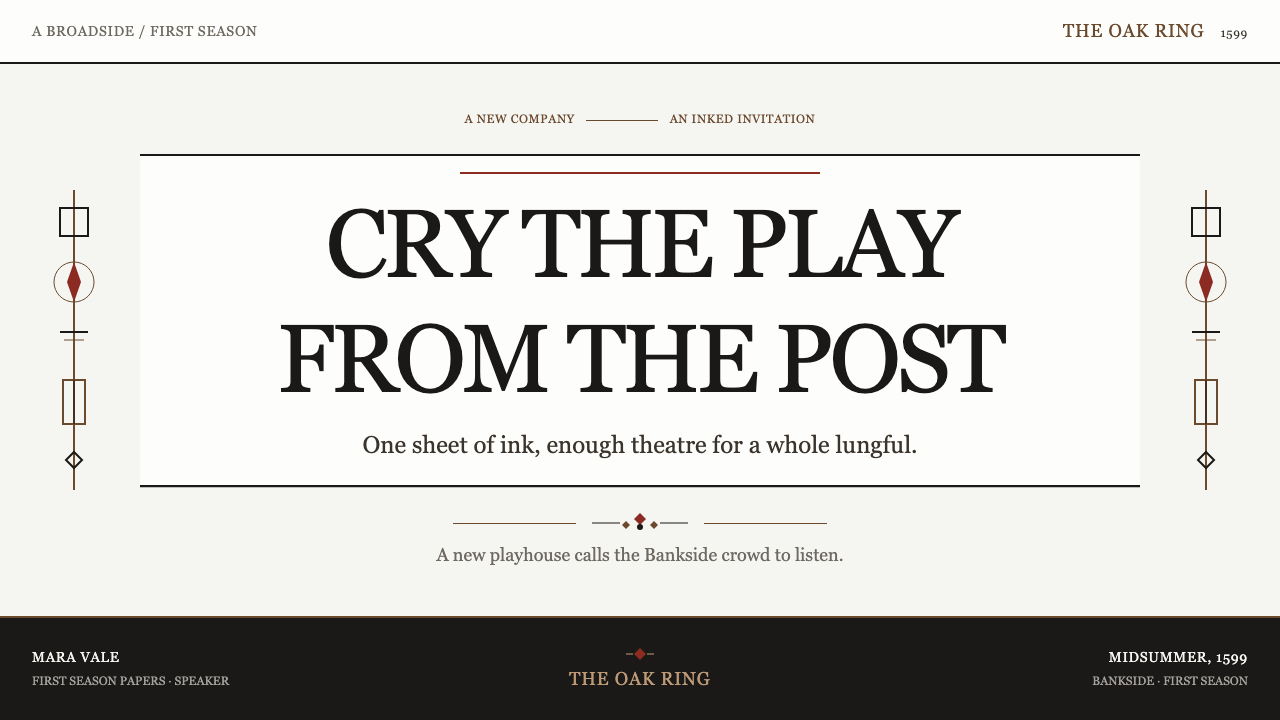
For presentation covers, use the playbill as the governing model. Place the title in a centered, vertically stacked display arrangement, allowing one or two dominant lines to carry the subject and smaller small-cap lines to establish context. Let an off-white paper-like ground hold dense black type, then use a single oxblood rule near the upper portion as the one forceful interruption. Avoid scenic theatrical imagery; the cover should feel like an announcement attached to a post, not an illustrated souvenir.
Content slides should translate the same public-print hierarchy into a disciplined reading sequence. Begin sections with a blackletter-style initial or a strong display heading, then set supporting copy in compact, readable blocks. Printer’s flowers can separate major ideas when a conventional divider would feel too generic. For data slides, retain the ink-and-paper premise: make labels and values feel printed, use hard structural rules to organize comparisons, and reserve the oxblood gesture for the one result or division that genuinely needs to be called out.
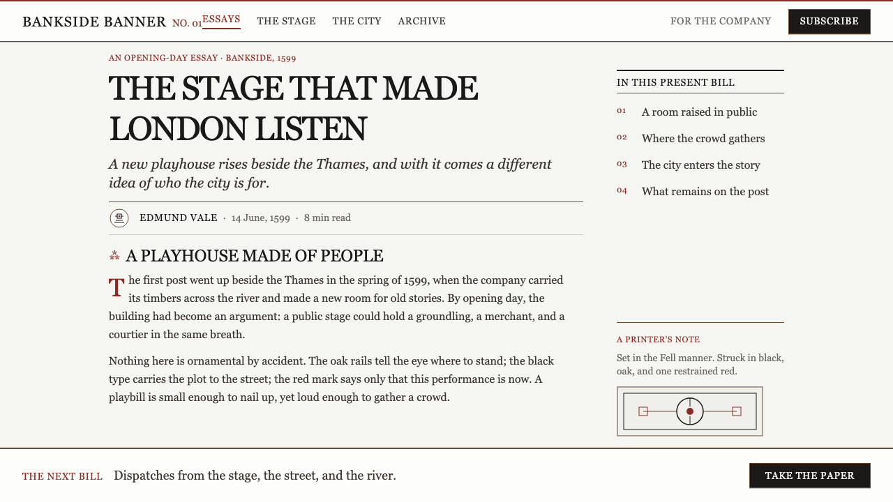
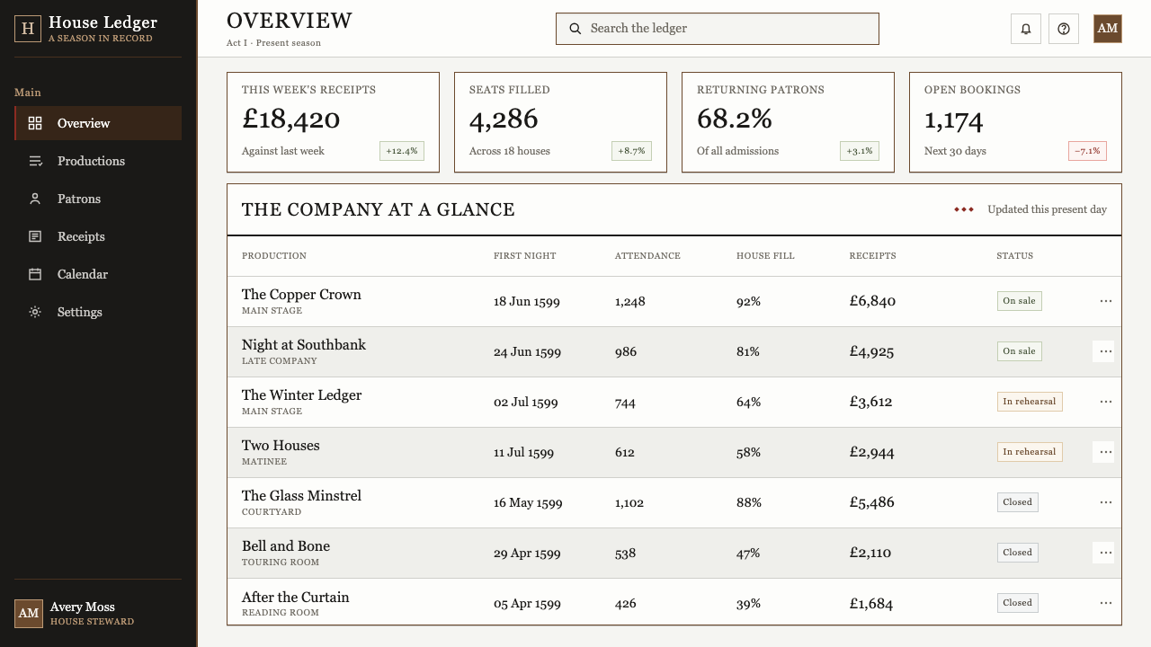
For web interfaces, this style is strongest in event pages, cultural programs, reading experiences, editorial landing pages, and theatrical archives. A dashboard can use the centered proclamation for its primary status while letting more ordinary information sit in quieter typographic blocks. A pricing or ticketing page can make each offer feel like a posted public notice, using black rules and clear text structure rather than glossy cards. The experience should remain legible and practical; the period character belongs in the material voice and hierarchy, not in making navigation obscure.
For editorial and marketing work, use the page as a broadsheet rather than as a decorative historical collage. A campaign can begin with a concentrated announcement, continue through sections separated by flowers or rules, and end with a direct invitation written in the same typographic voice. Rag-paper grounds, timber and plaster references, and occasional woodcut-like red marks can make a page feel spatially connected to a playhouse. Keep illustration restrained so that the primary drama remains the movement of words across the sheet.
The common mistake is to confuse this style with generalized old-fashioned decoration. Flooding the design with parchment effects, ornamental borders, repeated red accents, faux wax seals, or elaborate pseudo-medieval lettering weakens the system. Shakespeare’s Globe works because its components have jobs: the type announces, the black ink gives weight, the paper carries pressure, the flower pauses, and the single red rule strikes. Preserve that economy, and the result feels like a living public print object rather than a costume for contemporary content.
Shakespeare's Globe (1599) — FAQ
Is this style simply a historical English or medieval look?
No. Its identity comes from a specific theatrical and print setting: the Globe opening on Bankside in 1599, early English letterpress, the woodcut playbill, rag paper, and the public need to announce a performance. General old-world decoration is not enough. The style works when the page behaves like a printed notice with a job to do, not when it merely accumulates antique-looking motifs.
Why is there only one oxblood red rule?
Because the line is meant to read as a distinct printing event, like a woodblock proof struck slightly off-register. If red is repeated throughout the page, it becomes ordinary interface decoration and loses its material force. Keeping it singular lets it behave like an interruption: a sharp, visible act of ink against the press-black typography and off-white paper.
Can the style work for a modern website?
Yes, provided that usability remains clear. The style transfers well to event information, cultural publishing, ticketing, editorial stories, and selected dashboard states because it has strong typographic hierarchy. Modern interaction should remain straightforward, while the historical character appears through centered announcements, compact printed blocks, hard rules, restrained color, and material texture rather than through confusing controls or excessive theatrical props.
What role do blackletter initials and printer’s flowers play?
They organize reading. A blackletter initial marks the entry into a new block with concentrated visual weight. A printer’s flower marks a pause or transition between blocks. Both should remain subordinate to the central announcement. Their purpose is to make the page feel assembled from the working grammar of early print, not to turn every paragraph into a decorative specimen.
How should imagery be handled in a Globe-inspired layout?
Use imagery sparingly, if at all. The source world is led by type, ink, paper, timber, plaster, and the force of an announcement. A page may suggest the playhouse through material ground or a restrained woodcut-like mark, but scenic illustration should not compete with the display stack. The strongest image is often the printed title itself, made large enough to perform the work of a voice.
Related design styles
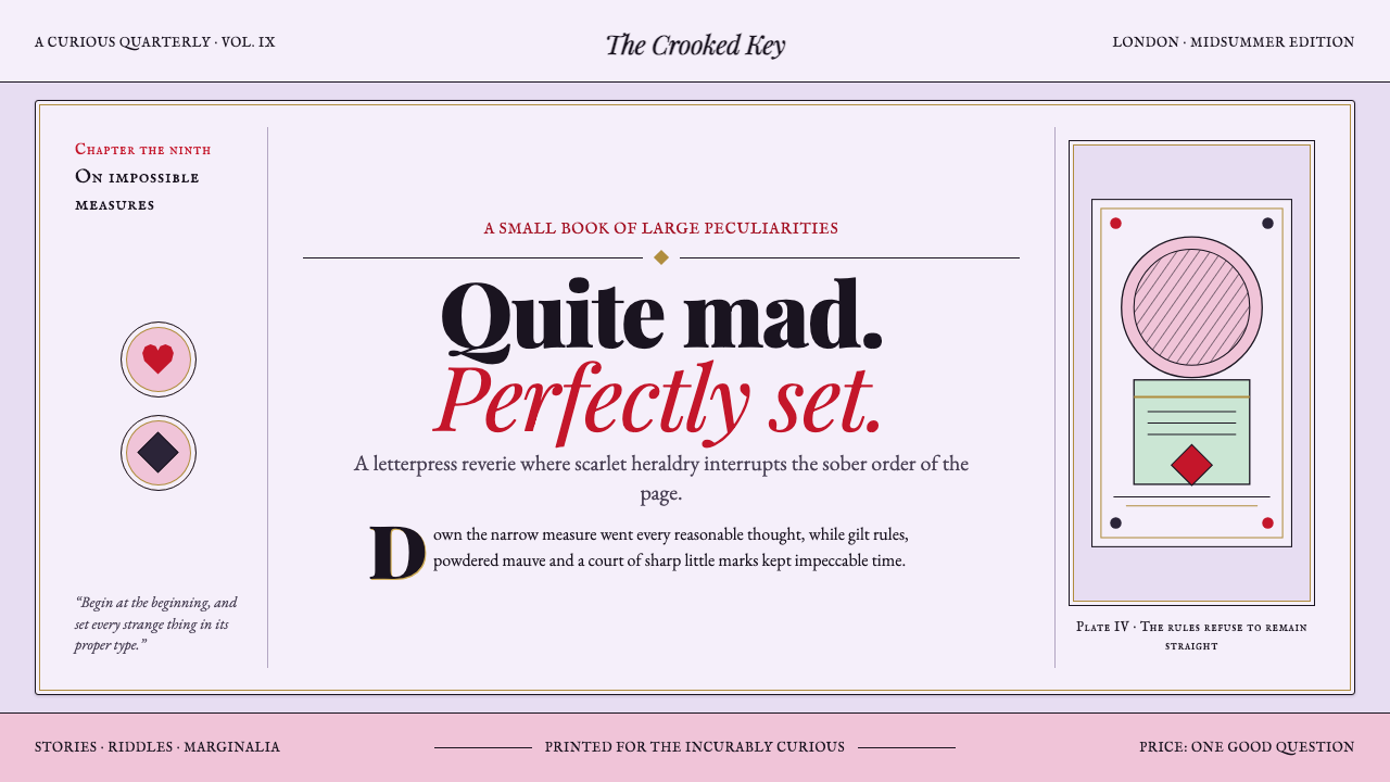 Alice in Wonderland (1865)Madness, impeccably typeset. Scarlet heraldry cuts through a chalky mauve eng…
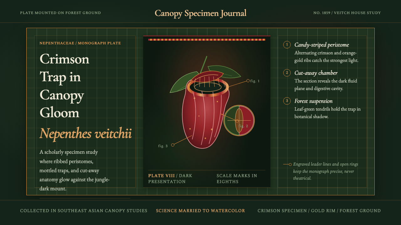 Carnivorous Pitcher PlantBotanical danger glows. Crimson traps and gold rims float on jungle-dark gree…
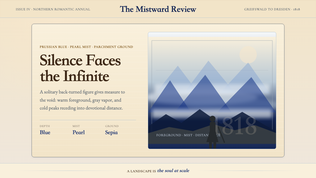 Caspar David FriedrichSilence becomes vast. Prussian blue depth, pearl mist, and parchment framing…
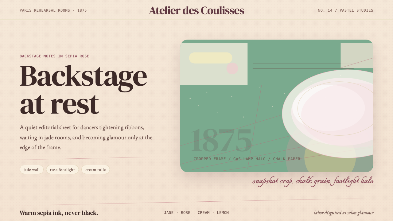 Degas Ballet PastelsBackstage glamour is labor. Jade walls, rose footlights, cropped serifs on cr…
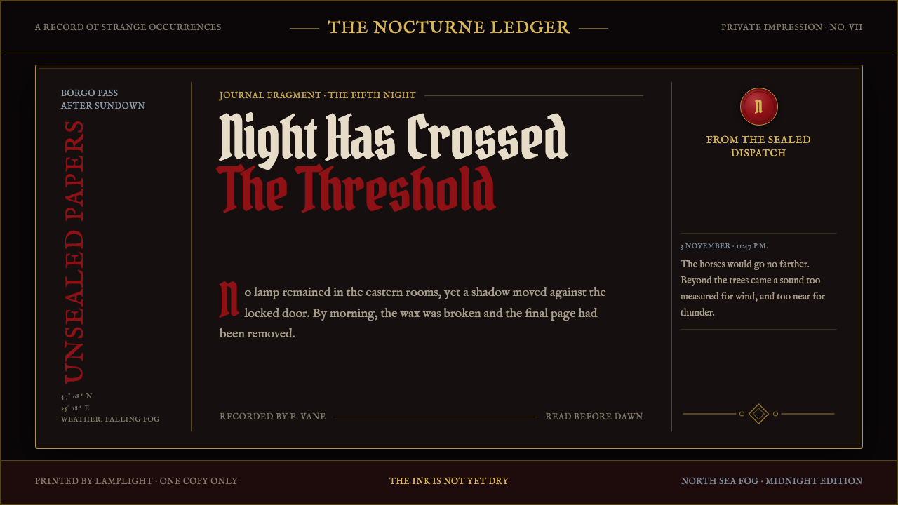 Dracula Gothic (1897)Victorian dread after dark. Blood-red initials and tarnished gilt haunt coffi…
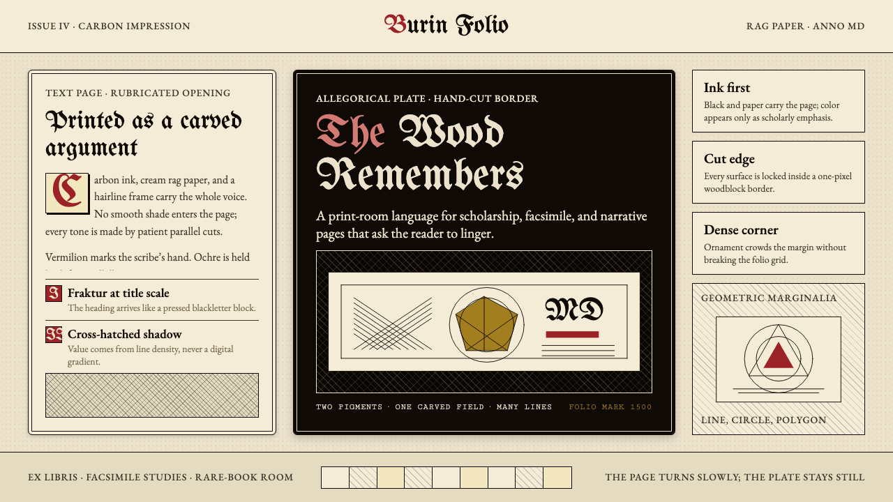 Dürer WoodcutInk remembers everything. Fraktur titles, rag-paper cream, and cross-hatched…