What is Shopify Polaris?
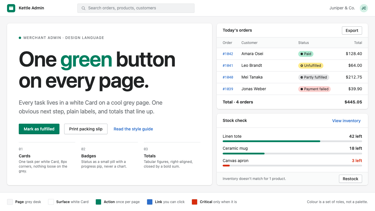
Polaris is the design language of a tool people open every morning: white Cards on a cool grey page, one green button per screen, and the plain words of a shopkeeper rather than an engineer.
Shopify Polaris in brief
Polaris is the design system behind the Shopify admin, the back-office screen where merchants check orders, restock products, answer customers and watch sales. Its visual style is the look of a dependable work tool: a cool light-grey page, white rectangular Cards sitting on it, small pill-shaped Badges that mark status, and one saturated green primary button that tells the user what to do next.
The organising principle is one task per Card. Each Card has a title, its content and its own actions, so a long page reads as a stack of small, self-contained jobs rather than a single tangled form. Each page also has exactly one primary button. Everything else is a quieter secondary or plain-text action, which keeps the hierarchy of choices obvious even for someone who has never seen the screen before.
The style is as much about language as about pixels. Labels, empty states and error messages are written for merchants, in everyday words, and numbers are treated with care: order totals are right-aligned and set in tabular figures so columns of money line up. The result is not showy. It is legible, steady and built for repeated daily use.

Where does Shopify Polaris come from?
Polaris was introduced in 2017 at Shopify Unite, the company's developer conference, as a public statement of how the Shopify admin should look and behave. Shopify is a commerce platform that grew out of a small online snowboard shop and is headquartered in Ottawa, Canada. Its co-founder and chief executive, Tobias Lütke, is closely associated with the company's engineering-driven culture, and a design system was a natural expression of that culture: a shared set of components that let many teams build screens that feel as if one person had made them.
From the start Polaris was published openly. Shopify released its components, guidelines and content standards for anyone to read, and made the code available for the apps that third-party developers build inside the admin. That openness places Polaris within the wider movement of open-source design systems, in which large product companies publish their interface rules both to keep partners consistent and to contribute to a shared vocabulary of components. Daniel Weinand is among the people associated with the system's design leadership.
Two threads shaped the style in particular. The first was design tokens: named values for colour, spacing, type and shadow, stored in one place and consumed by both designers and developers, so that a change in a single value propagates everywhere. The token set that underlies the current look comes from a design-language refresh around 2020 and 2021, which moved the system toward a calmer, more modern surface while keeping the older structural ideas of Cards, Badges and a single green action.
The second thread was content design in product interfaces, the idea that the words in an interface are part of the design and deserve the same rules as colour or spacing. Polaris documentation tells writers to be concise, to use plain language, to name actions with verbs and to avoid jargon. A merchant who sees that inventory counts do not match should be told exactly that, not given a code. This attention to voice is part of why the system feels so approachable, even when the screens carry dense information about money, shipping and stock.
What defines the Shopify Polaris look?
Colour
The page background is a cool, pale grey and the working surfaces are white, so the Cards read as clear islands. Text is a dark neutral, with softer grey for secondary information. Green is reserved for the single primary action on each page, which makes it a signal rather than a decoration. Status Badges borrow a small family of meaningful tints: calm for success, amber for caution, red for critical, blue for informational.
Cards as units of work
A Card is a white surface with a slight radius, a quiet shadow or hairline edge, a heading and one coherent piece of content. Related Cards sit in a single column or in a main-and-secondary two-column layout, with the main column carrying the primary job and the narrow column carrying notes, tags or customer details. The Card is the grammar of the whole system.
One primary action
Each page allows exactly one filled green button. Secondary actions appear as outlined or plain buttons, and destructive actions are marked in red but kept visually quieter than the main task. This rule keeps pages with many controls from feeling like a menu of equal choices, and it trains merchants to trust where the interface is pointing.
Badges and status
Order and product status is shown through small rounded Badges with short text such as Paid, Unfulfilled or Draft, often with a tiny progress or dot indicator. Status is something to be scanned down a list, not studied, so Polaris prefers a compact label to a chart or icon with a legend.
Numbers and alignment
Money and quantities are set in tabular figures and aligned to the right edge of their column, so totals, taxes and discounts can be compared at a glance. Currency symbols, signs for discounts and the bold weight of the final total follow a consistent pattern across order pages, invoices and reports.
Typography
The type is a clean, neutral system-style sans, chosen for legibility at small sizes rather than for personality. Headings are modest in scale and semibold, body text is comfortable and unhurried, and captions are lighter in tone. Hierarchy comes from weight and colour more than from large jumps in size, because the screens must hold a lot of information.
Plain-language voice
Interface copy uses short sentences, active verbs and the vocabulary a shop owner already uses. Empty states explain what will appear and offer one clear way to start. Error messages say what went wrong and how to fix it. This voice is treated as a visual element of the system, with its own rules, rather than as an afterthought.

Who shaped Shopify Polaris?
Co-founder and chief executive of Shopify, whose engineering-minded company culture produced and sustained the Polaris system.
A designer associated with the leadership of Polaris and Shopify's wider design work.
The shop owners who use the admin every day, whose needs for clarity, speed and trust define the whole system's tone.
How do you use Shopify Polaris today?
In slides, Polaris suits business reviews, operations updates and product walkthroughs where the audience wants to see work, not spectacle. A cover can be a pale grey field with a single white Card holding the title and one green button-like label. Content slides work as one Card per point, each with a bold heading and a short line of plain text. Data slides should right-align figures in tabular type, use Badges for status, and let the single green accent mark the number or decision that matters most.
On the web, the style is ideal for admin panels, order and inventory management, billing, CRM-like tools and any dashboard that people will open daily. Build pages as a stack of Cards in a main column with a narrower side column, keep one green primary button per page, and show status with Badges rather than colour-coded rows. Tables should have restrained dividers and right-aligned money. Pricing and plan pages can borrow the same grammar, with the recommended plan in a Card whose button is the page's single green action.
For editorial and marketing work, Polaris is useful when the message is practical: help-centre articles, onboarding guides, release notes for a business tool, and explainer pages for merchants and operators. Pair short headings with plain language and let screenshots sit inside bordered Cards. It is less suited to emotional brand stories or fashion-led storefronts, where its deliberately neutral surface would give no personality.
To adapt the style, treat the page grey and the Card white as the fixed frame and put brand in only two places: the single action colour and the voice of the copy. Keep the proportions of Cards and the rhythm of spacing, and the system will still read as dependable even if the accent is no longer green.
A common mistake is to add a second filled button because two things both feel important. This dissolves the one-action rule and sends users into hesitation. Another is to nest Cards within Cards until the page becomes a maze of boxes. A third is to write labels in internal jargon or to centre-align figures, which breaks the quick scanning that the system is built for. Keep one job per Card, one primary action per page, and words that a shopkeeper would use.

Shopify Polaris — FAQ
What is Polaris?
Polaris is the design system behind the Shopify admin. It was introduced in 2017 and provides the components, tokens, content guidelines and patterns that make the merchant back office look and behave consistently. The visual style it popularised is a cool grey page with white Cards, Badges for status and a single green primary button on each page.
Why does each page have only one green button?
The rule makes the next step obvious. When several equally loud buttons compete, users hesitate; when one stands out and the rest are quieter, the interface tells them where to go. It also keeps green meaningful, because it never appears as decoration.
Is Polaris open source?
Shopify published Polaris openly, including its component guidance, content standards and design tokens, so developers who build apps in the admin can match its look and behaviour. It belongs to the wider tradition of open design systems in which companies share their interface rules publicly.
Can the Polaris style work outside e-commerce?
Yes. Any product with lists, status, forms and money, such as billing tools, project trackers, internal dashboards and booking systems, benefits from its structure. The grey-and-white Card layout, the single primary action and the plain-language voice are not specific to selling goods.
How should numbers be shown in this style?
Set money and quantities in tabular figures and align them to the right edge of their column so that digits stack neatly. Keep the formatting of currency, discounts and totals consistent from page to page, and make the final total slightly heavier than the lines above it.
Related design styles
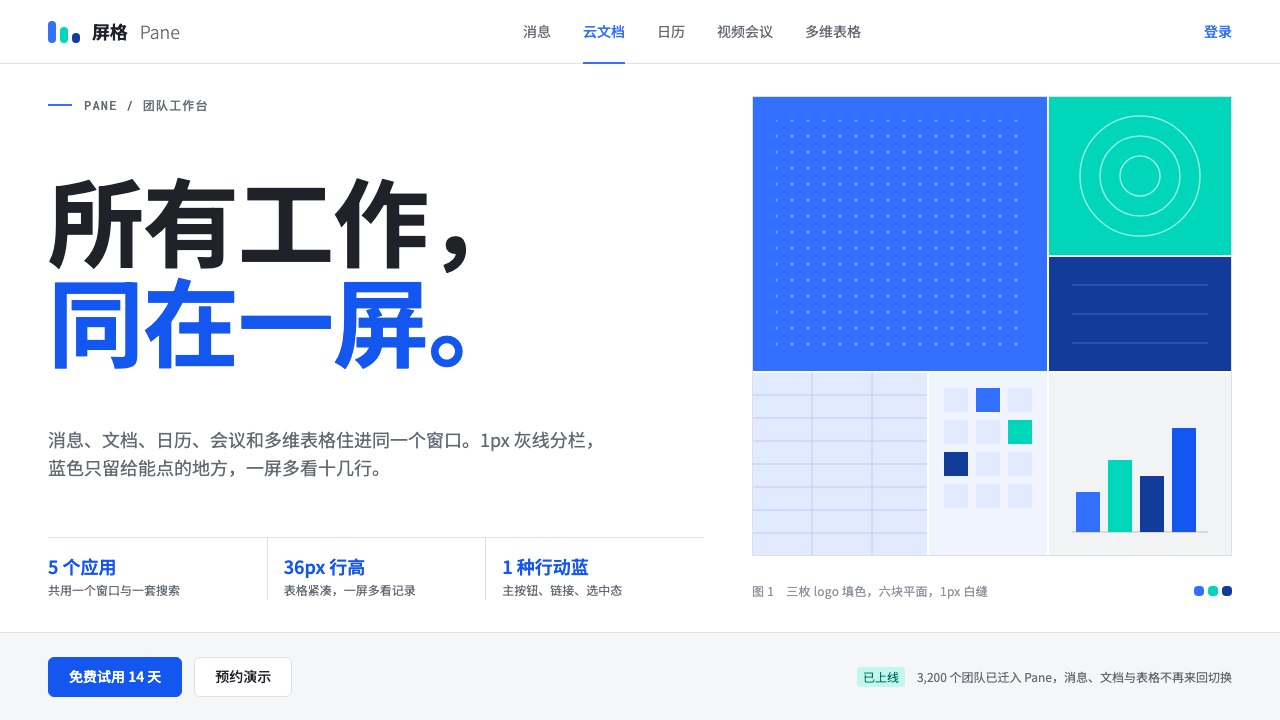 FeishuQuiet density, one blue. White panes split by 1px grey lines; blue marks only…
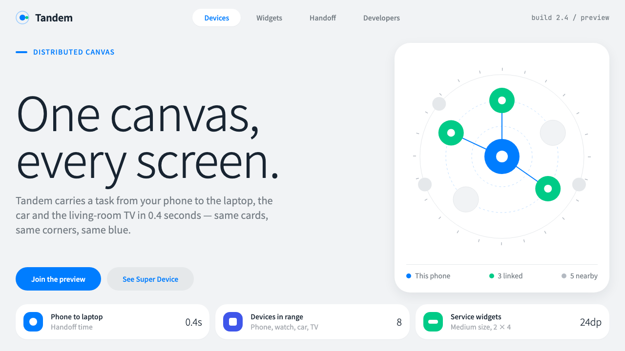 HarmonyOSOne blue for everything you can touch. White 24px cards on cool grey, navy te…
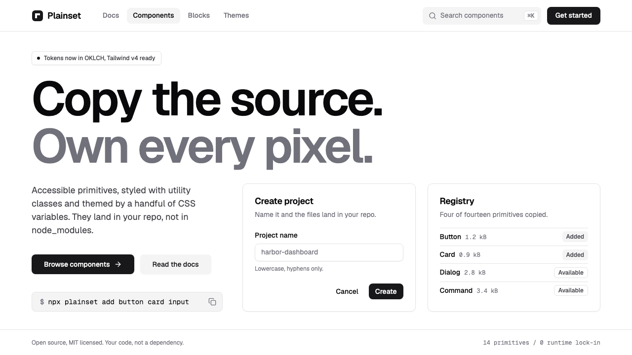 shadcn/uiQuiet enough to disappear. White pages, zinc hairlines, one near-black button…
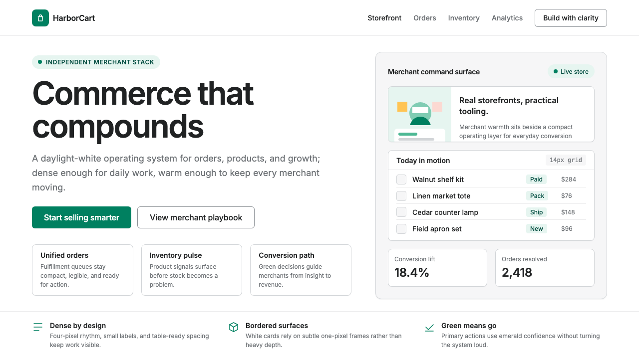 Shopify ModernMerchant ally, not corporate SaaS. Emerald actions on bordered white cards ca…
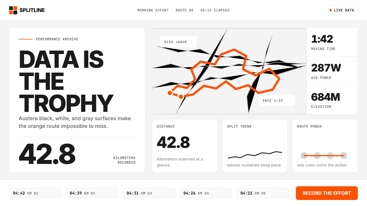 Strava Orange FitnessData becomes trophy. Inter numerals, gray metric grids, and one orange route…
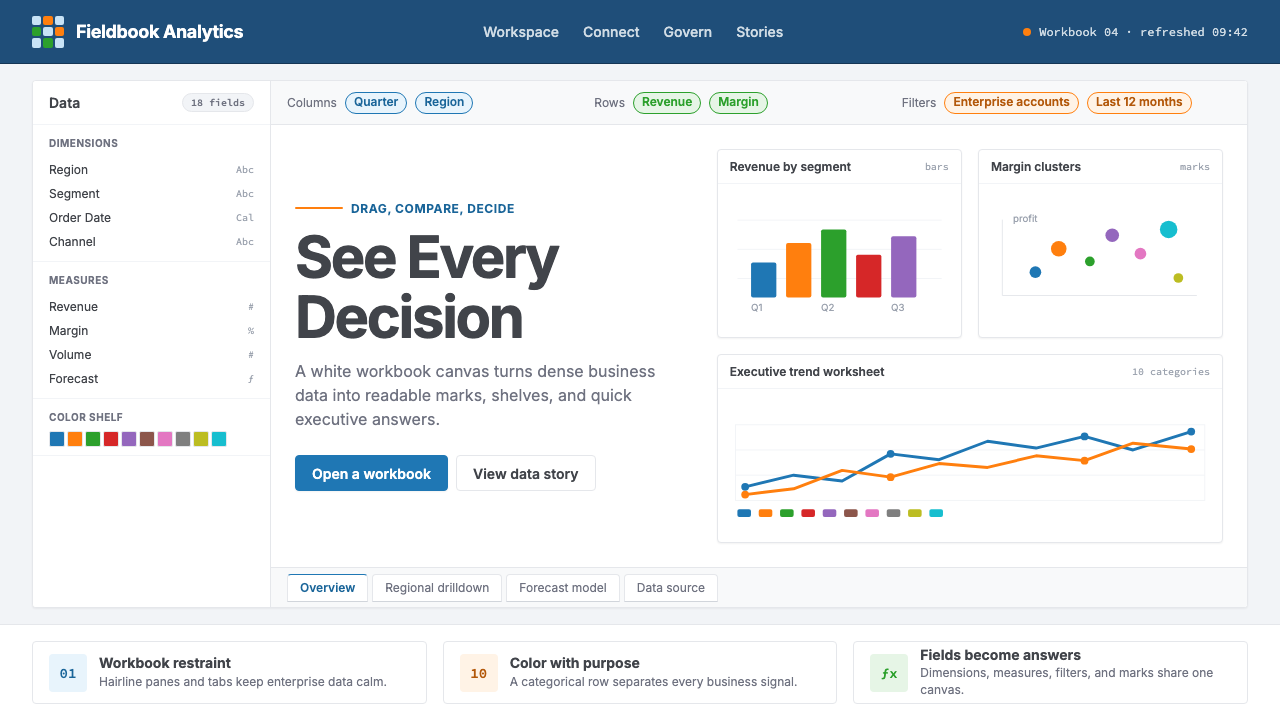 Tableau (Business Intelligence)Enterprise clarity. Navy workbook chrome, hairline panes, and 10-color marks…