What is shadcn/ui?
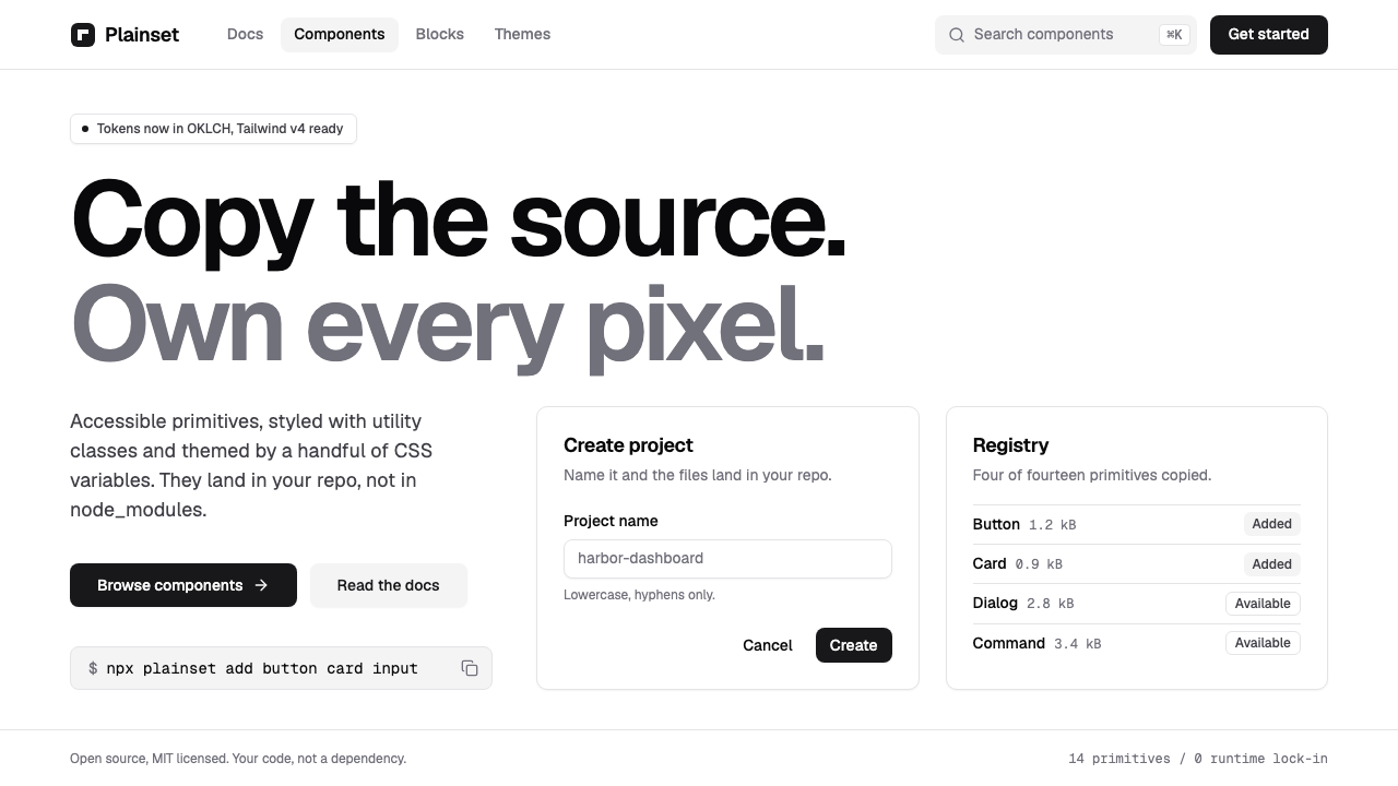
shadcn/ui is the interface style that tries hardest to be invisible: a white page, hairline zinc borders and one near-black button, with the code handed to you rather than rented.
shadcn/ui in brief
shadcn/ui is both a distribution idea and a visual style. Instead of installing a component library from a package registry and fighting its defaults, you copy the source of each component into your own project and own it from that moment on. Every component is built on an accessible, unstyled interaction primitive from Radix UI, dressed with Tailwind CSS utility classes, and themed through a small set of CSS variables that control colour, radius and surface.
The look that results is deliberately neutral. The default theme is called zinc: a white page, cool grey hairline borders, a gently rounded corner shared by every control, and a single near-black primary button. Text is dark grey rather than pure black for secondary information, and the type is a tightly set contemporary sans, most often Geist. Nothing is decorative. A card is a bordered rectangle, a dialog is a bordered rectangle with a soft shadow, and a badge is a tiny bordered rectangle.
That neutrality is the point. The style does not announce a brand; it provides a clean, well-behaved canvas on which a product can later place its own colour. It has become so common in dashboards, SaaS products and AI-generated interfaces that for many people it is simply what a modern web application looks like by default.

Where does shadcn/ui come from?
shadcn/ui was released publicly in 2023 by a developer who works under the handle shadcn. The project began from a practical frustration shared by many front-end teams: component libraries installed from a registry are convenient on day one and painful on day one hundred. Their styling is hidden inside a package, overrides pile up, and every upgrade risks breaking a customisation. The answer was to reverse the relationship. A command-line tool copies a component's source into your repository, and the library becomes a collection of well-made starting points rather than a dependency.
The visual language rests on three earlier movements in web development. The first is headless, accessible primitives, in which a library supplies keyboard handling, focus management and screen-reader behaviour but leaves appearance entirely open. The second is utility-first CSS, popularised by Adam Wathan through Tailwind CSS, which lets designers and developers express every spacing and colour decision directly in markup. The third is the broader copy-and-paste component culture, where snippets are shared, adapted and owned, not versioned and imported. shadcn/ui combined all three and added a restrained default theme that made the result look finished out of the box.
The style has not stood still. Its public release dates to 2023, but the current visual language reflects the later 2024 and 2025 generation of tooling: Tailwind version four, colour tokens defined in the perceptually uniform OKLCH space, and Geist as the preferred typeface. The core remains the same. Colour is defined as paired background and foreground variables, so that switching to a dark scheme means redefining a handful of variables rather than restyling every component.
Its spread has been helped by timing. Large language models learned the pattern from thousands of public repositories, so when an AI assistant is asked to build a dashboard, it frequently reaches for shadcn/ui conventions without being told to. That feedback loop has made the style both ubiquitous and, to some critics, monotonous. For designers it is best understood as a baseline: a competent, accessible floor from which a distinctive product can depart.
What defines the shadcn/ui look?
Colour
The page is white, text is a very dark grey close to black, and almost everything else is a cool grey of a few light steps. There is a single primary action colour, usually a near-black, so that the one thing you should press is the heaviest object on screen. Chromatic colour appears only for meaning: a muted red for destructive actions and errors, sometimes a soft tint in charts. A dark scheme inverts the logic rather than adding new hues.
Hairline borders
Structure is drawn with thin light-grey outlines, not fills or heavy shadows. Cards, inputs, tables, menus and tabs all share the same quiet stroke, which is why a screen can hold dozens of controls and still look calm. Where a surface must float, a very soft shadow sits beneath the border rather than replacing it.
Typography
A contemporary geometric-leaning sans, most often Geist, is set with slightly tightened tracking in headings and a relaxed, readable rhythm in body text. Hierarchy comes from weight and size in small steps rather than from contrast of typeface. Muted grey is used for descriptions and captions, which gives each card a clear title-then-supporting-text structure. A monospaced companion appears for code, keys and numeric detail.
Radius and shape
A single moderate corner radius is defined once as a variable and then derived for every control. Buttons, inputs, cards and popovers feel like members of one family because they round the same amount. Avatars and some badges become fully round. There are no cut corners, no notches and no decorative shapes.
Spacing and density
Spacing follows an even, small-step scale. Controls are compact enough for data-rich dashboards but padded enough that nothing feels cramped. Forms stack in clean single columns, tables use generous row height with faint dividers, and sections are separated by whitespace instead of heavy rules.
Interaction and focus
Hover states are a subtle darkening or a light grey wash, never a dramatic colour change. Keyboard focus is shown with a visible ring so that accessibility is part of the look, not an afterthought. Transitions are brief and functional: menus fade and slide a short distance, accordions open smoothly, and nothing bounces.
Composition by assembly
Because every part is a small, separate component, pages are built by assembling cards, tables, dialogs, command palettes, sidebars and toasts. The style has strong opinions about the parts and few about the whole, which is why the same system powers analytics tools, admin panels, documentation sites and marketing pages with only a change of content.

Who shaped shadcn/ui?
The developer behind the project, who released it in 2023 and defined the copy-the-source model that distinguishes it from conventional component libraries.
The author associated with Tailwind CSS and utility-first styling, the technique that every shadcn/ui component relies on for its appearance.
The family of headless, accessible primitives that supplies the behaviour underneath nearly every component, from dialogs to dropdown menus.
How do you use shadcn/ui today?
In slides, shadcn/ui translates into a calm, almost editorial minimalism. A cover slide can be a white field with a short title in a tightly set sans, a muted grey subtitle and one small near-black pill as a label. Content slides work well as a single bordered card per idea, with a title, a line of grey description and plenty of surrounding space. For data slides, use thin grey gridlines and restrained chart colours, and let one series be the near-black so the eye knows where to land.
On the web, this is the natural language of dashboards, settings pages, admin tools and developer products. Use bordered cards for grouped information, a left sidebar with understated active states, tables with faint dividers, and a command palette for navigation. Pricing pages translate as a row of bordered cards in which the recommended plan is distinguished by the dark primary button and perhaps a thicker outline, not by loud colour. Forms should stay single-column, with labels above inputs and helper text in muted grey.
For editorial and marketing work, the style is best at technical documentation, changelogs, product announcements and landing pages for tools aimed at developers. Large headings with tight tracking, short paragraphs and generous whitespace give an impression of confidence without any decoration. It is less suited to expressive brand storytelling, where it can read as generic unless a distinctive image, illustration or accent colour is introduced deliberately.
A good way to make the style your own is to change one thing on purpose. Choose a brand accent for the primary action, adjust the radius to be a little sharper or rounder, or swap the typeface, and keep the rest quiet. Because the theme lives in a few variables, these changes propagate everywhere at once, and the result looks designed rather than defaulted.
The most common mistake is to ship the defaults unchanged and let the product look like every other product built the same way. A second mistake is to add colour, gradients and heavy shadows to make the interface feel richer, which breaks the quiet logic of hairlines and a single dark action. A third is to stack too many bordered cards inside one another, creating visual noise. Keep nesting shallow, let whitespace separate groups, and reserve the dark primary button for one action per view.

shadcn/ui — FAQ
Is shadcn/ui a component library I install from npm?
Not in the usual sense. You use a command-line tool to copy the source of the components you want into your own project, where you can edit them freely. The components themselves are built on Radix UI primitives and styled with Tailwind CSS, so you own both the behaviour and the appearance rather than depending on a package for them.
Why does so much software look like shadcn/ui?
Three reasons combine. The default theme is neutral enough to suit almost any product, the components are accessible and easy to customise, and AI coding assistants have learned the pattern so thoroughly that they reproduce it by default. The result is a shared visual baseline across dashboards and SaaS products.
How do I make a shadcn/ui interface feel less generic?
Change one thing deliberately. Pick a brand colour for the primary action, adjust the corner radius, or replace the typeface, and then keep everything else restrained. Distinctive imagery, illustration or a bolder layout at the page level also helps, since the components themselves are meant to stay quiet.
Does the style support dark mode?
Yes. Colour is defined as paired background and foreground variables, so a dark scheme is a second set of values for the same variables. The logic of hairline borders, muted secondary text and one prominent action carries over unchanged, with the contrast inverted.
Is it a good fit for a marketing site?
It suits developer-facing and product-led marketing well, where clarity and trust matter more than spectacle. For consumer brands that depend on emotion or strong personality, it works better as a foundation to which you add distinctive colour, imagery and typography than as a finished look.
Related design styles
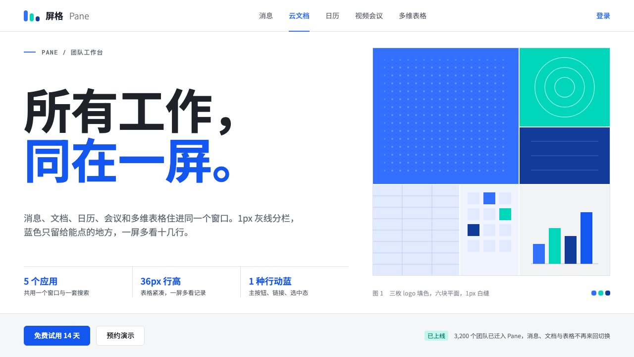 FeishuQuiet density, one blue. White panes split by 1px grey lines; blue marks only…
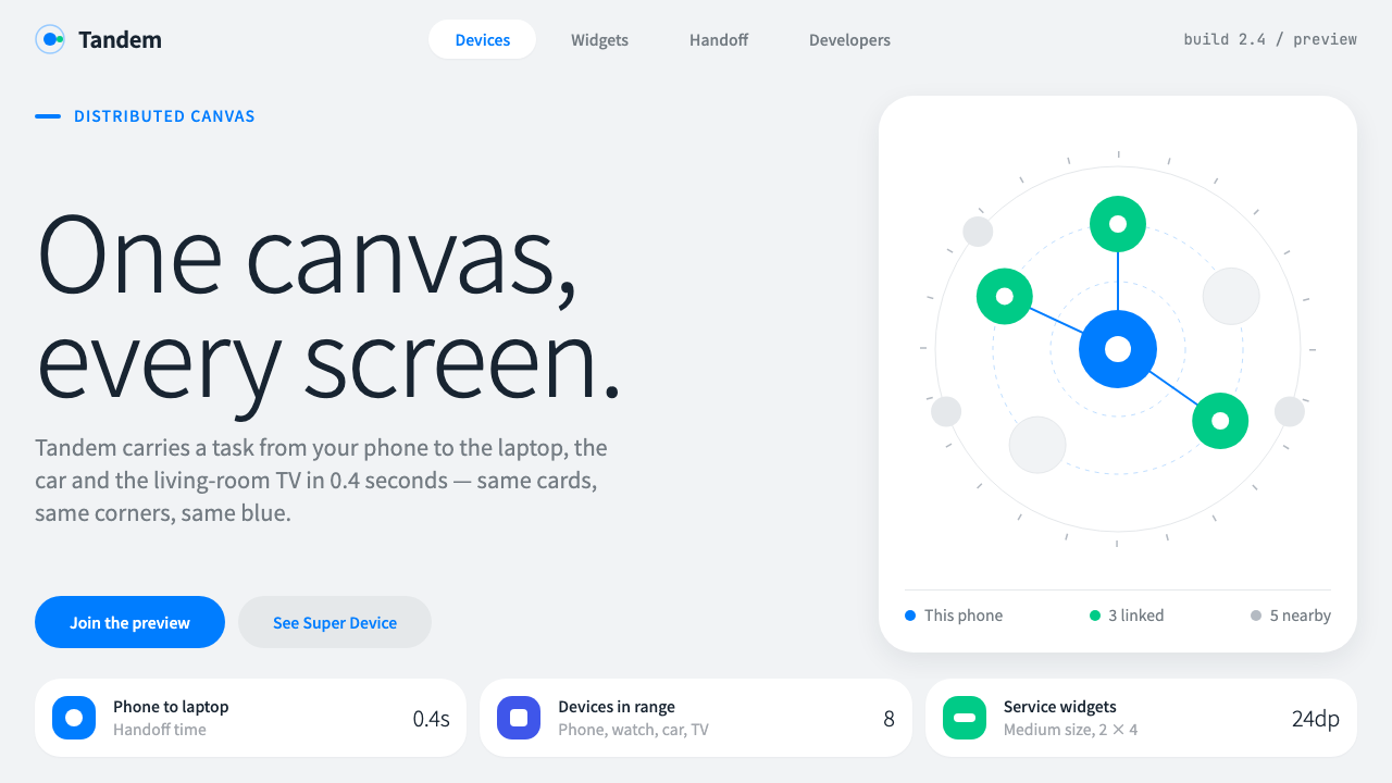 HarmonyOSOne blue for everything you can touch. White 24px cards on cool grey, navy te…
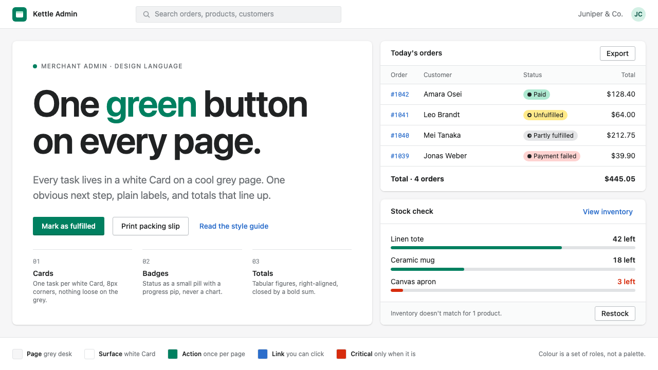 Shopify PolarisOne task per Card, one green button per page. White Cards on cool grey, pill…
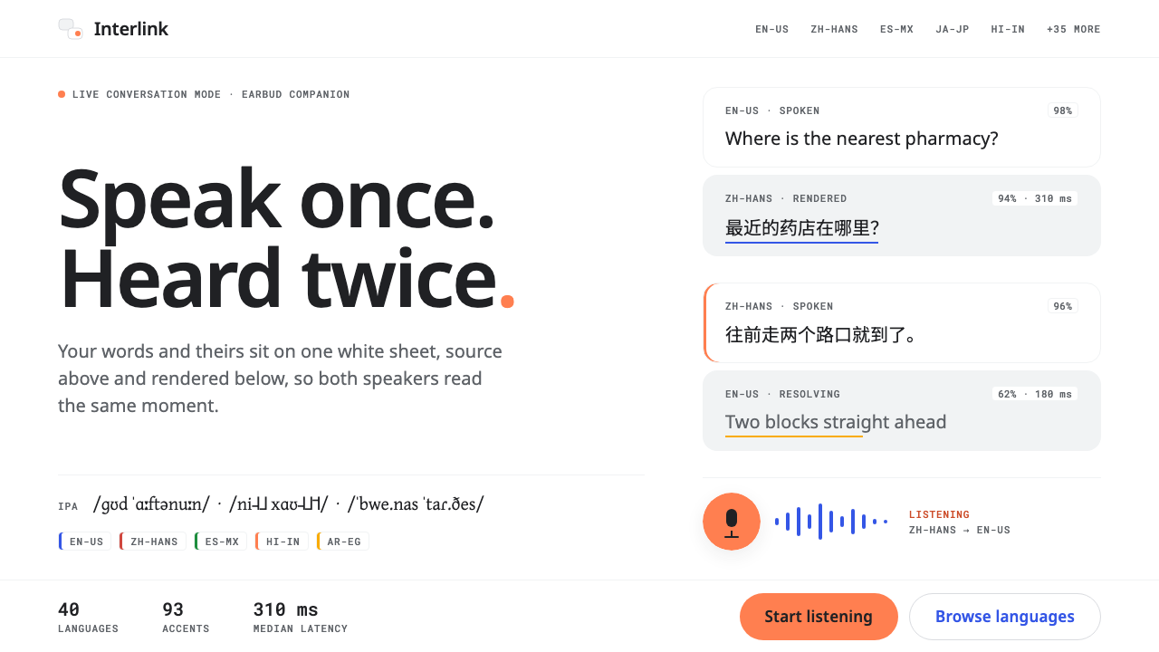 Universal Translator EarpieceTwo languages, one white sheet. Stacked Noto cards, mono fine print, coral on…
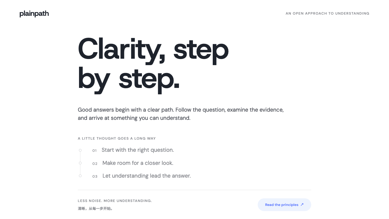 DeepSeekClarity without spectacle. White space, whale blue and a grey trail of though…
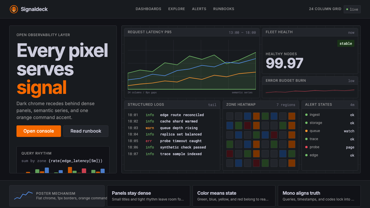 GrafanaData first, chrome last. Orange accent cuts through dense dark panels and sem…