What is DeepSeek?
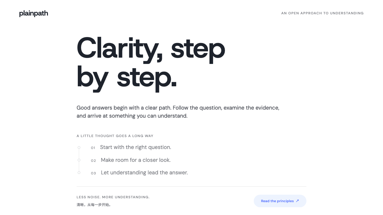
DeepSeek's look is an argument made by subtraction: a white page, one blue whale, one column of talk, and a grey thread of reasoning left open for anyone to read.
DeepSeek in brief
DeepSeek is the visual identity of a Hangzhou AI lab and its consumer chat assistant, as the product looked when its R1 reasoning model and free app rose to the top of the App Store in January 2025. Where most AI products of the period competed on spectacle, with glowing gradients, animated orbs and dark cosmic backgrounds, DeepSeek's interface offered almost nothing to look at: a white page, a small blue whale, and a single centered column of conversation.
The system built on that look is defined by three decisions. First, a single strong hue, whale blue, is reserved for action: the send button, the selected modes, the mark itself. Second, the human and the machine are distinguished by treatment rather than by decoration: the user speaks inside a pale blue bubble, while the model writes straight onto the white page with no bubble at all. Third, the reasoning is shown. When the DeepThink mode is on, the model's chain of thought appears above the answer as a grey trail threaded along a hairline with small nodes, collapsible but never hidden.
Taken together, these choices describe a tone rather than a trend: calm, literate and slightly austere, closer to a well-set reading page than to a product demo. It is a style for interfaces whose job is to let a person follow an argument, and it translates well to documentation, research tools, knowledge products and any interface where the explanation matters as much as the answer.

Where does DeepSeek come from?
DeepSeek is a Chinese artificial intelligence company based in Hangzhou, in Zhejiang province, founded in 2023 and led by Liang Wenfeng. It belongs to the family of open-weight large language model developers, labs that publish the trained parameters of their models so that others can run, inspect and adapt them. That commitment shaped how the company presented itself: technical, plain-spoken and unconcerned with marketing theatre.
The company's public profile changed quickly at the turn of 2025. DeepSeek-V3 arrived in December 2024 as a strong general model, and in January 2025 the R1 reasoning model and a free chat app reached the top of the App Store. R1 belongs to the line of reasoning models that expose a visible chain of thought, the intermediate working that a model produces before it commits to an answer. Most chat products had treated that working as an internal detail. DeepSeek chose to put it on the screen.
That decision is the root of the interface. If the reasoning is going to be shown, the surrounding page has to be quiet enough to carry a long block of grey, tentative, self-correcting prose without it looking like a malfunction. A white ground, generous margins, a single text column and restrained color give the thought process room to read as thought. The grey trail with its nodes works almost like the margin notes in a draft: present, legible, subordinate to the final answer.
The third strand in the background is the consumer chat assistant as a product category. Chat apps had by then settled into a recognizable grammar: a message list, a composer at the bottom, a few mode toggles. DeepSeek followed that grammar faithfully and added almost nothing to it. Its distinctiveness came from what it declined to add, which is why the style is best understood as a discipline of omission rather than a catalogue of features.
What defines the DeepSeek look?
Color
The palette is a white ground, near-black text and one saturated blue taken from the whale mark. Whale blue marks every action: the send control, the selected state of the DeepThink and Search pills, links. A pale tint of the same blue fills the user's bubbles and the active pills, so the whole interface feels like a single hue at different strengths. Greys carry everything else, especially the reasoning trail, which sits a step lighter than the answer so that it reads as secondary.
Typography
Type is a neutral, humanist sans-serif set for sustained reading, with an even weight and no display flourishes. Hierarchy comes from size, weight and the grey-to-black shift rather than from decorative faces. Long answers are set as ordinary paragraphs with comfortable line spacing, and the reasoning text is set in the same family but lighter in tone, so that the two voices share a typeface and differ only in confidence.
The whale mark
The blue whale is the only illustration in the system. It appears small and flat, in the same blue as the actions, and its curves are the one organic shape in an otherwise rectangular layout. It works as a signature rather than a mascot: it identifies the speaker, sits beside the model's answers and stays out of the way. Resist the temptation to enlarge it or surround it with effects.
Conversation layout
The page is one centered column with wide, empty margins on both sides. The user's turn sits in a pale blue bubble, short and slightly inset; the model's turn has no container and is written directly on the page. This asymmetry is the main structural idea: a person's message is an object, while the model's answer is simply the text of the page. There are no avatars crowding the margins, no timestamps and no dividers between turns.
The reasoning trail
When deep thinking is on, the model's working appears above the answer as a thread: a fine hairline runs down the left, small round nodes mark each step, and the text beside them is set in mid-grey. It can be folded away but is open by default. This is the signature component of the system, and it embodies a stance, that explanation is part of the product and not something to be tucked behind a disclosure arrow.
Mode pills
The two modes, DeepThink and Search, are small rounded pills sitting beside the composer. Off, they are quiet outlines; on, they fill with pale blue and take blue text. The change is deliberate and legible without being loud, and it shows how the whole palette behaves: color arrives only when a state is real, and fades back out when it is not.
Space and restraint
White space is not leftover; it is the material. Containers are rare, shadows are absent or barely perceptible, and borders are hairlines. Nothing animates for its own sake. The overall impression is of a clean sheet on which one blue object and a column of text have been placed with care, and every addition has to justify itself against that emptiness.

Who shaped DeepSeek?
Liang Wenfeng leads DeepSeek, the Hangzhou lab behind the models and the app. The product's character, technically serious and uninterested in spectacle, is generally associated with the lab's open-weight, research-first orientation, and the plain interface reads as an expression of that culture.
R1 is the reasoning model released in January 2025 alongside the free chat app. Because it exposes its chain of thought, it created the need for the interface's most distinctive component, the open grey reasoning trail, and it is the reason the product became a reference for how to display machine thinking.
V3, released in December 2024, is the general-purpose model that preceded R1 and established the lab's reputation among developers. It belongs to the same open-weight lineage, and the visual restraint of the later app is consistent with the lab's earlier developer-facing presence.
The free consumer app that climbed to first place on the App Store in January 2025 is the direct source of this style. Its single column, whale blue accent and unframed answers are what the system preserves, and its success showed that an interface with almost no visual ornament could still be unmistakably branded.
How do you use DeepSeek today?
DeepSeek's style is most useful wherever the content is explanatory and the reader needs to follow a line of thought. It is a poor fit for brand moments that need drama, but an excellent one for anything that must feel trustworthy, calm and literate. The core discipline is to keep one blue, one grey family and a great deal of white, and to resist every urge to decorate.
For presentation slides, build covers from almost nothing: a white field, a title set large in near-black, a short subtitle in grey and the single blue accent used once, perhaps as a small mark or a thin rule. Content slides work as one column of text or a few short points, with the grey reasoning-trail motif repurposed as a vertical hairline with small nodes to show steps in a process or an argument. Data slides should keep charts flat and sparse, with the blue used for the series that matters and grey for context.
For web interfaces, the style suits chat products, research assistants, documentation sites and knowledge bases. Center a single readable column, put user input in pale blue bubbles and answers directly on the page, and show mode toggles as small pills that fill only when active. Dashboards can borrow the same logic: let white dominate, use blue strictly for primary actions and selected states, and show secondary information in grey. Pricing pages benefit from the absence of shadows, since hairline borders keep plans comparable without visual noise.
For editorial and marketing work, the style supports long explanatory pieces, technical announcements and whitepapers. Use generous margins, a modest type scale and the thread-and-nodes device to break a long explanation into legible stages. Imagery should be minimal; if the whale mark appears, keep it small and flat, as a signature at the start or end rather than a hero graphic.
The most common mistake is to treat the restraint as a blank canvas for effects. Adding gradients, glows, glassy panels or a dark mode full of neon immediately turns this into the generic AI-product look it was defined against. The second mistake is to spread the blue everywhere: if headings, borders, icons and backgrounds are all blue, the signal that blue means action disappears. Hold the line, and let the emptiness do the work.

DeepSeek — FAQ
What makes the DeepSeek style different from other AI chat interfaces?
Most AI products of the period leaned on atmosphere: dark backgrounds, gradients, glowing accents. DeepSeek's interface does the opposite. It uses a white page, one blue, a single centered column and no bubble around the model's answers. The most distinctive element is the open reasoning trail, a grey thread with small nodes that shows the model's working above the answer. The difference is therefore less about decoration than about attitude: the interface treats explanation as content.
Why is the reasoning shown in grey rather than in the main text color?
Grey signals that the reasoning is working material, not the conclusion. Setting it a step lighter than the answer lets the reader scan past it when they only want the result, while still keeping it open and legible when they want to follow the logic. It is a way of ranking two kinds of text without hiding either.
Can this style work on a dark background?
The reference is firmly a light interface: white ground, near-black text, blue action. A dark variant is possible, but it needs care, because the identity depends on restraint and on blue meaning action. If you invert it, keep the surface a calm, low-contrast dark, retain a single blue accent, and avoid the glowing, neon-leaning treatments that would pull it toward generic AI styling.
Is the whale logo required in designs that use this style?
No. The whale is a signature for the original product. If you are borrowing the style for your own work, the transferable parts are the structure and the color logic: one blue reserved for action, a pale tint for the user's side, unframed answers and a quiet grey layer for secondary text. Replace the whale with your own small mark, or omit it, and the system still holds together.
What kinds of products is it best suited to?
It suits products in which a person reads and weighs an explanation: AI assistants, research tools, documentation, knowledge bases, technical reports and analytical dashboards. It is less suitable for entertainment, retail or any brand that needs bold visual drama, where its calm and near-empty page may feel underpowered.
Related design styles
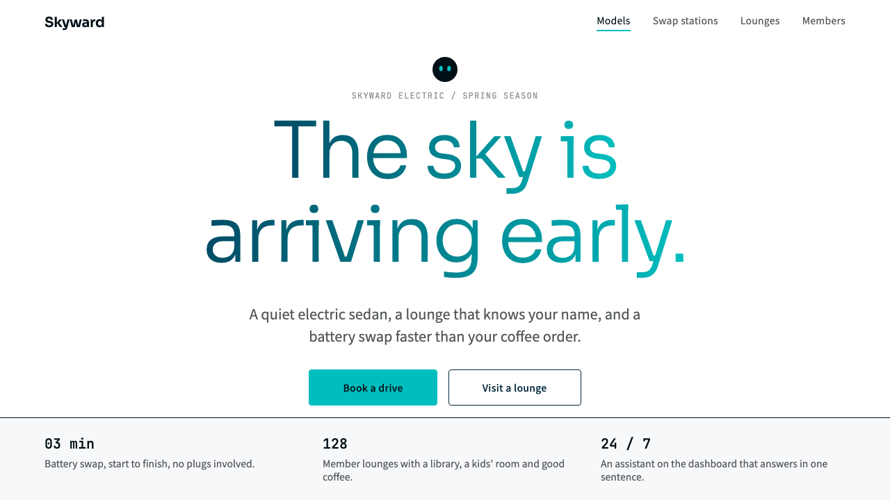 NIOQuiet premium with the sky in the headline. White pages, navy ink, one teal-t…
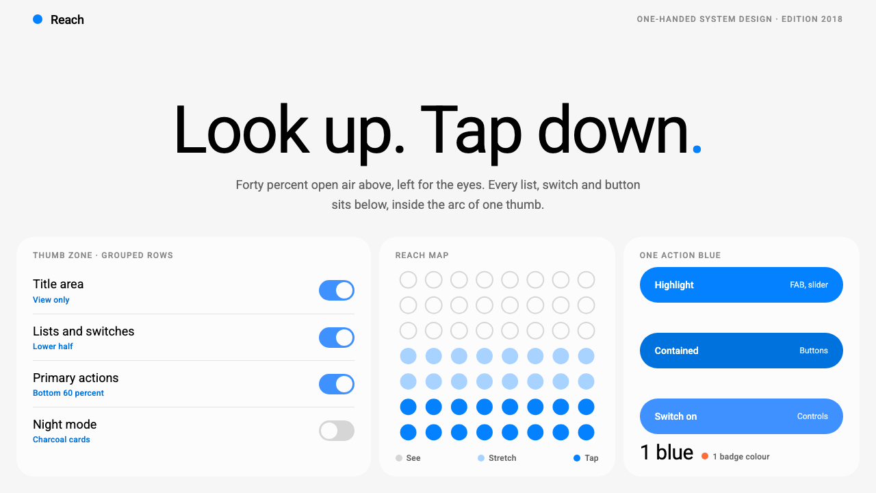 Samsung One UILook up, tap down. Giant Roboto title in open air, white 26px cards on grey,…
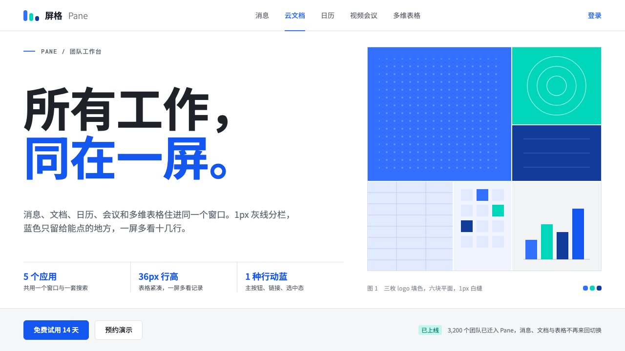 FeishuQuiet density, one blue. White panes split by 1px grey lines; blue marks only…
 HarmonyOSOne blue for everything you can touch. White 24px cards on cool grey, navy te…
 Threads (Meta)Restraint is the brand. Black Inter type, narrow feed, thin connectors, white…
 Universal Translator EarpieceTwo languages, one white sheet. Stacked Noto cards, mono fine print, coral on…