About Shopify Polaris
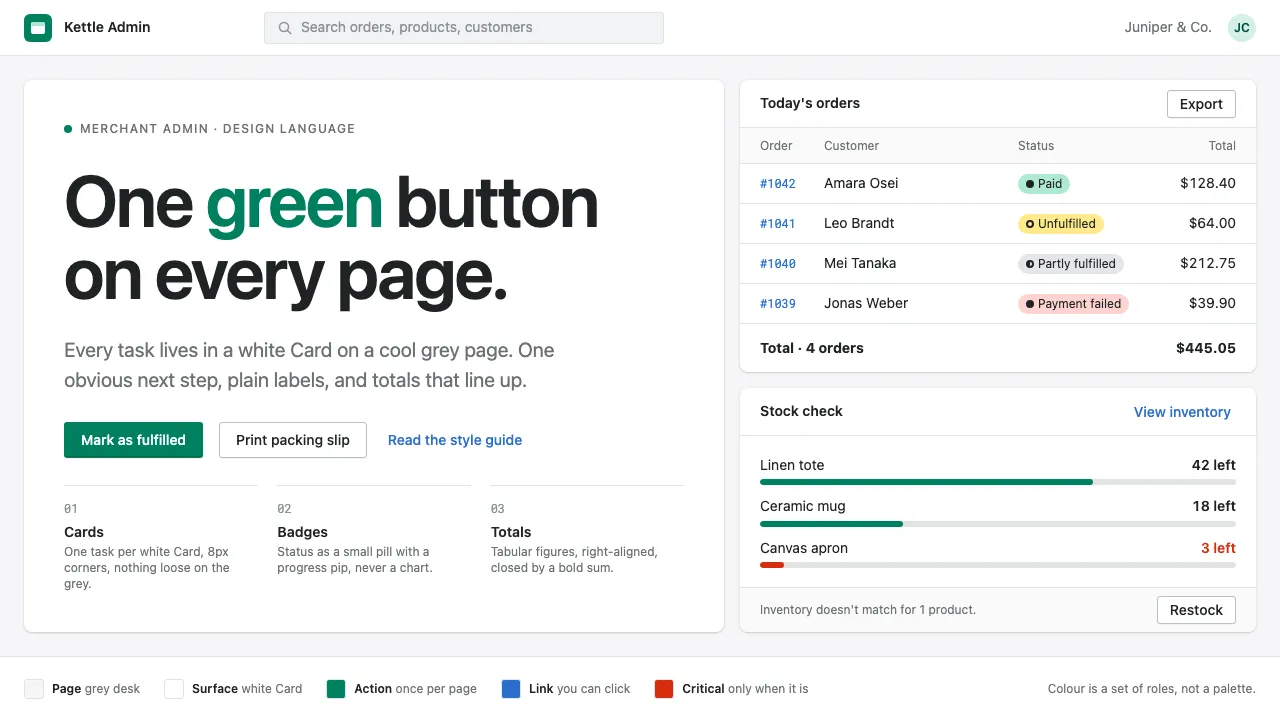
Polaris is the system behind the Shopify admin, the screen where millions of shop owners check orders, restock products and answer customers. A cool grey page holds white Cards; each Card is a titled task with its own actions, and each page gets exactly one green primary button.
It is written for merchants, not engineers. Labels use plain language, status shows up as a small Badge rather than a chart, and order totals line up in tabular figures. It is quiet, legible and built to be used every day.
- Origin
- Ottawa, Canada
- Era
- 2017 introduced at Shopify Unite; token set from the 2020–21 design-language refresh (@shopify/polaris-tokens 6.x)
- Key figures
- Tobias Lütke · Daniel Weinand
- Movements
- Open-source design systems · Design tokens · Content design in product UI
Shopify Polaris design spec
Colors
Background
Surface
Primary
Secondary
Accent
Text
Typography
-apple-systemHeadings
SFMono-RegularMono
Unlock for 1 credit
The other 11 sections — buttons, cards, spacing, motion, techniques and more — open once you unlock. Download the DESIGN.md or send it to your AI in one click. Unlock once, yours forever.
Sign up nowHave an account? Sign in
Styles similar to Shopify Polaris
Also inspired by brands & products, with a close feel.
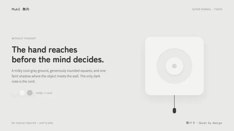 Fukasawa Without ThoughtHand reaches before mind decides. Milky cool-gray plastic, rounded squares, one faint wall shadow.
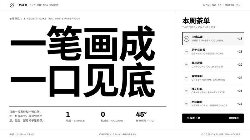 HEYTEANo colour at all. One black line on white cup paper, Chinese-first type, mini-program menu rows.
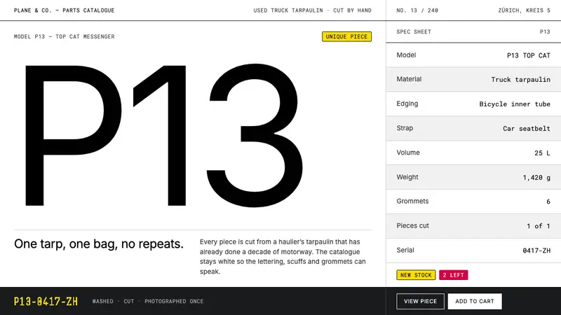 FREITAGColour-zero on purpose. White sweep, hairline grid, one type weight — the tarp holds the chroma.
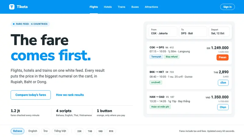 TravelokaThe fare comes first. Azure band, white cards, price as the biggest numeral, one orange Book button.